


The Hull City logo is one of those football badges that tells you exactly where it comes from the moment you see it. A snarling tiger’s head set inside an amber shield, with the club’s name arched above and “1904” stamped below. It’s bold. It’s aggressive. And it carries over a century of East Yorkshire football history.
Hull City Association Football Club, based in Kingston upon Hull, has been playing in black and amber since their very first match in 1904. The tiger imagery didn’t arrive until the late 1940s, but once it showed up, it stuck. The badge has been redesigned roughly 13 times across the club’s existence, each version reflecting the era it came from and the people running the club at the time.
Within the broader picture of English football branding, the Hull City crest sits in a unique space. Few clubs commit so fully to animal imagery as their primary identifier. The amber and black color combination is also rare in the top tiers of English football, making it instantly recognizable whether it’s printed on a matchday programme or stitched onto a jersey.
What Is the Hull City Logo?
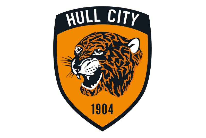
The Hull City logo is a shield-shaped emblem featuring a right-facing growling tiger’s head in black and amber, with “Hull City” displayed in uppercase across the top. Introduced in its current form for the 2019-20 season, the crest was developed through a supporter-led redesign process spearheaded by Vicky Beercock. It represents the club’s nickname, “The Tigers,” and its deep connection to Kingston upon Hull.
Here’s a breakdown of the logo’s key attributes:
- Design Type: Combination mark (emblem with mascot and wordmark)
- Primary Elements: Tiger’s head, amber shield, club name in uppercase, founding year “1904”
- Official Introduction Date: February 2019 (used from 2019-20 season onward)
- Designer/Agency: Developed under the direction of Vicky Beercock through a fan consultation process
- Trademark Status: Registered trademark of Hull City AFC
- Color Palette: Amber/Orange (#F18A01), Black (#000000), White (#FFFFFF)
- Usage Context: Matchday kits, club merchandise, digital platforms, stadium signage, official correspondence, and all marketing materials
How Has the Hull City Logo Evolved Over Time?

The Hull City badge has gone through about 13 different versions since the club’s founding. Starting with no crest at all, then civic crowns, then tiger heads, initials, roundels, and detailed shields. Each redesign reflected changes in ownership, design trends, or fan pressure.
The most controversial change came in 2014 when the club stripped the name off the badge entirely. That one didn’t last.
The Early Years: No Crest (1904-1935)
- Years Active: 1904-1935
- Design Description: No official crest worn on shirts
- Color Scheme: Black and amber striped kits with no badge
- Context: The club played its first match against Notts County on September 1, 1904. Many clubs of this era simply didn’t use shirt badges. Hull’s amber and black stripes earned them the “Tigers” nickname from the Hull Daily Mail as early as March 1905.
- Cultural Significance: The club established its identity through kit colors alone, which proved powerful enough to generate a lasting nickname without any official crest.
The Three Crowns Badge (1935-1947)
- Years Active: 1935-1947
- Design Description: Three civic crowns of Kingston upon Hull embroidered on shirts
- Color Scheme: Initially worn on blue and white kits (1935-36 only), then returned to black and amber
- Context: The club briefly switched to blue and white kits to match the civic colors of Kingston upon Hull. The three ducal crowns were taken from the city’s coat of arms, believed to reference the legend of the Three Magi. The kit change was unpopular and dropped after one season, but the crowns remained.
- Cultural Significance: This was the first time Hull City wore any form of official badge. It tied the club directly to the city’s civic identity rather than its “Tigers” persona.
First Tiger’s Head Badge (1947-1957)
- Years Active: 1947-1957
- Design Description: A tiger’s head placed inside an amber shield
- Color Scheme: Amber and black
- Context: This marked the birth of the tiger as a visual element on Hull City’s badge. The club had returned to amber kits, and the tiger’s head on a shield gave the “Tigers” nickname its first graphic form. Hull won the Third Division North in 1948-49 wearing this badge.
- Key Changes from Previous: Complete departure from civic symbolism to animal imagery
- Cultural Significance: Established the tiger as the core visual identity that would define every future badge.
Standalone Tiger’s Head (1957-1975)
- Years Active: 1957-1975 (briefly dropped around 1960-1971)
- Design Description: The tiger’s head without any background shield
- Color Scheme: Amber and black
- Context: A simplified version that removed the shield and let the tiger stand alone. It was dropped entirely for a period in the early 1960s before returning in 1971.
- Key Changes from Previous: Stripped away the shield container for a more direct approach
The HCAFC Initials (1975-1979)
- Years Active: 1975-1979
- Design Description: The club’s initials “HCAFC” used as the crest
- Color Scheme: Black and amber
- Context: A text-only badge that abandoned the tiger imagery. This was part of a broader trend across English football during the 1970s where several clubs experimented with initial-based or monogram badges.
- Key Changes from Previous: Complete removal of any graphic element
- Cultural Significance: Generally seen as a misstep. The tiger returned in 1979 and has stayed ever since.
Return of the Tiger (1979-2001)
- Years Active: 1979-2001 (with variations in the 1980s and 1990s)
- Design Description: The tiger’s head returned, eventually placed inside a circular roundel with “Hull City AFC” and “The Tigers” text. Multiple versions existed during this period.
- Color Scheme: Amber and black, sometimes with white
- Context: The late 1980s through early 1990s saw the tiger’s head surrounded by text in a roundel format. In 1998-99, a more complex crest was introduced that included the Humber Bridge and three crowns. It was not well received by fans and lasted only about two years.
The Hinchcliffe Shield (2001-2014)
- Years Active: 2001-2014
- Design Description: A shield in club colors with a fierce, open-jawed tiger, three crowns at the top, the club name, and year of establishment on a scroll banner
- Designer: Designed by the son of Stephen Hinchcliffe, who was a graphics design student at the time
- Color Scheme: Amber, black, and white
- Context: Created through a competition held in the matchday programme and on the club’s website in spring 2001. This became the badge worn during Hull’s historic 2008 promotion to the Premier League and their 2014 FA Cup Final appearance.
- Cultural Significance: The most beloved version among many fans. It was the badge of the club’s greatest achievements.
The Stripped-Down Crest (2014-2019)
- Years Active: 2014-2019
- Design Description: Just the tiger’s head with “1904” beneath it, all contained within an amber shield. No club name.
- Color Scheme: Amber and black
- Context: This coincided with owner Assem Allam’s attempt to rebrand the club as “Hull City Tigers,” a move rejected by the Football Association in April 2014. Removing the club name from the badge was deeply unpopular.
- Key Changes from Previous: Club name, three crowns, and scroll banner all removed
- Cultural Significance: A flashpoint for fan opposition. It triggered the supporter-led redesign campaign that produced the current badge.
The Current Crest (2019-Present)
- Years Active: 2019-present
- Design Description: Shield-shaped with the tiger’s head, “Hull City” restored in uppercase, and “1904” below
- Designer: Developed under Vicky Beercock’s direction through a multi-stage fan consultation process
- Color Scheme: Amber (#F18A01), Black (#000000), White (#FFFFFF)
- Context: The redesign started after the 2017-18 season. Fans were directly involved through feedback sessions and consultation panels. Unveiled in February 2019 and used from the 2019-20 season.
- Key Changes from Previous: Club name restored. More polished tiger illustration. Fan-approved design.
- Cultural Significance: Proved that supporter voice matters in football branding. Received overwhelmingly positive reception.
What Do the Design Elements of the Hull City Logo Mean?
Every piece of the Hull City crest carries specific meaning rooted in the club’s history and its connection to Kingston upon Hull. The tiger represents the club’s nickname and playing identity. The shield provides structure and tradition. The founding year anchors everything to 1904.
These aren’t decorative choices. They’re identity markers that fans have fought to protect, as the 2014-2019 badge controversy showed pretty clearly.
The Tiger’s Head
The growling tiger is the focal point of the entire badge. It has been there in some form since 1947, making it the longest-running visual element in the club’s branding.
The tiger connects directly to the club’s nickname, “The Tigers,” which itself comes from the black and amber striped kits worn since 1904. There’s a directness to the relationship between kit colors, nickname, and badge that you don’t always see in football. The psychology of shapes plays a role here too. The tiger’s open jaw and sharp angles signal aggression and competitiveness.
Earlier versions showed the tiger differently, sometimes more stylized, sometimes more realistic. The current version hits a middle ground that works across digital and print.
The Shield
Shields are common in English football badges. They suggest heritage and tradition. For Hull City, the shield also references heraldic design, connecting the club to the broader civic identity of Kingston upon Hull.
In previous versions, the three ducal crowns from the city’s coat of arms sat at the top of the shield. The current version simplifies things but keeps the shield outline as a structural container. It’s a layout built on solid graphic design principles, where every element sits in a clear, readable arrangement.
Why Did Hull City Choose These Specific Colors?

Amber and black have been Hull City’s colors since day one. The Hull Daily Mail coined the “Tigers” nickname in 1905 specifically because the striped kits looked like tiger markings.
Here are the official color codes:
- Amber/Orange: Hex #F18A01 | RGB (241, 138, 1) | CMYK (3, 55, 100, 0) | Pantone PMS 144 C
- Black: Hex #000000 | RGB (0, 0, 0) | CMYK (60, 40, 40, 100) | Pantone PMS Black 6 C
- White: Hex #FFFFFF | RGB (255, 255, 255) | CMYK (0, 0, 0, 0)
The amber brings energy. If you look at color psychology research, orange tones signal enthusiasm and warmth. Black adds weight and seriousness. Together they create high contrast, which makes the badge pop whether you’re looking at it from the stands or on a phone screen.
The combination also makes Hull City one of the most visually distinct clubs in English football. No other team in the top two tiers uses this exact pairing, which is a genuine branding advantage. For comparison, plenty of clubs have been drawn to orange in their logos, but few commit to it as completely as Hull does.
What Typography Style Is Used in the Hull City Logo?

The Hull City badge uses a bold, uppercase sans-serif font for the “Hull City” text. The club’s jersey lettering and broader branding reportedly use Impact Regular as a base.
It’s a heavy, condensed typeface that prioritizes readability at small sizes. That matters a lot for football badges, which need to be legible on everything from broadcast graphics to lapel pins. The typographic hierarchy is straightforward: the club name sits at the top, the tiger dominates the middle, and “1904” anchors the bottom.
Earlier versions used different type treatments. The Hinchcliffe-era badge featured the name on a scroll banner, which had a more traditional feel. The current version strips that away for something cleaner.
What Are the Hidden Meanings in the Hull City Logo?
The most significant layered meaning in the Hull City crest is the relationship between the tiger and the city’s maritime history. Previous badge versions included a ship in full sail, acknowledging Hull’s past as a major trading port. The current version focuses on the tiger, but that maritime connection still lives in the club’s culture.
The three ducal crowns, which appeared in older versions, come from the Kingston upon Hull coat of arms and supposedly reference the legend of the Three Kings (the Magi). These were certified in the city’s arms in 1879 but used on city seals going back to the fifteenth century.
The founding year “1904” is always present. It grounds the badge in history and was a sticking point during the Allam-era controversy because some fans felt removing the club name while keeping just a date and a tiger erased too much identity.
How Does the Hull City Logo Compare to Competitor Logos?
Hull City’s badge stands out among English football clubs for its commitment to animal imagery as the primary design element. Most clubs in the EFL Championship use heraldic shields or city-based symbols. Hull leans harder into the mascot than most.
Compare it to nearby Championship rivals. The Leeds United logo uses a circular badge with a saluting figure. Sheffield Wednesday’s badge features an owl in a more traditional heraldic style. Burnley’s crest leans on text and civic symbols.
Hull’s tiger-forward approach gives it stronger immediate recognition, at least in my opinion. You see that amber and black badge and you know who it is. That’s something a lot of clubs struggle with when their badges rely on generic shield layouts.
The amber and black palette is also genuinely unique in the upper tiers of English football. Wolverhampton Wanderers use old gold and black, which is close, but the tone difference is noticeable. The Wolverhampton Wanderers badge leans into a wolf’s head, so there’s actually an interesting parallel between the two clubs in how they use animal imagery, but the execution is quite different.
Among other clubs with animal-centric badges, Crystal Palace’s eagle and Sunderland’s cat imagery come to mind. But Hull’s tiger remains one of the most striking.
What Are the Technical Specifications of the Hull City Logo?
Official Color Codes
- Primary Color – Amber/Orange: Hex #F18A01 | RGB (241, 138, 1) | CMYK (3, 55, 100, 0) | Pantone PMS 144 C
- Secondary Color – Black: Hex #000000 | RGB (0, 0, 0) | CMYK (60, 40, 40, 100) | Pantone PMS Black 6 C
- Accent Color – White: Hex #FFFFFF | RGB (255, 255, 255) | CMYK (0, 0, 0, 0)
Dimensions and Proportions
The logo is built on a vertical shield format, taller than it is wide. The tiger’s head occupies roughly the center and lower portion of the shield, with the “Hull City” text filling the top arc.
Like most professional football badges, the Hull City crest is available as vector graphics (SVG, EPS, AI formats) for scalability. This means it can be printed at any size without quality loss, from a tiny pin badge to a massive stadium banner.
For digital applications, a minimum display size should maintain legibility of the “Hull City” text. The badge needs to work as small as a 32×32 pixel favicon and as large as stadium-scale banners. At very small sizes, the tiger head alone sometimes serves as an icon, which is a common practice across tech company logos and sports branding alike.
Clear space around the badge should roughly equal the width of the “1904” text at the base. This keeps the crest from getting crowded by adjacent elements.
What Cultural Impact Has the Hull City Logo Had?

The Hull City badge punches above its weight culturally, mostly because of what happened between 2013 and 2019. When owner Assem Allam tried to rebrand the team as “Hull City Tigers” and stripped the name from the badge, the backlash was enormous.
Fans organized. The Hull City Supporters Trust fought the name change, which the FA ultimately rejected in April 2014. But the badge stayed nameless until 2019, and the whole saga became a case study in how football clubs belong to their communities, not just their owners.
Beyond the controversy, the tiger badge is a genuine point of pride in Kingston upon Hull. It shows up on pub signs, murals, tattoos. It’s one of those crests where the city and the club blur together. The 2014 FA Cup Final appearance and the 2008 Premier League promotion both made the badge visible on a national stage, which deepened its cultural meaning.
The fan-led 2019 redesign process has been referenced by other clubs as an example of how to handle badge changes. It showed that storytelling in design works best when the people who care most about the story actually get a say.
How Does the Hull City Logo Fit Into the Overall Brand Identity?
The Hull City badge doesn’t exist in isolation. It’s the anchor point for a wider brand system that includes the amber and black color scheme, the “Tigers” nickname, matchday graphics, the MKM Stadium branding, and all merchandise.
Everything flows from that tiger. The club’s social media uses it as a profile image. The matchday programmes build layouts around it. Merchandise puts it front and center. A good set of brand guidelines ties all of this together, making sure the crest is used consistently across every touchpoint.
There’s a direct line from the badge to the stadium experience, to the shirt design, to the club’s digital presence. When Acun Ilicali took over ownership, the brand kept the 2019 crest intact. Smart move. Changing it again after such a thorough fan consultation would have been asking for trouble.
The logo also connects to the city’s broader identity. Hull was UK City of Culture in 2017, and the football club’s visual identity played a role in that wider civic story. The badge represents not just a football team but a community’s identity.
How Should the Hull City Logo Be Used?
If you’re working with the Hull City badge for any official or licensed purpose, there are standard rules to follow. Here’s the practical side:
- Do use the full-color version on white or light backgrounds whenever possible
- Do maintain the minimum clear space around the badge
- Do use official vector files from the club for print production to ensure proper DPI and resolution
- Don’t alter the colors, proportions, or arrangement of elements
- Don’t place the badge on busy backgrounds that reduce legibility
- Don’t stretch, compress, or rotate the crest
- Don’t add effects like drop shadows, outlines, or gradients to the badge
The Hull City logo is a registered trademark. Unauthorized commercial use (putting it on products for sale, using it in advertising without permission) is a legal issue. Fan art and personal use generally fall into a gray area that most clubs tolerate, but commercial reproduction requires a license.
Official logo files can typically be obtained through the club’s media or commercial department. For editorial and journalistic use, press assets are available through standard football media channels.
If you’re a designer working on something that involves the badge, pull the vector file rather than a bitmap screenshot. That way you preserve quality and avoid JPEG compression artifacts. And double-check the amber. It’s easy to drift toward a generic orange if you’re color-matching by eye rather than using the official Pantone PMS 144 C.
FAQ on The Hull City Logo
What does the Hull City logo look like?
The Hull City AFC badge features a growling tiger’s head inside an amber shield. “Hull City” is written in uppercase across the top, with “1904” at the base. The colors are amber, black, and white.
It’s a combination mark that blends mascot imagery with a wordmark. You can’t miss it.
When was the current Hull City crest introduced?
The current Hull City crest was unveiled in February 2019. It went into use starting with the 2019-20 season. Vicky Beercock led the redesign through a multi-stage fan consultation process after the unpopular 2014 version was scrapped.
Why is there a tiger on the Hull City badge?
Hull City’s nickname is “The Tigers.” That name came from the amber and black striped kits the club has worn since 1904. The Hull Daily Mail first used the nickname in March 1905.
The tiger’s head first appeared on the badge in 1947. It’s been there in some form ever since, aside from a brief gap in the 1970s.
What are the official Hull City logo colors?
The official colors are amber/orange (Hex #F18A01, Pantone PMS 144 C), black (Hex #000000, Pantone PMS Black 6 C), and white (Hex #FFFFFF). These match the club’s traditional kit colors used since their founding.
How many times has the Hull City logo changed?
The Hull City badge has been redesigned roughly 13 times. The club started with no crest at all in 1904, added civic crowns in 1935, then introduced the tiger in 1947.
Major changes happened in 1975, 1979, 2001, 2014, and 2019. Each reflected shifts in ownership or fan pressure.
What font is used in the Hull City logo?
The Hull City badge uses a bold, condensed sans-serif typeface. The club’s broader branding reportedly uses Impact Regular for jersey lettering and merchandise. It’s heavy and readable at small sizes, which matters for a football crest.
Why was the 2014 Hull City badge so controversial?
The 2014 redesign removed the club’s name entirely. It showed only the tiger’s head and “1904” inside an amber shield. This happened alongside owner Assem Allam’s attempt to rebrand the team as “Hull City Tigers.”
The FA rejected the name change. Fans organized against it. The badge lasted until 2019 when a supporter-led redesign replaced it.
What does “1904” mean on the Hull City crest?
1904 is the year Hull City Association Football Club was founded in Kingston upon Hull, East Riding of Yorkshire. The club played its first match, a friendly against Notts County, on September 1 of that year.
Can I download the Hull City logo for personal use?
The Hull City logo is available as a vector file (SVG, EPS) from various logo databases. Personal and editorial use is generally tolerated. But the crest is a registered trademark, so commercial reproduction without a license is not permitted.
Always use vector files over bitmap screenshots for better quality.
What do the three crowns in older Hull City badges represent?
The three ducal crowns came from the Kingston upon Hull coat of arms. They were first used on the badge in 1935 and appeared in several versions through the 2001-2014 era.
The crowns reference the legend of the Three Kings, or the Magi. They were certified in the city’s arms back in 1879 but appeared on Hull’s civic seals as far back as the fifteenth century.
Conclusion
The Hull City logo carries 120 years of football identity in a single amber shield. From the first crestless kits at Boothferry Park to the fan-approved 2019 redesign worn at the MKM Stadium, every version of this badge has reflected the club’s relationship with Kingston upon Hull.
The tiger remains the constant. It survived initial-only badges, ownership controversies, and the Allam-era rebrand attempt.
What makes this crest work is its clarity. The EFL Championship club has a badge that reads well on a matchday scarf, a digital screen, or a tattoo. Amber and black do the heavy lifting.
Few football club emblems have been shaped so directly by supporter input. That 2019 process set a standard for how clubs should handle visual identity changes.

Renowned for his expertise in logo design and visual branding, Bogdan has developed a multitude of logos for various clients.
His skills extend to creating posters, vector illustrations, business cards, and brochures. Additionally, Bogdan's UI kits were featured on marketplaces like Visual Hierarchy and UI8.
He also wrote in the past years on sites like Design Your Way, WebDesignerDepot, WPDean, Designmodo, Speckyboy, Slider Revolution, and more.
- Canva vs PowerPoint: Which Is Better for Presentations? - 22 September 2026
- How to Install Fonts on Mac (Step-by-Step Guide) - 20 September 2026
- From Mockup to Code: How AI-Augmented Development Speeds Up the Design Handoff - 19 September 2026

Bogdan Sandu is a seasoned designer who has been designing websites since 2008. Renowned for his expertise in logo design and visual branding, Bogdan has developed a multitude of logos for various clients. His skills extend to creating posters, vector illustrations, business cards, and brochures. Additionally, Bogdan's UI kits were featured on marketplaces like Visual Hierarchy and UI8. He also wrote in the past years on sites like Design Your Way, WebDesignerDepot, WPDean, Designmodo, Speckyboy, Slider Revolution, and more.
You Might Also Like


