


The Crystal Palace logo is one of those football badges that tells you exactly where the club comes from. And I mean that literally. The crest features an eagle clutching a football above a depiction of the actual Crystal Palace building, the famous glass and iron structure designed by Joseph Paxton for the 1851 Great Exhibition.
Crystal Palace F.C., based in Selhurst, South London, traces its roots to 1861 when members of the Crystal Palace Cricket Club formed a football team. The professional club was officially established in 1905. The badge has gone through roughly ten iterations since then, each reflecting a different chapter in the club’s identity. The current version was introduced in 2013 and updated in 2022, when the founding date on the crest was changed from 1905 to 1861.
So what makes this badge tick from a design standpoint? A lot, actually. And some of it is tricky to spot unless you know what you’re looking at.
What Is the Crystal Palace Logo?
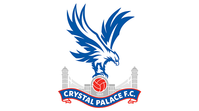
The Crystal Palace logo is a combination mark crest featuring a blue and white eagle perched on a red football, positioned above a silver depiction of the Crystal Palace exhibition building. It was officially unveiled in May 2013, refined by the agency CHI and designer Dan Mallahi from a concept proposed by a fan on an internet forum. The badge was updated in June 2022 to display 1861 instead of 1905.
Here is a breakdown of its key attributes:
- Design Type: Combination mark (emblem with mascot, architectural imagery, and wordmark)
- Primary Elements: Eagle mascot, football, Crystal Palace building silhouette, “CRYSTAL PALACE F.C.” wordmark on a ribbon, founding year
- Official Introduction Date: May 7, 2013 (updated June 18, 2022)
- Designer/Agency: CHI agency, designer Dan Mallahi, based on a fan-submitted concept
- Trademark Status: Registered trademark of Crystal Palace Football Club, owned and managed by CPFC LLC
- Color Palette: Blue (#1B458F), Red (#C4122E), White (#FFFFFF), Silver/Gray (#A7A5A6)
- Usage Context: Matchday kits, club merchandise, digital platforms, official communications, Selhurst Park stadium branding, broadcast media
How Has the Crystal Palace Logo Evolved Over Time?

The Crystal Palace badge has been redesigned roughly ten times since the mid-1930s. Early versions focused on the club’s initials and the Crystal Palace building.
The eagle first appeared in 1973, introduced by manager Malcolm Allison, who also changed the club’s nickname from “The Glaziers” to “The Eagles.”
Since then, every version of the badge has kept that bird in some form. The 2013 redesign brought cleaner lines and a more refined look, while the 2022 update only changed the date from 1905 to 1861.
The Initials Badge (1935-1955)
- Years Active: 1935-1955
- Design Description: A simple square badge in dark burgundy with “CP” on the upper line and “FC” on the lower line, rendered in orange-blue lettering
- Color Scheme: Burgundy background, orange-blue lettering
- Designer: Unknown (club-produced)
- Context: Crystal Palace had no formal crest before this. The initials were embroidered onto shirts starting in the 1935-36 season. Crests were not commonly used on kits until the 1940s, so the club was relatively late to adopt one.
- Cultural Significance: It was the club’s first move toward a distinct visual identity. Nothing fancy, just functional. Took me a while to even find good images of this one, honestly.
The Crystal Palace Building Badge (1955-1964)
- Years Active: 1955-1964
- Design Description: A black and white drawing of the Crystal Palace exhibition building with a claret and blue heraldic shield at the center. A white ribbon underneath carried the “Crystal Palace F.C.” wordmark in black sans-serif lettering.
- Color Scheme: Black, white, claret, blue
- Designer: Unknown
- Context: This was the first time the actual Crystal Palace building appeared on the badge, directly connecting the club to its historic birthplace.
- Key Changes from Previous: Went from a text-only badge to a fully illustrated crest with architectural imagery
- Cultural Significance: Set the foundation for every future badge by establishing the building as a core design element. The two towers of the palace became a recurring visual.
The Refined Palace Badge (1960-1964)
- Years Active: 1960-1964
- Design Description: A more detailed rendition of the palace drawn with many thin gray lines. The crest featured a gray and white palette with a thick gold frame. A wide wavy ribbon held the wordmark.
- Color Scheme: Gray, white, gold
- Key Changes from Previous: More intricate architectural detail, addition of gold framing
- Context: This was used alongside the earlier version for a brief period. The club was experimenting with different looks during this era.
The Minimalist Crest (1964-1967)
- Years Active: 1964-1967
- Design Description: A smooth, unframed crest split vertically. The left half was bright blue, the right half scarlet red, separated by a thick white vertical line.
- Color Scheme: Bright blue, scarlet red, white
- Key Changes from Previous: Completely removed the Crystal Palace building imagery. Went abstract.
- Context: Around this time, the club adopted an all-white strip inspired by Real Madrid, whom Palace had played in a friendly in 1962. The badge reflected that cleaner, more modern approach.
The Cursive Banner Badge (1967-1972)
- Years Active: 1967-1972
- Design Description: A solid burgundy square banner with “Crystal Palace” written in yellow diagonal handwritten cursive across two levels
- Color Scheme: Burgundy, yellow
- Key Changes from Previous: Returned to a text-based design but with a more expressive, handwritten style
- Cultural Significance: This badge had an interesting personality to it. The cursive felt lighter and more artistic compared to the stiff lettering of earlier versions.
The Glaziers Roundel (1972-1973)
- Years Active: 1972-1973
- Design Description: A circular emblem with a white center containing a light blue stylized “CP” monogram, surrounded by a wide burgundy frame. “Crystal Palace F.C.” and “The Glaziers” were written around the perimeter in a lightweight sans-serif typeface.
- Color Scheme: Burgundy, light blue, white
- Designer: Fan-designed (selected through a supporter competition)
- Context: The club let supporters choose this badge through a competition. It looked almost like an Art Deco piece, which was pretty unusual for a football crest at the time.
- Key Changes from Previous: First circular badge. First fan-selected design. Last badge to carry “The Glaziers” nickname.
The First Eagle Badge (1973-1987)
- Years Active: 1973-1987
- Design Description: A circular badge in red, white, and blue. A white eagle outlined in black holds a football at the center, set against a red background. Bold blue sans-serif lettering wraps around the white frame.
- Color Scheme: Red, white, blue, black
- Designer: Commissioned under manager Malcolm Allison
- Context: Allison overhauled the club’s identity. He changed the nickname from “The Glaziers” to “The Eagles,” inspired by Portuguese club Benfica. He also changed the kit colors from claret and blue to red and blue stripes, inspired by Barcelona. This was a total rebrand.
- Cultural Significance: This badge is where Palace’s identity as we know it really started. The eagle became the club’s defining symbol and has stayed ever since.
The Eagle and Palace Combined Badge (1987-1994)
- Years Active: 1987-1994
- Design Description: The eagle was placed above a depiction of the Crystal Palace building for the first time. The bird sat on a football atop the palace silhouette. The club name appeared on two solid red ribbons in white arched lettering. Blue dominated in three shades.
- Color Scheme: Multiple shades of blue, red, white
- Key Changes from Previous: Merged the eagle (from 1973) with the Crystal Palace building (from 1955) into one crest for the first time
- Cultural Significance: This was the badge Palace wore during the 1990 FA Cup final against Manchester United. It became one of the most emotionally charged versions for fans of that era.
The Aggressive Eagle Badge (1994-2013)
- Years Active: 1994-2013
- Design Description: A refined version of the 1987 badge with a more aggressive-looking eagle. Chairman Ron Noades felt the previous bird looked too much like a phoenix, so the eagle was redrawn with sharper features. Darker shades were used throughout.
- Color Scheme: Dark blue, red, white, silver
- Key Changes from Previous: Eagle redesigned to appear more fierce and distinct from a phoenix
- Context: This badge was in use during some turbulent years for the club, including multiple financial crises in the 2000s that nearly saw Palace go out of existence.
The Current Badge (2013-Present)
- Years Active: 2013-present (updated 2022)
- Design Description: A cleaner, more refined version. The eagle in blue and white sits above a red football, positioned over a more detailed silver rendering of the Crystal Palace building. A blue ribbon with red trim at the bottom carries “CRYSTAL PALACE F.C.” in white capital letters. The year “1861” sits at the base.
- Color Scheme: Blue (#1B458F), Red (#C4122E), White (#FFFFFF), Silver (#A7A5A6)
- Designer: CHI agency and Dan Mallahi, based on a fan concept from an internet forum
- Context: Unveiled on May 7, 2013, timed with the club’s promotion back to the Premier League. In June 2022, the date was changed from 1905 to 1861 after historian Peter Manning traced the club’s lineage back to the original amateur football team.
- Key Changes from Previous: Returned to a style closer to the 1973 badge than the 1994 version. More detailed Crystal Palace building. Cleaner linework overall. The 2022 update only changed the year.
What Do the Design Elements of the Crystal Palace Logo Mean?
Every part of the Crystal Palace badge carries specific meaning tied to the club’s history and location. The eagle represents ambition and power. It was borrowed from Benfica’s identity in 1973.
The Crystal Palace building anchors everything to the club’s origin story, the actual glass structure that gave the team its name. Together, these two elements have defined the club’s look for over fifty years.
Why Did Crystal Palace Choose These Specific Colors?
The current badge uses three main colors plus an accent. The red and blue combination dates back to 1973 when Malcolm Allison changed the club’s kit colors.
Before that, Palace wore claret and blue (similar to Aston Villa, which makes sense because Edmund Goodman, an Aston Villa employee, played a key role in founding the professional club in 1905).
Here are the official color palette details:
- Blue – Hex: #1B458F | RGB: (27, 69, 143) | CMYK: (100, 84, 12, 2) | Pantone: PMS 7686 C. Blue signals loyalty and stability. It has been part of the club’s identity since the very beginning, carried over from the original claret and blue.
- Red – Hex: #C4122E | RGB: (196, 18, 46) | CMYK: (16, 100, 90, 6) | Pantone: PMS 186 C. Red represents passion and energy. It was introduced as a primary color in 1973 during the Allison-era rebrand. According to color psychology, red grabs attention and stirs emotions, which fits a football club’s matchday atmosphere.
- White – Hex: #FFFFFF | RGB: (255, 255, 255). White is used for the text, eagle details, and outline accents. It provides the contrast needed to make the blue and red pop.
- Silver/Gray – Hex: #A7A5A6 | RGB: (167, 165, 166) | CMYK: (37, 31, 30, 0) | Pantone: PMS 422 C. Silver is used specifically for the Crystal Palace building illustration. It gives the structure a metallic, glass-like quality that references the original iron and glass construction.
What Typography Style Is Used in the Crystal Palace Logo?

The wordmark “CRYSTAL PALACE F.C.” uses a custom sans-serif font designed for the 2013 badge. The letters are all uppercase, set in white against the blue ribbon.
It is clean and legible at small sizes, which matters when you are printing it on everything from stadium signage down to the chest of a jersey. The letter spacing is tight but readable.
Earlier versions of the badge used different type styles. The 1967 version had a handwritten cursive. The 1972 badge used a lightweight sans-serif around a circular perimeter. The current typography is the most functional version the club has used.
What Are the Hidden Meanings in the Crystal Palace Logo?
There is not a lot of hidden meaning here, and that is actually a strength. The badge is direct. The eagle is the mascot. The building is the namesake. The ball is football.
But if you look closely, the two towers of the Crystal Palace building are always included. The club’s historian has noted that finding a photograph showing both towers was difficult because of the building’s enormous size and the limitations of early cameras. Yet the badge always includes them.
The 1861 date at the base is probably the most significant “hidden” detail for casual observers. Most people assume Crystal Palace was founded in 1905. That date actually refers to when the professional club was formed. The amateur team goes back to 1861, making Palace one of the oldest football clubs in the world.
How Does the Crystal Palace Logo Compare to Competitor Logos?
Crystal Palace’s badge sits in an interesting spot among Premier League crests. It is one of the few that features both a mascot and an architectural element, which gives it more visual complexity than most.
Compared to the Liverpool logo, which centers on the Liver bird and the Hillsborough memorial, Crystal Palace’s crest has more structural layers. The Arsenal logo is cleaner and more geometric with its cannon, while Palace goes for a more illustrative approach.
Among their closer rivals, the Fulham logo is much simpler with its text-based shield. The West Ham United logo uses crossed hammers in a shield, which is more compact. And the Tottenham Hotspur logo leans heavily on a single cockerel image without background architecture.
What makes Palace’s badge stand out is the eagle. Among English football clubs, bird-based logos are common (think Norwich City‘s canary or Sheffield Wednesday’s owl). But the combination of eagle plus building plus ball gives Crystal Palace a badge that is busy in a good way. At least in my experience, the badges with more story behind them tend to age better.
What Are the Technical Specifications of the Crystal Palace Logo?
Official Color Codes
- Primary Color: Blue – Hex: #1B458F | RGB: (27, 69, 143) | CMYK: (100, 84, 12, 2) | Pantone: PMS 7686 C
- Secondary Color: Red – Hex: #C4122E | RGB: (196, 18, 46) | CMYK: (16, 100, 90, 6) | Pantone: PMS 186 C
- Tertiary Color: White – Hex: #FFFFFF | RGB: (255, 255, 255) | CMYK: (0, 0, 0, 0)
- Accent Color: Silver/Gray – Hex: #A7A5A6 | RGB: (167, 165, 166) | CMYK: (37, 31, 30, 0) | Pantone: PMS 422 C
Dimensions and Proportions
The badge uses a roughly shield-like vertical orientation. The aspect ratio is taller than it is wide. The eagle and ball sit in the upper two-thirds, while the Crystal Palace building and the name ribbon occupy the lower third.
The club provides vector versions of the logo for official use. These scale without losing quality, which is critical for everything from tiny jersey prints to massive stadium banners.
Minimum clear space around the logo should maintain the badge’s legibility. On kits, the badge typically appears at about 7-8 cm in height on the chest. For digital use, the logo works well at pixel sizes down to about 32×32 for favicons, though the simplified eagle-and-ball version is used for smaller applications and casual merchandise.
What Cultural Impact Has the Crystal Palace Logo Had?
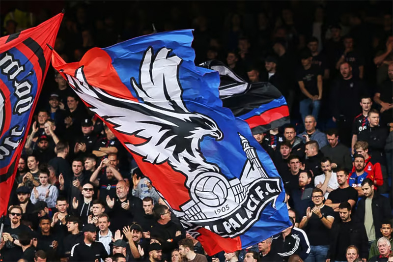
The Crystal Palace badge is deeply tied to the identity of South London. It represents not just a football club but a specific community centered around Selhurst, Croydon, and the surrounding boroughs.
The eagle has become a symbol fans rally around. Pete and Kayla, the live eagles that fly around Selhurst Park before matches, bring the badge to life in a way that is pretty unique in English football. Crystal Palace is also the only Premier League club with NFL-style cheerleaders, called the Crystals, adding another layer to how the brand presents itself on matchdays.
The 2022 date change to 1861 had real cultural weight too. It gave the club a claim to being one of the oldest football clubs still playing professional football. That is a big deal for a fanbase that sometimes feels overshadowed by bigger London clubs like Chelsea and Manchester United.
How Does the Crystal Palace Logo Fit Into the Overall Brand Identity?
The badge sits at the center of everything Crystal Palace does as a brand. The club’s red and blue color scheme runs through kits, stadium signage, the official website, social media accounts, and the Palace for Life Foundation’s community programs.
The current kit manufacturer is Puma, and the badge adapts well to different shirt designs, whether home red and blue stripes or alternate colorways. The simplified eagle-and-ball mark (without the building and ribbon) gets used on casual clothing and merchandise where the full crest would be too detailed.
Under chairman Steve Parish, the club has worked to strengthen its brand through community ties with the London Boroughs of Croydon, Bromley, and Sutton. The badge acts as a connecting thread across all of those efforts. Well-defined brand guidelines keep things consistent across every touchpoint, from the matchday program to the training ground.
How Should the Crystal Palace Logo Be Used?

The Crystal Palace badge is a registered trademark. You cannot slap it on merchandise or use it in commercial contexts without permission from the club.
Here are some general guidelines:
- Do: Use the official badge artwork provided by the club for any licensed products. Maintain the correct color values. Keep clear space around the logo. Use the simplified eagle mark for small-scale applications.
- Don’t: Alter the badge colors. Stretch or distort the proportions. Place it on busy backgrounds that reduce readability. Separate individual elements (eagle, building, ribbon) from the badge without authorization.
- Official Logos: Available through Crystal Palace’s official website (cpfc.co.uk) and approved licensing partners. Vector files in SVG and PDF formats are typically provided for official use.
- Licensing: Commercial use requires a formal licensing agreement with the club. Fan art and editorial use have more flexibility, but commercial products (shirts, mugs, prints) need approval.
- Trademark Protection: The badge, the eagle symbol, and the “Crystal Palace F.C.” wordmark are all protected. The club actively monitors and enforces its intellectual property rights, especially around matchday merchandise and online retail.
FAQ on The Crystal Palace Logo
What does the Crystal Palace FC badge represent?
The Crystal Palace crest represents the club’s history and South London roots. The eagle stands for ambition. The glass building references the original Crystal Palace exhibition structure built by Joseph Paxton. The football ties it to the sport.
When was the current Crystal Palace logo introduced?
The current badge was unveiled on May 7, 2013, ahead of the club’s Premier League promotion. It was updated in June 2022.
That update changed the founding year from 1905 to 1861. Everything else stayed the same.
Who designed the Crystal Palace emblem?
The 2013 redesign came from the agency CHI and designer Dan Mallahi. But here is the thing. The concept actually started as a fan submission on an internet forum after the club’s own proposals got rejected by supporters.
Why is there an eagle on the Crystal Palace badge?
Manager Malcolm Allison added the eagle symbol in 1973. He was inspired by Portuguese club Benfica.
He also changed the club nickname from “The Glaziers” to “The Eagles” and switched the kit colors to red and blue stripes.
What are the official Crystal Palace logo colors?
Blue (#1B458F), red (#C4122E), white (#FFFFFF), and silver gray (#A7A5A6). The red and blue date back to 1973. Silver is used for the palace building illustration on the badge.
Why did Crystal Palace change the date on their crest to 1861?
Historian Peter Manning traced an unbroken link between the professional club and the amateur football team formed in 1861. That research proved Crystal Palace is one of the oldest English football clubs still playing professionally.
How many times has the Crystal Palace logo been redesigned?
Roughly ten times. The club used simple initials from 1935 to 1955. Then came the palace building imagery. The eagle arrived in 1973.
Each version after that kept the eagle in some form. The current version refines the 1987 design.
What is the Crystal Palace building shown on the badge?
It is the famous iron and glass structure originally built for the 1851 Great Exhibition in Hyde Park. It was relocated to Sydenham Hill in South London in 1854. The building burned down in 1936, but the football club kept its image alive on the crest.
Does Crystal Palace have a simplified version of their logo?
Yes. A simplified mark featuring just the eagle and ball (without the palace building and ribbon) is used on casual clothing, club merchandise, and small-scale digital applications where the full crest would lose detail.
How does the Crystal Palace badge compare to other Premier League logos?
It is one of the more complex crests in the league. Most clubs use either a mascot or a symbol. Palace combines both an eagle and an architectural element, which gives its badge more visual depth than most competitors.
Conclusion
The Crystal Palace logo has gone through a lot since those first embroidered initials in the 1930s. Ten redesigns. Multiple color shifts. A complete identity overhaul under Malcolm Allison in 1973 that gave the club its eagle, its red and blue stripes, and its nickname.
What sticks with me is how the 2022 date change to 1861 quietly rewrote the club’s place in football history.
The badge now connects a Premier League side in Selhurst Park to Victorian cricketers and the founding of the Football Association. That is a lot of weight for one crest to carry.
And it carries it well. The combination of the eagle, the glass palace, and those bold club colors still works across kits, merchandise, and digital platforms without losing its identity at any size.

Renowned for his expertise in logo design and visual branding, Bogdan has developed a multitude of logos for various clients.
His skills extend to creating posters, vector illustrations, business cards, and brochures. Additionally, Bogdan's UI kits were featured on marketplaces like Visual Hierarchy and UI8.
He also wrote in the past years on sites like Design Your Way, WebDesignerDepot, WPDean, Designmodo, Speckyboy, Slider Revolution, and more.
- Jujutsu Kaisen Font Generator - 12 October 2026
- The Windsurf Logo History, Colors, Font, And Meaning - 10 October 2026
- How to Remove Background From Product Photos (No Photoshop) - 10 October 2026

Bogdan Sandu is a seasoned designer who has been designing websites since 2008. Renowned for his expertise in logo design and visual branding, Bogdan has developed a multitude of logos for various clients. His skills extend to creating posters, vector illustrations, business cards, and brochures. Additionally, Bogdan's UI kits were featured on marketplaces like Visual Hierarchy and UI8. He also wrote in the past years on sites like Design Your Way, WebDesignerDepot, WPDean, Designmodo, Speckyboy, Slider Revolution, and more.
You Might Also Like


