


The West Ham United logo is one of the most recognized crests in English football. Built around two crossed riveting hammers on a maroon shield, the badge traces directly back to the club’s founding as Thames Ironworks FC in 1895. It has gone through more than a dozen changes since then, but the hammers have stayed. Always.
The current version was introduced in 2016, timed with the club’s move from the Boleyn Ground to London Stadium. The castle that had appeared on previous badges was dropped. What remained was a stripped-back crest with gold hammers, the club name, and the word “London” at the bottom of the shield. It’s a logo that splits opinion among fans to this day, but there’s no questioning its roots in over 130 years of East London football history.
The Hammers sit within the Premier League, and their badge holds its own next to other English club crests that carry similar weight and heritage. West Ham has been through roughly 15 distinct logo variations since the 1890s, making it one of the more frequently redesigned identities in English professional football.
What Is the West Ham United Logo?
The West Ham United logo is a maroon shield-shaped emblem with a light blue outline, two crossed gold riveting hammers at its center, and the text “West Ham United” above with “London” below. It was officially introduced in 2016 and uses a custom sans-serif typeface throughout.
Here’s a breakdown of the main attributes:
- Design Type: Combination mark (emblem with integrated wordmark)
- Primary Elements: Two crossed riveting hammers, shield shape inspired by the bow of HMS Warrior, club name lettering
- Official Introduction Date: Summer 2016
- Previous Redesign Agency: Springett Associates handled the 1999 version. The 2016 redesign was managed internally by the club
- Trademark Status: Registered trademark of West Ham United plc
- Color Palette: Maroon (#7A263A), Blue (#1BB1E7), Yellow/Gold (#F3D459), White (#FFFFFF)
- Usage Context: Match kits, official merchandise, London Stadium branding, digital platforms, marketing materials, broadcast graphics
—
How Has the West Ham United Logo Evolved Over Time?

The West Ham badge has been through at least 15 major iterations since 1895. It started with a Union Jack flag representing Thames Ironworks FC, moved to crossed hammers in 1923, added a castle in the 1960s, and eventually dropped the castle again in 2016 for a cleaner, more modern look.
Thames Ironworks FC Crest (1895-1900)
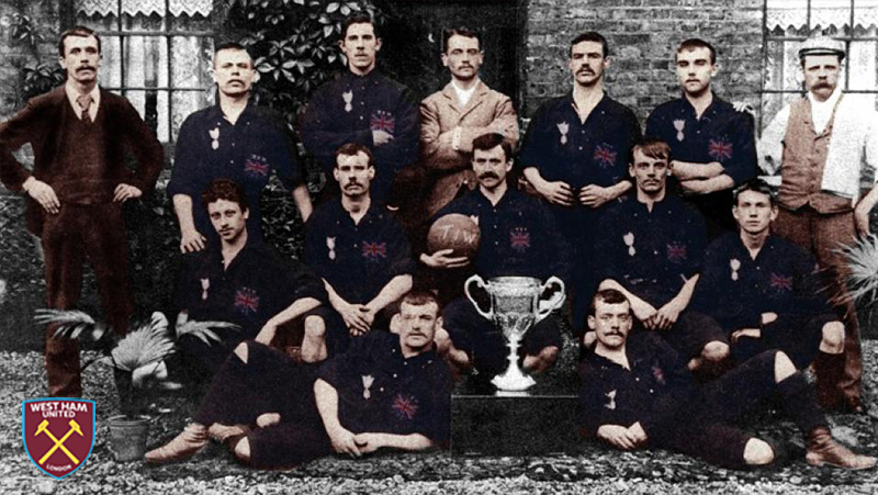
The original crest wasn’t really a crest at all. It was the Union Jack flag with “T.I.W.” written on a banner above and “F.C.” below.
The club was formed by Dave Taylor and Arnold Hills as a works team for the Thames Iron Works and Shipbuilding Company. Players wore dark Harrovian blue kits, a color choice pulled from Hills’ boarding school background at Harrow.
No hammers yet. No shield. Just a flag representing a shipyard football team from East London. The crest was used for only one season before being removed entirely.
For the next 27 years, West Ham played without any crest on their shirts at all.
The First Crossed Hammers Badge (1923-1950)
This is where it all started to click. The first proper West Ham United logo appeared in 1923, designed for the FA Cup Final against Bolton Wanderers at Wembley.
Two crossed burgundy hammers sat inside a circular frame, placed on a smooth sky-blue crest. The hammers referenced the riveting tools used in shipbuilding, and the circle around them was meant to represent unity and teamwork.
The color combination of burgundy and light blue became the club’s signature. This badge stayed mostly unchanged for nearly three decades.
By the way, those hammers eventually gave the club its two most famous nicknames: “The Hammers” and “The Irons.” Both stuck for good.
Refined Shield Badges (1950-1963)
In 1950, the club redesigned the logo with cleaner lines and a more defined shield shape. The hammers became smoother and more detailed, losing some of the roughness from the 1923 version.
This period saw a few quick changes. A 1952 redesign shifted to a badge-shaped shield, and by 1958, the maroon trim was shortened.
These weren’t dramatic overhauls. Think of them more as refinements. The core identity stayed the same, but the execution kept getting tighter.
Introduction of the Castle (1960s-1987)
The Boleyn Castle first appeared on official club materials in the early 1960s. The castle was a nod to Green Street House, a building that sat adjacent to the Boleyn Ground, the club’s home since 1904.
A shield with the castle perched above the crossed hammers became the standard layout. The 1964 FA Cup victory and the 1965 European Cup Winners’ Cup triumph made this version of the badge deeply memorable for fans.
Bobby Moore, Geoff Hurst, and Martin Peters all wore this crest. That matters.
Color Experiments (1980-1987)
The 1980s were wild for the badge. Seriously.
In 1980, the logo went yellow and blue. Bright, loud, and a big departure from tradition. A ribbon underneath carried the words “West Ham United” for the first time.
Then in 1983, everything was stripped back to just white hammers and “W.H.U.F.C.” on a solid burgundy square. Minimal. Almost too minimal.
By 1985, the yellow and blue shield returned. And in 1987, red replaced the yellow background, while the castle stayed yellow with white crosses. The banner below kept the blue and yellow trim.
It was a lot of back and forth. The club was clearly searching for something.
The Classic Modern Crest (1987-1999)
This version settled things down. The castle and crossed hammers sat on a defined shield with a ribbon below reading “West Ham United F.C.” in yellow.
The color palette landed on a combination of maroon, blue, and yellow that felt right. It lasted over a decade, which was a long time by West Ham standards at that point.
This is the badge most fans from the 1990s grew up with.
Springett Associates Redesign (1999-2016)
London-based design agency Springett Associates took on the redesign in the late 1990s. The castle got wider and lost its peaked tower tops. The cruciform windows were simplified. The hammers were redrawn with more defined edges.
A white “West Ham United” wordmark appeared on a maroon and blue ribbon beneath the shield. The overall effect was more solid, more structured.
This badge lasted 17 years. It covered the club’s time at the Boleyn Ground, multiple Premier League campaigns, and the 2006 FA Cup Final run.
Current West Ham United Logo (2016-Present)
The current crest was unveiled in 2014 but put into official use in 2016, matching the move to the London Stadium.
Gone was the Boleyn Castle. The shield shape was said to reference the bow of HMS Warrior, the first armour-plated, iron-hulled warship built at Thames Ironworks in 1860. Gold hammers sit in the center, flanked by small “T.I.W.” engravings on either side.
“West Ham United” runs across the top in white capitals, with “London” at the bottom. The entire badge sits on a maroon field with a thin blue outline.
Fan reaction was mixed. Some loved the clean, modern approach. Others felt the removal of the castle stripped away too much history. That debate hasn’t really gone away.
—
What Do the Design Elements of the West Ham United Logo Mean?
Every piece of the badge connects to the club’s origins as a shipyard workers’ team. The two crossed hammers are riveting tools from the shipbuilding trade. The shield shape references a warship. And the text anchors the whole thing to both the club name and its London home.
What Do the Crossed Hammers Represent?
The crossed hammers are riveting hammers, the kind used by shipbuilders at the Thames Iron Works to fasten parts of vessels together.
They’ve been on the badge since 1923 and are the single most consistent element across every version of the logo. The psychology behind these shapes says a lot. Crossed tools suggest craftsmanship, labor, and solidarity.
The hammers also appear on the coat of arms for the local area, making them both a club and community symbol.
What Does the Shield Shape Mean?
The current shield shape is said to be based on the cross-section of HMS Warrior’s bow. That warship was built at Thames Ironworks in 1860, so the connection runs deep.
Shields in football crests generally carry ideas of protection and strength. For West Ham, the specific shape ties back to shipbuilding heritage rather than generic heraldry. At least, that’s the official story. Some fans have pointed out the actual ship diagrams don’t perfectly match, but the intent is clear.
Why Did West Ham Choose These Specific Colors?
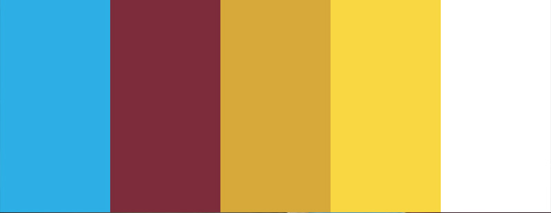
The club’s colors carry real meaning, and the way color choices affect perception plays a big role in how the badge lands with fans and rivals.
- Maroon (#7A263A) – Pantone PMS 7638 C. The dominant color on the badge. It communicates authority, tradition, and intensity. Maroon has been linked to West Ham since the early 1900s and is part of the “claret and blue” identity the club shares with a handful of other English clubs.
- Blue (#1BB1E7) – Pantone PMS 306 C. Used as the shield outline and accent color. The blue traces all the way back to the Harrovian blue worn by Thames Ironworks players. It represents loyalty and has stayed consistent across most badge versions.
- Yellow/Gold (#F3D459) – Pantone PMS 121 C. Applied to the hammers and lettering. Gold adds a sense of prestige and achievement. Took me a while to appreciate how well the gold works against maroon, but it really does carry the crest.
- White (#FFFFFF) – Used for the “West Ham United” and “London” text. Clean, readable, and provides strong contrast against the maroon background.
What Typography Style Is Used in the West Ham United Logo?
The current badge uses a custom sans-serif typeface for all text elements. The letters are bold, slightly condensed, and set in all capitals.
There’s no standard commercial font that matches it exactly. The club designed a bespoke face for the 2016 rebrand that gets used across kits, merchandise, and official communications.
The lettering is curved along the inside of the shield at the top, with “London” running along the bottom point. It reads well at small sizes, which matters for digital applications and broadcast.
What Are the Hidden Meanings in the West Ham United Logo?
Look closely at the hammers and you’ll spot the letters “T.I.W.” engraved on each side. That stands for Thames Iron Works, keeping the club’s original identity alive in a subtle way.
The shield shape’s connection to HMS Warrior is another layer most people miss. It’s not just a generic crest shape. It was specifically chosen to reference a warship built at the founding shipyard.
The removal of the castle in 2016 was itself a statement, a deliberate break from the Boleyn Ground era as the club entered a new chapter at London Stadium.
—
How Does the West Ham United Logo Compare to Competitor Logos?

Within the Premier League, West Ham’s crest sits in the traditional camp. It uses a shield shape, historic symbolism, and a limited selection of colors. That puts it in company with clubs like Arsenal and Tottenham Hotspur, both of which lean on established imagery inside shield or circular frames.
Compared to London rivals like Chelsea and Crystal Palace, West Ham’s badge is more restrained. Chelsea uses a full circular crest with a lion. Crystal Palace features an eagle. West Ham keeps it to hammers and text. That’s it.
Among clubs with industrial heritage like Sheffield United and Nottingham Forest, there’s a shared visual language around shields and working-class symbolism. But West Ham’s specific connection to shipbuilding gives it a unique angle. No other Premier League club has a badge that references a specific warship.
Manchester United and Liverpool have crests that are arguably more globally recognizable, but West Ham’s badge holds its own for distinctiveness. The crossed hammers are unmistakable. You don’t confuse them with anyone else.
—
What Are the Technical Specifications of the West Ham United Logo?
Official Color Codes
- Maroon (Primary)
- Hex: #7A263A
- RGB: (122, 38, 58)
- CMYK: (36, 92, 63, 35)
- Pantone: PMS 7638 C
- Blue (Secondary)
- Hex: #1BB1E7
- RGB: (27, 177, 231)
- CMYK: (69, 11, 0, 0)
- Pantone: PMS 306 C
- Yellow/Gold (Accent)
- Hex: #F3D459
- RGB: (243, 212, 89)
- CMYK: (5, 13, 78, 0)
- Pantone: PMS 121 C
- White (Text)
- Hex: #FFFFFF
- RGB: (255, 255, 255)
- CMYK: (0, 0, 0, 0)
Dimensions and Proportions
The crest uses a pointed shield shape with curved upper edges. The aspect ratio is roughly 5:6 (width to height), giving it a taller-than-wide profile that works well on kit fronts and vertical applications.
For printed materials, the club specifies minimum reproduction sizes and clear space requirements to keep the badge legible. The resolution standards vary depending on the output medium.
The logo is available as vector artwork for scalability, which means it holds up whether you’re printing it on a stadium billboard or shrinking it down for a social media avatar.
—
What Cultural Impact Has the West Ham United Logo Had?
The crossed hammers have become a symbol of East London identity that goes beyond football. You see the badge on pub walls, tattooed on arms, and displayed in homes across Newham and Stratford. It represents a community built around shipbuilding and working-class pride.
The 1966 World Cup connection amplified everything. Bobby Moore, Geoff Hurst, and Martin Peters all played for West Ham when England won the tournament. That tied the club’s identity, and its badge, to one of English football’s biggest moments.
The 2016 badge change sparked real cultural debate. Removing the castle felt like erasing a piece of local history for some supporters. The word “London” being added was seen by others as a corporate move aimed at global branding rather than community roots. Fan groups still campaign for a return to the castle design.
The logo also shows up in film and television. West Ham’s badge has appeared in movies like “Green Street” and across British pop culture, reinforcing its place as one of football’s most culturally loaded symbols.
—
How Does the West Ham United Logo Fit Into the Overall Brand Identity?
The badge sits at the center of everything the club puts out. Kits, stadium signage, digital platforms, social media, merchandise, matchday programs. Every touchpoint runs through the crest.
West Ham’s official brand rules define exactly how the logo should appear alongside sponsor logos, on retail products, and in broadcast settings. The maroon, blue, and gold palette extends to the club’s website, app, and print collateral.
The London Stadium itself carries the crest prominently, with large-scale versions appearing throughout the venue. The badge creates visual order across all these applications, tying together physical and digital spaces under one identity.
Kit manufacturers like Umbro and Adidas have worked with the crest across different eras, adapting its placement and size while keeping the core design intact. The badge also connects to the West Ham United Foundation and West Ham Women FC, creating a family of sub-brands under one visual mark.
—
How Should the West Ham United Logo Be Used?
The West Ham United name and logo are registered trademarks of West Ham United plc. That means any commercial use requires explicit permission from the club.
Do’s:
- Use official logo files provided by the club or licensed partners
- Maintain the specified clear space around the badge
- Reproduce the logo in approved color variations (full color, single color white, single color maroon)
- Follow minimum size guidelines to keep the crest legible
Don’ts:
- Alter the colors, proportions, or arrangement of elements
- Place the logo on busy or clashing backgrounds
- Use the logo for commercial purposes without a licensing agreement
- Recreate or redraw the badge from scratch
Official logo files can typically be sourced through the club’s media department or licensing partners. For editorial and informational use, PNG and SVG versions are sometimes available through the club’s press resources.
Fan-created designs and badge redesigns regularly surface online, and some of them are genuinely impressive. But they can’t be used commercially. The club protects its trademarks actively, so if you’re using the badge for anything beyond personal fan content, check the licensing terms first.
FAQ on The West Ham United Logo
What do the crossed hammers on the West Ham United logo represent?
The crossed hammers are riveting tools from the shipbuilding trade. They reference the club’s founding as Thames Ironworks FC in 1895.
The shipyard workers used these hammers to fasten iron plates on vessels. The symbol stuck and became the club’s permanent identity marker across every badge version since 1923.
When was the current West Ham United crest introduced?
The current crest was unveiled in 2014 and officially adopted in summer 2016. It matched the club’s move from the Boleyn Ground to London Stadium.
The Boleyn Castle was removed. A cleaner shield with gold hammers and “London” at the bottom replaced the older, more detailed emblem.
What are the official colors of the West Ham badge?
The official claret and blue palette includes maroon (#7A263A), blue (#1BB1E7), yellow/gold (#F3D459), and white (#FFFFFF).
These colors trace back to the early 1900s. The maroon and blue pairing is shared with a few other English clubs but remains most closely tied to West Ham’s identity in East London.
Why was the castle removed from the West Ham emblem?
The castle represented Green Street House, which sat next to the Boleyn Ground. When the club relocated to London Stadium, the castle lost its direct connection.
Vice-chair Karren Brady said the change was partly about branding for a wider audience. Many supporters still want it back.
Who designed the West Ham United football club badge?
The 1999 version was redesigned by London agency Springett Associates. The 2016 crest was handled internally by the club.
Earlier badge designs don’t have confirmed designers. The first crossed hammers crest appeared in 1923 for the FA Cup Final against Bolton Wanderers at Wembley.
What font is used in the West Ham logo?
The club uses a custom sans-serif typeface designed specifically for the 2016 rebrand. It’s bold, slightly condensed, and set in all capitals.
No commercially available font matches it exactly. The bespoke lettering appears on kits, merchandise, and all official club branding materials.
What does the shield shape in the West Ham crest mean?
The shield shape is said to reference the bow of HMS Warrior, an iron-hulled warship built at Thames Ironworks in 1860.
It ties the badge directly to the club’s shipbuilding heritage. Whether the actual ship diagrams match perfectly is debatable, but the intent is clear.
How many times has the West Ham United logo changed?
The club has gone through roughly 15 distinct logo variations since 1895. That’s a lot of changes for one football club crest.
Some lasted decades. Others barely made it two years. The 1980s alone saw four or five different versions as the club experimented with color and layout.
What does T.I.W. on the West Ham badge stand for?
T.I.W. stands for Thames Iron Works. It’s engraved on the hammers in the current badge as a subtle nod to the club’s original name.
Most people miss it entirely. But it keeps the founding identity alive inside the modern Premier League crest.
Can I use the West Ham United logo for my own project?
Not commercially. The West Ham United name and logo are registered trademarks of West Ham United plc.
Any commercial use requires a licensing agreement. Fan content for personal, non-commercial purposes is generally tolerated, but the club actively protects its trademark and brand identity.
Conclusion
The West Ham United logo carries over 130 years of East London football history inside a single crest. From Thames Ironworks shipyard workers to the Premier League, the crossed hammers have survived every rebrand, every stadium move, and every generation of supporters.
Few football club emblems connect so directly to their founding story. The riveting hammers, the claret and blue palette, the shield referencing HMS Warrior. All of it points back to 1895.
Whether you prefer the classic Boleyn Castle version or the modern 2016 design, the Hammers badge remains one of English football’s most distinctive visual identities.
It’s not just a club crest. It’s a piece of East London heritage that happens to show up on a football kit every matchday.

Renowned for his expertise in logo design and visual branding, Bogdan has developed a multitude of logos for various clients.
His skills extend to creating posters, vector illustrations, business cards, and brochures. Additionally, Bogdan's UI kits were featured on marketplaces like Visual Hierarchy and UI8.
He also wrote in the past years on sites like Design Your Way, WebDesignerDepot, WPDean, Designmodo, Speckyboy, Slider Revolution, and more.
- Jujutsu Kaisen Font Generator - 12 October 2026
- The Windsurf Logo History, Colors, Font, And Meaning - 10 October 2026
- How to Remove Background From Product Photos (No Photoshop) - 10 October 2026

Bogdan Sandu is a seasoned designer who has been designing websites since 2008. Renowned for his expertise in logo design and visual branding, Bogdan has developed a multitude of logos for various clients. His skills extend to creating posters, vector illustrations, business cards, and brochures. Additionally, Bogdan's UI kits were featured on marketplaces like Visual Hierarchy and UI8. He also wrote in the past years on sites like Design Your Way, WebDesignerDepot, WPDean, Designmodo, Speckyboy, Slider Revolution, and more.
You Might Also Like


