


The Manchester City logo is one of the most recognized club badges in English football. It represents more than a hundred years of history, community identity, and the city of Manchester itself.
Founded in 1880 as St. Mark’s (West Gorton), the club has gone through six distinct badge designs before landing on its current circular crest. That current version was introduced at the end of 2015 and officially used from the 2016-17 season onward. It was designed by the agency Someone, following a large-scale fan consultation.
The badge sits in the tradition of English football club crests that borrow from civic heraldry. Manchester City’s version pulls directly from the city’s coat of arms, featuring a golden ship, three diagonal river stripes, and the red rose of Lancashire. It is a combination mark, blending typographic elements with symbolic imagery inside a circular frame.
Across all its iterations, the Manchester City badge has always tried to anchor itself to the place it comes from. That has not changed.
What Is the Manchester City Logo?
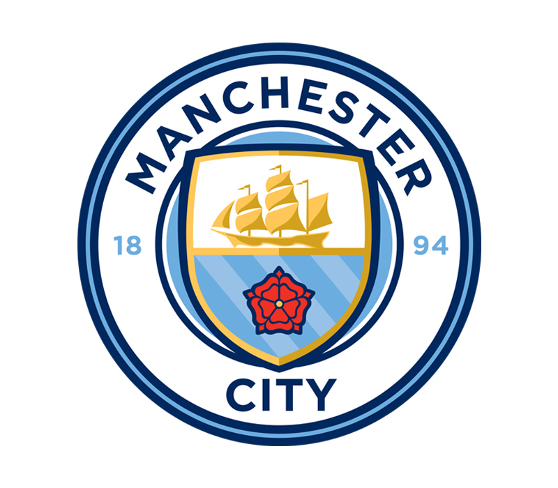
The Manchester City logo is a circular crest featuring a golden ship above three diagonal blue stripes and a red rose, enclosed in a round badge with “Manchester City” text and the founding year 1894. It was designed by the agency Someone and officially introduced on December 26, 2015.
- Design Type: Combination mark (emblem style). The badge pairs a shield-based graphic with a surrounding wordmark, all contained within a circular border.
- Primary Elements: A golden sailing ship (representing Manchester’s trading heritage via the Ship Canal), three diagonal blue stripes (symbolizing the rivers Irwell, Irk, and Medlock), a red rose of Lancashire, and the text “Manchester City” in bold sans-serif lettering.
- Official Introduction Date: Unveiled on December 26, 2015, before the match against Sunderland. Used on kits from the 2016-17 season.
- Designer/Agency: Someone, a London-based design agency, created the badge after consultation with over 20,000 fans and club stakeholders.
- Trademark Status: The badge was trademarked via the UK Intellectual Property Office (IPO). A design leak actually occurred two days before the official reveal when the IPO listing went public.
- Color Palette: Sky Blue (#6CABDD), Dark Navy Blue (#1C2C5B), Gold (#FFC659), Dark Gold (#D4A12A), Red (#EC3325), and White (#FFFFFF).
- Usage Context: Used across matchday kits, official merchandise, the Etihad Stadium, digital platforms, marketing materials, broadcast graphics, and all City Football Group communications related to the first team.
How Has the Manchester City Logo Evolved Over Time?

The Manchester City badge has been redesigned six times since the club’s founding in 1880. It started as a simple monochrome cross for St. Mark’s FC, transitioned through a heraldic coat of arms, shifted to circular crest formats in the 1960s, took a controversial turn with a golden eagle in 1997, and returned to a round, heritage-focused design in 2016.
Each version reflected something about where the club was at the time. Some changes were about modernization. Others were forced by copyright issues or fan backlash.
St. Mark’s FC Badge (1880-1887)
Years Active: 1880-1887
The original badge was a white cross Pattee on a black background. Nothing fancy. The club was still called St. Mark’s (West Gorton), and the design was pulled from decorative elements of the St. Mark’s church where the team was founded.
The cross Pattee itself had Greek origins and was popular during the Victorian era, often used to represent knightly virtues like bravery and loyalty.
There were no colors from the modern palette here. Just black and white. The badge served a very different purpose than what we think of today. It was more of a parish identifier than a sports brand.
Ardwick AFC Badge (1887-1894)
Years Active: 1887-1894
When the club renamed itself to Ardwick Association Football Club, the badge changed to a traditional crest shape. It used a blue and white color palette for the first time, with the letters “AAFC” placed in four segments of the shield.
This was the transitional period. The club was finding its feet. The badge reflected that, borrowing from basic heraldic conventions without yet establishing a unique identity.
Manchester City Coat of Arms (1894-1960s)
Years Active: 1894 to approximately 1960
Once the club officially became Manchester City in 1894, it adopted the full Manchester coat of arms as its badge. And it was not subtle.
The design featured an orange shield with three yellow diagonal lines and a clipper ship on a white and blue background. A white deer stood on the left, a golden lion on the right. Curvy orange and yellow vignettes sat on top, alongside a helmet and a globe with seven bees.
The Latin motto “Concilio et Labore” (meaning “Wisdom and Effort”) appeared at the base. This was the most complex badge the club ever used. It looked, honestly, quite similar to what Manchester United used in their early years, which makes sense since both pulled from the same civic source.
First Circular Crest (1960s-1972)
Years Active: Approximately 1960-1972
The 1960s brought a major simplification. Gone were the animals and the ornate vignettes. The orange and yellow shield was placed on a light blue background inside a thick white-and-black circular frame.
The clipper remained, rendered in yellow. A black sans-serif inscription reading “Manchester City FC” ran around the border. This was the first time the badge adopted the round shape that would become a recurring feature.
The minimalist approach made the badge far more practical for use on kits and printed materials. It also gave the club a more modern look during a period of on-field success under Joe Mercer and Malcolm Allison.
Red Rose Variations (1972-1997)
Years Active: 1972-1997 (with modifications in 1976, 1979, and 1981)
In 1972, the diagonal stripes on the shield were replaced by a red rose of Lancaster. The gold-outlined shield sat on a light blue background with bold sans-serif lettering around a white frame.
This version went through several color tweaks over the next two decades. In 1979, the frame turned light blue and the wordmark became gold with a black outline. In 1981, the shield picked up gradient blue and white shading that added some depth.
The core structure stayed the same, though. Ship on top, rose below, circular frame, club name around the edge. These were refinements, not redesigns.
Golden Eagle Badge (1997-2016)
Years Active: 1997-2016
This one was controversial. Due to copyright concerns over the previous badge’s use of civic symbols, Manchester City had to make a change. The result was a completely new concept.
A golden eagle with its head turned left carried a blue shield with three white diagonal stripes (representing the rivers Medlock, Irk, and Irwell). Three gold stars sat above the eagle, added for decoration rather than to mark specific trophies. A white ribbon below carried the Latin motto “Superbia In Proelio” (“Pride in Battle”) in black cursive.
The shield itself kept the stripes and the clipper, separated by a bold black line with “M.C.F.C.” in gold serif type. But fans never warmed to it. The eagle felt disconnected from Manchester’s identity. Criticism built steadily, and by 2015, the club launched a formal consultation to replace it.
Current Manchester City Badge (2016-Present)
Years Active: 2016-present
Officially unveiled on December 26, 2015, the current badge returned to the circular format. It was designed by the agency Someone after consulting with fans. The numbers tell the story of how much input supporters had: 94% preferred sky blue, 68% chose white, 85% wanted the ship, 67% picked the three rivers, and 60% selected the red rose.
The result is a clean, round crest. A gold ship sits atop a shield with three blue diagonal stripes and a red rose. The shield has a double outline in blue and gold. “Manchester City” is written in dark navy sans-serif capitals around the top arc. The year “1894” is split on either side of the shield’s base.
It is a better badge. It connects to the pre-1997 designs while feeling contemporary enough for the global brand Manchester City has become under City Football Group ownership.
What Do the Design Elements of the Manchester City Logo Mean?
Every element in the Manchester City badge ties back to the city’s history or the region’s identity. The golden ship references Manchester’s trading past and the Ship Canal. The three diagonal stripes represent the rivers Irwell, Irk, and Medlock. The red rose is the symbol of Lancashire.
None of these are random choices. They come directly from Manchester’s coat of arms and were selected through fan consultation.
What Does the Ship Symbolize?
The sailing ship is the most prominent element inside the shield. It represents the Manchester Ship Canal, which was a critical part of the city’s growth as a trading and industrial center.
Manchester was never a coastal city, but the canal (opened in 1894, the same year the club took its current name) connected it to the sea. The ship became a civic symbol of commerce and ambition. It has appeared on Manchester’s coat of arms for centuries.
In the current badge, the ship is rendered in gold tones, sitting above the blue stripes. As a focal point, it draws the eye to the center of the crest immediately.
What Do the Three Stripes Mean?
The three diagonal blue stripes below the ship represent the three rivers that run through Manchester: the Irwell, the Irk, and the Medlock.
These waterways shaped the city’s geography and its industrial development. In earlier badge versions, these stripes were rendered in yellow or white. The current version uses blue, which blends more naturally with the overall color scheme.
The stripes also add a sense of movement to the badge’s interior, pulling the eye diagonally across the shield.
Why Is There a Red Rose?
The red rose is the traditional emblem of Lancashire, the county in which Manchester sits. It dates back to the Wars of the Roses in the 15th century, when the House of Lancaster adopted the red rose as its symbol.
Manchester City first added the rose to its badge in 1972, replacing the earlier diagonal stripes. In the current design, the rose sits at the base of the shield, grounding the badge in regional identity.
Why Did Manchester City Choose These Specific Colors?
The club’s sky blue has been part of the kit since at least 1892, though the exact origin of the color choice is unclear. It just stuck.
Here are the official badge colors and their roles:
- Sky Blue (#6CABDD) – Pantone PMS 292 C. The primary club color. It fills the shield background and represents the “Sky Blues” nickname. According to color psychology, blue tones suggest trust, stability, and loyalty.
- Dark Navy Blue (#1C2C5B) – Pantone PMS 281 C. Used for the outer ring, text, and structural outlines. Adds weight and formality to the badge.
- Gold (#FFC659) – Pantone PMS 135 C. Applied to the ship and shield outlines. Connects to the heritage elements drawn from Manchester’s coat of arms.
- Dark Gold (#D4A12A) – Pantone PMS 7555 C. Used for depth and shading on the ship and other metallic-looking elements.
- Red (#EC3325) – Pantone PMS 485 C. Reserved almost entirely for the Lancashire rose. A small but significant pop of contrast against the blue and gold.
- White (#FFFFFF) – Used for the “1894” date mark and select highlights. Keeps the badge readable at small sizes.
The overall palette uses what could be described as complementary color relationships between the blue and gold tones, which creates strong visual separation between the badge elements.
What Typography Style Is Used in the Manchester City Logo?
The wordmark uses a custom sans-serif typeface designed specifically for the club. All letters are uppercase with uniform stroke widths.
It is clean, modern, and highly readable at reduced sizes. The font has some visual similarity to Metropolis Bold by Chris Simpson, though it is not the same typeface.
Before the 2016 redesign, the 1997-era badge used Palatino Bold, a serif face created by Hermann Zapf. The shift from serif to sans-serif was deliberate. It signaled a move toward a contemporary identity.
The letter spacing is generous enough that the text remains legible even when the badge is printed at smaller scales on kit sleeves or digital thumbnails.
What Are the Hidden Meanings in the Manchester City Logo?
The three gold stars that appeared on the 1997 eagle badge were purely decorative. They did not represent titles or trophies, despite what many fans assumed. That misconception persisted for years.
The “1894” date on the current badge refers to the year the club adopted the name Manchester City, not the actual founding year of 1880 under St. Mark’s. That is a deliberate choice to mark the club’s formal identity rather than its parish origins.
The circular shape itself carries meaning. It was chosen because it connects to the pre-1997 badges that fans preferred. The round form also suggests continuity, which was the whole point of moving away from the eagle.
How Does the Manchester City Logo Compare to Competitor Logos?

English football club badges fall into a few visual camps. Manchester City’s sits in the circular emblem category, which it shares with several Premier League rivals. But the execution and specific elements set it apart.
The Liverpool FC badge uses a shield format with the Liver Bird, built around red and gold. It feels more traditional and heraldic.
Arsenal’s crest also uses a shield (with a cannon), framed in a circle. Arsenal leans more heavily into red branding.
The Chelsea badge is round with a lion holding a staff. It has a similar circular structure but a busier internal composition.
Tottenham Hotspur’s logo takes a completely different approach, featuring a cockerel standing on a ball with a shield shape.
What Manchester City does differently is lean into civic symbolism rather than animal mascots or abstract marks. The ship, rivers, and rose are all tied to the city itself. Most blue-dominant football club badges across the Premier League use animal imagery. City’s approach is more geographic.
What Are the Technical Specifications of the Manchester City Logo?
Official Color Codes
- Sky Blue – Hex: #6CABDD | RGB: (108, 171, 221) | CMYK: (55, 16, 0, 0) | Pantone: PMS 292 C
- Dark Navy Blue – Hex: #1C2C5B | RGB: (28, 44, 91) | CMYK: (100, 90, 33, 29) | Pantone: PMS 281 C
- Gold – Hex: #FFC659 | RGB: (255, 198, 89) | CMYK: (0, 21, 76, 0) | Pantone: PMS 135 C
- Dark Gold – Hex: #D4A12A | RGB: (212, 161, 42) | CMYK: (0, 28, 98, 11) | Pantone: PMS 7555 C
- Red – Hex: #EC3325 | RGB: (236, 51, 37) | CMYK: (0, 78, 84, 7) | Pantone: PMS 485 C
- White – Hex: #FFFFFF | RGB: (255, 255, 255) | CMYK: (0, 0, 0, 0)
Dimensions and Proportions
The badge is a perfect circle, which gives it a 1:1 aspect ratio. This makes it straightforward to scale for different applications, from a tiny favicon to a stadium-sized display.
Minimum size requirements for legibility are typically around 20mm in diameter for print applications. Below that, the ship detail and the “1894” text start losing definition.
Clear space specifications follow standard brand guidelines practice. The badge should have a buffer zone around it equal to roughly the height of the “M” in “Manchester” on all sides. No other graphic elements or text should intrude into that space.
For digital use, the badge works well as a vector graphic (SVG or EPS) to maintain crispness at any resolution. Pixel-based formats like JPEG or PNG require higher DPI settings (at least 300 for print) to avoid blur on the fine ship details.
What Cultural Impact Has the Manchester City Logo Had?

The Manchester City badge has become one of the most widely displayed football crests globally, thanks to the club’s success under Pep Guardiola and the financial backing of City Football Group.
Fan tattoos of the badge are common. So are flags, murals, and DIY reproductions at supporters’ events worldwide.
The 2016 redesign was notable because of how much fan input shaped the final product. That process set a bit of a precedent. Other clubs have since looked at similar consultation models when considering badge changes.
The eagle badge from 1997-2016 also had cultural impact, though not the kind the club wanted. It became a symbol of corporate disconnect from the fanbase. The backlash against it was strong and sustained, which is partly why the consultation for the replacement was so thorough.
How Does the Manchester City Logo Fit Into the Overall Brand Identity?
The badge sits at the center of Manchester City’s brand system. It connects to the club’s kit designs (manufactured by Puma), stadium branding at the Etihad, City Football Group’s multi-club network, and all digital channels.
The sky blue primary color extends well beyond the badge. It covers everything from the club’s web design, app interface, and social media templates to the exterior lighting of the Etihad Campus.
Manchester City also maintains a separate brand style guide that dictates how the badge interacts with sponsor logos, partner branding, and City Football Group’s other properties like Melbourne City FC and New York City FC.
The consistency is tight. You see the same sky blue, the same sans-serif type family, and the same clean layouts across every touchpoint. The badge functions as the anchor of that system.
How Should the Manchester City Logo Be Used?
Official Usage Guidelines
- Do: Use the badge on a clean, uncluttered background. Maintain the required clear space. Apply it at or above the minimum size. Use the official color codes provided by the club.
- Don’t: Stretch, rotate, or distort the badge. Apply it over busy imagery without sufficient contrast. Alter the colors, remove elements, or add effects like drop shadows or outer glows. Use it to imply official endorsement without permission.
Where to Access Official Logos
Licensed media and partners can access official badge files through Manchester City’s media portal. Fans can find badge imagery through the club’s official website at mancity.com. For commercial use, licensing inquiries go through the club’s brand and licensing department.
Licensing and Trademark
The Manchester City badge is a registered trademark. Any commercial use requires written permission from the club. This includes merchandise, advertising, and promotional materials.
For personal, non-commercial use (fan art, social media posts, blog content), the club generally tolerates reproduction as long as it does not misrepresent official endorsement or damage the brand.
Unauthorized commercial use of the badge can result in legal action under UK and international trademark law.
FAQ on The Manchester City Logo
What Does the Manchester City Logo Look Like?
The current Manchester City badge is a circular crest. Inside sits a shield with a golden ship, three diagonal blue stripes, and a red rose of Lancashire.
The text “Manchester City” wraps around the top in dark navy sans-serif capitals. The founding year 1894 appears at the base.
When Was the Current Manchester City Badge Introduced?
The club unveiled its current crest on December 26, 2015, right before a Premier League match against Sunderland at the Etihad Stadium.
It replaced the golden eagle badge that had been used since 1997. Kits carried the new design starting from the 2016-17 season.
Who Designed the Manchester City Logo?
London-based design agency Someone created the badge after a large fan consultation process. Over 20,000 supporters gave input on colors, shapes, and which elements to include.
The result pulled heavily from pre-1997 circular designs that fans preferred.
What Do the Three Stripes on the Manchester City Crest Mean?
The three diagonal lines on the shield represent Manchester’s three rivers: the Irwell, the Irk, and the Medlock.
These waterways were central to Manchester’s growth as an industrial city. 67% of fans voted to keep them during the 2015 redesign consultation.
Why Does the Manchester City Badge Have a Ship?
The golden sailing ship represents the Manchester Ship Canal and the city’s trading heritage. It comes directly from the Manchester coat of arms.
The canal opened in 1894, the same year the club adopted the Manchester City name. 85% of fans chose to keep the ship in the current design.
What Are the Official Manchester City Logo Colors?
The badge uses sky blue (#6CABDD), dark navy (#1C2C5B), gold (#FFC659), dark gold (#D4A12A), red (#EC3325), and white (#FFFFFF).
Sky blue has been the club’s primary color since at least 1892. The saturation of the blue varies slightly between kit and badge applications.
How Many Times Has Manchester City Changed Its Logo?
The club has used six distinct badge designs since 1880. It started with a cross for St. Mark’s FC, moved through the Manchester coat of arms, adopted circular crests in the 1960s, switched to a golden eagle in 1997, then returned to a round format in 2016.
What Was the Golden Eagle on the Old Manchester City Badge?
The eagle was an old symbol of the city of Manchester. It appeared on the badge from 1997 to 2016, carrying a blue shield with three white diagonal stripes.
Copyright issues with the previous civic crest forced the redesign. Fans never really embraced the eagle look.
Can I Use the Manchester City Logo for Personal Projects?
The badge is a registered trademark under UK intellectual property law. Commercial use requires written permission from the club.
For personal, non-commercial purposes like fan art or social media posts, the club generally allows it. Just don’t imply official endorsement.
What Font Is Used in the Manchester City Logo?
The badge uses a custom sans-serif typeface with uniform stroke widths. It has some visual similarity to Metropolis Bold by Chris Simpson but is not the same face.
The previous 1997 badge used Palatino Bold, a serif font by Hermann Zapf. The switch reflected a push toward a more modern club identity.
Conclusion
The Manchester City logo tells the story of a football club that grew from a parish team in West Gorton to one of the biggest names in the Premier League. Six badge redesigns across 140-plus years, and the core idea stayed the same: represent Manchester.
The current circular crest works because fans helped build it. The golden ship, the three rivers, the Lancashire rose. These are not just design choices. They are the city’s identity on a badge.
Whether you are looking at it on an Etihad Stadium matchday kit or a bitmap thumbnail on social media, the badge holds up. That is what good logo design does. It scales, it lasts, and it means something to the people who wear it.

Renowned for his expertise in logo design and visual branding, Bogdan has developed a multitude of logos for various clients.
His skills extend to creating posters, vector illustrations, business cards, and brochures. Additionally, Bogdan's UI kits were featured on marketplaces like Visual Hierarchy and UI8.
He also wrote in the past years on sites like Design Your Way, WebDesignerDepot, WPDean, Designmodo, Speckyboy, Slider Revolution, and more.
- Jujutsu Kaisen Font Generator - 12 October 2026
- The Windsurf Logo History, Colors, Font, And Meaning - 10 October 2026
- How to Remove Background From Product Photos (No Photoshop) - 10 October 2026

Bogdan Sandu is a seasoned designer who has been designing websites since 2008. Renowned for his expertise in logo design and visual branding, Bogdan has developed a multitude of logos for various clients. His skills extend to creating posters, vector illustrations, business cards, and brochures. Additionally, Bogdan's UI kits were featured on marketplaces like Visual Hierarchy and UI8. He also wrote in the past years on sites like Design Your Way, WebDesignerDepot, WPDean, Designmodo, Speckyboy, Slider Revolution, and more.
You Might Also Like


