


The Wolverhampton Wanderers logo is one of the most recognizable crests in English football. A stylized black wolf’s head sitting inside a gold hexagon. No wordmark. No fussy detail. Just a clean, geometric animal that hits you the second you see it.
The club itself dates back to 1877, founded as St. Luke’s FC before becoming Wolverhampton Wanderers in 1879. That makes it one of the oldest professional football clubs in England. And the logo has gone through roughly nine different versions since the first crest appeared in 1921.
The current version was introduced in 2002, designed by Jonathon Russell. It built on Ian Jackson’s 1979 wolf head concept and stripped everything back to the basics. Gold, black, and white. Wolf. Hexagon. Done. It is one of the few Premier League badges that works without any text at all, which honestly says a lot about how strong the mark is on its own.
What Is the Wolverhampton Wanderers Logo?
The Wolverhampton Wanderers logo is a geometric black wolf’s head placed inside a gold hexagonal badge. Introduced in 2002, it was designed by Jonathon Russell as a simplified update of Ian Jackson’s 1979 original. The wolf references the club’s “Wolves” nickname and represents strength and pack mentality.
Here are the key attributes of the current badge:
- Design type: Mascot-based emblem (no wordmark in primary usage)
- Primary elements: Stylized wolf’s head with angular, geometric lines; hexagonal border; triangular white eyes
- Official introduction date: 2002
- Designer: Jonathon Russell (2002 redesign), building on Ian Jackson’s 1979 wolf motif
- Trademark status: Registered trademark of Wolverhampton Wanderers Football Club, owned by Fosun International since 2016
- Color palette: Old Gold (#FDB913), Black (#231F20), White (#FFFFFF)
- Usage context: Match kits, merchandise, Molineux Stadium signage, digital platforms, broadcast graphics, and official club communications
What makes this badge unusual compared to most Premier League crests is the total absence of typography in its primary form. Most clubs lean on their name or initials somewhere in the design. Wolves doesn’t need to. The wolf head is distinctive enough to carry the entire identity alone.
How Has the Wolverhampton Wanderers Logo Evolved Over Time?

The Wolverhampton Wanderers badge has been through roughly nine major versions since 1921. It moved from a detailed coat of arms to stacked W letterforms, then to a trio of wolves, and finally landed on the single geometric wolf head that fans know today.
Each change reflected something bigger going on at the club. New ownership, league promotion, or just the need to look modern.
Original Coat of Arms (1921-1939)
- Years active: 1921-1939
- Design description: A red shield divided into four quadrants with a golden Maltese cross at the center. Each section held a different symbol: a column, a board, an open book, and a yellow castle. A knight’s helmet with red and yellow plumes sat on top, along with crossed golden keys and a lit torch.
- Color scheme: Red, gold, yellow, white
- Designer: Based directly on the Wolverhampton City Council coat of arms
- Context: This was the club’s first formal badge. It connected the team to the city rather than creating a unique football identity.
- Cultural significance: The motto “Out of Darkness Cometh Light” appeared on a banner below, reflecting Wolverhampton’s industrial heritage. This phrase has remained tied to the club’s identity ever since.
It was a busy design. The kind of thing you’d expect on a civic building, not a football shirt. But that was normal for the era. Clubs borrowed directly from local government symbolism because the idea of a separate “sports brand” didn’t really exist yet.
The Double W Era (1970-1974)
- Years active: 1970-1974
- Design description: Two overlapping “W” letterforms arranged diagonally, with a leaping wolf silhouette placed above them. All rendered in black on a gold background.
- Color scheme: Black and old gold
- Key changes from previous: A complete departure from the heraldic coat of arms. The club finally created something that was theirs alone, rather than sharing imagery with the city council.
- Cultural significance: This was the first time the Wolves identity started to feel like a modern sports brand. The leaping wolf would become the DNA for everything that came after.
The gap between 1939 and 1970 is worth mentioning. The club didn’t really use a consistent formal logo during that stretch. The coat of arms appeared on occasion (mostly for cup finals), but daily branding was minimal. That’s just how football worked back then.
Three Wolves Badge (1974-1979)
- Years active: 1974-1979
- Design description: Three leaping wolf silhouettes stacked on top of each other, replacing the double W letterforms. Black on gold.
- Color scheme: Black and old gold
- Key changes from previous: Dropped the typography entirely. Replaced the letterforms with additional wolf imagery, tripling down on the animal motif.
- Cultural significance: A transitional design. It kept the leaping wolf energy but pushed the badge further away from text-based identification. You can see the seeds of the current logo philosophy here, actually, letting the imagery do all the talking.
Ian Jackson’s Wolf Head (1979-1988)
- Years active: 1979-1988
- Design description: A single wolf’s head facing forward, drawn with sharp geometric edges and angular contours. Black on a gold background with the wordmark “WOLVES” positioned below.
- Color scheme: Black and old gold
- Designer: Ian Jackson, graphic designer
- Context: This is the design that changed everything. Jackson created the geometric wolf head that has defined the club’s look for over four decades. Despite later redesigns, the fundamental concept has never really been replaced.
- Cultural significance: The wolf head became so iconic that it sparked a copyright dispute decades later. A retired building industry manager named Peter Davies claimed he had drawn a similar motif for an art competition in the early 1960s. He sued the club but lost in the High Court.
I’d say this is probably the most important logo in the club’s entire history. Everything after it was really just refinement.
Shield Version (1988-1990)
- Years active: 1988-1990
- Design description: Jackson’s wolf head placed on a yellow and white shield backdrop. “Wolverhampton Wanderers” appeared on a white banner above, and “Founded 1877” on a banner below.
- Color scheme: Gold, black, white
- Key changes from previous: Added a shield frame and text banners. This was an attempt to blend the modern wolf head with more traditional football crest design elements.
- Cultural significance: A short-lived hybrid that tried to do too many things at once. Fans didn’t take to it for long.
Return to the Standalone Wolf (1990-1993)
- Years active: 1990-1993
- Design description: A return to the standalone wolf head from the late 1970s. All the same components, but the wolf was slightly simplified and given a cleaner geometric look.
- Color scheme: Black and old gold
- Key changes from previous: Stripped away the shield, banners, and founding date. Back to basics.
Coat of Arms Return (1993-1996)
- Years active: 1993-1996
- Design description: A reintroduction of the Wolverhampton coat of arms to the team’s shirts, with updated ribbons and slightly thinner typography. Same fundamental structure as the 1921 version.
- Color scheme: Red, gold, yellow, white
- Context: Sir Jack Hayward bought the club in 1990 and wanted to reconnect it with its historical roots. The coat of arms made a comeback, though the wolf head continued to appear on merchandise.
- Cultural significance: This was really about nostalgia and a new owner putting his stamp on things. The wolf head never fully went away during this period, which tells you something about how strong that mark had become.
Hexagonal Wolf Head (1996-2002)
- Years active: 1996-2002
- Design description: The wolf head returned as the main badge, now enclosed in a hexagonal shape. “Wolverhampton” and “Wanderers” were inscribed along the inner sides of the hexagon. “FC” appeared in large 3D-style letters beneath.
- Color scheme: Black, old gold, white
- Key changes from previous: First time the hexagon frame appeared. The wolf head was placed inside a defined geometric border, which gave the whole thing a much more structured feel.
- Cultural significance: This version introduced the hexagonal shape that would carry over into the current design. Think of it as the prototype for what the logo eventually became.
Current Wolverhampton Wanderers Logo (2002-Present)
- Years active: 2002-present
- Design description: A simplified, refined wolf’s head inside a regular hexagon. Double contour with a thin inner white line and a thick outer black border. The wolf features sharp, angular lines and triangular white eyes. Gold background fills the hexagon.
- Color scheme: Old Gold (#FDB913), Black (#231F20), White (#FFFFFF)
- Designer: Jonathon Russell
- Context: Russell was commissioned to redesign the badge as part of a broader club refresh in 2002. The result stripped away nearly all text and decoration, leaving just the wolf and the hexagon.
- Key changes from previous: Removed the club name, “FC” lettering, and any extra ornamentation. The hexagon became a clean, regular shape. The wolf head was widened, with increased distance between the ears.
- Cultural significance: Not everyone loved it at first. Some fans at Molineux found it too simple. But it has proven itself over two decades. It is now one of the most recognizable crests in the Premier League, working perfectly across digital, print, and broadcast without any text support.
What Do the Design Elements of the Wolverhampton Wanderers Logo Mean?
The wolf’s head represents the club’s “Wolves” nickname and the city of Wolverhampton itself. The name Wolverhampton is believed to derive from “Wulfruna’s high town,” connecting the wolf imagery to the city’s Saxon origins.
The hexagonal frame and angular lines give the badge a modern, geometric quality that separates it from the more traditional crests used by most English clubs.
Why Did Wolverhampton Wanderers Choose These Specific Colors?

The gold and black color palette comes directly from the city of Wolverhampton’s motto: “Out of Darkness Cometh Light.” Black represents darkness, and gold represents light.
The club originally wore red and white (the colors of St. Luke’s Church school where it was founded). The switch to old gold and black happened in the late 1800s and stuck.
Here are the official color codes:
- Old Gold: Hex #FDB913, RGB (253, 185, 19), CMYK (1, 30, 99, 0), Pantone PMS 1235
- Black: Hex #231F20, RGB (35, 31, 32), CMYK (70, 67, 64, 74), Pantone Neutral Black C
From a color psychology standpoint, gold signals achievement, prestige, and warmth. Black adds weight and authority. Together they create a pairing that feels both premium and aggressive, which matches the club’s identity pretty well.
What Typography Style Is Used in the Wolverhampton Wanderers Logo?
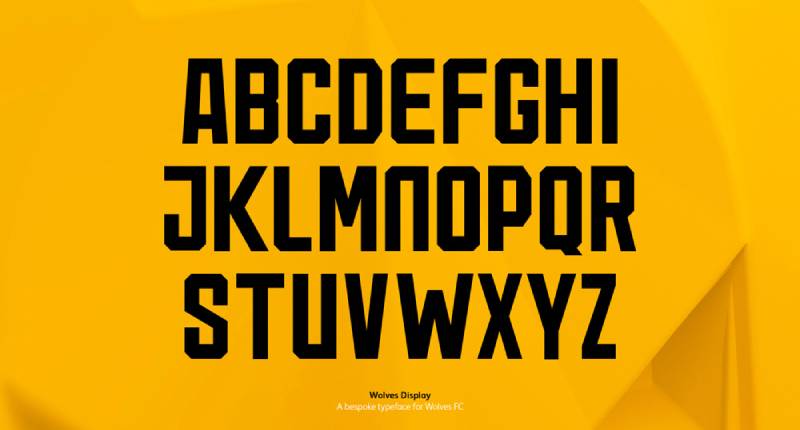
The current primary badge doesn’t actually include any typography. That’s one of its most distinctive traits.
When the club name does appear (on merchandise or extended branding), it uses a clean, uppercase sans-serif font. Simple shapes, even spacing, nothing that competes with the wolf itself.
Previous versions from the 1996-2002 era included the “Wolverhampton Wanderers” text inscribed along the hexagon’s inner edges and “FC” in a 3D-style font below. The move to drop all text in 2002 was bold, and not every club could pull that off.
What Are the Hidden Meanings in the Wolverhampton Wanderers Logo?
The hexagonal shape isn’t random. Look closely and you’ll notice it echoes the silhouette of a wolf’s head, with the top edges mimicking the ears. Shape and container work together.
The wolf’s triangular white eyes give the design an alert, almost aggressive quality. It’s staring right at you. The angular lines throughout the design reference pack mentality and directness.
Designer Jonathon Russell kept the geometric language from Jackson’s 1979 original but pushed it further toward minimalism. The result is a badge that looks like it could have been designed yesterday, even though its roots are over 40 years old.
How Does the Wolverhampton Wanderers Logo Compare to Competitor Logos?
Most Premier League badges follow a similar formula. Shield or circle, animal or symbol in the center, club name wrapped around it, maybe some stars or a founding date. The Arsenal logo, the Manchester City logo, and the Chelsea logo all fit this pattern.
Wolves breaks from that convention in almost every way. No shield. No circle. No text. The hexagon is unusual for football, and the absence of the club name makes it stand out immediately in any lineup of Premier League badges.
Among West Midlands rivals specifically, it offers a sharp contrast. The Aston Villa logo uses a traditional lion-on-shield design. The Birmingham City logo features a globe and a serif wordmark. Both are much more conventional. Wolves looks like it belongs to a different generation of branding entirely.
The closest comparisons in terms of style might actually be outside the league. Tech company logos often use this same kind of stripped-back, geometric approach, which is probably why the Wolves badge translates so well to digital platforms.
What Are the Technical Specifications of the Wolverhampton Wanderers Logo?
Official Color Codes
- Primary Color (Old Gold): Hex #FDB913, RGB (253, 185, 19), CMYK (1, 30, 99, 0), Pantone PMS 1235
- Secondary Color (Black): Hex #231F20, RGB (35, 31, 32), CMYK (70, 67, 64, 74), Pantone Neutral Black C
- Accent Color (White): Hex #FFFFFF, RGB (255, 255, 255), CMYK (0, 0, 0, 0)
Dimensions and Proportions
The badge is built around a regular hexagonal frame. The wolf head fills approximately 60-70% of the interior space, with the remaining area occupied by the gold background.
The double contour system (thin white inner line, thick black outer line) provides clear definition at any size. This is actually one of the badge’s biggest practical strengths. It remains readable even at very small sizes on mobile screens or distant stadium signage because the visual hierarchy is so clean.
Clear space requirements typically follow standard practice: the badge should be surrounded by a buffer zone equal to at least the width of the outer black border on all sides. Official usage guidelines are managed by the club and its licensing partners.
What Cultural Impact Has the Wolverhampton Wanderers Logo Had?

The Wolves badge has become a symbol of the city itself, not just the football club. You see it on murals around Wolverhampton, tattooed on fans, printed on everything from pint glasses to baby clothes.
When the club returned to the Premier League in 2018 under Fosun International’s ownership, the badge gained international exposure. It showed up on broadcasts across Asia, Europe, and the Americas. The fact that it works without text made it even more effective in non-English-speaking markets.
The 2019 High Court case over the badge’s origins (Peter Davies v. Wolverhampton Wanderers FC) also put the logo in the national headlines. The court ultimately ruled in the club’s favor, confirming Ian Jackson’s original authorship and Jonathan Russell’s subsequent redesign.
Among fans and collectors, the various historical versions of the Wolves badge are highly sought after. Retro shirt sales featuring the 1970s and 1988 designs do well, and the evolution from civic coat of arms to geometric wolf head makes a good case study in sports brand identity.
How Does the Wolverhampton Wanderers Logo Fit Into the Overall Brand Identity?

The badge is the anchor point. Everything else in the Wolves brand connects back to it.
The old gold and black color scheme runs through every touchpoint: kits, stadium design at Molineux, the official website, social media profiles, training gear, and community programs run through the Wolves Foundation.
Kit manufacturers (currently Castore) build their shirt designs around the badge placement. The wolf head appears on the left chest, and the entire kit palette derives from those same two primary colors.
Even the matchday experience ties in. The Molineux concourses, digital boards, and LED perimeter displays all use the gold-and-black system consistently. It is a cohesive brand system where the badge sits at the center and everything radiates outward from it.
How Should the Wolverhampton Wanderers Logo Be Used?
General usage guidelines:
- The badge should always appear on its gold background within the hexagonal frame. Don’t isolate the wolf head without the border.
- Don’t stretch, rotate, or distort the proportions. Maintain the original aspect ratio at all times.
- Maintain the required clear space around the badge. No other graphics or text should encroach on the buffer zone.
- The official colors must be used as specified. Don’t swap gold for yellow or use a different shade of black.
- On dark backgrounds, the full-color version with the black outer border works. On light backgrounds, the same version applies, since the gold fill provides enough contrast.
Where to access official logos: Licensed versions are available through the club’s official website and through Wolverhampton Wanderers FC’s licensing department. Media outlets can typically access press-ready files through the Premier League’s media portal.
Licensing and trademark: The Wolverhampton Wanderers badge is a registered trademark. Any commercial use requires explicit written permission from the club. Unauthorized reproduction on merchandise, publications, or digital content can result in legal action. The club actively protects its intellectual property, as the 2019 High Court case demonstrated.
For fan-created content (social media posts, fan art, blog articles), the club generally allows reasonable non-commercial use. But anything sold for profit needs a license. If you are unsure, contact the club directly before producing anything.
FAQ on The Wolverhampton Wanderers Logo
What does the Wolverhampton Wanderers logo look like?
It’s a stylized black wolf’s head inside a gold hexagon. Sharp angular lines, triangular white eyes, and a thick black outer border define the badge. No text appears in the primary version, which is rare for a Premier League club badge.
Who designed the current Wolves FC badge?
Jonathon Russell redesigned the crest in 2002. He built on Ian Jackson’s original 1979 wolf head motif, simplifying the geometric shapes and removing all club name text. The result is a clean, modern football emblem that still holds up today.
What do the colors on the Wolverhampton Wanderers badge mean?
Gold and black come from the city of Wolverhampton’s motto: “Out of Darkness Cometh Light.” The old gold (#FDB913) represents light. Black (#231F20) represents darkness.
These club colors replaced the original red and white of St. Luke’s FC in the late 1800s.
How many times has the Wolves logo changed?
Roughly nine times since 1921. The badge evolved from the Wolverhampton City Council coat of arms to stacked W letterforms, then three leaping wolves, and finally the single geometric wolf head.
Each version reflected shifts in ownership or football culture at Molineux Stadium.
Why is there a wolf on the Wolverhampton Wanderers crest?
The wolf references the club’s nickname, “the Wolves.” It also connects to the city’s name. Wolverhampton likely derives from “Wulfruna’s high town,” tying the animal motif directly to the region’s Saxon history and local identity.
What is the hexagon shape on the Wolves badge?
The hexagonal border frames the wolf head and mirrors its silhouette. The top edges suggest ears. This framing choice sets the Wolves apart from clubs that use traditional shields or circles. It gives the whole design a sharper, more contemporary feel.
Does the Wolverhampton Wanderers logo have any text?
Not in its primary form. The standalone wolf head badge works without any wordmark at all.
Previous versions (1996-2002) included “Wolverhampton Wanderers” inscribed along the hexagon’s inner edges. Dropping the text in 2002 was a deliberate move toward stronger logo design.
Was there a copyright dispute over the Wolves logo?
Yes. Peter Davies, a retired building industry manager from the West Midlands, claimed he drew a similar wolf head for an art competition in the early 1960s. He sued Wolverhampton Wanderers FC but lost in the High Court in 2019.
How does the Wolves badge compare to other English football crests?
Most Premier League badges follow a shield-plus-animal-plus-text formula. The Liverpool logo, Tottenham Hotspur logo, and Everton logo all include club names.
Wolves skips the wordmark entirely. That alone makes it stand out in any lineup of English football club logos.
Can I use the Wolverhampton Wanderers logo for my own project?
Not commercially without a license. The badge is a registered trademark owned by Wolverhampton Wanderers FC under Fosun International. Non-commercial fan use (social media, fan art) is generally tolerated, but anything sold for profit requires written club permission.
Conclusion
The Wolverhampton Wanderers logo has gone from a borrowed civic coat of arms to one of the cleanest badges in the Premier League. Nine versions over a century, and the current wolf head crest still works without a single word of text.
That says a lot about how well Jonathon Russell’s 2002 redesign holds up. The old gold and black complementary color pairing, the angular geometry, the hexagonal frame. It all clicks.
Whether you spot it on a kit at Molineux, a website, or a flag in the South Bank stand, the Wolves FC emblem is impossible to miss. Few English football club logos manage that kind of instant recognition.

Renowned for his expertise in logo design and visual branding, Bogdan has developed a multitude of logos for various clients.
His skills extend to creating posters, vector illustrations, business cards, and brochures. Additionally, Bogdan's UI kits were featured on marketplaces like Visual Hierarchy and UI8.
He also wrote in the past years on sites like Design Your Way, WebDesignerDepot, WPDean, Designmodo, Speckyboy, Slider Revolution, and more.
- Jujutsu Kaisen Font Generator - 12 October 2026
- The Windsurf Logo History, Colors, Font, And Meaning - 10 October 2026
- How to Remove Background From Product Photos (No Photoshop) - 10 October 2026

Bogdan Sandu is a seasoned designer who has been designing websites since 2008. Renowned for his expertise in logo design and visual branding, Bogdan has developed a multitude of logos for various clients. His skills extend to creating posters, vector illustrations, business cards, and brochures. Additionally, Bogdan's UI kits were featured on marketplaces like Visual Hierarchy and UI8. He also wrote in the past years on sites like Design Your Way, WebDesignerDepot, WPDean, Designmodo, Speckyboy, Slider Revolution, and more.
You Might Also Like


