


The Burnley logo is one of English football’s most layered and symbol-heavy club badges. Based directly on the town of Burnley’s coat of arms, this crest packs in references to local families, Lancashire’s industrial past, and a royal visit from 1886. The club itself was founded in 1882, making it one of the oldest professional football clubs in England and a founding member of the Football League.
Burnley FC, known as “the Clarets,” have worn some version of this badge across more than a dozen redesigns. The current iteration, updated in 2023, strips the crest down to a claret-and-white logo while keeping every symbolic element intact. It is a combination mark that blends heraldic imagery with the club’s name on a scroll beneath the shield.
Few football badges carry this much local meaning in a single composition. And that is exactly the point. This is not a logo designed for simplicity or global appeal. It is a badge built for Burnley.
What Is the Burnley Logo?
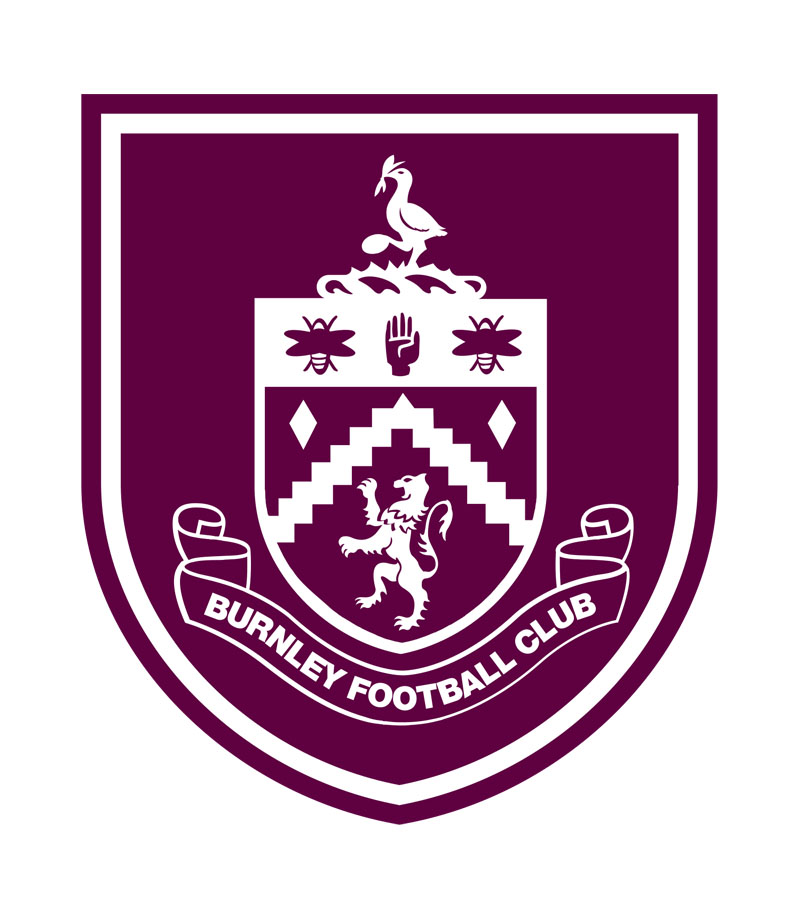
The Burnley logo is a heraldic combination mark featuring a claret shield with a white inner crest that includes a stork, two bees, a raised hand, a lion, a wavy chevron, and cotton plants. The current version was introduced in 2023 ahead of the club’s Premier League return, and it renders all elements in white on claret.
- Design Type: Combination mark (heraldic emblem with wordmark)
- Primary Elements: Stork holding a Lacy knot, two bees, a raised hand, lion, wavy chevron representing the River Brun, cotton plants, and a scroll reading “Burnley Football Club”
- Official Introduction Date: The current monochrome claret-and-white version was rolled out in summer 2023. The heraldic structure dates back to the 1979 redesign.
- Designer/Agency: The original heraldic design was developed in-house based on the town of Burnley’s coat of arms. No external agency has been publicly credited for the 2023 update.
- Trademark Status: The badge has been a registered trademark since the 1970s and is protected under UK intellectual property law
- Color Palette: Burgundy/Claret (#6C1D45), Light Blue (#99D6EA), Yellow (#EDE939), Gold (#F0B323). The 2023 version primarily uses claret and white.
- Usage Context: Match kits, official merchandise, Turf Moor signage, club website, Premier League broadcast graphics, social media profiles, and all licensed products
How Has the Burnley Logo Evolved Over Time?

The Burnley badge has gone through roughly 13 different versions since 1887. It started with the Prince of Wales’s coat of arms, shifted to simple monograms twice, then returned to heraldic designs rooted in the town’s municipal crest.
The biggest turning points were the introduction of the BFC monogram in 1969, the heraldic comeback in 1979, and the monochrome simplification in 2023.
The Royal Arms Era (1887-1935)
- Years Active: 1887 to approximately 1935
- Design Description: White jerseys featuring the Prince of Wales’s coat of arms with a blue sash
- Color Scheme: White, blue, and gold
- Context: Prince Albert Victor visited Turf Moor in October 1886 to watch Burnley play Bolton Wanderers. It was the first visit by a royal to a professional football ground. The club received jerseys bearing the Royal Arms as a gift shortly after. This crest stayed on kits until 1895, was briefly revived in 1914, and the royal connection influenced badge design for decades.
- Cultural Significance: It gave Burnley a direct link to royalty that no other club could claim at the time, and the lion symbol in later badges traces back to this period
The Town Coat of Arms Badge (1935-1960)
- Years Active: 1935 to 1960
- Design Description: A burgundy crest-shaped background with the town’s coat of arms inside a smaller shield. A yellow bird sat at the top, and an arched ribbon carried yellow lettering. The inner shield contained heraldic symbols from the Burnley municipal crest.
- Color Scheme: Burgundy, white, yellow, with some light blue
- Context: First appeared around the 1935 FA Cup semifinal. The club adopted the official municipal symbol permanently starting in the 1935-36 season. This was a shift away from royal imagery toward local civic identity.
- Key Changes from Previous: Moved from the Prince of Wales’s arms to the town’s own coat of arms
- Cultural Significance: Grounded the club’s identity in the Burnley community rather than a royal connection
The Revised Shield Badge (1960-1969)
- Years Active: 1960 to 1969
- Design Description: A shield-within-a-shield layout. The outer shield was light blue with a thick yellow border. Inside sat a golden inner shield with heraldic symbols. A black ribbon at the bottom carried the Latin motto “Pretiumque Et Causa Laboris” (The prize and the cause of our labor).
- Color Scheme: Light blue, yellow, black
- Context: Introduced during Burnley’s golden period. They won the First Division title in 1959-60 and competed in the European Cup in 1960-61.
- Key Changes from Previous: Flipped the color palette from burgundy-dominant to light blue-dominant. Added the Latin inscription.
- Cultural Significance: Represented the club at its peak, during an era when Burnley was one of the smallest towns to produce a league champion
The First BFC Monogram (1969-1975)
- Years Active: 1969 to 1975
- Design Description: Three letters, B, F, and C, placed diagonally from upper left to bottom right. The letters were light blue and written in an elegant cursive typeface.
- Color Scheme: Light blue on white
- Context: A complete departure from heraldry. The club went minimal during a period of declining on-field performance.
- Key Changes from Previous: Dropped every heraldic element. Pure typographic approach.
- Cultural Significance: Shows how clubs in the late 1960s and early 1970s experimented with simpler branding
The Circle Monogram (1975-1979)
- Years Active: 1975 to 1979
- Design Description: A solid burgundy circle with a yellow outline. Inside, a bold “BFC” monogram in yellow, with the letter F larger and overlapping the B and C. Clean sans-serif lettering.
- Color Scheme: Burgundy and yellow
- Key Changes from Previous: Moved from cursive to bold sans-serif. Added a circular container shape. Brought back claret/burgundy as the primary color.
- Cultural Significance: A very 1970s approach to club branding, similar to what many English clubs were doing at the time
The Heraldic Return (1979-1983)
- Years Active: 1979 to 1983
- Design Description: Two rampant lions holding red roses flanked a dark purple shield. Inside the shield: a bee, the founding year “1882,” a raised hand, a knight’s helmet, and a shuttle. A light blue ribbon beneath carried “Burnley Football Club” in white uppercase letters. A stork with a Lacy knot stood at the top.
- Color Scheme: Purple, red, light blue, white, gold elements
- Context: This was the first badge based on the town of Burnley’s coat of arms in a new, more detailed way. It pulled in local family crests, industrial symbols, and civic identity.
- Key Changes from Previous: Massive shift from a simple monogram back to full heraldic imagery
- Cultural Significance: This version became the structural template for every heraldic badge that followed. The basic layout has survived for over 40 years now.
The Second BFC Monogram (1983-1987)
- Years Active: 1983 to 1987
- Design Description: Three italicized cursive letters, B.F.C., set in a single line and separated by solid dots. Dark burgundy, almost purple in tone.
- Color Scheme: Dark burgundy/purple
- Key Changes from Previous: Stripped away the entire heraldic structure again. Back to a text-only mark.
The Gold and Burgundy Crest (1987-2009)
- Years Active: 1987 to 2009 (with anniversary variants in 2006-07 and 2007-08)
- Design Description: The 1979 heraldic crest returned with a new color scheme built around gold and burgundy. Two gold stars were added above the coat of arms. The shield, lions, stork, and all heraldic elements remained but were rendered in deeper, sharper tones. For the 2007-08 season, a special 125th anniversary version replaced “1882” with “125” and added “Burnley FC 1882-2007” to the ribbon.
- Color Scheme: Gold and burgundy primarily
- Context: Introduced to give the badge a more prestigious feel. The gold stars and richer tones added weight.
- Cultural Significance: This is the version many current fans grew up with. It lasted over two decades.
The Latin Motto Revival (2009-2010)
- Years Active: 2009 to 2010
- Design Description: Returned to the 1960s structure with the shield-within-a-shield layout. The ribbon at the bottom carried the Latin motto “Pretiumque Et Causa Laboris” in bright blue.
- Color Scheme: Light blue, yellow, black, with heraldic details
- Context: Used for one season marking a nostalgic callback to the club’s 1960s golden era
The Modern Heraldic Badge (2010-2023)
- Years Active: 2010 to 2023, with a ribbon redesign in 2015
- Design Description: The full heraldic crest returned with “Burnley Football Club” on the black ribbon in uppercase sans-serif type. Light blue. In 2015, the lettering was made bolder. The shield featured all traditional elements: stork, bees, hand, lion, chevron, cotton plants.
- Color Scheme: Light blue, yellow, gold, black, burgundy, red, green
- Key Changes from Previous: Replaced the Latin motto with the English club name. Added a slight three-dimensional effect to the shield frame.
- Cultural Significance: Carried the club through two Premier League promotions and the Sean Dyche era
The Monochrome Update (2023-Present)
- Years Active: 2023 to present
- Design Description: Same structural layout but rendered in white on a claret shield. All internal colors (black, yellow, gold, light blue) were removed from inside the shield. The scroll beneath still reads “Burnley Football Club.”
- Color Scheme: Claret and white
- Context: Rolled out ahead of the 2023-24 Premier League season, following the Championship title win and investment from J.J. Watt. Appeared first on the club website, social media, and Premier League graphics.
- Key Changes from Previous: Eliminated the multicolor interior. All elements are now white on claret.
- Cultural Significance: Part of a broader trend in football where clubs simplify crests for digital use and modern merchandise, though Burnley kept every element rather than removing icons
What Do the Design Elements of the Burnley Logo Mean?
Every element in the Burnley crest comes from the town’s coat of arms or from events in the club’s history. Nothing is decorative filler.
The stork at the top represents the Starkie family, who were prominent in the Burnley area. The Lacy knot in the stork’s beak references the de Lacy family, who held Burnley during medieval times.
The two bees stand for the town’s hardworking character (and the old Bee Hole End terrace at Turf Moor). The raised hand represents the town motto: “Hold to the Truth.” The lion connects to royalty and the 1886 royal visit. The wavy chevron running through the shield represents the River Brun, which gives Burnley its name.
Cotton plants around the stork’s hill reference Lancashire’s textile industry, which built the town’s economy. And “1882” marks the year the club was founded.
Why Did Burnley Choose These Specific Colors?
Burnley’s kit colors, claret and blue, were adopted in 1910. Before that, the club wore black and yellow stripes (earning them the nickname “Hornets”). The switch to claret and blue gave them the lasting nickname “the Clarets.”
Those colors carry directly into the badge. According to color psychology, deep claret tones suggest tradition, depth, and loyalty. The light blue brings a sense of calm and openness. Gold accents in earlier versions of the badge added prestige.
Here are the official color codes:
- Burgundy/Claret: Hex #6C1D45, RGB (108, 29, 69), CMYK (20, 100, 22, 61), Pantone PMS 222 C
- Light Blue: Hex #99D6EA, RGB (153, 214, 234), Pantone PMS 2975 C, CMYK (34, 0, 5, 0)
- Yellow: Hex #EDE939, RGB (237, 233, 57), Pantone PMS 394 C, CMYK (6, 0, 72, 0)
- Gold: Hex #F0B323, RGB (240, 179, 35), Pantone PMS 7409 C, CMYK (0, 31, 100, 0)
What Typography Is Used in the Burnley Logo?

The club name “Burnley Football Club” appears on a scroll beneath the shield. It uses a custom serif-influenced typeface that feels both traditional and clear at small sizes.
Earlier versions used everything from elegant cursive scripts (the 1969 BFC monogram) to bold sans-serif caps (the 1975 circle badge and the 2015 ribbon update). The 2023 version keeps the lettering clean, readable, and well-spaced inside the scroll.
The typographic hierarchy is straightforward: the visual crest dominates, and the text serves as a grounding label beneath it.
What Are the Hidden Meanings in the Burnley Logo?
The “hidden” meanings are really just layered ones. The shuttle between the bee and the knight’s helmet represents Burnley’s cotton industry, and it is also a nod to the Shuttleworth family of Gawthorpe Hall.
The knight’s helmet itself represents two local families: the Townleys and the Shuttleworths. Even the name “Burnley” is embedded in the design through the River Brun chevron, since the town’s name comes from “Brun” (brown) and “Lea” (meadow).
It is the kind of badge where you keep finding connections the more you look. That is by design, not by accident.
How Does the Burnley Logo Compare to Competitor Logos?
Most English football clubs have moved toward simplified, clean crests in recent years. Burnley went the opposite direction. They kept every heraldic element while simplifying the color execution.
Compare it to Manchester City’s badge, which also features a ship and eagle but renders them in flat, modern lines. Or look at the Leeds United logo, which reduced everything to a single rose. Burnley’s badge is denser than almost any other Premier League crest.
Local rivals Blackburn Rovers use a simpler shield with a red rose and the Latin motto “Arte et Labore.” The Aston Villa badge, another claret-and-blue club, features a single lion in a more streamlined layout.
Among NFL logos or NBA logos, this level of heraldic detail would be unusual. But in English football, where crests carry civic and historical weight, Burnley’s approach makes sense. It just happens to carry more of that weight than most.
What Are the Technical Specifications of the Burnley Logo?
Official Color Codes
- Claret/Burgundy: Hex #6C1D45, RGB (108, 29, 69), CMYK (20, 100, 22, 61), Pantone PMS 222 C
- Light Blue: Hex #99D6EA, RGB (153, 214, 234), CMYK (34, 0, 5, 0), Pantone PMS 2975 C
- Yellow: Hex #EDE939, RGB (237, 233, 57), CMYK (6, 0, 72, 0), Pantone PMS 394 C
- Gold: Hex #F0B323, RGB (240, 179, 35), CMYK (0, 31, 100, 0), Pantone PMS 7409 C
Dimensions and Proportions
The badge is taller than it is wide, roughly following a vertical shield proportion. The stork and cotton plants extend above the main shield, and the scroll with “Burnley Football Club” sits below.
For digital use, the badge is commonly available in PNG and SVG vector formats. The 2023 monochrome version works especially well at small sizes and on dark backgrounds because the white-on-claret rendering eliminates the problem of tiny colored details getting lost.
The club maintains brand guidelines that specify clear space around the crest, minimum reproduction sizes, and approved color variations for different backgrounds. These ensure consistent use across print and web applications.
What Cultural Impact Has the Burnley Logo Had?

Burnley’s badge is a community symbol more than a commercial one. In a town of roughly 78,000 people, the club draws average attendances of around 21,000 for Premier League matches. That is one of the best per-capita supporter ratios in English football.
The crest shows up everywhere in Burnley. Pub signs, school bags, car decals, tattoo parlors. It is woven into the identity of the town itself, partly because it literally shares the town’s coat of arms.
The 2023 monochrome update was quietly accepted by most fans. Unlike some controversial rebrandings in football (look at what happened with Leeds in 2018), Burnley’s update kept every symbol and just changed the rendering. That matters to supporters who see the badge as theirs, not the club’s marketing department’s.
How Does the Burnley Logo Fit Into the Overall Brand Identity?
The badge sits at the center of everything Burnley FC does. The claret-and-blue kits, the Turf Moor stadium branding, the official brand style guide, the club website, the matchday programs. All of it pulls from the same set of colors and the same heraldic style.
What makes Burnley’s branding unusual is how tightly the club badge is linked to the town itself. The coat of arms shared between the club and the borough creates a kind of dual identity that you don’t see with most football clubs. The stork, the bees, the cotton plants, the River Brun. These are Burnley-the-town symbols first, football symbols second.
That deep local rooting is probably why the badge has stayed structurally consistent since 1979 (apart from those two monogram interruptions in the 1980s). The framework works. The details carry meaning. And the fans recognize it instantly.
How Should the Burnley Logo Be Used?
The Burnley FC badge is a registered trademark. Unauthorized reproduction for commercial purposes is not allowed without the club’s permission.
Official usage guidelines include:
- The badge must be reproduced in approved colors only (claret and white for the 2023 version, or the full multicolor version for specific applications)
- A minimum clear space must surround the crest at all times
- The badge should not be stretched, rotated, recolored, or partially cropped
- For merchandise and packaging, only licensed manufacturers may use the crest
- Digital reproductions should use SVG or high-resolution PNG files to preserve detail, especially given the badge’s complexity
Official logo files and licensing inquiries go through Burnley Football Club directly at burnleyfootballclub.com. Fan-made content that uses the badge non-commercially (like supporter blogs or social media graphics) generally falls into a gray area, though the club has historically been tolerant of fan use.
If you need a clean version of the crest for a project, always pull it from official sources. The amount of detail in this badge means low-resolution copies tend to look terrible.
FAQ on The Burnley Logo
What does the Burnley FC badge represent?
The Burnley FC crest is based on the town of Burnley’s coat of arms. It features a stork, two bees, a raised hand, a lion, and a wavy chevron representing the River Brun. Each element ties directly to Lancashire heritage and local families.
When was the current Burnley logo introduced?
The current monochrome version launched in summer 2023 ahead of the club’s Premier League return. It renders all elements in white on a claret shield.
The heraldic structure itself dates back to 1979.
What do the bees on the Burnley emblem mean?
The two bees represent the hardworking character of Burnley’s people. They also reference the old Bee Hole End terrace at Turf Moor. The “B” connection to Burnley’s name was intentional too.
What are the official Burnley FC colors?
The Clarets use burgundy (#6C1D45), light blue (#99D6EA), yellow (#EDE939), and gold (#F0B323). Claret and blue have been the club’s kit colors since 1910.
Before that, they wore black and yellow stripes.
Why is there a stork on the Burnley crest?
The stork represents the Starkie family, who were prominent in the Burnley area. It holds a Lacy knot in its beak, which is the badge of the de Lacy family that held Burnley during medieval times.
How many times has the Burnley logo changed?
The club has used roughly 13 different badge versions since 1887. These range from the Prince of Wales’s coat of arms to simple BFC monograms to the detailed heraldic crests used from 1979 onward.
What is the lion on the Burnley badge?
The lion symbolizes the royal connection from 1886, when Prince Albert Victor visited Turf Moor. That visit made it the first professional football ground visited by a member of the royal family. The lion has appeared on every heraldic version since.
Can I use the Burnley FC logo for personal projects?
The Burnley badge is a registered trademark. Commercial use requires licensing from the club directly.
Fan-made content for non-commercial purposes tends to be tolerated, but always check with official sources first.
What does the wavy line on the Burnley shield mean?
The wavy chevron running through the shield represents the River Brun. The town’s name actually comes from “Brun” (meaning brown) and “Lea” (meaning meadow). So the river is literally built into Burnley’s identity.
Where can I download the official Burnley FC logo?
Official logo files are available through burnleyfootballclub.com. The badge is offered in PNG and SVG formats. Given the crest’s detail, always grab the highest resolution available. Low-quality copies lose the finer elements fast.
Conclusion
The Burnley logo is one of those football club emblems that refuses to simplify for the sake of trends. And honestly, that is what makes it work.
Every symbol on that claret shield, from the stork to the bees to the River Brun chevron, connects back to something real about the town and its people.
The 2023 monochrome update proved you can modernize a badge without gutting its meaning. The Clarets kept the full heraldic structure while making it cleaner for digital platforms and club merchandise.
For a founding member of the English Football League with over 140 years of history at Turf Moor, that kind of respect for heritage matters. The badge is not just branding. It is Burnley.

Renowned for his expertise in logo design and visual branding, Bogdan has developed a multitude of logos for various clients.
His skills extend to creating posters, vector illustrations, business cards, and brochures. Additionally, Bogdan's UI kits were featured on marketplaces like Visual Hierarchy and UI8.
He also wrote in the past years on sites like Design Your Way, WebDesignerDepot, WPDean, Designmodo, Speckyboy, Slider Revolution, and more.
- Canva vs PowerPoint: Which Is Better for Presentations? - 22 September 2026
- How to Install Fonts on Mac (Step-by-Step Guide) - 20 September 2026
- From Mockup to Code: How AI-Augmented Development Speeds Up the Design Handoff - 19 September 2026

Bogdan Sandu is a seasoned designer who has been designing websites since 2008. Renowned for his expertise in logo design and visual branding, Bogdan has developed a multitude of logos for various clients. His skills extend to creating posters, vector illustrations, business cards, and brochures. Additionally, Bogdan's UI kits were featured on marketplaces like Visual Hierarchy and UI8. He also wrote in the past years on sites like Design Your Way, WebDesignerDepot, WPDean, Designmodo, Speckyboy, Slider Revolution, and more.
You Might Also Like


