


The Blackburn Rovers logo is one of those football badges that just sticks with you. A red Lancashire rose sitting inside a blue and white circular crest, paired with the Latin motto “Arte et Labore.” It’s been around in some form since the late 1800s, though the version most fans recognize today traces back to 1989.
Blackburn Rovers FC was founded on November 5, 1875, making it one of the oldest professional football clubs in England. The club has gone through four main badge designs across its nearly 150-year history. The current crest, a combination mark featuring the Lancashire Red Rose, the club name, founding year, and motto, has been the standard since around 1989, with minor color and detail adjustments happening in the years after.
Within English football branding, Blackburn’s crest holds a specific place. It pulls directly from regional heraldry rather than inventing something from scratch. That gives it an authenticity a lot of modern redesigns lack. The logo connects the club to Lancashire itself, not just to the sport.
What Is the Blackburn Rovers Logo?
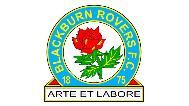
The Blackburn Rovers logo is a circular emblem centered on the red Lancashire Rose, enclosed in a blue ring bearing the club’s name, founding year of 1875, and the Latin motto “Arte et Labore” (meaning “By Skill and Hard Work”). The badge uses Helvetica Bold for its lettering, and the crest has been in use since the 1989-90 season with refinements in the late 1990s and mid-2000s.
Here’s a breakdown of the badge’s main attributes:
- Design Type: Combination mark (emblem with text and symbol)
- Primary Elements: Red Lancashire Rose with green stem and leaves, circular blue ring, club name text, founding year (“18” and “75” split on either side), rectangular motto banner
- Official Introduction Date: 1989-90 season (current circular format)
- Designer/Agency: No publicly credited external agency. The design evolved from existing Lancashire heraldic elements adapted by the club
- Trademark Status: Registered trademark of Blackburn Rovers Football Club, protected under UK intellectual property law
- Color Palette: Blue (#009EE0), White (#FFFFFF), Red (rose), Green (stem/leaves), Yellow/Gold (outlines and text), Black (contours)
- Usage Context: Match kits, official merchandise, Ewood Park stadium branding, digital platforms, club communications, and all official documentation
How Has the Blackburn Rovers Logo Evolved Over Time?

Blackburn Rovers has used four distinct badge designs since its founding. The club went from a simple Maltese Cross to the town coat of arms, then to a standalone Lancashire Rose, and finally to the circular crest still in use today.
Each change reflected what was happening at the club. Not every redesign was dramatic, but each one said something about where Rovers stood at that point in their history.
The Maltese Cross (1875-1960)
Years Active: 1875 to 1960
Design Description: A bright blue eight-pointed Maltese Cross on a white background. No text. No additional elements. Just the cross.
This was the first badge, and it came straight from the founders’ school days. John Lewis and Arthur Constantine, who started the club, were both old boys of Shrewsbury School. The Maltese Cross was a symbol of the public schools they attended.
It showed up on early kits as a small emblem on the left breast of a white jersey, paired with a blue and white skull cap. Photographic evidence from 1878 confirms this setup.
But here’s the thing. From roughly 1882 onward, Blackburn didn’t even wear a badge on their shirts for regular matches. The crest only appeared for cup finals and special occasions. For decades, the team played without any visible emblem at all.
The Town Coat of Arms (1960-1974)
Years Active: 1960 to 1974
Design Description: A detailed heraldic shield featuring three bees, a white horn between two golden diamonds, a wide black wave, and a dove sitting atop a spool of a loom. Below the shield sat a ribbon carrying the Latin motto “Arte et Labore.”
Color Scheme: Green, white, black, and gold
Context: Blackburn first wore this badge for the 1960 FA Cup final against Wolverhampton Wanderers. Club officials decided the team needed something more substantial on their shirts for such a big occasion. They grabbed the town’s own coat of arms.
The three bees on the shield represented the region’s industrial heritage. The white background referenced the calico and textile industry that had built the local economy. The dove was a longstanding symbol of Blackburn itself.
This was the first version of the badge to carry the “Arte et Labore” motto, which had originally belonged to the Blackburn City Council since 1852.
It stuck around for 14 years. A proper civic badge for a club that saw itself as part of its town’s identity.
The Lancashire Rose (1974-1989)
Years Active: 1974 to 1989
Design Description: A standalone bright red Lancashire Rose with the letters “B.R.F.C.” printed below in red capital letters, using a strict geometric sans-serif font.
Color Scheme: Red only
Key Changes from Previous: Complete departure from the complex heraldic shield. Gone were the bees, the horn, the diamonds, the dove. Just the rose and the initials.
The Lancashire Rose, or Red Rose of Lancaster, is a heraldic symbol connected to the House of Lancaster and the county of Lancashire. Its history goes all the way back to the Wars of the Roses (1455-1485). It’s a symbol that every person in that part of England recognizes instantly.
By putting it front and center, Blackburn tied themselves directly to their region. No more borrowing the town’s coat of arms. This was about Lancashire identity, pure and simple.
The problem? Visibility. A dark red rose on a dark blue shirt didn’t read well from the stands. Looked great up close, but from the terraces at Ewood Park, it was hard to make out. That issue eventually forced a rethink.
The Modern Circular Badge (1989-Present)
Years Active: 1989 to present
Design Description: A white circle containing the red Lancashire Rose (now drawn from a side angle, with a green stem and leaves). The circle sits inside a blue ring carrying the text “Blackburn Rovers F.C.” along with “18” and “75” (the founding year split on either side). Below the circle, a rectangular banner holds the motto “Arte et Labore.”
Color Scheme (initial 1989 version): Blue ring, red rose, green foliage, orange outlines and text
The first version used orange for the lettering and outlines. It looked fine on paper, but the orange text on the blue ring wasn’t the easiest to read.
A redesign in the late 1990s swapped the orange for yellow, switched the outline to a double border (yellow and black), and made the blue ring a brighter shade. The lettering became clearer. The rose got a more schematic treatment.
Then in the mid-2000s, the contours were cleaned up further. The text got sharper. Thin yellow strokes were added to the rose’s petals and leaves, giving the whole badge more depth.
These were not overhauls. Think of them as someone adjusting the focus on a camera. Same picture, just crisper each time.
What Do the Design Elements of the Blackburn Rovers Logo Mean?
Every piece of the Blackburn Rovers badge ties back to either the club’s founding, its geographic roots in Lancashire, or its working-class identity. Nothing in the design is decorative filler. The red rose, the motto, the founding date, they all serve a purpose.
Look, most football badges have some level of local symbolism. But Blackburn’s is unusually direct about it.
What Does the Red Rose Represent?
The red rose is the Lancaster Rose, the heraldic emblem of the House of Lancaster. It became associated with the entire county of Lancashire following the Wars of the Roses in the 15th century.
Blackburn sits in Lancashire. The rose places the club within its county’s identity and history. It’s been the central symbol on every Rovers badge since 1974.
According to color psychology, red communicates passion, energy, and determination. For a football club, those associations fit perfectly.
The way the rose is drawn has changed over the years. Initially a flat, head-on depiction, it was redrawn from a side angle in 1989, complete with stem and leaves. That gave it more personality and made it feel like an actual flower rather than a flat graphic.
Why Did Blackburn Rovers Choose These Specific Colors?
The badge uses several colors, each with a specific role:
- Blue – Hex: #009EE0, Pantone: PMS 2925 C. Blue is one of the club’s two primary colors, present on the kits since the 1870s. In the badge, it forms the main ring surrounding the rose. Blue typically signals loyalty and trust, which tracks with a club that has kept the same basic kit for well over a century.
- White – Hex: #FFFFFF. The other primary club color. It fills the inner circle behind the rose and represents the calico textile industry that shaped Blackburn’s economy. White provides the contrast needed to make the rose pop.
- Red – Used for the Lancashire Rose itself. It connects the badge to the county’s heraldic tradition and adds the most visually striking element to an otherwise blue and white palette.
- Yellow/Gold – Used for the text and outline borders in the current version. Yellow replaced the original orange in the late 1990s because it was more readable against the blue ring.
- Black – Used for contour lines and as part of the double border. Provides definition and keeps the smaller details from blending together.
- Green – The stem and leaves of the rose. Adds naturalistic detail and grounds the flower as a real botanical element rather than a purely abstract graphic.
What Typography Style Is Used in the Blackburn Rovers Logo?
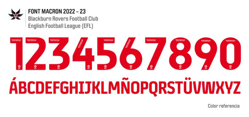
The badge uses Helvetica Bold, designed by Max Miedinger and Eduard Hoffmann and first published by Linotype AG. It’s a grotesque sans-serif font, known for its clean lines and neutral character.
Helvetica is arguably the most widely used typeface in the world. Choosing it signals reliability over flashiness.
The text sits in uppercase on the blue ring and on the motto banner. Early versions had readability issues (the orange-on-blue combo from 1989 was pretty rough), but the switch to yellow text fixed that.
The club also uses Neue Helvetica for jersey lettering, player names, numbers, and general branding. There’s consistency across all touchpoints, which is something a lot of clubs in the Championship still get wrong.
What Are the Hidden Meanings in the Blackburn Rovers Logo?
The founding year isn’t written as “1875” in one block. It’s split into “18” and “75” on either side of the badge. That’s a small but intentional design choice that creates balance in the circular layout.
The motto “Arte et Labore” predates the football club entirely. It was the Blackburn town council’s motto, adopted in 1852. The club borrowed it. That detail is easy to miss, but it says a lot about how Rovers see themselves: as part of the town, not separate from it.
Even the name “Rovers” has meaning baked in. When the club started, they didn’t have a fixed ground. They wandered from pitch to pitch. The suffix stuck long after they settled at Ewood Park in 1890.
How Does the Blackburn Rovers Logo Compare to Competitor Logos?
Blackburn’s badge sits among a group of English football crests that lean heavily on local heraldry and tradition. It’s not trying to look modern or minimalist. It’s doing the opposite, actually.
Their closest rivals provide an interesting comparison. The Burnley logo uses a detailed coat of arms with a stag, bees, and a hand holding a cotton shuttle. Much more complex than Blackburn’s approach, and harder to reproduce at small sizes. The Bolton Wanderers badge uses a much simpler design with just initials and bold colors.
Compared to Premier League clubs, Blackburn’s crest has that detailed, “don’t touch this” quality. Look at what happened with Leeds United’s logo when they tried a modern redesign and faced massive backlash. Or how Everton’s logo has stuck with its tower and wreath format. Football fans resist change when it comes to crests.
Among Championship clubs specifically, the Blackburn badge holds its own. It’s more visually distinct than something like the Sheffield Wednesday logo, and more immediately recognizable than the Hull City logo.
The rose gives Blackburn something most competitors don’t have: a single, strong focal point that draws the eye immediately.
What Are the Technical Specifications of the Blackburn Rovers Logo?
Official Color Codes
- Primary Color – Blue: Hex: #009EE0 | RGB: (0, 158, 224) | CMYK: (75, 23, 0, 0) | Pantone: PMS 2925 C
- Secondary Color – White: Hex: #FFFFFF | RGB: (255, 255, 255) | CMYK: (0, 0, 0, 0)
- Accent Color – Red (Rose): Approximate cherry red, used within the Lancashire Rose graphic
- Accent Color – Yellow/Gold: Used for text and border outlines
- Detail Color – Green: Used for stem and leaves of the rose
- Detail Color – Black: Used for contour lines and part of the double border
Dimensions and Proportions
The badge follows a roughly circular format with a rectangular extension at the bottom for the motto banner. The main circle’s proportions are close to a 1:1 aspect ratio for the circular portion, with the motto banner adding approximately 15-20% additional height.
Official brand guidelines from the club dictate clear space requirements around the badge, though the exact specifications are held internally. The logo is distributed in vector graphics format (SVG) for scalability, and in JPEG and PNG for standard digital use.
At very small sizes (below roughly 30 pixels wide), the rose detail and motto text become difficult to read. Most official applications use the full badge at sizes where all text remains legible.
What Cultural Impact Has the Blackburn Rovers Logo Had?

The Blackburn Rovers badge carries weight beyond football, particularly across Lancashire. The red rose on the crest doubles as a regional identifier. For people in Blackburn and surrounding towns, the badge is as much a local symbol as it is a sports emblem.
During the 1994-95 Premier League title-winning season under Jack Walker and Kenny Dalglish, the crest reached its widest audience. That was the peak of its visibility. Millions of people who had never been to Ewood Park saw the badge on television, in newspapers, on merchandise.
The motto “Arte et Labore” has also taken on a life of its own locally. You’ll find it referenced in community projects and local business branding across Blackburn. It predates the football club, but the club made it famous.
For badge collectors and football print design enthusiasts, the Blackburn crest is a notable example of a club that resisted the trend toward oversimplified logos. While other clubs stripped their badges down to flat icons for digital use, Blackburn kept the detail.
How Does the Blackburn Rovers Logo Fit Into the Overall Brand Identity?
The badge is the anchor of everything Blackburn Rovers does visually. The blue and white color scheme runs through the kits, the stadium signage at Ewood Park, the website, the social media channels, and all printed materials.
The club’s brand style guide ties the crest to a broader identity built on tradition and local roots. Rovers aren’t trying to be a global brand like Manchester United or Liverpool. The branding says “we’re Blackburn, we’re Lancashire, and that’s enough.”
Merchandise uses the badge prominently. Scarves, hats, mugs, phone cases, all built around the rose and the blue-white color palette. The typography stays consistent across touchpoints with the Neue Helvetica family.
The badge also connects to the club’s community programs. The Blackburn Rovers Community Trust uses a modified version of the crest in its own branding, keeping the visual link between the football club and its social outreach efforts.
How Should the Blackburn Rovers Logo Be Used?
Like any registered trademark, the Blackburn Rovers badge has rules around its use:
- Official sources: The club distributes approved logo files through its official website and to licensed partners. SVG vector files are available for scalable reproduction
- Color accuracy: Any reproduction should match the official hex and Pantone codes. The blue ring must be #009EE0, not some approximation
- Clear space: The badge needs breathing room around it. Don’t crowd it with other graphics or text that could muddy its readability
- No modifications: Stretching, recoloring, or removing elements from the badge is not permitted in official or licensed use. The rose, the text, the motto, they all stay as they are
- Licensing: Commercial use of the Blackburn Rovers badge requires permission from the club. Unauthorized reproduction on merchandise or promotional materials is a trademark violation
- Digital use: For web and app contexts, the badge should be displayed at a resolution where the motto text remains readable. On high-DPI displays, vector formats are preferred
Fan-created content (artwork, social media graphics, blog headers) generally falls into a gray area. Most clubs tolerate non-commercial fan use as long as it doesn’t misrepresent the club or damage the brand. But technically, the trademark applies regardless.
If you’re working on a project that involves the Blackburn Rovers badge in any commercial capacity, contact the club’s licensing department first. Don’t assume permission.
FAQ on The Blackburn Rovers Logo
What does the Blackburn Rovers logo look like?
The Blackburn Rovers badge features a red Lancashire Rose inside a white circle, surrounded by a blue ring. The ring carries the club name and founding year, 1875. A rectangular banner below displays the Latin motto “Arte et Labore.”
What does the red rose on the Blackburn Rovers crest mean?
The red rose is the Lancaster Rose, a heraldic symbol of Lancashire county. It dates back to the Wars of the Roses in the 15th century. Blackburn sits in Lancashire, so the rose ties the club directly to its home region.
When was the current Blackburn Rovers badge introduced?
The current circular format debuted in the 1989-90 season. It replaced the standalone red rose design that had been used since 1974. Color and detail updates followed in the late 1990s and mid-2000s, but the basic structure stayed the same.
What font does the Blackburn Rovers logo use?
The badge uses Helvetica Bold, a grotesque sans-serif designed by Max Miedinger and Eduard Hoffmann. The club also uses Neue Helvetica across its kit lettering, player names, and general branding materials for consistent visual identity.
What are the official Blackburn Rovers colors?
Blue and white are the primary club colors. The official blue is Hex #009EE0 (PMS 2925 C). The badge also includes red for the rose, green for the stem, yellow for text and outlines, and black for contour details.
What does “Arte et Labore” mean on the Blackburn Rovers emblem?
It translates from Latin as “By Skill and Hard Work.” The phrase wasn’t created for the football club. It originally belonged to the Blackburn town council, adopted in 1852, over two decades before Rovers were founded in 1875.
How many badge designs has Blackburn Rovers had?
Four main designs. The Maltese Cross came first in 1875. Then the town coat of arms from 1960. The standalone Lancashire Rose arrived in 1974. And the modern circular Blackburn Rovers FC crest replaced it in 1989.
Why did Blackburn Rovers change their logo in 1989?
Visibility. The dark red rose on a dark blue shirt was hard to see from the stands at Ewood Park. The redesign placed the rose inside a white circle with a blue ring, making the badge readable from distance.
Can I use the Blackburn Rovers logo for my own project?
Not without permission. The badge is a registered trademark of Blackburn Rovers Football Club. Commercial use requires licensing from the club. Fan-created, non-commercial content exists in a gray area, but the trademark still applies.
How does the Blackburn Rovers logo compare to other EFL Championship badges?
It’s more detailed than most. Many Championship clubs have simplified their crests for digital use. Blackburn kept the intricate rose, the motto banner, and the full circular layout. That level of detail sets it apart from competitors in the English Football League.
Conclusion
The Blackburn Rovers logo tells the story of a club that never forgot where it came from. Four badge designs across 150 years, and each one pointed back to Lancashire, to Ewood Park, to a town built on hard work.
The Lancashire Rose remains the heart of the crest. The motto still reads “Arte et Labore.” The blue and white kit colors haven’t changed since the 1870s.
While other clubs chase modern rebrands, Blackburn Rovers FC keeps its identity rooted in the same symbols that carried them through FA Cup wins, a Premier League title in 1994-95, and everything in between.
That kind of consistency is rare in English football. And it’s exactly what makes the badge worth studying.

Renowned for his expertise in logo design and visual branding, Bogdan has developed a multitude of logos for various clients.
His skills extend to creating posters, vector illustrations, business cards, and brochures. Additionally, Bogdan's UI kits were featured on marketplaces like Visual Hierarchy and UI8.
He also wrote in the past years on sites like Design Your Way, WebDesignerDepot, WPDean, Designmodo, Speckyboy, Slider Revolution, and more.
- Best Visual Regression Testing Tools for Web and App Design in 2026 - 13 October 2026
- Jujutsu Kaisen Font Generator - 12 October 2026
- The Windsurf Logo History, Colors, Font, And Meaning - 10 October 2026

Bogdan Sandu is a seasoned designer who has been designing websites since 2008. Renowned for his expertise in logo design and visual branding, Bogdan has developed a multitude of logos for various clients. His skills extend to creating posters, vector illustrations, business cards, and brochures. Additionally, Bogdan's UI kits were featured on marketplaces like Visual Hierarchy and UI8. He also wrote in the past years on sites like Design Your Way, WebDesignerDepot, WPDean, Designmodo, Speckyboy, Slider Revolution, and more.
You Might Also Like


