


The Manchester United logo is one of the most recognized football club badges on the planet. It sits right up there with the crests of clubs like Real Madrid and Barcelona in terms of global awareness. And honestly, even people who don’t follow football can probably pick it out of a lineup.
The current version of the emblem has been in use since 1998, though the core elements go back much further. The club itself was founded in 1878 as Newton Heath LYR Football Club, and the badge has gone through roughly seven major redesigns since then. Each version tells you something about where the club was at the time, what mattered to the people running it, and how football branding was changing around them.
As a piece of sports branding, the Manchester United crest does something that a lot of logos fail at. It balances tradition with visibility. The red devil, the ship, the shield shape. All of it works together without feeling cluttered, which is harder to pull off than most people think.
What Is the Manchester United Logo?
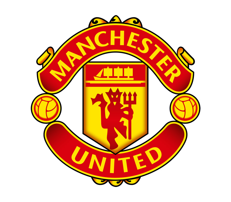
The Manchester United logo is a shield-shaped emblem featuring a red devil holding a trident, a sailing ship, and the club’s name in gold and red. Officially adopted in its current form in 1998, the crest draws from Manchester’s civic heraldry and the club’s “Red Devils” nickname.
Design Type: Emblem (combination of shield, mascot, and text)
Primary Elements: A red devil figure holding a trident sits at the center of the shield. Above it, a sailing ship references Manchester’s historical connection to trade and the city’s coat of arms. A gold ribbon at the bottom carries the words “Manchester United.” The shield itself is divided into red and gold sections.
Official Introduction Date: The current version was introduced in 1998, though its basic structure dates back to the 1960s redesign under Sir Matt Busby’s era.
Designer/Agency: The original devil motif was adopted in the early 1970s. The 1998 refinement was handled internally by the club. No single external agency is publicly credited with the full design.
Trademark Status: The logo is a registered trademark of Manchester United Football Club Ltd. It is protected under UK and international intellectual property law.
Color Palette:
- United Red – #DA291C
- Gold/Yellow – #FBE122
- Black – #000000
- White – #FFFFFF
Usage Context: The badge appears on matchday kits, training gear, official merchandise, digital platforms, stadium signage at Old Trafford, broadcasting graphics, and all licensed products worldwide.
How Has the Manchester United Logo Evolved Over Time?

The Manchester United badge has been redesigned at least seven times since the club’s founding in 1878. Early versions reflected the club’s original identity as Newton Heath LYR.
The shift toward the red devil motif came in the 1960s and 1970s. Each version after that refined the shield layout, the devil figure, and the typography surrounding it.
Newton Heath LYR Badge (1878-1902)
Years Active: 1878 to 1902
Design Description: The original badge was simple. It carried the initials of the Lancashire and Yorkshire Railway, the company whose workers formed the team. There was no devil, no ship, nothing fancy. Just functional lettering on team materials.
Color Scheme: Green and gold, which were the original team colors. Most people don’t know that. United wasn’t always red.
Context: The club was a works team. The badge reflected that industrial, blue-collar identity. Football branding wasn’t really a concept yet.
Cultural Significance: It represented a community. Railway workers playing football together. The badge was more of a label than an identity piece.
Early Manchester United Badge (1902-1960s)
Years Active: 1902 to the early 1960s
Design Description: After the club was renamed Manchester United in 1902, the branding shifted. Early versions used simple text-based designs and, at times, incorporated elements from the Manchester city coat of arms, including the ship and the striped shield.
Color Scheme: Red and white became the dominant colors after the rename. The green and gold era was over.
Key Changes from Previous: The entire identity changed. New name, new colors, new direction. This was a full rebrand before anyone used that word.
Context: The club needed to separate itself from its railway origins. Manchester United sounded bigger, more ambitious. The badge had to match that.
The Devil Arrives (1960s-1973)
Years Active: Early 1960s to 1973
Design Description: This is where things get interesting. The club started using a badge influenced by the Manchester city arms, but with a growing association with the “Red Devils” nickname. Sir Matt Busby reportedly encouraged the devil imagery. The badge began incorporating a small devil figure, though it wasn’t yet the central piece.
Color Scheme: Red, white, and gold
Designer: The design evolved organically within the club rather than through a single commissioned project.
Cultural Significance: The Busby Babes, the Munich air disaster, the 1968 European Cup victory. This era was loaded with emotion. The badge started carrying real weight beyond just being a team marker.
The Classic Devil Crest (1973-1998)
Years Active: 1973 to 1998
Design Description: The red devil holding a trident became the central figure inside a shield. The ship sat above it. “Manchester United” wrapped around in a banner or ribbon. This is the version most fans from the 80s and 90s picture when they close their eyes.
Color Scheme: Bold red, gold, black, and white
Key Changes from Previous: The devil was now front and center. Not a side element, not subtle. It owned the badge.
Context: Football was becoming a massive commercial product. Clubs needed strong, recognizable crests for merchandise, TV broadcasts, and international marketing. This badge worked perfectly for that.
Cultural Significance: This version carried the club through the early Ferguson years, the birth of the Premier League, and the beginning of United’s global commercial expansion. It’s the badge on a lot of people’s first United shirt.
Current Manchester United Badge (1998-Present)
Years Active: 1998 to present
Design Description: The 1998 update removed the words “Football Club” from the badge. The devil, trident, ship, and shield all stayed but were cleaned up. Lines got sharper. Colors got more standardized. The overall shape became slightly more streamlined.
Color Scheme: United Red (#DA291C), Gold (#FBE122), Black (#000000), White (#FFFFFF)
Key Changes from Previous: Dropping “Football Club” was a big deal. It signaled that Manchester United saw itself as more than a football club. It was a global brand now.
Context: The late 1990s were peak commercial football. United was winning everything under Ferguson, and the badge needed to work on everything from jerseys to credit cards to video games.
Cultural Significance: This is the Treble-winning badge. The Beckham badge. The Ronaldo badge. It has become so tied to a specific era of dominance that any talk of changing it would probably cause a fan revolt.
What Do the Design Elements of the Manchester United Logo Mean?
Every element in the Manchester United crest has a specific reason for being there. The red devil represents the club’s nickname and competitive spirit.
The ship connects to Manchester’s trading history. And the shield format gives the whole thing a sense of tradition and authority that flat, modern logos just can’t replicate.
What Does the Red Devil Symbolize?
The red devil holding a trident is the focal point of the entire badge. It comes from the club’s nickname, “Red Devils,” which was adopted in the early 1960s.
Sir Matt Busby liked the name after hearing it used for a rugby league team from Salford. The devil represents aggression, fearlessness, and a willingness to fight.
It’s not subtle. And that’s the point. The figure’s posture and the trident add a layer of authority that goes beyond just a fun mascot. This is about identity.
What Does the Ship Represent?
The ship sitting above the devil comes directly from the coat of arms of the City of Manchester. It references the city’s history as a major trading hub, particularly through the Manchester Ship Canal.
Including it in the badge ties the club to its city. It’s a geographic anchor. You see the ship and you know this club belongs to Manchester, not just to football fans around the world.
Why Did Manchester United Choose These Specific Colors?
The red comes from the club’s kit, which has been red since around 1902. In terms of color psychology, red communicates energy, passion, and aggression. It’s not a coincidence that so many dominant sports teams use it.
United Red (#DA291C): The primary color. It carries emotional intensity and has become synonymous with the club’s identity worldwide. It belongs in the broader family of red logos that dominate sports and entertainment branding.
Gold/Yellow (#FBE122): Used for the banner, lettering, and trim. Gold implies prestige and success. For a club with 20 league titles and multiple European trophies, it fits. You see similar gold usage in gold logos across luxury and heritage brands.
Black (#000000): Outlines and structural elements. Black gives the badge definition and makes it pop against any background. It’s a grounding color.
White (#FFFFFF): Background elements and accents. It provides contrast and keeps the design readable at small sizes.
What Typography Style Is Used in the Manchester United Logo?

The lettering on the current badge uses a custom serif font style. It’s bold and compact, designed to fit inside the ribbon at the bottom of the shield.
The serifs give it a classical, established feel. You wouldn’t use a sans-serif font here because it would clash with the heraldic style of the rest of the crest.
Readability at small sizes was clearly a consideration. The letters are spaced tightly but not so much that they blur together on a badge that might be only a few centimeters wide on a shirt.
What Are the Hidden Meanings in the Manchester United Logo?

There’s no secret arrow like the FedEx logo or anything like that. But the layout itself tells a story if you look closely.
The ship sits above the devil, which some interpret as the city being bigger than the club. The devil faces forward with the trident pointed upward, suggesting ambition and forward motion.
The shield shape connects the club to a tradition of heraldic design that goes back centuries. It’s a deliberate choice to feel institutional rather than trendy. Designers who understand the psychology of shapes know that shields communicate protection, loyalty, and belonging.
How Does the Manchester United Logo Compare to Competitor Logos?
Most top English football clubs use some form of shield or circular crest. The Liverpool logo centers on the Liver bird and uses a memorial flame for the Hillsborough disaster. The Arsenal logo went through a major simplification in 2002, moving to a cleaner, more modern cannon design.
The Chelsea logo has bounced between ornate and simple across its history. Manchester City’s logo went through a significant return to heritage in 2016, bringing back the circular crest with the ship and eagle.
United’s badge stands out because it hasn’t been dramatically overhauled in decades. While other clubs have gone through multiple redesigns chasing modern trends, United has mostly left theirs alone. That consistency is worth something. Fans recognize it instantly, and it doesn’t need to be “updated” to stay relevant.
Compared to clubs like Tottenham Hotspur, which uses a clean cockerel icon, or Newcastle United, which features seahorses and a castle, the Man United badge is busier. But it works because every element earns its place.
What Are the Technical Specifications of the Manchester United Logo?
Official Color Codes
Primary – United Red
Secondary – Gold
- Hex: #FBE122
- RGB: (251, 225, 34)
- CMYK: (0, 10, 86, 2)
- Pantone: 109 C
Tertiary – Black
- Hex: #000000
- RGB: (0, 0, 0)
- CMYK: (0, 0, 0, 100)
Accent – White
- Hex: #FFFFFF
- RGB: (255, 255, 255)
- CMYK: (0, 0, 0, 0)
Dimensions and Proportions
The badge uses a roughly 1:1.2 width-to-height aspect ratio due to the shield shape. It’s taller than it is wide.
For merchandise and print applications, minimum size requirements typically ensure the devil and ship remain distinguishable. At very small sizes (under 20mm), a simplified version or just the devil icon is sometimes used.
Clear space around the badge is usually equal to the height of the “M” in “Manchester” on all sides. The club’s brand guidelines specify exact padding, color variations for dark and light backgrounds, and approved single-color versions for situations where full color isn’t possible.
What Cultural Impact Has the Manchester United Logo Had?

The Manchester United crest is one of the most tattooed, replicated, and displayed sports logos on Earth. It shows up in pubs from Lagos to Bangkok. Kids who’ve never been within 5,000 miles of Old Trafford wear it on their shirts.
That kind of reach changes what a logo means. It stops being just a club badge and becomes a cultural marker, a signal of identity and allegiance that crosses language barriers.
The badge has also become a flashpoint during ownership disputes. Fans protesting the Glazer family’s ownership adopted green and gold scarves (the Newton Heath colors) as a deliberate rejection of the current branding. So the logo has become political, too. It represents not just the club but who controls it.
How Does the Manchester United Logo Fit Into the Overall Brand Identity?
The badge is the anchor. Everything else in the Manchester United brand ecosystem connects back to it. Kit designs by adidas feature it prominently. The Old Trafford stadium uses it across signage, seating, and tunnel branding.
Digital platforms, social media profiles, the official app. All of it centers on the crest. Even sub-brands like Manchester United Women and the academy teams use modified versions of the same badge.
The color palette from the badge dictates everything. Website design, merchandise packaging, stadium interiors. Red and gold run through all of it. The club’s brand style guide ensures consistency across hundreds of licensing partners and thousands of products worldwide.
This kind of tight brand control is what separates top clubs from the rest. The badge isn’t just decoration. It’s the foundation of a brand valued in the billions.
How Should the Manchester United Logo Be Used?
Official Usage Guidelines
Do:
- Use official logo files provided through Manchester United’s licensing team
- Maintain clear space around the badge as specified in the brand guidelines
- Use approved color variations (full color, single color white, single color black) based on background
- Keep the badge proportions locked (no stretching or squishing)
Don’t:
- Alter the colors outside of approved variations
- Add effects like drop shadows, gradients, or outlines that aren’t in the original
- Place the badge on visually busy backgrounds where it loses readability
- Recreate the badge from scratch or use unofficial versions pulled from image searches
Accessing Official Logos
Licensed partners receive logo files directly from Manchester United’s brand and licensing department. These come in vector graphics formats (AI, EPS, SVG) for scalable use and raster formats (JPEG, PNG) for digital applications. High DPI versions are provided for print.
Trademark and Licensing
The Manchester United crest is a registered trademark. Unauthorized commercial use will get you a cease and desist letter. Fan sites and editorial use fall under different rules, but selling products with the badge on them without a license is a fast way to get into legal trouble.
The club actively monitors and enforces its intellectual property globally. If you need the logo for a commercial project, go through official licensing channels. There’s no shortcut here, and honestly there shouldn’t be.
FAQ on The Manchester United Logo
What does the Manchester United logo look like?
The Manchester United logo is a shield-shaped emblem with a red devil holding a trident at its center. A sailing ship sits above the devil. Gold ribbons carry the club name, and the whole thing uses red, gold, black, and white.
Why is there a devil on the Manchester United badge?
The devil comes from the club’s Red Devils nickname. Sir Matt Busby adopted it in the early 1960s after hearing it used by a Salford rugby league team.
The figure represents competitive aggression and fearlessness on the pitch.
What does the ship on the Man United crest mean?
The ship is pulled directly from the Manchester city coat of arms. It references the city’s trading history and the Manchester Ship Canal.
It ties the football club to its home city. A geographic marker inside the badge.
When was the current Manchester United emblem introduced?
The current version launched in 1998. The club removed “Football Club” from the design, signaling a shift toward global brand identity. The core elements like the devil, ship, and shield stayed intact from earlier versions.
Has Manchester United ever changed its logo?
Yes. The badge has gone through roughly seven redesigns since 1878. It started as a simple railway works badge for Newton Heath LYR.
The devil motif appeared in the 1960s. Each update refined the visual identity without scrapping it entirely.
What are the official colors of the Manchester United logo?
United Red (#DA291C), Gold (#FBE122), Black (#000000), and White (#FFFFFF). Red dominates the shield. Gold handles the lettering and trim.
These colors match the club’s kit and run through all official merchandise and stadium branding at Old Trafford.
Who designed the Manchester United logo?
No single designer or agency is publicly credited. The badge evolved through internal club decisions over decades. The devil motif grew organically from the Red Devils nickname during the Busby era, and the 1998 refinement was handled in-house.
Can I use the Manchester United logo for my own project?
Not commercially. The crest is a registered trademark of Manchester United Football Club Ltd. Unauthorized use on products will result in legal action.
Licensed partners get official files through the club’s brand department. Editorial and fan use follows different rules.
What makes the Manchester United badge different from other Premier League club crests?
Consistency. While clubs like Leeds United and Leicester City have overhauled their badges, United has kept the same core design for decades. The devil is instantly recognizable, and the heraldic shield format feels rooted rather than trendy.
Where can I download an official Manchester United logo file?
Official logo files are only available through Manchester United’s licensing team. They provide vector and raster formats for approved partners.
Pulling logos from random image searches gives you low-quality, unofficial versions. Always go through proper channels for commercial work.
Conclusion
The Manchester United logo has survived decades of redesigns, ownership changes, and shifting football culture without losing what makes it work. That red devil on a shield still hits the same way it did in the Ferguson era.
Few Premier League club emblems carry this much history in a single badge. The ship, the trident, the gold lettering. Every piece connects to something real about Manchester and the club’s identity.
Whether it’s stitched on an adidas kit or displayed across Old Trafford’s facade, the MUFC crest remains one of the most recognizable pieces of sports branding globally.
It doesn’t need a rebrand. It just needs to keep winning trophies worthy of it.

Renowned for his expertise in logo design and visual branding, Bogdan has developed a multitude of logos for various clients.
His skills extend to creating posters, vector illustrations, business cards, and brochures. Additionally, Bogdan's UI kits were featured on marketplaces like Visual Hierarchy and UI8.
He also wrote in the past years on sites like Design Your Way, WebDesignerDepot, WPDean, Designmodo, Speckyboy, Slider Revolution, and more.
- Canva vs PowerPoint: Which Is Better for Presentations? - 22 September 2026
- How to Install Fonts on Mac (Step-by-Step Guide) - 20 September 2026
- From Mockup to Code: How AI-Augmented Development Speeds Up the Design Handoff - 19 September 2026

Bogdan Sandu is a seasoned designer who has been designing websites since 2008. Renowned for his expertise in logo design and visual branding, Bogdan has developed a multitude of logos for various clients. His skills extend to creating posters, vector illustrations, business cards, and brochures. Additionally, Bogdan's UI kits were featured on marketplaces like Visual Hierarchy and UI8. He also wrote in the past years on sites like Design Your Way, WebDesignerDepot, WPDean, Designmodo, Speckyboy, Slider Revolution, and more.
You Might Also Like


