


The Southampton logo is one of the most recognized club crests in English football. It belongs to Southampton Football Club, a professional team founded in 1885 in Hampshire, England. The club originally started as St. Mary’s Church Young Men’s Association, which is where the nickname “The Saints” comes from.
Within the larger picture of sports branding, the Southampton badge sits among a tradition of English football crests that lean heavily on local identity and heraldry. Unlike tech company logos that chase minimalism, football club badges tend to pile on symbols and meaning. Southampton’s is no exception.
The current version of the crest, in use since 2011, features a shield divided into sections with a halo, football, scarf, tree, waves, and the Hampshire Rose. Rolland Parris designed the original version of this badge in 1974 after winning a fan competition. The club has had roughly four distinct logo phases since its founding, though only two are considered truly unique crests.
What Is the Southampton Logo?

The Southampton logo is a combination mark featuring a shield-shaped crest topped by a football with a halo and wrapped in a red and white scarf. Designed originally by Rolland Parris in 1974, it represents the club’s religious origins, its connection to the city’s maritime history, and the surrounding New Forest landscape.
Here are the key attributes of the current Southampton badge:
- Design Type: Combination mark (emblem with text)
- Primary Elements: Shield, halo, football, scarf, tree, waves, Hampshire Rose, club name
- Official Introduction Date: Current version introduced in 2011, based on the 1974 original
- Designer: Rolland Parris (original 1974 design), with later refinements by the club’s in-house team
- Trademark Status: Registered trademark of Southampton Football Club
- Color Palette: Red (#D71920), Black (#130C0E), Yellow/Gold (#FFC20E), Blue (#00AEEF), Green (#0DB14B), White (#FFFFFF)
- Usage Context: Match kits, merchandise, stadium signage, digital platforms, official correspondence, and broadcast media
How Has the Southampton Logo Evolved Over Time?

The Southampton badge has gone through four main phases since the club’s founding in 1885. It started with the city’s coat of arms, then moved to a custom fan-designed crest in 1974, received refinements in the mid-1990s, got a special anniversary edition in 2010, and returned to a cleaned-up version of the classic design in 2011.
The City Coat of Arms (1885-1974)
For nearly 90 years, Southampton didn’t have their own dedicated logo. They borrowed the coat of arms of the city itself.
The city’s arms featured a shield divided horizontally. The upper half was white with two red roses, and the lower half was red with a single white rose. These roses were linked to the Royal houses of Lancaster and York. The letters “SFC” appeared below the shield.
This crest was used mainly for official club documents and materials. It rarely appeared on players’ shirts during this period. The red and white color scheme, though, was already established as part of the club’s identity.
Worth noting: the city’s coat of arms dates back to the 13th century. So the Saints were essentially borrowing something with serious historical weight. It gave the club a connection to Southampton’s past as a fortress town and naval port, even if it wasn’t exactly unique to football.
The Rolland Parris Design (1974-1995)
Years Active: 1974-1995
In 1974, the club ran a competition for fans to design a proper badge. Rolland Parris won. His design was first used for the 1974/75 season, and it changed everything about how the club presented itself visually.
The new crest introduced every element that still appears on the badge today. From top to bottom: a halo (referencing “The Saints”), a vintage-style football, a red and white scarf, a green tree (representing the New Forest and Southampton Common), two blue wavy lines (the city’s maritime connections), and a white Hampshire Rose at the bottom.
The shield shape was more squared off than traditional heraldic shields. The color palette expanded significantly from the old red and white scheme. Blue, green, gold, and black all entered the mix.
This was the badge that accompanied some of the club’s greatest moments, including the famous 1976 FA Cup win against Manchester United under Lawrie McMenemy.
The Mid-1990s Refinement (1995-2010)
Years Active: 1995-2010
In the mid-1990s, the club made a relatively subtle but deliberate change. The vintage football at the top of the crest was swapped out for a modern black and white paneled ball. This was done partly for copyright reasons.
The overall composition stayed the same. The contours of the design became more defined and polished. The gold lettering beneath the shield switched to a more refined serif typeface with clean, angular lines.
The Hampshire Rose got bolder outlines. The scarf stripes became wider and more distinct. And the general feel shifted from a hand-drawn look to something that reproduced better on merchandise and television broadcasts. It was a cleanup job rather than a rethink, which is the smart way to handle something fans already feel attached to.
The 125th Anniversary Crest (2010-2011)
Years Active: 2010-2011
For the club’s 125th anniversary, Southampton released a special edition crest. The black outlines and halo turned gold. The dates “1885” and “2010” flanked the shield. And the football was replaced by a three-dimensional red sphere with “125” on it.
This was a limited-run design. It appeared on a special anniversary kit that paid tribute to the original St. Mary’s Y.M.A. strip from 1885. The kit had no sponsor logo, which was a nice touch.
The anniversary crest added some gradient effects and glossy finishes to the existing design. It looked good on screen and in print, but it was never meant to be permanent. Just a celebration.
The Current Southampton Logo (2011-Present)
Years Active: 2011 to present
After the anniversary season, the club returned to its traditional crest. But not exactly the same one.
The 2011 version is basically the mid-1990s design with modernized contours. Lines are crisper. The details are slightly bolder. The gold lettering “Southampton F C” sits beneath the shield on a black background. The overall composition is identical to what Rolland Parris created back in 1974, just refined for the current era.
This is the version fans see today at St Mary’s Stadium, on kits, and across all digital and print materials.
What Do the Design Elements of the Southampton Logo Mean?
Every piece of the Southampton crest ties back to the club’s history, its city, or its surrounding region. Nothing is decorative for the sake of it. The badge reads like a story from top to bottom, starting with the religious origins and ending with the local landscape.
Why Did Southampton Choose These Specific Colors?

The red and white combination goes all the way back to the club’s earliest days. Those were the team’s playing colors from the start, inherited from the St. Mary’s Church connection.
Red (#D71920, Pantone PMS 032 C) is the primary color. It represents the club’s energy and the “red” half of the city’s coat of arms, which traces back to the House of Lancaster.
Black (#130C0E, Pantone PMS Black 6 C) provides the structural outlines and text background. It grounds everything and gives the badge definition at small sizes.
Yellow/Gold (#FFC20E, Pantone PMS 7408 C) is used for the lettering and details. It adds a classic, almost regal quality to the crest.
Blue (#00AEEF, Pantone PMS 299 C) appears in the wavy lines representing Southampton’s maritime identity. Green (#0DB14B, Pantone PMS 7481 C) shows up in the tree for the New Forest.
These secondary colors were all introduced with Parris’s 1974 design. Before that, it was just red and white. The expanded palette gave the badge depth without losing the core identity that fans associated with the club. Understanding color theory helps explain why this mix works. The warm reds and golds draw attention, while the cooler blues and greens add context without competing.
What Typography Style Is Used in the Southampton Logo?

The club name appears in a custom font that closely resembles Century Schoolbook Bold, a typeface designed by Morris Fuller Benton.
It has strong serifs, consistent stroke widths, and sharp angles. The letters sit in gold against a black banner below the shield. Readability was a clear priority here, even at smaller reproduction sizes.
This typographic choice fits the overall character of the badge. It feels established and traditional without being stuffy. The earlier versions of the crest used slightly different lettering, but the serif approach has been consistent since the mid-1990s refinement.
What Are the Hidden Meanings in the Southampton Logo?
The halo at the very top isn’t just decoration. It directly references the club’s nickname, “The Saints,” which comes from the St. Mary’s Church roots. It’s the first thing your eye hits.
The two wavy blue lines don’t simply represent the sea. They actually refer to Southampton’s unique double tide (caused by the Isle of Wight’s position), which made the city such an important port. The Mayflower and the Titanic both departed from Southampton, and those lines carry that whole maritime story.
The Hampshire Rose at the bottom of the shield connects to the city’s coat of arms, linking the modern badge back to the pre-1974 identity. The tree representing the New Forest is a nod to the 150 square miles of ancient woodland nearby, protected since William the Conqueror’s time. Each element serves double duty, connecting both to the club and to the wider community around it.
How Does the Southampton Logo Compare to Competitor Logos?

Among English football crests, Southampton’s badge is on the more detailed end. It packs a lot of symbolism into a compact shield, which is quite different from the approaches taken by rivals and peers.
The Bournemouth logo uses a simpler, more modern approach. Crystal Palace’s badge leans into its eagle mascot as the main feature. And cross-city rival Portsmouth uses a star and crescent moon, which is a completely different visual language.
Other Premier League and Championship badges like Wolverhampton Wanderers and Burnley share the shield format but with fewer internal elements. Leicester City built their identity around a single animal, while Newcastle United went with a more heraldic approach using seahorses.
Where Southampton stands apart is the vertical stacking of symbols. Most clubs arrange their elements horizontally or center them around one dominant image. The Saints’ badge reads top-to-bottom like a column of meaning, which gives it a distinct visual rhythm you don’t see much elsewhere.
What Are the Technical Specifications of the Southampton Logo?
Official Color Codes
- Red – Hex: #D71920, RGB: (215, 25, 32), CMYK: (0, 86, 63, 0), Pantone: PMS 032 C
- Black – Hex: #130C0E, RGB: (19, 12, 14), CMYK: (71, 67, 64, 75), Pantone: PMS Black 6 C
- Yellow/Gold – Hex: #FFC20E, RGB: (255, 194, 14), CMYK: (0, 29, 100, 0), Pantone: PMS 7408 C
- Blue – Hex: #00AEEF, RGB: (0, 174, 239), CMYK: (86, 8, 0, 0), Pantone: PMS 299 C
- Green – Hex: #0DB14B, RGB: (13, 177, 75), CMYK: (78, 1, 99, 0), Pantone: PMS 7481 C
- White – Hex: #FFFFFF, RGB: (255, 255, 255), CMYK: (0, 0, 0, 0)
Dimensions and Proportions
The badge uses a vertical orientation with the shield as its core structure. The halo, football, and scarf extend above the shield’s top edge. The club name text sits in a separate banner below.
For digital use, the logo is distributed as vector graphics in SVG format, which keeps it sharp at any size. Bitmap versions in JPEG and PNG formats are also available for web and print applications. The DPI should be set to at least 300 for print materials to keep the fine details crisp.
Clear space around the logo should match at least the width of the halo element on all sides. This prevents other visual elements from crowding the badge and losing its detail at smaller sizes.
What Cultural Impact Has the Southampton Logo Had?
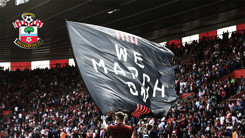
The Southampton crest has become deeply embedded in the identity of the city itself, not just the football club. For supporters, it represents a direct line back to 1885 and the St. Mary’s Church origins.
You see it on tattoos, pub signs, car stickers, and painted on walls around the city. It’s one of those badges that locals identify with even if they’re not die-hard match-going fans. The halo in particular has become shorthand for “Saints” in a way that transcends football.
During the club’s financial difficulties in the late 2000s, when Southampton dropped into League One, the badge became a rallying symbol for fans fighting to save the club. It showed up on protest banners and campaign materials. That kind of thing tells you a logo has moved past being just a graphic. It means something personal to people.
How Does the Southampton Logo Fit Into the Overall Brand Identity?
The badge is the anchor point for everything else in Southampton’s visual system. The red and white kit stripes mirror the scarf element in the crest. The club’s brand guidelines dictate how the badge sits alongside sponsor logos, on merchandise, and across digital platforms.
St Mary’s Stadium uses the crest prominently across its entrance, seating areas, and broadcast-facing positions. The gold lettering from the badge carries through to signage and wayfinding throughout the ground.
Even the club’s youth academy and community programs use modified versions of the same badge, keeping everything connected. It’s a single visual thread that ties the whole organization together, from the first team down to the under-9s.
How Should the Southampton Logo Be Used?
Southampton FC controls the usage of its badge through trademark registration. The crest is a registered trademark, and any commercial use requires written permission from the club.
Official usage guidelines include:
- Never alter the colors or proportions of the badge
- Maintain minimum clear space around the logo at all times
- Don’t place the badge on backgrounds that make any element hard to read
- Use only approved file formats provided by the club
- Fan-created content for personal, non-commercial use is generally tolerated, but selling merchandise with the badge without a license is not
Official logo files can be accessed through the club’s media department or authorized licensing partners. For press and editorial use, the club typically provides assets through its communications team.
If you’re creating fan content, stick to sourcing images from the club’s official channels rather than pulling low-resolution versions off search engines. The badge has a lot of fine detail, and a blurry version doesn’t do it justice.
FAQ on The Southampton Logo
What does the Southampton FC badge represent?
The Southampton FC crest represents the club’s origins at St Mary’s Church, its connection to the city’s maritime history, and the New Forest region. Each element on the shield tells part of that story, from the halo down to the Hampshire Rose.
Who designed the current Southampton logo?
Rolland Parris created the original design in 1974 after winning a fan competition. The club refined his work in the mid-1990s and again in 2011, but the core layout hasn’t changed. His composition is still what you see on every Saints shirt today.
What do the colors in the Southampton crest mean?
Red and white trace back to the club’s earliest playing kits. Gold adds a traditional feel to the lettering. Blue represents Southampton’s port connections, and green stands for the nearby New Forest. The full color psychology behind the badge ties each shade to local identity.
Why is there a halo on the Southampton badge?
The halo references the club’s nickname, “The Saints.” That name comes from the founding at St Mary’s Church in 1885. It sits at the very top of the crest, making it the first thing people notice about the club emblem.
What does the tree on the Southampton logo symbolize?
The green tree represents the New Forest and Southampton Common. It’s 150 square miles of ancient woodland near the city. William the Conqueror gave it royal protection nearly a thousand years ago, and it remains a defining feature of Hampshire.
Has Southampton ever changed their logo completely?
Only once. Before 1974, the club used the city of Southampton’s coat of arms. The fan-designed badge replaced it entirely. Since then, updates have been refinements rather than full redesigns. The 2010 anniversary version was temporary.
What is the rose at the bottom of the Southampton crest?
That’s the Hampshire Rose. It appears on the city’s coat of arms too, dating back centuries. The red and white roses link to the Houses of Lancaster and York. Including it kept a thread between the new badge and the club’s pre-1974 identity.
What font does the Southampton logo use?
The club uses a custom font similar to Century Schoolbook Bold, designed by Morris Fuller Benton. It features strong serifs and clean angles. The gold lettering sits on a black banner beneath the shield, built for typographic clarity at any size.
What do the wavy blue lines mean on the Southampton badge?
They represent Southampton’s importance as a port city. The lines also reference the city’s unusual double tide caused by the Isle of Wight. Both the Mayflower and the Titanic departed from Southampton, which makes those waves carry real weight.
Can I use the Southampton logo for my own projects?
Not commercially. The badge is a registered trademark of Southampton Football Club. Any commercial use needs written permission. Fan content for personal use is generally fine, but selling merchandise with the crest without a license will get you in trouble.
Conclusion
The Southampton logo is one of the few English football badges that genuinely tells a complete story. From the halo at the top to the Hampshire Rose at the base, every element connects to something real about the club and the city it calls home.
Rolland Parris got it right in 1974. Over fifty years later, the Saints badge still works because it was built on meaning, not trends.
The crest carries the weight of St Mary’s Stadium matchdays, the red and white stripes, and a community that stuck with the club through League One and back. That kind of storytelling through design is hard to fake.
For fans and designers alike, it remains a strong example of how a football club emblem can hold both local pride and lasting design principles together in a single shield.

Renowned for his expertise in logo design and visual branding, Bogdan has developed a multitude of logos for various clients.
His skills extend to creating posters, vector illustrations, business cards, and brochures. Additionally, Bogdan's UI kits were featured on marketplaces like Visual Hierarchy and UI8.
He also wrote in the past years on sites like Design Your Way, WebDesignerDepot, WPDean, Designmodo, Speckyboy, Slider Revolution, and more.
- Jujutsu Kaisen Font Generator - 12 October 2026
- The Windsurf Logo History, Colors, Font, And Meaning - 10 October 2026
- How to Remove Background From Product Photos (No Photoshop) - 10 October 2026

Bogdan Sandu is a seasoned designer who has been designing websites since 2008. Renowned for his expertise in logo design and visual branding, Bogdan has developed a multitude of logos for various clients. His skills extend to creating posters, vector illustrations, business cards, and brochures. Additionally, Bogdan's UI kits were featured on marketplaces like Visual Hierarchy and UI8. He also wrote in the past years on sites like Design Your Way, WebDesignerDepot, WPDean, Designmodo, Speckyboy, Slider Revolution, and more.
You Might Also Like


