


The Reading logo is one of the more underrated football badges in English football. It belongs to Reading Football Club, a professional side based in Reading, Berkshire, founded on Christmas Day 1871.
The club competes in EFL League One and carries the nickname “The Royals,” a nod to the Royal County of Berkshire.
The current badge, introduced for the 1998-99 season, is a circular crest built around local heritage. It features the Maiwand Lion, a crown, blue and white hoops, and the club’s founding year.
Cream Design, a local agency, redesigned the badge to coincide with the club’s move from Elm Park to the Madejski Stadium. Reading has had roughly five distinct badge versions since 1953.
What Is the Reading FC Logo?
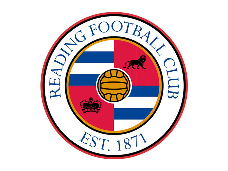
The Reading FC logo is a circular crest featuring the Maiwand Lion, a crown representing the Royal County of Berkshire, and blue and white quadrants reflecting the club’s traditional kit colors. It was introduced in 1998 by Cream Design and carries the text “Reading Football Club” along its outer ring.
Here is a breakdown of the badge’s key attributes:
- Design Type: Combination mark (roundel with text and imagery)
- Primary Elements: Maiwand Lion, royal crown, blue and white hooped quadrants, old-style panelled football, founding date (1871)
- Official Introduction Date: 1998-99 season
- Designer/Agency: Cream Design, Reading
- Trademark Status: Registered to Reading Football Club
- Color Palette: Royal Blue (#004494), White (#FFFFFF), with gold and red accents in the crown and lion details
- Usage Context: Match kits, stadium signage, digital platforms, merchandise, official stationery, and broadcast graphics
How Has the Reading FC Logo Evolved Over Time?

The Reading FC badge has gone through five major versions since the 1950s, each tied to a specific era in the club’s history. Early crests borrowed from the Borough of Reading coat of arms, while later designs reflected changes in kit colors, stadium moves, and ownership ambitions.
Borough Coat of Arms Era (Pre-1953)
Years Active: Pre-1953 (match programs and stationery only)
Reading’s first club emblem was never actually worn on shirts. It appeared on match day programs and headed paper, using the Borough of Reading coat of arms. These arms traced back to the town’s common seal from as early as 1365.
The design included an Abbot’s mitre with gold escallop shells and lyres. Two rams acted as supporters, representing Reading’s early wool trade. Wavy lines stood for the Thames and Kennet rivers.
The motto “A DEO ET REGINA” translated to “With God and Queen.” It was formal, heraldic, and had almost nothing to do with football. But it established a link between the club and the town’s deeper history.
The “R” Badge (1953-1954)
Years Active: 1953-1954 (one season on kits)
The first crest to actually appear on a Reading shirt was about as minimal as it gets. Just the letter “R” on a shield. That was it.
No rivers, no trees, no lions. Look, sometimes design is less about creativity and more about getting something on the jersey before Saturday. This was one of those moments.
It lasted a single season and then disappeared entirely. Reading wouldn’t feature another crest on their kits until 1981.
Elm Trees and Rivers Badge (1981-1983)
Years Active: 1981-1983
This badge brought in three elm trees, a reference to the club’s Elm Park ground where they had played since 1896. Wavy lines underneath represented the Thames and Kennet, keeping that connection to Reading’s geography alive.
The club name and founding year sat at the base. It was clean, local, and had a sense of place. But it only lasted two seasons before the club changed direction.
The timing matters here. Reading nearly went out of business in 1982-83. Plans were floated to merge with Oxford United under Robert Maxwell’s ownership to form “Thames Valley Royals.” Fans killed that idea, thankfully.
The Branfoot Shield (1987-1996)
Years Active: 1987-1996
During the 1980s, club manager Ian Branfoot designed a new badge. It used an Italian-style shield format with royal blue, light blue, yellow, and white. These were the club’s kit colors at the time (yes, Reading once wore yellow).
The design retained the club name and formation date but dropped the elm tree imagery. It looked modern for its era, though the color choices have aged in a way that divides opinion among older fans.
When John Madejski bought the club in 1990, things started shifting. The traditional blue and white hooped shirts came back in 1992 after supporter pressure. The badge, though, stuck around a bit longer.
Elm Park Farewell Badge (1996-1998)
Years Active: 1996-1998
For the final seasons at Elm Park, Reading brought back a design based on the 1981 crest. Elm trees and rivers returned. A banner below read “ELM PARK 1896-1998,” marking the centenary of the ground and its impending closure.
It was sentimental. It was supposed to be. The club was saying goodbye to 102 years at the same address.
Current Badge (1998-Present)
Years Active: 1998-present
The current Reading logo arrived with the move to the Madejski Stadium. Sir John Madejski himself pushed for a new crest, saying traditionalists should “bear in mind the need to move forward.”
Cream Design created the roundel format. The outer circle carries “Reading Football Club” in uppercase with “EST. 1871.” Inside, four quadrants hold the key symbols: the Maiwand Lion, a crown, and the club’s blue and white hooped colors. A vintage panelled football sits at the center.
This badge has now outlasted every previous version combined. It has been on Premier League kits, Championship promotions, and the less glamorous League One seasons too.
What Do the Design Elements of the Reading FC Logo Mean?
Every part of the Reading FC badge connects to something local. The lion is a war memorial. The crown ties to Berkshire’s royal status. The colors are the club’s DNA. Nothing in this design is decorative filler.
Why Did Reading FC Choose These Specific Colors?
Royal blue and white have been Reading’s colors since their earliest days, when they wore navy and white hooped jerseys. The blue represents loyalty and tradition, while white provides the clean contrast that makes the hoops so recognizable on the pitch.
The specific blue used is a deep royal shade (#004494, Pantone PMS 7687 C). In CMYK that translates to 100, 84, 11, 1. The white is standard (#FFFFFF).
Gold accents appear in the crown, and the lion carries warm tones that add depth without fighting the primary palette. These accent colors support the “Royal” identity without overcomplicating the color palette.
The blue and white hoops have emotional weight. Fans campaigned in the early 1990s to bring them back after the club experimented with other combinations. That campaign worked, and the colors were restored in 1992, well before the current badge even existed.
What Typography Style Is Used in the Reading FC Logo?
The font used in the Reading FC badge is Perpetua Roman, designed by Eric Gill and published by Monotype. It is a serif typeface with clean, classic letterforms.
The choice fits. Perpetua has that British institutional quality without feeling stuffy. The uppercase “READING FOOTBALL CLUB” around the outer ring reads clearly at small sizes, which matters for merchandise and broadcast.
Serif fonts carry associations with heritage and stability, and that is exactly what the club wanted when designing a badge for a new stadium era. You want something that says “we have been here since 1871” while also looking fresh enough for the 21st century.
What Are the Hidden Meanings in the Reading FC Logo?
The Maiwand Lion is the biggest story here. It is not just a generic lion symbol. It is a direct representation of a 16-ton cast iron statue that stands in Forbury Gardens, a public park in central Reading.
That statue, sculpted by George Blackall Simonds and unveiled in 1886, commemorates 329 men from the 66th Berkshire Regiment who died in the Second Anglo-Afghan War. At the time of its unveiling, it was the largest standing lion statue in the world.
The crown represents Berkshire’s royal county status (Windsor Castle is located there). And the vintage panelled football at the center is a nod to the early days of the sport, the kind of heavy leather ball that players used to head in the rain. It is a subtle way of saying this club has deep roots in the game’s history.
How Does the Reading FC Logo Compare to Competitor Logos?
Reading’s main rivals include Swindon Town, Oxford United, and Wycombe Wanderers. Among this group, the Reading badge stands out for its roundel format and its specific use of local landmarks.
Most English lower-league clubs lean on heraldic shields or simple wordmarks. Reading’s circular design feels more complete. It shares some structural DNA with badges like Leicester City’s (also featuring a prominent animal figure), but the local specificity of the Maiwand Lion gives it a story that most competitors cannot match.
Compared to nearby clubs in similar divisions, Reading’s badge has a polish that reflects the ambitions the club had when it moved to a new stadium. Sunderland, for instance, uses a much more traditional shield layout. Derby County relies heavily on their ram mascot. Reading blends symbol and setting in a way that feels distinct.
The blue and white color scheme is shared by several English clubs, but few commit to the hooped pattern in their badge the way Reading does. That specific detail ties the crest directly to the kit, creating consistency that some tech company logos would envy for brand cohesion.
What Are the Technical Specifications of the Reading FC Logo?
Official Color Codes
- Primary Color: Royal Blue
- Hex: #004494
- RGB: (0, 68, 148)
- CMYK: (100, 84, 11, 1)
- Pantone: PMS 7687 C
- Secondary Color: White
- Hex: #FFFFFF
- RGB: (255, 255, 255)
- CMYK: (0, 0, 0, 0)
Dimensions and Proportions
The badge uses a 1:1 circular aspect ratio. The outer ring holds the club name and founding date, while the inner circular area is divided into four quadrants.
For digital use, the minimum recommended size is typically around 32 x 32 pixels for favicon applications, though detailed reproduction requires at least 200 x 200 pixels for the lion and crown to remain clear.
Clear space around the badge should be maintained at a minimum distance equal to approximately 10% of the badge’s total width. Official club guidelines govern usage across kit printing, stadium displays, digital platforms, and licensed merchandise.
What Cultural Impact Has the Reading FC Logo Had?

The Reading FC badge has become one of the most recognizable symbols in the town, almost rivaling the Maiwand Lion statue itself. By putting the lion on the crest, the club cemented a connection between football and local heritage that goes beyond sport.
During Reading’s 2006-07 Premier League season, the badge got national and international exposure for the first time. For many viewers, it was their introduction to the Forbury Lion and the story behind it.
The badge has also become a symbol of community resilience. Following the tragic events at Forbury Gardens in June 2020, the Maiwand Lion took on additional meaning as a symbol of “Reading Together.” The crest carried that weight with it.
It shows up on pub signs, local business branding, and community events throughout Berkshire. The psychology of shapes matters here. The circle communicates community and inclusion, while the lion projects strength.
How Does the Reading FC Logo Fit Into the Overall Brand Identity?

The badge sits at the center of everything Reading FC does, from matchday programs to digital content and merchandise. It works because the elements inside it, the lion, the crown, the hoops, all connect to real things about the club and its home.
Reading’s brand guidelines extend the badge into a full visual system. The royal blue dominates stadium signage, the club website, and social media templates. Cream Design has continued working with the club for over 20 years, handling everything from kit launches to billboard advertising.
The “Royals” nickname, the blue and white colors, the crown in the badge. These are not separate brand elements. They are all part of one story about a club tied to its county and its town. Your mileage may vary on how well smaller clubs manage their branding, but Reading has kept things consistent for over 25 years now. That counts for something.
How Should the Reading FC Logo Be Used?
- Do use the badge on its intended blue or white backgrounds. The full-color version works on both.
- Do maintain proper clear space around the badge, keeping it free from competing text or graphics.
- Don’t stretch, rotate, or alter the proportions of the badge. Circular logos break visually when even slightly distorted.
- Don’t change the official colors. The blue is #004494, not a lighter or darker shade.
- Don’t use the badge for commercial purposes without licensing from Reading Football Club.
Official badge files can typically be accessed through the club’s media department or their licensing partners. For editorial use, vector graphic formats (SVG, EPS) are available through official channels.
The badge is a registered trademark of Reading Football Club. Unauthorized reproduction, especially on merchandise, is subject to intellectual property enforcement. Fans creating non-commercial content generally have more flexibility, but commercial sellers need proper agreements in place.
FAQ on The Reading Logo
What does the Reading FC logo look like?
The Reading FC logo is a circular crest with four quadrants. It features the Maiwand Lion, a royal crown, blue and white hooped sections, and a vintage panelled football at the center. The outer ring carries the club name and “EST. 1871.”
When was the current Reading logo introduced?
The current badge debuted in the 1998-99 season. It was designed by Cream Design to mark the club’s move from Elm Park to the Madejski Stadium in Reading, Berkshire.
What do the colors in the Reading logo represent?
Royal blue (#004494) and white are the club’s traditional colors, used since their founding in 1871. The blue represents loyalty. Gold accents in the crown connect to Berkshire’s royal status. These color choices reflect specific psychological associations tied to the club’s identity.
What is the lion on the Reading FC badge?
It is the Maiwand Lion, based on a 16-ton cast iron statue in Forbury Gardens, Reading. Sculpted by George Blackall Simonds in 1886, it commemorates soldiers from the 66th Berkshire Regiment who died in the Second Anglo-Afghan War.
Who designed the current Reading FC crest?
Cream Design, a local branding agency in Reading, created the current badge. They have worked with Reading Football Club for over 20 years on brand style projects, kit campaigns, and stadium graphics.
What font is used in the Reading logo?
The badge uses Perpetua Roman, a typeface designed by Eric Gill and published by Monotype. It is a serif font with clean British character. Works well at small sizes on merchandise and broadcast.
How many logos has Reading FC had?
Reading has used roughly five distinct crests since 1953. Before that, the Borough of Reading coat of arms appeared on programs. Each redesign matched a shift in kit colors, stadium, or ownership.
What does the crown in the Reading badge mean?
The crown represents Berkshire’s status as a royal county. Windsor Castle sits within the county, which is why Reading carries the nickname “The Royals.” It is a direct connection between local geography and club brand identity.
Can I use the Reading FC logo for my own project?
Not without permission. The badge is a registered trademark of Reading Football Club. Commercial use requires a licensing agreement. Fan-made non-commercial content has more flexibility, but selling merchandise with the crest is not allowed without authorization.
Why did Reading FC change their logo in 1998?
The club moved to the Madejski Stadium and wanted a fresh start. Chairman Sir John Madejski pushed for a new logo design that balanced tradition with a modern look. The old Elm Park crests no longer fit the club’s direction.
Conclusion
The Reading logo is proof that a football badge can carry real weight when it is rooted in local history. The Maiwand Lion, the crown, the blue and white hoops. Every element ties back to something specific about Reading, Berkshire.
Few clubs at this level have maintained the same crest for over 25 years. That kind of consistency builds recognition across web and print platforms alike.
Whether the club is chasing promotion or grinding through League One, the badge stays the same. And that is exactly the point of good brand identity design. It holds up regardless of circumstance.

Renowned for his expertise in logo design and visual branding, Bogdan has developed a multitude of logos for various clients.
His skills extend to creating posters, vector illustrations, business cards, and brochures. Additionally, Bogdan's UI kits were featured on marketplaces like Visual Hierarchy and UI8.
He also wrote in the past years on sites like Design Your Way, WebDesignerDepot, WPDean, Designmodo, Speckyboy, Slider Revolution, and more.
- Jujutsu Kaisen Font Generator - 12 October 2026
- The Windsurf Logo History, Colors, Font, And Meaning - 10 October 2026
- How to Remove Background From Product Photos (No Photoshop) - 10 October 2026

Bogdan Sandu is a seasoned designer who has been designing websites since 2008. Renowned for his expertise in logo design and visual branding, Bogdan has developed a multitude of logos for various clients. His skills extend to creating posters, vector illustrations, business cards, and brochures. Additionally, Bogdan's UI kits were featured on marketplaces like Visual Hierarchy and UI8. He also wrote in the past years on sites like Design Your Way, WebDesignerDepot, WPDean, Designmodo, Speckyboy, Slider Revolution, and more.
You Might Also Like


