


The Sunderland logo is the official crest of Sunderland Association Football Club, a professional football club based in Tyne and Wear, England. Founded in 1879 by schoolmaster James Allan, the club has gone through roughly ten badge variations across its history. The current version, introduced in 1997 to mark the move from Roker Park to the Stadium of Light, is an heraldic emblem featuring a quartered shield, two black lions, regional landmarks, and a colliery wheel.
Within English football branding, the Sunderland crest sits alongside some of the most recognizable badges in the sport. Clubs like Liverpool, Arsenal, and Manchester United have all built identities through their crests over the decades. Sunderland’s badge is a combination mark that blends heraldic imagery with civic symbolism. The club was founded in 1879 and has used at least ten distinct badge designs since its first official emblem appeared in 1905.
What is the Sunderland Logo?
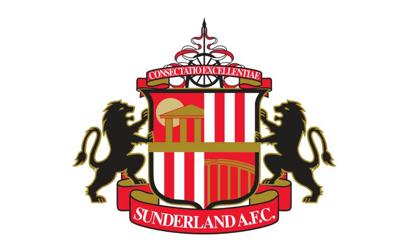
The Sunderland logo is an heraldic combination mark crest featuring a quartered red and white shield, two black lions as supporters, the Penshaw Monument, the Wearmouth Bridge, and a colliery wheel. It was introduced in 1997 when the club moved to the Stadium of Light.
Here are the defining attributes of the current Sunderland logo:
- Design Type: Combination mark with heraldic emblem structure. The badge combines iconography, typography, and symbolic imagery into a single unified crest.
- Primary Elements: A quartered shield with red and white vertical stripes, two black rampant lions, the Penshaw Monument (upper left), the Wearmouth Bridge (lower right), a colliery wheel above the shield, a scroll banner reading “Sunderland A.F.C.” below, and a Latin motto ribbon at the top.
- Official Introduction Date: 1997, coinciding with the club’s relocation from Roker Park to the Stadium of Light.
- Designer: The specific design agency has not been widely publicized by the club.
- Trademark Status: The crest is a registered trademark of Sunderland A.F.C. All commercial use requires official licensing from the club.
- Color Palette: Red (#EB172B), White (#FFFFFF), Black (#000000), and Gold accents on the motto and name ribbons.
- Usage Context: Match kits, training wear, official merchandise, the Stadium of Light signage, digital platforms, social media accounts, and all club communications.
How Has the Sunderland Logo Evolved Over Time?

The Sunderland badge has gone through roughly ten redesigns since 1905. Early versions featured a black cat. Mid-century designs introduced shield formats with ships and red-white stripes. The most significant overhaul came in 1997 with the current heraldic crest.
Original Sunderland Logo (1905-1913)
The club’s first official badge appeared in 1905 and centered around a black cat, a nod to the team’s nickname “The Black Cats.”
That nickname, by the way, traces back to a battery of artillery guns positioned along the River Wear during the Napoleonic Wars. The gun battery was called the “Black Cat Battery.” So the cat wasn’t just a cute mascot pick. It had real local roots.
This badge was relatively simple. A black cat sitting front and center. No shield, no elaborate framing. Just the cat. It lasted until 1913.
Heraldic Shield Badge (1913-1937)
In 1913, Sunderland adopted its first shield-shaped badge. This version borrowed heavily from the city’s coat of arms and included a knight’s helmet, feathers, a globe, a ribbon, and the Latin motto “Nil Desperandum Auspice Deo” (meaning “Don’t despair, in God we trust”).
It looked formal. Almost like something you would see on a civic building rather than a football shirt. But that was the style back then. Football clubs hadn’t yet separated themselves from the municipal identity of their home cities.
This design stayed in place through the club’s sixth league championship in 1936 and the FA Cup win in 1937.
Simplified Blue Shield (1937-1966)
The second shield design arrived in 1937. A blue crest with red and white lines surrounding it. The Latin motto stuck around, but the overall look was cleaner.
Still heraldic in nature, sure. But less cluttered than the 1913 version. The club kept this badge through some tough decades, including relegation from the top flight for the first time in 1958 after 68 years of continuous membership.
Letter-Based Badges (1966-1977)
Here is where things got stripped down. From 1966 to 1973, the club dropped the shield entirely and used a large “S” followed by “AFC.” No imagery at all.
Then from 1973 to 1977, they switched to just the initials “SAFC” in a cascading line. These were the club’s first badges without any shield element. Pretty bold for the time, honestly. Most English clubs were still leaning heavily on traditional crests.
The 1973 FA Cup Final win over Leeds United happened during this era. So while the badge was at its most minimal, the club was having one of its greatest moments.
Return to the Shield (1977-1997)
In 1977, the shield came back. The updated logo featured a quadrilateral shield with a pointed base and a black outline, split into two sections. The upper portion showed a ship on a blue background (Sunderland being a port city), while the lower section had a football with “A F C” lettered on it, set against red and white stripes taken from the team’s kit.
In 1972, there had been a brief version where the blue was swapped for black, making the whole thing feel heavier. That lasted only five years before the blue returned in a darker shade.
The serif font used for “Sunderland” on this badge was introduced around 1977 and remained in use moving forward. It is classified as a classic Antiqua typeface with short perpendicular strokes at the ends of each letter.
Current Sunderland Logo (1997-Present)
The 1997 redesign was the big one. The club moved from Roker Park to the Stadium of Light, and the badge was rebuilt from the ground up.
A quartered shield now sits at the center. Two of the four sections display red and white vertical stripes. The upper left section features the Penshaw Monument. The lower right shows the Wearmouth Bridge. Two black rampant lions flank the shield on either side, borrowed from the city of Sunderland’s coat of arms.
Above the shield sits a colliery wheel, a tribute to County Durham’s coal mining industry and the fact that the Stadium of Light was built on the site of the former Monkwearmouth Colliery. The mine operated until 1993.
At the top, a ribbon carries the club’s Latin motto: “Consectatio Excellentiae,” which translates to “In pursuit of excellence.” Below, another banner displays “Sunderland A.F.C.” in gold lettering.
What Do the Design Elements of the Sunderland Logo Mean?
Every element in the Sunderland crest carries specific meaning tied to the club, the city, or the region’s history. The shield’s red and white stripes reference the team’s home kit colors. The surrounding elements connect to Sunderland’s geography, industrial past, and civic identity.
Why Did Sunderland Choose These Specific Colors?
Red and white have been Sunderland’s primary kit colors since 1884. Before that, the club actually wore different colors entirely.
The psychology behind these color choices is interesting. Red communicates energy, passion, and aggression. White adds clarity and contrast. Together, they create a high-visibility pairing that works well on the pitch and translates cleanly to a badge.
The black used for the lions carries weight and authority in traditional heraldry. Gold on the lettering and ribbons adds a sense of prestige. These aren’t random color picks. They connect to both the club’s on-pitch identity and its civic symbolism.
Here are the official color codes used in the current badge:
- Sunderland Red: Hex #EB172B, RGB (235, 23, 43), CMYK (0, 90, 82, 8)
- White: Hex #FFFFFF, RGB (255, 255, 255), CMYK (0, 0, 0, 0)
- Black: Hex #000000, RGB (0, 0, 0), CMYK (0, 0, 0, 100)
- Gold: Used on motto and name ribbons as an accent color
What Typography Style Is Used in the Sunderland Logo?

The club has used the same general font style since 1977. It is an Antiqua-style serif with perpendicular strokes at the letter terminals.
The “Sunderland A.F.C.” text at the base of the crest appears in uppercase gold lettering on a red ribbon. It is clear and readable at small sizes, which matters when you are putting it on a kit badge that needs to hold up from a distance.
The Latin motto “Consectatio Excellentiae” at the top uses a similar serif style. Both pieces of text feel traditional, which is the right call for a club founded in 1879.
What Are the Hidden Meanings in the Sunderland Logo?
The Penshaw Monument that appears in the upper left of the shield is a half-scale replica of the Temple of Hephaestus in Athens. It sits on Penshaw Hill and was built in 1844 as a memorial to John George Lambton, the 1st Earl of Durham.
Local legend ties the hill to the Lambton Worm, a giant creature from northeast English folklore. Including the monument connects the club to a wider sense of regional identity that goes beyond just football.
The colliery wheel above the shield is easy to miss if you’re not looking for it. But it references the mining communities that formed so much of Sunderland’s identity for over a century. The Stadium of Light itself stands where Monkwearmouth Colliery once operated.
How Does the Sunderland Logo Compare to Competitor Logos?

Within English football, Sunderland’s crest sits in the “civic heraldic” category alongside clubs like Newcastle United and West Ham United. These badges pull from local coats of arms and municipal symbols rather than going with a purely abstract or mascot-driven approach.
Compare it to something like the Tottenham Hotspur crest, which centers on a cockerel, or the Crystal Palace badge with its eagle. Sunderland’s logo is busier by comparison, but that complexity is intentional. It tells a story about the place, not just the team.
Northeast rival Newcastle United also uses a heraldic style with seahorses flanking a shield. The two crests share a similar DNA, which makes sense given that both clubs draw from their respective cities’ official coats of arms. The Tyne-Wear derby, contested since 1898, extends even to the visual identity of both clubs.
Among other clubs that use red as a primary badge color, Sunderland’s crest is more detailed than most. Nottingham Forest keeps things simple with a tree. Southampton uses a circular format with a halo and a single tree. Sunderland packs in more imagery because, well, the city’s history gives them a lot to work with.
What Are the Technical Specifications of the Sunderland Logo?
Official Color Codes
- Primary Color (Red): Hex #EB172B, RGB (235, 23, 43), CMYK (0, 90, 82, 8), Pantone 185 C (approximate)
- White: Hex #FFFFFF, RGB (255, 255, 255), CMYK (0, 0, 0, 0)
- Black: Hex #000000, RGB (0, 0, 0), CMYK (0, 0, 0, 100)
- Gold Accent: Used on banners and text. Exact hex varies by application.
Dimensions and Proportions
The badge is roughly taller than it is wide due to the vertical stacking of the colliery wheel above the shield and the name ribbon below. The exact aspect ratio is not publicly documented by the club in a formal brand guidelines document that has been released to the public.
The crest is available in vector format (SVG) for scalability, which is standard practice for professional sports badges. For raster formats, the minimum recommended size would typically be around 40 pixels wide to maintain legibility of the finer details like the Penshaw Monument and Wearmouth Bridge.
Clear space around the badge should be maintained in all applications to prevent other visual elements from crowding the crest. This is a common requirement in brand style guides for sports organizations.
What Cultural Impact Has the Sunderland Logo Had?
The Sunderland crest is one of the most recognized football badges in the northeast of England. It has appeared in major media productions, most notably the Netflix documentary “Sunderland ‘Til I Die” which ran from 2018 to 2020 and brought global attention to the club.
The badge appeared on screen regularly throughout that series, reaching audiences who had never watched a Championship or League One match. That kind of exposure turned the crest into something beyond a sports logo. It became shorthand for an entire community’s identity.
Sunderland’s attendance figures tell part of that story. Even after relegation from the Premier League in 2017 and from the Championship in 2018, the club posted average attendances above 30,000. In League One, they broke the division’s all-time attendance record on Boxing Day 2018. The badge on the shirt mattered to those fans. It still does.
In 2024, the club even created a one-off modified badge to raise climate change awareness, altering the coastal elements to show the potential impact of rising sea levels on landmarks like Roker Pier. That kind of campaign shows how the crest carries cultural weight far beyond matchday.
How Does the Sunderland Logo Fit Into the Overall Brand Identity?
The Sunderland crest sits at the center of a broader brand system that includes the club’s red and white kit colors, the “Black Cats” nickname, the Stadium of Light, and the club motto. Everything connects back to Wearside and its history.
The visual hierarchy of the badge places the shield as the focal point, with the lions and ribbons acting as supporting elements. The colliery wheel sits at the apex, drawing the eye upward. This kind of structured layout follows the same principles that guide good design in any context, not just sports branding.
Kit manufacturer Hummel currently produces the club’s playing and training wear, all of which features the badge. Before Hummel, manufacturers like Nike and Adidas have also carried the crest on their Sunderland ranges. The badge has to work across all of these different contexts, from embroidered patches on jerseys to digital use on the club’s website and social media.
Owner Kyril Louis-Dreyfus has maintained the existing badge since taking majority ownership. Any significant rebrand would be a massive decision, given how strongly fans associate the current design with the club’s modern era at the Stadium of Light.
How Should the Sunderland Logo Be Used?
If you need the official Sunderland A.F.C. badge for any purpose, the club’s official website and merchandise store are the only authorized sources. The crest is a registered trademark, and using it without permission is a legal issue.
Do’s:
- Use official assets provided by the club for media and editorial purposes
- Maintain the original color scheme and proportions
- Keep adequate clear space around the badge
- Reference the club’s media guidelines when available
Don’ts:
- Alter the colors, rearrange elements, or distort the proportions
- Place the badge on backgrounds that reduce its readability
- Use the crest on commercial products without a licensing agreement
- Create derivative versions of the badge for unofficial merchandise
For fan content on social media, most clubs including Sunderland tolerate non-commercial use. But anything being sold (shirts, prints, stickers) needs proper licensing. The club actively protects its trademark, and rightly so. That badge represents over 140 years of history.
FAQ on The Sunderland Logo
What does the Sunderland logo represent?
The Sunderland AFC badge represents the club’s connection to the city of Sunderland and its industrial past. The shield contains the Penshaw Monument, Wearmouth Bridge, red and white stripes from the team’s kit, and a colliery wheel honoring the region’s mining heritage.
When was the current Sunderland crest introduced?
The current crest was introduced in 1997. It coincided with the club’s move from Roker Park to the Stadium of Light.
The redesign was a complete overhaul, replacing the simpler two-section shield that had been used since 1977 with the quartered heraldic design fans know today.
What do the black lions on the Sunderland badge mean?
The two black lions flanking the shield come from the city of Sunderland’s coat of arms. They also tie into the club’s official nickname, the Black Cats, which was made official through a fan vote in February 2000.
What are the official colors of the Sunderland logo?
Red, white, and black are the primary badge colors. Gold appears on the motto ribbon and club name banner.
The red uses hex code #EB172B. These Sunderland badge colors have been tied to the club’s kit identity since 1884 when they first adopted red and white stripes.
What is the Latin motto on the Sunderland emblem?
The motto reads “Consectatio Excellentiae,” which translates to “In pursuit of excellence.” It sits on a ribbon above the shield.
This replaced the earlier motto “Nil Desperandum Auspice Deo” that appeared on SAFC badges between 1913 and 1966.
Why is there a wheel on top of the Sunderland crest?
The colliery wheel honors County Durham’s coal mining history. The Stadium of Light was built on the site of the former Monkwearmouth Colliery, which operated until 1993. It is a direct tribute to the working communities of Wearside.
How many times has the Sunderland logo changed?
The club has used roughly ten distinct badge designs since its first official emblem in 1905. Early versions featured a black cat.
Mid-century designs introduced shields with ships. The 1960s and 1970s went minimal with letter-based marks. The current Sunderland crest design arrived in 1997.
What is the ship on older Sunderland badges?
Older versions of the badge featured a ship representing Sunderland’s shipbuilding industry. The city was one of the largest shipbuilding centers in the world during the 19th and early 20th centuries.
The ship was dropped from the 1997 redesign but the Wearmouth Bridge maintained that connection to the River Wear.
Can I use the Sunderland logo on my own products?
No. The Sunderland AFC crest is a registered trademark. Any commercial use requires a licensing agreement with the club. Fan-made content for personal, non-commercial use on social media is generally tolerated, but selling merchandise with the badge is not allowed.
Where can I download the official Sunderland badge?
The club’s official website is the only authorized source for the Sunderland team symbol. Vector and raster versions exist for media use. Third-party sites may offer downloads, but always verify licensing terms before using any version of the badge commercially.
Conclusion
The Sunderland logo is more than a football club emblem. It is a compressed history of Wearside, from the coal mines to the Wear’s banks, packed into a single heraldic shield.
Every element earns its place. The Penshaw Monument, the colliery wheel, the black lions, the red and white stripes. None of it is decorative filler.
Since 1905, the Black Cats crest has shifted forms roughly ten times. But the 1997 version stuck because it got the balance right between civic pride and football identity.
For supporters who fill the Stadium of Light week after week, that badge on the shirt is personal. It connects generations of Mackems to a club founded in 1879 and still fighting for excellence on the pitch.

Renowned for his expertise in logo design and visual branding, Bogdan has developed a multitude of logos for various clients.
His skills extend to creating posters, vector illustrations, business cards, and brochures. Additionally, Bogdan's UI kits were featured on marketplaces like Visual Hierarchy and UI8.
He also wrote in the past years on sites like Design Your Way, WebDesignerDepot, WPDean, Designmodo, Speckyboy, Slider Revolution, and more.
- Jujutsu Kaisen Font Generator - 12 October 2026
- The Windsurf Logo History, Colors, Font, And Meaning - 10 October 2026
- How to Remove Background From Product Photos (No Photoshop) - 10 October 2026

Bogdan Sandu is a seasoned designer who has been designing websites since 2008. Renowned for his expertise in logo design and visual branding, Bogdan has developed a multitude of logos for various clients. His skills extend to creating posters, vector illustrations, business cards, and brochures. Additionally, Bogdan's UI kits were featured on marketplaces like Visual Hierarchy and UI8. He also wrote in the past years on sites like Design Your Way, WebDesignerDepot, WPDean, Designmodo, Speckyboy, Slider Revolution, and more.
You Might Also Like


