


The QPR logo is one of the most recognizable crests in English football’s second tier. It belongs to Queens Park Rangers Football Club, a professional club based in Shepherd’s Bush, West London, currently competing in the EFL Championship.
Founded in 1882 (with the formal merger happening in 1886), QPR has gone through five distinct badge designs over its history. The current version, introduced in 2016, features a circular design with interlocking “QPR” lettering at its center. Blue and white have stayed constant across every version. That consistency matters.
Few Championship clubs carry this much visual history in their crest. The badge sits alongside other well-known English football emblems like those of Fulham and Chelsea, both London rivals with their own complicated badge timelines.
What Is the Queens Park Rangers Logo?
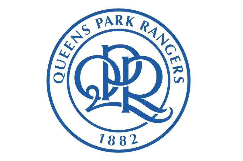
The QPR logo is a circular emblem featuring interlinked “QPR” initials in a cursive style, surrounded by the full club name “Queens Park Rangers” and the founding year “1882.” It was unveiled in May 2016 following a fan vote and uses a blue and white color palette that reflects the club’s traditional hooped kit.
- Design Type: Combination mark (monogram with circular text border)
- Primary Elements: Interlocking “QPR” cursive monogram, circular border, club name in uppercase, founding year “1882”
- Official Introduction Date: May 6, 2016 (for the 2016-17 season onward)
- Designer/Agency: Created in-house following a supporter consultation. The winning option was titled “Option two: 1982 monogram edit,” based on the popular 1982 crest
- Trademark Status: Registered trademark of Queens Park Rangers Football Club
- Color Palette: Blue (#1D5BA4) and White (#FFFFFF)
- Usage Context: Match kits, official merchandise, digital platforms, Loftus Road stadium branding, club communications, and all licensed products
How Has the QPR Logo Evolved Over Time?

QPR has used five primary badge designs since the 1950s. The club went from a borrowed coat of arms to a hooped shield, then to a monogram circle, followed by a controversial heraldic redesign, and finally back to a refined circular crest.
Each shift mirrored something happening at the club. Financial changes, ownership transitions, fan pressure. The timeline is not exactly smooth.
Original QPR Badge (1953-1975)
- Years Active: 1953-1975
- Design Description: A reproduction of the shield from the former Metropolitan Borough of Hammersmith’s coat of arms. This was common practice for English clubs during that era. The badge featured heraldic elements borrowed from the borough’s arms, which were originally granted in December 1897
- Color Scheme: Multi-colored heraldic design
- Designer: Adapted from existing municipal heraldry
- Context: QPR adopted this as their first official club emblem. Most English clubs at the time simply used their local borough’s arms or some variation of them
- Cultural Significance: It tied the club to its geographic roots in West London, but it lacked a unique football identity. You could have slapped it on any local institution and nobody would have blinked
The Hooped Shield Badge (1975-1982)
- Years Active: 1975-1982
- Design Description: A shield featuring the club’s blue and white hoops with the “QPR” initials placed in front of an old-style panelled football. The club name appeared in a scroll at the base. This was the first badge that actually looked like a football crest
- Color Scheme: Blue and white hoops on a shield
- Designer: Not publicly attributed
- Context: Introduced as QPR was establishing itself in top-flight English football. The club had narrowly missed winning the First Division title in 1975-76, finishing just one point behind Liverpool. A new badge felt right
- Key Changes from Previous: Completely moved away from the municipal heraldry. This was QPR’s own mark for the first time
- Cultural Significance: It gave the club a distinct football identity separate from the borough of Hammersmith. The hoops became the central feature, which was exactly what fans wanted to see
The Circular Monogram Badge (1982-2008)
- Years Active: 1982-2008
- Design Description: A circular badge with the interlinked “QPR” monogram in cursive script at the center. “Queens Park Rangers” wrapped around the top of the circle, with “Loftus Road” displayed on a scroll below the circular frame. A blue center background set off the white lettering
- Color Scheme: Blue center with white text and detailing
- Designer: Not publicly credited
- Context: Introduced to mark the club’s centenary and their run to the 1982 FA Cup final. QPR went on to win the Second Division championship that same season. The badge was simplified slightly in 1983
- Key Changes from Previous: Replaced the shield format with a circular design. Dropped the panelled football graphic. Made the monogram the focal point
- Cultural Significance: This became the badge most fans associate with QPR’s identity. It lasted 26 years and covered some big moments, including Premier League campaigns and relegation battles. Many supporters still consider it the “real” QPR crest
The Heraldic Shield Badge (2008-2016)
- Years Active: 2008-2016
- Design Description: A shield-based design featuring the club’s blue and white hoops. The club name was arranged within the white hoops across the shield. A football with a Queen’s crown sat on top, with heraldic wreath elements on each side. A scroll at the bottom displayed “Loftus Road”
- Color Scheme: Blue and white with gold accents
- Designer: Commissioned under the new ownership of Flavio Briatore and Bernie Ecclestone
- Context: Introduced after Formula One tycoons purchased the club in 2007. The new owners wanted a symbol to represent what they hoped would be a new era. The badge drew criticism from fans who felt it looked too similar to Glasgow Rangers’ crest
- Key Changes from Previous: Abandoned the circular monogram entirely. Returned to a shield format. Added heraldic elements that hadn’t been part of any previous QPR badge
- Cultural Significance: This is probably the most divisive badge in QPR’s history. It looked polished, sure. But many supporters never warmed to it. The resemblance to Glasgow Rangers’ emblem was a sticking point that just wouldn’t go away
The Current QPR Badge (2016-Present)
- Years Active: 2016-present
- Design Description: A circular emblem featuring the interlocking “QPR” cursive monogram at its center, with “Queens Park Rangers” in uppercase around the top arc and “1882” at the bottom. Clean lines, no scroll, no shield, no crown
- Color Scheme: Blue (#1D5BA4) and White (#FFFFFF)
- Designer: Developed through fan consultation, based on the winning “Option two: 1982 monogram edit” from a December 2015 online vote
- Context: The club returned to the beloved circular design after years of supporter dissatisfaction with the heraldic badge. The 2016 version refined the 1982 original, removing the “Loftus Road” scroll and simplifying the overall look
- Key Changes from Previous: Dropped the shield, crown, wreath, and all heraldic elements. Brought back the monogram that fans actually wanted
- Cultural Significance: This badge represents a rare case where fan pressure directly shaped a club’s visual identity. The online vote gave supporters real ownership of the decision, and the result was a return to what felt authentically QPR
What Do the Design Elements of the QPR Logo Mean?
Every element in the current QPR badge ties back to the club’s history and community. The interlocking “QPR” monogram acts as the centerpiece. It is a direct callback to the 1982 design that fans loved.
The circular frame holds it all together, creating a clean shape that works across digital and print applications.
“1882” at the bottom anchors the badge in time, reminding everyone that this club has been around for over 140 years.
Why Did QPR Choose These Specific Colors?

Blue and white are not random picks. They come directly from the club’s famous hooped playing kit, which QPR adopted in the late 1800s.
The specific blue used is Pantone PMS 7685 C, with a hex value of #1D5BA4. In RGB, that is (29, 91, 164). The CMYK breakdown is (93, 70, 4, 0).
White is straightforward: #FFFFFF across all formats.
From a color psychology standpoint, blue carries associations with trust, loyalty, and stability. White suggests clarity and new beginnings. Together they create a combination that reads as both traditional and confident, which is pretty much what any football club wants its badge to say.
What Typography Style Is Used in the QPR Logo?
The club uses Optima Bold as its primary font. Hermann Zapf designed it, and Linotype published it.
Optima is a humanist sans-serif with subtle stroke variation. It has more personality than your typical grotesque sans-serif, but it still reads cleanly at small sizes. That matters when a badge shows up on everything from stadium signage to pixel-sized social media avatars.
The monogram itself uses a custom cursive style with interlocking letterforms. The “Q,” “P,” and “R” flow into each other with sweeping curves, giving the center of the badge a classic, almost hand-drawn feel.
What Are the Hidden Meanings in the QPR Logo?

The interlocking letters are the biggest design detail worth noting. They are not just stacked on top of each other. They connect, which is a deliberate nod to community and unity.
“1882” does double duty. It marks the founding of Christchurch Rangers (the earlier club that became QPR after merging with St Jude’s in 1886). Using the earlier date was an intentional choice to claim the longest possible history.
The absence of a crown, shield, or any heraldic imagery in the current badge is itself a statement. It says: we do not need borrowed symbols to tell people who we are.
How Does the QPR Logo Compare to Competitor Logos?
QPR’s badge sits in a crowded field. London alone has over a dozen professional football clubs, and most of them carry crests with more visual complexity.
Arsenal’s crest leans on a cannon graphic. Tottenham Hotspur’s badge uses a cockerel standing on a ball. West Ham United has crossed hammers. QPR, by comparison, keeps things tight with just a monogram and text.
Among Championship rivals, the QPR badge holds its own through simplicity. Burnley’s crest packs in bees, a hand, and a stork. Leeds United’s badge is essentially just text inside a shield. QPR lands somewhere between those two approaches.
The circular format actually puts it in good company. Several modern football crests have moved toward round or oval shapes because they scale better on digital platforms. QPR was doing this back in 1982, well before anyone was thinking about how badges would render on phone screens.
What Are the Technical Specifications of the QPR Logo?
Official Color Codes
- Primary Color: Blue
- Hex: #1D5BA4
- RGB: (29, 91, 164)
- CMYK: (93, 70, 4, 0)
- Pantone: PMS 7685 C
- Secondary Color: White
- Hex: #FFFFFF
- RGB: (255, 255, 255)
- CMYK: (0, 0, 0, 0)
Dimensions and Proportions
The badge uses a 1:1 aspect ratio thanks to its circular shape. This makes it one of the easier football crests to work with across platforms.
Minimum size requirements generally follow standard practice for circular logos. The “QPR” monogram needs to remain legible, so going below roughly 20mm in print or 40 DPI-equivalent pixels on screen starts to lose detail.
Clear space around the badge should be at least equal to the height of the “1882” text at the bottom. Official usage guidelines from the club dictate that no other graphic elements should intrude into this protected zone.
The logo is available in vector graphics formats for professional use and in JPEG or PNG raster formats for web and social media use.
What Cultural Impact Has the QPR Logo Had?

QPR’s badge holds a specific kind of cultural weight in West London. It is the visual shorthand for a community that stretches across Shepherd’s Bush, White City, and the surrounding neighborhoods.
The badge shows up on pub walls, tattoo parlors, and the fronts of corner shops around Loftus Road. It is deeply local in a way that bigger London clubs have somewhat outgrown.
The 2015-2016 fan vote for the current crest was itself a cultural moment. It showed that supporter voices could directly influence branding decisions. Other clubs have since looked at QPR’s approach as a template for their own badge redesigns.
The hoops, the blue, the monogram. Together they carry weight that goes beyond football for people in that part of London. At least in my experience, that local connection is what separates smaller club badges from the corporate feel of Premier League super-brands.
How Does the QPR Logo Fit Into the Overall Brand Identity?
The badge is the anchor of everything QPR puts out visually. Kit designs, matchday programs, website layouts, social media assets, and all merchandise flow from the blue and white circular crest.
The club’s brand guidelines keep things consistent. The Optima Bold typeface shows up in official communications. The blue (#1D5BA4) is locked in across all touchpoints. Even the stadium signage at Loftus Road follows the same system.
QPR’s brand identity links to several related entities: the EFL Championship as the competitive context, the Kiyan Prince Foundation (which briefly renamed the stadium), the broader West London football community, and the club’s historical rivals like Fulham and Brentford.
The circular badge format works especially well for digital-first branding, which is something more clubs are catching on to. Your mileage may vary, but round logos tend to perform better as profile pictures and app icons. QPR got lucky there, or maybe somebody back in 1982 just had good instincts.
How Should the QPR Logo Be Used?
If you are looking to use the QPR crest for anything beyond personal, non-commercial purposes, you need permission from the club. The badge is a registered trademark of Queens Park Rangers Football Club.
Do:
- Use the official color values (#1D5BA4 blue, #FFFFFF white) without modification
- Maintain the clear space around the badge
- Use the vector version for print materials to keep things sharp
- Access official assets through QPR’s media or press channels
Don’t:
- Alter the colors, proportions, or arrangement of elements
- Place the badge on backgrounds that reduce its legibility
- Use the crest for commercial purposes without a licensing agreement
- Recreate or approximate the badge using unofficial sources
Official logo files and usage guidelines can be requested through the club’s communications department at Loftus Road. Licensed merchandise is available through the QPR Official Store, both online and at the stadium.
For media and press use, the club typically provides approved logo packs that include multiple formats and colorways to cover different applications.
FAQ on The QPR Logo
What Does the QPR Logo Look Like?
The current QPR logo is a circular badge with interlocking “QPR” initials in cursive at the center. “Queens Park Rangers” curves around the top in uppercase. The founding year “1882” sits at the bottom. Blue and white are the only colors used.
When Was the Current QPR Badge Introduced?
QPR unveiled their current crest on May 6, 2016. It launched for the 2016-17 season after a fan vote held in December 2015.
The winning design was called “Option two: 1982 monogram edit.” It brought back the popular circular format from the club’s centenary badge.
What Colors Are in the QPR Crest?
Two colors. Blue (#1D5BA4) and white (#FFFFFF). That is it.
These come from the club’s traditional hooped playing kit, which dates back to the late 1800s. The blue carries a Pantone value of PMS 7685 C.
How Many Times Has QPR Changed Their Logo?
QPR has used five primary badge designs. The timeline runs: 1953-1975 (Hammersmith arms), 1975-1982 (hooped shield), 1982-2008 (circular monogram), 2008-2016 (heraldic shield), and 2016-present (refined circular monogram).
What Font Does the QPR Logo Use?
Optima Bold is the club’s primary typeface. Hermann Zapf designed it and Linotype published it. It is a humanist sans-serif with subtle stroke variation, which gives it more character than a standard grotesque.
Why Did QPR Change Their Badge in 2016?
Fan pressure. The 2008 heraldic crest was widely disliked by supporters who felt it looked too similar to Glasgow Rangers’ emblem.
The club ran an online vote and brought back the circular design that most fans considered the authentic QPR identity.
What Does the QPR Monogram Represent?
The interlocking “Q,” “P,” and “R” in cursive script represent the club’s full name, Queens Park Rangers. The letters connect and overlap deliberately. It is a design emphasis on community and togetherness rather than just initials stacked on a page.
Where Can I Download the Official QPR Logo?
Official logo files are available through QPR’s communications department at Loftus Road. Some third-party sites offer the badge in SVG and PNG formats.
Always check licensing before using the crest commercially. It is a registered trademark.
What Is the Meaning Behind “1882” on the QPR Badge?
1882 is the founding year of Christchurch Rangers, which later merged with St Jude’s in 1886 to form Queens Park Rangers. The club uses the earlier date to claim its full heritage. Most football club crests include a founding year for historical context.
How Does the QPR Logo Compare to Other Championship Club Badges?
QPR’s circular badge is cleaner than most EFL Championship crests. Clubs like Sheffield Wednesday and Nottingham Forest use more complex imagery with owls and trees. QPR keeps it to a monogram and text, which scales better on digital platforms.
Conclusion
The QPR logo tells the story of a club that learned to listen to its supporters. Five badge redesigns across seven decades, and the fans pulled it back to where it started.
That circular monogram with its interlocking cursive letters is more than a club emblem. It is a piece of West London football heritage worn on kits, printed on scarves, and tattooed on arms around Shepherd’s Bush.
The blue and white color scheme has stayed constant through every change. So have the hoops.
Whether you are a Queens Park Rangers supporter, a badge collector, or someone studying sports logo design principles, this crest shows what happens when visual balance, tradition, and fan identity line up right.

Renowned for his expertise in logo design and visual branding, Bogdan has developed a multitude of logos for various clients.
His skills extend to creating posters, vector illustrations, business cards, and brochures. Additionally, Bogdan's UI kits were featured on marketplaces like Visual Hierarchy and UI8.
He also wrote in the past years on sites like Design Your Way, WebDesignerDepot, WPDean, Designmodo, Speckyboy, Slider Revolution, and more.
- Jujutsu Kaisen Font Generator - 12 October 2026
- The Windsurf Logo History, Colors, Font, And Meaning - 10 October 2026
- How to Remove Background From Product Photos (No Photoshop) - 10 October 2026

Bogdan Sandu is a seasoned designer who has been designing websites since 2008. Renowned for his expertise in logo design and visual branding, Bogdan has developed a multitude of logos for various clients. His skills extend to creating posters, vector illustrations, business cards, and brochures. Additionally, Bogdan's UI kits were featured on marketplaces like Visual Hierarchy and UI8. He also wrote in the past years on sites like Design Your Way, WebDesignerDepot, WPDean, Designmodo, Speckyboy, Slider Revolution, and more.
You Might Also Like


