


The Norwich City logo is one of the most recognized club badges in English football. It features a canary perched on a football inside a green shield, paired with a stylized version of the City of Norwich coat of arms. The club, founded in 1902 in Norfolk, England, has gone through five distinct logo versions across its history.
The current badge was introduced in 2022, designed by London-based agency SomeOne with final artwork by Rob Clarke. It dropped the black keylines from its predecessor and simplified every element for better digital use. Norwich City competes in the EFL Championship, and its crest is a direct tie to the club’s “Canaries” nickname, which dates back to the early 1900s when the chairman was a canary breeder himself.
Football club badges sit at a tricky intersection of tradition and function. They need to work on a shirt, on a stadium facade, and on a 32-pixel favicon. Norwich’s badge has had to solve that problem five times over 120-plus years.
What Is the Norwich City Logo?
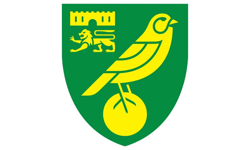
The Norwich City logo is a shield-shaped emblem containing a yellow canary standing on a football, with a miniature version of the Norwich coat of arms (a lion and castle) in the upper left. It was officially redesigned in 2022 by agency SomeOne. The crest uses yellow and green as its primary colors and represents the club’s “Canaries” identity.
Here are the key details of the current Norwich City badge:
- Design Type: Combination mark (emblem with figurative and heraldic elements)
- Primary Elements: Canary bird, football, Norwich Castle, lion, green shield
- Official Introduction Date: Unveiled November 23, 2021. Applied to all branding from June 2022
- Designer/Agency: SomeOne (London), with artwork by Rob Clarke and initial exploration by Toby Hall
- Trademark Status: Registered trademark of Norwich City Football Club PLC
- Color Palette: Canary Yellow (#FFF200), Norwich Green (#00A650), and formerly Black (#000000) in the pre-2022 version
- Usage Context: Kits, Carrow Road stadium signage, merchandise, digital platforms, matchday programs, official correspondence
How Has the Norwich City Logo Evolved Over Time?

Norwich City has used five primary badge designs since 1902. Each one reflects where the club was at the time, both on the pitch and in terms of its identity. The progression moved from civic heraldry to a mascot-first approach, then gradually combined both.
The biggest single change happened in 1972 when the canary-on-ball design got paired with the city’s coat of arms. That version lasted 50 years. The 2022 update kept the same structure but cleaned everything up for screens and small-scale reproduction.
Original Norwich City Crest (1902-1922)
- Years Active: 1902 to 1922
- Design Description: A red and black shield bearing a silver castle and a gold lion, taken directly from the arms of the City of Norwich
- Color Scheme: Red, black, silver, gold
- Designer: Unknown (based on municipal heraldry)
- Context: The club was originally called the “Citizens” and wore blue and white. No canary appeared yet. The crest was purely civic
- Key Changes from Previous: This was the first logo, no predecessor
- Cultural Significance: Established Norwich City’s initial visual link to the city itself rather than any football-specific identity
The First Canary Badge (1922-1940)
- Years Active: 1922 to 1940
- Design Description: A yellow canary with gold highlights standing on a gold-trimmed stick, set inside a green circle with gold trim
- Color Scheme: Yellow, green, gold
- Designer: Unknown
- Context: By the early 1900s, the club’s chairman (a canary breeder) had already shifted the team’s colors to yellow and green and the nickname to “The Canaries.” This badge made that identity official on the shirt
- Key Changes from Previous: Dropped all civic heraldry. Introduced the canary as the central figure. Shifted to a circular format
- Cultural Significance: This was the moment Norwich City stopped looking like a generic city club and became The Canaries in visual terms too. It reflected Norfolk’s real history of canary breeding, brought to the region by Flemish weavers (“The Strangers”) in the 16th century
The Shield-Format Canary Badge (1940-1972)
- Years Active: 1940 to 1972
- Design Description: A canary standing on a football (without visible seams), with the castle and lion of Norwich in the upper right corner, all on a green shield with gold trim
- Color Scheme: Green, yellow, gold
- Designer: Unknown
- Context: When league football resumed after World War Two, Norwich adopted all-yellow shirts with green trim. The canary crest was embroidered onto a rounded shield. Quality varied and the edges of the shield often frayed badly on the actual kits
- Key Changes from Previous: Reintroduced the city’s coat of arms alongside the canary. Switched from a circle to a shield shape. Added the football beneath the bird
- Cultural Significance: Blended club identity with civic pride for the first time. The football under the canary would become a lasting part of the Norwich badge going forward
The Classic Norwich City Badge (1972-2022)
- Years Active: 1972 to 2022
- Design Description: A hand-drawn canary perched on a yellow football with visible black detailing, the city’s coat of arms (lion and castle) in the upper left, all on a green shield with black keylines throughout
- Color Scheme: Yellow, green, black
- Designer: Unknown (hand-drawn in-house, 1972)
- Context: Created to celebrate Norwich winning the Second Division title and reaching the First Division for the first time. This badge was used for half a century, through the club’s greatest achievements including their third-place Premier League finish in 1993 and their UEFA Cup run
- Key Changes from Previous: Heavier black detailing. Lion and castle moved to the upper left. Football gained visible seams and black outlines. More detailed overall composition
- Cultural Significance: This is the version most Norwich fans grew up with. It became almost untouchable. The hand-drawn quality gave it warmth but created real problems for consistent reproduction across different media. By the late 2010s, multiple variations existed across the stadium, merchandise, and digital platforms
The Current Norwich City Badge (2022-Present)
- Years Active: 2022 to present
- Design Description: A simplified canary on a centrally placed football, with a redesigned lion and castle in the upper left, all on a green shield. No black keylines or borders
- Color Scheme: Canary Yellow (#FFF200), Norwich Green (#00A650)
- Designer: SomeOne agency, artwork by Rob Clarke, initial exploration by Toby Hall
- Context: Unveiled November 23, 2021 during Norwich’s Premier League stint. Applied to all branding from June 2022. The redesign followed two years of consultation involving 50+ internal interviews and over 5,000 fan responses
- Key Changes from Previous: Removed all black keylines. Redrawn canary, lion, and castle from scratch. Centered the football in the lower half of the shield. Made the lion actually look like a lion (the old version was often criticized)
- Cultural Significance: The club called it “an evolution, not a revolution.” The 2021 reveal achieved 89% positive sentiment from 78 million impressions. SomeOne also developed a bespoke typeface with Colophon Foundry and a brand property called “The Weave,” inspired by Norfolk’s weaving heritage
What Do the Design Elements of the Norwich City Logo Mean?
Every piece of the Norwich City badge ties back to something specific. The canary references the region’s history of breeding the birds, brought to Norfolk by Flemish immigrants. The castle and lion come from the city’s own coat of arms. The shield shape follows English football heraldic tradition.
None of it is decorative filler. Each element earned its place over more than a century of design decisions.
The Canary
The canary is the most important element. It connects to Norfolk’s 16th-century weaving industry. Flemish and Walloon immigrants (called “The Strangers”) settled in Norwich and brought canaries that sang while they worked at their looms.
Canary breeding became a popular local pastime. When the club’s chairman started calling the team “The Canaries” around 1907, it stuck. The bird showed up on shirts as early as the 1907-08 season, which was unusual for clubs at that time.
In the current badge, the canary faces right and sits on top of a football. SomeOne redrew it from scratch in 2022 to make it reproduce cleanly at any size.
The Castle and Lion
These come from the arms of the City of Norwich. Norwich Castle is a Norman-era structure built in the 12th century. The lion beneath it is a traditional heraldic element.
In the old badge, the lion looked, well, questionable. Supporters and the club itself acknowledged it didn’t clearly read as a lion. The 2022 redesign made both the castle and lion significantly clearer and more defined.
The Shield
The green shield shape has been part of the Norwich badge since the 1940s. It follows a long tradition of English football clubs using shield-based crests, a nod to heraldic traditions rooted in the psychology of shapes. Shields suggest protection, strength, and belonging.
The Football
A football has sat beneath the canary since at least the 1940s version. It grounds the badge in sport. In the 2022 update, the ball was moved to sit exactly in the center of the lower half of the shield, fixing a long-standing off-center placement that threw off the visual balance of the old badge.
Why Did Norwich City Choose These Specific Colors?
Yellow and green became Norwich’s colors around 1907 when the club adopted the Canaries nickname. The chairman at the time bred canaries himself, so yellow was the obvious pick. Green represented Norfolk’s countryside.
The current official colors are:
- Canary Yellow: Hex #FFF200, RGB (255, 242, 0), CMYK (0, 5, 100, 0), Pantone PMS 803 C. Yellow is a high-energy color. It reads as optimism and visibility. There’s a reason Norwich stands out on TV. Among yellow logos in sports, the Canaries’ shade is one of the most vivid
- Norwich Green: Hex #00A650, RGB (0, 166, 80), CMYK (100, 0, 52, 35), Pantone PMS P 139-8 C. Green carries associations with nature, stability, and growth. For Norwich, it ties directly to the agricultural landscape of Norfolk. It pairs well with yellow, and the two form a strong complementary color scheme
The 2022 redesign dropped black from the badge itself, though it may still appear in certain applications. The psychological impact of color played a role here. Removing black made the yellow and green pop harder, especially on screens.
What Typography Style Is Used in the Norwich City Logo?
The badge itself doesn’t feature any text. Norwich City’s name appears in supporting materials, not within the crest. But as part of the 2022 rebrand, SomeOne and Colophon Foundry created a custom typeface for the club.
The bespoke font draws from Norfolk’s weaving history. It comes in multiple weights and two-tone color options, built to work across everything from shirt printing to stadium signage.
For the 2022-23 season, fans could even get this custom typeface on the back of their replica kits for the first time. That’s a real typographic commitment from a Championship club.
What Are the Hidden Meanings in the Norwich City Logo?
There aren’t major “hidden” easter eggs in the Norwich badge, honestly. It’s a pretty straightforward design. But there are layers worth knowing.
The canary facing right follows Western reading direction, which creates a subtle sense of forward movement. The positioning of the coat of arms in the upper left keeps it visible but secondary to the canary, creating a clear visual hierarchy.
And the entire connection between canaries and Norwich runs deeper than most people think. It’s not just a random bird. It’s a reference to centuries of immigration, trade, and cultural exchange with mainland Europe. That’s a lot of history packed into one small badge.
How Does the Norwich City Logo Compare to Competitor Logos?
English football badges tend to fall into a few categories. Shield-based crests with heraldic elements (most clubs), circular badges (like Leicester City), and simplified modern marks. Norwich sits firmly in the shield camp but with a distinctive twist because of the canary.
Compared to Championship and Premier League rivals, Norwich’s badge holds up well.
Aston Villa’s logo uses a similar heraldic approach but with a lion as the primary figure. Crystal Palace features an eagle inside a shield. Nottingham Forest uses a tree. What sets Norwich apart is the canary itself. No other major English club uses a songbird as its central emblem. That makes it instantly identifiable.
The 2022 redesign brought Norwich closer to the clean, scalable trend that clubs like Wolverhampton Wanderers and Manchester City adopted earlier. SomeOne actually worked on all three of those rebrand projects, and you can see a shared design philosophy: strip out noise, keep the soul.
East Anglian rivals Ipswich Town also updated their badge recently. Both clubs now have cleaner, more digitally friendly crests, but their approaches feel different. Ipswich leaned into a horse, Norwich stuck with the canary. Neither badge would be confused for the other at any size.
What Are the Technical Specifications of the Norwich City Logo?
Official Color Codes
- Primary Color: Canary Yellow
- Hex: #FFF200
- RGB: (255, 242, 0)
- CMYK: (0, 5, 100, 0)
- Pantone: PMS 803 C
- Secondary Color: Norwich Green
- Hex: #00A650
- RGB: (0, 166, 80)
- CMYK: (100, 0, 52, 35)
- Pantone: PMS P 139-8 C
- Tertiary Color: Black (used in pre-2022 branding, still in some applications)
- Hex: #000000
- RGB: (0, 0, 0)
- CMYK: (0, 0, 0, 100)
- Pantone: PMS Black 6 C
Dimensions and Proportions
The 2022 badge uses a shield shape that’s taller than it is wide, roughly a 9:10 width-to-height ratio. The football sits centered in the lower half. The coat of arms occupies approximately the upper left quadrant.
One of the main goals of the redesign was making sure the logo works at small sizes. The old hand-drawn version lost detail when shrunk for digital use, especially the lion and castle. The new version was specifically tested for strong rendering at small scale and in vector format.
Clear space requirements and official usage guidelines are managed by the club’s marketing department in line with the brand guidelines developed alongside SomeOne.
What Cultural Impact Has the Norwich City Logo Had?

The Norwich City badge carries weight that goes beyond the pitch. In Norfolk, the canary is a community symbol. You see it on everything from pub signs to tattoos. It represents local identity for people who don’t even follow football.
The club’s song “On the Ball, City” is the oldest football chant still in use, written in the 1890s. Pair that with a badge that references 16th-century immigration patterns and you have a club whose identity runs deep into the region’s cultural fabric.
When the 2022 redesign was revealed, it generated 78 million impressions and 89% positive sentiment. For a Championship club, those numbers are huge. People cared because the badge means something to them. It’s not just a logo on a shirt. It’s an identity marker for an entire region of England.
The canary has also become a shorthand in football culture for resilience. Norwich has bounced between the Premier League and Championship repeatedly. They keep coming back. The bird keeps standing on the ball. There’s a metaphor in there that fans have grabbed onto.
How Does the Norwich City Logo Fit Into the Overall Brand Identity?
The badge sits at the center of a broader system that SomeOne built out in 2022. This includes the bespoke typeface (made with Colophon Foundry), “The Weave” brand property, custom pictograms, and a complete set of brand style guidelines.
“The Weave” is a pattern system inspired by Norfolk’s textile history. It works as a background texture, a motion graphic, and a stadium graphic. It can scale from phone screens to the side of a building.
Everything ties together through color (yellow and green), shape language (the weave patterns), and consistent repetition across touchpoints. The project won Gold at the 2022 Sports Business Awards for Best Fan Engagement Programme.
This is where smaller clubs sometimes fall short. They update the badge but stop there. Norwich went further. The entire visual system was rethought as a connected piece. It plays out through matchday experiences, social media, merchandise, wayfinding, and everything fans touch.
How Should the Norwich City Logo Be Used?
Official Usage Guidelines:
- Always use the official version of the badge. Don’t recreate or approximate it
- Maintain the required clear space around the crest. No other graphic elements should crowd it
- The badge should appear on the approved color backgrounds only (primarily green, yellow, or white)
- Don’t alter the proportions, rotate the badge, or change individual colors
- For print reproduction, use the Pantone values. For digital, use Hex or RGB. Match the right color space to the medium, every time
Where to Access Official Logos:
- The club’s official website (canaries.co.uk) hosts approved assets for media use
- Accredited media partners can request vector files through the club’s communications department
- Fan-created content should reference official versions rather than third-party recreations
Licensing and Trademark:
- The Norwich City crest is a registered trademark. Unauthorized commercial use is prohibited
- Licensing for merchandise or third-party products goes through the club’s commercial department
- Fan art and non-commercial uses are generally tolerated, but the club reserves the right to enforce its trademark if the usage could cause confusion or damage the brand
FAQ on The Norwich City Logo
What does the Norwich City logo look like?
The Norwich City badge features a yellow canary standing on a football inside a green shield. The upper left corner holds a stylized version of the City of Norwich coat of arms, showing a castle and lion.
No text appears within the crest itself. The club name sits in supporting materials using a bespoke typeface created with Colophon Foundry.
When was the current Norwich City crest introduced?
The current version was unveiled on November 23, 2021. It replaced the hand-drawn 1972 badge that had been used for 50 years.
Official rollout across all Carrow Road branding and merchandise began in June 2022, coinciding with the club’s 120th anniversary.
Who designed the Norwich City FC logo?
London-based creative agency SomeOne led the project. Rob Clarke handled the final artwork, with initial exploration by Toby Hall.
SomeOne had previously worked with Tottenham Hotspur and other Premier League clubs on similar badge projects.
Why is there a canary on the Norwich badge?
Flemish weavers settled in Norfolk during the 16th century and brought canaries that sang while they worked. Breeding the birds became a local tradition.
Around 1907, the club chairman (himself a canary breeder) changed the team’s colors to yellow and green and dubbed them “The Canaries.”
What are the official Norwich City logo colors?
Canary Yellow (Hex #FFF200) and Norwich Green (Hex #00A650) are the two official colors. The 2022 redesign removed the black keylines from the previous version.
These two colors form the club’s entire visual identity, from kits to stadium signage to digital platforms.
What does the lion and castle mean on the Norwich crest?
They come from the City of Norwich coat of arms. Norwich Castle is a real Norman-era structure in the city center. The lion is a traditional heraldic symbol of authority.
The 2022 update redrew both elements so the lion actually looks like a lion. The older version was pretty rough, honestly.
How many times has the Norwich City logo changed?
Five distinct versions exist. The club used civic arms from 1902 to 1922, then introduced the canary badge. Further updates came in 1940, 1972, and 2022.
Each version reflected where Norwich City FC sat in English football at the time. The 1972 badge marked their first ever top-flight promotion.
Can I download the Norwich City logo for personal use?
The official crest is a registered trademark of Norwich City Football Club. Fan art and non-commercial use are generally tolerated.
For media purposes, approved assets are available through the club’s official website at canaries.co.uk. Commercial licensing goes through their marketing department.
What changed in the 2022 Norwich City badge redesign?
SomeOne stripped out all black keylines, recentered the football, and redrew the canary, lion, and castle from scratch. The goal was better rendering at small sizes and across digital formats.
Over 5,000 fans responded to consultation surveys during the two-year process. The reveal hit 89% positive sentiment.
How does the Norwich City logo compare to other Championship club badges?
Most EFL Championship badges use shield-based designs with local heraldic elements. Norwich stands out because no other major English club features a songbird as its primary symbol.
Clubs like Burnley and Leeds United rely on more traditional crests. The canary gives Norwich instant recognition at any size.
Conclusion
The Norwich City logo is more than a football club emblem. It’s 120 years of Norfolk identity compressed into a green shield.
Five badge versions tell the story of a club that went from civic arms to one of the most distinctive crests in the EFL Championship. The canary, the castle, the yellow and green. Every piece earned its spot.
SomeOne’s 2022 redesign proved you can modernize a badge without gutting its soul. Took them two years and thousands of fan surveys to get it right.
For supporters at Carrow Road and across Norfolk, this crest carries real weight. It connects a Premier League yo-yo club to Flemish weavers, canary breeders, and generations of matchday memories. Not bad for a bird on a ball.

Renowned for his expertise in logo design and visual branding, Bogdan has developed a multitude of logos for various clients.
His skills extend to creating posters, vector illustrations, business cards, and brochures. Additionally, Bogdan's UI kits were featured on marketplaces like Visual Hierarchy and UI8.
He also wrote in the past years on sites like Design Your Way, WebDesignerDepot, WPDean, Designmodo, Speckyboy, Slider Revolution, and more.
- Canva vs PowerPoint: Which Is Better for Presentations? - 22 September 2026
- How to Install Fonts on Mac (Step-by-Step Guide) - 20 September 2026
- From Mockup to Code: How AI-Augmented Development Speeds Up the Design Handoff - 19 September 2026

Bogdan Sandu is a seasoned designer who has been designing websites since 2008. Renowned for his expertise in logo design and visual branding, Bogdan has developed a multitude of logos for various clients. His skills extend to creating posters, vector illustrations, business cards, and brochures. Additionally, Bogdan's UI kits were featured on marketplaces like Visual Hierarchy and UI8. He also wrote in the past years on sites like Design Your Way, WebDesignerDepot, WPDean, Designmodo, Speckyboy, Slider Revolution, and more.
You Might Also Like


