


The Stoke City logo is one of the most recognizable crests in English football. It belongs to a club founded in 1863 (though some historians argue 1868), making it one of the oldest professional football clubs on the planet. The badge sits at the center of everything the club does, from matchday kits at the bet365 Stadium to merchandise sold worldwide.
What makes this logo interesting is its connection to place. Stoke-on-Trent built its identity around the pottery industry, and that heritage runs straight through every version of the crest. The Potters, as they’re known, carry that local pride into the badge itself. Red and white stripes, the Staffordshire Knot, a bottle kiln. All rooted in the city’s story.
Over the years, the club has gone through roughly seven distinct badge designs. Some were full heraldic shields pulled from the city’s coat of arms. Others stripped things down to something cleaner and more commercial. The current version was introduced in 2001, though a new crest has been announced for the 2026-27 season.
What Is the Stoke City Logo?
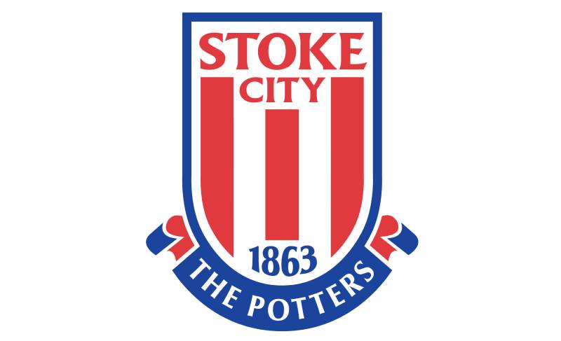
The Stoke City logo is a shield-shaped emblem featuring red and white vertical stripes, the founding year 1863, the club’s name, its nickname “The Potters,” and the initials S.C.F.C. It was officially introduced in 2001 as part of a club-wide rebrand following the move to the Britannia Stadium (now bet365 Stadium).
Here’s what defines the badge at a glance:
- Design Type: Combination mark. It blends a shield graphic with text elements.
- Primary Elements: A shield divided into sections, red and white vertical stripes, “Stoke City” and “Football Club” text, the founding year 1863, the nickname “The Potters,” and the letters S.C.F.C.
- Official Introduction Date: 2001 (start of the 2000/2001 season)
- Designer/Agency: The specific designer has not been publicly credited. The redesign was commissioned as part of the club’s broader push to modernize its brand after relocating grounds.
- Trademark Status: Registered and protected by Stoke City Football Club. Usage is restricted to official club merchandise and licensed products.
- Color Palette: Red (#E03A3E) and Blue (#1B449C) serve as the two main badge colors, with white used as background and accent.
- Usage Context: Matchday kits, training wear, club merchandise, digital platforms, stadium signage at the bet365 Stadium, official communications, and broadcast media.
The 2001 redesign was a deliberate move away from the ornate Stoke-on-Trent coat of arms the club had used previously. It was built for flexibility. Something that works on a shirt, a mug, and a 32-pixel favicon.
How Has the Stoke City Logo Evolved Over Time?

Stoke City’s badge has gone through at least seven major versions since the 1950s. The club moved from using the full Stoke-on-Trent coat of arms to a simplified shield, back to the coat of arms, and then to the modern corporate-style crest used from 2001 through 2026.
A new badge for 2026-27 has already been revealed, bringing the total count even higher.
Each change reflected something happening at the club or in football at large.
Original Stoke City Coat of Arms Badge (1953-1957)
- Years Active: 1953-1957 (used infrequently afterward through the 1970s)
- Design Description: A traditional heraldic shield pulled directly from the Stoke-on-Trent coat of arms, granted in 1912 after six towns merged into one borough. The shield was divided into four quarters by a red cross decorated with gold frets. Each quarter held a different symbol: a Portland vase (top left), a kneeling camel (top right), a heraldic eagle (bottom left), and a scythe (bottom right). Above the shield sat a dark red arch with two Staffordshire Knots flanking a boar’s head.
- Color Scheme: Red, gold, white, and black
- Context: The club adopted the city’s coat of arms because it lacked a distinct football-specific identity. In its early years, local organizations helped fund the club, and using the city’s symbols was both a tribute and a practical choice. Each symbol in the crest represented one of the merged towns: the vase for Fenton’s pottery heritage, the camel for Hanley (from the crest of its first mayor, John Ridgway), the eagle for Longton, and the scythe for Tunstall.
- Cultural Significance: This was less a football badge and more a civic emblem worn on a shirt. It tied the club deeply to the region but said nothing about football itself.
The 1977 Simplified Crest (1977-1989)
- Years Active: 1977-1989
- Design Description: A completely new shield design. The top panel displayed “S.C.F.C.” in bold yellow sans-serif capitals against a red background. The remaining four sections alternated between two quarters with red and white vertical stripes and two black quarters featuring a Staffordshire Knot and a bottle kiln (also called a “pot bank”). A thick gold outline framed the entire shield.
- Color Scheme: Red, white, yellow/gold, black
- Key Changes from Previous: Gone were the camel, eagle, scythe, and vase. This was the first time the club created a badge specifically for football, dropping the full civic heraldry in favor of symbols that spoke directly to local tradition (the kiln and knot) and club identity (the stripes and initials).
- Context: Introduced around the time of the club’s relegation in 1977. The football world was moving toward simpler, more geometric badge designs. This version was far easier to reproduce on kits and merchandise.
- Cultural Significance: Many fans still consider this the best Stoke City badge. It balanced local heritage with a clean football identity. The bottle kiln, in particular, became a beloved symbol of the club’s roots in the Potteries.
The 1989 Refinement (1989-1992)
- Years Active: 1989-1992
- Design Description: Largely identical to the 1977 version but with color adjustments. The yellow “S.C.F.C.” lettering was changed to white. The red and white vertical stripes became thinner, and the white elements on the black quarters were redrawn at a smaller scale.
- Color Scheme: Red, white, black (gold removed)
- Key Changes from Previous: The removal of the yellow/gold color cooled down the badge significantly. Some fans felt it lost warmth. Others thought it looked more polished. Either way, the shift was subtle but noticeable.
- Context: A minor refinement rather than a full redesign. The club was going through a difficult period on the pitch, eventually dropping to the Third Division in 1990.
Return to the Full Coat of Arms (1992-2001)
- Years Active: 1992-2001
- Design Description: The club went back to the full Stoke-on-Trent coat of arms from 1953, this time with two ribbon banners added. The upper ribbon read “Stoke City FC” in black serif capitals. The lower ribbon carried the Latin motto “Vis Unita Fortior” (“United Strength is Stronger”). An Egyptian potter at his wheel appeared in the crest above the shield.
- Color Scheme: Red, gold, white, black
- Key Changes from Previous: A full reversal. The simplified football badge was gone, replaced by the detailed civic heraldry of decades past, now with added text elements.
- Context: Lou Macari became manager and led the club to promotion. The return to traditional symbols coincided with a sense of renewal and pride. The Football League Trophy win in 1992 and subsequent promotion as Third Division champions gave the badge a feel-good association.
- Cultural Significance: The Latin motto became a rallying cry for supporters. But the badge was complex, difficult to reproduce at small sizes, and looked dated compared to what other clubs were doing.
The Modern Crest (2001-2026)
- Years Active: 2001-2026
- Design Description: A clean, corporate-style shield. Red and white vertical stripes fill the background. “Stoke City” sits at the top in a customized serif typeface, “Football Club” below. The founding year 1863 is centered, and “The Potters” nickname appears at the bottom. The initials S.C.F.C. are placed at the very top of the shield.
- Color Scheme: Red (#E03A3E), Blue (#1B449C), White
- Key Changes from Previous: Massive simplification. No coat of arms, no Latin motto, no Egyptian potter. Just stripes, text, and a date. This was the first Stoke City badge designed primarily for commercial use.
- Context: Part of a broader rebrand coinciding with the club’s move to the Britannia Stadium (opened 1997, later renamed bet365 Stadium). The club was modernizing everything, and the badge needed to work across digital platforms, broadcast media, and a growing merchandise range.
- Cultural Significance: This crest saw the club through its most successful modern era. Tony Pulis led Stoke to the Premier League in 2008, an FA Cup final in 2011, and European football. For a generation of fans, this is the Stoke City badge. But some supporters always felt it was too plain. It lacked a direct connection to the city’s heritage beyond the stripes and nickname text.
150th Anniversary Badge (2012-2013)
- Years Active: 2012-2013 (one season only)
- Design Description: A special variant of the 2001 crest marking the club’s 150th anniversary. It reintroduced the Latin motto “Vis Unita Fortior” and featured commemorative design touches.
- Context: A one-off celebration. The club returned to the standard 2001 badge the following season.
The New Stoke City Crest (2026-27 Onward)
- Years Active: 2026-27 season onward
- Design Description: Based on the 1977-1992 badge design but given a modern refresh. Features a bottle kiln, the Staffordshire Knot, the club’s founding year, and red and white stripes. Announced in August 2025 following an extended fan consultation.
- Key Changes from Previous: Brings back heritage elements that the 2001 badge dropped. The kiln and knot return as central features.
- Context: 68% of fans voted in favor of the change. The consultation was verified by sports data specialists Two Circles. The crest debuts on 2026-27 kits and will roll out across digital platforms, merchandise, and the bet365 Stadium over the following seasons.
- Cultural Significance: Represents a return to local identity after 25 years of the more generic 2001 design. The supporters’ group Stoke City Connect was involved from start to finish.
What Do the Design Elements of the Stoke City Logo Mean?
Every piece of the Stoke City crest carries meaning tied to the city, the club, or both. The red and white stripes reflect the team’s traditional kit colors. The founding year 1863 sits at the heart of the badge, asserting the club’s status as one of the oldest in the world.
The nickname “The Potters” appears prominently, connecting the club to Stoke-on-Trent’s centuries-old ceramics industry. These aren’t decorative choices. They’re identity markers.
In earlier versions, the symbols ran deeper. A bottle kiln represented the pottery kilns that once dotted the Stoke-on-Trent skyline. The Staffordshire Knot, a three-looped knot associated with the county of Staffordshire, tied the club to its broader geographic roots. Even the Portland vase and kneeling camel in the oldest crests told specific stories about the towns that merged to form the city.
Why Did Stoke City Choose These Specific Colors?

Red has been part of Stoke’s kit since the late 1800s. The red and white vertical stripes became the team’s signature look and naturally carried over into the badge.
According to color theory, red communicates energy, passion, and aggression. White adds openness and clarity. Together, they make for a bold, high-contrast pairing that reads well on a football pitch and on a crest.
Here are the official color codes for the current (2001-2026) badge:
- Red: Hex #E03A3E | RGB (224, 58, 62) | CMYK (6, 92, 79, 1) | Pantone PMS 711 C
- Blue: Hex #1B449C | RGB (27, 68, 156) | CMYK (99, 85, 3, 0) | Pantone PMS 7687 C
- White: Used as background and accent throughout the badge
The blue appears in the badge outline and certain text elements. It adds depth and works well alongside the red, creating a complementary color scheme that keeps the crest from looking flat.
Looking at color psychology, red signals intensity and competitiveness (fitting for a club known for its physical style of play), while blue adds trust and stability.
What Typography Style Is Used in the Stoke City Logo?
The 2001 crest uses a customized typeface with serif characteristics. The letters have sharp, smooth endpoints with straight or diagonal cuts instead of traditional serifs.
All text is uppercase. “Stoke City” appears larger, with “Football Club” below in smaller type. The founding year 1863 uses a slightly curved, antiqued style that gives it a historical feel. This creates a clear typographic hierarchy, moving the eye from name to date to nickname.
“The Potters” at the bottom uses a distinct, smaller size. It’s a nice touch. Your mileage may vary on whether the font choices hold up at tiny sizes, but at standard reproduction scales, the text is clear and readable.
What Are the Hidden Meanings in the Stoke City Logo?
The most obvious “hidden” element is the founding year. 1863 sits front and center, and it makes a very specific claim: that Stoke City is the second oldest professional football club in England. Historians have debated this for decades.
Recent research suggests the club was actually formed in 1868, not 1863. But the date stuck, and it’s become part of the badge’s identity regardless.
The vertical red and white stripes aren’t just decorative. They mirror the team’s home kit pattern, creating a direct visual link between the badge and the shirt. That kind of repetition builds recognition fast.
How Does the Stoke City Logo Compare to Competitor Logos?
Compared to other EFL Championship and English football crests, the 2001-2026 Stoke City badge is one of the simpler designs in the division. While clubs like Nottingham Forest and Burnley use more detailed crests with trees, hands, and bees, Stoke went minimal.
It sits closer to the style of the Sheffield United badge or the Sunderland crest in terms of clean lines and limited detail. But most Championship rivals pack more local symbolism into their badges.
That’s actually why the 2026-27 redesign happened. Fans wanted something that told a story about Stoke-on-Trent, not just displayed colors and text. Clubs like Crystal Palace and Wolverhampton Wanderers have badges dripping with local character. Stoke’s 2001 version felt sterile by comparison.
The new crest, with its kiln and Staffordshire Knot, brings Stoke back in line with clubs that wear their city’s identity on their chest.
What Are the Technical Specifications of the Stoke City Logo?
Official Color Codes
- Primary Color (Red): Hex #E03A3E | RGB (224, 58, 62) | CMYK (6, 92, 79, 1) | Pantone PMS 711 C
- Secondary Color (Blue): Hex #1B449C | RGB (27, 68, 156) | CMYK (99, 85, 3, 0) | Pantone PMS 7687 C
- Accent (White): Used in background stripes, text, and shield elements
Dimensions and Proportions
The badge uses a shield shape with a slightly curved top and a pointed base. The aspect ratio is roughly portrait-oriented, taller than it is wide.
Like most football club crests, minimum size requirements exist for print applications. At very small sizes (below roughly 20mm in height), the text inside the badge becomes difficult to read. This was actually one reason the 2001 design was preferred over the detailed coat of arms: it held up better at reduced scale and proportion.
For digital use, the badge is available in vector graphics formats (SVG, EPS) and raster formats (PNG, JPEG). Vector versions allow infinite scaling without loss of quality, which matters for everything from stadium banners to mobile app icons.
Clear space guidelines typically require a buffer zone around the badge equal to a set portion of the badge height, keeping it from being crowded by other graphic elements.
What Cultural Impact Has the Stoke City Logo Had?

For supporters, the badge is more than a graphic. It’s an identity marker. Walk through Stoke-on-Trent on a Saturday afternoon and you’ll see it on scarves, flags, tattoos, and car windows.
The 2001 crest became synonymous with the club’s best modern era. Premier League football, an FA Cup final against Manchester City in 2011, European competition. All of that happened under this badge.
But there was always tension. The older fans remembered the kiln and the knot. The 2001 badge felt corporate to them. It lacked the storytelling quality that the 1977 version carried. That’s why the 2026 redesign generated so much engagement. It wasn’t just about aesthetics. It was about what the club wanted to say about itself.
Badge culture runs deep in English football. Supporters collect enamel pin badges from different eras. They debate which version was best. The 1977-1992 Stoke badge, with its bottle kiln, remains a fan favorite in that collector’s market.
How Does the Stoke City Logo Fit Into the Overall Brand Identity?
The logo sits at the center of a broader brand system that includes the red and white striped kit, the bet365 Stadium, the “Potters” nickname, and the club’s connection to Stoke-on-Trent’s ceramic history. Every piece reinforces the others.
The badge shows up on kits made by the club’s current manufacturer, on matchday programmes, across social media channels, and throughout the stadium. It functions as the anchor of the brand guidelines that dictate how the club presents itself visually.
Consistency matters here. The red in the badge matches the red on the home shirt. The typeface on the crest feels connected to the type used in stadium signage. That kind of unity across touchpoints is what turns a badge into a proper brand.
The upcoming 2026-27 crest will need to integrate into all of these existing systems. That rollout is expected to take several seasons to fully complete, touching everything from digital platforms to physical signage inside the ground.
How Should the Stoke City Logo Be Used?
The Stoke City badge is a registered trademark of Stoke City Football Club. You can’t slap it on a product and sell it without a license. That goes for t-shirts, prints, digital content, and anything else carrying the crest.
Official usage guidelines typically cover:
- Do: Use the official badge files provided by the club. Maintain clear space around the logo. Reproduce it at minimum recommended sizes to keep text legible.
- Don’t: Stretch, rotate, recolor, or modify the badge. Don’t place it on busy backgrounds that reduce readability. Don’t combine it with other club logos or competing brand marks without authorization.
For fans who want to use the badge in non-commercial contexts (a blog post, a fan site, a personal project), the club generally permits fair use. But anything sold for profit needs licensing.
Official badge files in PNG and vector formats can usually be accessed through the club’s media resources or brand asset pages. For print production, using vector files and correct DPI settings is a must to avoid blurry reproduction.
With the new 2026-27 crest incoming, expect updated brand style guide documentation from the club covering how the new badge should (and shouldn’t) be used across all platforms.
FAQ on The Stoke City Logo
What does the Stoke City logo look like?
The Stoke City badge is a shield-shaped crest with red and white vertical stripes, the founding year 1863, and the club’s name. “The Potters” nickname sits at the bottom. The initials S.C.F.C. appear at the top.
When was the current Stoke City badge introduced?
The current crest was adopted in 2001. It replaced the full Stoke-on-Trent coat of arms that had been used since 1992.
The club designed it as part of a rebrand after moving to the bet365 Stadium.
What do the symbols on the Stoke City crest mean?
The red and white stripes match the traditional home kit. The year 1863 marks the club’s claimed founding date.
“The Potters” references Stoke-on-Trent’s pottery industry, which shaped the city’s identity for centuries.
Why is Stoke City called The Potters?
Stoke-on-Trent was the center of Britain’s ceramics trade. The six towns that merged to form the city all had deep ties to pottery production. The nickname stuck and became part of the club’s visual identity on the badge itself.
What are the official Stoke City logo colors?
Red (Hex #E03A3E) and blue (Hex #1B449C) are the primary badge colors. White fills the background stripes and text areas.
The red connects to the club’s kit design heritage going back to the late 1800s.
Has Stoke City changed its badge recently?
Yes. In August 2025, the club revealed a new crest for the 2026-27 season. It brings back the Staffordshire Knot and bottle kiln from the 1977-1992 badge. 68% of fans voted in favor of the change.
What is the Staffordshire Knot on the Stoke City emblem?
The Staffordshire Knot is a three-looped knot associated with the county of Staffordshire. It appeared on earlier Stoke City badges and returns in the upcoming 2026-27 crest.
It ties the club to its geographic roots beyond just the city.
What font is used in the Stoke City logo?
The 2001 badge uses a custom serif-style typography. All text is uppercase with sharp, clean letter endings.
The founding year 1863 uses a slightly antiqued style that gives it a historical feel.
Can I download the Stoke City logo for personal use?
PNG and vector versions of the Stoke City FC badge are available through various logo archive sites. Personal, non-commercial use is generally fine. Selling products with the crest requires a license from the club.
How does the Stoke City badge compare to other EFL Championship club logos?
The 2001 version is simpler than most Championship crests. Clubs like Leeds United and Hull City pack more local symbolism into their badges.
The new 2026-27 design closes that gap by reintroducing heritage elements from the Potteries.
Conclusion
The Stoke City logo tells you where this club comes from and what it values. Every version, from the 1953 coat of arms to the clean 2001 shield, has reflected a specific moment in the club’s history.
The upcoming 2026-27 crest feels like a correction. Fans wanted the bottle kiln and Staffordshire Knot back, and the club listened.
That’s rare in modern football branding. Most Championship clubs chase trends. Stoke went the other way, reaching back into the Potteries heritage that made the badge matter in the first place.
Whether you’re a lifelong supporter or just curious about English football club badges, this one is worth knowing. Few crests carry this much local weight.

Renowned for his expertise in logo design and visual branding, Bogdan has developed a multitude of logos for various clients.
His skills extend to creating posters, vector illustrations, business cards, and brochures. Additionally, Bogdan's UI kits were featured on marketplaces like Visual Hierarchy and UI8.
He also wrote in the past years on sites like Design Your Way, WebDesignerDepot, WPDean, Designmodo, Speckyboy, Slider Revolution, and more.
- Canva vs PowerPoint: Which Is Better for Presentations? - 22 September 2026
- How to Install Fonts on Mac (Step-by-Step Guide) - 20 September 2026
- From Mockup to Code: How AI-Augmented Development Speeds Up the Design Handoff - 19 September 2026

Bogdan Sandu is a seasoned designer who has been designing websites since 2008. Renowned for his expertise in logo design and visual branding, Bogdan has developed a multitude of logos for various clients. His skills extend to creating posters, vector illustrations, business cards, and brochures. Additionally, Bogdan's UI kits were featured on marketplaces like Visual Hierarchy and UI8. He also wrote in the past years on sites like Design Your Way, WebDesignerDepot, WPDean, Designmodo, Speckyboy, Slider Revolution, and more.
You Might Also Like


