


The Salvation Army logo is one of the most recognized charitable symbols on the planet. A bold red shield with diagonal white lettering, it has survived over a century of design trends without losing its punch. Few nonprofit logos carry this kind of weight.
The organization itself dates back to 1865, when William and Catherine Booth started the East London Christian Mission. By 1878, the mission had reorganized into The Salvation Army, complete with military ranks, uniforms, and two distinct visual symbols: the crest and the red shield. The crest came first. The shield came later, born out of wartime necessity. And it is the shield that most people picture today.
Between the original 1878 crest and the current red shield, The Salvation Army has gone through roughly three major logo phases. The current shield version was formally standardized by the Commissioners Conference in 1958 and has been the organization’s primary corporate image ever since.
What Is The Salvation Army Logo?

The Salvation Army logo is a red shield-shaped emblem featuring the organization’s name in white diagonal lettering. It originated during the Boer War era around 1899-1901 as a silver badge, later changed to red enamel for practical wartime reasons. The design was refined by War Cry artist Joseph Hoy and formally standardized in 1958.
Design Type: The current Salvation Army logo is a combination mark. It pairs an iconic shield shape with custom text placed diagonally across the center. There is also a separate, more complex crest emblem used mainly for internal church purposes.
Primary Elements: A hexagonal shield shape with four angular protrusions at three top points and one bottom point, plus two rounded sides. White diagonal text reading “The Salvation Army” runs across the red field. A double-line border frames the entire mark.
Official Introduction Date: The red shield concept first appeared around 1899-1901 during the Boer War. It was formally launched as a fundraising symbol in September 1918 in Calgary, Canada. The Commissioners Conference standardized it as the official corporate logo in 1958.
Designer/Agency: Captain Russel Clarke drew the first formal Red Shield in 1918. Joseph Hoy, a War Cry artist, later refined the design under the direction of Colonel George Carpenter. Captain William Ebdon designed the original 1878 crest (the older emblem).
Trademark Status: The logo is a registered trademark worldwide. William Booth first applied to register the crest as a trademark in 1884. The current red shield is actively protected, and unauthorized commercial use is prohibited under brand guidelines.
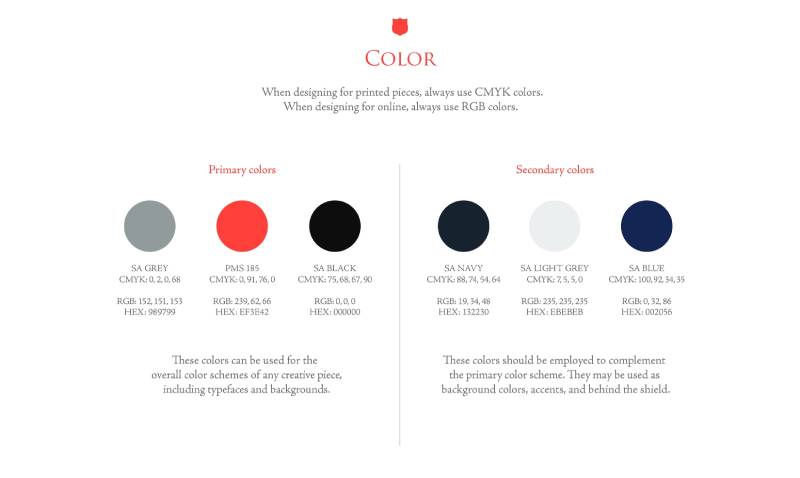
Color Palette: The primary color is SA Red (PMS 185, Hex: #EF3E42). Supporting colors include SA Blue (Hex: #002056), SA Gold (Hex: #AF8C46), SA Flag Yellow (Hex: #FFF200), SA Navy (Hex: #132230), SA Grey (Hex: #989799), SA Light Grey (Hex: #EBEBEB), and SA Black (Hex: #000000).
Usage Context: The red shield appears on Salvation Army buildings, thrift stores, disaster relief vehicles, volunteer uniforms, Christmas kettle campaigns, fundraising materials, digital platforms, stationery, and merchandise. It is the external-facing symbol, while the crest is used more for internal church settings.
How Has The Salvation Army Logo Evolved Over Time?

The Salvation Army’s visual identity has moved through three main phases: the ornate Victorian crest (1878), the wartime red shield (1899-1918), and the standardized modern shield (1958 to present). Each step simplified the design, making it easier to reproduce across media.
The shift from a complex coat-of-arms style badge to a clean, readable shield tracks with broader trends in graphic design movements during the 20th century. Less decoration. More clarity.
The Original Crest (1878-1901)
Years Active: 1878 to present (still used internally), but it was the primary public symbol from 1878 through the early 1900s.
Design Description: An ornate circular badge with a geometric frame. A white and blue rounded medallion enclosed in yellow triangular rays, topped with a large crown featuring five four-pointed stars. In the center sat a red letter “S” intertwined with a Christian cross and two crossed swords. The motto “Blood and Fire” appeared around the blue perimeter.
Color Scheme: Red, blue, yellow, white, and black. These remain the traditional Salvation Army colors to this day.
Designer: Captain William H. Ebdon created the original design in 1878. The only change made to his work was the addition of the crown.
Context: The Christian Mission officially became The Salvation Army in 1878, adopting military structure and terminology. The crest was created to represent the organization’s doctrines and beliefs visually. It first appeared in print on official letterhead by March 1879.
Key Changes from Previous: This was the first official logo. There was no prior version.
Cultural Significance: The crest functioned like a coat of arms for a religious movement. Every element had doctrinal meaning, from the seven dots (truths of the gospel) to the crossed swords (the war of salvation). In the U.S., the crown was temporarily replaced with an American eagle around 1890 due to copyright issues with a breakaway officer. That change was reversed in the 1980s.
The Early Red Shield (1899-1958)
Years Active: Roughly 1899 through 1958, though usage grew gradually.
Design Description: A simple shield shape bearing the words “Salvation Army.” Early versions were hand-lettered and varied considerably. Some appeared on blue backgrounds, others on red. The shield was often a physical metal badge, about 45 millimeters in size, worn by Salvationists.
Color Scheme: Initially silver, then red enamel. During World War I, shields on buildings and canteens were described as enameled sheet iron with a blood-red background.
Designer: Captain Russel Clarke drew the first formal Red Shield design in September 1918 at a Calgary Rotary Club gathering. Joseph Hoy later improved the design after WWI ended.
Context: William Booth sent officers to support British troops during the Boer War in South Africa (1899-1902). They wore silver shield badges. An officer pointed out that the reflective silver could reveal troop positions to the enemy at night. So the silver was swapped for red enamel. That practical decision gave birth to the “Red Shield” identity.
The symbol gained massive visibility during both World Wars, appearing on recreation huts, mobile canteens, and relief stations. By the time WWII ended, the Red Shield was deeply associated with service to military personnel.
Key Changes from Previous: A dramatic simplification. The ornate crest with its crown, swords, sun rays, and multiple text elements gave way to a clean shield with just the organization’s name. Think of it as stripping a design back to its core logo function.
Cultural Significance: The Red Shield became synonymous with frontline humanitarian service. It was the mark soldiers looked for when they needed food, rest, or a friendly face. That wartime goodwill carried over into peacetime fundraising and community programs.
The Standardized Modern Shield (1958-Present)
Years Active: 1958 to present.
Design Description: A hexagonal red shield with four angular protrusions (three at the top, one at the bottom) and two rounded sides. “The Salvation Army” runs diagonally in white across the center. A double-line border runs along the edges. Clean, direct, no extra decoration.
Color Scheme: Red (PMS 185) as the primary color, with white text. Supporting brand colors include blue, gold, navy, and grey for secondary materials.
Designer: The standardization was approved at the Commissioners Conference in 1958, building on the design work refined by Joseph Hoy decades earlier. The modern brand guidelines use Trajan Pro as the official companion font for branded materials, though the logo text itself is a custom, hand-drawn style.
Context: By the mid-20th century, The Salvation Army operated across dozens of countries. Regional logo variations were creating inconsistency. The 1958 standardization gave every territory one unified mark. The 1960s then brought even more systematic brand guidelines.
Key Changes from Previous: The shape was tightened. The lettering was made consistent. Guidelines were established for minimum sizes, clear space, and approved color usage. It went from a loosely applied wartime symbol to a controlled corporate identity.
Cultural Significance: This version turned the Red Shield into one of the most recognized charity marks globally. Brand recognition studies have shown awareness rates above 90% in major markets. It appears on everything from thrift store signage to Christmas kettle campaigns to disaster relief vehicles.
What Do the Design Elements of The Salvation Army Logo Mean?
Every piece of The Salvation Army logo carries meaning rooted in the organization’s Christian faith and military heritage. The shield shape references biblical imagery of God as a protector. The red color connects directly to the “Blood and Fire” motto.
This is not a logo where someone picked shapes because they looked good. The whole thing is doctrine made visual. And that kind of intentional storytelling is what gives the mark its staying power.
Why Did The Salvation Army Choose These Specific Colors?
SA Red (PMS 185, Hex: #EF3E42): This is the dominant color. It represents the blood of Jesus Christ in Christian theology. On a practical level, red triggers immediate emotional responses tied to urgency and compassion. Look at the Red Cross logo for a similar approach. Red works in charity branding because it demands attention.
The psychology behind color choices here is no accident. Red is among the most commonly used colors in logos that need to convey action and urgency.
SA Blue (Hex: #002056): Blue represents the purity of God in Salvation Army symbolism. It appears on the organization’s flag and in secondary brand materials.
SA Flag Yellow (Hex: #FFF200): Yellow stands for the fire of the Holy Spirit. It shows up on the Salvation Army flag as a central star and in accent applications across branded materials.
SA Gold (Hex: #AF8C46): Used as an accent for formal and ceremonial materials. Similar to how many gold-accented logos suggest tradition and prestige.
SA Navy (Hex: #132230), SA Grey (#989799), SA Light Grey (#EBEBEB), SA Black (#000000): These are supporting neutral tones used for backgrounds, body text, and secondary design applications.
The overall color palette stays tight. Red does the heavy lifting. White provides contrast. Everything else supports without competing.
What Typography Style Is Used in The Salvation Army Logo?
The lettering on the red shield itself is custom and hand-drawn. It was created long before digital typography tools existed, so it does not match any standard typeface you can buy or download.
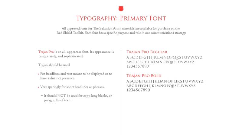
For official printed and digital materials, The Salvation Army uses Trajan Pro as its primary branded serif font. Adobe Jenson Pro serves as a secondary option. Both carry a classical, authoritative tone that fits the organization’s identity.
The diagonal placement of text on the shield is unusual. Most logos center text horizontally. But the angled lettering gives the mark a sense of movement and forward momentum, almost like a banner cutting across the shield. Took me a while to appreciate how well that diagonal pulls your eye across the entire shape.
What Are the Hidden Meanings in The Salvation Army Logo?
The shield shape itself carries layered references. Biblically, it points to God as a protective shield. Militarily, it connects to the organization’s army-style structure. And in the context of heraldry and shape psychology, shields communicate defense, safety, and trustworthiness.
The Red Shield’s origin story adds another layer. It was not designed at a desk. It came from a warzone, where a silver badge was replaced with red enamel so soldiers would not get killed by reflected light. That origin gives the logo an authenticity that no branding agency could manufacture.
The hexagonal form with its angular top points and rounded sides creates an interesting tension. Sharp angles suggest military precision. Rounded edges soften the overall feel toward compassion and approachability. That balance between authority and warmth is, honestly, hard to pull off in any logo.
How Does The Salvation Army Logo Compare to Competitor Logos?
In the world of major charitable organizations, logo design tends to lean toward simplicity and strong color choices. The Salvation Army’s red shield sits among some heavy hitters.
The Red Cross logo uses a red cross on white. Stripped down. Universal. But it lacks the textual identification that the Salvation Army shield carries.
The WWF logo takes a completely different approach with its iconic panda illustration, a black and white mark that relies on an animal mascot rather than a shape-plus-text combination.
The UNICEF logo uses a blue wordmark paired with a simplified graphic of a parent and child within a globe. More modern. More corporate.
The Habitat for Humanity logo features a stylized house shape. Direct and literal about the organization’s mission.
What makes The Salvation Army shield different is its military heritage. None of the other major charity logos look like they could have come off a soldier’s uniform. That gives the mark a ruggedness and historical weight that newer, cleaner designs just do not have. It is a logo that feels earned rather than designed.
If you compare it to other organizations operating in the same space, like the Feeding America logo, the Salvation Army’s mark has a much stronger visual authority. Feeding America uses softer, more contemporary design language. The Salvation Army’s approach is bolder, older, and grittier.
What Are the Technical Specifications of The Salvation Army Logo?
Official Color Codes
Primary Color – SA Red: Hex: #EF3E42 | RGB: (239, 62, 66) | CMYK: (0, 100, 85, 0) | Pantone: PMS 185
SA Blue: Hex: #002056 | RGB: (0, 32, 86) | CMYK: (100, 92, 34, 35)
SA Gold: Hex: #AF8C46 | RGB: (175, 140, 70) | CMYK: (31, 41, 85, 6)
SA Flag Yellow: Hex: #FFF200 | RGB: (255, 242, 0) | CMYK: (0, 5, 100, 0)
SA Navy: Hex: #132230 | RGB: (19, 34, 48) | CMYK: (88, 74, 54, 64)
SA Grey: Hex: #989799 | RGB: (152, 151, 153) | CMYK: (0, 2, 0, 68)
SA Light Grey: Hex: #EBEBEB | RGB: (235, 235, 235) | CMYK: (7, 5, 5, 0)
SA Black: Hex: #000000 | RGB: (0, 0, 0) | CMYK: (75, 68, 67, 90)
Dimensions and Proportions
The shield is treated as a single unit. You cannot enlarge or reduce one part of the symbol independently. The aspect ratio of the shield is roughly 212 x 250 pixels in its standard SVG rendering, giving it an approximate ratio of about 0.85:1 (width to height).
Minimum size requirements exist to keep the diagonal text legible. Clear space around the logo must be maintained so nothing crowds the shield. The registry mark (the “R” in a circle) should be printed in red to match the shield.
Official logo files are distributed as vector graphics through territorial headquarters and the Red Shield Toolkit portal. This makes sure the mark reproduces cleanly at any scale, from a small lapel pin to a building-sized sign. For web and social media, rasterized versions are available in PNG format at appropriate DPI settings.
What Cultural Impact Has The Salvation Army Logo Had?
The Red Shield has become more than a logo. It functions as a cultural shorthand for charitable service, especially in English-speaking countries. When people see that red shield on a building, on a kettle, or on a disaster relief truck, the association is immediate: help is here.
Christmas kettle campaigns have done a lot of this heavy lifting. Since the 1890s, Salvation Army bell ringers standing beside red kettles have become a seasonal fixture in front of stores across the United States, Canada, and beyond. The red shield on that kettle is one of the most repeated logo exposures in the nonprofit sector.
The logo has appeared in films, news broadcasts, and media coverage of every major disaster since World War I. That kind of earned visibility, not paid advertising, builds a recognition level that most brands spend millions trying to achieve. Brand awareness studies place The Salvation Army above 90% in major markets.
There is also the thrift store angle. Salvation Army Family Stores put the red shield in front of millions of shoppers every week. The logo does double duty there, functioning as both a retail brand and a reminder of the organization’s charitable mission.
How Does The Salvation Army Logo Fit Into the Overall Brand Identity?

The red shield does not exist alone. It sits at the center of a broader visual system that includes the crest (for church settings), the tricolor flag (red, blue, yellow), officer uniforms, the “Doing the Most Good” tagline, and a full set of brand guidelines covering everything from line spacing to approved photography styles.
The relationship between the shield and the crest is worth noting. The crest is the doctrinal symbol, packed with theological meaning. The shield is the public-facing mark, optimized for quick recognition. In the UK, current policy requires the red shield on all new Salvation Army buildings, with the crest reserved for internal use.
This two-emblem strategy is unusual among nonprofits. Most organizations pick one mark and stick with it. The Salvation Army maintains two because it is both a church and a global charity, and each identity needs its own visual language.
Trajan Pro ties the written materials together. The flag’s colors (red for blood of Christ, blue for purity of God, yellow for fire of the Holy Spirit) reinforce the same color theory principles at work in the shield. It all connects. Nothing feels random.
How Should The Salvation Army Logo Be Used?
Official Usage Guidelines
The Salvation Army’s brand standards are detailed and strictly enforced. Here is what you need to know:
Do: Use the shield as a complete unit. Maintain required clear space. Reproduce in approved colors only (PMS 185 Red, black, grey, or silver metallic). Include the registered trademark symbol. Use official vector files from the Red Shield Toolkit or territorial headquarters.
Don’t: Resize individual parts of the shield independently. Place the logo on busy backgrounds that reduce legibility. Alter the colors, proportions, or orientation. Use the logo without proper authorization or licensing. Combine the shield with other logos in ways that imply endorsement without approval.
Where to Access Official Logos
Authorized logo files are available through The Salvation Army’s Red Shield Toolkit portal (redshieldtoolkit.org) and through individual territorial or divisional headquarters. Files come in vector and raster formats for both print and web applications.
Licensing and Trademark
The logo is a registered trademark. Commercial use requires formal licensing agreements through The Salvation Army. Revenue from licensed merchandise supports the organization’s programs, including adult rehabilitation centers and emergency assistance. Unauthorized use is actively monitored and subject to legal action.
If you are producing materials for a Salvation Army event, fundraiser, or partnership, always request official assets rather than pulling images from the web. The brand style guide exists for a reason: consistency across 133 countries is not something you can leave to chance.
FAQ on The Salvation Army Logo
What does The Salvation Army logo look like?
It is a red shield with “The Salvation Army” written diagonally in white. The hexagonal shape has angular top points and a single bottom point, with rounded sides. A double border frames the whole emblem.
Simple. Readable from a distance. That was the point.
What does the Red Shield symbol mean?
The shield represents God’s protection, drawn from biblical references. Red stands for the blood of Christ and connects to the organization’s “Blood and Fire” motto.
It also ties to the military heritage of William Booth’s original structure. Defense, service, sacrifice.
Who designed The Salvation Army crest?
Captain William Ebdon created the original crest in 1878 when the Christian Mission became The Salvation Army. The only change made to his design was adding the crown on top.
It first appeared on official letterhead by March 1879.
What is the difference between the crest and the shield?
The crest is the older, more complex emblem with a sun, cross, swords, crown, and the “Blood and Fire” motto. It is used for internal church purposes.
The red shield is the public-facing charity logo. Most people only recognize the shield.
What are the official colors of The Salvation Army logo?
The primary color is SA Red, Pantone 185 (Hex: #EF3E42). Supporting brand colors include SA Blue (#002056), SA Gold (#AF8C46), and SA Flag Yellow (#FFF200).
Red does the heavy lifting. White provides contrast on the shield itself.
What font does The Salvation Army use?
The shield lettering is custom and hand-drawn. It does not match any standard typeface. For branded materials, the organization uses Trajan Pro as its primary font, with Adobe Jenson Pro as a secondary option.
When did the Red Shield logo originate?
During the Boer War (1899-1902). Salvationists wore silver shield badges while serving British troops in South Africa. The silver was changed to red enamel because it reflected light and endangered soldiers at night.
A wartime fix that became a global nonprofit symbol.
How did The Salvation Army logo change over time?
Three main phases. The ornate Victorian crest appeared in 1878. The red shield emerged around 1899-1918 during wartime service. The Commissioners Conference standardized the modern shield in 1958.
Each version simplified the design further.
Can I use The Salvation Army logo for my project?
Not without permission. The Red Shield is a registered trademark worldwide. Any commercial use requires a formal licensing agreement through The Salvation Army’s territorial headquarters or brand guidelines team.
Always request official files rather than pulling images from the web.
Why is The Salvation Army logo so recognizable?
Consistency across 133 countries helps. So does over a century of visibility on thrift stores, Christmas kettle campaigns, and disaster relief operations. Brand recognition studies show awareness above 90% in major markets.
Few charitable organization emblems have that kind of reach.
Conclusion
The Salvation Army logo did not come from a branding workshop. It came from a battlefield. That origin is what separates the Red Shield from most nonprofit emblems designed in conference rooms.
From Captain Ebdon’s 1878 crest to the standardized shield we see on thrift stores and disaster relief trucks today, every change served a purpose. Nothing was decorative for the sake of it.
The consistent use of PMS 185 Red, the hand-drawn lettering, and the shield shape rooted in Christian symbolism all work together. They communicate trust, protection, and action across 133 countries.
Few charitable organizations have maintained this level of brand recognition for over a century. Your mileage may vary with newer logo trends, but this one has proven itself.

Renowned for his expertise in logo design and visual branding, Bogdan has developed a multitude of logos for various clients.
His skills extend to creating posters, vector illustrations, business cards, and brochures. Additionally, Bogdan's UI kits were featured on marketplaces like Visual Hierarchy and UI8.
He also wrote in the past years on sites like Design Your Way, WebDesignerDepot, WPDean, Designmodo, Speckyboy, Slider Revolution, and more.
- Canva vs PowerPoint: Which Is Better for Presentations? - 22 September 2026
- How to Install Fonts on Mac (Step-by-Step Guide) - 20 September 2026
- From Mockup to Code: How AI-Augmented Development Speeds Up the Design Handoff - 19 September 2026

Bogdan Sandu is a seasoned designer who has been designing websites since 2008. Renowned for his expertise in logo design and visual branding, Bogdan has developed a multitude of logos for various clients. His skills extend to creating posters, vector illustrations, business cards, and brochures. Additionally, Bogdan's UI kits were featured on marketplaces like Visual Hierarchy and UI8. He also wrote in the past years on sites like Design Your Way, WebDesignerDepot, WPDean, Designmodo, Speckyboy, Slider Revolution, and more.
You Might Also Like


