


The Nature Conservancy logo is one of those marks that people recognize without always knowing why. It shows up on donation mailers, conservation reports, and outdoor signage across more than 70 countries. And yet most people have never really looked at it closely.
That green globe wrapped in leaves, paired with clean black text. It’s been around since the organization’s founding in 1951, though the version you see today looks nothing like the original. The mark represents the largest environmental nonprofit by assets in the Americas, an organization that has protected over 119 million acres of land worldwide.
What makes this logo work isn’t complexity. It’s restraint. The design says “we protect the planet” without screaming it. That kind of quiet confidence is tough to pull off in nonprofit branding, where organizations often feel pressure to be loud and urgent with every visual choice they make.
What Is The Nature Conservancy Logo?
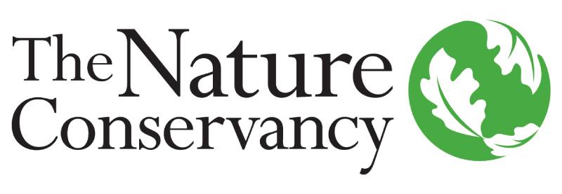
The Nature Conservancy logo is a combination mark featuring a stylized green globe covered in oak leaf patterns, placed next to a stacked wordmark in a clean sans-serif typeface. Introduced alongside the organization’s founding in 1951 and refined through multiple redesigns, the mark communicates global environmental stewardship through natural imagery and earth-toned colors.
Here’s what you need to know about its core attributes:
- Design Type: Combination mark (icon plus wordmark)
- Primary Elements: Stylized green globe with white oak leaf pattern, stacked text reading “The Nature Conservancy”
- Official Introduction: 1951, with the current version being a modernized iteration
- Typography: Custom sans-serif similar to Imago; the organization also uses a serif face called “Oakleaf”
- Trademark Status: Registered trademark of The Nature Conservancy, with controlled licensing for partner use
- Color Palette: Primary green (earth-toned, nature-inspired green), black for the wordmark, and white for leaf details and backgrounds
- Usage Context: Conservation reports, fundraising materials, digital platforms, corporate partnership collateral, merchandise, and field signage across 70+ countries
The word “Nature” sits larger than the other text in the wordmark. That’s a deliberate choice. It puts the mission front and center before the organizational name even fully registers.
How Has The Nature Conservancy Logo Evolved Over Time?
The Nature Conservancy’s visual identity has gone through several major shifts since 1951. Early versions leaned heavily on academic credibility, looking more like something you’d find on a university letterhead than a global conservation brand. Over seven decades, each redesign reflected whatever the environmental movement needed most at that moment.
Original Nature Conservancy Logo (1951 – 1970s)
- Years Active: 1951 to approximately the mid-1970s
- Design Description: A conservative, text-heavy mark with minimal graphic elements. It leaned on institutional credibility over visual appeal.
- Color Scheme: Primarily black and white, typical of nonprofit materials from that era
- Context: The organization had just incorporated as a U.S. nonprofit on October 22, 1951, growing out of the Ecologists’ Union. The logo needed to look serious and scientific.
- Cultural Significance: It established TNC as a research-driven organization, not an activist group. That distinction mattered in the 1950s.
Mid-Century Refinement (1970s – 1990s)
- Years Active: Mid-1970s through the early 1990s
- Design Description: Introduction of natural imagery and the beginnings of the globe/leaf concept. Green started appearing in the identity as environmental awareness grew.
- Color Scheme: Green and black introduced, reflecting the broader “green movement”
- Key Changes: Shift from purely typographic identity to one incorporating graphic symbols. The organization was growing fast under Patrick Noonan’s presidency (1973-1980), and the branding needed to match.
- Cultural Significance: This period aligned with the first Earth Day in 1970 and rising public concern about habitat loss. The logo started speaking to a wider audience beyond scientists.
Modern Globe and Leaf Identity (1990s – Present)
- Years Active: 1990s to present day
- Design Description: The now-familiar green globe wrapped with white oak leaf shapes, paired with a stacked sans-serif wordmark. Clean lines and generous spacing.
- Color Scheme: Earth-toned green for the globe, black for the typography, white for the leaf pattern and backgrounds
- Key Changes from Previous: Complete departure from the academic look. The globe-leaf icon became the focal point, capable of standing alone without the text in some applications.
- Context: TNC had grown into the largest environmental nonprofit in the Americas. The branding needed to work across dozens of countries and thousands of digital touchpoints.
- Cultural Significance: The design positioned TNC as both global and approachable. It moved the organization from “serious science group” to “we’re protecting your planet, and you should join us.”
What Do the Design Elements of The Nature Conservancy Logo Mean?
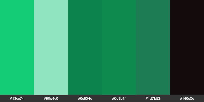
Every piece of this mark serves a purpose. The green globe represents Earth itself, while the oak leaf pattern wrapping around it suggests nature’s protective role.
Together, these elements say something specific: conservation isn’t about locking nature away. It’s about keeping the planet healthy for everyone.
The round shape of the globe also matters. Circles suggest inclusion and completeness, which fits TNC’s mission of working with communities rather than against them.
Why Did The Nature Conservancy Choose These Specific Colors?
The primary green isn’t an accident. It’s a carefully selected earth-toned shade that avoids looking either too corporate or too casual.
Green connects directly to growth, renewal, and the natural world. That’s color psychology at work. People see green and immediately think “environment” without needing any other context.
The black wordmark does something different. It adds authority and seriousness, reminding viewers this is a science-driven organization, not just a feel-good charity. Contrast between the green icon and dark text keeps the logo readable at any size.
White serves a structural role, creating the leaf shapes within the globe and providing breathing room around the mark. The result is a color palette that feels grounded and trustworthy.
What Typography Style Is Used in The Nature Conservancy Logo?
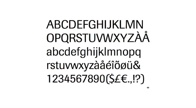
The logo uses a clean sans-serif font similar to Imago. The organization also maintains a serif typeface called “Oakleaf” for other brand materials.
The text stacks in two lines. “The Nature” sits on top, “Conservancy” below. Both lines are centered. This layout improves readability and creates a compact footprint that works on everything from business cards to billboards.
What’s worth noting: “Nature” is visually larger than the surrounding words. It’s a simple typographic hierarchy trick that puts the mission keyword right where your eye lands first.
What Are the Hidden Meanings in The Nature Conservancy Logo?
The oak leaf choice is specific. Oaks are symbols of strength, endurance, and longevity across many cultures. They live for hundreds of years. For a conservation organization, that’s not subtle.
Look at the globe-leaf combination again. The leaves don’t just sit on the surface. They wrap around the earth, suggesting protection without enclosure. It’s a visual argument that nature and the planet aren’t separate things.
There’s also the absence of hard edges. The whole mark uses soft, organic curves that work against the rigidity you’d expect from a $7 billion organization. That softness is intentional, it keeps the brand approachable.
How Does The Nature Conservancy Logo Compare to Competitor Logos?
Put the TNC logo next to other major environmental organizations and the differences jump out.
The WWF logo uses a black-and-white panda. Simple, mascot-driven, emotionally direct. It makes you feel something for a specific animal. TNC’s approach is broader, focused on the entire planet rather than one species.
The Sierra Club leans into rugged mountain imagery and has a more traditional, outdoorsy feel. Greenpeace goes with bold, action-oriented branding. The Red Cross logo uses stark red and white for instant humanitarian recognition.
TNC sits in a different space. Its logo communicates scientific credibility and global scope at the same time. Among nonprofit logos, this is unusual. Most environmental organizations pick either “emotional appeal” or “professional authority.” TNC manages both.
The green logo approach is common in environmental branding. But TNC’s globe-and-leaf concept adds a layer of specificity that generic green marks don’t have.
What Are the Technical Specifications of The Nature Conservancy Logo?
Official Color Codes
- Primary Color: Nature Green
- A medium earth-toned green used for the globe icon
- For RGB digital screens, the value follows green-heavy specifications with minimal red and blue
- Print materials use CMYK formulations to match the on-screen appearance
- Pantone spot color references are specified in brand guidelines for consistent print reproduction
- Secondary Color: Black
- Hex: #000000
- RGB: (0, 0, 0)
- CMYK: (0, 0, 0, 100)
- Used for the wordmark and certain single-color applications
- Accent Color: White
- Hex: #FFFFFF
- RGB: (255, 255, 255)
- Used for the oak leaf details within the globe and reversed-out versions
Dimensions and Proportions
- Aspect Ratio: The full combination mark (icon plus wordmark) maintains a roughly horizontal orientation, though vertical stacking is permitted in specific contexts
- Minimum Size: Brand guidelines specify minimum reproduction sizes to keep the leaf details inside the globe legible. Below a certain threshold, the icon alone is used without the text
- Clear Space: A defined exclusion zone surrounds the logo to prevent other elements from crowding it. This zone is typically measured using the height of a key element in the mark as the unit
- File Formats: Available as vector graphics (SVG, EPS, AI) for scalability, plus raster formats (PNG, JPEG) for web and basic print use
- DPI Requirements: Digital applications call for 72 DPI minimum; print requires 300 DPI or higher for clean reproduction
What Cultural Impact Has The Nature Conservancy Logo Had?
The TNC logo helped define what an environmental nonprofit is supposed to look like. Before it and a handful of other conservation marks gained wide recognition, there wasn’t really a visual language for “we protect nature at a global scale.”
Now that green-globe-and-leaf combination is almost a genre. Smaller conservation organizations borrow from its visual playbook all the time.
The mark also played a role in shifting public perception of conservation from a niche academic interest to a mainstream cause. When your logo shows up in 70+ countries and on partnership materials with major corporations, it normalizes the idea that environmental work is serious, professional, and worth funding.
How Does The Nature Conservancy Logo Fit Into the Overall Brand Identity?
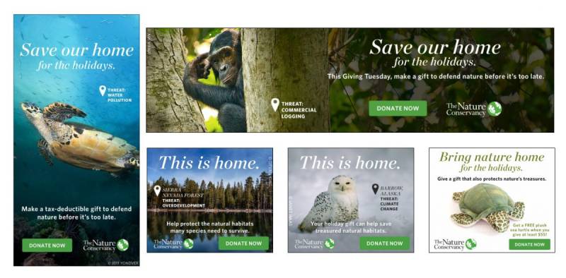
The logo doesn’t exist in isolation. It’s one piece of a larger brand style guide that covers typography, photography direction, color usage, and tone of voice.
TNC’s broader identity leans heavily on nature photography paired with clean layouts and lots of white space. The logo anchors all of this. It appears on every touchpoint, from the website header to field research documents to volunteer t-shirts.
What ties everything together is consistency. The same green, the same typefaces, the same clear-space rules. TNC’s brand guidelines are strict about this, and for good reason. When you operate in 70+ countries, visual consistency is the only thing that keeps your identity from fragmenting.
How Should The Nature Conservancy Logo Be Used?
Official usage do’s:
- Always reproduce the logo from official digital files, never recreate it manually
- Maintain the specified clear space around the mark at all times
- Use approved color versions: full color, single-color black, or reversed white
- Follow minimum size requirements so the leaf detail stays visible
Official usage don’ts:
- Don’t alter the colors, proportions, or arrangement of the logo elements
- Don’t place the logo on busy backgrounds that reduce legibility
- Don’t add effects like drop shadows, outlines, or gradients to the mark
- Don’t use the logo to imply endorsement without a formal partnership agreement
Where to access official logos: TNC’s communications and marketing teams distribute approved logo files to authorized partners. Educational institutions can request special usage permissions for research publications.
Licensing: Partner organizations receive controlled usage rights through formal agreements. Corporate sponsors and collaborators must follow specific co-branding rules outlined in the partnership guidelines.
Trademark protection: The Nature Conservancy logo is a registered trademark. Unauthorized use in commercial contexts is subject to legal enforcement. The organization actively monitors for misuse and takes action to protect its brand equity.
FAQ on The Nature Conservancy Logo
What does The Nature Conservancy logo look like?
The Nature Conservancy logo features a green globe wrapped in white oak leaf shapes, paired with a stacked sans-serif wordmark in black. The word “Nature” appears larger than the rest. It’s a combination mark that works across digital and print platforms.
What do the leaves in The Nature Conservancy logo represent?
The oak leaves symbolize strength, endurance, and long-term protection. Oaks live for centuries, which maps directly to the conservation mission.
Wrapping around the globe, they suggest nature shielding the planet. The psychology of shapes here reinforces that protective message.
What colors are used in The Nature Conservancy logo?
The primary color palette includes an earth-toned green for the globe, black for the wordmark, and white for leaf details. Green connects to environmental stewardship and growth.
Black adds authority. This color theory approach builds trust with donors, partners, and the general public.
What font does The Nature Conservancy use in its logo?
The logo uses a clean font similar to Imago, a modern sans-serif. TNC also maintains a custom serif typeface called “Oakleaf” for supporting brand materials.
The text stacks in two centered lines. That layout keeps things compact and readable at small sizes.
When was The Nature Conservancy logo first created?
The first logo launched in 1951 when the organization incorporated as a U.S. nonprofit. It looked nothing like the current version.
Early designs focused on scientific credibility over visual appeal. Multiple redesigns followed over seven decades as conservation priorities shifted.
Has The Nature Conservancy logo changed over the years?
Yes, significantly. The original was a conservative text-based mark. By the 1970s, green imagery started appearing as environmental awareness grew.
The modern globe-and-leaf icon came later and became the recognizable logo used today across 70+ countries. Each version reflected the organization’s expanding global mission.
Can I download or use The Nature Conservancy logo?
Not freely. The Nature Conservancy logo is a registered trademark. Unauthorized commercial use faces legal enforcement.
Partner organizations get controlled usage rights through formal licensing agreements. Educational institutions can request special permissions for research publications. Always use official files from TNC’s communications team.
How does The Nature Conservancy logo compare to the WWF logo?
The WWF logo uses a black-and-white panda, focusing emotional appeal on a single species. TNC takes a broader approach with its globe-and-leaf mark.
TNC communicates global scope and scientific authority. WWF goes for instant emotional connection. Both work, just for different reasons.
What makes The Nature Conservancy logo effective?
Restraint. The mark uses minimalist design thinking without feeling empty. The oak leaf globe is specific enough to be memorable but broad enough to represent a worldwide mission.
Strong visual hierarchy guides your eye from icon to text. It scales well from mobile screens to building signage.
Where is The Nature Conservancy logo used?
Everywhere the organization operates. Conservation reports, fundraising campaigns, web design assets, corporate partnership materials, field signage, and merchandise.
TNC works in over 70 countries, so the logo appears on everything from research papers in Arlington, Virginia to habitat markers in remote forests. Consistency across all these touchpoints is what keeps the brand identity intact.
Conclusion
The Nature Conservancy logo proves that nonprofit branding doesn’t need to be loud to be effective. A green globe, oak leaf patterns, and a clean wordmark have carried this organization’s visual identity across seven decades and 70+ countries.
Every design choice ties back to the mission. The earth-toned greens, the Imago-style typography, the organic curves. Nothing is accidental.
For conservation organizations building their own brand recognition, this mark is worth studying. It balances scientific credibility with broad public appeal, and that’s a tricky line to walk. Few environmental logos manage it this well.

Renowned for his expertise in logo design and visual branding, Bogdan has developed a multitude of logos for various clients.
His skills extend to creating posters, vector illustrations, business cards, and brochures. Additionally, Bogdan's UI kits were featured on marketplaces like Visual Hierarchy and UI8.
He also wrote in the past years on sites like Design Your Way, WebDesignerDepot, WPDean, Designmodo, Speckyboy, Slider Revolution, and more.
- Best Visual Regression Testing Tools for Web and App Design in 2026 - 13 October 2026
- Jujutsu Kaisen Font Generator - 12 October 2026
- The Windsurf Logo History, Colors, Font, And Meaning - 10 October 2026

Bogdan Sandu is a seasoned designer who has been designing websites since 2008. Renowned for his expertise in logo design and visual branding, Bogdan has developed a multitude of logos for various clients. His skills extend to creating posters, vector illustrations, business cards, and brochures. Additionally, Bogdan's UI kits were featured on marketplaces like Visual Hierarchy and UI8. He also wrote in the past years on sites like Design Your Way, WebDesignerDepot, WPDean, Designmodo, Speckyboy, Slider Revolution, and more.
You Might Also Like


