


The Red Cross logo is one of the few symbols on the planet that needs zero explanation. You see it on a battlefield, on the side of a disaster relief truck, or stitched onto a volunteer’s jacket, and you already know what it means. Help is here.
It traces back to 1863, when Henry Dunant and a small committee in Geneva needed a single, universal mark for medical neutrality. They flipped the Swiss flag. Red background, white cross became white background, red cross. That simple reversal became one of the most legally protected emblems in history, backed by the Geneva Conventions.
The current version used by the American Red Cross got a refresh in 2012, designed by Turner Duckworth. But the core symbol itself? Barely changed in over 160 years. It sits within the broader family of the International Red Cross and Red Crescent Movement, alongside the Red Crescent (adopted in 1929) and the Red Crystal (added in 2005). Few marks in the history of logo design have stayed this consistent for this long.
What Is the Red Cross Logo?

The Red Cross logo is a red cross on a white background, first adopted at the 1863 Geneva Conference as a universal emblem for medical neutrality. Designed by reversing the colors of the Swiss flag, it identifies humanitarian workers and receives legal protection under international humanitarian law.
Here are the key attributes of this emblem:
- Design Type: Emblem and combination mark. The American Red Cross version pairs the cross symbol with a wordmark. The ICRC uses the standalone cross for protective purposes.
- Primary Elements: A red Greek cross (equal-armed) composed of five squares on a white background. The American Red Cross version places this inside a circular “button” shape with the organization name alongside it.
- Official Introduction Date: October 26, 1863, at the first International Conference in Geneva. Codified into law with the First Geneva Convention on August 22, 1864.
- Designer: The concept came from Dr. Louis Appia and General Henri Dufour, both founding members of the committee that became the ICRC. Henri Dunant is credited as the driving force behind the movement. The 2012 American Red Cross brand refresh was handled by Turner Duckworth.
- Trademark Status: Protected under the Geneva Conventions of 1949 and their Additional Protocols. In the United States, use of the red cross emblem is restricted by federal law. Only the American Red Cross and the U.S. military medical services can use it. Unauthorized use can lead to prosecution.
- Color Palette: The emblem itself uses Red Cross Red (#ED1B2E) and White (#FFFFFF). The broader American Red Cross brand palette includes secondary colors like Nevada Gray (#6D6E70), Pacific Blue (#0091CD), and Regal Blue (#004B79).
- Usage Context: Military medical services, disaster relief vehicles, humanitarian aid operations, blood donation campaigns, first aid kits, digital platforms, volunteer identification, and official communications from Red Cross and Red Crescent societies worldwide.
How Has the Red Cross Logo Evolved Over Time?

The Red Cross emblem has gone through remarkably few changes since 1863. The core symbol (a red cross on white) has stayed constant, while the organizational branding around it shifted to match modern needs.
Most logos get redesigned every decade or so. This one barely budged in over 160 years. That kind of staying power tells you something about how well the original concept worked.
Original Red Cross Emblem (1863-1881)
- Years Active: 1863-1881 (international use before American branch founding)
- Design Description: A plain red cross on a white background. No text, no circle, no additional graphic elements. Five red squares arranged in a plus formation.
- Color Scheme: Red and white only.
- Designer: Attributed to Dr. Louis Appia and General Henri Dufour, with the concept proposed at the committee chaired by Gustave Moynier.
- Context: Created because battlefield medics needed instant, universal identification. Before this, every country used different symbols for medical services, and none were legally protected. The 1864 First Geneva Convention made this emblem an official sign of neutrality.
- Cultural Significance: First universally recognized humanitarian symbol. It established the principle that medical personnel in war zones are off-limits. The psychology of shapes played a role here too. The cross is instantly readable, even at a distance or in chaotic conditions.
American Red Cross Classic Logo (1881-2012)
- Years Active: 1881-2012
- Design Description: The red cross symbol paired with “American Red Cross” in bold, black sans-serif lettering. The cross sat to the left of the text, stacked in two lines. Clean, no-frills layout.
- Color Scheme: Red cross, black text, white background.
- Designer: Clara Barton founded the American Red Cross in 1881, adopting the international emblem. The branding evolved organically over the decades without a single credited redesign until 2012.
- Context: Clara Barton was inspired by the International Red Cross after witnessing its work during the Franco-Prussian War. She lobbied the U.S. government for years before the American branch was formally chartered by Congress in 1900 and again in 1905.
- Key Changes from Previous: Added the organizational name next to the cross. The emblem went from a standalone protective symbol to also serving as a brand identity for the American chapter.
- Cultural Significance: Became linked with domestic disaster relief in America, particularly after the Johnstown Flood of 1889. The logo appeared on blood drives, hurricane relief operations, and wartime support efforts throughout the 20th century.
American Red Cross Button Logo (2012-Present)
- Years Active: 2012-present
- Design Description: The red cross placed inside a three-dimensional white circle with subtle shadows, giving it a “pin” or “button” appearance. The organization name appears to the right in gray typeface. Three logo configurations exist: the button logo, the classic logo, and a standalone wordmark.
- Color Scheme: Red Cross Red (#ED1B2E), white, and gray text. The shift from black to gray text softened the overall look.
- Designer: Turner Duckworth, with founding partner David Turner leading the project. BBDO NY handled the advertising rollout.
- Context: The refresh aimed to attract a new generation of donors and volunteers while honoring the 130-year heritage. The button concept was inspired by vintage Red Cross lapel pins from the early 1900s.
- Key Changes from Previous: The flat cross moved into a dimensional circle. Text changed from black to gray. The overall feel shifted from institutional to personal and approachable.
- Cultural Significance: Represented a move toward modern nonprofit branding without abandoning the core symbol. The “button” concept was meant to signal personal participation, like wearing a pin to show you belong to something.
What Do the Design Elements of the Red Cross Logo Mean?

Every part of the Red Cross logo was chosen for practical reasons first. The red cross on white creates maximum contrast, making it visible from hundreds of meters away.
The equal-armed cross shape has no directional bias. It reads the same from any angle, which matters when you’re trying to identify a medical tent during an artillery barrage.
And the decision to reverse the Swiss flag? That was about associating the symbol with Switzerland’s well-established neutrality, not about religion or decoration.
Why Did the Red Cross Choose These Specific Colors?
Red Cross Red
Hex: #ED1B2E | RGB: (237, 27, 46) | CMYK: (0, 100, 90, 0)
Red signals urgency across almost every culture. It grabs attention faster than any other color on the spectrum. For a symbol that needs to stop soldiers from shooting, that matters. The psychological impact of red ties directly to emergency, action, and life.
White
Hex: #FFFFFF | RGB: (255, 255, 255) | CMYK: (0, 0, 0, 0)
White has meant truce and surrender for centuries. A white flag is universal. Combining it with the red cross reinforced the message of non-combatant status. It also ensures the red cross pops visually against the background, even in dirty, chaotic environments.
Gray (2012 brand update)
Hex: #6D6E70 | RGB: (109, 110, 112)
The 2012 refresh moved the text from black to gray. This was a deliberate tonal shift. Black felt heavy and institutional. Gray softened the brand’s voice without weakening it. The cross stays the focal point, and the gray text stays secondary.
What Typography Style Is Used in the Red Cross Logo?
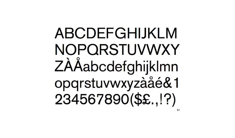
The American Red Cross uses Akzidenz Grotesk BE Super as its primary font. It was designed by Gunter Gerhard Lange and published by the Berthold Type Foundry.
Akzidenz Grotesk is one of the earliest widely-used sans-serif typefaces, dating back to 1896. It influenced later typography heavyweights like Helvetica and Univers.
The organization chose it because the letterforms are clean, with no decorative elements that could slow down reading. When you’re printing text on the side of a relief truck or stamping it on medical supplies, legibility is everything. Spacing between characters stays consistent at any size.
For digital situations where Akzidenz isn’t available, the brand guidelines allow Arial as a substitute. Georgia serves as the approved serif alternative for body text in certain contexts.
What Are the Hidden Meanings in the Red Cross Logo?
Look, there’s been a lot of debate about this one. Some claim the cross has Christian origins tied to the Knights of Malta. Others argue there’s no religious connection at all.
The official position from the ICRC is straightforward. The emblem was created by inverting the Swiss flag, as a tribute to Switzerland’s neutrality. The 1906 revision of the Geneva Convention explicitly stated this connection.
But here’s what’s interesting. The Ottoman Empire didn’t buy that explanation back in the 1870s and replaced the cross with a crescent during the Russo-Turkish War. That tension eventually led to the adoption of the Red Crystal in 2005, a neutral diamond shape with no perceived religious or cultural meaning.
So the “hidden meaning” is really about perception versus intent. The designers meant neutrality. Some cultures read something else entirely.
How Does the Red Cross Logo Compare to Competitor Logos?

Comparing the Red Cross to other nonprofit logos is a bit like comparing apples to institutions. But it’s still worth looking at how other major humanitarian organizations handle their visual identity.
The WWF logo uses a stylized panda. It’s iconic, warm, and immediately communicates wildlife conservation. But it requires more detail to reproduce than a simple cross. You can’t scratch a panda into a wall with a piece of chalk during a crisis.
The UNICEF logo incorporates the UN globe with a parent and child figure. It’s more complex, relies on blue as its primary color, and communicates children’s welfare specifically rather than universal medical aid.
Doctors Without Borders goes the opposite direction entirely. It’s just the name in a bold, stark typeface. No symbol at all. That choice communicates seriousness and urgency through pure typographic weight.
The Salvation Army uses a red shield, which actually competes somewhat in the same visual space as the Red Cross. Both use red. Both suggest protection. But the shield shape reads as defense, while the cross reads as medical aid.
What sets the Red Cross apart from all of them? Legal protection. No other nonprofit logo is backed by international law. That’s a category of one.
What Are the Technical Specifications of the Red Cross Logo?
Official Color Codes
Primary Color: Red Cross Red
- Hex: #ED1B2E
- RGB: (237, 27, 46)
- CMYK: (0, 100, 90, 0)
Secondary Color: White
- Hex: #FFFFFF
- RGB: (255, 255, 255)
- CMYK: (0, 0, 0, 0)
Text Color: Nevada Gray
- Hex: #6D6E70
- RGB: (109, 110, 112)
- Pantone: Cool Gray 8
Accent: Pacific Blue
- Hex: #0091CD
- RGB: (0, 145, 205)
- Pantone: PMS 290 (Light Blue variant: #C4DFF6)
Dimensions and Proportions
The cross is built on a grid of five equal squares. One square in the center, and one extending from each side. The official brand standards specify that the clear space around the logo must equal at least twice the height of one arm of the cross (referred to as “1x” in their documentation).
Minimum size requirements exist for both print and digital applications. The logo should never be reproduced so small that the cross becomes unreadable. For web applications, the organization provides GIF and PNG files at preset sizes. For print work, EPS and vector files are available through their brand portal.
The aspect ratio of the cross itself is 1:1 when measured from arm tip to arm tip. The button logo version adds a circular container with a slight 3D effect through a subtle gradient and shadow.
What Cultural Impact Has the Red Cross Logo Had?
The Red Cross logo changed how the world thinks about symbols in conflict. Before 1863, there was no universal sign that meant “don’t shoot, we’re medics.” That concept simply didn’t exist at scale.
The emblem created a visual language for mercy that crosses borders, languages, and political systems. It showed up in both World Wars on armbands, tents, ships, and aircraft. Soldiers from opposing sides both recognized it.
It also triggered one of the most interesting debates in design history. The cross shape, regardless of its intended Swiss origins, was perceived as a Christian symbol by multiple Muslim-majority nations. This led to the Red Crescent. And eventually, to the Red Crystal. So a single logo design decision in 1863 spawned an entire conversation about cultural sensitivity in global design principles that’s still happening today.
Then there’s the Johnson & Johnson situation. In 2007, J&J sued the American Red Cross over the red cross trademark. J&J had been using a red cross on their products since 1887, before the American Red Cross even had its congressional charter. The case was eventually settled, but it showed how a humanitarian symbol and a commercial trademark can collide in unexpected ways.
How Does the Red Cross Logo Fit Into the Overall Brand Identity?

The Red Cross logo doesn’t exist in isolation. It sits at the center of a connected system that includes the ICRC, the International Federation of Red Cross and Red Crescent Societies (IFRC), and 191 National Societies worldwide.
Each branch uses the core emblem differently. The ICRC uses it as a protective symbol under international law. National societies use it as an organizational brand marker. The IFRC has its own combined Movement logo that represents all three parts together, and it requires special approval to display.
The American Red Cross visual system extends beyond the logo into photography style, voice guidelines, and a defined color palette with warm supporting tones. Their brand voice is described as uplifting, empowering, inviting, and personal. Everything from the button logo to the choice of Akzidenz Grotesk reinforces that.
The white space around the logo in official materials is carefully controlled. It’s not just an aesthetic choice. It protects the emblem’s visibility and prevents visual clutter from reducing its impact during emergencies.
How Should the Red Cross Logo Be Used?
Official Usage Rules
This is where it gets serious. The Red Cross emblem isn’t like other logos. You can’t just slap it on a product or use it in a design because you think it looks good.
Under the Geneva Conventions, only authorized entities can display the red cross symbol. In the United States, this means the American Red Cross and U.S. Armed Forces medical services. Companies that used the red cross mark before 1906 were grandfathered in, but no new commercial use is permitted.
Do’s:
- Use official logo files from redcross.org/brand
- Maintain required clear space (2x the arm height)
- Use approved color values only
- Choose the appropriate logo version for context (button logo for marketing, classic logo for disaster and corporate materials, wordmark when the full logo appears elsewhere)
Don’ts:
- Never rotate, animate, or distort the logo
- Don’t change the colors or add effects like drop shadows beyond what’s built into the official files
- Don’t use the all-red logo version on websites (web use requires the red and black/gray version)
- Never use the red cross emblem for commercial purposes without authorization
- Don’t place the logo on busy backgrounds that reduce visibility
Where to Access Official Logos
The American Red Cross provides downloadable vector and PNG files at redcross.org/brand. These include all three logo configurations in various formats (EPS, SVG, PNG, GIF). If Akzidenz Grotesk isn’t installed on your system, you can request it through their Brand Central portal by emailing brandid@redcross.org.
Trademark Protection
Misuse of the Red Cross emblem isn’t just a branding issue. In many countries, it’s a criminal offense. The Geneva Conventions obligate signatory governments to prevent and prosecute unauthorized use. This includes everything from using the symbol on commercial first aid kits (without authorization) to displaying it in video games or entertainment without permission.
The level of legal protection around this symbol is, to my knowledge, unmatched by any other organizational logo on the planet. And for good reason. If the symbol loses its meaning or gets diluted through overuse, people in war zones could die because combatants stop respecting it.
FAQ on The Red Cross Logo
What does the Red Cross logo represent?
The Red Cross emblem represents neutrality and protection during armed conflicts and disasters. It signals that medical personnel and humanitarian workers are non-combatants under the Geneva Conventions.
The symbol identifies anyone providing emergency aid without political or military bias.
Who designed the original Red Cross logo?
Dr. Louis Appia and General Henri Dufour proposed the design in 1863. Henry Dunant drove the broader movement that led to its adoption.
The concept reversed the Swiss flag colors to connect the emblem with Switzerland’s established neutral status.
Why is the Red Cross logo a reverse of the Swiss flag?
Switzerland’s neutrality had been recognized since the 1815 Treaties of Vienna and Paris. Reversing the flag linked the humanitarian symbol to that reputation.
The white background also connected to the white flag of truce, reinforcing the non-combatant message in battlefield conditions.
Is it illegal to use the Red Cross symbol without permission?
Yes. International humanitarian law protects this emblem under the 1949 Geneva Conventions. Most countries have domestic laws that make unauthorized use a criminal offense.
Only recognized Red Cross societies and military medical services can display it.
What are the official colors of the Red Cross logo?
The core emblem uses Red Cross Red (Hex: #ED1B2E) on a white background. The American Red Cross brand adds Nevada Gray (#6D6E70) for text.
Secondary brand colors include Pacific Blue and Regal Blue, but the red and white combination is the protected emblem.
What font does the American Red Cross use?
Akzidenz Grotesk BE Super is the official typeface, created by the Berthold Type Foundry in 1896. It’s a grotesque sans-serif chosen for clean readability across all media.
Arial serves as the approved digital substitute when Akzidenz is unavailable.
How has the Red Cross logo changed over time?
The core cross symbol has barely changed since 1863. The American Red Cross updated its branding in 2012, when Turner Duckworth placed the cross inside a circular button shape.
Text shifted from black to gray. The overall identity became warmer and more personal.
What is the difference between the Red Cross, Red Crescent, and Red Crystal?
The Red Crescent was adopted in the 1870s by the Ottoman Empire as an alternative perceived as culturally neutral. The Red Crystal followed in 2005.
All three carry equal legal protection and serve the same purpose within the International Red Cross and Red Crescent Movement.
Why did Johnson and Johnson sue the Red Cross over the logo?
Johnson and Johnson began using a red cross trademark in 1887, before the American Red Cross received its congressional charter. In 2007, J&J filed suit claiming the Red Cross overstepped into commercial activity.
The dispute was settled the following year.
Can businesses use a red cross symbol in their branding?
Generally, no. Companies that used the symbol before 1906 were grandfathered in under U.S. law. New commercial use is prohibited.
This protection exists because the emblem’s credibility in conflict zones depends on it not being diluted by commercial applications.
Conclusion
The Red Cross logo has done something that almost no other emblem has managed. It survived 160 years without a major redesign and still works perfectly in both print and digital contexts.
That’s not luck. It’s the result of a symbol built on clarity, international humanitarian law protection, and a color scheme that cuts through chaos.
From the Battle of Solferino to modern disaster response operations, the red cross on white background remains the quickest way to communicate medical neutrality across borders.
The ICRC, the American Red Cross, and 191 National Societies all rely on this single mark. Its trademark protection under the Geneva Conventions keeps it credible where it matters most.
Few symbols carry that kind of weight. Even fewer earn it.

Renowned for his expertise in logo design and visual branding, Bogdan has developed a multitude of logos for various clients.
His skills extend to creating posters, vector illustrations, business cards, and brochures. Additionally, Bogdan's UI kits were featured on marketplaces like Visual Hierarchy and UI8.
He also wrote in the past years on sites like Design Your Way, WebDesignerDepot, WPDean, Designmodo, Speckyboy, Slider Revolution, and more.
- The Windsurf Logo History, Colors, Font, And Meaning - 10 October 2026
- How to Remove Background From Product Photos (No Photoshop) - 10 October 2026
- How Designers can Build a Stronger Online Creative Identity - 9 October 2026

Bogdan Sandu is a seasoned designer who has been designing websites since 2008. Renowned for his expertise in logo design and visual branding, Bogdan has developed a multitude of logos for various clients. His skills extend to creating posters, vector illustrations, business cards, and brochures. Additionally, Bogdan's UI kits were featured on marketplaces like Visual Hierarchy and UI8. He also wrote in the past years on sites like Design Your Way, WebDesignerDepot, WPDean, Designmodo, Speckyboy, Slider Revolution, and more.
You Might Also Like


