


The WWF logo is one of the most recognized symbols in the world. Not just in conservation, but across all industries. A black-and-white panda, stripped down to its most basic form, doing more heavy lifting for brand recognition than most Fortune 500 companies could ever dream of.
It first appeared in 1961, the same year the World Wildlife Fund was founded. Since then, the mark has gone through a handful of redesigns. But the core idea has stayed the same: a giant panda rendered in bold black and white. Sir Peter Scott, a British naturalist and painter, sketched the original version. His work set the direction for every version that followed.
The panda was chosen for a practical reason. Chi Chi, a giant panda living at the London Zoo, was generating massive public attention at the time. The organization needed a symbol that would translate across languages and cultures. A panda did that. No words needed.
Today, the WWF panda sits among a small group of nonprofit logos that people can identify without any text underneath. That says something. Most organizations burn through logo redesigns trying to achieve that level of instant recognition. WWF got close to it on their first try.
What Is the WWF Logo?

The WWF logo is a stylized black-and-white illustration of a giant panda, first introduced in 1961. Designed originally by Sir Peter Scott and later refined by several designers, it symbolizes wildlife conservation and the protection of endangered species worldwide.
Here’s what makes up the mark and how it functions across different contexts:
- Design Type: Combination mark. The panda icon works on its own, but official usage often pairs it with the “WWF” lettermark beneath.
- Primary Elements: A simplified giant panda illustration facing slightly to the right, with distinct black patches on ears, eyes, shoulders, and legs. The letters “WWF” appear below in a custom sans-serif weight.
- Official Introduction Date: 1961, with the current refined version adopted in 1986.
- Designer: Sir Peter Scott created the original concept sketch. Gerald Watterson produced the first usable version. The 1986 refinement was handled by Landor Associates.
- Trademark Status: Registered trademark of the World Wide Fund for Nature (known as World Wildlife Fund in the United States and Canada). The organization famously reached a legal settlement with World Wrestling Entertainment over the “WWF” initials in 2002.
- Color Palette: Black (#000000) and White (#FFFFFF). That’s it. No grays, no gradients, no secondary palette. The simplicity is the point.
- Usage Context: Conservation reports, fundraising campaigns, merchandise, digital platforms, partnership branding, Earth Hour promotional materials, and field signage across 100+ countries.
How Has the WWF Logo Evolved Over Time?

The WWF panda has been redesigned roughly five times since 1961. Each version simplified the illustration further, stripping away detail to create something bolder and more versatile.
The progression follows a clear pattern. More detail in the early years, then a steady move toward abstraction. By the 1986 version, the panda became almost geometric.
Original WWF Logo (1961-1962)
Years Active: 1961 to 1962
Sir Peter Scott’s first sketch was rough, almost like a naturalist’s field drawing. It showed a full-bodied panda with visible fur texture and a somewhat sad expression. Gerald Watterson then adapted this into the first official logo.
The Watterson version kept a lot of realistic detail. You could see individual toes, shading on the body, and a clearly defined face. It looked like an illustration you might find in a wildlife encyclopedia.
Color Scheme: Black and white, with some gray tonal variation in the shading.
Context: The organization had just launched. They needed something fast, something that would work on letterheads and early fundraising materials. Chi Chi the panda at London Zoo was the direct inspiration.
Cultural Significance: This was the birth of what would become one of the most powerful symbols in nonprofit history. At the time, though, nobody knew that. It was just a sketch of a panda.
Second WWF Logo (1962-1967)
Years Active: 1962 to 1967
The second version cleaned things up. The panda’s outline became more defined, and some of the finer fur detail was removed.
The face got a bit more character. The eyes became more prominent, which helped with emotional connection. People respond to eyes, even on a stylized animal. That’s basic shape psychology at work.
Key Changes: Smoother lines, less naturalistic shading, slightly adjusted proportions. The panda started looking more like a symbol and less like a zoological drawing.
Third WWF Logo (1967-1979)
Years Active: 1967 to 1979
This is where the design started getting serious about simplification. The panda’s body became more compact. The black patches were rendered as solid shapes rather than textured areas.
The overall silhouette became instantly recognizable even at small sizes. That matters when you’re printing on pins, stickers, and donation envelopes.
Color Scheme: Pure black and white. The gray tones from earlier versions were dropped entirely.
Context: The organization was expanding globally. They needed a mark that worked across different printing technologies and cultural contexts. Simplification was the answer.
Fourth WWF Logo (1979-1986)
Years Active: 1979 to 1986
The panda got bolder. The black areas became larger and more graphic. Some people describe this version as looking “chunkier,” which is fair.
The face was redesigned to be more symmetrical. The body proportions shifted to make the panda appear more compact and sturdy.
Key Changes: Heavier black shapes, more geometric approach to the body structure, simplified facial features. The design was clearly moving toward the version most people know today.
Current WWF Logo (1986-Present)
Years Active: 1986 to present
Landor Associates handled this one. And honestly, they nailed it. The current version is the most abstracted yet. The panda is built from a small number of bold black shapes on a white background.
Every unnecessary line was removed. What’s left is a mark that works at any size, on any surface, in any context. You can put it on a billboard or shrink it down to a favicon and it still reads clearly.
Designer: Landor Associates
Color Scheme: Black (#000000) and White (#FFFFFF). No exceptions.
Cultural Significance: This version turned the WWF panda into a true global icon. It’s now recognized by an estimated 90% of people worldwide, which puts it in the same category as the Nike swoosh and the Apple logo in terms of raw brand recognition.
What Do the Design Elements of the WWF Logo Mean?

Every part of the WWF panda carries meaning, both intentional and accumulated over decades. The black-and-white color scheme, the simplified form, and the animal choice itself all point back to the organization’s mission.
The panda represents endangered wildlife. But it also represents something bigger: the idea that a single image can rally millions of people around a cause.
Why Did WWF Choose a Panda as Their Symbol?
Chi Chi, a giant panda at the London Zoo, was the direct inspiration. In 1961, she was one of the few pandas in the Western world, and public fascination with her was enormous.
Sir Peter Scott recognized that a panda would work across language barriers. You don’t need to read English (or any language) to understand what the symbol represents.
The giant panda was also an endangered species, which made it a fitting ambassador. It communicated vulnerability and the need for protection without any words.
Why Did WWF Choose These Specific Colors?
Black and white. That’s the entire color palette.
- Black (#000000): Represents the panda’s natural markings. From a color psychology standpoint, black communicates authority and seriousness. It also prints well on literally any surface.
- White (#FFFFFF): Functions as both the panda’s body color and the negative space around the mark. White suggests purity and clarity. It gives the logo breathing room, which is something white space does well in any design context.
The monochrome color approach was also practical. In 1961, printing in color was expensive. A black-and-white logo could be reproduced cheaply on any material. That decision, born from budget constraints, ended up becoming one of the logo’s greatest strengths.
No Pantone matching headaches. No CMYK conversion issues. Just black ink on white paper. Done.
What Typography Style Is Used in the WWF Logo?

The “WWF” lettermark uses a custom sans-serif font with bold, slightly rounded characteristics. It’s designed to feel approachable but authoritative.
The letters sit beneath the panda icon with consistent tracking between each character. There’s enough spacing to let each letter breathe without feeling disconnected.
Over the years, the typography has been refined alongside the panda. Earlier versions used lighter weights. The current version uses a heavier, more confident letterform that matches the boldness of the icon above it.
Readability was always the priority. The text needs to work at small sizes on merchandise and at large scales on event banners. The thick strokes and simple letterforms make that possible.
What Are the Hidden Meanings in the WWF Logo?
The most talked-about “hidden” element is what’s not there. The panda is incomplete. Parts of the body are suggested through negative space rather than drawn explicitly.
This is a technique rooted in Gestalt principles. Your brain fills in the missing parts automatically. It makes the viewer an active participant in the design, which creates a stronger connection.
Sir Peter Scott reportedly wanted the logo to feel like it was emerging from the page. The open areas give it that quality. The panda isn’t fully contained. It suggests movement and life.
Some have also noted that the overall shape of the panda creates a rough circle, which subconsciously communicates protection, wholeness, and the global nature of the organization’s mission.
How Does the WWF Logo Compare to Competitor Logos?
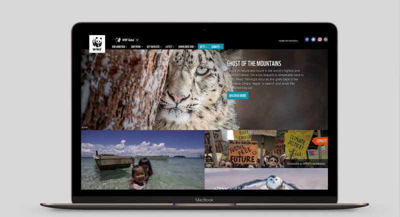
Most environmental and conservation organizations use green in their branding. WWF doesn’t. That alone makes it stand out in a crowded field.
Compare it to The Nature Conservancy’s logo, which uses a green leaf and globe. Or Greenpeace, with its green and white rainbow warrior mark. They’re fine logos, but they blend together in your memory.
The WWF panda occupies its own space. It’s an animal, not an abstract symbol or a nature element. That’s a big distinction. People connect with animals on an emotional level that leaves and globes can’t match.
Among other nonprofit organizations, the Red Cross logo is probably the closest comparison in terms of global recognition. Both use extremely simple marks. Both avoid color complexity. Both have become so iconic that the symbol alone communicates the entire organization’s purpose.
The UNICEF logo takes a different approach with its blue globe and mother-child imagery. Amnesty International’s logo uses a candle wrapped in barbed wire. Doctors Without Borders keeps it text-heavy. Each serves its purpose, but none achieve the instant emotional response that a panda does.
The WWF logo follows minimalist design thinking before minimalism was a trend in branding. That gave them a head start that competitors are still trying to close.
What Are the Technical Specifications of the WWF Logo?
Official Color Codes
- Primary Color: Black
- Hex: #000000
- RGB: (0, 0, 0)
- CMYK: (0, 0, 0, 100)
- Secondary Color: White
- Hex: #FFFFFF
- RGB: (255, 255, 255)
- CMYK: (0, 0, 0, 0)
That’s it. Two colors. The simplicity means there’s virtually no room for color reproduction errors across different media.
Dimensions and Proportions
The panda icon sits within a roughly square frame. The proportions of the mark follow a careful geometric structure, though the exact aspect ratio is proprietary.
Minimum size requirements exist to make sure the panda remains legible. At very small sizes, the fine details of the face can blur together, so the brand guidelines specify thresholds for print and digital use.
Clear space around the logo is typically defined as the height of the “W” in the WWF text. Nothing should intrude into that zone. This keeps the mark from feeling cramped when placed alongside partner logos or in busy layouts.
The logo is distributed as vector graphics for professional use, which means it scales infinitely without quality loss. JPEG and PNG versions exist for everyday digital applications, but the vector files are the source of truth.
What Cultural Impact Has the WWF Logo Had?

The WWF panda has become more than a logo. It’s a cultural shorthand for conservation itself. When people see a black-and-white panda in almost any context, their minds go to wildlife protection.
That’s a rare achievement. Most logos represent their own brand and nothing more. The WWF panda represents an entire movement.
It’s appeared on postage stamps, currency, and government documents in dozens of countries. It’s been referenced in pop culture, street art, and fashion collaborations. During Earth Hour, the panda mark becomes one of the most shared images on social media globally.
The logo also influenced how other nonprofits think about branding. Before WWF, many charitable organizations treated their visual identity as an afterthought. WWF proved that a strong mark could directly drive donations, awareness, and public trust. That lesson changed the nonprofit sector permanently.
How Does the WWF Logo Fit Into the Overall Brand Identity?

The panda doesn’t exist in isolation. It sits at the center of a carefully managed brand system that covers everything from campaign materials to field office signage.
WWF’s brand guidelines are strict. The panda must always appear in black on white or reversed out as white on black. No color tints. No creative reinterpretations (with rare, approved exceptions for special campaigns).
The brand style guide extends beyond the logo to cover photography style, tone of voice, and layout systems. Everything ties back to the same core values: clarity, urgency, and respect for the natural world.
The panda works as the anchor point for the entire visual hierarchy of any WWF communication. It’s always the first thing you see, and it frames everything else on the page.
Partner organizations that co-brand with WWF must follow specific placement rules to make sure the panda maintains its prominence. The logo can’t be squeezed into a corner or overshadowed by a sponsor’s mark. Those rules protect the integrity of the brand across thousands of applications worldwide.
How Should the WWF Logo Be Used?
Official Usage Guidelines
Do:
- Use the official logo files provided by WWF’s brand team
- Maintain required clear space around the mark
- Display the logo in black on white or white on black only
- Keep the panda and text lockup together as specified
- Follow minimum size requirements for both print and digital
Don’t:
- Add colors, shadows, or effects to the logo
- Stretch, rotate, or distort the proportions
- Place the logo on busy backgrounds that reduce legibility
- Separate the panda icon from the WWF text in unauthorized ways
- Use the logo to imply endorsement without formal partnership approval
Accessing Official Logo Files
Official logo files are available through WWF’s brand portal, which is accessible to approved partners and internal staff. Public use of the logo requires written permission from WWF’s communications team.
Licensing and Trademark Protection
The WWF panda is a registered trademark in virtually every country where the organization operates. Unauthorized commercial use will get you a cease-and-desist letter. They take this seriously.
The 2002 legal dispute with World Wrestling Entertainment (formerly World Wrestling Federation) is the most famous example of how aggressively WWF protects its brand. The wrestling company had to rebrand entirely, changing its name and logo to WWE. That case set a precedent for trademark enforcement in the nonprofit sector.
Font licensing is also managed carefully. The custom typeface used alongside the panda is not available for public download. It’s restricted to official WWF communications to prevent unauthorized use that could dilute the brand.
FAQ on The WWF Logo
Who Designed the WWF Logo?
Sir Peter Scott sketched the original concept in 1961. Gerald Watterson turned that sketch into the first usable version.
The current version was refined by Landor Associates in 1986. They stripped it down to bold, geometric shapes that work at any size.
Why Is a Panda the Symbol of WWF?
Chi Chi, a giant panda at the London Zoo, inspired the choice. She was one of the few pandas in the West at the time, and crowds loved her.
The panda also crosses language barriers. You don’t need to read anything to understand what it means. That made it perfect for a global conservation organization.
What Do the Colors in the WWF Logo Represent?
Black and white. Nothing else. The colors mirror the panda’s natural markings.
Black communicates seriousness. White provides clarity and open space around the mark. The limited palette also made printing cheap in 1961, which mattered for a young nonprofit on a tight budget.
Has the WWF Logo Changed Over the Years?
Yes. Roughly five times since 1961. Each redesign removed detail and pushed the panda toward a more abstract, graphic form.
The logo evolution followed one clear direction: simplify. The 1986 version by Landor Associates is still in use today.
What Does the WWF Logo Stand For?
It represents the World Wildlife Fund (called World Wide Fund for Nature outside the US and Canada). The panda symbolizes endangered species and habitat preservation.
More broadly, it’s become shorthand for the entire wildlife conservation movement.
Is the WWF Logo Trademarked?
Absolutely. It’s registered in nearly every country where the organization operates. WWF enforces its trademark aggressively.
The most famous case was the 2002 dispute with World Wrestling Federation, which had to rebrand as WWE after losing the legal battle.
What Font Is Used in the WWF Logo?
The “WWF” text uses a custom sans-serif with bold, slightly rounded letterforms. It’s not publicly available.
The weight and spacing were chosen for readability across sizes, from small merchandise tags to large event banners. Clean and functional.
Can I Use the WWF Logo for My Project?
Not without permission. Any commercial or public use requires written approval from WWF’s communications team.
Unauthorized use will likely result in a cease-and-desist. They protect their brand identity closely, and the legal team does not mess around.
What File Formats Is the WWF Logo Available In?
Official files come as vector formats (AI, EPS, SVG) for professional use. These scale without losing quality.
PNG and raster versions exist for digital applications. But the vector files are always the primary source for anything print-related or large-format.
Why Is the WWF Logo So Recognizable?
Simplicity. Two colors. One animal. No clutter. The logo design principles behind it are almost textbook: reduce until you can’t reduce anymore.
Decades of consistent use helped too. WWF never chased trends or did seasonal redesigns. They picked a direction in 1961 and stuck with it. That kind of discipline in visual storytelling is rare.
Conclusion
The WWF logo proves that restraint works. A single animal, two colors, and decades of discipline turned a quick sketch into one of the most recognized marks on the planet.
Few organizations have managed to build that level of brand recognition while keeping their visual identity this simple. The panda communicates conservation, urgency, and trust without saying a word.
It’s a case study in what happens when good graphic design principles meet a clear mission. No gimmicks. No trend-chasing. Just a panda that billions of people understand instantly.
That kind of lasting design doesn’t happen by accident.

Renowned for his expertise in logo design and visual branding, Bogdan has developed a multitude of logos for various clients.
His skills extend to creating posters, vector illustrations, business cards, and brochures. Additionally, Bogdan's UI kits were featured on marketplaces like Visual Hierarchy and UI8.
He also wrote in the past years on sites like Design Your Way, WebDesignerDepot, WPDean, Designmodo, Speckyboy, Slider Revolution, and more.
- Canva vs PowerPoint: Which Is Better for Presentations? - 22 September 2026
- How to Install Fonts on Mac (Step-by-Step Guide) - 20 September 2026
- From Mockup to Code: How AI-Augmented Development Speeds Up the Design Handoff - 19 September 2026

Bogdan Sandu is a seasoned designer who has been designing websites since 2008. Renowned for his expertise in logo design and visual branding, Bogdan has developed a multitude of logos for various clients. His skills extend to creating posters, vector illustrations, business cards, and brochures. Additionally, Bogdan's UI kits were featured on marketplaces like Visual Hierarchy and UI8. He also wrote in the past years on sites like Design Your Way, WebDesignerDepot, WPDean, Designmodo, Speckyboy, Slider Revolution, and more.
You Might Also Like


