


The Amnesty International logo is one of those rare marks in the nonprofit world that you recognize before you even read the text next to it. A candle wrapped in barbed wire. Simple. Direct. And it has carried the weight of a global human rights movement since 1963.
The emblem sits at the crosspoint of protest art and corporate identity, which is a tricky spot for any organization to land. But Amnesty pulled it off. The mark works on a banner at a protest march just as well as it does on a letterhead or a website header. That kind of flexibility doesn’t happen by accident.
What makes this logo different from most nonprofit marks is its emotional punch. It doesn’t try to be friendly or approachable. It tells you something is wrong, and it tells you there’s hope at the same time. That dual message, all packed into two visual elements, is what has kept it relevant for over sixty years.
Founded in 1961 by British lawyer Peter Benenson, Amnesty International has used roughly two main iterations of its logo. The original was created in 1963, and a refined version arrived in 2000. Not a lot of changes for an organization that’s been around this long, which actually says a lot about how well the initial concept worked.
What Is the Amnesty International Logo?
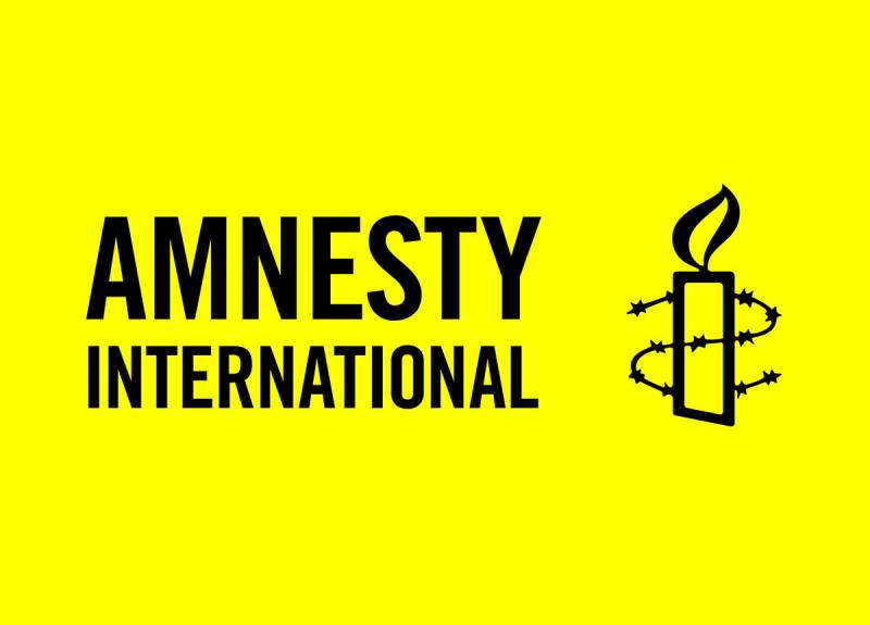
The Amnesty International logo is a combination mark featuring a lit candle encircled by barbed wire, paired with the organization’s name in uppercase lettering. Created in 1963 by British artist Diana Redhouse, the design draws from the Chinese proverb “Better to light a candle than curse the darkness.” It represents hope for political prisoners and people suffering human rights abuses worldwide.
Design Type: Combination mark (symbol plus wordmark). The candle-and-wire icon works as a standalone symbol, but it’s most commonly shown alongside the full name of the organization.
Primary Elements: A lit candle with a visible flame, surrounded by a coil of barbed wire. The candle sits upright, centered within the wire. There’s no extra decoration, no background shapes, nothing else competing for your attention.
Official Introduction Date: 1963. Diana Redhouse created the original image for Amnesty’s first-ever Christmas card. Peter Benenson chose her design because of, as he put it, its simplicity and the effectiveness of its symbolism.
Designer: Diana Redhouse (original, 1963). Redhouse was a British artist who trained at Central St Martins College of Art and Design in London. She’d been conscripted to work in the UK Government’s drawing office during World War II. Simon Endres, a New Zealand-born sculptor and graphic artist based in New York, refined the mark in 2000 while working at Kirshenbaum Bond.
Trademark Status: The “Amnesty International” name and the candle-and-barbed-wire icon are internationally recognized trademarks belonging to Amnesty International Limited, based in the United Kingdom. Unauthorized use violates their trademark protections.
Color Palette: The official palette is tight. Yellow (Hex #FFFF00, or sometimes listed as #FFF101 in some regional guides), Black (Hex #231F20), and White (Hex #FFFFFF). That’s it. No gradients, no secondary accent colors.
Usage Context: Campaign materials, protest banners, emergency action alerts, fundraising appeals, digital platforms, social media profiles, official reports, merchandise, and flags. The logo appears on materials across more than 150 countries and in dozens of languages.
How Has the Amnesty International Logo Evolved Over Time?

The Amnesty International logo has seen only two significant versions since the organization was founded. The original 1963 design by Diana Redhouse established the core visual concept, and a 2000 refinement by Simon Endres cleaned it up for modern use.
That’s a remarkably short timeline for a global brand. Most organizations of this scale go through half a dozen redesigns. Amnesty didn’t need to.
Original Amnesty International Logo (1963-2000)
Years Active: 1963 to 2000
Design Description: A hand-drawn candle with a visible flame, encircled by a rough coil of barbed wire. The illustration had that slightly imperfect, human quality you get from hand-drawn artwork. Lines weren’t perfectly smooth. The wire had a bit of texture to it.
Color Scheme: Primarily black and white. The logo was created for a Christmas card, so early prints were simple single-color reproductions. Yellow wasn’t yet established as the brand color.
Designer: Diana Redhouse. She was inspired by Peter Benenson’s writing about political prisoners and had already founded the Hampstead branch of Amnesty after reading one of his articles. Prior to that, she’d been involved with anti-fascist groups in London.
Context: Benenson needed a symbol for Amnesty’s first Christmas card in 1963. He’d seen Redhouse’s work and picked her candle-and-wire drawing for its directness. The image came from the old Chinese proverb about lighting a candle rather than cursing the darkness. At the time, Amnesty was only two years old.
Key Changes from Previous: This was the first logo. There was nothing before it.
Cultural Significance: It gave the fledgling human rights movement a face. Before this mark existed, Amnesty was mostly known through Peter Benenson’s written appeals. The candle-and-wire image turned an idea into something you could put on a poster, a badge, a banner. It became the thing people pointed to when they talked about prisoners of conscience.
Refined Amnesty International Logo (2000-Present)
Years Active: 2000 to present
Design Description: A cleaner, more geometric rendering of the same candle-and-wire concept. The lines are sharper. The flame is more defined. The barbed wire coils are more evenly spaced and precise. The overall shape feels tighter and more controlled, which makes it work much better at small sizes and in digital formats.
Color Scheme: Yellow (#FFFF00), Black (#231F20), and White (#FFFFFF). The yellow became the primary brand identifier during this period. Most people now associate Amnesty with that bright, attention-grabbing yellow background.
Designer: Simon Endres, formerly of Kirshenbaum Bond, later co-founder of Pro-Am, Inc. in New York. His client list includes names like Target, Sony, and Tommy Hilfiger, so he brought serious commercial design experience to a nonprofit project.
Context: By 2000, the internet had changed everything about how logos needed to perform. The hand-drawn original didn’t scale well on screens, especially at small sizes. The organization needed a version that could hold up as a tiny favicon or a massive billboard. The refinement was about function, not reinvention.
Key Changes from Previous: Cleaner linework. Standardized proportions. More precise barbed wire rendering. Sharper flame shape. Better scale and proportion for reproduction across print and digital. The soul of the design stayed the same.
Cultural Significance: This version is the one most people alive today recognize. It solidified Amnesty’s position as a globally consistent brand. Whether you see the logo in Tokyo, Nairobi, or Buenos Aires, it looks the same. That kind of consistency across 150+ countries is hard to maintain, and the cleaner 2000 version made it possible.
What Do the Design Elements of the Amnesty International Logo Mean?

Every part of this logo carries a specific meaning. The candle is hope. The barbed wire is oppression. Together, they tell the story of Amnesty’s entire mission in a single image.
There’s no filler in this mark. No decorative elements just for the sake of looking polished. It’s stripped down to exactly two things, and both of them are doing real work.
What Does the Candle Symbolize?
The candle comes directly from the proverb “Better to light a candle than curse the darkness.” In the context of Amnesty’s work, it represents the action taken by the organization and its supporters to protect people whose rights are being violated.
The flame itself is a universal symbol. You don’t need to speak English, or any particular language, to understand what a burning candle means. It’s light in the dark. It’s someone paying attention when everyone else has looked away.
Peter Benenson saw the candle as a statement about Amnesty’s approach. Their work would shine a light in places where human rights violations go unnoticed. That idea has held up for decades.
What Does the Barbed Wire Represent?
The barbed wire is the darkness from the proverb. It stands for imprisonment, torture, and detention. For the hopelessness of people locked away where they think nobody remembers them.
It’s also one of those images that doesn’t need explanation. Barbed wire means confinement. It means force. It means you can’t leave. Pair that with a candle and the message is immediate: someone is trapped, and someone else is trying to help.
The wire wrapping around the candle (but not putting it out) is a key detail. The flame persists. That’s not a small thing, design-wise. It says the fight is ongoing but the hope hasn’t been extinguished.
Why Did Amnesty International Choose These Specific Colors?
Yellow (#FFFF00)
According to Amnesty’s own brand materials, yellow is the color of urgency. And also of hope. It grabs your eye before almost any other color, which is exactly what you want when you’re trying to get people to pay attention to human rights violations.
From a color psychology standpoint, yellow signals optimism and energy. It’s warm. It feels active. For an organization asking people to write letters, sign petitions, and show up at protests, that active energy matters.
Black (#231F20)
Black gives the logo weight. It signals seriousness, authority, and the gravity of the issues Amnesty addresses. In nonprofit branding, black tends to communicate established, global action. Think of how WWF uses black and white too.
The contrast between yellow and black is one of the strongest color palette combinations you can use. It’s the same combination used on warning signs, caution tape, and taxi cabs. Your brain is wired to notice it.
White (#FFFFFF)
White serves as the neutral ground. It’s used for backgrounds, text on dark surfaces, and variations where the logo needs to sit on materials that can’t support the full yellow treatment. It keeps things clean and readable.
What Typography Style Is Used in the Amnesty International Logo?
The typeface is a customized version of Trade Gothic, specifically Trade Gothic Bold Condensed No. 20. All headings and the logotype itself use this sans-serif font.
Condensed fonts are a practical choice here. The organization’s name is long (two words, 22 characters), so a condensed face lets it sit comfortably beside the candle icon without feeling squeezed.
For Arabic-language materials, they use Al-Ghad, designed by Tarek Atrissi Design. It was selected to match the visual weight and feel of Trade Gothic across scripts. That level of attention to multilingual typography is something a lot of global organizations still struggle with.
The wordmark is always set in uppercase. All caps gives it a sense of authority and urgency. The letter spacing is carefully controlled for clear readability at various sizes.
What Are the Hidden Meanings in the Amnesty International Logo?
The relationship between the candle and the wire is the big one. The wire wraps around the candle, but it doesn’t crush it or snuff out the flame. That tension is built into the design on purpose.
Diana Redhouse’s background matters here too. She’d been involved with anti-fascist groups before creating the logo. Her personal history with political activism shaped how she thought about the image. It wasn’t just a nice drawing for a Christmas card. It came from real conviction.
Some people also read the wire as forming a kind of protective barrier around the flame, which flips the meaning. Instead of just confinement, the wire also becomes a frame that highlights and protects the light. That reading was probably unintentional, but it works.
How Does the Amnesty International Logo Compare to Competitor Logos?

In the nonprofit space, Amnesty’s logo sits in a class with a handful of instantly recognizable marks. The Red Cross logo, the UNICEF logo, and the Doctors Without Borders logo all play in similar territory. But Amnesty’s approach is fundamentally different.
The Red Cross uses a simple geometric shape (a cross) in a single color. Pure abstraction. UNICEF uses an emblem with a mother and child inside a globe, which is representational and fairly literal. WWF went with a panda illustration that connects directly to their conservation mission.
Amnesty’s logo is neither abstract nor literal. It’s symbolic. The candle-and-wire image tells a story without spelling it out. You have to put two things together in your head (hope plus imprisonment) to get the full meaning. That bit of mental engagement makes it stickier than most nonprofit logos.
Where Red Cross and UNICEF use blue or red (common trust-building colors in the nonprofit sector), Amnesty went with yellow and black. That’s a bold choice. It reads more like a warning than an invitation, and that’s appropriate for an organization whose whole job is to sound the alarm about injustice.
Another thing worth noting: most of these organizations have redesigned their logos multiple times. Amnesty has done it once, in over 60 years. That kind of restraint is rare, and it shows confidence in the original concept.
What Are the Technical Specifications of the Amnesty International Logo?
Official Color Codes
Primary Color: Yellow
Secondary Color: Black
- Hex: #231F20
- RGB: (35, 31, 32)
- CMYK: (0, 0, 0, 100)
Tertiary Color: White
- Hex: #FFFFFF
- RGB: (255, 255, 255)
- CMYK: (0, 0, 0, 0)
Dimensions and Proportions
Minimum Size: The logo should be at least 1.5 inches wide for clear readability in print. For the Amnesty International UK guidelines specifically, the minimum height for print is 10mm.
Clear Space: The required clear space around the logo is defined by the height of the flame in the candle symbol. No other graphic elements, text, or busy image areas should intrude into this zone.
Aspect Ratio: The candle icon and the wordmark have fixed proportional relationships. You can’t resize one independently of the other. The logo should always be less than half the size of the main message on any given page, but it must remain legible.
Official Usage Guidelines: Don’t change the logo colors. Don’t change the size or positioning of any elements. Don’t change the proportions. Don’t rotate it. Don’t alter the spacing between the icon and the wordmark. Always use it on a contrasting background. These rules are consistent across all regional offices.
What Cultural Impact Has the Amnesty International Logo Had?
The candle-and-wire image has become one of the most recognized humanitarian symbols on the planet. It shows up at protests, on petitions, in courtrooms, and in news coverage wherever human rights are being discussed.
What’s interesting is how the logo functions outside of official Amnesty materials. People draw it on protest signs by hand. They tattoo it. They spray-paint it on walls. It has crossed over from organizational branding into a general symbol of resistance and hope, which is something very few logos achieve.
Amnesty won the Nobel Peace Prize in 1977, and that further cemented the logo’s status. When an organization carrying this symbol receives that level of recognition, the symbol itself takes on additional weight. It stops being just a logo and starts being a cultural marker.
The choice of yellow has had its own cultural ripple. Amnesty’s use of bright yellow on protest materials and campaign graphics has made the color almost synonymous with human rights activism in certain contexts. During Write for Rights campaigns, that yellow is everywhere.
How Does the Amnesty International Logo Fit Into the Overall Brand Identity?

The logo is the anchor for everything Amnesty does visually. Their brand guidelines are strict, and for good reason. When you operate in over 150 countries with dozens of regional offices and thousands of volunteer groups, visual consistency is the only thing holding the brand together.
The candle icon can stand alone as a recognizable mark. The wordmark can work independently in text-heavy contexts. But together, they form a visual hierarchy that puts the symbol first and the name second. Your eye hits the candle before it reads “Amnesty International.”
Everything else in the brand system flows from the logo. The yellow-and-black color scheme carries through to reports, social media templates, video intros, and merchandise. The Trade Gothic font family extends from the logotype into headlines and body text across all communications.
The brand style guide also dictates photography style, which tends toward high-impact, black-and-white documentary images accented with yellow. This creates a unified look that you can spot across platforms without even seeing the logo itself. That’s good branding, because it means the identity works even when the mark isn’t visible.
How Should the Amnesty International Logo Be Used?
Official Do’s:
- Use the logo on a contrasting background at all times
- Maintain the defined clear space (measured by the flame height)
- Keep the logo at or above the minimum size requirements
- Use only the approved color combinations: yellow on black, black on yellow, white on black, black on white
Official Don’ts:
- Don’t alter the logo colors
- Don’t change the size or positioning of individual elements
- Don’t change the proportions
- Don’t rotate the logo
- Don’t place it on busy backgrounds that reduce legibility
- Don’t add effects like shadows, outlines, or gradients
Where to Access Official Logos: Amnesty International maintains a Brand Hub on their website (amnesty.org) where authorized users can download official logo files. Regional sections like Amnesty Canada and Amnesty UK also provide branding resources and logo downloads for activists and authorized partners. Files are available in vector graphics formats (SVG, EPS) and bitmap formats (PNG, JPEG) for different use cases.
Licensing Information: The logo requires permission from Amnesty International for any use. This applies to educational programs, fundraising campaigns, promotional materials, and any other context. Contact the organization directly for licensing details.
Trademark Protection: The Amnesty International name and candle-and-wire symbol are internationally registered trademarks belonging to Amnesty International Limited in the UK. Using these marks without authorization is a violation of their trademark rights. If you’re working with Amnesty as a contractor or volunteer, specific font access and brand asset usage will be coordinated through your point of contact within the organization.
FAQ on The Amnesty International Logo
Who Designed the Amnesty International Logo?
British artist Diana Redhouse designed the original logo in 1963. She trained at Central St Martins College of Art and Design in London.
Peter Benenson, the organization’s founder, selected her candle-and-barbed-wire drawing for Amnesty’s first Christmas card. Simon Endres refined the mark in 2000.
What Does the Candle in the Amnesty International Logo Mean?
The candle represents hope and action against human rights violations. It comes from the Chinese proverb “Better to light a candle than curse the darkness.”
The flame stands for Amnesty’s commitment to shining a light on political prisoners and people facing unjust detention worldwide.
What Does the Barbed Wire Symbolize in the Logo?
The barbed wire represents imprisonment, torture, and the hopelessness of people locked away unfairly. It’s the “darkness” from the proverb.
Paired with the candle, it creates a visual story about confinement and the fight against it. Two symbols. One clear message.
What Are the Official Colors of the Amnesty International Logo?
The official color scheme is built on yellow and black. Yellow (Hex #FFFF00) signals urgency and hope. Black (Hex #231F20) adds gravity.
White (#FFFFFF) serves as a supporting neutral. The high saturation of the yellow makes the logo impossible to miss on campaign materials and protest banners.
What Font Does the Amnesty International Logo Use?
The logotype uses Trade Gothic Bold Condensed No. 20, a clean sans-serif typeface. It’s set in all uppercase for authority and urgency.
For Arabic-language materials, Amnesty uses Al-Ghad by Tarek Atrissi Design. The condensed style keeps the long organization name compact and readable.
Has the Amnesty International Logo Changed Over the Years?
Only once. The original 1963 hand-drawn version by Diana Redhouse was refined in 2000 by Simon Endres.
The update sharpened the linework, standardized proportions, and improved digital scalability. But the core candle-and-wire concept stayed untouched. That’s unusual restraint for a 60-year-old brand.
Can I Use the Amnesty International Logo Freely?
No. The candle-and-wire symbol and the “Amnesty International” name are internationally registered trademarks owned by Amnesty International Limited in the UK.
Any use requires permission from the organization. This applies to educational, fundraising, and promotional contexts. Contact them directly for licensing.
Why Did Amnesty International Choose Yellow and Black?
Yellow is one of the most visible colors. It grabs attention fast, which is exactly what a human rights organization needs. According to color theory, yellow also signals optimism.
Black adds seriousness. Together, they create one of the strongest contrast pairings in design. Think warning signs, caution tape. Your brain notices it immediately.
What Type of Logo Is the Amnesty International Logo?
It’s a combination mark, meaning it pairs a symbol (the candle in barbed wire) with a wordmark (the organization’s name). The icon works as a standalone mark too.
This gives the nonprofit flexibility. The candle symbol alone works on social media avatars and merchandise where space is limited.
Where Can I Download the Official Amnesty International Logo?
Amnesty maintains a Brand Hub on their website where authorized users can access official files. Regional offices like Amnesty Canada and Amnesty UK also provide activist branding resources.
Files come in high-resolution formats including SVG, EPS, PNG, and JPEG. Always use official versions rather than random downloads to maintain brand integrity.
Conclusion
The Amnesty International logo proves that a strong visual identity doesn’t need constant reinvention. Two elements, a candle and barbed wire, have carried a global human rights organization for over six decades.
Diana Redhouse’s 1963 design still works because it was built on universal symbols, not trends. The yellow-and-black brand identity cuts through noise the same way it did on that first Christmas card.
Few logo designs built on solid principles achieve this kind of longevity. It’s a reminder that clarity and purpose will always outlast clever gimmicks.

Renowned for his expertise in logo design and visual branding, Bogdan has developed a multitude of logos for various clients.
His skills extend to creating posters, vector illustrations, business cards, and brochures. Additionally, Bogdan's UI kits were featured on marketplaces like Visual Hierarchy and UI8.
He also wrote in the past years on sites like Design Your Way, WebDesignerDepot, WPDean, Designmodo, Speckyboy, Slider Revolution, and more.
- The Windsurf Logo History, Colors, Font, And Meaning - 10 October 2026
- How to Remove Background From Product Photos (No Photoshop) - 10 October 2026
- How Designers can Build a Stronger Online Creative Identity - 9 October 2026

Bogdan Sandu is a seasoned designer who has been designing websites since 2008. Renowned for his expertise in logo design and visual branding, Bogdan has developed a multitude of logos for various clients. His skills extend to creating posters, vector illustrations, business cards, and brochures. Additionally, Bogdan's UI kits were featured on marketplaces like Visual Hierarchy and UI8. He also wrote in the past years on sites like Design Your Way, WebDesignerDepot, WPDean, Designmodo, Speckyboy, Slider Revolution, and more.
You Might Also Like


