


The Feeding America logo is one of the most recognized symbols in the American nonprofit sector. It represents a network of over 200 food banks and 60,000 food pantries and meal programs working to end hunger across the United States. The mark itself carries a lot of weight, visually and culturally, and the choices behind it were anything but random.
Founded in 1979 by John van Hengel as America’s Second Harvest, the organization rebranded to Feeding America in 2008. The branding agency Siegel & Gale handled both the original identity and the 2008 redesign. Over its lifetime, the logo has gone through two major versions, each reflecting where the organization stood at that point in its history.
What Is the Feeding America Logo?
The Feeding America logo is a combination mark featuring a stacked wordmark in orange and green with a wheat stalk symbol replacing the letter “I” in “FEEDING.” Introduced in 2008, it was designed by Siegel & Gale to represent growth, nourishment, and the organization’s mission to end food insecurity.
Here’s a closer look at the key attributes of this logo:
- Design Type: Combination mark (wordmark plus symbol)
- Primary Elements: Stacked text reading “FEEDING” over “AMERICA,” with a wheat stalk icon integrated into the letter “I.” The stalk features nine kernels and sits at the top, where the two aligned “I” letters from each word create a single vertical line.
- Official Introduction Date: 2008, coinciding with the rebrand from America’s Second Harvest
- Designer/Agency: Siegel & Gale, a branding firm founded in 1969 and now part of Omnicom Group
- Trademark Status: Registered with the USPTO. The wheat stalk symbol is a registered trademark (serial numbers 77435990, 77540114, and 77575555). The trademark was originally filed on March 31, 2008.
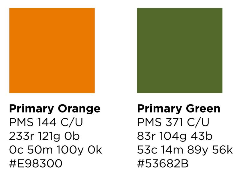
- Color Palette: Feeding America Orange (Pantone 144, Hex #E98300) and Feeding America Green (Pantone 371, Hex #53682B). The full-color version is preferred on white or light backgrounds.
- Usage Context: Appears on food bank signage, volunteer training materials, the MealConnect platform, mobile food pantry vehicles, corporate partnership materials, disaster relief operations, and all digital platforms run by the organization.
How Has the Feeding America Logo Evolved Over Time?
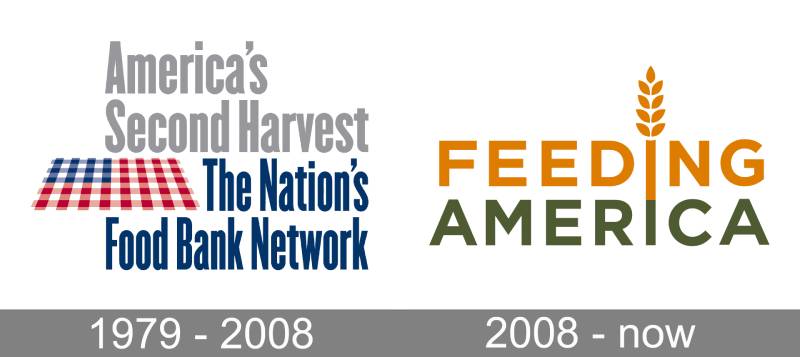
The Feeding America logo has gone through two distinct phases. The first was the America’s Second Harvest identity used from 1979 to 2008. The second is the current Feeding America mark introduced during the 2008 rebrand.
The shift was dramatic. Not just a name change, but a complete rethinking of what the organization’s visual identity should communicate.
Original America’s Second Harvest Logo (1979-2008)
- Years Active: 1979 to 2008
- Design Description: Text-heavy mark with “America’s Second Harvest” at the top in a light gray sans-serif font, followed by “The Nation’s Food Bank Network” in dark blue. A checkered tablecloth graphic sat in the center, styled to look like an American flag.
- Color Scheme: Patriotic red, white, and blue. The palette leaned into national identity over food-specific messaging.
- Designer: Siegel & Gale
- Context: Created when the food bank concept was still new in America. John van Hengel had just started organizing surplus food distribution in Arizona, and the branding reflected that early, grassroots phase.
- Cultural Significance: The tablecloth/flag design tried to connect hunger relief with patriotism. But here’s the thing. After nearly 29 years, research showed most Americans didn’t recognize the brand at all. The name “Second Harvest” didn’t clearly communicate what the organization actually did.
Current Feeding America Logo (2008-Present)
- Years Active: 2008 to present
- Design Description: “FEEDING” appears in bold uppercase orange, with “AMERICA” in slightly smaller green text below. The two “I” letters are vertically aligned and connected, forming a single line topped by a wheat stalk with nine kernels. The whole thing feels warm and readable.
- Color Scheme: Orange (Pantone 144) and green (Pantone 371). A much warmer direction than the old red, white, and blue.
- Designer: Siegel & Gale
- Context: The 2008 rebrand coincided with a merger of multiple food bank networks. The organization needed a name people could actually remember and a mark that clearly communicated “we feed people.” This happened right around the start of the Great Recession, when demand for food assistance skyrocketed.
- Key Changes from Previous: Everything changed, honestly. The flag imagery was dropped entirely. The narrow, condensed typography was swapped for a bold, geometric sans-serif closer to Gotham. And the color palette shifted from patriotic tones to food-associated orange and green.
- Cultural Significance: The new name and logo made the mission immediately obvious. “Feeding America” is direct, active, and hard to misinterpret. Brand recognition jumped significantly after the rebrand. The wheat stalk became a powerful standalone symbol for hunger relief across the country.
What Do the Design Elements of the Feeding America Logo Mean?
Every piece of the Feeding America logo was chosen to support a message about food, community, and growth. The wheat stalk is the most obvious symbol, but there’s more going on when you look at how the elements of the design work together.
The stacked text creates a sense of structure and stability. The connected “I” letters form the stalk’s stem. And the warm orange-green palette triggers associations with food and nature, not bureaucracy.
Why Did Feeding America Choose These Specific Colors?
Feeding America Orange (Pantone 144, Hex #E98300, RGB 233/121/0, CMYK 0/50/100/0) is the dominant color. Orange is closely tied to the hunger movement. It signals warmth, optimism, and energy. Most people associate it with fresh produce, baked goods, and sunlight.
The psychology behind color choices matters here. Orange creates feelings of accessibility and friendliness, which is exactly what a charitable food organization needs to project.
Feeding America Green (Pantone 371, Hex #53682B, RGB 83/104/43, CMYK 53/14/89/56) is the secondary color. Green represents growth, well-being, and a connection to the land. It reinforces the idea that the organization supports healthy, nutritious food access.
The extended palette also includes supporting colors named after foods: Squash (Hex #FDB515), Pepper (Hex #940B0F), Asparagus (Hex #8FB73E), and Kale (Hex #275125). This food-inspired approach to the color palette is pretty smart, actually. It keeps every touchpoint connected to the organization’s core purpose.
White plays an important role too. It provides contrast and helps with ADA compliance, making sure the logo remains readable for people with visual impairments.
What Typography Style Is Used in the Feeding America Logo?
The font in the Feeding America logo is very similar to Gotham Bold, a geometric sans-serif designed by Tobias Frere-Jones. Known for being clean, modern, and strong.
But the logo version has been custom-modified. The kerning is adjusted specifically for the wordmark, so it’s not just Gotham slapped onto a page. For brand materials outside the logo, Gotham is the primary typeface, with Arial as a fallback when Gotham isn’t available. Georgia serves as the serif alternative for more formal applications.
The choice makes sense for a nonprofit that needs to look trustworthy without looking corporate. Gotham has that friendly, open feel at small sizes, which matters when your logo ends up on everything from warehouse signage to mobile app icons.
What Are the Hidden Meanings in the Feeding America Logo?
The most talked-about detail is how the aligned “I” letters in “FEEDING” and “AMERICA” form a single vertical line that becomes the wheat stalk’s stem. It’s a clever bit of design that most people don’t notice right away.
The wheat stalk itself contains exactly nine kernels. Wheat is a universal symbol for sustenance and abundance. Its growth from seed to harvest mirrors the organization’s mission of turning donated resources into meals for millions.
There’s also the way the two words are equal in width, creating a visual block that feels balanced and solid. That sense of balance was intentional, reinforcing the idea of stability and reliability in a space where trust is everything.
How Does the Feeding America Logo Compare to Competitor Logos?

When you look at major nonprofit logos in the hunger relief and charitable sectors, Feeding America’s mark stands out for its simplicity. Many organizations in this space lean on complex illustrations, detailed icons, or overtly emotional imagery.
The Red Cross logo, for example, is pure symbol with no wordmark in most uses. The WWF logo relies on an iconic panda illustration. The UNICEF logo combines a globe, child, and laurel wreath for maximum symbolism.
Feeding America takes a different approach. It keeps things clean and readable, closer to what you’d see from a tech company than a traditional charity. That’s not accidental. The organization works with major corporate partners like Walmart, Amazon, and General Mills. Looking professional and modern helps when you’re sitting across from a Fortune 500 marketing team.
The Habitat for Humanity logo and The Salvation Army logo both carry more traditional, institutional weight. Feeding America’s orange-and-green warmth creates a more approachable feel, which is probably why it tested so well with the general public during the rebrand.
What Are the Technical Specifications of the Feeding America Logo?
Official Color Codes
- Primary Color: Feeding America Orange
- Hex: #E98300
- RGB: (233, 121, 0)
- CMYK: (0, 50, 100, 0)
- Pantone: 144
- Secondary Color: Feeding America Green
- Hex: #53682B
- RGB: (83, 104, 43)
- CMYK: (53, 14, 89, 56)
- Pantone: 371
- Accent Color: Squash
- Hex: #FDB515
- RGB: (253, 181, 21)
- CMYK: (0, 32, 100, 0)
- Accent Color: Asparagus
- Hex: #8FB73E
- RGB: (143, 183, 62)
- CMYK: (50, 10, 100, 0)
Dimensions and Proportions
The logo is built on a stacked layout where “FEEDING” and “AMERICA” are roughly equal in width. The wheat stalk icon extends above the text block.
Clear space minimums are built directly into the official logo files. The organization’s brand guidelines specify that no other elements should crowd the logo’s breathing room.
The logo ships in multiple formats: Adobe Illustrator (.ai) files for vector-based scalability, EPS for commercial printing, JPEG at 300 DPI for print, and PNG with transparent backgrounds for screen use. The two-color spot version uses the official Pantone Matching System values, which is best for screen printing or embroidery.
What Cultural Impact Has the Feeding America Logo Had?

The Feeding America logo became the visual anchor for hunger awareness across the United States. After the 2008 rebrand, recognition grew fast. Forbes now ranks Feeding America as the second largest U.S. charity by revenue.
The orange color specifically became associated with the hunger movement itself. Hunger Action Month, held every September, uses that same orange as its campaign color. You see it on social media profile overlays, volunteer T-shirts, and donation pages across the country.
The wheat stalk works as a standalone mark too. Member food banks use it alongside their own local branding, creating a visual network that spans all 50 states. When you spot that wheat icon on a food pantry door or a delivery truck, you know it’s part of something bigger.
That kind of recognition took years to build. But the 2008 redesign gave the organization a mark simple enough and strong enough to carry it. Took me a while to realize how much of their fundraising success traces back to that single branding decision.
How Does the Feeding America Logo Fit Into the Overall Brand Identity?
The logo sits at the center of a carefully controlled brand system. Feeding America operates a network of over 200 independently run food banks, 21 statewide food bank associations, and over 60,000 partner agencies. Getting all of them to look like they belong together is no small task.
Each member food bank has its own local brand style guide that aligns with the national brand. The wheat stalk, the orange and green palette, the Gotham type family. These elements repeat across every member organization. Local food banks add their own names and regional identifiers but keep the Feeding America visual DNA intact.
The organization follows the Associated Press Stylebook for editorial style. They prefer “food pantries and meal programs” over “agencies.” They use “end hunger” rather than “fight hunger.” These language rules work alongside the visual identity to create a consistent brand experience everywhere the organization shows up.
Corporate partners like Walmart Foundation and Amazon display the Feeding America lockup on their own charitable campaign materials. The principles behind the logo design make this easy. It scales well, stays readable, and doesn’t clash with partner brands.
How Should the Feeding America Logo Be Used?
Feeding America maintains strict usage rules. Here’s what you need to know:
Do:
- Use official logo files only. Don’t recreate the logo from scratch.
- Maintain required white space around the mark. The spacing is already built into the distributed files.
- Display the full-color version on white or light backgrounds for best visibility.
- Include the registered trademark symbol (®) with the wheat stalk when required.
- Use the two-color spot version (Pantone 144 and Pantone 371) for screen printing or embroidery.
Don’t:
- Alter the logo’s colors, proportions, or arrangement in any way.
- Remove the wheat stalk from the wordmark.
- Place the logo on busy or dark backgrounds that reduce readability.
- Scale JPEG versions up (only scale them down, since they’re pixel-based at 300 DPI).
- Use the logo without permission from Feeding America’s communications team.
To access official logo files, contact Feeding America’s marketing department directly or check the partner resource page on their website. The organization uses HungerNet as an internal resource hub for member food banks.
Trademark protection is active. The Feeding America name and wheat stalk are both registered with the U.S. Patent and Trademark Office. Unauthorized use, especially in fundraising contexts, can result in legal action. If you’re a partner organization or community program, reach out to the national office for proper licensing and co-branding guidance.
FAQ on The Feeding America Logo
What does the Feeding America logo look like?
The Feeding America logo is a combination mark with “FEEDING” in orange stacked over “AMERICA” in green. A wheat stalk with nine kernels replaces the letter “I,” creating a vertical line that connects both words.
Who designed the Feeding America logo?
Siegel & Gale, a branding agency founded in 1969, designed both the original America’s Second Harvest identity and the 2008 Feeding America rebrand. They’re also known for work with the NBA, Dell, and Girl Scouts of the USA.
When was the current Feeding America logo introduced?
The current logo launched in 2008 when America’s Second Harvest changed its name. The rebrand happened because most Americans didn’t recognize the old name after nearly 29 years. Timing coincided with increased food insecurity during the recession.
What do the colors in the Feeding America logo mean?
Orange (Pantone 144) represents warmth, optimism, and the hunger relief movement. Green (Pantone 371) signals growth and community well-being. Together, these food-associated colors replaced the old patriotic red, white, and blue palette.
What font does the Feeding America logo use?
The logo uses a custom-modified version of Gotham Bold, a geometric sans-serif by Tobias Frere-Jones. The letter spacing was adjusted specifically for the wordmark. Brand materials use standard Gotham, with Arial as a backup.
What does the wheat stalk symbol represent?
The wheat stalk is a registered trademark symbolizing nourishment, abundance, and growth. It sits where the letter “I” would be, turning the text into a visual story about the food bank network’s mission to end hunger in America.
Is the Feeding America logo trademarked?
Yes. Feeding America holds multiple USPTO registrations filed starting March 2008. The name and wheat stalk symbol are both protected. Unauthorized use, especially for fundraising or food donation campaigns, can lead to legal action.
What file formats are available for the Feeding America logo?
Official files come in Adobe Illustrator (.ai), EPS, JPEG at 300 DPI, and PNG with transparent backgrounds. Vector formats allow unlimited scaling. JPEG versions should only be scaled down since they’re pixel-based.
Can anyone use the Feeding America logo?
No. You need permission from Feeding America’s communications team. The organization’s brand guidelines restrict unauthorized use. Partner food banks and corporate donors must follow co-branding rules outlined in the official Partner Style Guide.
How does the Feeding America logo compare to other nonprofit logos?
It’s cleaner and more modern than most charitable organization marks. Where groups like the Red Cross or UNICEF rely on detailed symbols, Feeding America keeps things simple. That approach works well across digital platforms and corporate partnership materials.
Conclusion
The Feeding America logo did something most nonprofit marks fail to do. It made a charitable food distribution network instantly recognizable to millions of Americans.
Siegel & Gale’s 2008 redesign turned a forgotten brand into the visual face of hunger awareness across the country. The wheat stalk, the warm orange and green palette, the Gotham-based wordmark. Every piece works toward one goal.
With over 200 member food banks using this identity, the mark connects volunteer programs, corporate partnerships, and community meal services under a single visual system.
Good nonprofit brand identity doesn’t just look nice. It builds the trust that keeps food pantry doors open and donation campaigns funded.

Renowned for his expertise in logo design and visual branding, Bogdan has developed a multitude of logos for various clients.
His skills extend to creating posters, vector illustrations, business cards, and brochures. Additionally, Bogdan's UI kits were featured on marketplaces like Visual Hierarchy and UI8.
He also wrote in the past years on sites like Design Your Way, WebDesignerDepot, WPDean, Designmodo, Speckyboy, Slider Revolution, and more.
- The Windsurf Logo History, Colors, Font, And Meaning - 10 October 2026
- How to Remove Background From Product Photos (No Photoshop) - 10 October 2026
- How Designers can Build a Stronger Online Creative Identity - 9 October 2026

Bogdan Sandu is a seasoned designer who has been designing websites since 2008. Renowned for his expertise in logo design and visual branding, Bogdan has developed a multitude of logos for various clients. His skills extend to creating posters, vector illustrations, business cards, and brochures. Additionally, Bogdan's UI kits were featured on marketplaces like Visual Hierarchy and UI8. He also wrote in the past years on sites like Design Your Way, WebDesignerDepot, WPDean, Designmodo, Speckyboy, Slider Revolution, and more.
You Might Also Like


