


The Habitat for Humanity logo is one of those nonprofit marks that people recognize instantly, even if they can’t explain why. It’s a combination mark featuring three stylized human figures beneath a green triangular roof, paired with a two-level wordmark. The organization was founded in 1976 by Millard and Linda Fuller in Americus, Georgia. And the logo has stayed remarkably consistent since then, with only a few refinements over nearly five decades.
That kind of staying power is rare. Most organizations go through total rebrands every decade or so. But Habitat’s visual identity has held up because it was built on something solid: simple shapes, clear meaning, and a color palette that connects directly to its mission.
The mark currently serves over 3,000 locations in more than 70 countries. It appears on everything from construction site signs to donor materials, volunteer t-shirts to digital platforms. Few nonprofit logos carry that kind of range.
What Is the Habitat for Humanity Logo?

The Habitat for Humanity logo is a combination mark that pairs a house-shaped emblem containing three abstract human figures with a stacked wordmark reading “Habitat” above “for Humanity.” It was introduced shortly after the organization’s 1976 founding and was notably refreshed in 2005 by an in-house design team. The symbol represents shelter, community partnership, and the organization’s Christian roots.
Here’s a breakdown of the key attributes:
- Design Type: Combination mark (emblem plus wordmark)
- Primary Elements: Three stylized human silhouettes with raised arms, a green triangular roof structure, and the “Habitat for Humanity” text set on two lines
- Official Introduction: Late 1970s, with a major refresh completed around 2005
- Designer/Agency: The current version was developed by Habitat for Humanity’s in-house design department, coordinated across five design teams. George Acosta is also credited with design work on the mark
- Trademark Status: Registered trademark of Habitat for Humanity International. Usage is strictly governed by official brand guidelines
- Color Palette: Traditional two-color version uses blue (for the figures and wordmark) and green (for the roof). The expanded creative palette adds Bright Blue (Pantone 638) and Bright Green (Pantone 382), though these are not applied to the logo itself
- Usage Context: Construction site signage, volunteer materials, donor communications, digital platforms, merchandise, truck wraps, office signage, and Habitat ReStore branding
How Has the Habitat for Humanity Logo Evolved Over Time?
The Habitat for Humanity logo has gone through fewer changes than you might expect for an organization pushing 50 years old.
The core concept has remained the same since the late 1970s: people under a roof. But the execution has been tightened up, especially during a significant 2005 overhaul. Most of the changes were about making the mark work better across different formats and countries, not about reinventing it.
Original Habitat for Humanity Logo (Late 1970s – Early 2000s)
Years Active: Approximately 1976 through the early 2000s
The original version was created shortly after Millard and Linda Fuller established the organization. It featured more detailed architectural elements in the house graphic, with the three human figures already present. The blue and green color combination was there from the start.
Look, for a small nonprofit in rural Georgia in the mid-1970s, having any kind of consistent visual mark was already ahead of the curve. The early version did its job. But as the organization grew internationally, the logo needed to work in contexts nobody had imagined when it was first drawn.
The wordmark used a narrowed sans-serif typeface, with “Habitat” set larger on the first line and “for Humanity” smaller beneath it. This two-line text layout created a clear reading order and has remained a constant feature through every version.
Refreshed Habitat for Humanity Logo (2005 – Present)
Years Active: 2005 to present
In 2004, Habitat’s executives asked the in-house design department to create a refreshed global logo and identity system. The project involved five separate design teams and produced a comprehensive, location-specific redesigned mark along with a full identity system and online logo repository.
The refresh brought cleaner lines to the house graphic. The human figures became more abstract and simplified. And the overall proportions were adjusted for better scale and proportion across applications, from tiny social media icons to large-format signage.
Key Changes: Simplified house geometry, refined human figure silhouettes, improved scalability for digital platforms, location-specific signature line system for affiliates
Cultural Significance: This was the first time Habitat had a truly unified global identity. Before the refresh, affiliates in different countries often used inconsistent variations. The 2005 version gave the brand coherence across more than 70 countries and 3,000 locations.
The house graphic element can now, for the first time, be used alone as a standalone design element in limited applications. That’s a sign of how much brand recognition the mark has built.
What Do the Design Elements of the Habitat for Humanity Logo Mean?

Every piece of this logo carries meaning tied directly to the organization’s mission. The triangular roof represents shelter and protection. The three human figures show community, family, and the partnership model Habitat uses to build homes.
The figures have their arms raised, which reads as celebration and joy. It also suggests active participation, which is key to how Habitat works. Families who receive homes actually help build them through sweat equity.
The psychology of shapes plays a real role here. Triangles convey stability. The rectangular base beneath the figures suggests solid construction. Together, these geometric forms communicate permanence and safety without needing a single word.
Why Did Habitat for Humanity Choose These Specific Colors?
The traditional logo uses two main colors. Blue shows up in the figures and the wordmark. Green covers the roof element.
Green signals growth, life, and environmental responsibility. It connects to the construction process itself, to new beginnings, and to eco-friendly building practices. Blue represents trust, reliability, and systematic commitment. Every Habitat house is built to technical standards, and the blue reinforces that sense of dependability.
The broader brand palette (introduced alongside the brand refresh) adds a Bright Blue (Pantone 638) and Bright Green (Pantone 382), but here’s the thing: those brighter colors are specifically not applied to the logo. They’re for marketing materials, backgrounds, and display text only. The logo keeps its traditional tones. Understanding how color psychology works helps explain why the organization made that distinction.
Black is also an official logo color, used for one-color applications where the two-color version isn’t practical. The black version sits primarily on white backgrounds.
What Typography Style Is Used in the Habitat for Humanity Logo?
The logo typeface has been identified as Monotype Clearface Gothic Std Bold, though some sources also reference PT Sans for certain applications.
It’s a condensed sans-serif with clean lines and slightly flared stroke endings. Those flared ends actually matter. They suggest openness and approachability while maintaining a stable, professional feel. For supporting brand materials, Habitat uses Neue Haas Grotesk (Display Medium for headlines, Text Regular for body copy) and Minion Pro as a secondary serif option.
The letter spacing in the brand guidelines calls for relatively tight overall spacing with individual adjustments between specific letter pairs to keep things visually consistent.
What Are the Hidden Meanings in the Habitat for Humanity Logo?
The three figures aren’t just decorative. They represent a family unit: adults and a child, embodying care across generations. But they also stand for the three-way partnership between homeowners, volunteers, and the organization itself.
There’s a subtle nod to the organization’s Christian roots in the overall composition, according to the 2005 redesign documentation. The house element also implies construction in progress, not just a finished home. That distinction matters because Habitat’s whole model is about the building process, not just the end result.
Your mileage may vary on whether you pick up all of these layers at first glance. Most people just see “people, house, good.” And that’s actually fine. The best logos work on multiple levels like that.
How Does the Habitat for Humanity Logo Compare to Competitor Logos?

In the nonprofit housing space, most organizations lean toward safe, predictable marks. Habitat’s logo stands apart because it includes human figures directly inside the visual structure of a house. That’s a more integrated approach than most.
Compare it to other major charity marks. The Red Cross logo uses a simple geometric symbol. The WWF logo relies on a single animal illustration. The UNICEF mark pairs a globe motif with text.
Habitat took a different route by showing both the cause (shelter) and the people (community) in one mark. The Feeding America logo takes a similar people-first approach but uses a completely different visual style. Meanwhile, the Salvation Army emblem leans into its military heritage with shield-based design.
What makes Habitat’s mark work is that it tells a story in a single glance. You don’t need context. You see people under a roof and you get it. Not many logos pull that off.
What Are the Technical Specifications of the Habitat for Humanity Logo?

Official Color Codes
- Habitat Blue (Figures/Wordmark): The traditional blue used in the logo. Hex: #0054A4 (approximate), RGB: (0, 84, 164), CMYK: (100, 63, 0, 0)
- Habitat Green (Roof): The traditional green for the house element. Hex: #00843D (approximate), RGB: (0, 132, 61), CMYK: (85, 0, 100, 30)
- Black (One-color version): Hex: #000000, RGB: (0, 0, 0), CMYK: (0, 0, 0, 100)
- Creative Palette, Bright Blue: Pantone 638 (not applied to logo itself)
- Creative Palette, Bright Green: Pantone 382 (not applied to logo itself)
Note: Exact color values should be confirmed against official Habitat for Humanity brand files, as the creative palette colors must not be tinted or lightened. CMYK values are specified for print use.
Dimensions and Proportions
The brand guidelines spell out clear rules for logo usage. The preferred format is the two-color horizontal lockup with the emblem to the left and the wordmark to the right.
Clear space must be maintained around the logo at all times. No additional marks, taglines, or graphic elements should be placed near it (the ReStore identifier is the only exception). The house graphic itself, when used alone as a design element, should appear as a large, page-dominant background piece, ideally anchored and bleeding off the edge of the page.
For affiliate locations, the logo includes signature lines below the main mark. These can be customized with the affiliate’s legally registered name, with some words like “Inc.,” “of,” “the,” “in,” and “for” optionally omitted. Co-branded lockups with partners follow a horizontal format with a dividing rule between the two logos.
The logo is available as vector files for scalability across all formats. High-DPI versions are available for print applications.
What Cultural Impact Has the Habitat for Humanity Logo Had?
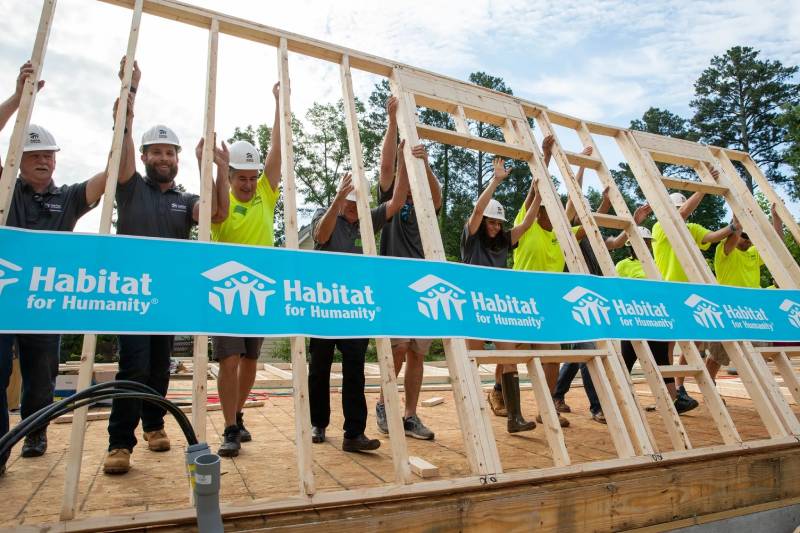
This logo has become shorthand for affordable housing advocacy worldwide. When people see the green roof and blue figures, they think volunteer builds, Jimmy Carter with a hammer, and community coming together.
That’s significant. Most nonprofit marks don’t reach that level of cultural recognition. Habitat’s logo has appeared across media coverage of disaster relief, celebrity volunteer events, and community development stories for decades. It’s been on construction sites in more than 70 countries.
The organization has built or repaired over 300,000 homes. Every single one of those projects carried this mark in some form. That kind of repeated, real-world exposure builds recognition in a way that no amount of advertising can replicate. The logo is now so well-known that the house graphic can stand alone without the wordmark in certain contexts.
How Does the Habitat for Humanity Logo Fit Into the Overall Brand Identity?
The logo sits at the center of a larger brand system that includes a defined voice, a creative platform, messaging guidelines, and a full brand style guide. Habitat’s brand promise is built around “strength, stability, self-reliance through shelter.”
All marketing materials, volunteer recruitment campaigns, and donor communications flow from the same visual hierarchy. Headlines use Neue Haas Grotesk Display Medium in lowercase. Supporting text uses the Text Regular weight. The brand personality is described as strong, determined, and confident.
The logo always takes the most prominent position in any layout. Programs, events, and initiative names appear beneath the logo, never alongside or above it. This approach keeps the Habitat name front and center no matter what the specific campaign is about. It’s a textbook example of how strong design principles protect brand integrity over time.
Habitat ReStore (the organization’s home improvement retail operation) has its own identifier, but it’s the only sub-brand allowed a separate visual treatment. Everything else runs through the primary logo system.
How Should the Habitat for Humanity Logo Be Used?
Habitat’s brand guidelines are detailed and strict. And honestly, they need to be. When you have thousands of affiliates across dozens of countries, consistency gets tricky fast.
Do:
- Use the preferred black logo on white backgrounds for most applications
- Maintain the two-color logo for exterior signage, truck wraps, and existing physical assets
- Keep clear space around the logo free of other marks or text
- Use common, one-color versions of partner logos alongside the Habitat mark to reduce visual clutter
- Always place the Habitat logo above any program or event name
Don’t:
- Apply the bright creative palette colors (Pantone 638 and 382) to the logo
- Add taglines, graphic identifiers, or lockups to the logo
- Use previous versions of the logo
- Alter the house graphic, add elements to it, or separate the human forms from the roof
- Tint or lighten the logo colors
Official logo files are managed through Habitat for Humanity International’s brand portal at my.habitat.org/branding. Affiliate organizations, campus chapters, and Young Professionals groups each have specific guidelines for how they can extend the logo with local signature lines.
The mark is a registered trademark. Any use outside of officially chartered Habitat entities needs authorization from Habitat for Humanity International. If you’re working with the logo for legitimate purposes, always pull files from official channels. Downloaded versions from random websites might use outdated colors or proportions, and that causes more brand inconsistency than you’d think.
FAQ on The Habitat For Humanity Logo
What does the Habitat for Humanity logo look like?
It’s a combination mark. Three stylized human figures stand beneath a green triangular roof, with the “Habitat for Humanity” wordmark stacked to the right.
The figures are blue. The roof is green. Simple shapes, clear message. The whole thing reads as shelter and community at a glance.
Who designed the Habitat for Humanity logo?
The current version was developed in-house starting in 2004. Five design teams coordinated the refresh across more than 3,000 locations in nearly 70 countries.
George Acosta is credited with design work on the mark. The project was art directed internally at Habitat for Humanity International’s headquarters.
What do the colors in the Habitat for Humanity logo mean?
Blue represents trust and systematic commitment to building safe, durable homes. It covers the human figures and the wordmark.
Green signals growth, new beginnings, and eco-friendly construction. It’s used exclusively for the roof element. Together, these analogous color tones create a calm, approachable feel.
What font is used in the Habitat for Humanity logo?
The logo uses Monotype Clearface Gothic Std Bold, a condensed sans-serif with slightly flared stroke endings. Some sources also reference PT Sans for certain applications.
Brand materials use Neue Haas Grotesk for headlines and Minion Pro as a secondary font option.
Has the Habitat for Humanity logo changed over the years?
Not drastically. The core concept of people under a roof has stayed the same since 1976. But refinements happened.
The biggest update came around 2005. The house geometry was simplified, figures became more abstract, and the whole mark was optimized for digital and global use.
What do the three figures in the Habitat for Humanity logo represent?
They represent a family unit, including adults and a child. But there’s a second reading. The three figures also stand for the partnership between homeowners, volunteers, and the organization.
Their raised arms suggest joy and active participation in the home-building process.
Can I use the Habitat for Humanity logo for my own project?
Not without permission. The logo is a registered trademark of Habitat for Humanity International. Strict usage rules are outlined in their official brand user guide.
Only chartered affiliates, campus chapters, and authorized partners can use the mark. Unauthorized use risks legal action.
What is the official Habitat for Humanity logo color code?
The traditional logo uses a specific blue for the figures and wordmark, and a specific green for the roof. The creative palette adds Bright Blue (Pantone 638) and Bright Green (Pantone 382).
Those brighter tones are for marketing materials only. They should never be applied to the logo itself.
Why is the Habitat for Humanity logo so recognizable?
Consistency. The mark has barely changed in almost fifty years. It appears on construction sites, volunteer gear, donor materials, and ReStore locations across 70+ countries.
The design is also just intuitive. People under a roof. You don’t need anyone to explain what that means.
Where can I download the official Habitat for Humanity logo?
Official files are available through Habitat for Humanity International’s brand portal at my.habitat.org/branding. That’s the only source that guarantees correct colors, proportions, and file formats.
Random downloads from third-party sites often use outdated versions or wrong color values. Always go through official channels.
Conclusion
The Habitat for Humanity logo has done something most nonprofit marks never manage. It stayed relevant for nearly five decades without losing its original meaning. That green roof and those blue figures still communicate affordable housing advocacy as clearly today as they did when Millard and Linda Fuller started building homes in Americus, Georgia.
Good logo design principles show up here. Clean geometry, a limited color scheme, and visual unity across thousands of global affiliates.
The mark works because it mirrors the mission. Shelter, partnership, community. No tricks needed.

Renowned for his expertise in logo design and visual branding, Bogdan has developed a multitude of logos for various clients.
His skills extend to creating posters, vector illustrations, business cards, and brochures. Additionally, Bogdan's UI kits were featured on marketplaces like Visual Hierarchy and UI8.
He also wrote in the past years on sites like Design Your Way, WebDesignerDepot, WPDean, Designmodo, Speckyboy, Slider Revolution, and more.
- The Windsurf Logo History, Colors, Font, And Meaning - 10 October 2026
- How to Remove Background From Product Photos (No Photoshop) - 10 October 2026
- How Designers can Build a Stronger Online Creative Identity - 9 October 2026

Bogdan Sandu is a seasoned designer who has been designing websites since 2008. Renowned for his expertise in logo design and visual branding, Bogdan has developed a multitude of logos for various clients. His skills extend to creating posters, vector illustrations, business cards, and brochures. Additionally, Bogdan's UI kits were featured on marketplaces like Visual Hierarchy and UI8. He also wrote in the past years on sites like Design Your Way, WebDesignerDepot, WPDean, Designmodo, Speckyboy, Slider Revolution, and more.
You Might Also Like


