The AC Horsens logo is the official badge of Alliance Club Horsens, a Danish professional football club based in the city of Horsens in the Central Denmark Region. Founded in 1994 as a merger structure built on Horsens fS (which dates back to 1915), Stensballe IK, and FC Horsens, the club has carried its yellow and black identity from the very start.
Danish football has a long tradition of clubs tying their visual identity to local history, and AC Horsens fits that pattern. The club’s badge sits within a broader tradition of Scandinavian sports branding, where simplicity and bold color choices tend to win out over overly complicated designs.
The current version of the logo was updated in 2017. The club has gone through a handful of redesigns since 1994, but the core DNA (yellow, black, circular shape) has stayed consistent. Nicknamed “Den Gule Fare” (The Yellow Danger), AC Horsens wears its color scheme as a point of pride, and the badge reflects that.
What Is the AC Horsens Logo?
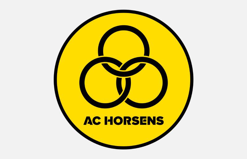
The AC Horsens logo is a combination mark featuring a circular emblem with the club name, a football graphic, and dynamic shapes rendered in yellow and black. It was last updated in 2017 and designed by professional sports branding specialists working with the club.
Here is a breakdown of the key attributes:
- Design Type: Combination mark (emblem with text and graphic elements)
- Primary Elements: Football icon, circular badge shape, “AC Horsens” text, dynamic lines suggesting movement
- Official Introduction Date: 1994 (original); current version introduced in 2017
- Designer/Agency: Developed by a professional sports branding team in collaboration with club officials
- Trademark Status: Active and registered. Fans and third parties need permission for commercial use
- Color Palette: Yellow (#FCDB00) and Black (#1E1917)
- Usage Context: Match kits, club merchandise, official website, social media, stadium signage, and print materials
How Has the AC Horsens Logo Evolved Over Time?
The AC Horsens badge has been updated several times since the club’s founding in 1994. Each version kept the yellow and black scheme intact.
But the shapes, text treatments, and graphic details shifted to match the era. The changes were never drastic. More like incremental polishing than full overhauls.
Original AC Horsens Logo (1994-2000s)
- Years Active: 1994 through the early 2000s
- Design Description: A more traditional football crest influenced by classic Danish football insignia designs. Heavier line work, less refined typography, and a more ornate badge shape
- Color Scheme: Yellow and black, consistent from day one
- Context: Introduced when the club formed through the merger of Horsens fS, Stensballe IK, and FC Horsens. The badge needed to give the new entity its own identity separate from the founding clubs
- Cultural Significance: Established the “Den Gule Fare” visual language. Gave supporters something to rally behind during the club’s early years in the lower divisions
Refined AC Horsens Logo (2000s-2017)
- Years Active: Early 2000s through 2017
- Design Description: Cleaner lines, more streamlined design. The circular shape became more defined, and the text was tightened up. The football icon became a more central graphic element
- Color Scheme: Same yellow and black
- Key Changes from Previous: Simplified details. Reduced visual clutter. Typography cleaned up for better readability at small sizes
- Context: Coincided with the club’s rise through the Danish football system. AC Horsens earned promotion to the Superliga in 2005, and a polished badge better suited the top-flight stage
- Cultural Significance: This version was the one most fans saw during the club’s first stint in the Danish Superliga. It carried the club through some of its most visible years
Current AC Horsens Logo (2017-Present)
- Years Active: 2017 to present
- Design Description: A modernized circular badge with sharper geometry, refined text placement, and a more contemporary football icon. The shapes feel more dynamic and suggest forward motion
- Color Scheme: Yellow (#FCDB00) and Black (#1E1917)
- Key Changes from Previous: Tighter composition. Better suited for digital applications. Improved scalability across screen sizes and print formats
- Context: Introduced as part of a broader brand refresh. The club wanted something that worked well on social media, mobile apps, and merchandise while still feeling like “Horsens”
- Cultural Significance: Represents the club’s modern era, including relegation, promotion back to the Superliga, and continued growth off the pitch
What Do the Design Elements of the AC Horsens Logo Mean?

The AC Horsens badge uses a limited set of graphic elements, and each one carries meaning. The football icon at the center communicates the club’s sole focus on the sport.
The circular badge shape signals unity and completeness. And the dynamic lines running through the design create a sense of energy and forward motion.
Why Did AC Horsens Choose These Specific Colors?
Yellow and black have been the club’s colors since 1994. Not an accident. Yellow grabs attention and communicates energy and optimism. It is also where the nickname “Den Gule Fare” (The Yellow Danger) comes from.
Black grounds the whole thing. It adds weight and authority, keeping the bright yellow from looking too casual. The high contrast between the two colors makes the badge pop at any size.
Here are the official color specifications:
- Yellow (Sizzling Sunrise): Hex #FCDB00 | RGB (252, 219, 0) | Symbolizes energy, optimism, and the club’s attacking spirit
- Black (Eerie Black): Hex #1E1917 | RGB (30, 25, 23) | Represents strength, determination, and professionalism
This two-color approach keeps things simple. From a color psychology standpoint, yellow and black together tend to signal caution and alertness. Think warning signs. For a club nicknamed “The Yellow Danger,” that reads about right.
What Typography Style Is Used in the AC Horsens Logo?
The club name in the badge uses a clean, modern sans-serif typeface. It is nothing flashy, which is the point.
The letterforms are designed for readability first. You can make out “AC Horsens” on a jersey from across the pitch or on a tiny social media avatar. That kind of flexibility matters more than most people realize.
The font communicates stability without being boring. It pairs well with the geometric shapes in the badge, and the weight of the letters balances the visual mass of the football icon nicely.
What Are the Hidden Meanings in the AC Horsens Logo?
There is no single “hidden” symbol buried in the design, but the choices are all deliberate. The circular form references both a football and the idea of a complete, unified club.
The dynamic lines suggest speed and athletic movement. And the yellow-dominant color ratio keeps the club’s identity as “The Yellow Danger” front and center in every version of the badge.
It is less about secrets and more about consistency. Every element reinforces the same message: energy, football, Horsens.
How Does the AC Horsens Logo Compare to Competitor Logos?
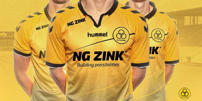
Danish football badges tend to lean traditional. Circular or shield-shaped crests, club colors, sometimes a local symbol or mascot. AC Horsens fits that mold in shape but stands out with its color choice.
Most Danish Superliga clubs use red, blue, or white as primary badge colors. The bold yellow of AC Horsens is hard to miss in a lineup of competitors.
Look at the competition. Brondby IF also uses yellow, but pairs it with blue. FC Midtjylland goes with red and black. Randers FC uses blue. FC Nordsjaelland features red and yellow. Silkeborg IF works with red and white.
AC Horsens’ combination of bright yellow and deep black gives it one of the most instantly recognizable palettes in Danish football. The badge itself is not overly complicated, which actually helps. In a league where some crests carry a lot of detail, the relative simplicity of the Horsens badge makes it easier to identify at a glance, whether on a broadcast, a scarf, or a phone screen.
What Are the Technical Specifications of the AC Horsens Logo?
Official Color Codes
- Primary Color – Yellow (Sizzling Sunrise):
- Hex: #FCDB00
- RGB: (252, 219, 0)
- CMYK: (0, 13, 100, 1)
- Secondary Color – Black (Eerie Black):
- Hex: #1E1917
- RGB: (30, 25, 23)
- CMYK: (0, 17, 23, 88)
Dimensions and Proportions
The logo uses a circular aspect ratio (1:1). The official SVG file is nominally 300 x 300 pixels with a file size of about 5 KB. Being an SVG, it scales to any resolution without quality loss, which makes it ideal for both digital and print applications.
Clear space around the badge should generally be maintained at a minimum distance equal to about 10% of the badge diameter. This keeps the logo from looking cramped when placed alongside sponsor marks or other graphics on jerseys, banners, and digital layouts.
For web use, the logo is typically served as vector graphics (SVG) or high-resolution PNG files. Print applications use EPS formats to maintain quality at any DPI setting.
What Cultural Impact Has the AC Horsens Logo Had?
The AC Horsens badge is a local identity marker as much as a sports logo. In Horsens, a city with about 60,000 people, the yellow and black crest shows up on storefronts, car stickers, and community event materials.
It ties the football club to the town’s broader identity. When the club reached the Superliga, the badge became more widely recognized across Denmark, giving Horsens a level of national visibility it would not otherwise have.
For supporters, the badge carries emotional weight that goes beyond design. It represents promotions, relegations, memorable matches, and the identity of being a Horsens fan. That kind of connection is something no redesign can manufacture. It builds over years.
How Does the AC Horsens Logo Fit Into the Overall Brand Identity?

The badge sits at the center of a broader brand system. The yellow and black scheme extends to everything: home kits, stadium signage at Nordstern Arena, the official website, social media channels, the club’s mobile app, and all licensed merchandise.
The “Den Gule Fare” identity creates a thread that connects the badge to the fan culture, the stadium experience, and the club’s marketing presence. Even the way the club communicates online uses those same yellow and black tones as a backdrop.
It all works because the logo is simple enough to anchor the rest. A complicated badge would fight with other brand elements. The AC Horsens crest does its job, then gets out of the way, letting the broader brand identity breathe.
How Should the AC Horsens Logo Be Used?
If you want to use the AC Horsens badge, here is what you need to know:
- Official access: The logo is available on the club’s official website (achorsens.dk), their social media platforms, and through brand asset databases like Brandfetch and Logotyp.us in SVG format
- Permission required: Any commercial use of the badge needs explicit approval from AC Horsens. You cannot just slap it on merchandise or marketing materials without a license
- Do’s: Use the official color codes. Maintain the clear space around the badge. Keep the proportions locked (no stretching or squishing). Use the provided SVG or high-res files rather than low-quality screenshots
- Don’ts: Do not alter the colors. Do not rearrange the elements. Do not place the badge on busy backgrounds where readability suffers. Do not crop or partially obscure the logo
- Trademark protection: The logo is a registered trademark of AC Horsens. Unauthorized reproduction for commercial gain is a legal issue
For fan projects (blogs, social posts, matchday graphics), the club is generally supportive, but it is always worth checking. A quick message to the club’s media team saves you headaches later.
FAQ on The AC Horsens Logo
What does the AC Horsens logo look like?
The AC Horsens logo is a circular emblem in yellow and black. It features a football icon, dynamic shapes, and the club name in a clean typeface.
The design blends modern and traditional Danish football badge elements. It has been active since 1994 with updates along the way.
What colors are used in the AC Horsens badge?
Yellow (#FCDB00) and black (#1E1917). That is it. Two colors, high contrast, no filler.
Yellow represents energy and optimism. Black adds strength. The combination is why fans call the club “Den Gule Fare,” which translates to The Yellow Danger.
When was the AC Horsens club crest last updated?
The current version dates to 2017. The club modernized the badge with sharper geometry and better digital scalability.
Core elements stayed the same. The color palette and circular shape carried over from earlier versions without major disruption to the club’s visual identity.
What font is used in the AC Horsens logo?
The badge uses a custom clean-spaced sans-serif font. It prioritizes readability across sizes, from stadium banners to small mobile screens.
Nothing decorative. The lettering is built for function, not style points.
Who designed the AC Horsens emblem?
A team of professional graphic designers specializing in sports branding created the current version. They worked directly with club officials in Horsens.
The design process involved research into the club’s heritage, fan culture, and how the badge would perform across merchandise and digital platforms.
Can I download the AC Horsens logo in SVG or PNG format?
Yes. The official logo is available as a logo file in SVG format through brand asset sites. PNG versions exist too, but SVG is better for scaling.
Any commercial use still requires permission from the club. Fan projects usually get a pass, but check first.
What does the football icon in the AC Horsens crest represent?
Pretty straightforward. The football graphic at the center of the badge represents the club’s single focus on the sport. It is the focal point of the entire design.
The dynamic lines around it suggest movement and athletic energy, tying back to the club’s identity on the pitch.
How does the AC Horsens logo compare to other Danish Superliga badges?
Most Danish Superliga clubs lean toward red, blue, or white. AC Horsens stands out with its bold yellow and black scheme.
The badge is simpler than many competitors. Clubs like Viborg FF and Sonderjyske carry more detailed crests. Horsens keeps things tight.
Is the AC Horsens logo trademarked?
Yes. The emblem is a registered trademark of Alliance Club Horsens. You cannot reproduce it for commercial purposes without a licensing agreement.
Unauthorized use is a legal matter. The club protects its brand identity the same way any professional football organization does.
Why is the AC Horsens logo yellow and black?
These have been the club’s colors since its founding in 1994. The color theory behind the pairing works well for sports. Yellow demands attention. Black delivers authority.
Together they create one of the most recognizable yellow-based logos in Danish football. The nickname “Den Gule Fare” would not exist without that color choice.
Conclusion
The AC Horsens logo does what a good football club badge should do. It identifies the team instantly, carries the history of the organization, and works across every format from a matchday scarf to a mobile app icon.
Yellow and black. A football. Clean text. That is the whole formula, and it holds up.
For a club that has bounced between the Danish 1st Division and the Superliga, the badge has been the one constant. Kits change. Sponsors rotate. The crest stays.
Whether you are studying logo design principles or just curious about Scandinavian football branding, the AC Horsens emblem is a solid case study in keeping things simple and letting the design elements do the talking.

Renowned for his expertise in logo design and visual branding, Bogdan has developed a multitude of logos for various clients.
His skills extend to creating posters, vector illustrations, business cards, and brochures. Additionally, Bogdan's UI kits were featured on marketplaces like Visual Hierarchy and UI8.
He also wrote in the past years on sites like Design Your Way, WebDesignerDepot, WPDean, Designmodo, Speckyboy, Slider Revolution, and more.
- The Cursor Logo History, Colors, Font, And Meaning - 24 September 2026
- Top 7 Web Design Subscription Services That Replace Full-Time Hires - 24 September 2026
- Canva vs PowerPoint: Which Is Better for Presentations? - 22 September 2026

Bogdan Sandu is a seasoned designer who has been designing websites since 2008. Renowned for his expertise in logo design and visual branding, Bogdan has developed a multitude of logos for various clients. His skills extend to creating posters, vector illustrations, business cards, and brochures. Additionally, Bogdan's UI kits were featured on marketplaces like Visual Hierarchy and UI8. He also wrote in the past years on sites like Design Your Way, WebDesignerDepot, WPDean, Designmodo, Speckyboy, Slider Revolution, and more.
You Might Also Like