

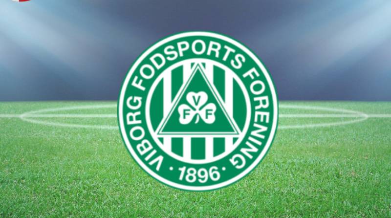
The Viborg FF logo is the official crest of Viborg Fodsports Forening, a Danish football club founded on April 1, 1896, in Central Jutland. It features a circular design built around green and white stripes, a green triangle, and a three-leaf clover at its center. The clover ties directly to the city of Viborg’s own coat of arms, where the shamrock has been a long-standing civic symbol. Over the decades, the badge has gone through several redesigns. But it has always kept the core elements that connect the club to its roots and to the city itself.
The current version of the crest balances tradition with a cleaner look suited for digital use, merchandise, and broadcast. For a club that has bounced between the Danish Superliga and lower divisions since the early 1990s, the badge has stayed surprisingly consistent. It works as an anchor for fans who have stuck around through promotions, relegations, and everything in between.
What Is the Viborg FF Logo?

The Viborg FF logo is a circular emblem featuring a green triangle containing a three-leaf clover, surrounded by green and white stripes. Introduced in its modern form during the early 2000s, it reflects the club’s founding year (1896) and deep ties to the city of Viborg through the shamrock symbol.
Here is a breakdown of the badge’s main attributes:
- Design Type: Combination mark (emblem with integrated text)
- Primary Elements: Three-leaf clover inside a green triangle, encircled by alternating green and white stripes that suggest a football shape. The club initials are worked into the clover’s leaves.
- Official Introduction Date: The current iteration dates to the early 2000s, with the original badge first appearing after the club’s founding in 1896.
- Designer/Agency: No publicly credited designer or agency. The badge evolved internally through the club’s branding decisions over the years.
- Trademark Status: Registered under Viborg Fodsports Forening. Used exclusively by the club and its commercial partners.
- Color Palette: Green (approximately #009A44) and white (#FFFFFF) as primary colors. Occasional gold or brown accent tones appear in special editions.
- Usage Context: Match kits, stadium signage, digital platforms, social media, official merchandise (scarves, hats, mugs), and all broadcast graphics for Danish Superliga coverage.
The circular structure gives the badge a contained, self-sufficient feel. You can slap it on a jersey or shrink it down for a social media avatar, and it still reads clearly. That matters more than people think, especially for clubs that aren’t household names outside Scandinavia.
How Has the Viborg FF Logo Evolved Over Time?
The Viborg FF badge has gone through several visual shifts since 1896, moving from plain text-based marks to the more detailed circular crest used today. Each update kept the green and white colors intact while refining the layout for modern applications.
The changes were never dramatic. More like gradual adjustments. The shamrock stayed. The colors stayed. But the execution got tighter with each pass.
Original Viborg FF Logo (1896 – Mid-20th Century)
- Years Active: 1896 through approximately the 1950s
- Design Description: A simple text-based mark featuring the club name and year of founding. No elaborate graphics. The clover may have appeared in rudimentary form, but early versions focused on identification rather than visual branding.
- Color Scheme: Green and white, consistent with the club’s identity from day one.
- Designer: Unknown. Like most clubs from that era, branding was handled informally.
- Context: Viborg was founded as a multi-sport club covering cricket, gymnastics, and boxing alongside football. The badge served a basic function: put the name on the kit and move on.
- Cultural Significance: These early marks established green and white as the club’s signature. The nickname “De Gronne” (The Greens) traces back to this period.
Mid-Century Viborg FF Badge (1950s – 1990s)
- Years Active: Approximately 1950s through the 1990s
- Design Description: The three-leaf clover became more prominent. The circular shape started taking form. Typography got cleaner. The founding year (1896) was incorporated into the layout.
- Color Scheme: Green and white remained dominant. Slight variations in shade appeared across different kit manufacturers.
- Key Changes from Previous: The shift from a purely text-based mark to a proper crest with symbolic elements. The shamrock moved to center stage.
- Context: This period saw Viborg FF fluctuate between divisions. The badge needed to work on television as Danish football broadcasting expanded.
- Cultural Significance: The clover cemented itself as inseparable from the club’s identity, borrowing from the city of Viborg’s own coat of arms.
Modern Viborg FF Crest (2000s – Present)
- Years Active: Early 2000s to present
- Design Description: A refined circular emblem with green and white stripes forming a football-like outer ring. A green triangle sits at the center with the three-leaf clover inside it. The club initials are integrated into the clover leaves. The year 1896 is displayed.
- Color Scheme: Green (#009A44 approximately) and white (#FFFFFF). Gold or brown accents for special occasions.
- Key Changes from Previous: Sharper lines. Better scalability for digital media. The overall composition was tightened to work across print, screen, and merchandise.
- Context: The club won the Danish Cup in 2000 and qualified for the UEFA Cup. This was a peak period, and the refreshed badge matched the ambition. The stadium was also rebuilt around this time.
- Cultural Significance: This version became the badge most fans recognize. It arrived during the club’s most successful stretch and has remained through promotions, relegations, and a UEFA Conference League run in 2022.
What Do the Design Elements of the Viborg FF Logo Mean?

Every piece of the Viborg FF crest carries a specific reference. The shamrock connects to the city’s heraldic tradition. The circular shape represents togetherness. And the green and white color palette runs through every part of the club’s public face.
It is not a logo that tries to be clever. It is direct. That directness is actually its strength.
Why Did Viborg FF Choose These Specific Colors?
Green has been Viborg FF’s color since 1896. It links the club to the city of Viborg, where green landscapes and the shamrock symbol are part of the local identity.
White provides contrast and readability. Together, the two colors make the badge instantly recognizable on kit, stadium, and screen.
- Green: Hex approximately #009A44. RGB (0, 154, 68). CMYK (100, 0, 56, 40). Represents growth, energy, and the Jutland landscape. Also connects to the psychology of color, where green signals freshness and endurance.
- White: Hex #FFFFFF. RGB (255, 255, 255). CMYK (0, 0, 0, 0). Represents purity and clarity. Keeps the badge clean and legible at small sizes.
- Accent Gold/Brown: Used sparingly in merchandise and commemorative editions. Adds a layer of depth without disrupting the primary palette.
The green and white combination puts Viborg FF in the same visual space as clubs like Panathinaikos, Celtic, and Sporting Lisbon. It is a look that reads “tradition” across football culture, regardless of the league.
What Typography Style Is Used in the Viborg FF Logo?

The typography in the Viborg FF badge uses a custom, blocky sans-serif style. It is built for legibility at various sizes.
The club name and founding year are placed within the circular frame, working with the overall composition rather than competing with the clover symbol.
The typeface leans classic but avoids anything overly ornate. It needs to hold up on a jersey from 20 meters away. And it does. The spacing between characters is tight enough to keep things compact but open enough to stay readable on small applications like pins or digital thumbnails.
What Are the Hidden Meanings in the Viborg FF Logo?
The three-leaf clover is the biggest intentional symbol. It is pulled directly from Viborg’s civic coat of arms, tying the club to its city at a structural level. Not many football clubs do that so literally.
The club initials woven into the clover leaves are easy to miss at first glance. It is a subtle touch that adds a personal layer. The circular outer ring with its alternating stripes is designed to look like a football, which might seem obvious but reinforces the sport connection without being heavy-handed. The overall composition leans into visual unity, where every element supports the others.
How Does the Viborg FF Logo Compare to Competitor Logos?

Danish Superliga badges tend to lean traditional. Most clubs use circular or shield-based crests with strong local references. Viborg’s logo fits this pattern but stands out through its shamrock, which is unique among Danish football clubs.
Look at the rivals. The FC Midtjylland logo uses a red and black shield with stylized wolves. It feels aggressive, modern. Very different energy from Viborg’s rooted, civic design.
Brondby IF’s badge features a yellow and blue globe-style mark. Clean and corporate-feeling. Silkeborg IF’s emblem uses a more traditional shield layout. FC Nordsjaelland went modern and minimal with a tiger graphic.
Viborg’s badge sits somewhere in the middle. Traditional but not stiff. It has a warmth that comes from the clover and the green tones. Among the clubs that use green in their logos, Viborg’s crest holds its own through the strength of its local symbolism.
Where some Superliga clubs have chased contemporary rebrands, Viborg has stayed the course. That consistency is worth something. Fans know what they are getting.
What Are the Technical Specifications of the Viborg FF Logo?
Official Color Codes
- Primary Green: Hex: #009A44 | RGB: (0, 154, 68) | CMYK: (100, 0, 56, 40) | Closest Pantone: 348 C
- White: Hex: #FFFFFF | RGB: (255, 255, 255) | CMYK: (0, 0, 0, 0)
- Accent Gold (occasional use): Used in commemorative and limited-edition materials. Exact codes vary by application.
Dimensions and Proportions
- Aspect Ratio: 1:1 (circular design)
- Minimum Size: Recommended minimum of 20mm diameter for print applications to keep the clover detail legible.
- Clear Space: The badge should be surrounded by clear space equal to roughly 10% of the badge diameter on all sides. This keeps the crest from getting cramped against other elements.
- File Formats: Available in vector formats (AI, EPS, SVG) for scalable use, and raster formats (PNG, JPEG) for digital platforms.
- Resolution: For digital use, the badge should be rendered at a minimum of 72 DPI. For print, 300 DPI minimum to keep the fine details sharp, especially the clover leaves and text.
What Cultural Impact Has the Viborg FF Logo Had?
The Viborg FF crest is one of the most recognizable symbols in Central Jutland, even beyond football. It carries the shamrock from the city’s own heraldic tradition into sports culture, giving Viborg a visual identity that extends past match days.
Fans wear the badge on scarves, jackets, and car stickers as a point of local pride. The ultra group “Shamrock Ultras,” founded in 2004, took its name directly from the logo’s central symbol. That says a lot about how deeply the crest has embedded itself into the supporter culture.
During the club’s 2000 Danish Cup win and subsequent UEFA Cup appearance, the badge got its widest exposure. For a smaller club, those moments put the shamrock on an international stage. And it held up. The design was distinctive enough that people remembered it.
It is not a badge that makes global headlines. But within Denmark and Scandinavian football circles, it carries weight. Took me a while to appreciate how much a civic symbol like the clover can anchor a club’s identity across generations.
How Does the Viborg FF Logo Fit Into the Overall Brand Identity?

The Viborg FF logo sits at the center of a broader brand system that includes the club’s kit design, stadium branding at Energi Viborg Arena, digital presence, and merchandise. Green and white run through everything. The shamrock shows up not just on the badge but across supporter gear, training kits, and youth academy materials through FK Viborg.
The badge connects to the city’s own brand guidelines, since both the club and the municipality of Viborg share the shamrock as a core symbol. That overlap strengthens the sense that the club and the city are one thing. Not many football clubs outside of maybe a few English or Italian examples have that kind of direct link between civic identity and club crest.
The nickname “De Gronne” (The Greens) reinforces the color choice, and the brand style stays consistent from the first team all the way down to the under-12s. That kind of repetition across touchpoints builds recognition even for people who don’t follow Danish football closely.
How Should the Viborg FF Logo Be Used?
If you are working with the Viborg FF badge for any official or licensed purpose, there are some things to keep in mind.
- Do not alter the colors. The green and white palette is fixed. Swapping in other colors, even for “creative” purposes, breaks the brand consistency the club has built over more than a century.
- Do not stretch or distort the badge. It is a 1:1 circular mark. Keep the proportions locked.
- Maintain clear space. Give the badge room to breathe. Crowding it against text, sponsors, or other logos reduces its impact.
- Use official files. Vector versions are available through the club and authorized licensees. Do not trace or recreate the badge from screenshots. The details in the clover and lettering matter.
- Licensing: Any commercial use of the Viborg FF logo requires permission from the club. This covers merchandise, promotional materials, and third-party digital content. The badge is a registered trademark of Viborg Fodsports Forening.
- Where to access: Official logo files can be requested through the club’s website or commercial department. Several vector download sites host versions, but always verify against the club’s own assets for accuracy.
Look, the main thing is respect. This badge has been around since 1896 in one form or another. Treat it accordingly.
FAQ on The Viborg FF Logo
What does the Viborg FF logo look like?
The Viborg FF logo is a circular emblem with green and white stripes forming a football-like outer ring. A green triangle sits at the center, holding a three-leaf clover with the club initials worked into the leaves. The founding year 1896 is also displayed.
What does the clover in the Viborg FF badge mean?
The shamrock comes directly from the city of Viborg’s coat of arms. It is the official symbol of the Danish town itself.
In the club crest, the clover represents local identity, good fortune, and the deep connection between the football club and its home city in Central Jutland.
What are the official colors of the Viborg FF emblem?
Green and white. Those have been the club’s colors since its founding in 1896. Green (approximately #009A44) signals energy and ties to the Jutland landscape. White (#FFFFFF) adds clarity.
Some special editions include subtle gold accents, but green and white always dominate.
When was the current Viborg FF crest introduced?
The modern version of the badge appeared in the early 2000s. This lined up with the club’s most successful period, including winning the Danish Cup in 2000 and qualifying for the UEFA Cup.
The refresh gave the crest sharper lines for digital and broadcast use.
Who designed the Viborg FF logo?
No designer or agency has been publicly credited. Like many Danish football club badges, the Viborg FF visual identity evolved internally over decades.
Each redesign built on what came before. The club crest was shaped by the organization itself rather than an outside firm.
Has the Viborg FF logo changed over the years?
Yes. The badge started as a simple text mark in 1896. By mid-century, the shamrock became more prominent. The circular structure took shape gradually.
The current version refined everything for modern use. But the green and white identity has never changed.
Can I download the Viborg FF logo in vector format?
Several sites host the badge in AI, EPS, SVG, and PNG formats. But always verify against the club’s own files for accuracy.
Any commercial use requires permission from Viborg Fodsports Forening, since the logo is a registered trademark.
What makes the Viborg FF logo different from other Danish Superliga badges?
The shamrock. No other club in the Danish Superliga uses a clover as its central symbol. Most rivals rely on shields, animals, or abstract marks.
Viborg’s direct tie to the city’s heraldic tradition gives it a civic weight that other football club crests in Denmark don’t carry.
What is the connection between the Viborg FF logo and the city of Viborg?
The three-leaf clover in the badge mirrors the shamrock on the Viborg Municipality coat of arms. Club and city share the same symbol.
That overlap means the Viborg FF emblem doubles as a piece of local identity, not just a sports brand.
Where is the Viborg FF logo displayed?
Match kits, Energi Viborg Arena signage, social media, broadcast graphics, and all official merchandise. Scarves, hats, mugs, posters.
The badge also appears on youth academy materials through FK Viborg and across the club’s digital platforms for Danish football coverage.
Conclusion
The Viborg FF logo is one of those football badges that does more with less. A shamrock, two colors, a founding year. That is the whole story, and it works.
It has survived relegations, promotions, and over a century of Danish football history without losing its core identity.
The connection between the club crest and the city’s coat of arms gives it a permanence that trendy redesigns cannot match. Few Scandinavian football emblems carry that kind of civic weight.
For fans, designers, and anyone studying football club branding, the Viborg FF badge is a case study in consistency. Sometimes the best thing you can do with a logo is just leave it alone.

Renowned for his expertise in logo design and visual branding, Bogdan has developed a multitude of logos for various clients.
His skills extend to creating posters, vector illustrations, business cards, and brochures. Additionally, Bogdan's UI kits were featured on marketplaces like Visual Hierarchy and UI8.
He also wrote in the past years on sites like Design Your Way, WebDesignerDepot, WPDean, Designmodo, Speckyboy, Slider Revolution, and more.
- The Cursor Logo History, Colors, Font, And Meaning - 24 September 2026
- Top 7 Web Design Subscription Services That Replace Full-Time Hires - 24 September 2026
- Canva vs PowerPoint: Which Is Better for Presentations? - 22 September 2026

Bogdan Sandu is a seasoned designer who has been designing websites since 2008. Renowned for his expertise in logo design and visual branding, Bogdan has developed a multitude of logos for various clients. His skills extend to creating posters, vector illustrations, business cards, and brochures. Additionally, Bogdan's UI kits were featured on marketplaces like Visual Hierarchy and UI8. He also wrote in the past years on sites like Design Your Way, WebDesignerDepot, WPDean, Designmodo, Speckyboy, Slider Revolution, and more.
You Might Also Like


