


The Silkeborg IF logo is one of those football badges that tells you exactly where it comes from. Founded in 1917 in the Danish city of Silkeborg, this club has worn its crest through promotions, relegations, a Superliga title, and two Danish Cup wins. The current version of the badge, in use since around 2000, combines blue, red, white, and apricot tones into a shield-shaped emblem that pulls from both the city’s identity and the club’s football tradition. It is not flashy. It does not try to be. But it works, and it has held up across decades of use on kits, merchandise, and digital platforms.
The badge sits within a broader tradition of Scandinavian football branding, where clubs tend to favor clean lines and local symbolism over overly complex illustration. Silkeborg IF fits that pattern. The emblem has gone through a handful of updates since the club’s founding, but the core elements (the club name, the city connection, the red and white palette) have stayed consistent. Victor Kristensen is credited with the current version’s design.
What Is the Silkeborg IF Logo?

The Silkeborg IF logo is a shield-shaped emblem featuring the club’s name, a combination of blue, red, white, and apricot colors, and design elements tied to the city of Silkeborg. It was introduced around 2000 and designed by Victor Kristensen.
Here is a breakdown of the badge’s main attributes:
- Design Type: Combination mark. The logo pairs text with graphic elements inside a crest shape, which is standard for European football clubs.
- Primary Elements: The badge includes the full club name “Silkeborg IF,” a shield outline, and graphical references to the city. The crest shape gives it a traditional football club feel.
- Official Introduction Date: The current version dates back to approximately 2000, based on SportsLogos.Net records showing the primary logo listed from 2000 to present.
- Designer: Victor Kristensen, according to Brands of the World.
- Trademark Status: The logo is an active trademark of Silkeborg IF. It is protected under Danish intellectual property regulations and UEFA club licensing rules.
- Color Palette: Five colors make up the badge. Munsell Blue (#0090B2), White (#FFFFFF), Mellow Apricot (#FDC070), Rosso Corsa (#D90000), and Indigo Dye (#0F298F).
- Usage Context: The logo appears on match kits (currently supplied by adidas), fan merchandise, JYSK Park stadium signage, official communications, and all digital platforms operated by the club.
How Has the Silkeborg IF Logo Evolved Over Time?
The Silkeborg IF badge has changed a few times since 1917, though it has never undergone a total overhaul. Early versions were simple, almost utilitarian. Later updates brought better visual clarity and a more polished look that matched modern sports branding standards.
The club’s approach to redesigning has always been conservative. Keep the bones, clean up the surface.
Original Silkeborg IF Logo (1917-1960s)
- Years Active: Roughly 1917 through the mid-1960s
- Design Description: A basic text-based mark with minimal graphic elements. Most Danish clubs from this era used simple lettering, sometimes placed inside a circle or basic shield shape. Nothing fancy.
- Color Scheme: Red and white, reflecting the city’s flag and the club’s identity from day one.
- Designer: Unknown. These early marks were rarely credited to specific individuals.
- Context: The club was still a local sports association competing in Jutland’s regional leagues. Branding was not a priority. Survival was.
- Cultural Significance: It established red and white as the club’s DNA. That stuck forever.
Mid-Century Silkeborg IF Logo (1960s-1990s)
- Years Active: Mid-1960s through the late 1990s
- Design Description: The crest began taking on a more defined shield shape. The club name became more prominent, and graphical elements referencing the city were added. The typeface was modernized for the era.
- Color Scheme: Red, white, and blue entered the picture. Blue accents started to appear, giving the badge more depth.
- Key Changes from Previous: Moved from plain text to a proper crest format. Added layered visual elements.
- Context: This period covered the club’s promotion to the 2nd division in 1966 and its rise to the top flight in 1987. The badge needed to work on TV broadcasts and printed programs, which pushed the design toward something more structured.
- Cultural Significance: The 1993-94 Superliga title happened during this era. Fans associate this version with the club’s greatest achievement.
Current Silkeborg IF Logo (2000-Present)
- Years Active: 2000 to present
- Design Description: A refined shield emblem with crisp lines, the full club name integrated into the design, and a five-color palette that balances tradition with modern readability. The apricot accent adds warmth that most football badges lack.
- Color Scheme: Munsell Blue, White, Mellow Apricot, Rosso Corsa, Indigo Dye
- Designer: Victor Kristensen
- Key Changes from Previous: Cleaner linework. Better color definition. Improved scalability for digital use, which matters more than people realize when you need the badge to look sharp at 64 pixels on a phone screen.
- Context: Introduced as the club entered the 2000s and began expanding its commercial presence. The 2001 Danish Cup win and the move to JYSK Park in 2017 both carried this version of the crest.
- Cultural Significance: This is the badge that has been on the kit for the club’s second Danish Cup win in 2024 and its European campaigns. It is the version most current fans recognize.
What Do the Design Elements of the Silkeborg IF Logo Mean?
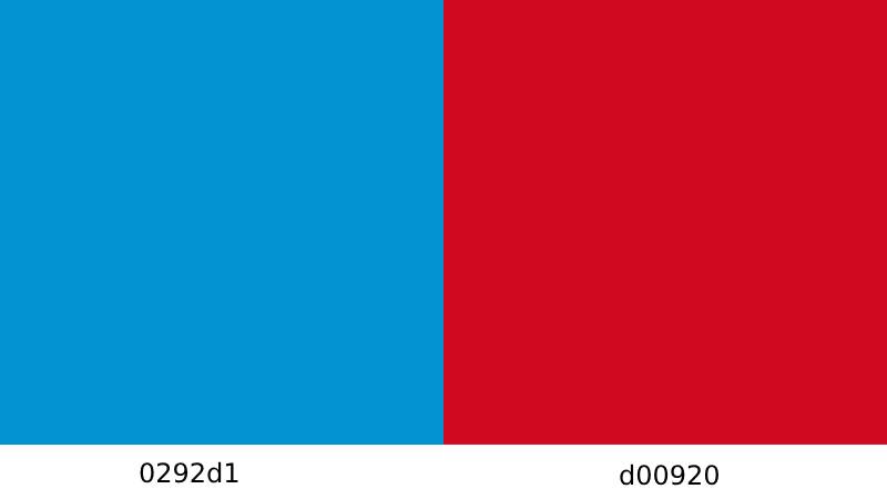
Every piece of this badge traces back to either the city of Silkeborg or the club’s football identity. The shield shape communicates tradition and competition. The colors tie directly to local heritage.
Nothing in the design exists just to fill space.
Why Did Silkeborg IF Choose These Specific Colors?
The five colors in the badge each carry a specific purpose. Red (#D90000, Rosso Corsa) represents energy and competitive passion. It has been part of the club since 1917, pulled from the city’s own flag.
Blue appears in two forms. Munsell Blue (#0090B2) adds a lighter, more approachable tone, while Indigo Dye (#0F298F) brings depth and authority. Together, they reference loyalty and trust, which are common associations in color psychology.
White (#FFFFFF) works as a separator and a contrast tool. It keeps the other colors legible when printed at small sizes. And Mellow Apricot (#FDC070) is the interesting one. It is warm, a bit unusual for a football crest, and adds a distinctive accent that separates Silkeborg’s badge from the dozens of red logos across European football.
Understanding color theory helps explain why this combination works. The mix of warm reds and cool blues creates visual tension that holds your eye. The apricot serves almost like a hue bridge between the two extremes.
What Typography Style Is Used in the Silkeborg IF Logo?

The font in the badge is a custom sans-serif style, chosen for clarity at various sizes. It reads well on both a matchday jersey and a tiny social media avatar.
The letterforms are bold and compact. There is no ornamentation, no decorative flourishes. The typography prioritizes function over style, which lines up with Scandinavian design preferences. Good kerning keeps the characters from crowding each other inside the shield shape.
What Are the Hidden Meanings in the Silkeborg IF Logo?
The shield shape itself doubles as a nod to civic heraldry. Danish football clubs often borrow from municipal coat-of-arms traditions, and Silkeborg IF is no exception.
The red and white combination goes beyond the pitch. It mirrors Silkeborg City’s flag. So when fans see the badge, they are not just seeing a football club. They are seeing a piece of their city on the kit. The apricot accent? That is less about hidden meaning and more about differentiation. It makes the badge instantly recognizable even at a distance.
How Does the Silkeborg IF Logo Compare to Competitor Logos?
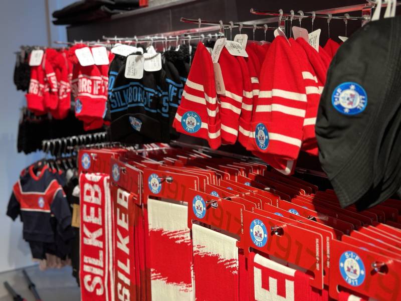
In the Danish Superliga, most clubs lean on similar design patterns: shield shapes, local colors, text inside a crest. Silkeborg IF follows this template but stands apart through its color choices.
Compare it to the Brondby IF logo, which uses bold yellow and blue. Or the FC Midtjylland logo, which leans heavily into red and black with a wolf motif. Silkeborg’s approach is quieter but no less effective.
The Randers FC logo shares some of the same blue palette, being another Jutland-based club. But Silkeborg’s apricot accent creates a visual signature that Randers does not have. The FC Nordsjaelland logo goes in a completely different direction with a more modern, circular design.
Among the broader Scandinavian football scene, Silkeborg’s badge reads as traditional but not dated. It does not try to reinvent football branding. It just does its job well.
What Are the Technical Specifications of the Silkeborg IF Logo?
Official Color Codes
- Munsell Blue – Hex: #0090B2, RGB: (0, 144, 178), CMYK: (100, 19, 0, 30)
- White – Hex: #FFFFFF, RGB: (255, 255, 255), CMYK: (0, 0, 0, 0)
- Mellow Apricot – Hex: #FDC070, RGB: (253, 192, 112), CMYK: (0, 24, 56, 1)
- Rosso Corsa – Hex: #D90000, RGB: (217, 0, 0), CMYK: (0, 100, 100, 15)
- Indigo Dye – Hex: #0F298F, RGB: (15, 41, 143), CMYK: (90, 71, 0, 44)
Dimensions and Proportions
The badge uses a vertical shield orientation with an aspect ratio close to 1:1.2. Most official usage keeps the logo above 30mm in height for print to maintain legibility of the text elements.
Clear space around the logo should be at least 10% of the badge’s total height on all sides. This prevents other design elements from crowding the emblem. For digital platforms, the minimum recommended size is 64×64 pixels, though it scales cleanly down to smaller favicon sizes thanks to the bold linework.
The badge is available in vector graphics formats (SVG, AI, EPS) for professional use, as well as PNG for web and social applications. DPI requirements for print should be 300 or higher to avoid blurring on merchandise and official documents.
What Cultural Impact Has the Silkeborg IF Logo Had?
For a city of around 50,000 people, the Silkeborg IF badge punches well above its weight in terms of recognition. The 1993-94 Superliga title put the crest on national television and in newspapers across Denmark.
The 1996 UEFA Intertoto Cup win pushed it into European visibility. And the 2024 Danish Cup victory reintroduced the badge to a younger generation of fans who may not remember the glory days of the 90s.
Locally, the logo is everywhere. On bumper stickers, in shop windows, on scarves. It serves as a community marker. People in Silkeborg display the crest not just because they follow football, but because it represents the city itself. That is the kind of cultural weight that goes beyond sport.
How Does the Silkeborg IF Logo Fit Into the Overall Brand Identity?
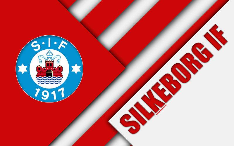
The badge is the anchor of a wider visual system that includes the club’s kit design, JYSK Park stadium branding, social media presence, and commercial partnerships. Everything radiates out from the crest.
Adidas, the current kit supplier, works within the club’s established color palette when producing home and away shirts. Red dominates the home kit, white and blue the away versions.
The club’s brand guidelines ensure the logo maintains consistency across touchpoints. Whether it appears on a matchday program, a youth academy jersey, or a social media post, the same version of the badge is used. This repetition builds recognition over time.
The relationship between the badge and the club’s broader identity follows solid graphic design principles. Clear visual hierarchy, consistent color use, and a design that scales across applications. Nothing groundbreaking, but reliably effective.
How Should the Silkeborg IF Logo Be Used?
If you need to use the Silkeborg IF badge for editorial, media, or fan-created content, there are some basic rules to follow.
Do:
- Use the official version from the club’s media resources or licensed vector databases
- Maintain the original colors. Do not swap or adjust the palette
- Keep the required clear space around the emblem
- Use high-resolution files (300+ DPI for print, SVG for web where possible)
Don’t:
- Stretch, skew, or rotate the badge
- Place the logo on busy backgrounds that reduce readability
- Alter the typography or rearrange any internal elements
- Use the badge for commercial purposes without written permission from the club
The club trademark is registered in Denmark and protected under both national law and UEFA’s intellectual property framework. For commercial licensing inquiries, contact the club directly through their official website at silkeborgif.com. Fan use for non-commercial purposes (social media posts, fan art, supporter banners) is generally tolerated by most football clubs, but the badge should not be used to imply official endorsement.
Official logo files can be found through the club’s communications department, and several vector logo databases carry versions available for editorial and informational use.
FAQ on The Silkeborg IF Logo
What does the Silkeborg IF logo look like?
The Silkeborg IF logo is a shield-shaped crest featuring blue, red, white, and apricot tones. The club name sits inside the badge alongside graphic elements tied to Silkeborg City. It has been the primary emblem since around 2000.
What colors are in the Silkeborg IF badge?
Five colors define the badge. Munsell Blue (#0090B2), White (#FFFFFF), Mellow Apricot (#FDC070), Rosso Corsa (#D90000), and Indigo Dye (#0F298F).
The red and white connect directly to the city’s flag. Blue adds depth, and the apricot accent makes it stand out from other Danish Superliga crests.
Who designed the current Silkeborg IF logo?
Victor Kristensen is credited with the current version of the club emblem. The design balances traditional football crest conventions with clean, modern linework suited for both print and digital use.
When was the Silkeborg IF logo introduced?
The current badge dates to approximately 2000, based on available records. Silkeborg IF was founded in 1917, so the club has used different versions of its visual identity across more than a century of competition.
Has the Silkeborg IF logo changed over the years?
Yes. Early versions were simple text-based marks with minimal detail. Mid-century updates introduced a proper shield shape and added blue to the existing red and white scheme.
The 2000 version refined everything. Cleaner lines, better saturation in the colors, and improved scalability for screens.
What does the Silkeborg IF crest symbolize?
The shield shape references civic heraldry and Danish football tradition. Red and white mirror the Silkeborg City flag, tying the club directly to its hometown. The overall design communicates local pride and competitive identity within the Danish football system.
Where can I download the Silkeborg IF logo?
Vector files in SVG, AI, and EPS formats are available through logo databases like Brands of the World and Seek Logo. PNG versions work for web and social media.
Always use the official version. Stretched or low-resolution copies look terrible on merchandise and printed materials.
What font is used in the Silkeborg IF logo?
The badge uses a custom typeface with bold, compact letterforms. There are no decorative elements in the lettering. It prioritizes readability at small sizes, which matters when the crest appears on everything from team jerseys to phone screens.
How does the Silkeborg IF logo compare to other Danish club badges?
Most Danish clubs use shield-based crests with local colors. Silkeborg follows that pattern but adds an unusual apricot accent that gives it a warmer feel.
Clubs like Viborg FF and AC Horsens stick to more conventional two-tone schemes. Silkeborg’s five-color palette is bolder for a mid-sized club.
Can I use the Silkeborg IF logo for my project?
For editorial and informational purposes, usage is generally acceptable. Commercial use requires written permission from the club.
The trademark is registered in Denmark and protected under UEFA licensing rules. Contact Silkeborg IF directly through silkeborgif.com for any licensing questions. Fan art and non-commercial supporter content is typically tolerated.
Conclusion
The Silkeborg IF logo does what a good football club emblem should. It carries the weight of a city, a fanbase, and over a century of competition without trying too hard.
From its origins in 1917 to the current shield-shaped crest designed by Victor Kristensen, every update has respected the club’s roots while keeping up with modern sports branding. The five-color palette, the clean typography elements, and the shield format all work together.
Whether displayed at JYSK Park, printed on adidas match kits, or scaled down to a favicon, the badge holds up. It is a piece of Danish football heritage that fans in Silkeborg wear with real pride.

Renowned for his expertise in logo design and visual branding, Bogdan has developed a multitude of logos for various clients.
His skills extend to creating posters, vector illustrations, business cards, and brochures. Additionally, Bogdan's UI kits were featured on marketplaces like Visual Hierarchy and UI8.
He also wrote in the past years on sites like Design Your Way, WebDesignerDepot, WPDean, Designmodo, Speckyboy, Slider Revolution, and more.
- The Windsurf Logo History, Colors, Font, And Meaning - 10 October 2026
- How to Remove Background From Product Photos (No Photoshop) - 10 October 2026
- How Designers can Build a Stronger Online Creative Identity - 9 October 2026

Bogdan Sandu is a seasoned designer who has been designing websites since 2008. Renowned for his expertise in logo design and visual branding, Bogdan has developed a multitude of logos for various clients. His skills extend to creating posters, vector illustrations, business cards, and brochures. Additionally, Bogdan's UI kits were featured on marketplaces like Visual Hierarchy and UI8. He also wrote in the past years on sites like Design Your Way, WebDesignerDepot, WPDean, Designmodo, Speckyboy, Slider Revolution, and more.
You Might Also Like


