The Brondby IF logo is one of the most recognized football club badges in Scandinavian sports. It sits on jerseys, scarves, stadium walls, and across every piece of merchandise the club produces. But it’s also a pretty fascinating piece of design if you look closely enough.
Brondbyernes Idraetsforening, usually shortened to Brondby IF, was founded on December 3, 1964, through a merger of two local clubs in the Brondby area west of Copenhagen. The club has won 11 Danish championships and 7 Danish Cups. And the logo has been with them through most of that journey, picking up small changes along the way while keeping its core look intact.
The crest features a shield shape with a deep blue background, a stylized water well in yellow, two stars, and the initials “B.I.F.” on a ribbon. It’s a combination mark that blends heraldic elements with local symbolism. The water well, by the way, is a direct reference to the town’s name. “Brondby” translates roughly to “well village” in Danish. That kind of detail gets overlooked a lot.
What Is the Brondby IF Logo?
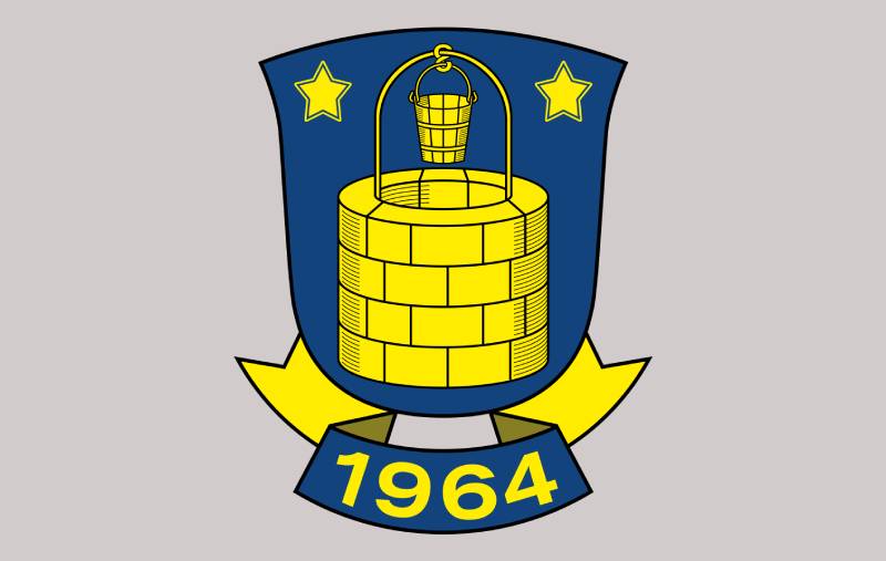
The Brondby IF logo is a shield-shaped emblem featuring a yellow water well, two five-pointed stars, and the club’s initials “B.I.F.” on a blue background. It was first introduced in the late 1960s after the club’s founding and has been refined several times since, most recently in the late 1980s.
Here’s a breakdown of the key attributes:
- Design Type: Combination mark (shield emblem with text and graphic elements)
- Primary Elements: Shield shape, water well, bucket, two stars, “B.I.F.” lettering on a ribbon, and the founding year
- Official Introduction: Mid-1960s (original version), late 1980s (current refined version)
- Designer: A local graphic artist commissioned by the club. The specific name hasn’t been widely publicized
- Trademark Status: Registered and protected under the club’s official branding guidelines
- Color Palette: Cool Black (#072F67) and Yellow (#FFFF00)
- Usage Context: Match kits, stadium signage, digital platforms, fan merchandise, official documents, and promotional materials
The logo functions as the club’s primary identifier across all touchpoints. Whether you see it on a scarf in the stands at Brondby Stadium or on the club’s website, the same emblem appears. That consistency matters more than most people think.
How Has the Brondby IF Logo Evolved Over Time?

The Brondby IF badge has gone through several refinements since the club’s formation in 1964. The core elements have stayed remarkably consistent, but the execution has been updated to match the times. Most changes were about cleaning up details rather than starting from scratch.
Original Brondby IF Logo (1964-1970s)
Years Active: 1964 through the 1970s
The first badge appeared shortly after the merger of Brondbyoster IF and Brondbyvester IF. It was a fairly basic design, heavier on detail than what you’d see today. The shield shape was there from the start, along with the club colors.
Traditional symbols like the ball and shield dominated. The artwork was more intricate, which was typical for football crests of that era. Think about how most European club badges looked in the 1960s. Heavy on ornamentation, light on scalability.
The color scheme used blue and yellow from the beginning. Those colors carried over from the merging clubs and became the foundation of the new identity.
Refined Brondby IF Logo (1980s-Present)
Years Active: Late 1980s to present
This is the version most fans recognize today. The club commissioned a local graphic artist to rework the emblem, keeping the core identity but tightening everything up. The shield was made cleaner. The water well became more stylized. The lettering got bolder.
The two stars were added to mark the club’s championship success, showing that Brondby IF had won more than five Danish league titles. That detail ties directly to Scandinavian football tradition, where stars above or beside a crest indicate title wins.
Since the late 1980s, changes have been subtle. Mostly adjustments to line weight, color consistency across digital and print, and small tweaks to the typography. The goal each time was modernization without alienating the fanbase. Your mileage may vary on whether they got the balance right, but the crest is definitely one of those that holds up well at small sizes on screen and large formats on banners.
What Do the Design Elements of the Brondby IF Logo Mean?

Every piece of the Brondby IF crest carries meaning tied to the club’s geography, history, or values. The shield represents defense and tradition. The water well connects the badge to the town itself. And the stars celebrate on-field success.
It’s not just decoration. Each component was chosen to tell part of the club’s story.
Why Did Brondby IF Choose These Specific Colors?
Blue stands for loyalty and trust. At least that’s the official line, and honestly, it fits. Blue shows up in a lot of Danish institutional branding for exactly those reasons.
Yellow represents energy and optimism. It also makes the crest pop visually against darker backgrounds.
The official color codes are Cool Black (#072F67) with RGB values of approximately (7, 47, 103), and Yellow (#FFFF00). Understanding the psychology behind colors helps explain why this pairing works so well. Blue paired with yellow creates strong contrast, which is great for readability and recognition from a distance.
These colors are used uniformly across kits, merchandise, stadium signage, and digital assets. That kind of disciplined approach to a color palette is what builds recognition over decades.
What Typography Style Is Used in the Brondby IF Logo?
The font used in the emblem is bold and modern. It’s designed for legibility at all sizes, which is trickier than it sounds when you’re dealing with a crest that needs to work on everything from a pin to a stadium banner.
The “B.I.F.” lettering sits on a ribbon element at the base of the shield. It uses a sans-serif style that leans contemporary but keeps some classical weight to it.
When updates have been made, the type has always been adjusted carefully. The spacing between letters and the stroke weight have been tuned over the years, but the overall feel hasn’t changed drastically. That’s a smart approach when your fanbase has an emotional connection to how those three letters look.
What Are the Hidden Meanings in the Brondby IF Logo?
The water well is the big one. “Brondby” literally means “well village,” so placing a stylized well at the center of the crest roots the club in its geography. It’s the kind of detail that separates a thoughtful badge from a generic one.
The two stars above the well represent championship wins. In Danish football, stars are added once a club passes certain title thresholds.
The ribbon with the founding year serves as a timestamp, grounding the modern design in 1964. And the shield itself pulls from heraldic tradition, connecting the football club to broader European crest conventions. The psychology behind the shield shape suggests protection, strength, and belonging.
How Does the Brondby IF Logo Compare to Competitor Logos?

Danish football crests tend to lean traditional. Shields, heraldic animals, city symbols. Brondby fits that pattern but stands out through its use of the water well, which is pretty unique among European football badges.
FC Copenhagen, Brondby’s biggest rival, uses a lion on their crest. It’s a more aggressive symbol, fitting for the “New Firm” derby dynamic. FC Midtjylland’s badge takes a more modern, streamlined direction with red and black, which makes sense given the club was only founded in 1999.
Where Brondby’s crest feels rooted in place and history, some of the newer Danish clubs lean toward corporate-style marks. FC Nordsjaelland, for example, uses a cleaner, more graphic approach. And clubs like Silkeborg IF sit somewhere in between, blending traditional shield shapes with slightly updated graphic treatments.
Brondby’s yellow and blue combination is distinct within the Danish Superliga. Most competitors use red, blue, or black as dominant colors. That yellow-forward identity gives them instant visual separation in any lineup of league crests.
What Are the Technical Specifications of the Brondby IF Logo?
Official Color Codes
- Primary Color: Cool Black – Hex: #072F67, RGB: (7, 47, 103), CMYK: (93, 54, 0, 60)
- Secondary Color: Yellow – Hex: #FFFF00, RGB: (255, 255, 0), CMYK: (0, 0, 100, 0)
Dimensions and Proportions
The logo uses a roughly 5:6 width-to-height ratio within its shield outline. Minimum reproduction size should keep the “B.I.F.” lettering legible, which typically means no smaller than about 20mm in height for print applications.
Clear space around the logo should equal at least the height of one of the stars in the design. This buffer zone prevents the crest from looking cramped next to other elements.
For digital use, the logo is typically distributed in vector formats like SVG and EPS, which keep it sharp at any resolution. Pixel-based versions in PNG format are available for web and social media, usually at a minimum of 300 DPI for print work.
What Cultural Impact Has the Brondby IF Logo Had?

The Brondby IF crest is more than a badge for fans. It’s an identity marker for a community.
Supporters wear it tattooed on their skin. They paint it on walls. They wave it on flags at Brondby Stadium, where the highest recorded attendance hit over 31,000 for a Copenhagen Derby match.
The yellow and blue of the badge have become shorthand for a specific kind of working-class, suburban Danish football culture. The club draws fans not just from Brondby itself but from across Denmark, with reports suggesting a large share of the supporter base comes from Jutland as well.
During European campaigns, particularly the famous 1990-91 UEFA Cup semifinal run, the crest became visible across the continent. Those matches against Eintracht Frankfurt, Bayer Leverkusen, and Roma put the yellow and blue shield in front of millions of viewers. That kind of exposure does things for brand recognition that no marketing budget can replicate.
How Does the Brondby IF Logo Fit Into the Overall Brand Identity?
The logo sits at the center of everything Brondby IF does visually. Kit designs, stadium branding, the club website, social media profiles, official communications. It all radiates outward from the crest.
The club’s brand guidelines dictate how the logo should appear across different media. Color values stay consistent. Placement rules keep the badge from being distorted or misused. The same typeface family used in the crest carries over into other branded materials.
What makes it work is repetition. The same shield, the same colors, the same layout, across every single touchpoint. That builds familiarity. And familiarity, over time, builds trust. The visual hierarchy of the brand always puts the crest first, with supporting elements arranged around it.
Merchandise sales, sponsorship decks, matchday programs, youth academy kits. All of it ties back to the logo as the anchor point. That’s how you build a brand in football. You don’t reinvent. You reinforce.
How Should the Brondby IF Logo Be Used?
Do’s:
- Always use the official logo files provided by the club
- Maintain the required clear space around the crest
- Use the correct color codes (Hex #072F67 and #FFFF00) in all applications
- Scale the logo proportionally without stretching or distorting
- Place the logo on backgrounds that maintain sufficient contrast
Don’ts:
- Don’t alter the colors or rearrange elements within the crest
- Don’t place the logo on busy backgrounds that reduce legibility
- Don’t add effects like drop shadows, gradients, or outlines that aren’t part of the official design
- Don’t reproduce the logo below minimum size requirements
- Don’t use the logo for commercial purposes without proper licensing from the club
Official logo assets can typically be accessed through the club’s media department or their official website at brondby.com. For press and media use, the club provides approved files in various formats.
The Brondby IF logo is a registered trademark. Unauthorized commercial use can result in legal action. Fan-created content for personal, non-commercial use generally falls into a gray area, but selling merchandise with the badge on it without a license? That’s where things get serious fast.
FAQ on The Brondby IF Logo
What does the Brondby IF logo look like?
The Brondby IF logo is a shield-shaped emblem with a deep blue background. It features a yellow water well at the center, two five-pointed stars, and a ribbon displaying “B.I.F.” in bold white letters.
The founding year appears at the bottom of the crest.
What do the colors in the Brondby IF badge mean?
Blue represents loyalty and trust. Yellow signals energy and optimism. Together they form the club’s visual identity and show up on kits, merchandise, and stadium signage across all branding efforts.
The pairing also creates strong visual separation from other Danish Superliga clubs.
Why is there a water well in the Brondby IF crest?
“Brondby” translates to “well village” in Danish. The well connects the club to its hometown near Copenhagen. It’s a geographic reference that grounds the club emblem in local identity and heritage.
What do the two stars on the Brondby IF emblem represent?
The stars mark championship success. In Scandinavian football tradition, stars are added once a club passes certain title thresholds. Brondby IF has won 11 Danish championships, which earns the two stars above the well.
When was the current Brondby IF logo introduced?
The current version was introduced in the late 1980s. A local graphic artist refined the original 1960s design. Core elements stayed the same, but the shield, lettering, and well graphic were all cleaned up.
Has the Brondby IF logo changed over the years?
Yes, but the changes have been subtle. Early versions from the 1960s had more detailed artwork. The logo evolution focused on simplifying lines and improving how the crest reproduces across digital and print formats.
The basic structure has never been completely overhauled.
What font is used in the Brondby IF logo?
The “B.I.F.” lettering uses a bold, modern sans-serif style. It’s designed for readability at all sizes. The club keeps the same typeface across official branding materials to maintain consistency in their football club identity.
Can I download the Brondby IF logo for personal use?
Vector files in SVG and EPS formats are available through various logo databases. The club trademark protects commercial use, though. Selling products with the badge requires a license from Brondby IF directly.
What are the official Brondby IF logo color codes?
The primary color is Cool Black, hex #072F67. The secondary color is Yellow, hex #FFFF00. These codes stay consistent across all applications, from Danish football club merchandise to digital platforms and matchday programs.
How does the Brondby IF logo compare to other Danish Superliga badges?
Most Danish club crests use shields and heraldic symbols. Brondby stands out with the water well, which is unique among European football badges. The yellow and blue scheme also gives them instant recognition against competitors who lean toward red or black.
Conclusion
The Brondby IF logo is more than a football badge. It’s a piece of Danish sports branding that has held up across decades of club history, European competition, and shifts in design trends.
The water well, the shield, the yellow and blue color scheme, the championship stars. Every element ties back to Brondby Municipality and the club’s founding in 1964.
What keeps it effective is restraint. The club has resisted the urge to overhaul the crest every few years, choosing small refinements instead.
For fans who pack Brondby Stadium during Copenhagen Derby matches, that consistency matters. The club crest is their symbol of identity, community, and six decades of football tradition in the Danish Superliga.

Renowned for his expertise in logo design and visual branding, Bogdan has developed a multitude of logos for various clients.
His skills extend to creating posters, vector illustrations, business cards, and brochures. Additionally, Bogdan's UI kits were featured on marketplaces like Visual Hierarchy and UI8.
He also wrote in the past years on sites like Design Your Way, WebDesignerDepot, WPDean, Designmodo, Speckyboy, Slider Revolution, and more.
- The Cursor Logo History, Colors, Font, And Meaning - 24 September 2026
- Top 7 Web Design Subscription Services That Replace Full-Time Hires - 24 September 2026
- Canva vs PowerPoint: Which Is Better for Presentations? - 22 September 2026

Bogdan Sandu is a seasoned designer who has been designing websites since 2008. Renowned for his expertise in logo design and visual branding, Bogdan has developed a multitude of logos for various clients. His skills extend to creating posters, vector illustrations, business cards, and brochures. Additionally, Bogdan's UI kits were featured on marketplaces like Visual Hierarchy and UI8. He also wrote in the past years on sites like Design Your Way, WebDesignerDepot, WPDean, Designmodo, Speckyboy, Slider Revolution, and more.
You Might Also Like