


The FC Nordsjaelland logo is the official badge of Football Club Nordsjaelland, a Danish Superliga club based in the town of Farum. It represents one of Denmark’s most forward-thinking football organizations, known globally for its partnership with the Right to Dream academy network.
Football club badges across Scandinavia tend to lean toward tradition. Crests, shields, founding dates. That kind of thing. But FC Nordsjaelland broke from that pattern when it overhauled its entire visual identity in 2019, commissioning Costa Rica-based agency Pupila to redesign everything from the ground up.
The current version of the logo features a roaring tiger set against red and gold vertical stripes within a hybrid shield shape. It was officially introduced in June 2019. The club itself was founded as Farum Boldklub in 1991, rebranded to FC Nordsjaelland in 2003, and has gone through two main logo versions since then.
What Is the FC Nordsjaelland Logo?
The FC Nordsjaelland logo is a combination mark featuring a stylized golden tiger on a red and gold striped background, enclosed in a rounded shield. It was designed by the international agency Pupila and introduced in June 2019. The tiger represents the club’s “Wild Tigers” nickname and competitive identity.
Here is a breakdown of the logo’s key attributes:
- Design Type: Combination mark (emblem with wordmark). The crest integrates an illustrated mascot, a typographic element, and a shield outline into one lockup.
- Primary Elements: A golden-yellow tiger in a forward-facing roaring pose, a football at its feet, vertical red and gold background stripes, the “FCN” abbreviation in white bold uppercase, and the full “FC Nordsjaelland” name beneath it.
- Official Introduction Date: June 25, 2019. Unveiled alongside new Nike kit deal.
- Designer/Agency: Pupila, an international branding studio based in Costa Rica. They also handled the rebrand for the Right to Dream organization.
- Trademark Status: The logo is a registered trademark of FC Nordsjaelland. All rights belong to the club, and usage requires written permission.
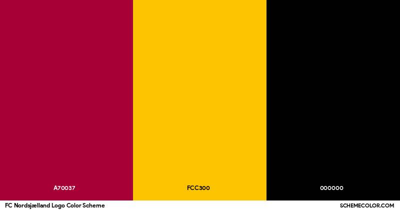
- Color Palette: Deep red (#A70037), golden yellow (#FCC300), and black (#000000). White is used for text elements.
- Usage Context: Match kits, merchandise, stadium branding at Right to Dream Park, official website (fcn.dk), social media profiles, marketing materials, and broadcast graphics across Danish Superliga coverage.
How Has the FC Nordsjaelland Logo Evolved Over Time?
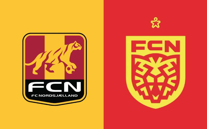
The FC Nordsjaelland logo has gone through two distinct versions since the club adopted its current name in 2003. Before that, the club operated as Farum Boldklub with its own separate badge. The 2019 redesign marked the biggest visual shift in the club’s history.
The Farum Boldklub Badge (1991-2003)
Before FC Nordsjaelland existed, there was Farum Boldklub. Founded on January 1, 1991, from the merger of Farum IK and Stavnsholt BK, the club carried a traditional Danish football badge.
The colors pulled from both founding clubs. Stavnsholt brought red and white. Farum IK contributed yellow and blue. The result was a kit with yellow and red stripes plus dark blue shorts.
The badge itself was a conventional shield-style crest. Nothing flashy. It served its purpose during the club’s rise through Danish football’s lower divisions and into the top flight.
This era ended abruptly in March 2003 when the club was purchased by Allan K. Pedersen’s AKP Holding. The Brixtofte scandal, involving the club’s former benefactor Mayor Peter Brixtofte, made a full rebrand necessary.
The First FC Nordsjaelland Logo (2003-2019)
Years Active: 2003 to 2019
The first FC Nordsjaelland logo introduced the tiger mascot. The previous owner was apparently obsessed with tigers, and the choice stuck. It helped that FC Copenhagen, one of FCN’s biggest rivals, uses a lion. As the club’s head of marketing once put it: “You have the bigger club, but we have the bigger cat.”
This version showed the tiger leaning on a football, with its head slightly lowered. The overall shape was more square and boxlike. Colors were red, yellow, and some blue. The “FCN” lettering appeared below or within the crest.
It was a functional badge. Did the job for 16 years. But it had problems. A club in the USA, Princeton FC, essentially copied the entire design. Same shape, same font, same layout. They just swapped the “N” for a “P.” That was a wake-up call.
The badge also struggled to read well on digital platforms. Social media icons, small screen displays, broadcast graphics. The square format and detailed illustration lost clarity at smaller sizes.
The Current FC Nordsjaelland Logo (2019-Present)
Years Active: 2019 to present
The agency Pupila was brought in from Costa Rica. They spent time in both Denmark and Ghana (where the Right to Dream academy operates) to research the club’s identity from the inside out. They interviewed fans and staff anonymously before starting any design work.
The new tiger faces forward and roars directly at you. It is in attack mode, not resting. This change came directly from how the team plays on the pitch, that high-pressing, aggressive style FCN is known for.
The shield shape is actually a combination of two forms. The top portion echoes the old square FCN badge, while the bottom tapers into a traditional shield, referencing the original Farum Boldklub crest. It is a nod to both chapters of the club’s history.
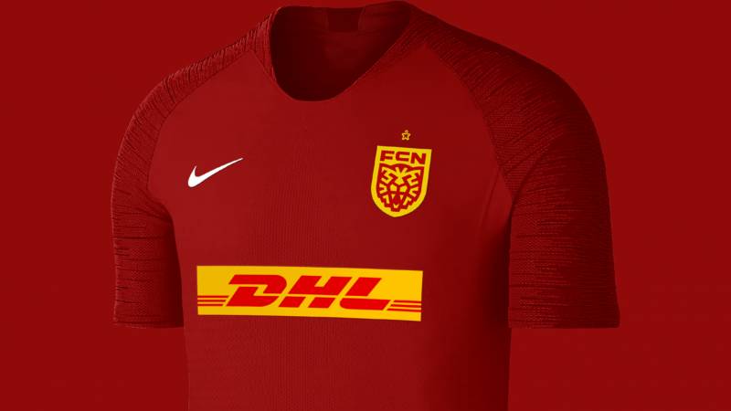
Dropped the blue entirely. Went with a cleaner two-tone red and gold palette, plus black and white accents. The whole identity launched alongside a new Nike sponsorship deal, replacing Diadora.
What Do the Design Elements of the FC Nordsjaelland Logo Mean?
Every piece of the FC Nordsjaelland logo carries meaning tied to the club’s values, playing style, and regional identity. The tiger, shield, colors, and text all work together to communicate who FCN is as a football organization.
The tiger is the most obvious element. It connects to the club’s “Wild Tigers” nickname and represents an aggressive, fearless approach. The roaring posture was chosen specifically to mirror FCN’s attacking style of play.
Why Did FC Nordsjaelland Choose These Specific Colors?
The red and yellow combination traces back to the 1991 merger. Stavnsholt BK wore red and white. Farum IK wore yellow and blue.
When the clubs merged, those colors blended into the yellow-and-red striped kit that FCN still uses today.
Here are the official color details:
- Deep Red (#A70037): The dominant color. Based on color psychology, red communicates intensity, passion, and competitive drive. It anchors the badge and gives it immediate visual weight.
- Golden Yellow (#FCC300): The secondary color. It adds energy and warmth. Within Danish football, this yellow tone helps FCN stand out from the many red-only clubs in the league.
- Black (#000000): Used for outlines, the tiger illustration details, and the football at the tiger’s feet. It grounds the design and adds contrast.
- White: Reserved for the “FCN” text and the full club name. It ensures readability against the darker background sections of the badge.
The 2019 rebrand dropped the blue that appeared in earlier versions. This simplified the color palette and made the badge bolder at small sizes.
What Typography Style Is Used in the FC Nordsjaelland Logo?
The “FCN” lettering uses a custom bold sans-serif typeface. It is all uppercase, tight in spacing, and designed to read clearly even at very small sizes.
Below the abbreviation, “FC Nordsjaelland” appears in a smaller weight of the same custom type family.
The typography was built as part of the Pupila rebrand. It is not a commercially available font. The letterforms are geometric, with clean terminals and minimal decoration. No serifs, no flourishes.
This approach fits the broader trend in modern football badges. Clubs want their abbreviations and names to work across digital platforms, from stadium screens to mobile app icons. Tight kerning and high x-height proportions help with that.
What Are the Hidden Meanings in the FC Nordsjaelland Logo?
The hybrid shield shape is probably the most overlooked detail. Most fans see a badge. But the top half references the squared-off shape of the 2003 logo, and the lower half tapers into the pointed shield of the old Farum BK crest.
It is two clubs in one shape. That was intentional from Pupila’s design process.
The tiger dribbling the football is another layer. Unlike the old logo, where the tiger just leaned on a ball passively, this one is in motion. It is a direct reference to FCN’s fast, youth-driven style of play. The club’s identity on the pitch shaped the identity of the badge.
How Does the FC Nordsjaelland Logo Compare to Competitor Logos?
Danish Superliga badges tend to follow traditional European football design conventions. Circular crests, founding years, regional symbols. FCN’s logo breaks from that quite a bit.
Look at Brondby IF’s badge, for example. It is a clean circular emblem with yellow and blue. Classic, recognizable, and traditional. FC Midtjylland’s logo uses a stylized wolf within a shield, which is closer to FCN’s approach but more contained and less aggressive in posture.
Compared to clubs like Silkeborg IF or Randers FC, which stick to very standard crest formats, FCN’s badge is louder. More mascot-forward. That was by design. The club wanted something that would read internationally, not just within Denmark.
Outside the Danish league, the approach is similar to what you see with clubs like Wolverhampton Wanderers in the Premier League, where the mascot (a wolf) takes center stage. FCN’s tiger does the same thing, which makes the badge easier to identify from a distance or at thumbnail size.
What Are the Technical Specifications of the FC Nordsjaelland Logo?
Official Color Codes
- Primary Color – Deep Red: Hex: #A70037 | RGB: (167, 0, 55) | CMYK: (0, 100, 67, 35)
- Secondary Color – Golden Yellow: Hex: #FCC300 | RGB: (252, 195, 0) | CMYK: (0, 23, 100, 1)
- Accent Color – Black: Hex: #000000 | RGB: (0, 0, 0) | CMYK: (0, 0, 0, 100)
- Text Color – White: Hex: #FFFFFF | RGB: (255, 255, 255) | CMYK: (0, 0, 0, 0)
Dimensions and Proportions
The logo uses a vertical orientation. It is taller than it is wide, fitting the shield-like format common in football branding.
For digital use, the badge is typically distributed as vector graphics in SVG or AI format. This keeps the illustration sharp at any size, from a 16-pixel favicon to a stadium-sized banner.
Clear space around the logo should generally equal the height of the “FCN” text block. The club’s brand guidelines specify minimum reproduction sizes to prevent the tiger illustration from losing detail. On print materials, a minimum height of roughly 20mm is standard. For screens, the full-detail version should not go below about 40 pixels in height.
When a simplified version is needed (like a social media avatar), the “FCN” abbreviation with the shield outline sometimes appears without the full tiger illustration.
What Cultural Impact Has the FC Nordsjaelland Logo Had?
For a club from a town of around 20,000 people, FCN’s badge punches above its weight in terms of recognition.
The 2019 rebrand got attention far beyond Denmark. Sports branding publications and football kit communities discussed it widely. The club’s shirt designs since the rebrand have been called some of the most creative in European football.
The tiger itself has become a cultural marker in Farum and the broader North Zealand region. It connects the football club to a wider identity that includes the Right to Dream academy program, which scouts talent from Ghana and develops players at the club’s facilities in Denmark.
That global connection, a small Danish town linked to an academy in West Africa, gives the badge meaning beyond just football. When the logo appears on a kit in the Danish Superliga or in a UEFA competition, it carries a story about youth development and cross-cultural exchange.
How Does the FC Nordsjaelland Logo Fit Into the Overall Brand Identity?
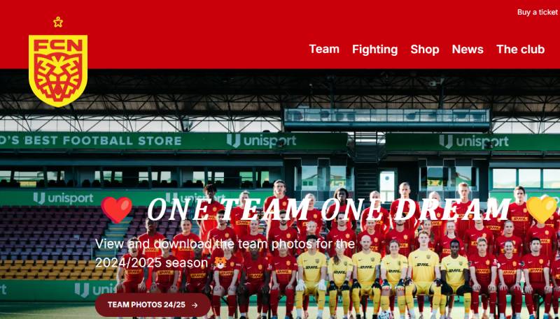
The logo is one piece of a broader brand system that Pupila designed in 2019. It connects to the Right to Dream organization, the club’s kit designs, stadium branding at Right to Dream Park, and all digital touchpoints.
FCN’s brand style guide ties the logo to a set of custom typefaces, photographic styles, and graphic patterns. The vertical stripes from the badge, for instance, appear as a design motif across marketing materials and jersey designs.
The club has been especially creative with its kits since the rebrand. Pin-striped home shirts, Pride-themed designs, and away jerseys with custom patterns and symbols pulled from the club’s visual language. The 2025-2026 home kit even features color-shifting versions of the logo, where the badge and Nike swoosh change appearance depending on the light. That kind of execution only works when the base logo is strong enough to handle variation.
The tiger motif, the red-and-gold palette, and the custom typography flow consistently across merchandise, the club website, social media content, and matchday programs. It is a cohesive system, not just a standalone badge.
How Should the FC Nordsjaelland Logo Be Used?
- Do: Use the official vector files from the club for any reproduction. Maintain the specified clear space around the badge. Keep the colors accurate to the official hex codes.
- Don’t: Stretch, rotate, or distort the logo. Do not change the colors. Do not place it on busy or patterned backgrounds where the details are lost. Do not separate the tiger from the shield or use individual elements outside the complete lockup.
- Where to access: Official logo files can be requested through the club’s media department via fcn.dk. Vector versions in SVG and AI format are available for licensed media use.
- Licensing: The FC Nordsjaelland logo is a protected trademark. Any commercial use, including merchandise production and promotional materials, requires written authorization from the club. Unauthorized reproduction, as the Princeton FC incident proved, is taken seriously.
- Trademark details: The logo, the “FCN” abbreviation, and the club name are all protected under Danish and European trademark law. The tiger illustration and the specific shield shape are proprietary assets of Football Club Nordsjaelland.
FAQ on The FC Nordsjaelland Logo
What does the FC Nordsjaelland logo look like?
The FCN logo features a golden-yellow tiger roaring over a football, set against red and gold vertical stripes inside a rounded shield. The letters “FCN” appear in bold white at the bottom, with the full club name beneath.
When was the current FC Nordsjaelland badge introduced?
The current version launched on June 25, 2019. It replaced the original FC Nordsjaelland emblem that had been in use since 2003. The rebrand coincided with a new Nike kit sponsorship deal.
Who designed the FC Nordsjaelland crest?
Pupila, an international branding studio from Costa Rica, handled the redesign. They spent time in both Denmark and Ghana researching the club’s identity before starting any visual work on the new FCN crest.
What do the colors in the FC Nordsjaelland logo mean?
Deep red (#A70037) represents competitive intensity. Golden yellow (#FCC300) adds energy and warmth. These colors trace back to the 1991 merger of Stavnsholt BK and Farum IK, whose kits combined into the red-and-yellow scheme FCN still uses.
Why is there a tiger in the FC Nordsjaelland emblem?
The club’s previous owner was a tiger enthusiast and picked it as the mascot. Fans loved it. The nickname “Wild Tigers” stuck. It also helps that FC Copenhagen uses a lion, and the tiger is the bigger cat.
What was the old FC Nordsjaelland logo before the 2019 rebrand?
The 2003-2019 badge showed a tiger leaning passively on a ball inside a square-shaped crest. It used red, yellow, and blue. The design was functional but struggled with digital readability and was copied by a US club.
What is the connection between the FCN logo and Right to Dream?
Right to Dream owns FC Nordsjaelland. Pupila rebranded both organizations simultaneously in 2019. The FCN brand identity now visually connects to the Right to Dream academy network, which scouts football talent from Ghana.
Can I download the FC Nordsjaelland logo for free?
Several sites offer the FCN logo in SVG, PNG, and AI formats. But the badge is a protected trademark. Any commercial use requires written permission from the club. Personal or editorial use is generally acceptable.
How does the FC Nordsjaelland badge compare to other Danish Superliga logos?
Most Danish football club badges use traditional circular crests. FCN’s mascot-forward design is louder and more aggressive. It reads better at small sizes than many competitor logos in the league, which was a goal of the 2019 redesign.
What file formats is the FC Nordsjaelland logo available in?
The official club logo is distributed as a vector file, typically in SVG or Adobe Illustrator format. PNG versions at various resolutions exist for web use. The vector format keeps the tiger illustration sharp at any size.
Conclusion
The FC Nordsjaelland logo is more than a football club badge. It tells the story of a small-town Danish club with global ambitions, built on youth development and a fierce competitive identity.
From the Farum Boldklub days to the 2019 Pupila rebrand, every version of the FCN crest reflected where the club stood at that moment.
The roaring tiger, the red and gold shield, the custom typography. These elements work together to give the Wild Tigers a visual identity that holds up across the Danish Superliga, UEFA competitions, and digital platforms alike.
Few clubs at this level have a badge this recognizable. That was the whole point.

Renowned for his expertise in logo design and visual branding, Bogdan has developed a multitude of logos for various clients.
His skills extend to creating posters, vector illustrations, business cards, and brochures. Additionally, Bogdan's UI kits were featured on marketplaces like Visual Hierarchy and UI8.
He also wrote in the past years on sites like Design Your Way, WebDesignerDepot, WPDean, Designmodo, Speckyboy, Slider Revolution, and more.
- The Cursor Logo History, Colors, Font, And Meaning - 24 September 2026
- Top 7 Web Design Subscription Services That Replace Full-Time Hires - 24 September 2026
- Canva vs PowerPoint: Which Is Better for Presentations? - 22 September 2026

Bogdan Sandu is a seasoned designer who has been designing websites since 2008. Renowned for his expertise in logo design and visual branding, Bogdan has developed a multitude of logos for various clients. His skills extend to creating posters, vector illustrations, business cards, and brochures. Additionally, Bogdan's UI kits were featured on marketplaces like Visual Hierarchy and UI8. He also wrote in the past years on sites like Design Your Way, WebDesignerDepot, WPDean, Designmodo, Speckyboy, Slider Revolution, and more.
You Might Also Like


