The Sonderjyske logo is one of the most recognizable badges in Danish football. It belongs to Sonderjyske Fodbold, a professional club based in Haderslev that competes in the Danish Superliga. The club traces its roots back to 1906, when Haderslev Fodboldklub was first founded during a period when the region was still part of the German Empire.
What makes this badge stand out from other Scandinavian football crests is how it ties regional identity to sports branding. The logo represents not just one city but the entire Southern Jutland region. And that was always the point. When Sonderjysk Elitesport formed in 2004, combining football, ice hockey, and handball under one umbrella, the visual identity had to speak to a whole area, not just Haderslev.
The current version of the badge was introduced in 2023, following the club’s administrative split from the broader SonderjyskE sports organization. Before that, the logo used from 2010 to 2023 served the multi-sport brand. There have been roughly two major logo iterations in the modern era, though the club’s visual history stretches back through decades of simpler designs under the Haderslev FK name.
What Is the Sonderjyske Logo?
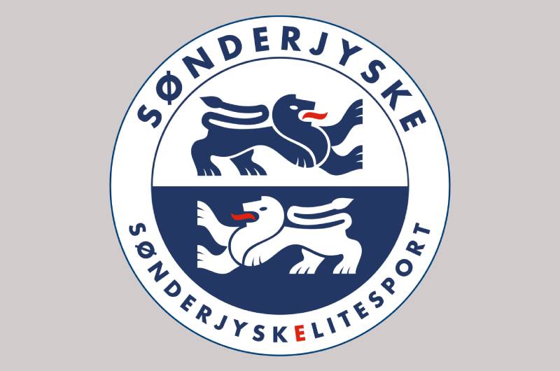
The Sonderjyske logo is a circular emblem featuring two stylized lions, the club name arched across the top, and a split blue-and-white background. It was updated in 2023 to reflect the football club’s separation from the broader SonderjyskE organization. The lions carry deep regional symbolism tied to Southern Jutland’s heraldic traditions.
Here are the main attributes of the badge:
- Design Type: Combination mark (emblem with wordmark). The badge pairs a circular crest with bold lettering, making it work both as a standalone icon and a full branded mark.
- Primary Elements: Two heraldic lions in dynamic poses, one rendered in blue outline on white, the other reversed on a deep blue field. A red tongue detail on each lion adds a touch of contrast. The circular frame holds it all together.
- Official Introduction Date: The current version launched in 2023, following the October 2022 name change from SonderjyskE to Sonderjyske Fodbold.
- Designer/Agency: No publicly credited designer or external agency has been named for the current badge. It appears to have been developed internally as part of the rebranding process.
- Trademark Status: The logo is actively used across all official club materials, merchandise, and digital platforms. Registered under the Sonderjyske Fodbold organization in Denmark.
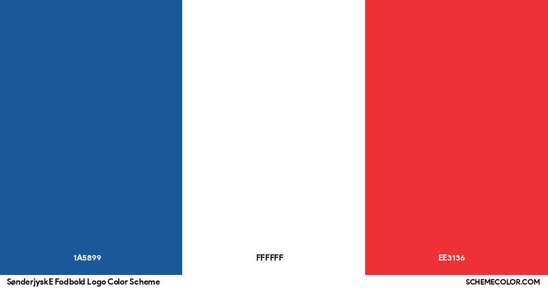
- Color Palette: Prussian Blue (#002147), Thunderbird Red (#DD2413), and White (#FFFFFF). The blue dominates, the red is limited to accent details on the lions, and white provides contrast.
- Usage Context: Match kits, stadium signage at Sydbank Park, official website, social media profiles, fan merchandise (scarves, shirts, flags), broadcast graphics, and press materials.
How Has the Sonderjyske Logo Evolved Over Time?
The Sonderjyske logo has gone through two main phases in its modern form. The first ran from 2010 to 2023 under the SonderjyskE multi-sport brand. The second began in 2023 after the football club separated and rebranded as Sonderjyske Fodbold.
Before 2010, the club used earlier badges tied to the Haderslev FK identity and the initial SonderjyskE branding from 2004. Those earlier designs were simpler, with less refined graphic work and a more straightforward approach to the crest.
The SonderjyskE Multi-Sport Logo (2010-2023)
Years Active: 2010 to 2023
Design Description: A circular badge with the text “SONDERJYSKE” arched along the top and “SONDERJYSKE ELITESPORT” at the bottom. Two lions occupied the upper and lower halves of the circle. The background split between white (upper) and deep blue (lower), creating a two-tone effect. Bold, capital lettering in blue tied the whole composition together.
Color Scheme: Prussian Blue, white, and red accents on the lion tongues.
Context: This badge served the multi-sport organization, covering football, handball, and ice hockey. It needed to feel bigger than one sport. The lions reference the heraldic traditions of Southern Jutland, connecting to the psychology of shapes in that shield-like forms and animal figures communicate authority and heritage.
Cultural Significance: This version of the logo became tied to the club’s greatest achievements, including the 2020 Danish Cup victory and the team’s first European competition appearances. Fans identify it strongly with the “golden era” of Sonderjyske football.
The Sonderjyske Fodbold Logo (2023-Present)
Years Active: 2023 to present
Design Description: The updated logo retains the circular structure and lion motifs but adjusts the branding text. “SONDERJYSKE ELITESPORT” was removed, reflecting the football department’s administrative independence. The design was refined with cleaner lines and slightly updated graphic treatment of the lions.
Color Scheme: Same core palette. Prussian Blue (#002147), White (#FFFFFF), and Thunderbird Red (#DD2413).
Key Changes from Previous: Removal of the “Elitesport” text. Subtle refinements to the lion illustrations. The badge now represents football specifically, rather than a multi-sport umbrella.
Context: In August 2022, American ownership sold the club back to local investors. The name changed from SonderjyskE to Sonderjyske in October 2022, and by 2023 the updated logo reflected this new chapter. It was a clean break, both organizationally and visually.
Cultural Significance: The updated badge symbolizes a return to local roots and community ownership. For fans in the “Blue Section,” it represents reclaiming the club after a turbulent period under foreign investment.
What Do the Design Elements of the Sonderjyske Logo Mean?
Every piece of the Sonderjyske badge carries weight. The lions are the most obvious element, but the circular frame, the split background, and the text placement all serve specific roles.
The heraldic lions reference the Schleswig coat of arms, which historically represented the duchy that covered modern Southern Jutland. Two blue lions with red tongues appear on the regional flag and seal. Using them in a football crest links the club directly to centuries of Sonderjylland identity.
Why Did Sonderjyske Choose These Specific Colors?
Prussian Blue (#002147) is the dominant color. It carries associations of loyalty, stability, and trust. In color psychology, deep blue tones suggest reliability and depth. For a football club, that reads as steadiness and commitment.
White (#FFFFFF) fills the upper portion of the crest and provides breathing room within the design. It signals clarity and openness. Paired with the blue, it creates a clean, high-contrast color palette that reproduces well on everything from jerseys to digital screens.
Thunderbird Red (#DD2413) is strictly an accent. It appears on the lions’ tongues. The red adds energy and aggression to what would otherwise be an entirely cool-toned badge. Just enough fire without overwhelming the composition.
The blue-and-white combination also connects the badge to other blue logos in professional sports, a popular choice because of how well it communicates authority. Look at how many European football clubs lean on blue as a primary identity color.
What Typography Style Is Used in the Sonderjyske Logo?
The club name is set in a bold, uppercase sans-serif font. It arches along the top of the circular badge, following the curve of the frame.
The letterforms are heavy and slightly condensed. No frills, no serifs. It reads like it means business. The tracking between characters is tight enough to maintain a compact look but loose enough that the letters stay legible at smaller sizes.
This kind of typography choice is standard in football badge design. You need something that holds up on a jersey crest, in stadium signage, and at thumbnail size on a phone screen. The font gets the job done.
What Are the Hidden Meanings in the Sonderjyske Logo?
The split background is worth paying attention to. The upper half is white, the lower half is dark blue. This division mirrors the geographic position of Sonderjylland, a border region historically split between Danish and German influence.
The two lions face in opposite directions, which could reference duality, both the club’s dual sporting heritage and the region’s dual cultural roots. Whether that was intentional or just a design choice, fans have read it that way for years.
The circular shape itself (rather than a shield or square) suggests inclusivity, a club that belongs to the whole region, not just one town.
How Does the Sonderjyske Logo Compare to Competitor Logos?
Danish football badges generally lean toward traditional crests and regional symbols. Sonderjyske’s heraldic approach fits right in, but certain details set it apart from rivals.
Compare it to the Brondby IF logo, which goes for a much simpler, more geometric design with bold yellow and blue. Or look at the FC Midtjylland logo, which uses an angular wolf’s head for a more aggressive, modern feel.
The FC Nordsjaelland logo takes a totally different route with a tiger motif and red-heavy palette. Meanwhile, Viborg FF’s logo keeps things classic with green and white.
Sonderjyske sits in the traditional camp. It uses regional heraldry rather than a mascot or abstract mark. That decision ages well. Modernist logos can feel dated within a decade, but a heraldic crest rooted in centuries of history tends to stay relevant. The AC Horsens logo takes a similar heraldic path, though with a very different color approach.
Where Sonderjyske really stands out among Danish clubs is the circular frame. Most competitors use shields or irregular shapes. That round container gives the badge a coin-like quality that is distinct at a glance.
What Are the Technical Specifications of the Sonderjyske Logo?
Official Color Codes
- Primary Color: Prussian Blue
- Hex: #002147
- RGB: (0, 33, 71)
- CMYK: (100, 54, 0, 72)
- Secondary Color: White
- Hex: #FFFFFF
- RGB: (255, 255, 255)
- CMYK: (0, 0, 0, 0)
- Accent Color: Thunderbird Red
- Hex: #DD2413
- RGB: (221, 36, 19)
- CMYK: (0, 84, 91, 13)
Dimensions and Proportions
The logo uses a 1:1 aspect ratio because of its circular shape. This makes it one of the easier football badges to work with across different formats.
For print design, the minimum recommended reproduction size is typically around 15mm in diameter to maintain legibility of the text and lion details. Clear space around the badge should equal at least 10% of the logo’s diameter on all sides.
The logo is distributed in vector graphics formats (SVG, AI, EPS), which means it scales cleanly to any size. For web design use, PNG versions with transparent backgrounds are also common, though SVG remains the better choice for responsive layouts where the badge might appear at wildly different sizes.
When it comes to DPI requirements, any raster version should be at least 300 DPI for print and 72 DPI for screen. But honestly, just use the vector. That is what it is there for.
What Cultural Impact Has the Sonderjyske Logo Had?
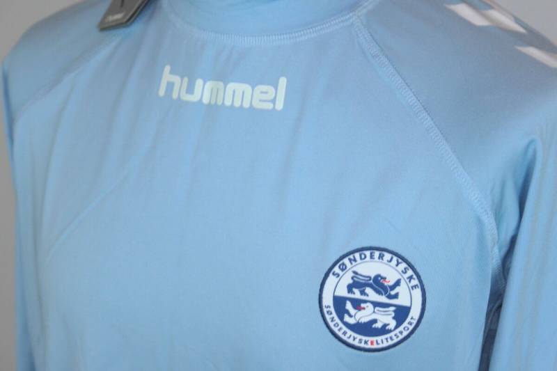
The Sonderjyske badge carries more weight than most Danish football logos because of what it represents beyond the sport. Southern Jutland has a complicated history. The region was part of Germany until 1920, when a referendum reunited it with Denmark.
That history shows up in the fan culture. Supporters in the “Blue Section” sometimes display banners in German, playfully referencing the cross-border heritage. The logo, with its Schleswig lions, is a visual anchor for that identity. It says “we are from here” in a way that a generic modern badge never could.
The 2020 Danish Cup win turned the badge into something bigger. Suddenly the Sonderjyske crest was on national television, on trophy celebrations, and all over social media. For a club from a region that had never seen top-level silverware, that moment cemented the logo as a symbol of what smaller communities can achieve in professional football.
How Does the Sonderjyske Logo Fit Into the Overall Brand Identity?
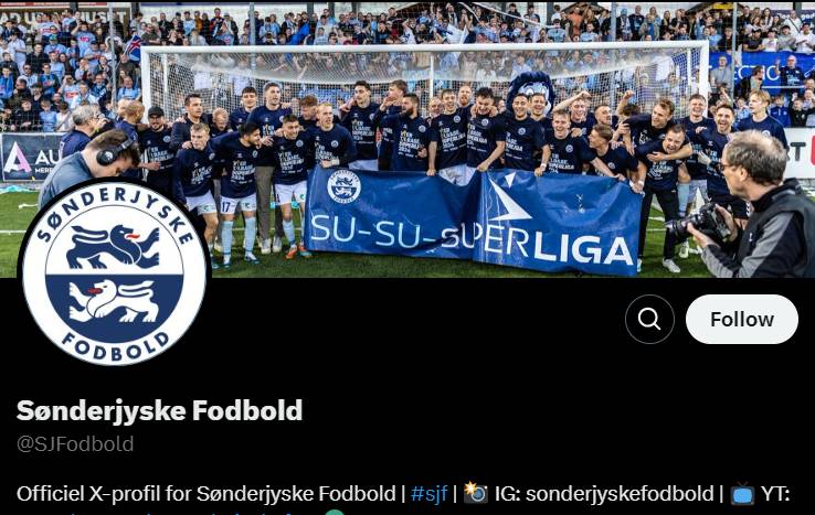
The badge is the anchor point for everything the club puts out visually. From the Sydbank Park stadium signage to the matchday programs, the Sonderjyske logo sets the tone. It establishes the brand guidelines that every other piece of communication follows.
Kit supplier Hummel (who have been with the club since 2015) builds the jersey designs around the blue-and-white identity. The Prussian Blue shows up in training wear, travel gear, and even the club’s website background. White provides the secondary canvas.
Fan merchandise leans heavily on the crest. Scarves, hats, phone cases, stickers. The circular shape of the badge actually helps here because it sits naturally on round or square products without needing awkward cropping.
The club’s digital presence, including its website at soenderjyskefodbold.dk and social media accounts, uses the badge as the profile image across every platform. That consistency is textbook brand style guide execution. You always know you are looking at Sonderjyske content, whether it is on Instagram, in the stadium, or on a matchday ticket.
How Should the Sonderjyske Logo Be Used?
If you need the official Sonderjyske badge for editorial or fan purposes, the club’s official site is the primary source. Vector files ensure the highest quality reproduction.
Do:
- Use the logo at its correct proportions. No stretching, no squishing.
- Maintain the specified clear space around the badge.
- Use it on backgrounds that provide enough contrast for the blue and white to read clearly.
- Stick to the official color codes when reproducing the badge.
Don’t:
- Alter the colors or swap elements within the crest.
- Place the logo on busy backgrounds where the details get lost.
- Add effects like drop shadows, gradients, or outlines to the badge.
- Crop or partially obscure the crest.
- Use low-resolution bitmap versions when vector files are available.
The Sonderjyske logo is a registered trademark. Any commercial use requires permission from the club. Unofficial merchandise sellers take note. Fan art and editorial use typically fall under fair use, but selling products with the badge without a license is a different story entirely.
For media inquiries or licensing requests, contact the club directly through soenderjyskefodbold.dk. They have a press section with downloadable assets for accredited journalists and broadcast partners.
FAQ on The Sonderjyske Logo
What does the Sonderjyske logo look like?
The Sonderjyske logo is a circular emblem split into blue and white halves. Two heraldic lions sit inside, one on each half, with red tongue accents. The club name arches across the top in bold capital letters.
It works as both a football club badge and a regional symbol for Southern Jutland.
When was the current Sonderjyske logo introduced?
The current version launched in 2023. It followed the club’s separation from the broader Sonderjysk Elitesport organization in October 2022. The previous badge had been in use since 2010.
The update removed the “Elitesport” text and refined the lion illustrations slightly.
What do the lions in the Sonderjyske badge represent?
The two lions come from the Schleswig coat of arms. They represent the historical duchy that covered the Sonderjylland region. Blue lions with red tongues have been a heraldic symbol of Southern Jutland for centuries.
It ties the football club crest directly to local heritage.
What are the official colors of the Sonderjyske logo?
Prussian Blue (#002147), White (#FFFFFF), and Thunderbird Red (#DD2413). Blue dominates the badge. White fills the upper background. Red appears only on the lions’ tongues as an accent.
These team colors stay consistent across kits, merchandise, and digital platforms.
Why did Sonderjyske change their logo in 2023?
The club split from the multi-sport SonderjyskE brand after being sold back to local ownership in August 2022. A new name, Sonderjyske Fodbold, required a new badge that represented football specifically.
It was a clean break from the previous branding identity.
Where is Sonderjyske Fodbold based?
The club is based in Haderslev, Denmark. They play home matches at Sydbank Park, a 10,000-capacity stadium. The founding club, Haderslev Fodboldklub, was established on July 14, 1906.
Sonderjyske is the only top-level professional football team in Southern Jutland.
Can I download the Sonderjyske logo in vector format?
Yes. Several logo databases offer the badge in SVG and AI formats. The club’s official website, soenderjyskefodbold.dk, is the best source for approved assets.
Vector files keep the Sonderjyske FC badge sharp at any size, unlike raster formats that lose quality when scaled.
What font does the Sonderjyske logo use?
The badge uses a bold, uppercase sans-serif typeface. The letters are slightly condensed and follow the curve of the circular frame. No custom or publicly named font family has been confirmed.
It reads clearly on both match jerseys and small digital icons.
How does the Sonderjyske logo compare to other Danish Superliga badges?
Most Danish football club crests use shields or irregular shapes. Sonderjyske stands out with its circular design. Rivals like Randers FC and Silkeborg IF take different approaches.
The heraldic lion motif gives Sonderjyske a more traditional feel compared to modern abstract logos in the league.
What league does Sonderjyske play in?
Sonderjyske competes in the Danish Superliga, the top tier of Danish football. They earned promotion back to the Superliga after winning the Danish 1st Division. The club also won the DBU Pokalen cup in 2020.
Their logo appears on broadcast graphics across Scandinavian football coverage.
Conclusion
The Sonderjyske logo is more than a football club badge. It is a piece of Sonderjylland’s cultural identity, built on heraldic lions, a blue-and-white palette, and over a century of history rooted in Haderslev.
From the 1906 founding of Haderslev FK to the 2023 rebrand under local ownership, every version of this crest has reflected where the club stands at that moment. The current emblem balances regional pride with clean, modern execution.
Whether you are studying Danish Superliga branding, designing fan merchandise, or just curious about Scandinavian football identity, the Sonderjyske badge is a solid case study in how logo design principles and local heritage can work together.

Renowned for his expertise in logo design and visual branding, Bogdan has developed a multitude of logos for various clients.
His skills extend to creating posters, vector illustrations, business cards, and brochures. Additionally, Bogdan's UI kits were featured on marketplaces like Visual Hierarchy and UI8.
He also wrote in the past years on sites like Design Your Way, WebDesignerDepot, WPDean, Designmodo, Speckyboy, Slider Revolution, and more.
- The Cursor Logo History, Colors, Font, And Meaning - 24 September 2026
- Top 7 Web Design Subscription Services That Replace Full-Time Hires - 24 September 2026
- Canva vs PowerPoint: Which Is Better for Presentations? - 22 September 2026

Bogdan Sandu is a seasoned designer who has been designing websites since 2008. Renowned for his expertise in logo design and visual branding, Bogdan has developed a multitude of logos for various clients. His skills extend to creating posters, vector illustrations, business cards, and brochures. Additionally, Bogdan's UI kits were featured on marketplaces like Visual Hierarchy and UI8. He also wrote in the past years on sites like Design Your Way, WebDesignerDepot, WPDean, Designmodo, Speckyboy, Slider Revolution, and more.
You Might Also Like