The Mahindra logo is one of the most recognized brand marks in India. It represents more than a car company: the Mahindra Group spans SUVs, tractors, commercial vehicles, IT, and finance.
That breadth is why “the Mahindra logo” can mean two things. There is the red Mahindra group wordmark, introduced in January 2013, and there is the Twin Peaks emblem that Mahindra’s SUVs have worn since August 2021.
Mahindra & Mahindra was founded on 2 October 1945 in Ludhiana as a steel trading company. Its visual identity has changed several times since, from a plain grey wordmark to the current split identity.
What is the Mahindra Logo?
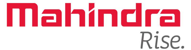
The Mahindra logo is a red, hand-drawn Mahindra wordmark used by the whole group since January 2013, developed with Landor Associates and Mahindra’s internal design unit. Mahindra SUVs carry a separate Twin Peaks emblem, two stylized “M” forms, designed by Chief Design Officer Pratap Bose and unveiled on 9 August 2021.
| Symbol | Group: red Mahindra wordmark with “Rise” tagline; SUVs: Twin Peaks emblem formed from two “M”s |
| Designer/agency | Wordmark: Landor Associates with Mahindra’s internal design unit; Twin Peaks: Pratap Bose and the Mahindra Design Team |
| Current version since | Group wordmark: 18 January 2013; Twin Peaks SUV logo: 9 August 2021 |
| Colors (hex) | Red approx. #E61535, sampled from the current wordmark; grey for the Rise tagline; chrome or metallic finish on the Twin Peaks badge |
| Typeface | Custom hand-drawn lettering; not a commercial font |
| Previous major version | The “millennium” logo, an “M” in an ellipse (the Road Ahead logo), with a grey wordmark |
How Has the Mahindra Logo Evolved Over Time?
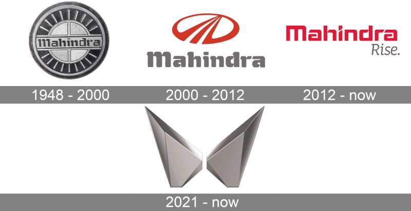
The Mahindra identity has gone through several changes since the 1940s. Each version reflected what the company wanted to be at that point.
The progression runs from a simple round badge to an abstract “M,” then to a group wordmark, and finally to a dedicated SUV emblem.
The Early Mahindra Logos (1945 to the 1990s)
The company started as Mahindra & Mohammed, founded by brothers Kailash Chandra and Jagdish Chandra Mahindra with Malik Ghulam Muhammad. After Ghulam Muhammad moved to the newly formed Pakistan, the brothers renamed the company Mahindra & Mahindra in 1948, which let them keep the existing “M&M” stationery and stamp.
Early Mahindra marks were simple. One widely reproduced version shows the Mahindra name across a round, spoked metal badge. No designer is credited for these early logos, and exact dates are hard to pin down.
The Millennium “Road Ahead” Logo (Around 2000 to Today)
Around the turn of the century, Mahindra adopted what it calls its millennium logo: a stylized “M” inside an ellipse, usually in red with a grey wordmark below. Mahindra refers to it as the Road Ahead logo, and its two strokes are often read as a road running toward the horizon.
This is the “old Mahindra logo” that many people remember from Scorpio and XUV500 grilles. It is still in use: Mahindra kept it for its commercial vehicles and farm equipment when the Twin Peaks arrived.
The Mahindra Rise Wordmark (2013 to Today)
In January 2011, Mahindra launched “Rise” as the group’s new brand positioning. The visual identity followed two years later.
On 18 January 2013, chairman Anand Mahindra unveiled a new hand-drawn wordmark in red. It replaced the earlier grey wordmark, which had matched the steel-grey vehicle badges. Landor Associates of San Francisco worked on it with Mahindra’s internal design unit.
The 2013 identity also added a “ridge” graphic inspired by the ridges of Mount Everest. From then on, the M-in-ellipse logo was kept only as a vehicle badge and for mobility products.
The Twin Peaks SUV Logo (2021 to Today)
On 9 August 2021, Mahindra unveiled a new visual identity made only for its SUV range. The XUV700 was the first vehicle to wear it, followed by models like the Thar and Bolero.
The Twin Peaks logo was designed by the Mahindra Design Team and Pratap Bose, then the recently appointed Chief Design Officer. It was his first design for the brand.
The design applies minimalist design ideas: two angular, faceted shapes that together read as an “M,” with a narrow gap between them.
What Do the Design Elements of the Mahindra Logo Mean?
For the Twin Peaks, Mahindra’s own explanation is the best guide. Bose said, “The 2Ms within the logo symbolise an expansive and exciting future which is based on a solid heritage.”
Rajesh Jejurikar, then Executive Director of the Auto and Farm Sector, said the new identity was “designed to evoke the powerful emotion of freedom.”
This psychology of shapes creates an immediate link with mountains, climbing, and going off-road, which suits an SUV brand.
What Are the Mahindra Logo Colors?
The group wordmark is red. When it launched in 2013, it was described as a deep, bright red, slightly darker than Mahindra’s earlier signature red.
Mahindra has not published official hex, RGB, CMYK, or Pantone values.
- Mahindra red: approx. #E61535, sampled from the current wordmark
- Rise grey: a mid grey used for the “Rise” tagline
- Twin Peaks badge: a chrome or metallic finish on the vehicles, with no single published color
Understanding color psychology explains the choice of red. It is bold, energetic, and visible at a distance, and it puts Mahindra in the company of many other red logos.
If you need the logo for print, use vector graphics rather than a low-resolution image.
What Font Does the Mahindra Logo Use?
The Mahindra wordmark does not use a commercial font. It is custom, hand-drawn lettering created for the 2013 identity.
The letters are heavy and squared-off, with a distinctive angled cut in the “i.” This makes it a custom sans-serif font design in style, not one you can download.
The “Rise” tagline below it is set in a lighter, italic style in grey. Mahindra has not named the typeface.
Earlier Mahindra wordmarks used heavier, more traditional lettering, some with serif font details. The 2013 version moved the group’s typography toward something more contemporary.
What Are the Hidden Meanings in the Mahindra Logo?
The Twin Peaks hide the brand initial twice. Each peak is an “M,” and the pair also reads as one larger “M.”
The gap between the peaks is often read as a narrow road between two mountains. Some people also see an upward arrow in it.
The older Road Ahead logo has a similar reading: the strokes of its “M” are often seen as a highway receding toward the horizon.
How Does the Mahindra Logo Compare to Competitor Logos?
Mahindra takes a different approach than its main Indian rival. The Tata Motors Logo uses a “T” in an oval, while Mahindra’s SUV emblem is all sharp geometry.
Korean competitors like the Hyundai Logo and Kia Logo also changed course recently, with Kia switching to a flat, handwritten-style wordmark in 2021.
Compared with most car logos from European brands, the Twin Peaks design feels new and free of heritage constraints.
The Land Rover Logo keeps a traditional oval with a wordmark. Mahindra’s abstract symbol takes a bigger design risk.
What Cultural Impact Has the Mahindra Logo Had?
In India, Mahindra badges are linked with rugged SUVs, the Thar, and tractors. Few vehicle logos are seen on as many farms and village roads.
The “Rise” positioning is a good example of brand storytelling: one word that ties together dozens of businesses.
The Twin Peaks gave the SUV range its own identity, separate from the group’s trucks and tractors. That split helps Mahindra compete in markets where brand perception matters as much as product quality.
How Does the Mahindra Logo Fit Into the Overall Brand Identity?
Mahindra uses a layered brand system. The red wordmark represents the group. The Twin Peaks represent SUVs. The Road Ahead logo stays on commercial vehicles and farm equipment.
The 2013 ridge graphic was designed to change color by business: plain red for corporate and mobility, red with grey for B2B, and red with yellow, green, or blue for consumer businesses outside mobility.
Like any large group, Mahindra works from internal brand guidelines. Those documents are not public.
How Should the Mahindra Logo Be Used?
This is general advice, not Mahindra’s own rules. The Mahindra name, wordmark, and emblems are trademarks of Mahindra & Mahindra Limited.
Editorial use, such as news or design commentary, is usually fine if you show the logo unaltered and with enough contrast to read. Commercial use needs permission from Mahindra.
FAQ on the Mahindra Logo
What Does the Mahindra Logo Represent?
The Twin Peaks SUV logo is made of two “M” shapes. Designer Pratap Bose said they symbolize “an expansive and exciting future which is based on a solid heritage.” The red group wordmark ties to the group’s “Rise” positioning, launched in 2011.
When Did Mahindra Change Its Logo?
Mahindra unveiled the Twin Peaks SUV logo on 9 August 2021, first on the XUV700. The group’s red wordmark dates from 18 January 2013.
Who Designed the New Mahindra Logo?
The Twin Peaks logo was designed by the Mahindra Design Team and Chief Design Officer Pratap Bose. The 2013 group wordmark was developed with Landor Associates and Mahindra’s internal design unit.
What Did the Old Mahindra Logo Look Like?
The old SUV logo, known as the Road Ahead or millennium logo, is a stylized “M” inside an ellipse, usually red with a grey wordmark. Its strokes are often read as a road running toward the horizon. It is still used on commercial vehicles and farm equipment.
How Many Mahindra Logos Are There?
Mahindra currently uses three main marks: the red group wordmark with “Rise,” the Twin Peaks for SUVs, and the Road Ahead “M” for commercial vehicles and tractors. Earlier versions included a round badge and a grey wordmark.
What Font Does Mahindra Use in Its Logo?
The Mahindra wordmark is custom, hand-drawn lettering from the 2013 identity, not a commercial font. There is no official font to download. The “Rise” tagline uses a lighter italic style.
What Are the Mahindra Logo Colors?
The group wordmark is red (approx. #E61535, sampled from the current logo) with a grey “Rise” tagline. The Twin Peaks badge on SUVs has a chrome or metallic finish. Mahindra has not published official color codes.
Why Did Mahindra Change Its Logo for SUVs?
Mahindra wanted a separate identity for its SUV range. Executive Director Rajesh Jejurikar said the new identity was designed “to evoke the powerful emotion of freedom.”
What Does M&M Stand For?
M&M stands for Mahindra & Mahindra. The company was founded in 1945 as Mahindra & Mohammed and renamed in 1948, which let it keep its “M&M” stationery.
Can I Use the Mahindra Logo?
The Mahindra logos are trademarks of Mahindra & Mahindra Limited. Editorial use is usually acceptable. Commercial use requires permission from the company.
Conclusion
The Mahindra logo tells the story of a company that keeps redefining itself. From a steel trader’s stamp in the 1940s to the Twin Peaks on today’s SUVs, each mark captured a moment in the group’s growth.
The red hand-drawn wordmark holds the group together. The Twin Peaks give the SUVs their own face, and the Road Ahead “M” still works hard on trucks and tractors.
The system follows solid logo design principles: a focused color palette, a custom typeface in place of an off-the-shelf font, and a clear role for each logo. Its typography elements and shapes stay recognizable from a Thar grille to a tractor hood.
Few Indian brand marks have reached this level of brand recognition.
Sources
- Autocar Professional, Mahindra reveals new logo for future SUVs (9 August 2021) – https://autocarpro.in/news-national/mahindra-reveals-new-logo-for-future-suvs-79798
- Business Today, Mahindra group unveils new logo (18 January 2013) – https://businesstoday.in/latest/corporate/story/mahindra-group-unveils-new-logo-38938-2013-01-18
- afaqs!, Mahindra unveils new visual identity, brand architecture – https://afaqs.com/news/story/36531_Mahindra-unveils-new-visual-identity-brand-architecture
- Wikipedia, Mahindra & Mahindra – https://en.wikipedia.org/wiki/Mahindra_%26_Mahindra

Renowned for his expertise in logo design and visual branding, Bogdan has developed a multitude of logos for various clients.
His skills extend to creating posters, vector illustrations, business cards, and brochures. Additionally, Bogdan's UI kits were featured on marketplaces like Visual Hierarchy and UI8.
He also wrote in the past years on sites like Design Your Way, WebDesignerDepot, WPDean, Designmodo, Speckyboy, Slider Revolution, and more.
- Logo Quiz - 22 November 2026
- The LinkedIn Logo History, Colors, Font, and Meaning - 20 November 2026
- How to Design Landing Pages That Convert Visitors into Email Subscribers - 20 November 2026

Bogdan Sandu is a seasoned designer who has been designing websites since 2008. Renowned for his expertise in logo design and visual branding, Bogdan has developed a multitude of logos for various clients. His skills extend to creating posters, vector illustrations, business cards, and brochures. Additionally, Bogdan's UI kits were featured on marketplaces like Visual Hierarchy and UI8. He also wrote in the past years on sites like Design Your Way, WebDesignerDepot, WPDean, Designmodo, Speckyboy, Slider Revolution, and more.
You Might Also Like