


The Riskified logo is the visual identity of a publicly traded ecommerce fraud prevention company headquartered in Tel Aviv, Israel, with offices in New York City. It represents a SaaS platform that uses machine learning to help online merchants prevent chargebacks, detect fraud, and approve more legitimate orders. Founded in 2012 by Eido Gal and Assaf Feldman, Riskified (NYSE: RSKD) has grown into one of the most recognized names in fintech security.
Within the broader landscape of tech company logos, the Riskified mark stands out for its combination of a custom wordmark and a stylized checkmark symbol. That checkmark isn’t just decorative. It directly references the company’s core function: approving orders. The brand has gone through at least two major logo iterations since launch, with the current version introduced around 2021.
The current logo was designed in-house, with Sophie Strajnik (Brand Design Team Lead at Riskified, Bezalel Academy of Art and Design graduate) playing a key role. The design features rounded letterforms, an expanded color palette of green and blue, and a dynamic checkmark that doubles as the letter “R” when viewed from a different angle. Since its founding, the brand has used two primary logo versions.
What Is the Riskified Logo?
The Riskified logo is a combination mark featuring a custom sans-serif wordmark paired with a stylized checkmark symbol. Introduced around 2021, it was designed by Riskified’s in-house design team led by Sophie Strajnik. The checkmark represents order approval and doubles as the letter “R,” while the green and blue palette signals growth and technology.
Here’s what defines the current Riskified logo:
- Design Type: Combination mark (wordmark + symbol)
- Primary Elements: Custom sans-serif wordmark with a stylized checkmark/R symbol. The typography uses rounded letterforms for a friendlier, more approachable feel
- Official Introduction Date: The current version launched around late 2021, replacing the original 2013 design
- Designer/Agency: Designed in-house by Riskified’s brand design team, with Sophie Strajnik credited as a key contributor on Dribbble and Brand New (Under Consideration)
- Trademark Status: “RISKIFIED” is a registered trademark with the USPTO (Serial No. 86686521), with first use in commerce dating to September 1, 2013
- Color Palette: Six primary brand colors. Green (#00BEA6), Blue (#5A4CFF), Dark Green (#002B33), Dark Blue (#080E3F), Purple (#BA97FF), and Light Grey (#F8F8F9)
- Usage Context: The logo appears across merchant-facing platforms, API documentation, partner lockup materials, marketing assets, event branding (like their annual hayaData conference), and NYSE investor communications
How Has the Riskified Logo Evolved Over Time?

The Riskified logo has gone through two main versions since the company’s founding.
The original 2013 design was a straightforward wordmark built for credibility in fintech.
The 2021 rebrand brought rounder shapes, a wider color palette, and that clever checkmark-to-R symbol.
Both versions kept green as the anchor color, but the mood shifted from serious to approachable.
Original Riskified Logo (2013-2021)
- Years Active: 2013 to approximately 2021
- Design Description: A simpler wordmark with a standard checkmark symbol. The letterforms were more angular and conventional. Think traditional fintech: clean, corporate, no-nonsense. The checkmark sat as a distinct element, clearly separate from the text
- Color Scheme: Darker tones, primarily green with supporting dark hues. The palette was narrower and aligned with what most payment processors and risk management companies were doing at the time
- Designer: Not publicly attributed to a specific individual. Some sources reference early U.S.-based design involvement
- Context: Riskified was a startup in 2013. They needed a mark that communicated security and trustworthiness to enterprise merchants. The logo had to work across merchant onboarding materials, pitch decks, and early product interfaces
- Cultural Significance: This was the logo that took Riskified through its seed funding, Series A through E rounds, and all the way to its IPO on the NYSE in July 2021
Current Riskified Logo (2021-Present)
- Years Active: 2021 to present
- Design Description: A completely refreshed combination mark. The wordmark switched to rounded, friendlier letterforms. The signature checkmark transformed into a dynamic symbol that looks like an “R” from another angle. The checkmark no longer appears as a standalone element; it only shows up as part of the full logotype
- Color Scheme: Expanded to six colors. Green (#00BEA6) still leads, but blue (#5A4CFF), purple (#BA97FF), dark green (#002B33), dark blue (#080E3F), and light grey (#F8F8F9) were added
- Designer: In-house team, with Sophie Strajnik (Brand Design Team Lead) credited on Dribbble. The project was featured on Brand New (Under Consideration) as “done in-house”
- Context: By 2021, Riskified had grown well beyond a single-product fraud prevention startup. They needed a visual identity that reflected expansion into chargeback guarantees, account security, policy protection, and dispute resolution. The rebrand coincided with the company going public
- Key Changes from Previous: Rounder letterforms replaced angular ones. The color palette tripled. The checkmark became a dual-meaning symbol (checkmark + letter R). The overall tone shifted from corporate seriousness to what the company described as “friendlier”
- Cultural Significance: This is the logo that represents Riskified as a NYSE-listed company serving some of the world’s 10 largest ecommerce merchants. It’s also the mark that travels across partner lockup materials with companies like Shopify and Salesforce Commerce Cloud
What Do the Design Elements of the Riskified Logo Mean?
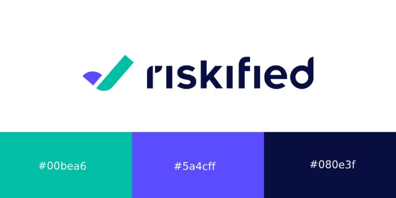
Every piece of the Riskified logo ties back to what the company actually does.
The checkmark is the most obvious element. It stands for approved orders, which is the whole point of their platform.
But viewed differently, that same shape becomes the letter “R.” It’s a small trick, but it works. The rounded typeface was chosen to feel human and warm, not cold and robotic.
Why Did Riskified Choose These Specific Colors?
Green has been Riskified’s primary color from day one. According to their own brand guidelines, green equals positivity.
They see fraud prevention as a growth engine, not just a defensive tool. Green reinforces that idea.
Blue was added to represent technology, because the core of what Riskified does involves machine learning and AI-powered risk assessment.
Here are the official brand colors and their details:
- Green (#00BEA6): RGB 0, 190, 166 | CMYK 66, 0, 39, 0 | Pantone 339C. Symbolizes positivity and growth. The psychological effect here is optimism, which matters when your product is about saying “yes” to more orders
- Blue (#5A4CFF): RGB 90, 76, 255 | CMYK 64, 55, 0, 0 | Pantone 2366C. Represents technology and machine learning. Blue builds trust, and in financial services, that’s not optional
- Dark Green (#002B33): RGB 0, 43, 51 | CMYK 90, 65, 60, 65 | Pantone 7722C. Used for depth and grounding in darker applications
- Dark Blue (#080E3F): RGB 8, 14, 63 | CMYK 100, 100, 6, 60 | Pantone 2766C. Provides contrast for dark-mode or formal brand materials
- Purple (#BA97FF): RGB 186, 151, 255 | CMYK 34, 42, 0, 0 | Pantone 2072C. Adds flexibility and a modern edge to the palette
- Light Grey (#F8F8F9): RGB 248, 248, 249 | CMYK 5, 3, 2, 0. A clean background tone for digital interfaces and documentation
The understanding of color theory behind this palette is solid. Green and blue sit close enough on the spectrum to feel cohesive (they’re actually close to analogous colors), but the purple adds enough range to keep things from feeling monotone.
What Typography Style Is Used in the Riskified Logo?
The logo uses a custom font designed specifically for brand recognition. It’s a sans-serif with rounded terminals.
The letterforms were intentionally softened from the original angular version. Readability was a big deal here, because this wordmark shows up everywhere from tiny favicon sizes to massive conference banners.
The spacing between characters is generous enough to feel open but tight enough to hold together as a unit. That matters more than people think when a logo gets scaled down to 16 pixels wide.
What Are the Hidden Meanings in the Riskified Logo?
The most talked-about detail is the dual-meaning checkmark. Straight on, it’s a checkmark for approved transactions.
Rotated or viewed from a different perspective, it becomes the letter “R” for Riskified. The design team has confirmed this was intentional.
The rounded shapes are supposed to represent the human talent behind the technology, according to the company’s own blog post about the rebrand. There’s also a sense of forward motion built into the checkmark’s angle, which hints at driving partners’ growth.
How Does the Riskified Logo Compare to Competitor Logos?
Most ecommerce fraud prevention companies lean into dark, serious color schemes. Blues and blacks dominate. Think corporate, think buttoned-up.
Riskified went the other direction. Their green-forward palette feels more optimistic than defensive, which is a deliberate positioning choice.
Compare it to the Stripe logo, which uses a clean wordmark in purple/blue. Or the Adyen logo, which keeps things strictly typographic in green. The Klarna logo goes with a bubbly pink aesthetic. And the Square logo (now Block) used geometric simplicity.
What makes Riskified different is the dual-meaning symbol. Most fintech logos are pure wordmarks. Having that checkmark/R element gives Riskified something to work with in icon-only contexts, which is tricky territory for companies that don’t have a recognizable standalone symbol. Other financial institution logos tend to rely on abstract shapes or monograms, but Riskified’s approach ties directly back to their product (approval = checkmark).
What Are the Technical Specifications of the Riskified Logo?
Official Color Codes
- Primary – Green: Hex #00BEA6 | RGB (0, 190, 166) | CMYK (66, 0, 39, 0) | Pantone 339C
- Secondary – Blue: Hex #5A4CFF | RGB (90, 76, 255) | CMYK (64, 55, 0, 0) | Pantone 2366C
- Dark Green: Hex #002B33 | RGB (0, 43, 51) | CMYK (90, 65, 60, 65) | Pantone 7722C
- Dark Blue: Hex #080E3F | RGB (8, 14, 63) | CMYK (100, 100, 6, 60) | Pantone 2766C
- Purple: Hex #BA97FF | RGB (186, 151, 255) | CMYK (34, 42, 0, 0) | Pantone 2072C
- Light Grey: Hex #F8F8F9 | RGB (248, 248, 249) | CMYK (5, 3, 2, 0)
Dimensions and Proportions
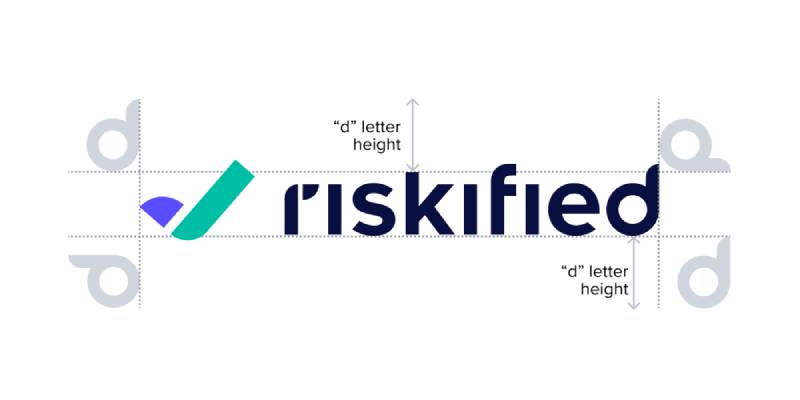
The Riskified brand guidelines specify strict rules about spacing and sizing. The checkmark symbol never appears as a standalone; it only works as part of the full logotype. For partnership lockups, the partner logo can’t exceed the height of the Riskified symbol, and both logos must look visually equal in size.
Clear space around the logo is defined as 1.5x on the sides and 2x above and below (based on the symbol’s proportions). This spacing can be increased but never reduced. The logo comes in SVG and PNG formats, with the PNG version available at 2000×311 pixels. On white or bright backgrounds, the logos appear in original colors. On dark backgrounds, the logos switch to white.
What Cultural Impact Has the Riskified Logo Had?
The Riskified logo sits in a very specific niche. It’s not a consumer-facing brand that people see on billboards or TV ads. But within ecommerce, fintech, and B2B SaaS circles, the mark carries real weight.
It’s the logo that appeared on the NYSE trading floor when Riskified went public in July 2021. That’s not nothing.
It shows up in integrations with platforms like Shopify, Salesforce Commerce Cloud, and various payment orchestrators. For online merchants dealing with fraud, spotting the Riskified checkmark on a partner page builds immediate credibility. The company was also named to CNBC’s World’s Top Fintech Companies in 2024, and that kind of visibility gives the logo wider recognition within the industry.
How Does the Riskified Logo Fit Into the Overall Brand Identity?
The logo is just one piece of a much bigger system. Riskified maintains a detailed brand style guide that covers everything from color usage to partnership lockup rules to sub-brand marks.
They run several sub-brands under the main identity. Riskified Tech represents their engineering team and community involvement (including the hayaData conference). Riskified Partners covers their ecosystem of integrations with consultancies, payment orchestrators, and ecommerce platforms.
All of these use the same core color palette and typographic system. The brand guidelines enforce sentence case for all headlines and subheads, avoiding title case entirely. That’s a pretty deliberate choice. It keeps the voice consistent and slightly less formal than what you’d expect from a financial services company.
How Should the Riskified Logo Be Used?
Official Usage Guidelines
Riskified’s brand book is pretty specific about what you can and can’t do:
- Do: Use the logo in its original colors on white or bright backgrounds. Switch to the all-white version on dark backgrounds. Maintain the minimum clear space (1.5x sides, 2x top/bottom). Keep proportions exactly as specified
- Don’t: Use the checkmark as a standalone icon. Change the logo’s proportions, spacing, orientation, or colors. Modify the composition in any way. Place the checkmark in the symbol lockup version (it belongs only in the full logotype)
Partnership Lockups
When Riskified appears alongside a partner’s logo, an “X” is placed between the two marks. Both logos should look visually equal in size, but the partner logo cannot exceed the height of the Riskified symbol. Logos are aligned to the optical baseline of the Riskified logotype.
Where to Access Official Logos
Official brand assets are available through Riskified’s design guidelines page (hosted on Webflow at riskified-brand-book.webflow.io). Third-party sites like Brandfetch and Seeklogo also host vector graphics versions in SVG, PNG, AI, CDR, and EPS formats.
Trademark Protection
The “RISKIFIED” mark is registered with the USPTO under Serial No. 86686521, covering financial risk management services for merchants and financial institutions, as well as online fraud detection software. First use in commerce dates back to September 1, 2013. The trademark is actively maintained by Riskified Ltd.
FAQ on The Riskified Logo
What does the Riskified logo look like?
The Riskified logo is a combination mark. It pairs a custom sans-serif wordmark with a stylized checkmark symbol in green and blue.
That checkmark doubles as the letter “R” when viewed from a different angle. The rounded letterforms give it a friendly, modern look across digital platforms.
What do the colors in the Riskified logo mean?
Green (#00BEA6) stands for positivity and growth. Blue (#5A4CFF) represents technology and machine learning.
The full brand color palette includes six colors: green, blue, dark green, dark blue, purple, and light grey. Each supports the company’s identity in color psychology terms.
Who designed the current Riskified logo?
Riskified’s in-house design team created the current logo. Sophie Strajnik, Brand Design Team Lead, is credited on Dribbble for the redesign.
She studied at Bezalel Academy of Art and Design. The project was confirmed as done in-house by Brand New (Under Consideration).
When was the Riskified logo redesigned?
The current version launched around late 2021, replacing the original 2013 design. The rebrand coincided with Riskified’s IPO on the New York Stock Exchange (NYSE: RSKD).
It reflected the company’s expansion beyond fraud prevention into chargeback guarantees, account security, and policy protection.
Can I download the Riskified logo in vector format?
Yes. The Riskified logo is available as an SVG file and in PNG format (2000x311px). Third-party sites like Brandfetch and Seeklogo host downloadable versions.
Official assets follow strict logo design principles and are governed by the company’s usage guidelines. Always check trademark restrictions before using them.
What font does the Riskified logo use?
The logo features a custom sans-serif typeface designed specifically for brand recognition. The letterforms are rounded, which was a deliberate shift from the original angular design.
This choice improves readability at small sizes across payment gateway interfaces and merchant onboarding materials.
Is the Riskified logo trademarked?
Yes. “RISKIFIED” is a registered trademark with the USPTO under Serial No. 86686521. First use in commerce dates to September 1, 2013.
The registration covers financial risk management services, online fraud detection software, and credit card fraud prevention for merchants and financial institutions.
What is the hidden meaning in the Riskified logo?
The checkmark symbol represents approved ecommerce transactions. But rotate it slightly, and it becomes the letter “R” for Riskified.
This dual-meaning design was intentional. The forward-leaning angle also suggests momentum, tying back to the company’s mission of driving merchant growth.
How has the Riskified logo changed since 2013?
The original logo was a darker, more angular wordmark with a simple checkmark. Standard fintech stuff. The 2021 rebrand introduced rounder shapes, a wider color scheme, and the clever R/checkmark symbol.
Green stayed as the primary hue, but the overall mood went from corporate to approachable.
What are the official Riskified logo usage rules?
The checkmark never appears as a standalone. It only exists within the full logotype. Proportions, spacing, and colors can’t be changed.
On bright backgrounds, use original colors. On dark backgrounds, switch to white. Clear space is 1.5x on sides and 2x top and bottom. Partnership lockups require an “X” placed between the two brand marks.
Conclusion
The Riskified logo does more than identify a company. It communicates trust, forward motion, and a clear connection to ecommerce fraud prevention through one clever dual-meaning symbol.
From its 2013 origins in Tel Aviv to its current role on the NYSE trading floor, the brand mark has matured alongside the platform itself.
The expanded palette of green, blue, and purple supports a visual system built for web design, partner integrations, and merchant-facing materials. It works at scale.
For anyone studying how fintech companies approach contrast and visual hierarchy in their branding, Riskified’s identity is worth a closer look. The details hold up.

Renowned for his expertise in logo design and visual branding, Bogdan has developed a multitude of logos for various clients.
His skills extend to creating posters, vector illustrations, business cards, and brochures. Additionally, Bogdan's UI kits were featured on marketplaces like Visual Hierarchy and UI8.
He also wrote in the past years on sites like Design Your Way, WebDesignerDepot, WPDean, Designmodo, Speckyboy, Slider Revolution, and more.
- The Cursor Logo History, Colors, Font, And Meaning - 24 September 2026
- Top 7 Web Design Subscription Services That Replace Full-Time Hires - 24 September 2026
- Canva vs PowerPoint: Which Is Better for Presentations? - 22 September 2026

Bogdan Sandu is a seasoned designer who has been designing websites since 2008. Renowned for his expertise in logo design and visual branding, Bogdan has developed a multitude of logos for various clients. His skills extend to creating posters, vector illustrations, business cards, and brochures. Additionally, Bogdan's UI kits were featured on marketplaces like Visual Hierarchy and UI8. He also wrote in the past years on sites like Design Your Way, WebDesignerDepot, WPDean, Designmodo, Speckyboy, Slider Revolution, and more.
You Might Also Like


