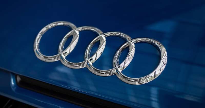
The Audi Logo stands as one of the most recognized automotive emblems worldwide. Four interlocking rings. Simple, yet loaded with meaning.
This emblem represents more than a car manufacturer. It tells the story of four separate companies merging into one entity back in 1932.
The current version uses a flat, two-dimensional design introduced in 2016. Audi AG, headquartered in Ingolstadt, Germany, has refined this symbol through roughly ten iterations since its founding.
Within the broader landscape of car logos, few achieve this level of instant recognition. The four rings have become shorthand for German engineering excellence.
What is the Audi Logo?
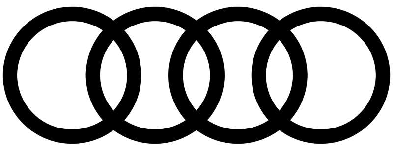
The Audi logo consists of four overlapping silver rings arranged horizontally. Introduced in its current flat form in 2016, this emblem symbolizes the 1932 merger of Audi, DKW, Horch, and Wanderer into Auto Union. Each ring represents one founding company.
Design Specifications
- Design Type: Abstract symbol (interlocking rings)
- Primary Elements: Four horizontally linked circles of equal size
- Official Introduction Date: Original 1932, current version 2016
- Designer/Agency: KMS Team (2016 redesign)
- Trademark Status: Registered trademark of Audi AG
- Color Palette: Silver/Chrome (#C0C0C0), Black (#000000), White (#FFFFFF)
- Usage Context: Vehicle grilles, steering wheels, key fobs, dealerships, digital platforms, merchandise, motorsport liveries
How Has the Audi Logo Evolved Over Time?
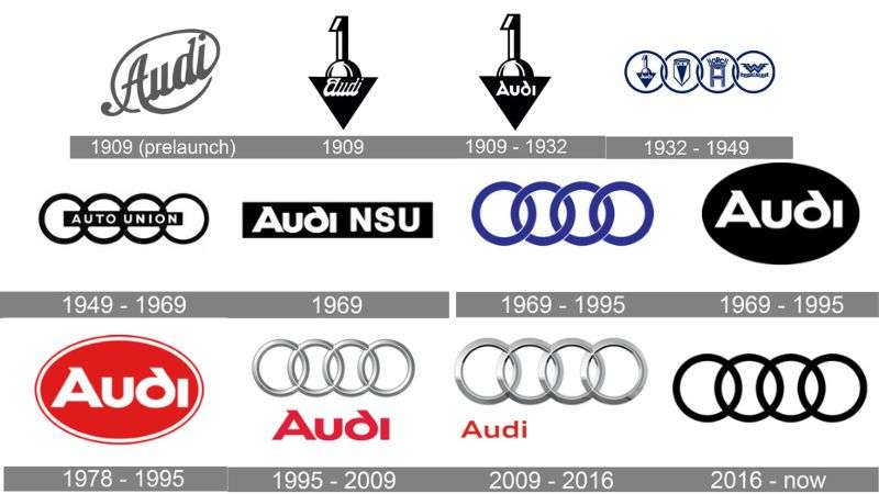
The Audi emblem has undergone significant changes since 1909. From August Horch’s original Audi wordmark to the four-ring symbol of Auto Union, each redesign reflected business transformations.
The logo became flatter and more digital-friendly in 2016.
Original Audi Wordmark (1909-1932)
- Years Active: 1909-1932
- Design Description: Simple “Audi” text in an inverted triangle
- Color Scheme: Black text on white background
- Designer: August Horch (company founder)
- Context: Horch founded Audi after leaving his previous company. The name “Audi” is Latin for “listen,” a translation of his surname.
- Key Changes from Previous: First logo for the brand
- Cultural Significance: Established Audi as a distinct luxury automobile maker in early 20th century Germany
Auto Union Four Rings (1932-1969)
- Years Active: 1932-1969
- Design Description: Four interlocking rings with individual company names inside each circle
- Color Scheme: Chrome/silver with black outlines
- Designer: Unknown (created during merger)
- Context: The Great Depression forced Audi, DKW, Horch, and Wanderer to merge. Each ring honored one company.
- Key Changes from Previous: Shift from single brand wordmark to unified symbol representing four manufacturers
- Cultural Significance: Represented survival through economic crisis and German industrial consolidation
Audi NSU Auto Union Revival (1969-1995)
- Years Active: 1969-1995
- Design Description: Four rings with “Audi” wordmark positioned above or alongside
- Color Scheme: Red wordmark with chrome rings
- Designer: Internal design team
- Context: Volkswagen Group acquired the brand. The Audi name returned as primary identity.
- Key Changes from Previous: Individual company names removed from rings, standalone wordmark added
- Cultural Significance: Marked rebirth under VW ownership and expansion into global markets
Three-Dimensional Chrome Era (1995-2016)
- Years Active: 1995-2016
- Design Description: Highly polished 3D chrome rings with metallic shading and reflections
- Color Scheme: Reflective silver/chrome
- Designer: Audi Design Team
- Context: Digital rendering allowed photorealistic logos. Luxury brands embraced dimensional effects.
- Key Changes from Previous: Added depth, shadows, and metallic textures for premium feel
- Cultural Significance: Represented technological advancement and premium positioning against BMW and Mercedes
Flat Modern Design (2016-Present)
- Years Active: 2016-present
- Design Description: Clean two-dimensional rings with consistent stroke weight, no gradients or shadows
- Color Scheme: Solid black or white depending on application
- Designer: KMS Team, Munich
- Context: Digital-first branding required scalable, responsive logos. Flat design dominated interface trends.
- Key Changes from Previous: Removed all 3D effects, separated rings from wordmark entirely
- Cultural Significance: Signaled shift toward electric vehicles and digital customer experiences
What Do the Design Elements of the Audi Logo Mean?
The four rings directly represent the 1932 merger of Audi, DKW, Horch, and Wanderer.
These companies formed Auto Union to survive the Great Depression.
The interlocking design suggests unity and cooperation. Each ring equals the others in size, showing no single brand dominated the partnership.
Why Did Audi Choose These Specific Colors?
Silver dominates the Audi palette. This choice ties directly to the “Silver Arrows” racing heritage from the 1930s.
German racing cars stripped their white paint to meet weight limits, revealing bare aluminum. That silver became legendary.
- Silver/Chrome: Hex #C0C0C0. Represents precision engineering, technological sophistication, and racing heritage. Creates psychological associations with premium metals and high value.
- Black: Hex #000000. Used for contrast and modern applications. Suggests power, elegance, and authority in the luxury segment.
- White: Hex #FFFFFF. Provides clean backgrounds. Supports readability across digital and print applications.
What Typography Style Is Used in the Audi Logo?
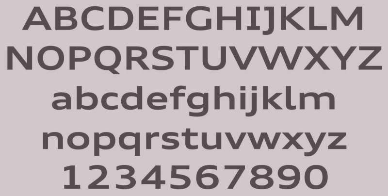
Audi uses a custom typeface called “Audi Type.” It replaced the previous “Audi Sans” in 2015.
The font features clean geometric shapes with subtle humanist touches.
Extended characters support global markets. The typography works well at small sizes on digital screens and large scales on billboards.
What Are the Hidden Meanings in the Audi Logo?
Some see Olympic rings influence. Others notice the mathematical precision of the overlap geometry.
The designers never confirmed hidden messages. But the left-to-right reading matches the chronological founding dates of the four companies.
Wanderer came first in 1885. Then Horch in 1899. DKW followed in 1916. Audi last in 1909, though positioned second in the rings.
How Does the Audi Logo Compare to Competitor Logos?
German luxury automakers take different approaches. The BMW Logo uses a circular roundel with quartered blue and white.
Mercedes-Benz relies on its three-pointed star. Audi stands apart with linked geometric shapes rather than a single enclosed symbol.
Among competitors, the Porsche Logo incorporates heraldic elements from Stuttgart.
The Ferrari Logo features the prancing horse. These use figurative imagery while Audi stays purely abstract.
This abstraction helps. The four rings scale better across digital platforms and tiny app icons where detailed crests lose clarity.
What Are the Technical Specifications of the Audi Logo?
Official Color Codes
- Audi Silver: Hex #C0C0C0, RGB (192, 192, 192), CMYK (0, 0, 0, 25), Pantone 877 C
- Audi Black: Hex #000000, RGB (0, 0, 0), CMYK (0, 0, 0, 100), Pantone Black C
- Audi Red (accent): Hex #BB0A30, RGB (187, 10, 48), CMYK (0, 100, 80, 20), Pantone 187 C
Dimensions and Proportions
- Aspect Ratio: Approximately 4:1 for rings alone (width to height)
- Ring Overlap: Each ring overlaps its neighbor by roughly one-third of diameter
- Minimum Size: 10mm width for print, 40 pixels for digital
- Clear Space: Minimum padding equal to 25% of logo height on all sides
- Stroke Weight: Consistent thickness throughout all four rings
Audi maintains these as vector graphics files. This allows infinite scaling without quality loss.
What Cultural Impact Has the Audi Logo Had?

The four rings became shorthand for German automotive engineering. Motorsport victories at Le Mans cemented this reputation.
The Quattro all-wheel-drive system, paired with the logo, dominated rally racing in the 1980s.
Today, people recognize those rings instantly. Even without the Audi name, the symbol communicates premium status and technological competence.
How Does the Audi Logo Fit Into the Overall Brand Identity?

The rings anchor everything Audi does. Marketing materials, dealership architecture, and digital interfaces all reference this central symbol.
The brand guidelines specify exact placement on vehicles. Grille-mounted rings differ from trunk badges in size and finish.
Sub-brands like Audi Sport and e-tron adapt the rings while maintaining recognition. This visual hierarchy keeps the parent brand visible across product lines.
How Should the Audi Logo Be Used?
Official Usage Guidelines
- Do: Maintain clear space around the logo, use approved color variations, scale proportionally
- Do: Use official files from Audi Media Center for press and partner materials
- Don’t: Stretch, rotate, or distort the rings
- Don’t: Add effects like shadows, outlines, or gradients not specified in guidelines
- Don’t: Place the logo on busy backgrounds that reduce legibility
Access and Licensing
Official logo files are available through the Audi Media Center for authorized press and partners.
The four rings are registered trademarks of Audi AG. Unauthorized commercial use violates international trademark law.
Fan artwork and editorial use fall under different rules. Check local regulations before reproducing.
FAQ on The Audi Logo
What Do the Four Rings in the Audi Logo Mean?
Each ring represents one of the four companies that merged to form Auto Union in 1932.
These were Audi, DKW, Horch, and Wanderer. The interlocking design shows their cooperation.
All four German automakers joined forces during the Great Depression to survive economic hardship.
Who Designed the Original Audi Logo?
The original four rings emblem was created internally during the Auto Union merger. No single designer received credit.
The 2016 flat redesign came from KMS Team in Munich.
August Horch founded the original Audi company but did not design the rings symbol himself.
When Was the Audi Logo First Introduced?
The four rings first appeared in 1932 when the merger created Auto Union.
Earlier Audi wordmarks existed from 1909. The current minimalist design launched in 2016.
That makes the core ring concept over 90 years old.
Why Does Audi Use Four Rings Instead of One Symbol?
Four separate companies needed representation. A single emblem would have erased their individual histories.
The linked circles honor each brand equally. No ring sits higher or larger than another.
This symmetry communicates partnership and balance between the founding members.
What Is Auto Union and How Does It Relate to Audi?
Auto Union was the 1932 merger of Audi, DKW, Horch, and Wanderer. It created one of Germany’s largest car manufacturers.
Volkswagen Group later acquired the company. The Audi name eventually became the primary brand identity.
The four rings remained as the corporate trademark throughout these changes.
Has the Audi Logo Changed Over the Years?
Yes. The logo evolved through roughly ten versions since 1909.
Major shifts include adding and removing company names within rings. The biggest recent change was dropping 3D chrome effects for flat vector rendering.
Each redesign reflected broader graphic design movements of its era.
What Colors Are Used in the Official Audi Logo?
The primary color palette includes silver, black, and white. Silver connects to the legendary “Silver Arrows” racing cars.
Audi red appears as an accent in some applications.
The monochrome approach keeps the emblem versatile across different backgrounds and materials.
What Font Does Audi Use in Its Branding?
Audi uses a custom sans-serif font called “Audi Type.” It replaced the older “Audi Sans” in 2015.
The typography features geometric letterforms with humanist details.
Clean lines ensure readability at any size, from tiny app icons to massive billboards.
Is the Audi Four Rings Logo Trademarked?
Yes. Audi AG holds registered trademarks on the four rings symbol worldwide.
Unauthorized commercial use violates international trademark law. The company actively protects its visual identity.
Press and partners access official files through the Audi Media Center in Ingolstadt, Germany.
What Does the Name “Audi” Actually Mean?
Audi is Latin for “listen.” It translates the German surname Horch, which also means “listen.”
Founder August Horch could not use his own name after leaving his first car company. A colleague’s son suggested the Latin translation.
The name stuck. It became one of automotive history’s clever wordplays.
Conclusion
The Audi Logo proves that great brand identity outlasts trends. Four interlocking rings, simple as they are, have carried meaning for over nine decades.
From the Auto Union merger through Volkswagen Group ownership, this emblem adapted without losing its core identity.
The psychology of shapes plays a role here. Circles suggest continuity and connection.
Good logo design principles demand simplicity and scalability. The Audi rings deliver both.
Whether stamped on a Quattro grille or displayed on a digital screen, the symbol remains instantly recognizable. That is the mark of lasting design.

Renowned for his expertise in logo design and visual branding, Bogdan has developed a multitude of logos for various clients.
His skills extend to creating posters, vector illustrations, business cards, and brochures. Additionally, Bogdan's UI kits were featured on marketplaces like Visual Hierarchy and UI8.
He also wrote in the past years on sites like Design Your Way, WebDesignerDepot, WPDean, Designmodo, Speckyboy, Slider Revolution, and more.
- Canva vs PowerPoint: Which Is Better for Presentations? - 22 September 2026
- How to Install Fonts on Mac (Step-by-Step Guide) - 20 September 2026
- From Mockup to Code: How AI-Augmented Development Speeds Up the Design Handoff - 19 September 2026

Bogdan Sandu is a seasoned designer who has been designing websites since 2008. Renowned for his expertise in logo design and visual branding, Bogdan has developed a multitude of logos for various clients. His skills extend to creating posters, vector illustrations, business cards, and brochures. Additionally, Bogdan's UI kits were featured on marketplaces like Visual Hierarchy and UI8. He also wrote in the past years on sites like Design Your Way, WebDesignerDepot, WPDean, Designmodo, Speckyboy, Slider Revolution, and more.
You Might Also Like