


The Wawa logo stands as one of the most recognized convenience store symbols across the Eastern United States. That flying goose isn’t just a random bird. It connects directly to the company’s Pennsylvania roots and the Lenape word “wawa,” which translates to goose.
Within the retail and fuel industry, this emblem has become synonymous with quality grab-and-go food and friendly service. The current version, featuring a stylized Canada goose in flight, has represented the brand through multiple refinements since the company’s transition from dairy farm to convenience retail.
Wawa’s visual identity has gone through approximately four to five significant iterations since the 1960s. Each version refined the goose symbol while maintaining brand recognition across hundreds of locations.
What Is the Wawa Logo?
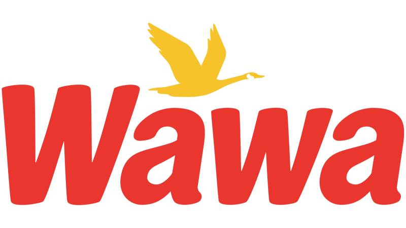
The Wawa logo is a combination mark featuring a flying Canada goose silhouette paired with custom wordmark typography. Officially refined into its modern form during the 2000s, the design symbolizes the company’s heritage and Pennsylvania origins, where “wawa” means goose in the Lenape language.
Design Type: Combination mark (symbol plus wordmark)
Primary Elements: Stylized flying Canada goose silhouette, custom sans-serif wordmark, horizontal orientation
Official Introduction Date: Current iteration refined in the early 2000s, with the goose symbol dating back to the 1960s
Designer/Agency: Internal design team with various agency collaborations over the decades
Trademark Status: Registered trademark of Wawa, Inc.
Color Palette: Primary red (#C8102E), yellow/gold accents, white, with variations for different applications
Usage Context: Store signage, fuel stations, packaging design, mobile apps, merchandise, delivery vehicles, and marketing materials
How Has the Wawa Logo Evolved Over Time?

The Wawa logo has transformed from a simple dairy farm identifier to a polished retail symbol over six decades. Major redesigns occurred in the 1970s, 1990s, and 2000s.
Each update modernized the goose while preserving instant recognition.
Original Wawa Dairy Farms Logo (1960s-1970s)
Years Active: Approximately 1964-1970s
Design Description: Early versions featured a more detailed, realistic Canada goose illustration. The imagery connected to the Wawa Dairy Farms heritage.
Color Scheme: Earth tones with brown and cream elements reflecting dairy origins.
Context: Introduced when the first Wawa Food Market opened in Folsom, Pennsylvania in 1964. The company needed a symbol that honored its dairy roots while signaling a new retail direction.
Cultural Significance: Represented the transition from pure dairy distribution to convenience retail. Locals immediately connected the goose to the town of Wawa.
Modernized Goose Era (1970s-1990s)
Years Active: Mid-1970s through early 1990s
Design Description: The goose became more stylized and less illustrative. Cleaner lines replaced detailed feather work.
Color Scheme: Introduction of bolder red tones alongside the goose imagery.
Key Changes from Previous: Simplified silhouette, stronger brand colors, improved scalability for growing store network.
Context: Expansion across Pennsylvania and into New Jersey required a logo that reproduced well at various sizes. The simplified goose worked better on everything from storefronts to coffee cups.
Contemporary Wawa Logo (2000s-Present)
Years Active: Early 2000s to present
Design Description: Sleek, aerodynamic goose silhouette in flight. The bird faces right, suggesting forward motion and progress. Clean wordmark sits below or beside the symbol.
Color Scheme: Bold red primary with yellow accents. White backgrounds for clarity.
Key Changes from Previous: Further abstraction of the goose form. Enhanced visual hierarchy between symbol and text. Digital-ready proportions.
Cultural Significance: This version accompanied Wawa’s expansion into Florida, Virginia, and beyond. It represents the brand’s evolution from regional favorite to multi-state presence.
What Do the Design Elements of the Wawa Logo Mean?

The flying goose represents freedom, journey, and the migratory nature of geese returning home. It connects customers to the brand’s Pennsylvania heritage.
The bird in flight also suggests speed and efficiency, which is appropriate for a convenience-focused business.
Why Did Wawa Choose These Specific Colors?
Red dominates the Wawa color palette for good reason. Understanding color psychology explains why.
Red (#C8102E): Creates urgency and appetite appeal. Perfect for a food-focused retailer. Red signs grab attention from roads and parking lots.
Yellow/Gold: Suggests warmth, optimism, and energy. Often used in accent positions and promotional materials. The combination of red and yellow follows patterns seen in many successful fast food logos.
White: Provides contrast and breathing room. Keeps the design from feeling overwhelming.
What Typography Style Is Used in the Wawa Logo?
Wawa uses a custom sans-serif font in its wordmark. The letterforms are rounded and approachable, nothing too corporate or cold.
The lowercase presentation feels friendly. It matches the brand’s reputation for personal service.
Letter spacing is generous, which helps with readability on storefronts and signage at various distances.
What Are the Hidden Meanings in the Wawa Logo?
The goose flying rightward isn’t accidental. In Western design, rightward motion suggests progress and moving forward.
Some observers note that the goose appears mid-journey rather than landing. This could represent Wawa’s continuous growth and expansion.
The bird’s posture, wings angled upward, creates an optimistic feeling. It’s subtle, but intentional according to brand discussions over the years.
How Does the Wawa Logo Compare to Competitor Logos?

Among convenience store brands, Wawa’s approach stands apart. Most competitors rely on abstract shapes or simple wordmarks. Wawa commits to a recognizable mascot figure.
Sheetz uses bold angular typography without a character. 7-Eleven depends entirely on its iconic numeral styling.
QuickChek employs a checkmark motif. None of these create the same emotional connection that an animal symbol provides.
The goose gives Wawa a storytelling advantage. There’s an actual reason behind the imagery, a history customers can learn and share. That’s harder to achieve with geometric shapes alone.
Similar animal-based approaches have worked well for other brands. The Duolingo logo with its owl mascot creates comparable recognition and emotional connection.
What Are the Technical Specifications of the Wawa Logo?

Official Color Codes:
Primary Red: Hex #C8102E, RGB (200, 16, 46), CMYK (0, 100, 85, 5)
Yellow/Gold: Hex #FFC72C, RGB (255, 199, 44), CMYK (0, 18, 90, 0)
White: Hex #FFFFFF for backgrounds and reverse applications
Dimensions and Proportions:
The logo maintains specific aspect ratios depending on application. Horizontal lockups are most common for storefronts. Stacked versions exist for square applications like social media profiles.
Clear space requirements typically mandate buffer zones equal to the height of the “w” in the wordmark on all sides.
Minimum size specifications ensure the goose remains recognizable at small scales. For print design applications, maintaining proper DPI is critical for reproduction quality.
What Cultural Impact Has the Wawa Logo Had?
Wawa’s goose has become a regional icon beyond simple brand identification. In the Mid-Atlantic, spotting that flying bird on a highway sign triggers genuine excitement for road-trippers.
The logo appears on fan merchandise, tattoos, and social media tributes. Few convenience stores inspire that level of devotion.
Local sports teams have partnered with Wawa, further embedding the goose into community identity. Philadelphia Eagles fans particularly embrace the brand as part of their regional pride.
How Does the Wawa Logo Fit Into the Overall Brand Identity?

The goose anchors an entire visual system. Store interiors, employee uniforms, coffee cup designs, and app interfaces all reference the same brand guidelines.
Red appears throughout the customer experience. From fuel pump screens to hoagie wrappers, the color creates consistency.
The friendly, approachable feeling of the logo extends to marketing copy and customer service training. Everything works together.
Understanding logo design principles helps explain why this cohesive approach builds stronger customer loyalty than fragmented visual identities.
How Should the Wawa Logo Be Used?
Official Usage Guidelines:
Always maintain minimum clear space around the logo. Never stretch, rotate, or distort the goose or wordmark. The logo should appear on approved background colors only.
Prohibited Uses:
Do not separate the goose from the wordmark in official communications. Avoid placing the logo on busy photographic backgrounds without proper contrast treatment. Never recreate the logo using alternative fonts.
Accessing Official Assets:
Wawa provides approved logo files to franchisees, partners, and media through official channels. Press inquiries can request assets through the corporate communications department.
Trademark Protection:
The Wawa name and flying goose design are registered trademarks. Unauthorized commercial use may result in legal action. Fan art and personal use typically fall outside enforcement priorities, but selling merchandise requires explicit licensing agreements.
FAQ on The Wawa Logo
What Does the Wawa Logo Represent?
The Wawa logo represents the company’s Pennsylvania heritage and connection to the town of Wawa in Delaware County.
The flying goose symbolizes freedom, journey, and forward motion. It honors the Lenape language origins of the brand name.
Why Is There a Goose in the Wawa Logo?
“Wawa” means goose in the Lenape language. The town in Pennsylvania where the company started was named after the Canada goose.
Using the bird creates instant storytelling. It connects customers to authentic local history rather than generic corporate imagery.
What Colors Are in the Wawa Logo?
Red serves as the primary color. Yellow and white provide supporting accents throughout the brand identity.
This combination follows proven color theory principles. Red triggers appetite and urgency. Yellow adds warmth and energy to the convenience store branding.
When Was the Wawa Logo Created?
The original goose symbol appeared in 1964 when the first Wawa Food Market opened in Folsom, Pennsylvania.
Multiple redesigns followed. The current modern version took shape in the early 2000s during the company’s expansion beyond the East Coast.
Who Designed the Wawa Logo?
Internal teams handled most logo development over the decades. Various design agencies contributed to refinements.
No single famous graphic designer claims credit for the iconic flying goose. The Wawa brand identity evolved through collaborative corporate efforts.
What Font Is Used in the Wawa Logo?
Wawa uses a custom typeface for its wordmark. The rounded, lowercase letterforms feel approachable and friendly.
Good font spacing ensures readability on store signage. The typography matches the brand’s welcoming personality.
Has the Wawa Logo Changed Over Time?
Yes. The logo evolution spans roughly four to five major versions since the 1960s.
Early designs featured detailed goose illustrations. Each update simplified the bird into today’s sleek silhouette while preserving brand recognition across Pennsylvania, New Jersey, Florida, and Virginia.
What Does “Wawa” Mean?
Wawa translates to “goose” in the Lenape Native American language. The town of Wawa, Pennsylvania took its name from the Canada geese that populated the area.
The Wawa Dairy Farms adopted this name when George Wood founded the company.
Can I Download the Wawa Logo?
Official vector graphics files are available through Wawa’s corporate communications for approved partners and media.
The trademark protects unauthorized commercial use. Fan projects and personal use typically don’t trigger enforcement, but selling merchandise requires licensing.
Why Is the Wawa Logo So Recognizable?
The goose creates a strong focal point. Animal mascots build emotional connections faster than abstract shapes.
Consistent application across store signage, hoagie packaging, and gas station branding reinforces recognition. The design elements work together seamlessly.
Conclusion
The Wawa logo proves that regional identity can become a powerful branding asset. That flying goose emblem has carried Wawa Inc. from a small Pennsylvania dairy operation to a multi-state convenience store chain.
Every design choice serves a purpose. The red and yellow brand colors trigger appetite. The streamlined goose suggests speed and reliability.
Few retail chains achieve this level of customer loyalty through visual identity alone. From Philadelphia to Florida, the Wawa emblem means quality hoagies, fresh coffee, and friendly service.
Good logo design tells a story. This one does it exceptionally well.

Renowned for his expertise in logo design and visual branding, Bogdan has developed a multitude of logos for various clients.
His skills extend to creating posters, vector illustrations, business cards, and brochures. Additionally, Bogdan's UI kits were featured on marketplaces like Visual Hierarchy and UI8.
He also wrote in the past years on sites like Design Your Way, WebDesignerDepot, WPDean, Designmodo, Speckyboy, Slider Revolution, and more.
- Canva vs PowerPoint: Which Is Better for Presentations? - 22 September 2026
- How to Install Fonts on Mac (Step-by-Step Guide) - 20 September 2026
- From Mockup to Code: How AI-Augmented Development Speeds Up the Design Handoff - 19 September 2026

Bogdan Sandu is a seasoned designer who has been designing websites since 2008. Renowned for his expertise in logo design and visual branding, Bogdan has developed a multitude of logos for various clients. His skills extend to creating posters, vector illustrations, business cards, and brochures. Additionally, Bogdan's UI kits were featured on marketplaces like Visual Hierarchy and UI8. He also wrote in the past years on sites like Design Your Way, WebDesignerDepot, WPDean, Designmodo, Speckyboy, Slider Revolution, and more.
You Might Also Like


