


The Duolingo logo represents one of tech’s most recognizable mascots in the educational technology space.
The green owl mascot, officially named Duo, has become synonymous with language learning since the platform launched in 2011.
Co-founded by Luis von Ahn and Severin Hacker at Carnegie Mellon University, Duolingo has evolved through multiple logo iterations while maintaining its core mascot identity.
The current logo features a bright green owl with expressive eyes and a playful personality that embodies the brand’s mission to make education accessible and enjoyable. Through strategic logo design principles and consistent branding, the Duolingo owl has transformed from a simple flat design into a dynamic character capable of expressing multiple emotions.
What is the Duolingo Logo?
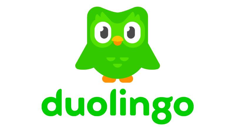
The Duolingo logo is a mascot-based logo featuring a bright green owl named Duo with large expressive eyes and a yellow-orange beak. Introduced in 2011 by co-founders Luis von Ahn and Severin Hacker, the design was updated significantly in 2019 by Design Lead Jack Morgan.
The logo incorporates several key attributes:
Design Type: Mascot-based combination mark featuring both the owl character and wordmark
Primary Elements: Three-dimensional owl character with gradient green coloring, expressive eyes, yellow-orange beak, and minimalist body shape with three feather details on chest
Official Introduction Date: November 2011 (initial version), August 2019 (current major redesign)
Designer/Agency: Jack Morgan (2019 redesign) working as Design Lead at Duolingo
Trademark Status: Registered with the U.S. Patent and Trademark Office (Registration Number 4588574, filed January 21, 2014, registered August 19, 2014)
Color Palette:
- Feather Green: #58CC02 (Primary)
- Mask Green: #89E219 (Secondary)
- Eel Black: #4B4B4B
- Snow White: #FFFFFF
- Orange (beak/feet): #F49000
- Golden Yellow: #FFC200
Usage Context: Mobile app icons, web platform branding, marketing materials, merchandise, social media profiles, and educational content
How Has the Duolingo Logo Evolved Over Time?

The Duolingo mascot has undergone five major redesigns since 2010, each refining the owl’s personality and visual appeal. The evolution reflects the platform’s growth from a small startup to a publicly traded company with over 500 million users.
Original Duolingo Logo (2010-2011)
Years Active: 2010-2011
Design Description: The first logo featured a two-toned wordmark without a mascot character. The darker “Duo” portion had an arched green underline resembling a smile, while “Lingo” appeared in light gray.
Color Scheme: Dark lettering with green accent and light gray text
Designer: Created by co-founders during the beta development phase
Context: Developed for the closed beta version at Carnegie Mellon University
Key Changes from Previous: First iteration establishing brand identity
Cultural Significance: Represented the platform’s initial focus on dual-language learning model
First Owl Logo (2011-2012)
Years Active: November 2011-2012
Design Description: A flat green owl with the letters “duo” stylized as facial features. The lowercase “D” and “O” formed eyes, while the “U” created the beak shape. Small white details appeared on the head and body.
Color Scheme: Bright green with white accents and black leg details
Designer: Internal design team
Context: Launched with the private beta in November 2011
Key Changes from Previous: Introduction of owl mascot representing wisdom and learning
Cultural Significance: Established the owl as the brand’s primary visual identity, though the lettering-as-face approach created readability issues
Three-Dimensional Owl (2012-2013)
Years Active: 2012-2013
Design Description: Removed the stylized lettering from the owl’s face and rendered the mascot in three dimensions with bright green gradients. The owl appeared friendly and welcoming with a more natural bird shape.
Color Scheme: Gradient green shading from light center to darker edges
Designer: Duolingo design team
Context: Released to address user confusion about brand name spelling
Key Changes from Previous: Separated wordmark from mascot, added dimensional depth, created more friendly appearance
Cultural Significance: Made the owl more approachable and suitable for broad audience appeal
Animated Owl Redesign (2013-2018)
Years Active: 2013-2018
Design Description: Animation-style owl with wings spread wide in an excited jumping pose. The design featured expressive eyes with sparkle, raised “ears” (feather tufts), and simplified legs represented as two orange spots of different sizes.
Color Scheme: Multiple green gradients, light center transitioning to dark edges, orange leg accents
Designer: Internal design team
Context: Created to emphasize friendliness and user engagement through personality
Key Changes from Previous: Added dynamic movement, emotional expression, simplified leg design, more cartoon-like appearance
Cultural Significance: Transformed the owl from static mascot to character with personality, supporting the gamification strategy
Current Logo Design (2019-Present)
Years Active: August 2019-Present
Design Description: Modern, minimalist owl with cleaner lines and simplified features. The mascot can express a full spectrum of emotions through various poses and facial expressions. The design includes larger eye fluff and three miniature semicircles on the chest.
Color Scheme: Primary feather green (#58CC02), mask green (#89E219), with orange and yellow beak accents
Designer: Jack Morgan, Design Lead at Duolingo
Context: Part of complete brand identity system redesign to support company scale and product expansion
Key Changes from Previous: Simplified geometry, balanced proportions, emotional versatility, cleaner silhouette, ability to convey bewilderment, joy, sadness, and other emotions
Cultural Significance: Elevated Duo from mascot to pop culture icon, supporting viral marketing campaigns and social media engagement that garnered millions of followers
What Do the Design Elements of the Duolingo Logo Mean?
The owl mascot represents wisdom, knowledge, and learning, directly aligning with the platform’s educational mission. Owls have symbolized intelligence across cultures for centuries, making them an ideal choice for a language learning application.
The bright green coloring symbolizes growth, development, and renewal. Green psychology suggests energy, freshness, and forward progress, all qualities Duolingo wants users to associate with their learning journey.
The large, expressive eyes create an emotional connection with users. The human-like eye design makes Duo approachable and relatable, fostering engagement with the learning process.
The playful, animated style reflects the platform’s gamification strategy. By presenting education through a friendly, entertaining character, Duolingo reduces the intimidation often associated with language learning.
Why Did Duolingo Choose These Specific Colors?
The color palette follows specific psychological principles:
Feather Green (#58CC02): The primary brand color represents growth and achievement. According to color psychology, green conveys renewal and progress, encouraging users to continue their learning streaks.
Mask Green (#89E219): The lighter green shade creates depth and dimension, symbolizing the journey from beginner to advanced learner.
Eel Black (#4B4B4B): Used sparingly for contrast and definition, particularly in the eyes, creating visual clarity and focus.
Orange/Yellow Beak: Warm colors suggest enthusiasm, energy, and success, supporting the positive reinforcement strategy central to Duolingo’s learning approach.
The green color choice has an interesting origin story. Co-founder Severin Hacker reportedly hated green, so co-founder Luis von Ahn deliberately chose green for the owl specifically to annoy him. This playful decision became one of the most recognizable aspects of the brand.
What Typography Style Is Used in the Duolingo Logo?
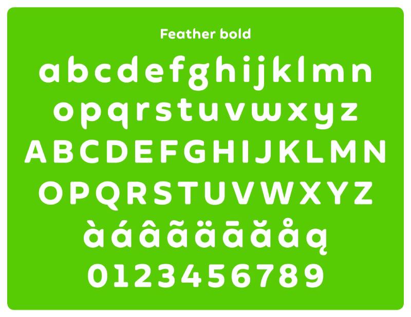
The wordmark uses a custom sans-serif font designed specifically for Duolingo in 2019. The typeface features rounded, organic shapes with no perfectly straight lines or sharp corners.
The design includes fancy, feather-like endings on letters, with the lowercase “g” particularly distinctive, shaped to resemble an owl with a single feather protruding from its head. Based on fonts like Torus Bold or Auro Bold, the customized version eliminates readability issues from earlier designs.
The original wordmark, modified from the font Chalet, created confusion because the stylized letters led to frequent misspellings as “DuoLingo” with a capital L. The 2019 redesign by Jack Morgan solved this problem with more geometric, balanced letterforms.
What Are the Hidden Meanings in the Duolingo Logo?
The three semicircular feathers on Duo’s chest represent the three core elements of Duolingo’s learning method: reading, writing, and listening. Though not explicitly stated by designers, this subtle detail reinforces the platform’s comprehensive approach.
The owl’s varying emotional states serve as psychological motivation tools. Happy Duo rewards progress, while disappointed or crying Duo creates gentle guilt when users skip lessons, leveraging emotional design to maintain engagement.
The spread-wing pose in many versions symbolizes openness and welcome, representing Duolingo’s mission to make education accessible to everyone regardless of economic status. The wings-wide stance invites learners to join the platform.
The simplified leg design (two orange spots of different sizes) creates depth perception while maintaining the friendly, approachable character that defines the brand’s personality.
How Does the Duolingo Logo Compare to Competitor Logos?
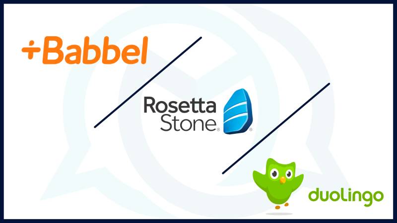
Unlike competitors such as Rosetta Stone (which uses a literal stone) or Babbel (which uses abstract geometric shapes), Duolingo chose a living character mascot. This decision created stronger emotional connections and viral marketing opportunities that static logos cannot achieve.
The bright green color stands out in app stores dominated by blues and reds. While apps like Memrise use softer colors and Busuu employs muted tones, Duolingo’s vibrant palette demands attention.
Most language learning platforms use abstract symbols or wordmarks. Duolingo’s character-based approach allows for storytelling, meme creation, and social media personality that competitors struggle to replicate. Duo has appeared in costumes at conventions, generated countless user-created memes, and maintains active social media accounts with distinct personality.
The emotional versatility of Duo surpasses other mascots in the educational technology space. Where competitors might show one static character, Duolingo’s owl can express joy, sadness, anger, excitement, and dozens of other emotions, creating more dynamic user interactions.
What Are the Technical Specifications of the Duolingo Logo?

Official Color Codes:
Primary Color: Feather Green
- Hex: #58CC02
- RGB: (88, 204, 2)
- CMYK: (58, 0, 96, 0)
- Pantone: PMS 361 C
Secondary Color: Mask Green
- Hex: #89E219
- RGB: (137, 226, 25)
- CMYK: (42, 0, 87, 0)
- Pantone: PMS 368 C
Accent Color: Eel Black
- Hex: #4B4B4B
- RGB: (75, 75, 75)
- CMYK: (3, 0, 21, 88)
- Pantone: PMS 418 C
Beak Lower/Feet: Orange
- Hex: #F49000
- RGB: (244, 144, 0)
- CMYK: (0, 52, 97, 0)
- Pantone: PMS 715 C
Beak Upper: Golden Yellow
- Hex: #FFC200
- RGB: (255, 194, 0)
- CMYK: (0, 24, 96, 0)
- Pantone: PMS 7548 C
Dimensions and Proportions:
The logo maintains specific aspect ratios to ensure visual consistency across platforms. Vector graphics formats are used to enable scaling without quality loss.
Minimum Size Requirements:
Digital applications require minimum dimensions to maintain recognizability, though specific measurements vary by platform and use case.
Clear Space Specifications:
The logo requires protective space around all sides equivalent to the height of Duo’s eye to prevent visual crowding.
Official Usage Guidelines:
Duolingo maintains brand guidelines that specify acceptable logo variations, color combinations, and prohibited alterations to maintain brand integrity.
What Cultural Impact Has the Duolingo Logo Had?
Duo has transcended typical mascot status to become a pop culture phenomenon. The owl appears in memes, Halloween costumes, and viral social media content that often reaches audiences beyond Duolingo users.
The “Spanish or Vanish” meme phenomenon turned Duo into an internet legend, with users creating jokes about the owl’s persistent learning reminders. This organic content marketing generated millions of impressions without paid advertising.
The mascot’s passive-aggressive personality became a marketing strategy. Push notifications framed as threats from Duo (“These reminders don’t seem to be working. We’ll stop sending them for now”) created humor that users eagerly shared online.
Duolingo’s TikTok presence, where Duo appears in costume performing trends and skits, has garnered over 10 million followers. The physical mascot suit has become as recognizable as the digital logo.
The owl has appeared in traditional media, including news coverage, educational discussions, and business case studies as an example of successful storytelling in branding.
How Does the Duolingo Logo Fit Into Overall Brand Identity?

Duo serves as the central element of Duolingo’s entire brand ecosystem. The owl appears across all touchpoints, from app icons and website headers to email campaigns and merchandise.
The mascot’s emotional versatility supports different product features. Happy Duo celebrates streak milestones, concerned Duo appears when users miss lessons, and excited Duo introduces new features or content.
The logo integrates with Duolingo’s gamification elements. The owl often appears alongside achievement badges, level indicators, and progress bars, creating visual cohesion throughout the user experience.
Brand extensions like Duolingo English Test, Duolingo ABC, and Duolingo Math all incorporate Duo variants, maintaining consistency while distinguishing different product lines.
The character’s personality drives social media strategy, customer support tone, and marketing campaigns, making the logo more than a visual element but the face of company culture.
How Should the Duolingo Logo Be Used?

Official Usage Do’s:
Use official logo files from Duolingo’s brand resources when available
Maintain proper clear space around the logo
Use approved color variations on appropriate backgrounds
Preserve the logo’s proportions and aspect ratio
Link logo usage to Duolingo’s official platforms or legitimate educational discussions
Official Usage Don’ts:
Don’t alter the logo’s colors, proportions, or design elements
Avoid placing the logo on busy backgrounds that reduce visibility
Don’t combine the logo with other brand marks or symbols
Refrain from using the logo to imply false endorsement or partnership
Never use the logo for commercial purposes without permission
Where to Access Official Logos:
Duolingo maintains brand guideline resources for legitimate usage, though access may be restricted for commercial applications.
Licensing Information:
The Duolingo name and owl mascot are registered trademarks. Commercial usage requires explicit permission and licensing agreements.
Trademark Protection Details:
Duolingo actively protects its intellectual property through trademark registration (Registration Number 4588574). The owl design, including its distinctive features like large eyes and three chest feathers, receives trademark protection as a visual mark.
FAQ About the Duolingo Logo
When was the Duolingo logo created?
The first Duolingo owl logo was introduced in November 2011 during the private beta launch. The current version of the logo was redesigned in August 2019 by Design Lead Jack Morgan as part of a comprehensive brand identity overhaul.
Who designed the Duolingo logo?
Jack Morgan, Design Lead at Duolingo, created the 2019 redesign that remains current today. The original logo iterations were developed by the internal design team and co-founders Luis von Ahn and Severin Hacker during the company’s early years.
What do the colors in the Duolingo logo mean?
The bright green represents growth, development, and progress in language learning. Orange and yellow in the beak symbolize enthusiasm and success. The color scheme creates positive psychological associations that support user motivation and engagement throughout the learning journey.
How many times has the Duolingo logo been redesigned?
The Duolingo logo has undergone five major redesigns since 2010. Each iteration refined the owl’s appearance while maintaining core brand recognition elements like the green color and owl character.
Where can I download the official Duolingo logo?
Official Duolingo logo files are available through the company’s brand guidelines portal for legitimate usage. Commercial applications require permission and licensing agreements. Unauthorized use of trademarked materials may result in legal action.
Is the Duolingo logo trademarked?
Yes, the Duolingo logo and owl mascot are registered trademarks with the U.S. Patent and Trademark Office. Registration Number 4588574 was filed on January 21, 2014, and registered on August 19, 2014, protecting the brand’s visual identity.
What font is used in the Duolingo logo?
The wordmark uses a custom sans-serif typeface designed specifically for Duolingo in 2019. Based on fonts like Torus Bold or Auro Bold, the customized version features rounded shapes with feather-like letter endings and no sharp corners, creating a friendly and approachable aesthetic.
Why did Duolingo choose an owl for their logo?
Owls symbolize wisdom, knowledge, and learning across cultures, making them ideal for an educational platform. The choice also has a personal story: co-founder Severin Hacker disliked green, so Luis von Ahn deliberately chose a green owl partly to playfully annoy him.
Conclusion
The Duolingo logo represents a masterclass in mascot-based branding within the educational technology sector.
From its 2011 origins to the refined 2019 redesign, Duo the owl has evolved from a simple mascot into a pop culture icon with millions of social media followers. The bright green color palette, expressive character design, and emotional versatility distinguish Duolingo from competitors while supporting the platform’s gamification strategy.
The logo’s success stems from strategic alignment between visual design and brand mission. By choosing a wise owl rendered in growth-symbolizing green, Duolingo created instant recognition that reinforces its educational purpose.
As language learning continues expanding globally, the Duolingo logo will likely adapt while maintaining the core elements that have made Duo one of technology’s most recognizable mascots.

Renowned for his expertise in logo design and visual branding, Bogdan has developed a multitude of logos for various clients.
His skills extend to creating posters, vector illustrations, business cards, and brochures. Additionally, Bogdan's UI kits were featured on marketplaces like Visual Hierarchy and UI8.
He also wrote in the past years on sites like Design Your Way, WebDesignerDepot, WPDean, Designmodo, Speckyboy, Slider Revolution, and more.
- The Windsurf Logo History, Colors, Font, And Meaning - 10 October 2026
- How to Remove Background From Product Photos (No Photoshop) - 10 October 2026
- How Designers can Build a Stronger Online Creative Identity - 9 October 2026

Bogdan Sandu is a seasoned designer who has been designing websites since 2008. Renowned for his expertise in logo design and visual branding, Bogdan has developed a multitude of logos for various clients. His skills extend to creating posters, vector illustrations, business cards, and brochures. Additionally, Bogdan's UI kits were featured on marketplaces like Visual Hierarchy and UI8. He also wrote in the past years on sites like Design Your Way, WebDesignerDepot, WPDean, Designmodo, Speckyboy, Slider Revolution, and more.
You Might Also Like


