


The OVO logo stands as one of the most recognizable symbols in contemporary streetwear and hip hop culture. This owl-based emblem represents October’s Very Own, the lifestyle brand and record label founded by Canadian artist Drake.
The mark occupies a unique position within graphic design movements, bridging luxury fashion aesthetics with urban street culture. Its current iteration features a stylized owl icon that has remained largely consistent since the brand’s 2008 founding.
The logo has undergone subtle refinements rather than complete overhauls. Most recognize the black and gold owl silhouette that appears across clothing, accessories, and album artwork. It functions as both a record label identifier and a premium fashion mark.
What is the OVO Logo?
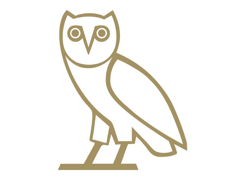
The OVO logo is a stylized owl symbol representing Drake’s October’s Very Own brand, introduced around 2008. The design features a simplified owl silhouette rendered in black or gold, symbolizing wisdom, nocturnal creativity, and the artist’s October birthday month.
Design Specifications:
- Design Type: Combination mark (symbol with accompanying wordmark)
- Primary Elements: Stylized owl icon with rounded geometric forms, “OVO” lettermark
- Official Introduction: Approximately 2008, coinciding with the brand’s founding
- Designer/Agency: Original designer not publicly credited; refined over time by internal creative team
- Trademark Status: Registered trademark under October’s Very Own Inc.
- Color Palette: Primary black (#000000), gold/metallic gold (#CFB53B), white (#FFFFFF)
- Usage Context: Apparel, accessories, OVO Sound releases, retail locations, collaborations with Jordan Brand and other partners
How Has the OVO Logo Evolved Over Time?
The OVO owl has maintained remarkable consistency since its creation. Early versions appeared slightly rougher around the edges.
Refinements came gradually. The proportions tightened. Lines became cleaner.
By the mid-2010s, the logo had settled into its current polished form. No drastic redesigns occurred, which actually strengthened brand recognition.
Original OVO Logo (2008-2012)
- Years Active: 2008-2012
- Design Description: A simplified owl with prominent eyes, rendered in solid colors with slightly thicker line weights
- Color Scheme: Predominantly black on white backgrounds, occasional gold applications
- Designer: Attributed to Drake’s early creative collaborators
- Context: Launched alongside Drake’s mixtape era, the owl appeared on early merchandise and promotional materials
- Cultural Significance: Established the owl as Drake’s personal symbol before mainstream success
Refined OVO Logo (2012-2017)
- Years Active: 2012-2017
- Design Description: Streamlined owl silhouette with more balanced proportions and cleaner curves
- Color Scheme: Expanded use of gold in branding alongside black and white
- Key Changes from Previous: Smoother edges, more consistent stroke width, better scalability
- Context: Coincided with OVO’s expansion into physical retail locations and the Jordan Brand partnership
- Cultural Significance: Transitioned from artist merch to legitimate fashion label status
Current OVO Logo (2017-Present)
- Years Active: 2017-present
- Design Description: Highly refined owl with geometric precision, optimized for digital and print applications
- Color Scheme: Maintained core palette with expanded seasonal color variations
- Key Changes from Previous: Minor proportion adjustments for improved reproduction across media
- Context: Reflects OVO’s position as an established luxury streetwear brand
- Cultural Significance: Recognized globally as a symbol of Drake’s cultural influence
What Do the Design Elements of the OVO Logo Mean?
The owl carries deep symbolic weight. It represents wisdom, mystery, and nocturnal creativity.
Drake chose this creature deliberately. Owls see clearly in darkness. They operate when others sleep.
This connects to the late-night studio sessions and introspective lyrics that defined his early work. The October reference ties everything to Drake’s birth month and emotional season.
Why Did OVO Choose These Specific Colors?
Understanding color psychology explains these choices perfectly.
Black (Hex: #000000) communicates sophistication and power. It grounds the brand in luxury without trying too hard. Black in logo design signals authority and timelessness.
Gold (Hex: #CFB53B) adds that aspirational quality. Success. Achievement. It pops against dark backgrounds and photographs well on merchandise.
White (Hex: #FFFFFF) provides necessary contrast and works for reversed applications. Clean and versatile.
What Typography Style Is Used in the OVO Logo?
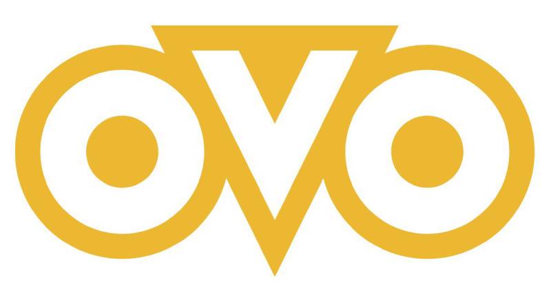
The “OVO” lettermark uses a custom geometric sans-serif typeface.
The letterforms are round and balanced. Each O mirrors the other. The V sits centered between them.
This creates visual symmetry that feels intentional and polished. The typography complements the owl rather than competing with it.
What Are the Hidden Meanings in the OVO Logo?
The owl’s eyes function as the most striking feature. They draw you in immediately.
Some fans see the overall shape as two letter O’s flanking the beak (forming OVO). Whether intentional or not, it works.
The rounded forms feel approachable despite the premium positioning. There’s warmth hiding behind that luxurious exterior.
How Does the OVO Logo Compare to Competitor Logos?

Within streetwear, OVO takes a different approach than most competitors.
Brands like Stussy rely on script lettering. Off-White uses industrial typography and arrows.
OVO stands apart with its animal mascot approach. The owl provides instant recognition that wordmarks struggle to achieve.
Compared to other celebrity brands, OVO invested more heavily in cohesive visual identity from the start. Many artist-owned labels treat logos as afterthoughts. Drake’s team understood logo design principles from day one.
The result? A mark that holds its own against heritage fashion houses while maintaining street credibility.
What Are the Technical Specifications of the OVO Logo?

Official Color Codes:
- Primary Black: Hex: #000000 | RGB: (0, 0, 0) | CMYK: (0, 0, 0, 100)
- Signature Gold: Hex: #CFB53B | RGB: (207, 181, 59) | CMYK: (17, 22, 88, 0)
- Clean White: Hex: #FFFFFF | RGB: (255, 255, 255) | CMYK: (0, 0, 0, 0)
Dimensions and Proportions:
- Aspect Ratio: Approximately 1:1 for owl icon alone; varies with wordmark inclusion
- Minimum Size: Owl icon should not appear smaller than 0.5 inches in print to maintain detail legibility
- Clear Space: Minimum padding equal to the height of one owl eye on all sides
- File Formats: Available in vector formats for scalability, plus raster versions for web use
What Cultural Impact Has the OVO Logo Had?
The owl transcended its origins as artist merchandise. It became a status symbol.
Wearing OVO signals cultural awareness and taste. The logo appears at NBA games, music festivals, and high-end retail districts worldwide.
It helped legitimize rapper-owned fashion as genuine design rather than quick cash grabs. Younger artists now study OVO’s brand-building playbook.
How Does the OVO Logo Fit Into the Overall Brand Identity?

The owl anchors everything OVO does. It connects clothing lines to record releases to annual festivals.
Strong brand guidelines ensure consistency across touchpoints. Whether you see the logo on a hoodie or a vinyl sleeve, the experience feels unified.
This cohesion explains why OVO commands premium prices. Every piece fits a larger storytelling framework built around Drake’s persona and Toronto roots.
How Should the OVO Logo Be Used?
Official Usage Guidelines:
- Do: Maintain clear space around the logo; use approved color combinations; reproduce from official vector files
- Don’t: Stretch or distort proportions; place on busy backgrounds without contrast; recreate or approximate the design
- Access: Official assets available through OVO’s brand partnerships team for licensed collaborators
- Licensing: Unauthorized commercial use prohibited; OVO actively enforces trademark protections
- Trademark: The owl design and “OVO” wordmark are registered trademarks; reproduction requires written permission
Counterfeit OVO merchandise remains a significant issue. The brand works with customs agencies and online platforms to remove unauthorized products. Buyers should purchase only from official OVO stores or authorized retailers.
FAQ on The OVO Logo
What Does the OVO Logo Mean?
The OVO owl logo represents wisdom, nocturnal creativity, and Drake’s October birth month.
October’s Very Own is the full brand name. The owl symbolizes seeing clearly in darkness, which connects to late-night studio sessions and introspective songwriting that defined Drake’s rise.
Who Designed the OVO Logo?
The original designer remains officially uncredited. Drake’s early creative team developed the owl concept around 2008.
Unlike marks created by famous graphic designers, this one grew organically from the Toronto hip hop scene. Internal teams refined it over time.
Why Is the OVO Logo an Owl?
Owls represent wisdom and mystery across cultures. They thrive at night when others rest.
This fits Drake’s creative process perfectly. The psychology of shapes matters here too. Rounded forms feel approachable despite the luxury positioning.
What Colors Are in the OVO Logo?
The official color palette consists of black, gold, and white.
Black grounds the brand in sophistication. Gold adds aspirational luxury appeal. White provides versatility for reversed applications across streetwear merchandise and OVO Sound releases.
When Was the OVO Logo Created?
The owl first appeared around 2008 when Drake launched October’s Very Own as a blog and brand.
It predates his mainstream success. Early versions showed rougher edges before refinements created the polished Toronto clothing brand mark seen today.
Is the OVO Logo Trademarked?
Yes. October’s Very Own Inc. holds registered trademarks for both the owl symbol and OVO wordmark.
The company actively enforces these protections. Counterfeit OVO merch remains a problem, so the brand works with customs agencies to combat unauthorized reproductions.
What Font Does OVO Use?
OVO uses a custom geometric typeface for its wordmark. The letterforms are round and balanced.
Each O mirrors the other with the V centered between them. This creates clean balance that photographs well on hip hop fashion merchandise.
Can I Use the OVO Logo?
Not without permission. Commercial use requires licensing from OVO’s brand partnerships team.
Unauthorized reproduction violates trademark law. The brand style guide restricts usage to official collaborators like Jordan Brand and approved retailers only.
What Does OVO Stand For?
October’s Very Own is the full meaning. It references Drake’s October birthday and personal creative identity.
The phrase became both a record label name (OVO Sound) and luxury streetwear brand. Warner Records distributes OVO Sound releases globally.
How Has the OVO Logo Changed Over Time?
Changes have been subtle rather than dramatic. Early versions featured thicker lines and rougher proportions.
Refinements improved scalability and digital reproduction. The core owl silhouette stayed consistent, which strengthened the iconic owl image recognition across Drake merchandise and brand collaborations.
Conclusion
The OVO logo proves that simplicity wins. Drake’s owl emblem transformed from mixtape artwork into an iconic brand symbol recognized worldwide.
Few celebrity clothing lines achieve this level of design consistency. The owl works across OVO apparel, OVO Fest branding, and OVO Sound releases without losing impact.
That takes discipline. Most hip hop merchandise feels disposable. This doesn’t.
The minimalist design approach gives the mark staying power. Clean lines. Thoughtful proportions. A focal point that commands attention.
Toronto’s most famous owl isn’t going anywhere.

Renowned for his expertise in logo design and visual branding, Bogdan has developed a multitude of logos for various clients.
His skills extend to creating posters, vector illustrations, business cards, and brochures. Additionally, Bogdan's UI kits were featured on marketplaces like Visual Hierarchy and UI8.
He also wrote in the past years on sites like Design Your Way, WebDesignerDepot, WPDean, Designmodo, Speckyboy, Slider Revolution, and more.
- Canva vs PowerPoint: Which Is Better for Presentations? - 22 September 2026
- How to Install Fonts on Mac (Step-by-Step Guide) - 20 September 2026
- From Mockup to Code: How AI-Augmented Development Speeds Up the Design Handoff - 19 September 2026

Bogdan Sandu is a seasoned designer who has been designing websites since 2008. Renowned for his expertise in logo design and visual branding, Bogdan has developed a multitude of logos for various clients. His skills extend to creating posters, vector illustrations, business cards, and brochures. Additionally, Bogdan's UI kits were featured on marketplaces like Visual Hierarchy and UI8. He also wrote in the past years on sites like Design Your Way, WebDesignerDepot, WPDean, Designmodo, Speckyboy, Slider Revolution, and more.
You Might Also Like


