Behind every memorable logo, striking poster, and innovative brand identity stands a master of visual communication. Famous graphic designers have shaped how we see and interact with the world through their revolutionary approaches to typography, color theory, and visual hierarchy.
From Paul Rand’s corporate modernism to Milton Glaser’s expressive illustrations, these creative visionaries transformed commercial art into a respected profession. Their work spans decades of design evolution, establishing fundamental graphic design principles still taught today.
Understanding these influential designers reveals how modern visual culture developed. Their innovations in grid systems, minimalist design, and digital integration continue influencing contemporary practice.
This exploration examines legendary figures who defined graphic design as both art and strategic communication, revealing the personalities and philosophies behind iconic work that shaped entire graphic design movements.
Famous Graphic Designers
| Designer | Design Movement/Style | Notable Works/Clients | Core Contribution |
|---|---|---|---|
| Paul Rand | Modernist, Swiss Design | IBM logo, UPS logo, ABC logo | Corporate identity design pioneer |
| Saul Bass | Minimalist, Kinetic Typography | Movie titles (Psycho, Vertigo), AT&T logo | Motion graphics and title sequences |
| Milton Glaser | Psychedelic, Pop Art | I ♥ NY logo, Bob Dylan poster | Cultural icon design and illustration |
| Massimo Vignelli | International Typographic Style | NYC Subway map, American Airlines | Information design and systematic thinking |
| David Carson | Deconstructivism, Grunge Typography | Ray Gun magazine, Nike campaigns | Experimental typography revolution |
| Stefan Sagmeister | Conceptual, Experimental | Lou Reed album covers, Talking Heads | Conceptual design and personal expression |
| Paula Scher | Postmodern, Typographic | Pentagram partner, Public Theater | Environmental graphics and identity |
| Tibor Kalman | Anti-Design, Social Commentary | Colors magazine, Talking Heads | Socially conscious design approach |
| Neville Brody | Digital Typography, Post-Punk | The Face magazine, Arena magazine | Digital design transition pioneer |
| Pentagram (Collective) | Multi-disciplinary, Collaborative | Mastercard rebrand, Windows logo | Collaborative design consultancy model |
| Chip Kidd | Contemporary Book Design | Jurassic Park book cover, Knopf books | Modern book cover design innovation |
| Jessica Hische | Modern Lettering, Digital Typography | Wes Anderson films, Daily Drop Cap | Contemporary lettering and type design |
| Aaron Draplin | American Vernacular, Retro | Field Notes, Obama campaign | Blue-collar aesthetic and brand identity |
| Erik Spiekermann | Information Design, Typography | FF Meta typeface, Deutsche Bahn | Typeface design and information systems |
| Herb Lubalin | Typographic Expression, Avant-garde | Avant Garde magazine, ITC typefaces | Expressive typography and lettering |
| April Greiman | New Wave, Digital Pioneer | Xerox campaigns, CalArts posters | Early digital design adoption |
| Wolfgang Weingart | New Wave Typography | Basel School, experimental posters | Typography education and experimentation |
| Jan Tschichold | Modernist, Bauhaus-influenced | Penguin Books design, Die Neue Typographie | Modern typography principles |
| Josef Müller-Brockmann | Swiss International Style | Grid systems, Zurich concert posters | Grid-based design methodology |
| Otl Aicher | Systematic Design, Functionalism | 1972 Olympics Munich, Lufthansa | Corporate design systems and pictograms |
Paul Rand

Paul Rand is an American graphic designer known for modernist design and corporate identity systems. Born Peretz Rosenbaum in 1914 in Brooklyn, he died in 1996.
Design Philosophy & Style
Rand embraced functional-aesthetic perfection through graphic design principles rooted in European modernism. His approach combined clear visual communication with color theory applications that defied conventional advertising aesthetics.
He believed in creating identities that could retain recognizable quality even when blurred or mutilated. This philosophy drove his corporate work and established fundamental logo design principles.
Notable Works & Projects
IBM logo (1956, revised 1960 and 1972), ABC television network identity (1962), UPS shield logo, Westinghouse mark, NeXT Computer identity for Steve Jobs.
His magazine covers for Direction and Esquire magazines showcased innovative layouts. Corporate annual reports for major firms influenced the field of business communications.
Awards & Recognition
National Medal of Arts (first graphic designer recipient), New York Art Directors Club Hall of Fame (1972), Yale University Professor Emeritus, numerous design exhibitions at MoMA and international museums.
Influence & Legacy
Students at Yale University included generations of American designers. His writings, particularly “Thoughts on Design,” became foundational texts. Modern corporate identity programs trace back to his systematic approach.
Design firms worldwide still reference his integration of text and image. His belief that good graphic design equals fine art elevated the profession’s status.
Design Techniques & Tools
Preferred typography focused on clarity and hierarchy. Used controlled color palette selections with strategic contrast applications.
Applied grid systems rigorously. Combined photography with geometric shapes using scale and proportion principles.
Saul Bass
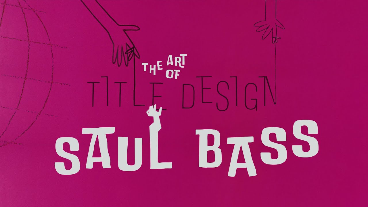
Saul Bass is an American graphic designer and filmmaker known for motion picture title sequences and corporate logos. Born in 1920 in the Bronx, he died in 1996.
Design Philosophy & Style
Bass revolutionized film title design by treating opening credits as narrative elements. His minimalist design approach distilled complex ideas into simple, memorable images.
He introduced kinetic typography to cinema, making letters dynamic participants in storytelling. This philosophy extended to corporate work where symbols needed immediate recognition.
Notable Works & Projects
Film titles: “The Man with the Golden Arm” (1955), “North by Northwest” (1959), “Psycho” (1960), “Goodfellas” (1990), “Casino” (1995).
Corporate identities: AT&T Bell logo (1969), Continental Airlines jetstream logo (1968), United Airlines tulip logo (1974), Warner Bros “Big W” logo (1972).
Awards & Recognition
Academy Award for “Why Man Creates” (1968), Student Academy Award design for Motion Picture Academy, numerous design industry honors, documentaries about his work including retrospectives.
Influence & Legacy
Modern title sequences trace directly to his innovations. Television series like “Mad Men” and “Westworld” use his techniques. Film directors including Martin Scorsese sought his collaboration throughout their careers.
Corporate logo longevity averages 34 years for Bass designs. Many identities remained unchanged until company mergers rather than redesigns.
Design Techniques & Tools
Mastered paper cut-out animation techniques for film work. Applied geometric shapes systematically in logo construction.
Used focal point creation through visual hierarchy in both static and motion graphics. Preferred bold, simple sans-serif font selections.
Milton Glaser

Milton Glaser is an American graphic designer and illustrator known for the “I ♥ NY” logo and psychedelic poster art. Born in 1929 in the Bronx, he died in 2020.
Design Philosophy & Style
Glaser rejected Swiss design orthodoxy in favor of eclectic, decorative approaches. His work drew from Art Nouveau, Islamic art, Renaissance painting, and popular culture simultaneously.
He believed design should communicate warmth and humanity rather than cold perfection. This philosophy influenced the postmodern design movement significantly.
Notable Works & Projects
“I ♥ NY” logo (1977), Bob Dylan poster with psychedelic hair (1966), DC Comics bullet logo, Brooklyn Brewery identity, numerous magazine covers and editorial designs.
Co-founded Push Pin Studios (1954) and New York magazine (1968). Created over 400 posters throughout his career spanning multiple decades.
Awards & Recognition
National Medal of Arts (2009, first graphic designer), Cooper Hewitt Lifetime Achievement Award (2004), exhibitions at MoMA, Centre Pompidou Paris, Victoria and Albert Museum London.
Influence & Legacy
Push Pin Studios influenced global graphic design through its rejection of modernist constraints. Students and followers created more expressive, personal design approaches worldwide.
The “I ♥ NY” concept spawned countless imitations globally. His educational philosophy at School of Visual Arts shaped design pedagogy.
Design Techniques & Tools
Mastered hand-drawn illustration combined with typography elements. Used vibrant color psychology applications strategically.
Applied historical style references through pairing fonts with illustration. Created mood board processes for concept development.
Massimo Vignelli

Massimo Vignelli is an Italian-American designer known for modernist corporate identities and systematic design approaches. Born in 1931 in Milan, he died in 2014.
Design Philosophy & Style
Vignelli advocated radical simplicity through systematic grid systems application. His modernist philosophy emphasized timeless design over trendy aesthetics.
He limited typeface selections to Helvetica, Garamond, Bodoni, and Century Expanded, believing too many fonts created visual pollution. This disciplined approach became foundational to corporate design.
Notable Works & Projects
American Airlines logo (1967), New York City subway signage system (1972), Knoll International identity, Bloomingdale’s branding, Washington Metro visual identity development.
Furniture design including Heller stackable dinnerware, lighting fixtures, architectural projects. Published “The Vignelli Canon” as design education resource.
Awards & Recognition
Presidential Design Award (1985) from Ronald Reagan, National Lifetime Achievement Award Cooper-Hewitt (2003), numerous honorary doctorates, permanent collections in major design museums.
Influence & Legacy
Popularized Helvetica typeface usage across American corporate design. Established systematic corporate identity methodologies still used today.
His subway signage remains New York City standard. Students worldwide study his grid-based layout principles and minimalist design philosophy.
Design Techniques & Tools
Mastered grid systems for all layout applications. Used white space strategically to create visual clarity and emphasis.
Applied color theory through limited palettes. Preferred sans-serif font selections for maximum readability and timeless appeal.
David Carson

David Carson is an American graphic designer known for experimental typography and deconstructed layouts. Born in 1955, he revolutionized magazine design in the 1990s.
Design Philosophy & Style
Carson rejected traditional graphic design principles in favor of intuitive, expressive approaches. His work prioritized emotional communication over legibility, challenging established design conventions.
He embraced Grunge design aesthetics and experimental typography manipulation. This philosophy influenced digital design and alternative culture communications.
Notable Works & Projects
Ray Gun magazine art direction (1992-1995), Beach Culture magazine, Pepsi advertisements, Nike campaigns, MTV graphics, numerous experimental poster designs.
Book publications including “The End of Print” and “2nd Sight.” Corporate work for major brands seeking edgy, youth-oriented visual communication.
Awards & Recognition
AIGA awards, Art Directors Club recognition, international design competition honors, exhibitions in design museums worldwide, influential design book publications.
Influence & Legacy
Inspired generation of designers to break modernist rules. His experimental approaches influenced web design development and digital motion graphics.
Music industry graphics, alternative magazine design, and youth-oriented branding trace back to his innovations. Design schools worldwide study his boundary-pushing methods.
Design Techniques & Tools
Deconstructed typography elements through layering and distortion. Used asymmetry deliberately to create dynamic compositions.
Applied photographic manipulation with text integration. Preferred experimental font combinations over systematic approaches.
Stefan Sagmeister

Stefan Sagmeister is an Austrian-American graphic designer known for provocative poster design and experimental approaches. Born in 1962, he combines personal expression with commercial work.
Design Philosophy & Style
Sagmeister integrates personal experiences with client communications through storytelling approaches. His work often includes handwritten elements and unconventional materials.
He takes sabbatical years for creative exploration, believing design requires constant renewal. This philosophy challenges traditional client-designer relationships and creative processes.
Notable Works & Projects
Album covers for Lou Reed, Talking Heads, and The Rolling Stones. Poster designs using unconventional materials including skin, food, and architectural elements.
“Happy Show” exhibitions exploring design’s relationship to happiness. Typography installations in public spaces combining typography with architecture.
Awards & Recognition
Grammy nominations for album package design, AIGA Gold Medal, Art Directors Club awards, museum exhibitions worldwide, TED talks on design philosophy.
Influence & Legacy
Encouraged designers to incorporate personal expression in commercial work. His sabbatical philosophy influenced design studio management and creative sustainability discussions.
Students worldwide adopt his experimental methods for combining typography with unconventional media and materials.
Design Techniques & Tools
Hand-lettered typography combined with photographic experimentation. Uses mood board processes extensively for concept development.
Applied color psychology through emotional association. Prefers experimental approaches over systematic grid systems.
Paula Scher

Paula Scher is an American graphic designer known for expressive typography and cultural institution branding. Born in 1948, she joined Pentagram as a partner in 1991.
Design Philosophy & Style
Scher combines systematic design thinking with intuitive creative expression. Her approach emphasizes cultural context and audience engagement through visual hierarchy creation.
She advocates for design solutions that reflect institutional personality rather than generic modernist approaches. This philosophy influenced cultural branding and public space design.
Notable Works & Projects
Public Theater identity featuring bold typography treatments, Brooklyn Academy of Music branding, High Line park signage, Metropolitan Opera identity development.
Poster design for theatrical productions, hand-painted typographic maps, numerous corporate identity programs for cultural institutions.
Awards & Recognition
AIGA Medal, Art Directors Club Hall of Fame, Cooper Hewitt National Design Award, numerous design competition honors, museum exhibitions of personal work.
Influence & Legacy
Established Pentagram’s cultural sector expertise. Her theatrical poster approach influenced poster design globally.
Students study her integration of systematic design with expressive typography. Cultural institutions worldwide reference her branding methodologies.
Design Techniques & Tools
Hand-painted typography combined with systematic layout principles. Uses scale and proportion dramatically for impact.
Applied color psychology through cultural association. Prefers expressive typeface selections over minimalist approaches.
Pentagram Design Collective

Pentagram is a design consultancy founded in 1972, known for collaborative partnership structure and influential design work across multiple disciplines.
Design Philosophy & Style
Pentagram operates through independent partners who collaborate on major projects. Each partner maintains individual creative identity while contributing to collective expertise and resources.
The firm emphasizes long-term client relationships and systematic design thinking. This approach combines individual creativity with organizational consistency and brand guidelines development.
Notable Works & Projects
Michael Bierut’s work includes Hillary Clinton 2016 campaign identity, MIT Media Lab branding. Paula Scher’s cultural institution work spans decades.
Corporate identities for major brands, book design, architectural graphics, digital interface design. Partners regularly speak at design conferences worldwide.
Awards & Recognition
Numerous AIGA awards, Design Museum London recognition, Art Directors Club honors, international design competition victories, permanent museum collections.
Influence & Legacy
Established partnership model adopted by design consultancies globally. Partners’ individual work influences specific design specializations while collective maintains broad cultural impact.
Design education includes Pentagram case studies across multiple disciplines. The firm’s systematic approaches appear in brand style guide development worldwide.
Design Techniques & Tools
Partners use diverse approaches from minimalist design to experimental typography. Systematic grid systems combined with expressive solutions.
Applied color theory varies by partner specialty. Collaborative processes integrate multiple design perspectives and technical expertise.
Jessica Hische

Jessica Hische is an American lettering artist and graphic designer known for custom typography and web design advocacy. Born in 1984, she represents contemporary design entrepreneurship.
Design Philosophy & Style
Hische specializes in hand-lettered typography that combines traditional craftsmanship with contemporary applications. Her work emphasizes personality and warmth in digital communications.
She advocates for design education and professional development through online resources. This philosophy influences how contemporary designers build careers and share knowledge.
Notable Works & Projects
Book cover lettering for major publishers, web design projects, custom typeface development, brand identity work combining lettering with systematic design.
Educational resources including “Daily Drop Cap” project, speaking engagements, online typography courses. Personal projects that explore typography history and technique.
Awards & Recognition
AIGA awards, Type Directors Club recognition, Art Directors Club honors, design competition victories, influential social media presence in design community.
Influence & Legacy
Inspired renaissance in hand-lettering among digital designers. Her educational advocacy influences how designers share knowledge and build communities online.
Students worldwide study her techniques for combining traditional and digital methods. The intersection of craftsmanship and technology appears in contemporary design education.
Design Techniques & Tools
Hand-lettered typography digitized for various applications. Uses color palette selection strategically for project personality.
Applied traditional lettering techniques with contemporary design principles. Prefers custom solutions over existing font selections for distinctive results.
Aaron Draplin

Aaron Draplin is an American graphic designer known for bold, simplified design and entrepreneurial advocacy. Born in 1973, he represents blue-collar design philosophy and practical creativity.
Design Philosophy & Style
Draplin emphasizes thick lines, bold shapes, and limited color palette selections in his work. His approach combines modernist simplification with American vernacular design references.
He advocates for design accessibility and entrepreneurial independence. This philosophy influences how designers price work, interact with clients, and build sustainable creative businesses.
Notable Works & Projects
Field Notes brand identity and ongoing collaboration, Nike subsidiary work, numerous logo designs for small businesses, speaking engagements at design conferences worldwide.
Book publication “Pretty Much Everything” documenting design process and business philosophy. Workshop leadership and design education advocacy through speaking.
Awards & Recognition
AIGA recognition, design community awards, successful entrepreneurial ventures, influential design conference presentations, strong social media following in design community.
Influence & Legacy
Inspired designers to embrace simplified approaches and entrepreneurial thinking. His advocacy influences design pricing, client relations, and creative business development.
Students study his systematic approach to logo design principles and brand development. American design education includes his business philosophy perspectives.
Design Techniques & Tools
Bold geometric shapes with limited color palette applications. Uses contrast strategically for immediate recognition.
Applied symmetry and balance principles systematically. Prefers sans-serif font selections for clarity and impact.
Erik Spiekermann
Erik Spiekermann is a German typographer and graphic designer known for typeface design and systematic typography approaches. Born in 1947, he founded multiple design firms and type foundries.
Design Philosophy & Style
Spiekermann emphasizes readability and systematic typography application in all design work. His approach combines historical typography knowledge with contemporary communication needs.
He advocates for design accessibility and clear communication over stylistic trends. This philosophy influences European design education and professional practice standards.
Notable Works & Projects
FF Meta typeface development, Berlin Transit system identity, numerous corporate typography systems, founding FontShop and UnitedDesigners firms.
Book publications on typography and design practice, conference speaking, design education through workshops and lectures worldwide.
Awards & Recognition
Type Directors Club Medal, AIGA recognition, international design awards, honorary doctorates, influential publications in typography and design fields.
Influence & Legacy
Established systematic approaches to corporate typography that influenced global design practice. His typefaces appear in major branding worldwide.
Students study his integration of historical typography knowledge with contemporary applications. Design firms worldwide reference his systematic methodologies.
Design Techniques & Tools
Systematic typography application with careful attention to kerning, leading, and tracking. Uses grid systems rigorously.
Applied color theory through systematic palette development. Prefers carefully tested typeface combinations over experimental approaches.
Herb Lubalin

Herb Lubalin is an American typographer known for expressive typography and radical magazine design. Born in 1918, died in 1981.
Design Philosophy & Style
Lubalin pioneered typographic expressionism, transforming letters into illustrative elements. His approach combined playful experimentalism with functional communication, rejecting International Style constraints.
He treated typography elements as visual images rather than mere text. This philosophy created distinctive typographic hierarchy through letterspacing manipulation.
Notable Works & Projects
Avant Garde magazine logo and typeface (1970), “Mother & Child” nameplate, Eros magazine design, Fact magazine layouts, U&lc publication for International Typeface Corporation.
ITC Avant Garde Gothic, Lubalin Graph, ITC Serif Gothic font designs. World Trade Center trademark, Sprite identity work.
Awards & Recognition
Over 500 design prizes, AIGA Gold Medal, Art Directors Club Hall of Fame, Type Directors Club Medal, Cooper Union teaching position, international exhibition participations.
Influence & Legacy
Founded International Typeface Corporation with Aaron Burns. Influenced postmodern design through experimental approaches.
Students worldwide study his letter-as-image philosophy. The Herb Lubalin Study Center preserves his work and design methodology for contemporary reference.
Design Techniques & Tools
Hand-lettered typography with photocomposition technology integration. Mastered ligature creation and tight letterspacing for distinctive visual hierarchy.
Applied unconventional kerning and overlapping characters. Preferred sans-serif font families with geometric characteristics.
April Greiman

April Greiman is an American graphic designer known for New Wave typography and digital design pioneering. Born in 1948, she revolutionized computer graphics integration.
Design Philosophy & Style
Greiman merged European modernist training with California experimentalism. Her hybrid imagery philosophy combined traditional design with emerging digital technologies.
She rejected pure Swiss design orthodoxy, embracing layered compositions and dimensional thinking. This approach influenced postmodern design development significantly.
Notable Works & Projects
“Does It Make Sense?” Design Quarterly 133 (1986), CalArts poster with Jayme Odgers (1978), 1984 Los Angeles Olympics poster, Wet magazine designs.
Made in Space studio projects, architectural collaborations, digital motion graphics experimentation, book and publication design work.
Awards & Recognition
AIGA Gold Medal, MacWorld First Annual Mac Masters Art Competition winner, four honorary doctorates, Cooper Hewitt National Design Museum recognition, international exhibition participations.
Influence & Legacy
Pioneered computer graphics acceptance in design profession. Students study her digital integration methods and dimensional design thinking approaches.
Contemporary designers reference her transmedia philosophy across disciplines. Her teaching influenced CalArts Visual Communications program development and digital design education.
Design Techniques & Tools
Early Macintosh computer adoption with MacVision video capture systems. Combined hand-set typography with digital elements in layered compositions.
Applied experimental color palette selections with pixelation techniques. Preferred typography elements integration with photographic imagery.
Wolfgang Weingart

Wolfgang Weingart is a German-Swiss typographer known for New Wave movement development and experimental typography. Born in 1941, he challenged Swiss modernist orthodoxy.
Design Philosophy & Style
Weingart systematically deconstructed Swiss design principles while maintaining structured foundations. His typographic rebellion philosophy emphasized intuitive experimentation over rigid rules.
He believed typography could express emotion while remaining functional. This approach influenced graphic design movements toward expressive communication methods.
Notable Works & Projects
Basel School of Design experimental posters, “Swiss Punk” typography demonstrations, teaching materials for typography courses, international workshop presentations.
Experimental letterpress works, photomontage integration with type, diagonal composition studies, collage technique development for graphic applications.
Awards & Recognition
International design education recognition, Basel School teaching position (1968-1985), influential publications in Design Quarterly, worldwide workshop leadership, honorary mentions in typography histories.
Influence & Legacy
Students include April Greiman, Dan Friedman, and international New Wave practitioners. His teaching methods influenced design education globally.
Contemporary designers study his systematic rule-breaking approaches. His experimental methodologies appear in current design education curricula worldwide.
Design Techniques & Tools
Hand-composition with lead type manipulation, experimental letterpress printing techniques, photographic integration with typography elements.
Applied unconventional font spacing and diagonal text arrangements. Preferred Akzidenz-Grotesk typeface for systematic experimentation.
Jan Tschichold
Jan Tschichold is a German typographer known for “Die neue Typographie” and modernist design principles. Born in 1902, died in 1974.
Design Philosophy & Style
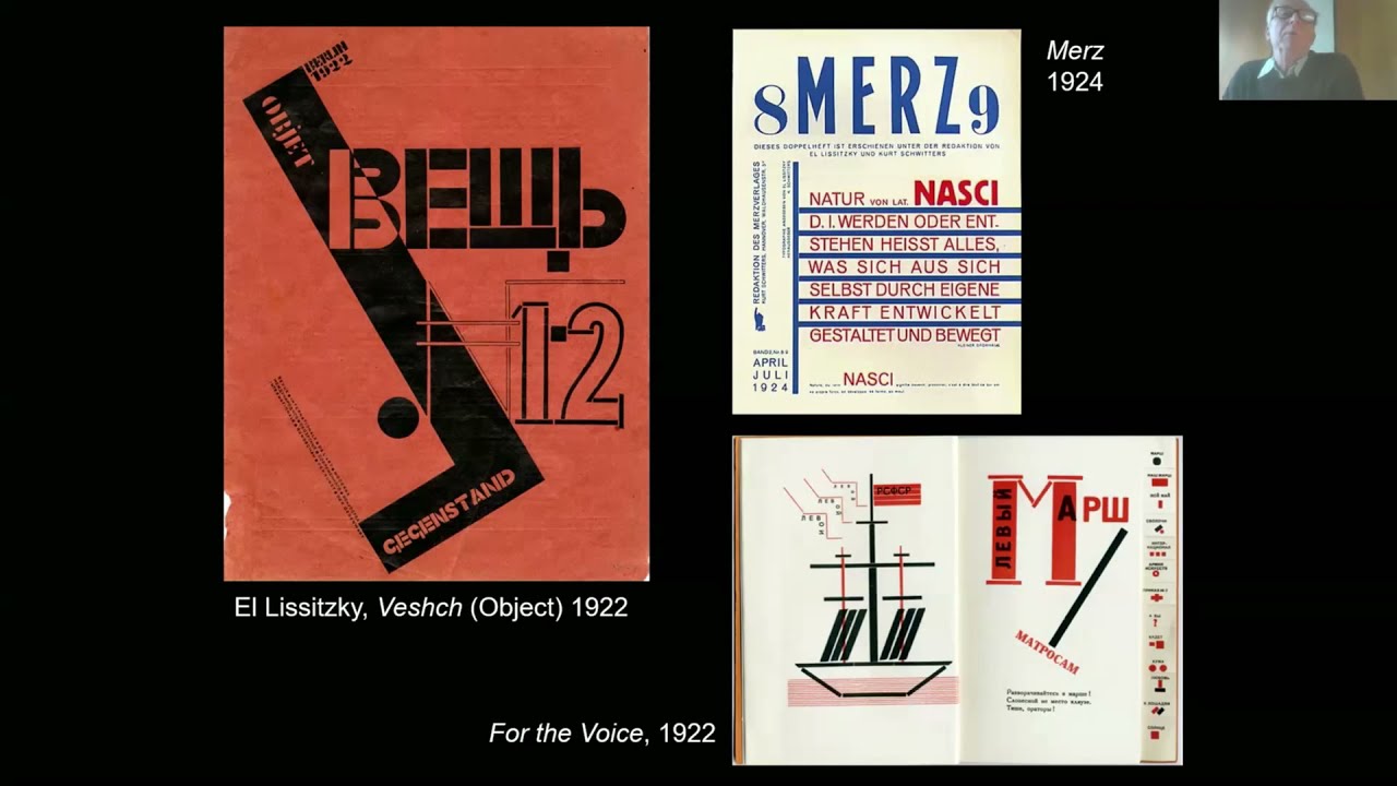
Tschichold codified modernist typography through systematic principles rejecting traditional centered layouts. His functional modernism emphasized asymmetry and sans-serif typography.
Later career showed philosophical evolution toward classical approaches, demonstrating design thinking flexibility. This transformation influenced contemporary typography debates about tradition versus innovation.
Notable Works & Projects
“Die neue Typographie” (1928), Penguin Books redesign (1947-1949), Sabon typeface development, Munich cinema posters, “Typographische Mitteilungen” contributions.
Penguin Composition Rules establishment, educational publications on typography principles, international lecture presentations, design theory writing.
Awards & Recognition
Typography history recognition, Penguin Books legacy achievement, influential publications in design literature, international design education references, permanent museum collections.
Influence & Legacy
Established foundational modernist typography principles studied globally. His systematic approaches influenced Swiss design development significantly.
Contemporary typographers reference his grid-based methodologies. Design schools teach his principles as fundamental graphic design principles knowledge.
Design Techniques & Tools
Systematic grid systems application with mathematical precision. Preferred sans-serif font selections for functional communication.
Applied strict alignment principles and visual hierarchy creation. Used photomontage integration with typography elements.
Josef Müller-Brockmann

Josef Müller-Brockmann is a Swiss graphic designer known for grid systems development and International Typographic Style leadership. Born in 1914, died in 1996.
Design Philosophy & Style
Müller-Brockmann advocated objective communication through mathematical precision and systematic organization. His constructivist methodology eliminated decorative elements in favor of functional clarity.
He believed design should communicate universally through geometric principles and structured layouts. This philosophy established Swiss design as international standard.
Notable Works & Projects
“Grid Systems in Graphic Design” publication, Tonhalle concert poster series (1950-1972), IBM corporate work, Swiss Federal Railways visual system development.
“Der Film” poster (1960), numerous exhibition designs, educational publications on design methodology, international design consultation projects.
Awards & Recognition
International design awards, Swiss design recognition, permanent museum collections, influential publications in design literature, teaching positions at major institutions.
Influence & Legacy
Established systematic grid systems as fundamental design tool. Students worldwide study his mathematical approaches to layout organization.
Contemporary designers apply his principles across digital and print design media. His systematic thinking influences current design education curricula globally.
Design Techniques & Tools
Mathematical grid systems with modular organization principles. Preferred Akzidenz-Grotesk and Helvetica typeface selections for systematic consistency.
Applied precise alignment and scale and proportion relationships. Used white space strategically for visual hierarchy creation.
Otl Aicher
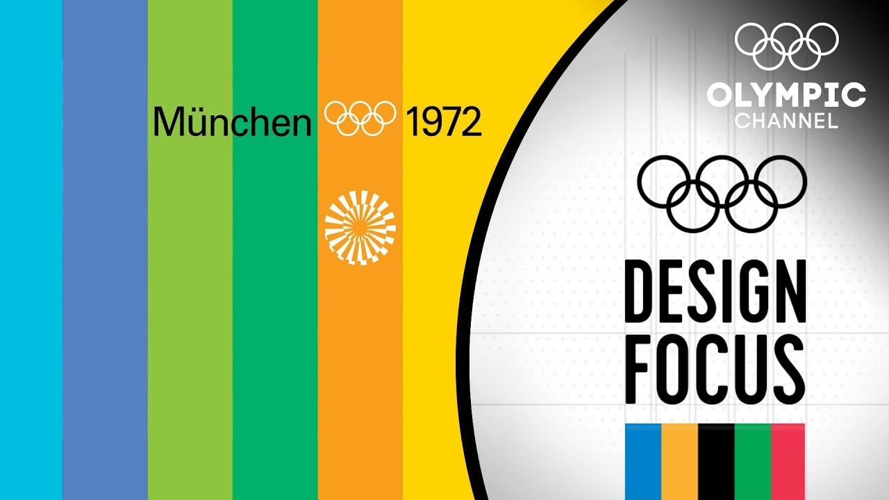
Otl Aicher is a German graphic designer known for 1972 Munich Olympics visual identity and systematic design approaches. Born in 1922, died in 1991.
Design Philosophy & Style
Aicher developed comprehensive visual identity systems through democratic design principles. His philosophy emphasized accessibility, clarity, and systematic organization across multiple applications.
He believed design should communicate without cultural barriers through universal visual language. This approach influenced corporate identity development and public information design standards.
Notable Works & Projects
1972 Munich Olympics complete visual identity, pictogram system development with Gerhard Joksch, Lufthansa corporate identity (1962), Rotis typeface family design.
Munich Airport signage systems, ERCO lighting company identity, Braun product design consultation, Frankfurt Airport wayfinding system development.
Awards & Recognition
Olympic design legacy achievement, corporate design industry recognition, international design awards, influential publications in design literature, permanent museum collections worldwide.
Influence & Legacy
Established pictogram design as universal communication tool. His systematic approaches influenced public information design and wayfinding system development globally.
Contemporary designers study his comprehensive identity methodologies. The 1972 Olympics visual system remains reference standard for major event design coordination.
Design Techniques & Tools
Systematic grid systems application across multiple media formats. Developed modular color palette systems for organizational clarity.
Applied geometric simplification for pictogram design. Preferred sans-serif font selections with systematic font spacing applications.
These pioneering designers established theoretical foundations and practical methodologies that continue influencing contemporary visual communication. Their systematic approaches to typography, layout organization, and visual hierarchy creation provide timeless frameworks for effective design solutions.
Modern designers integrate their principles with current technology while maintaining core communication values of clarity, accessibility, and systematic thinking across all design applications and cultural contexts.
FAQ on Famous Graphic Designers
Who are the most influential graphic designers in history?
Paul Rand, Milton Glaser, Saul Bass, and Massimo Vignelli lead the list of legendary designers. Their work in logo design principles, typography, and corporate identity shaped modern visual communication fundamentally.
What makes a graphic designer famous?
Creating iconic designs that transcend time and culture creates lasting fame. Designers achieve recognition through innovative visual hierarchy techniques, groundbreaking color theory applications, and developing influential graphic design principles.
Which graphic designer created the I Love NY logo?
Milton Glaser designed the iconic I ♥ NY logo in 1977. He sketched it with red crayon during a taxi ride, creating one of history’s most recognizable pieces of logo design.
Who invented the grid system in graphic design?
Josef Müller-Brockmann systematized grid systems in his influential 1981 book. His mathematical approach to layout organization became fundamental to Swiss design and modern graphic design principles.
What is Swiss design and who created it?
Swiss design emphasizes clean typography, mathematical grids, and objective communication. Pioneers like Josef Müller-Brockmann, Armin Hofmann, and Max Bill developed this minimalist design approach during the 1950s-60s.
Which designer is known for movie title sequences?
Saul Bass revolutionized film titles with kinetic typography and minimalist aesthetics. His work on “Psycho,” “North by Northwest,” and “The Man with the Golden Arm” established motion graphics as storytelling tools.
Who designed the most famous corporate logos?
Paul Rand created timeless identities for IBM, ABC, and UPS that remain largely unchanged today. His systematic approach to logo design principles influenced generations of brand identity designers worldwide.
What is New Wave typography and who started it?
Wolfgang Weingart pioneered experimental typography that challenged Swiss design orthodoxy. His students, including April Greiman, brought New Wave principles to America, influencing postmodern design development.
Which graphic designer works are in major museums?
Museum collections worldwide feature works by Paul Rand, Milton Glaser, Josef Müller-Brockmann, and Saul Bass. MoMA, Cooper Hewitt, and the Design Museum London preserve their contributions to visual hierarchy and design history.
How do I study famous graphic designers’ work?
Analyze their design methodology through books, museum exhibitions, and online archives. Study their typography choices, color palette decisions, and grid systems to understand fundamental design principles.
Conclusion
The legacy of famous graphic designers continues shaping contemporary visual culture through their pioneering contributions to design elements and systematic methodologies. Their innovations transcend historical periods, providing frameworks that remain relevant across digital and traditional media.
From experimental typography elements to systematic grid systems, these masters established fundamental approaches to visual hierarchy and communication design. Their work demonstrates how effective design balances creativity with strategic thinking.
Modern designers benefit from studying these creative visionaries who transformed graphic arts from craft to profession. Their understanding of contrast, balance, and emphasis provides timeless principles for contemporary practice.
Whether developing brand guidelines or creating poster design projects, today’s practitioners draw from these foundational design pioneers. Their collective influence ensures that clear communication and aesthetic excellence remain central to graphic design evolution across all applications and cultural contexts.

Renowned for his expertise in logo design and visual branding, Bogdan has developed a multitude of logos for various clients.
His skills extend to creating posters, vector illustrations, business cards, and brochures. Additionally, Bogdan's UI kits were featured on marketplaces like Visual Hierarchy and UI8.
He also wrote in the past years on sites like Design Your Way, WebDesignerDepot, WPDean, Designmodo, Speckyboy, Slider Revolution, and more.
- Death Note Font Generator - 26 October 2026
- 5 Best AI Presentation Makers: Tested & Compared - 26 October 2026
- Versatile Georgia Font Pairing for Timeless Layouts - 24 October 2026

Bogdan Sandu is a seasoned designer who has been designing websites since 2008. Renowned for his expertise in logo design and visual branding, Bogdan has developed a multitude of logos for various clients. His skills extend to creating posters, vector illustrations, business cards, and brochures. Additionally, Bogdan's UI kits were featured on marketplaces like Visual Hierarchy and UI8. He also wrote in the past years on sites like Design Your Way, WebDesignerDepot, WPDean, Designmodo, Speckyboy, Slider Revolution, and more.
You Might Also Like