The Electronic Arts logo is one of the most recognized marks in the gaming industry. It represents decades of brand evolution for a company that started in 1982 and grew into one of the biggest video game publishers on the planet. EA’s visual identity has been through roughly seven major redesigns, each one reflecting where the company was headed at the time.
The current version, introduced in 2020, features a coral red circle with a white “EA” monogram alongside a clean sans-serif wordmark. Barry Deutsch of Steinhilber Deutsch & Gard designed the original 1982 mark. Trip Hawkins founded the company that same year after leaving Apple, and the logo has been reimagined at least seven times since then.
What Is the Electronic Arts Logo?
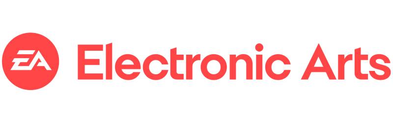
The Electronic Arts logo is a combination mark featuring a stylized “EA” monogram inside a circular badge, paired with the full company name in a custom typeface. Officially updated in 2020, the current version was built on the monogram first introduced in 2000 by Rod Swanson, Corey Higgins, and Thomas Hallgren of Pittard Sullivan. It symbolizes innovation, connectivity, and the global reach of EA’s gaming brands.
Design Type: Combination mark (monogram plus wordmark)
Primary Elements: A stylized “EA” monogram set inside a solid circle, with the full “Electronic Arts” name to the right. The letter “E” is built from two parallel horizontal lines connected by an angled stroke. The “A” connects to the lower portion of the “E,” making both letters feel like a single fluid shape.
Official Introduction Date: The current version launched in 2020, though the “EA” monogram concept first appeared in 2000.
Designer/Agency: The original 1982 logo was created by Barry Deutsch of Steinhilber Deutsch & Gard. The 2000 monogram was developed by Rod Swanson (creative head of EA Sports), Corey Higgins (senior designer, EA Corporate), and Thomas Hallgren of Pittard Sullivan. The 2020 custom typeface, Electronic Arts Display, was created by MCKL, a type foundry run by Jeremy Mickel.
Trademark Status: The EA logo and monogram are registered trademarks of Electronic Arts Inc., protected under U.S. and international trademark law.
Color Palette: The primary version uses coral red (Hex: #f05556, Pantone PMS 178 C) with white. Monochrome black-and-white versions are also widely used.
Usage Context: The logo appears across game packaging, digital storefronts, in-game splash screens, marketing campaigns, merchandise, the EA app (formerly Origin), and all corporate communications.
How Has the Electronic Arts Logo Evolved Over Time?
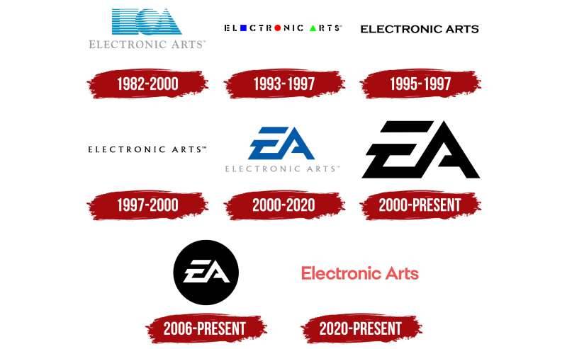
The Electronic Arts logo has gone through about seven distinct versions since 1982. It started as an abstract geometric design, moved through wordmark-only phases, and eventually settled on the “EA” monogram that most people know today.
Each change tracked closely with where the company was in its growth. The shifts weren’t random.
Original Electronic Arts Logo (1982-1993)
Years Active: 1982 to 1993
Barry Deutsch designed the first logo. It featured three geometric shapes, a square, a circle, and a triangle, rendered in segmented blue and white lines. The company name “ELECTRONIC ARTS” appeared below in grey, set in Goudy Old Style.
The square was meant to represent an “E.” The triangle stood for “A.” The circle? That one caused a lot of debate. Some people thought it was the “O” from “Electronic.” Others claimed it represented global ambition. There’s even a story that it was a glitch in the computer program that kept placing the circle there, and the team just kept it.
The blue color scheme connected to ideas about technology, communication, and mental processes. It fit the era. EA was positioning itself as a company that treated game developers like artists, and the logo had that slightly academic, slightly artsy feel to it.
Revised Shapes Logo (1993-1997)
Years Active: 1993 to 1997
This version turned things up. The pale blue and grey were replaced with vivid blue, bright red, green, and black. The three shapes got smaller and were directly integrated into the wordmark itself.
The blue square replaced the letter “E.” The red circle replaced the “O.” The green triangle replaced the “A.” So if you read the wordmark carefully, you could actually decode the shapes for the first time. The font shifted to something resembling stencil lettering with broken, interrupted lines.
This redesign was about making the brand bolder. EA was growing fast through the 90s, absorbing studios and pushing into console gaming. The logo needed to reflect that energy.
Serif Wordmark Logo (1997-2000)
Years Active: 1997 to 2000
EA stripped everything back. No shapes. No color. Just “ELECTRONIC ARTS” in black uppercase letters on a white background, using a classic serif typeface similar to Albertus. The elongated serifs on the letter bars were the only decorative touch.
It looked sophisticated. Almost corporate. The geometric playfulness was gone, replaced by something that said “we’re a serious company now.” This version lasted only about three years, but the wordmark actually stuck around as a secondary element until 2020.
EA Monogram Logo (2000-2006)
Years Active: 2000 to 2006
This is where the modern EA identity really started. Rod Swanson and Corey Higgins adapted the “EA” mark from EA Sports into a standalone monogram for the entire company. Thomas Hallgren of Pittard Sullivan helped finalize it.
The full company name disappeared from the primary mark. Instead, two letters, “E” and “A,” were locked together in a bold geometric style. The “E” was built from two thick parallel stripes. The “A” connected at the lower angle, creating what looked like one continuous letterform.
Black and white versions were common. A blue variation also appeared, with the full “Electronic Arts” name in light grey underneath. This was also when EA launched sub-brand labels like EA Games and EA Sports with their own derivative logos.
Circle Monogram Logo (2006-2020)
Years Active: 2006 to 2020
The monogram was placed inside a solid circle. White letters on a black circular background. Same typeface, same letter structure, but the circular frame changed the whole feel.
It felt more contained. More confident. The circle added unity and made the mark work better at small sizes, which mattered more and more as digital platforms became the primary way people interacted with games. This version became deeply associated with EA’s biggest franchises: FIFA, Madden, Battlefield, The Sims.
Some game-specific variations appeared during this era. The Sims games featured a green-tinted version with a Plumbob above it. Battlefield editions used silver or military-styled treatments. But the core circle monogram stayed consistent.
Current Electronic Arts Logo (2020-Present)
Years Active: 2020 to present
The 2020 redesign kept the monogram but changed just about everything else around it. The black circle became coral red. The “EA” letters stayed white inside. And for the first time in two decades, the full “Electronic Arts” name returned as part of the primary lockup.
The wordmark uses Electronic Arts Display, a custom sans-serif typeface designed by Jeremy Mickel of MCKL in Los Angeles. It’s clean, geometric, and modern. The coral red (Hex: #f05556) was a surprising choice for the gaming industry, where blue and dark colors dominate most competitor brands.
Monochrome black-and-white versions are still in use too. The flexibility was clearly intentional, letting the mark adapt across game packaging, digital platforms, and corporate materials without losing recognition.
What Do the Design Elements of the Electronic Arts Logo Mean?
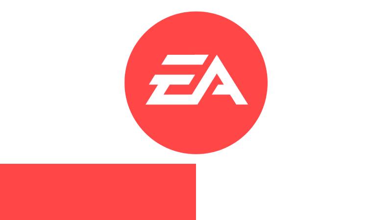
Every part of the EA logo carries some level of intent. The monogram condenses the brand into two interlocked letters. The circle creates a sense of completeness.
And the coral red? That was a deliberate break from gaming industry norms.
Why Did Electronic Arts Choose These Specific Colors?
The original 1982 logo used blue because it connected to technology and communication. That made sense for a company launching during the early home computer boom.
The 1993 update brought in vivid blue, red, and green. Each shape got its own color, and the contrast against the black wordmark was much stronger. It reflected a bolder, more aggressive EA.
Then came the monochrome era. From 2000 to 2020, most versions of the logo were black and white. That’s a classic monochrome approach, and it worked because the mark needed to function everywhere, from game discs to app icons to promotional materials.
The 2020 switch to coral red (#f05556, RGB: 240, 85, 86, CMYK: 0, 65, 64, 6) was a real curveball. Most gaming company logos lean heavily on blue, black, or green. EA picked a warm, energetic hue that sits somewhere between red and orange. It feels approachable but still stands out.
The psychological impact of coral red is interesting. Red signals excitement and energy. Orange suggests creativity and friendliness. Coral blends both, which maps well to a company that wants to be seen as both a major entertainment brand and a creative force.
What Typography Style Is Used in the Electronic Arts Logo?
The “EA” monogram uses a custom geometric letterform that’s unique to the brand. The “E” is constructed from two thick parallel horizontal bars joined by an angular connector. The “A” flows directly from the lower portion of the “E,” and its crossbar has a slanted cut that doesn’t quite reach the left leg.
For the wordmark, EA currently uses Electronic Arts Display. It was designed by Jeremy Mickel of MCKL, a Los Angeles type foundry. It’s a geometric sans-serif with clean lines and good readability at all sizes.
Before 2020, the wordmark used Albertus, designed by Berthold Wolpe. Earlier versions used fonts similar to Copperplate FS Bold and Goudy Old Style. The letter spacing has varied quite a bit across eras, from tight stencil-style kerning in the 90s to the more open, breathing spacing in the current mark.
What Are the Hidden Meanings in the Electronic Arts Logo?
The way the “E” and “A” lock together isn’t accidental. They read as a single unit, not two separate letters. That’s supposed to suggest connection and flow, qualities EA wants associated with its gaming experiences.
The circle has been part of EA’s identity since 1982, when the original logo included a sphere alongside the square and triangle. Those three shapes were described by Barry Deutsch as representing the “basic alphabet of graphic design.” The circle specifically has been interpreted as global reach, inclusion, and wholeness.
There’s also the matter of the negative space inside the monogram. The angular cuts and gaps between the letter strokes create small triangular voids that echo the original triangle shape from the 1982 logo. Whether that’s deliberate or just a happy accident, it creates a subtle link back to the brand’s origins.
How Does the Electronic Arts Logo Compare to Competitor Logos?

Most major gaming publishers lean toward cooler tones. Activision Blizzard used deep blues and metallic silvers. The Unity Software logo is a dark, angular mark. Roblox uses a bold red, but in a very different style with its tilted wordmark.
EA’s coral red sets it apart visually. It’s warmer and less aggressive than the typical dark palette used by companies like Corsair or Paradox Interactive.
The monogram approach is also distinctive. While most competitors use full wordmarks or abstract symbols, EA’s interlocked “E” and “A” inside a circle is compact and highly recognizable at small sizes. That matters a lot in today’s app-icon-driven landscape. Among other video game logos, EA’s stands out for its clarity and adaptability.
Bandai Namco uses a bright orange and red circular mark. Nexon goes for a clean blue wordmark. Playtika leans into playful typography. EA sits somewhere in the middle: geometric, modern, but not cold.
What Are the Technical Specifications of the Electronic Arts Logo?
Official Color Codes:
Primary Color: Coral Red Hex: #f05556 RGB: (240, 85, 86) CMYK: (0, 65, 64, 6) Pantone: PMS 178 C
Secondary Color: White Hex: #FFFFFF RGB: (255, 255, 255) CMYK: (0, 0, 0, 0)
Tertiary Color: Black Hex: #000000 RGB: (0, 0, 0) CMYK: (0, 0, 0, 100)
Dimensions and Proportions:
The monogram sits inside a perfect circle. When used with the wordmark, the circle anchors the left side while “Electronic Arts” extends to the right in a horizontal lockup. EA’s brand guidelines specify minimum clear space around the logo, typically equal to the height of the “E” in the wordmark. Minimum reproduction size guidelines apply to prevent the monogram from becoming illegible at very small sizes.
The logo is distributed as vector graphics (SVG, EPS, AI) for scalability and as raster formats (PNG, JPEG) for web and digital use. At high DPI settings, the angular cuts of the monogram stay sharp and legible.
What Cultural Impact Has the Electronic Arts Logo Had?
The EA logo is recognizable to hundreds of millions of gamers worldwide. It appears before almost every major EA title, often with game-specific animation and sound design. For many players, that spinning circle with the “EA” letters is the first thing they see when booting up a game.
That kind of repeated exposure builds deep brand association. The logo has been parodied, referenced in memes (especially during controversies around loot boxes and microtransactions), and turned into fan art countless times. Love it or not, people know it instantly.
Its appearance in motion graphics across game intros has given it a life beyond static branding. The animated versions, complete with sound effects, have become part of gaming culture themselves.
How Does the Electronic Arts Logo Fit Into the Overall Brand Identity?
The EA logo is the anchor of a larger brand system that includes sub-brands like EA Sports, EA Originals, and the EA app. Each sub-brand uses its own variation of the monogram, but they all share the same foundational geometry and structure.
EA Sports, for example, keeps the “EA” monogram but adds “SPORTS” in EA Sans Bold beneath it, usually inside its own circular treatment. EA Originals softens the presentation for indie-style titles while still using the core mark.
The brand style guide ties everything together through consistent typography, color palette usage, and clear visual hierarchy rules. The coral red, black, and white palette carries across all EA touchpoints, from web design to packaging to in-game menus.
How Should the Electronic Arts Logo Be Used?
EA has strict guidelines around logo usage. The monogram should never be distorted, recolored outside approved palettes, or placed on visually cluttered backgrounds. Clear space requirements exist to make sure the mark always has room to breathe.
The coral red version is preferred for most consumer-facing uses. Black-and-white versions are approved for contexts where color reproduction isn’t possible or where a more neutral presentation is needed.
Official logo files can be accessed through EA’s press portal and media kits. Unauthorized use of the EA monogram or wordmark for commercial purposes is prohibited under trademark law. The mark is registered in the United States and internationally, and EA actively enforces its trademark rights.
For media, press, and partners, EA provides specific approved lockups and file formats. If you’re working on anything that involves the EA logo, always pull directly from their official resources rather than grabbing something off a search engine. The wrong version, wrong color, or wrong proportion can get flagged fast.
FAQ on The Electronic Arts Logo
What does the Electronic Arts logo look like?
The current EA logo features a stylized “EA” monogram inside a coral red circle. The full “Electronic Arts” name sits beside it in a custom sans-serif font. Black-and-white versions also exist for different uses across digital platforms and print.
Who designed the original Electronic Arts logo?
Barry Deutsch of Steinhilber Deutsch & Gard created the first logo in 1982. It had three geometric shapes: a square, circle, and triangle made of segmented blue lines.
Those shapes were meant to represent the basic building blocks of graphic design.
How many times has the EA logo changed?
The EA logo has gone through roughly seven major redesigns since 1982. Changes happened in 1993, 1995, 1997, 2000, 2006, and 2020. Each version reflected shifts in the company’s brand identity and the gaming industry overall.
What font is used in the Electronic Arts logo?
The current wordmark uses Electronic Arts Display, a custom typeface designed by Jeremy Mickel of MCKL. Earlier versions used Albertus and fonts resembling Copperplate FS Bold.
The monogram itself is a fully custom letterform, not based on any existing font family.
What do the colors in the EA logo mean?
The coral red (Hex: #f05556) signals energy and creativity. It breaks from the darker tones most tech company logos use.
White adds clarity. The color combination keeps things flexible across game packaging, apps, and marketing materials.
What do the shapes in the original EA logo represent?
The square stood for “E,” the triangle for “A.” The circle’s meaning was debated for years. Some said it was the “O” in Electronic. Others believed it symbolized global ambition.
There’s even a story about it being a computer program glitch that the team decided to keep.
Is the EA logo trademarked?
Yes. The EA monogram and wordmark are registered trademarks of Electronic Arts Inc. They’re protected in the United States and internationally. Unauthorized commercial use can result in legal action from the company.
What is the EA monogram?
The EA monogram locks the letters “E” and “A” into one connected shape. The “E” is two parallel horizontal bars joined by an angle. The “A” flows from the lower part, reading as a single continuous form inside a circle.
Why did Electronic Arts change its logo in 2020?
The 2020 redesign brought back the full company name and introduced coral red. EA wanted a fresher, more approachable look.
The previous black-and-white version had been in use for nearly 14 years. The update gave the brand a more modern and distinctive presence across digital platforms.
Where can I download the official Electronic Arts logo?
Official logo files are available through EA’s press portal and media kits. Always use approved vector formats for accuracy. Grabbing random files from image search results will often give you outdated or incorrect versions of the mark.
Conclusion
The Electronic Arts logo has moved from abstract geometric shapes to one of the most recognized marks in interactive entertainment. Seven redesigns across four decades, and the core idea still holds: keep it simple, keep it readable, make it work everywhere.
The 2020 coral red update gave EA a distinct edge among game logos that mostly stick to darker tones. That was a smart call.
From Trip Hawkins’ original vision to the custom EA monogram sitting inside app icons today, the brand’s visual identity tracks the full arc of the gaming industry. Few logo designs in this space have aged this well while still feeling current.

Renowned for his expertise in logo design and visual branding, Bogdan has developed a multitude of logos for various clients.
His skills extend to creating posters, vector illustrations, business cards, and brochures. Additionally, Bogdan's UI kits were featured on marketplaces like Visual Hierarchy and UI8.
He also wrote in the past years on sites like Design Your Way, WebDesignerDepot, WPDean, Designmodo, Speckyboy, Slider Revolution, and more.
- Jujutsu Kaisen Font Generator - 12 October 2026
- The Windsurf Logo History, Colors, Font, And Meaning - 10 October 2026
- How to Remove Background From Product Photos (No Photoshop) - 10 October 2026

Bogdan Sandu is a seasoned designer who has been designing websites since 2008. Renowned for his expertise in logo design and visual branding, Bogdan has developed a multitude of logos for various clients. His skills extend to creating posters, vector illustrations, business cards, and brochures. Additionally, Bogdan's UI kits were featured on marketplaces like Visual Hierarchy and UI8. He also wrote in the past years on sites like Design Your Way, WebDesignerDepot, WPDean, Designmodo, Speckyboy, Slider Revolution, and more.
You Might Also Like