


The Nexon logo is the corporate mark of Nexon Co., Ltd., one of the biggest online game publishers in the world. Founded in Seoul, South Korea in 1994 by Kim Jung-ju and Jake Song, the company built its reputation through hit titles like MapleStory, Dungeon Fighter Online, and KartRider. The logo has gone through multiple redesigns since the company’s founding, with the current version featuring a geometric icon alongside a custom wordmark.
As a brand symbol, the Nexon logo sits alongside other major gaming company logos as a recognizable mark in the global digital entertainment space. Nexon now operates from headquarters in Tokyo, Japan (since 2005), and maintains offices across Asia, North America, and Europe. The logo has seen at least three major iterations over its 30+ year history.
What Is the Nexon Logo?
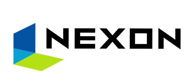
The Nexon logo is a combination mark featuring a geometric “door” icon composed of a dark blue trapezoid, a cyan triangle, and a lime green rhombus, paired with a custom sans-serif wordmark. Introduced in its current form around 2009 (with further refinements circa 2016), the logo represents digital connection and gaming community.
Here are the key attributes of the Nexon logo:
- Design Type: Combination mark (geometric icon + wordmark)
- Primary Elements: A geometric “door” shape made from three colored forms (trapezoid, triangle, rhombus) positioned above or beside the NEXON wordmark
- Official Introduction Date: The geometric icon first appeared around 2003 for on-screen use. The current refined version dates to approximately 2009, with a further update around 2016
- Designer/Agency: Developed in-house by Nexon’s corporate team. The specific designer is not publicly credited
- Trademark Status: Registered with the USPTO under Registration Number 4225959, filed March 4, 2009 and registered October 16, 2012, owned by NXC Corporation
- Color Palette: Dark blue (#002B5C approximate), cyan/turquoise blue (#64E3E4), lime green (#A9D22E approximate), and black (#090A0C) for the wordmark
- Usage Context: Game launchers, splash screens, official websites, mobile apps, esports events, press materials, merchandise, and corporate communications across all Nexon subsidiaries
How Has the Nexon Logo Evolved Over Time?
The Nexon logo has changed significantly from a simple text-based wordmark in 1994 to the geometric combination mark used today.
Each redesign matched a shift in the company’s growth and market positioning. The transition from pure wordmark to icon-plus-text reflected Nexon’s expansion from a small Korean startup to a global gaming giant.
Original Nexon Wordmark (1994-2003)
- Years Active: 1994-2003
- Design Description: A straightforward text-only wordmark. Simple typography without any accompanying icon or graphic symbol. The company did not use an on-screen logo during this period
- Color Scheme: Basic black text on white backgrounds
- Designer: Not publicly documented
- Context: Nexon was still a young company at this stage, primarily operating in the South Korean market with titles like Nexus: The Kingdom of the Winds. Branding was minimal
- Key Changes from Previous: This was the first Nexon logo, so no prior version existed
- Cultural Significance: Represented the earliest days of Korean online gaming, when visual branding took a back seat to game development
Geometric Door Icon Introduction (2003-2009)
- Years Active: 2003-2009
- Design Description: The first version to include the geometric “door” icon. A black trapezoid, cyan triangle, and lime green rhombus formed a door-like shape. The NEXON wordmark appeared below the icon in a bold, angular sans-serif font
- Color Scheme: Black (trapezoid), cyan blue (triangle), lime green (rhombus), with black wordmark text
- Designer: Nexon internal team
- Context: MapleStory launched in 2003, becoming a massive hit. This logo appeared on game splash screens as Nexon started building international awareness
- Key Changes from Previous: Addition of the geometric icon. Shift from text-only to a combination mark
- Cultural Significance: The door shape became a beloved symbol among MapleStory and KartRider players. Many gamers still associate that chime sound with this version of the logo
Refined Geometric Logo (2009-Present)
- Years Active: 2009-present (with further refinements around 2016)
- Design Description: The trapezoid shifted from black to dark blue. The overall forms became cleaner and more polished. The wordmark was updated with refined letterforms. Around 2016, further adjustments were made to support global branding consistency, including interconnected circular elements in some applications
- Color Scheme: Dark blue (trapezoid), cyan/turquoise (#64E3E4), lime green (rhombus), black wordmark
- Designer: Nexon corporate design team
- Context: Nexon moved its headquarters to Tokyo in 2005. By 2009, the company was expanding into North American and European markets. The refined logo matched this international push. A 30th anniversary variant was used throughout 2024
- Key Changes from Previous: Trapezoid color changed from black to dark blue. Overall design became more saturated and refined. The wordmark received a subtle update for better readability across digital platforms
- Cultural Significance: This version of the mark is now recognized globally. It appears across 80+ game titles and anchors one of Asia’s largest gaming brands
What Do the Design Elements of the Nexon Logo Mean?

The Nexon logo’s geometric “door” shape represents an entry point into gaming worlds. It is a visual shorthand for the idea of stepping into new digital experiences.
The three distinct shapes, a trapezoid, triangle, and rhombus, fit together to create a unified form that suggests openness and possibility.
Why Did Nexon Choose These Specific Colors?
The Nexon color palette is built around three core colors, each with a specific role.
Dark Blue (approximately #002B5C). This is the anchor color. Blue builds trust and signals reliability, which matters a lot when you’re asking millions of players to invest time and money into your platform. There’s a reason so many tech company logos lean on blue. It works.
Cyan/Turquoise Blue (#64E3E4, RGB: 100, 227, 228). The lighter blue adds energy and a digital feel. It keeps the palette from feeling too corporate and injects a sense of fun that fits a gaming brand.
Lime Green (approximately #A9D22E). Green brings a sense of growth, freshness, and approachability. In the context of the Nexon logo, the green rhombus adds visual variety and breaks up the blue tones. The psychological effect of color in branding plays a big part here.
Black (#090A0C, CMYK: 25, 17, 0, 95). Used for the wordmark. It grounds the entire design and provides maximum contrast for readability.
What Typography Style Is Used in the Nexon Logo?

Nexon uses a custom typeface called NEXON Lv.1 Gothic for its branding. The company also developed a broader font family called NEXON SANS, which comes in Regular, Italic, Hollow, and Reversed styles.
Both are geometric sans-serif fonts built for readability across screens. The letterforms are clean, wide, and slightly rounded. They hold up well at small sizes on mobile screens and game interfaces, which is exactly what you need for a company running 80+ titles.
These fonts are available for free use with some restrictions on modification and redistribution.
What Are the Hidden Meanings in the Nexon Logo?
The “door” shape is the most discussed element. It’s not accidental. Nexon’s early identity centered around the idea of opening a door to new experiences, literally a portal into gaming worlds.
The three separate geometric pieces fitting together as one form can also be read as a nod to how different games, communities, and platforms come together under one company. Whether that reading was intentional from the start or grew over time is hard to say. But it fits.
During the 30th anniversary celebration in 2024, Nexon leaned into the door concept by having an animated character walk through the shape, confirming the “entry point” reading was always part of the plan.
How Does the Nexon Logo Compare to Competitor Logos?

Most gaming publishers lean toward either dark, aggressive branding or bright, playful marks. Nexon sits somewhere in between, which is actually a smart position.
Look at other publishers in the space. The Electronic Arts logo uses a clean, minimal circle mark. Bandai Namco’s logo goes full color with a rounded, friendly approach. The Playtika logo targets the casual gaming crowd with softer forms. And then you’ve got the Paradox Interactive logo, which keeps things dark and minimal for the strategy gaming audience.
Nexon’s geometric door icon stands out because it carries a specific visual concept (the “door” idea) while still reading as clean and modern. Many competitor logos are purely abstract or just wordmarks. The Unity Software logo, for example, focuses entirely on a cube shape to represent its 3D engine, while the Roblox logo leans on its blocky, playful aesthetic.
Where Nexon differs most is in its use of a three-color icon. Most video game logos stick to one or two colors. The blue-cyan-green combination gives Nexon a unique fingerprint in the lineup.
What Are the Technical Specifications of the Nexon Logo?
Official Color Codes
- Primary Color: Dark Blue – Hex: #002B5C (approximate), RGB: (0, 43, 92), used for the trapezoid element
- Secondary Color: Turquoise Blue – Hex: #64E3E4, RGB: (100, 227, 228), CMYK: (56, 0, 0, 11), used for the triangle element
- Accent Color: Lime Green – Hex: #A9D22E (approximate), RGB: (169, 210, 46), used for the rhombus element
- Wordmark Color: Black – Hex: #090A0C, RGB: (9, 10, 12), CMYK: (25, 17, 0, 95)
- Background: White/Polar – Hex: #F6FAFD, RGB: (246, 250, 253), CMYK: (3, 1, 0, 1)
Dimensions and Proportions
The Nexon logo uses a stacked layout (icon above wordmark) and a horizontal layout (icon beside wordmark), depending on the application. The brand style guide maintained at brand.nexon.com specifies clear space requirements around the mark.
Minimum size requirements exist to make sure the geometric details of the icon stay readable at small scales. The logo is distributed as vector graphics (SVG format) for scalability, plus rasterized PNG versions for web and social media use.
Clear space around the logo is typically defined by the height of the icon or a portion of the wordmark, preventing other elements from crowding the mark.
What Cultural Impact Has the Nexon Logo Had?
For millions of MapleStory players, that little geometric door shape is burned into memory. Took about 2 seconds on a splash screen, followed by a synth chime. That’s all it needed.
The logo became a cultural touchpoint for an entire generation of online gamers in South Korea and across Asia. Kids who grew up playing Nexon games in the 2000s now associate that icon with nostalgia on par with seeing a classic Nintendo or Sega logo.
Nexon celebrated its 30th anniversary in 2024, and the commemorative materials leaned heavily on the geometric door icon. The company’s animated anniversary trailer featured a character literally traversing games from Nexus: The Kingdom of the Winds through to The First Descendant, all framed within the logo shape. That kind of retrospective only works when the logo itself carries cultural weight.
How Does the Nexon Logo Fit Into the Overall Brand Identity?
The Nexon logo is the anchor of a broader identity system that covers subsidiaries like Nexon Korea, Nexon Japan, and Nexon America. Each subsidiary may carry the parent logo alongside its own materials, creating a clear corporate hierarchy.
Individual game titles like MapleStory, KartRider, and Dungeon Fighter Online all have their own distinct logos, but the Nexon mark appears at launch as an endorsement. It acts as a quality stamp. Players know the parent brand, and that recognition carries trust.
The brand guidelines at brand.nexon.com define how the corporate mark interacts with game-specific branding. The system covers color usage, spacing, co-branding rules, and platform-specific adaptations for mobile, PC, and console.
Nexon’s identity also extends into custom fonts (NEXON Lv.1 Gothic and NEXON SANS), merchandise standards, and event branding for esports and press conferences. Everything ties back to that geometric icon as the focal point of the visual system.
How Should the Nexon Logo Be Used?
Nexon treats its logo as protected intellectual property and enforces strict usage standards.
Do’s:
- Use the official logo files from Nexon’s press kit or corporate communications channel
- Maintain the required clear space around the mark
- Use the approved color versions (full color, white, or black) as specified for each background
- Follow minimum size guidelines to keep the icon legible
Don’ts:
- Don’t stretch, rotate, or distort the logo
- Don’t alter the colors or rearrange the geometric elements
- Don’t place the logo on busy backgrounds without proper contrast
- Don’t use outdated versions of the logo for current materials
Accessing Official Logo Files: Press and media partners can obtain approved logo assets through Nexon’s corporate website and press kit. The brand identity portal at brand.nexon.com provides guidelines and resources.
Licensing: The NEXON trademark is registered under USPTO Registration Number 4225959 and is owned by NXC Corporation. Unauthorized use of the logo, wordmark, or associated brand elements violates intellectual property laws. Contact Nexon’s legal department for any licensing inquiries. Nexon’s terms of service state clearly that no rights to their trademarks or logos are granted without prior written consent.
FAQ on The Nexon Logo
What does the Nexon logo look like?
The Nexon logo features a geometric “door” icon made from a dark blue trapezoid, cyan triangle, and lime green rhombus. Below or beside the icon sits the NEXON wordmark in a custom sans-serif typeface. It is a combination mark.
When was the Nexon logo first introduced?
Nexon Corporation was founded in 1994 in Seoul, South Korea. The company used a simple text wordmark until 2003, when the geometric door icon first appeared on game splash screens.
The current refined version dates to around 2009.
Who designed the Nexon logo?
The Nexon logo design was created by the company’s in-house corporate team. No individual designer has been publicly credited. The internal approach gave Nexon direct control over its brand identity and visual direction across global markets.
What font is used in the Nexon logo?
Nexon uses a custom font called NEXON Lv.1 Gothic. The company also developed NEXON SANS with various spacing styles including Regular, Italic, Hollow, and Reversed. Both are geometric sans-serif designs built for screen readability.
What colors are in the Nexon logo?
The logo uses dark blue, turquoise (#64E3E4), lime green, and black (#090A0C). Blue signals trust and tech reliability. Green adds freshness.
Black anchors the wordmark. The complementary color choices create strong visual separation between elements.
What does the Nexon logo symbolize?
The geometric “door” shape represents an entry point into gaming worlds. The three interlocking pieces (trapezoid, triangle, rhombus) suggest community and connection under one gaming brand.
Nexon confirmed this reading during its 30th anniversary celebration in 2024.
Can I download the Nexon logo for free?
Official Nexon logo files are available through the company’s press kit and the brand portal at brand.nexon.com. The NEXON trademark is registered under USPTO Number 4225959. Unauthorized use without written consent from Nexon violates intellectual property law.
How has the Nexon logo changed over the years?
The Nexon logo evolution spans three major phases. A plain wordmark from 1994 to 2003. Then the geometric door icon appeared in 2003.
In 2009, the trapezoid shifted from black to dark blue. Further refinements came around 2016 for global consistency.
Is the Nexon logo trademarked?
Yes. The NEXON mark is registered with the United States Patent and Trademark Office, owned by NXC Corporation. It was filed in March 2009 and registered in October 2012. Nexon actively protects its logo and associated brand marks worldwide.
How does the Nexon logo compare to other game publisher logos?
Most game publishers use single-color abstract marks or plain wordmarks. Nexon stands out with its three-color geometric icon carrying a specific concept.
Compared to peers like EA or Rovio Entertainment, Nexon’s approach is more structured and symbol-driven.
Conclusion
The Nexon logo has come a long way from a plain wordmark to a globally recognized gaming symbol. Three decades of refinement turned a simple text mark into a geometric icon that millions of MapleStory and Dungeon Fighter Online players know on sight.
Its three-color system and door-shaped emblem give Nexon a distinct identity among major game logos. Few publishers in the free-to-play space have managed that kind of visual consistency across 80+ titles.
Whether you are studying Korean gaming company branding or building your own corporate mark, Nexon’s approach to logo design shows what happens when a company treats its visual identity as seriously as its game development. The logo works because it means something.

Renowned for his expertise in logo design and visual branding, Bogdan has developed a multitude of logos for various clients.
His skills extend to creating posters, vector illustrations, business cards, and brochures. Additionally, Bogdan's UI kits were featured on marketplaces like Visual Hierarchy and UI8.
He also wrote in the past years on sites like Design Your Way, WebDesignerDepot, WPDean, Designmodo, Speckyboy, Slider Revolution, and more.
- Jujutsu Kaisen Font Generator - 12 October 2026
- The Windsurf Logo History, Colors, Font, And Meaning - 10 October 2026
- How to Remove Background From Product Photos (No Photoshop) - 10 October 2026

Bogdan Sandu is a seasoned designer who has been designing websites since 2008. Renowned for his expertise in logo design and visual branding, Bogdan has developed a multitude of logos for various clients. His skills extend to creating posters, vector illustrations, business cards, and brochures. Additionally, Bogdan's UI kits were featured on marketplaces like Visual Hierarchy and UI8. He also wrote in the past years on sites like Design Your Way, WebDesignerDepot, WPDean, Designmodo, Speckyboy, Slider Revolution, and more.
You Might Also Like


