The Playtika logo is one of those marks that had to grow up fast. Founded in 2010 in Herzliya, Israel, the company went from a small social casino startup to a multi-billion-dollar gaming giant in just a few years. And the logo? It had to keep pace with all of that.
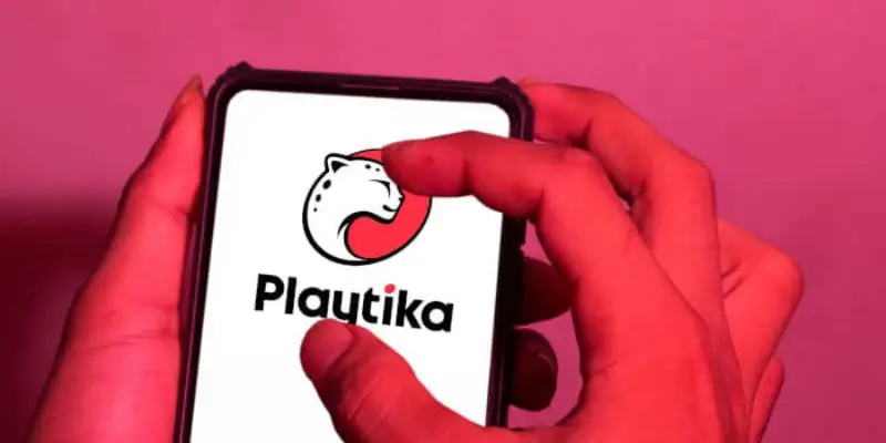
What makes it interesting is the cheetah. Not many gaming companies lead with an animal symbol, but Playtika made the cheetah a core part of its identity from the very beginning. The current version, introduced during the company’s 2020 rebrand, pairs a simplified cheetah icon inside a tilted ellipse with clean, modern typography. The whole thing sits on a palette of red, black, and white. It looks sharp at any size, which matters when you’re running games played by over 35 million people monthly.
The brand has been through roughly three major visual phases since its founding. Each one reflects where Playtika was as a business at that point. From scrappy startup energy to a NASDAQ-listed corporation with 18 global offices, the logo tells that story whether you realize it or not.
What Is the Playtika Logo?
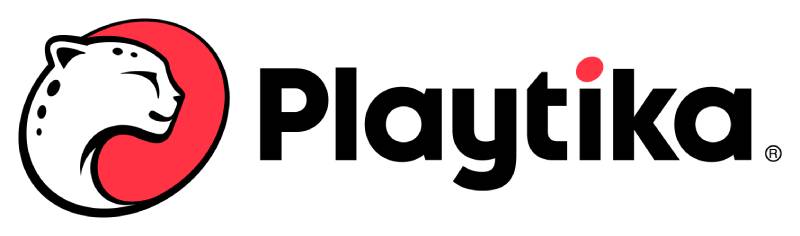
The Playtika logo is a combination mark featuring a stylized cheetah icon enclosed in a tilted ellipse, paired with the “Playtika” wordmark set in Codec Pro, a modern sans-serif font. Introduced in its current form in 2020, the design was led by Styles+Partners and Deloitte Digital. It represents speed, playfulness, and forward movement.
Here are the key attributes of the current Playtika logo:
- Design Type: Combination mark (icon + wordmark)
- Primary Elements: Cheetah symbol inside a tilted ellipse, custom wordmark
- Official Introduction Date: July 2020 (current version)
- Designer/Agency: Styles+Partners (London) and Deloitte Digital / Awesome TLV (Tel Aviv)
- Trademark Status: Registered trademark. The cheetah icon alone uses the TM symbol when displayed without the full wordmark
- Color Palette: Red (#C8102E approximate), Black (#000000), White (#FFFFFF), with an expanded secondary palette for studio-level branding
- Usage Context: Mobile game interfaces, app store listings, corporate communications, marketing materials, employee branding, merchandise, and social media platforms
How Has the Playtika Logo Evolved Over Time?

The Playtika logo has gone through three main phases since the company’s founding in 2010. Each version matched the company’s stage of growth, moving from a startup sketch to a polished corporate identity system built for a global gaming portfolio.
The shifts weren’t just cosmetic. They reflected real business changes, from Caesars Entertainment’s acquisition to a Chinese consortium buyout to a NASDAQ IPO.
Original Playtika Logo (2010-2014)
- Years Active: 2010-2014
- Design Description: The first cheetah symbol and logotype were drawn by one of Playtika’s earliest employees. It had a rough, startup quality to it. Think heavy gradients, three-dimensional effects, and the kind of glossy look that was everywhere in early 2010s tech branding.
- Color Scheme: Dark tones with metallic and gradient effects
- Designer: An early Playtika employee (name undisclosed)
- Context: Playtika had just launched and was building its first social casino games. The logo needed to feel exciting and game-like. Caesars Interactive Entertainment acquired the company in 2011, but the original mark stuck around for a few more years.
- Cultural Significance: It established the cheetah as Playtika’s mascot, a symbol that employees became deeply attached to over time
Playtika Group Identity (2014-2020)
- Years Active: 2014-2020
- Design Description: Playtika debuted a refined corporate identity at the Casual Connect trade show in San Francisco in July 2014. The cheetah remained but got cleaner. The wordmark was tightened up. Robert Antokol, CEO and founder, described the rebrand as a way to integrate multiple acquired studios (Buffalo Studios, Pacific Interactive, and others) under one unified name.
- Color Scheme: Red and black with white accents
- Designer: Internal team with external support
- Key Changes from Previous: Less reliance on gradients, more structured layout, better readability at smaller sizes
- Context: Playtika’s game portfolio had grown to include Slotomania, Bingo Blitz, House of Fun, and World Series of Poker. By 2016, a Chinese consortium acquired the company for $4.4 billion. The brand had to look credible at that scale.
- Cultural Significance: This version carried Playtika through its most aggressive acquisition phase, adding studios like Wooga, Jelly Button, and Seriously
Current Playtika Logo (2020-Present)
- Years Active: 2020-present
- Design Description: A full rebrand led by Styles+Partners (London) and Deloitte Digital’s Awesome TLV studio. The cheetah was redrawn from scratch. It sits inside a tilted ellipse inspired by the cheetah’s spots, suggesting motion and energy. The wordmark uses Codec Pro, a clean typeface with slightly rounded characteristics. Animated versions add wavy, playful motion to the letters.
- Color Scheme: Red, black, and white as primary colors, plus an expanded palette for individual gaming studios
- Designer: Styles+Partners and Deloitte Digital (Awesome TLV), with Nir Korczak (CMO) directing the project
- Key Changes from Previous: Completely redrawn cheetah with more dynamic posture, tilted ellipse replacing static circular framing, new “fun meter” design system for balancing corporate and playful tones, studio-specific cheetah textures
- Context: Playtika had grown to over 2,000 employees across 18 locations worldwide. Many joined through acquisitions and didn’t fully connect with the brand. The rebrand, anchored by the motto “Infinite Ways to Play,” aimed to unify everyone under one identity. The company went public on NASDAQ (PLTK) in January 2021, just months after the rebrand.
- Cultural Significance: This version represents Playtika’s transition from a collection of independent studios into a cohesive entertainment company with a clear brand story
What Do the Design Elements of the Playtika Logo Mean?
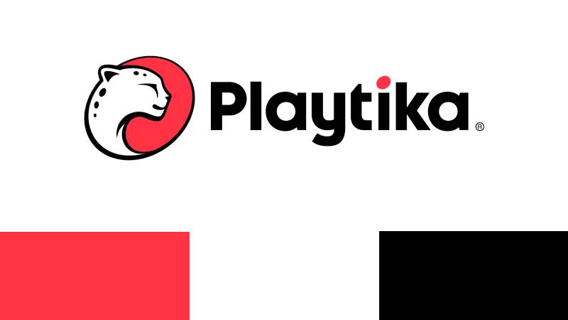
Every piece of the Playtika logo was chosen to communicate speed, play, and trust. The cheetah represents fast-paced entertainment. The tilted ellipse adds a sense of forward motion.
And the clean wordmark keeps things professional enough for investor presentations while still feeling approachable to casual gamers.
The rounded letterforms in the wordmark reduce the corporate stiffness that you see in a lot of tech company logos. That was intentional.
Why Did Playtika Choose These Specific Colors?
Red is the dominant brand color. It brings energy and draws attention, which matters for a company competing in crowded app stores.
According to color psychology, red triggers excitement and urgency. Perfect for gaming.
Black adds authority and sophistication to the brand identity. It grounds the red and prevents it from feeling too loud or cheap. You see a lot of black in logos across the entertainment industry for exactly this reason.
White provides clarity and breathing room. It keeps the logo legible on dark backgrounds and in small app icons.
Here are the primary color codes:
- Red: Hex: #C8102E (approximate), RGB: (200, 16, 46), CMYK: (0, 92, 77, 22)
- Black: Hex: #000000, RGB: (0, 0, 0), CMYK: (0, 0, 0, 100)
- White: Hex: #FFFFFF, RGB: (255, 255, 255), CMYK: (0, 0, 0, 0)
The 2020 rebrand also expanded the color palette beyond red and black. Individual gaming studios within Playtika can now use additional colors to represent their own creative identity, all within the master brand system.
What Typography Style Is Used in the Playtika Logo?
The Playtika logo uses Codec Pro, a geometric sans-serif font with soft, rounded edges. It’s used consistently across all English-language branding.
The letterforms feel modern without being cold. That slight roundness in the characters is what separates it from more rigid corporate typography choices.
Animated versions of the wordmark include wavy elements running through the letters, giving everything a sense of constant movement. Which, honestly, fits a company that never seems to stop acquiring new studios.
What Are the Hidden Meanings in the Playtika Logo?
The tilted ellipse surrounding the cheetah isn’t just a frame. It was inspired by the cheetah’s spots, according to the Deloitte Digital team that worked on the rebrand.
The tilt itself communicates forward momentum. When the previous logo featured a more static, upright circle, the new angled version suggests the company is moving, not sitting still.
Each Playtika studio can create its own cheetah texture using the brand’s color palette, which is a subtle way of saying “we’re all different, but we’re all part of the same pack.” It’s not a hidden meaning exactly, but it’s a design detail most people miss.
How Does the Playtika Logo Compare to Competitor Logos?
Most gaming company logos fall into one of two camps: abstract symbols or stylized wordmarks. Playtika does something different by combining both with an animal mascot.
Compare it to Electronic Arts, which uses a simple circular monogram. Or Zynga, which leans hard on its dog mascot but in a much more cartoonish way. Playtika’s cheetah sits somewhere in between, stylized enough to feel corporate but distinctive enough to be memorable.
Nexon keeps things clean with a straightforward wordmark. Aristocrat, another competitor in the social casino space, uses a more traditional approach. Playtika’s tilted ellipse and dynamic cheetah give it more personality than most in the category.
The Sciplay logo is worth mentioning too, since Sciplay was actually spun off from Scientific Games and competes directly with Playtika in social casino. Its branding is simpler and less distinctive.
Where Playtika really stands out is in its design system. The “fun meter” concept that Deloitte Digital created allows the brand to dial up or down the playfulness depending on context. Corporate investor deck? More restrained. Internal employee event? Full color, full fun. Not many competitors have that kind of built-in flexibility.
What Are the Technical Specifications of the Playtika Logo?
Official Color Codes
- Primary Color: Red – Hex: #C8102E, RGB: (200, 16, 46), CMYK: (0, 92, 77, 22)
- Secondary Color: Black – Hex: #000000, RGB: (0, 0, 0), CMYK: (0, 0, 0, 100)
- Accent Color: White – Hex: #FFFFFF, RGB: (255, 255, 255), CMYK: (0, 0, 0, 0)
Dimensions and Proportions
- Aspect Ratio: The logo is available in both horizontal and vertical (stacked) configurations
- Clear Space: When using the vertical layout, clear space should be 150% of the height of the lowercase “a” on all sides. This prevents other graphics or text from crowding the mark
- Positioning: The logo should be centered on the horizontal axis and placed slightly above center on the vertical axis
- File Formats: Available in vector formats (SVG, EPS, AI, CDR) and raster formats (PNG, JPEG) through official channels
- Usage Guidelines: The official brand guidelines cover sizing, spacing, color reproduction, and acceptable background treatments. When the cheetah icon appears without the wordmark, a TM symbol replaces the registered trademark symbol
What Cultural Impact Has the Playtika Logo Had?
Within the mobile gaming industry, the Playtika cheetah is one of the most recognized corporate mascots. It’s not on the level of, say, the Twitter bird or the Apple logo. But among people who play social casino games, it carries real weight.
The 2020 rebrand had a big internal impact too. Playtika used the new identity to pull together employees from over 15 acquisitions who didn’t always feel like they belonged to the same company. The cheetah became a unifying symbol.
Recruitment campaigns in Israel featured the new branding prominently in major cities. The company even built an internal swag store where employees could order branded merchandise, which sounds small but actually helped people connect with the new identity on a personal level.
How Does the Playtika Logo Fit Into the Overall Brand Identity?
The logo is just one piece of a larger brand system built around the idea of “Infinite Ways to Play.” The brand style guide covers everything from animated logo treatments for video ads to email signature designs.
Individual studios like Wooga, Jelly Button, and Buffalo Studios keep their own creative identities. But they all tie back to the master brand through the cheetah texture system and the shared color palette.
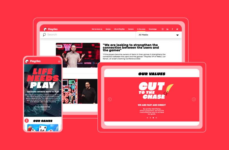
The brand voice, visual language, and motion graphics standards all connect back to the logo’s core message: play, speed, and energy. Even the web design for Playtika’s corporate site features animated details that reflect the logo’s playful DNA.
How Should the Playtika Logo Be Used?
Do’s:
- Use official logo files from Playtika’s newsroom media gallery
- Maintain the required clear space (150% of the “a” height) around the mark
- Use approved color variations: full color on white, black on white, white on dark backgrounds, white with red dot
- Keep the logo centered horizontally and slightly above vertical center when placing it in compositions
Don’ts:
- Don’t stretch, rotate, or distort the logo
- Don’t change the official colors or apply unauthorized gradients
- Don’t place the logo on busy backgrounds that reduce legibility
- Don’t separate the cheetah icon from the wordmark unless using the approved “logobit” version
- Don’t use the logo for commercial purposes without written permission from Playtika Holdings Corp
Where to access official logos: Playtika’s newsroom at news.playtika.com provides downloadable logo files in multiple formats including RGB and black versions.
Licensing: Commercial use of the Playtika logo requires explicit permission from the company. The cheetah symbol, wordmark, and combined mark are all protected intellectual property. Unauthorized use, especially in connection with gambling or gaming products, could result in trademark enforcement action.
FAQ on The Playtika Logo
What does the Playtika logo look like?
The Playtika logo is a combination mark. It features a stylized cheetah inside a tilted ellipse paired with a clean wordmark set in Codec Pro.
The primary colors are red, black, and white. The design prioritizes readability across mobile game interfaces and corporate materials.
Who designed the current Playtika logo?
Styles+Partners in London and Deloitte Digital’s Awesome TLV studio in Tel Aviv led the 2020 rebrand. CMO Nir Korczak directed the project internally.
The original cheetah symbol was drawn by one of Playtika’s first employees back in 2010.
When was the Playtika logo last updated?
The most recent redesign launched in July 2020. Playtika removed its cheetah from social media beforehand, then reintroduced the updated version as part of a full brand identity overhaul.
The company went public on NASDAQ months later in January 2021.
What font does Playtika use in its logo?
Playtika uses Codec Pro, a geometric sans-serif with slightly rounded letterforms. It appears across all English-language branding, from video title animations to app store listings.
The rounded edges keep things approachable for casual gamers.
What do the colors in the Playtika logo mean?
Red signals energy and excitement. It fits a company built on social casino games and freemium entertainment.
Black adds authority. White keeps everything legible. The 2020 rebrand also introduced an expanded color palette for individual studios.
Why does Playtika use a cheetah in its logo?
The cheetah represents speed and agility. It became a beloved part of Playtika’s culture early on and survived every rebrand since 2010.
The 2020 version was redrawn to show movement rather than a static pose. The tilted ellipse around it mimics the cheetah’s spots.
Can I download the Playtika logo for free?
Playtika offers official logo files through its newsroom media gallery at news.playtika.com. Files include RGB, black, and white versions.
Commercial use requires written permission from Playtika Holdings Corp. Unauthorized use may lead to trademark action.
What file formats is the Playtika logo available in?
Official versions come in vector formats like SVG, EPS, and AI, plus raster options like PNG. Vector files keep the logo sharp at any size.
For print projects, vector is the way to go. PNG works fine for digital use.
How does the Playtika logo compare to other gaming company logos?
Most competitors pick either a wordmark or an abstract symbol. Playtika combines both with an animal mascot, which is uncommon.
Electronic Arts uses a monogram. Zynga leans cartoonish. AppLovin keeps it minimal. Playtika’s cheetah gives it more personality than most in the mobile gaming space.
What is the meaning behind the tilted ellipse in the Playtika logo?
The tilted ellipse was inspired by the shape and psychology of the cheetah’s spots, according to the Deloitte Digital design team.
Its angle suggests forward momentum. The previous version used a static circle, which lacked that sense of energy and direction.
Conclusion
The Playtika logo has come a long way from a quick sketch by an early employee to a full-blown corporate identity system built for a NASDAQ-listed company. That kind of evolution doesn’t happen by accident.
Every detail, from the redrawn cheetah mascot to the Codec Pro typeface choices, serves the brand’s mission of delivering entertainment across its free-to-play gaming portfolio.
The 2020 rebrand gave Playtika Holdings Corp a visual hierarchy that works at every touchpoint. App icons, investor decks, recruitment campaigns. All unified.
For a company managing studios like Wooga, Seriously, and Buffalo Studios across 18 locations, that kind of brand consistency matters more than most people realize.

Renowned for his expertise in logo design and visual branding, Bogdan has developed a multitude of logos for various clients.
His skills extend to creating posters, vector illustrations, business cards, and brochures. Additionally, Bogdan's UI kits were featured on marketplaces like Visual Hierarchy and UI8.
He also wrote in the past years on sites like Design Your Way, WebDesignerDepot, WPDean, Designmodo, Speckyboy, Slider Revolution, and more.
- Jujutsu Kaisen Font Generator - 12 October 2026
- The Windsurf Logo History, Colors, Font, And Meaning - 10 October 2026
- How to Remove Background From Product Photos (No Photoshop) - 10 October 2026

Bogdan Sandu is a seasoned designer who has been designing websites since 2008. Renowned for his expertise in logo design and visual branding, Bogdan has developed a multitude of logos for various clients. His skills extend to creating posters, vector illustrations, business cards, and brochures. Additionally, Bogdan's UI kits were featured on marketplaces like Visual Hierarchy and UI8. He also wrote in the past years on sites like Design Your Way, WebDesignerDepot, WPDean, Designmodo, Speckyboy, Slider Revolution, and more.
You Might Also Like