The Corsair logo is one of those marks that PC builders recognize instantly. Three stylized sails, leaning forward like they’re catching wind. It’s been around since 1994, and honestly, it’s gone through some drama most brands never have to deal with.
Corsair Gaming, Inc. is an American hardware company that makes memory modules, power supplies, cooling systems, gaming keyboards, mice, headsets, and streaming equipment. The company started in Fremont, California, founded by Andy Paul, Don Lieberman, and John Beekley. It now trades on NASDAQ under the ticker CRSR.
The logo sits at the center of a brand identity that connects nautical heritage with high-performance PC components. “Corsair” itself comes from the Latin word “cursus,” meaning “course,” which tied the pirate reference to the idea of charting new paths in technology. The current version of the sails emblem was introduced at Computex 2015, after a controversial detour with a crossed-swords design that the community absolutely rejected. There have been roughly four distinct logo iterations since the company’s founding.
What Is the Corsair Logo?
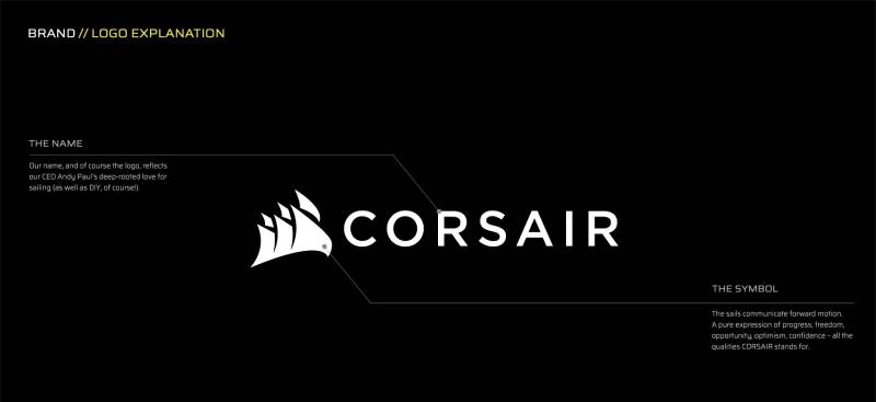
The Corsair logo is a combination mark featuring three angular, overlapping sails positioned above or beside the uppercase wordmark “CORSAIR.” It was officially reintroduced in its current form at Computex in June 2015. The sails reference the company’s pirate-inspired name and represent forward motion, precision, and performance in gaming hardware.
Extended Details:
- Design Type: Combination mark (symbol plus wordmark)
- Primary Elements: Three stylized triangular sails, overlapping and angled to suggest forward movement, paired with a bold uppercase wordmark reading “CORSAIR”
- Official Introduction Date: The current modernized sails version debuted in June 2015 at Computex Taipei
- Designer/Agency: Corsair’s in-house team handled the redesign. No external agency has been publicly credited
- Trademark Status: The logo is a registered trademark of Corsair Gaming, Inc., protected under U.S. trademark law
- Color Palette: The primary color palette uses Black (#000000) and White (#FFFFFF) as the core brand colors. An additional Corsair Blue (Pantone 3025, approximate RGB 0, 81, 114) appears on light backgrounds. Supplementary branding colors include Indigo Dye (#203F5B), Grullo (#A5A08F), and Eerie Black (#1C1C1C)
- Usage Context: The logo appears on product packaging, gaming peripherals (keyboards, mice, headsets), PC components, the iCUE software interface, esports sponsorship materials, marketing collateral, and digital platforms including social media and the company website
How Has the Corsair Logo Evolved Over Time?

The Corsair logo has been through four main phases since 1994. It started with a detailed blue sails emblem, shifted to a darker and sharper version in the mid-2000s, took a brief (and infamous) detour into crossed swords in 2014, then returned to a modernized sails design in 2015 that the company still uses today.
Original Corsair Microsystems Logo (1994-2006)
The first Corsair logo launched in 1994 when the company was still called Corsair Microsystems.
It featured a blue emblem depicting three ship’s sails arranged diagonally, overlapping each other. The sails were soft in shape, detailed, and had a more traditional maritime look.
Below the emblem sat the wordmark “CORSAIR” in all capitals, set in a bold serif typeface that looked confident and a bit classic.
The color scheme was straightforward. Deep blue for both the sails and the text, usually placed on a white or light background.
No specific external designer or agency has been publicly named. The logo reflected the company’s early identity as a DRAM memory module manufacturer, not yet a full gaming brand.
For a startup in Fremont making memory modules in the mid-90s, the pirate sails were a bold choice. Most competitors went with abstract tech symbols or plain wordmarks. Corsair picked something with personality.
Refined Sails Logo (2006-2014)
Sometime around 2006, Corsair cleaned up the original design.
The sails got sharper. Designers narrowed the right side and widened the left, creating a stronger sense of forward movement. The overall look became more angular and geometric.
The color shifted from blue to black. This was a big deal. The monochrome approach made the logo more versatile, easier to slap onto product boxes, cases, and peripherals without worrying about background clashes.
The typography changed too. The new serif font had sharper endpoints, and the letter “R” got an elongated, curved right leg that extended past the word. It gave the whole mark a bit of flair without going overboard.
This version coincided with Corsair’s expansion from memory into power supplies, cooling, and eventually gaming peripherals. The brand was growing up, and the logo reflected that.
Corsair Gaming “Swords” Logo (2014-2015)
And then things got weird.
In late 2014, Corsair launched its “Corsair Gaming” sub-brand for peripherals like the K70 RGB keyboard and H1500 headset. With it came a completely new logo: two crossed pirate swords with ornate, tribal-style detailing. The yellow color was a departure too.
The community hated it. Immediately.
People called it a “tramp stamp.” An online petition gathered nearly 8,000 signatures. Modders made YouTube videos showing how to physically remove the logo from keyboards, and those videos hit 300,000+ views. Fans photoshopped it into everything from crabs to mustache faces.
Some markets actually liked it. South America was reportedly on board. But the US and UK gaming communities were relentless.
Corsair CEO Andy Paul and PR Director Rick Allen later admitted they didn’t realize how loyal people were to the sails. “We couldn’t buy PR like that,” Paul said about the backlash. Allen’s response? “Please don’t buy any more PR like that.”
The swords logo lasted about eight months on new products before Corsair pulled the plug.
Modernized Sails Logo (2015-Present)
At Computex 2015, Corsair unveiled a refreshed sails logo and announced it would be the unified mark for the entire brand going forward. No more separate gaming sub-brand logo.
The new sails are sharper, more triangular, and more geometric than any previous version. They still lean forward, still overlap, still read as wind-filled sails. But the lines are cleaner and the shapes are tighter.
The wordmark switched to a sans-serif font, which was a first for the brand. Clean, modern, and a lot more practical for digital screens and small product labels.
Black and white are the primary colors. Corsair Blue (Pantone 3025) shows up on specific light-background applications.
This is the version that appears on everything now. Keyboards, mice, headsets, PC cases, power supplies, the iCUE software, esports events. CEO Andy Paul called it “the logo that will be our ultimate logo for everything.”
What Do the Design Elements of the Corsair Logo Mean?

Every piece of the Corsair logo ties back to the company’s name and identity. The sails represent the concept of a corsair (a privateer or pirate) moving forward with purpose. The angular shapes suggest speed and cutting-edge technology. The overall composition creates a sense of motion, connecting the brand’s nautical heritage with its position in the PC hardware market.
What Do the Sails Represent?
The three overlapping sails are the core of the entire mark. They reference corsairs, the privateers who operated under government authority during the Age of Sail.
But there’s a clever double reading. The thin, plate-like shapes of the sails also look like memory modules or circuit boards stacked together. That connection between pirate ships and computer hardware is intentional.
The forward lean of the sails creates a sense of movement. Nothing about the logo feels static. It pushes the eye forward, which aligns with Corsair’s positioning as a company that pushes performance boundaries.
Why Did Corsair Choose These Specific Colors?
The current logo primarily uses two colors, and the reasoning is pretty straightforward.
Black (#000000): Power, precision, premium quality. Black is the default for the logo on light backgrounds. In color psychology, black signals authority and sophistication. For a gaming hardware brand, it reads as serious and high-end. You see this same approach across many brands that use black in their logos.
White (#FFFFFF): Used on dark backgrounds, which is more common given that Corsair products and marketing lean toward dark themes. White provides clean contrast and keeps the logo legible across product surfaces and digital screens.
Corsair Blue (Pantone 3025, ~RGB 0, 81, 114): A dark, nautical blue that appears in specific contexts. It’s a nod to the brand’s maritime origins. The hue connects to themes of depth, trust, and reliability.
Supplementary colors include Indigo Dye (#203F5B), Grullo (#A5A08F), and Eerie Black (#1C1C1C) for extended branding materials.
What Typography Style Is Used in the Corsair Logo?
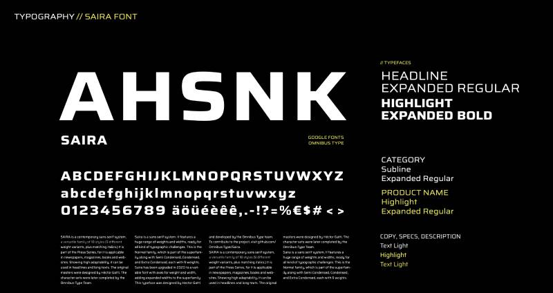
The current wordmark uses a custom font designed specifically for Corsair. It’s not available for public purchase or download.
The typeface is a clean sans-serif with strong, even strokes. Previous versions used serifs that resembled faces like Trump Mediaeval, Minion Pro Subhead Bold, and Royal Romain Bold.
The switch from serif to sans-serif in 2015 was significant. Serifs feel traditional and established. Sans-serifs feel modern and technical. For a company trying to unify its identity across gaming peripherals and PC components, the sans-serif choice made sense. It scales better on screens and at small sizes, which matters when your logo needs to look sharp on a keyboard’s spacebar.
The letter spacing is measured and even, giving the wordmark a stable foundation beneath the more dynamic sails symbol.
What Are the Hidden Meanings in the Corsair Logo?
The most discussed “hidden” element is the dual reading of the sails. They work as both nautical sails and abstracted tech components, like stacked memory modules or thin circuit boards.
The arrangement of the sails also uses perspective. Foreground elements are larger, background ones smaller. This creates depth on a flat surface and makes the mark feel three-dimensional without any gradient effects.
Some observers note that the three sails grouped together suggest the number three, which visually reinforces stability (think tripod, triangle). In shape psychology, triangular forms communicate strength and direction.
How Does the Corsair Logo Compare to Competitor Logos?
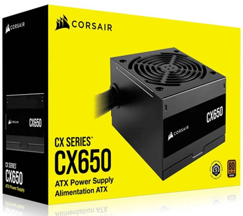
Among tech company logos, Corsair stands out by leaning into storytelling rather than abstraction. Most gaming hardware competitors use geometric shapes or aggressive lettermarks. Corsair chose a pictorial symbol with real meaning behind it, which gives the brand a different kind of personality in the space.
Look at the competition. Logitech uses a simplified “G” icon. Razer has its triple-headed snake. SteelSeries goes with a flat geometric mark. HyperX (now HyperX by HP) uses an angular “HX” monogram.
Corsair’s sails are among the most figurative marks in the group. Where Razer’s snake and Corsair’s sails both pull from nature and history, the rest lean more toward clean geometry. That figurative approach helps Corsair with brand recall. People remember a picture faster than they remember an abstract shape.
The monochrome approach is shared by most competitors though. Black-and-white logos are standard in gaming hardware because they need to work with RGB lighting, different product colors, and dark retail environments.
The logo choices of each competitor reflect different brand strategies. But Corsair’s nautical identity gives it something the others lack: a story. And a story people clearly care about, given what happened with the swords debacle.
What Are the Technical Specifications of the Corsair Logo?
Official Color Codes:
- Primary Color: Black – Hex: #000000, RGB: (0, 0, 0), CMYK: (0, 0, 0, 100)
- Primary Color: White – Hex: #FFFFFF, RGB: (255, 255, 255), CMYK: (0, 0, 0, 0)
- Accent Color: Corsair Blue – Pantone 3025, approximate RGB: (0, 81, 114)
- Extended Brand Color: Indigo Dye – Hex: #203F5B
- Extended Brand Color: Grullo – Hex: #A5A08F
- Extended Brand Color: Eerie Black – Hex: #1C1C1C
Dimensions and Proportions:
- Aspect Ratio: The logo appears in both horizontal (sails beside text) and stacked (sails above text) configurations. The horizontal version has a wider aspect ratio, roughly 3:1. The stacked version is closer to square
- Minimum Size Requirements: Corsair’s brand guidelines specify minimum reproduction sizes to keep the sails detail legible. Generally, the logo should not be reproduced smaller than about 25mm wide in print
- Clear Space: A buffer zone equal to the height of one sail element must surround the logo on all sides. No other graphics, text, or design elements should enter this zone
- File Formats: Official logos are available in vector formats (SVG, AI, EPS) and raster formats (PNG with transparency). The vector versions allow unlimited scaling without quality loss. For raster images, the DPI should be 300 or higher for print use
What Cultural Impact Has the Corsair Logo Had?
The Corsair sails logo has become one of the most recognized symbols in PC gaming culture. It’s more than a corporate mark. It shows up in custom PC builds, community forums, wallpaper collections, and esports broadcasts.
The biggest cultural moment was the 2014 swords backlash. Nearly 8,000 people signed a petition, YouTube fix-it videos hit six figures in views, and the meme content was endless. That level of community attachment to a corporate logo is unusual in any industry, let alone PC hardware.
The incident became a case study in brand loyalty and the risks of changing a beloved visual identity without community input. It proved that the sails weren’t just a logo to Corsair’s customers. They were part of how people identified with the brand and their own PC setups.
How Does the Corsair Logo Fit Into the Overall Brand Identity?
The sails logo sits at the top of Corsair’s brand system. It ties together a product lineup that spans from DRAM modules to streaming microphones, giving very different product categories a single visual thread.
Corsair’s brand style guide controls how the logo works alongside sub-brands like Vengeance, Dominator, and Elgato. Each sub-brand has its own identity, but the sails serve as the parent symbol that unifies everything.
The iCUE software ecosystem is another touchpoint. The logo appears in the app’s interface and on every compatible product, creating a consistent experience from hardware to software. RGB lighting on products can even display or highlight the sails emblem, turning the logo into an interactive part of the user experience.
Esports sponsorships extend the logo’s reach into competitive gaming events, where it appears on jerseys, stream overlays, and broadcast graphics. The mark’s simplicity and strong visual hierarchy help it hold up at any size, from a tiny keyboard badge to a massive arena banner.
How Should the Corsair Logo Be Used?
Official Usage Guidelines:
- Do: Use the logo in its approved configurations (horizontal or stacked). Maintain the required clear space around the mark. Use only the official color versions: black on light, white on dark, or Corsair Blue where specified
- Don’t: Stretch, rotate, or distort the logo. Change the colors outside of approved options. Add effects like drop shadows, outlines, or gradients. Place the logo on busy backgrounds that reduce legibility. Modify the typeface or alter the spacing between the sails and wordmark
Where to Access Official Logos:
Corsair provides official logo files through their newsroom at corsair.com/newsroom/company-logos. Press and media partners can download approved assets from this page.
Licensing Information:
The Corsair logo is proprietary. Use outside of Corsair’s authorized materials requires written permission from the company. Fan content, reviews, and editorial coverage typically fall under fair use, but commercial use without a license is not allowed.
Trademark Protection:
Corsair Gaming, Inc. holds trademark registrations for the sails logo and the CORSAIR wordmark in multiple jurisdictions. The company actively protects these marks against unauthorized commercial use, counterfeiting, and brand impersonation. Any infringement concerns should be directed to Corsair’s legal department.
FAQ on The Corsair Logo
What Does the Corsair Logo Represent?
The Corsair logo features three stylized sails that reference the brand’s pirate-inspired name. “Corsair” comes from the Latin “cursus,” meaning course. The sails symbolize forward motion and performance in gaming hardware.
The angular shapes also resemble stacked memory modules, connecting nautical heritage to PC components.
Who Designed the Current Corsair Logo?
Corsair’s in-house design team created the current sails logo. It was unveiled at Computex 2015 in Taipei. No external agency has been publicly credited.
CEO Andy Paul confirmed it would serve as the unified mark for every Corsair product going forward.
Why Did Corsair Change Its Logo in 2014?
Corsair introduced a crossed-swords logo for its new gaming peripherals division. The design was meant to feel aggressive and weapon-like. It landed badly.
Gamers compared it to a tribal tattoo. Nearly 8,000 people signed an online petition demanding the sails logo return. Corsair reversed course within months.
What Colors Are in the Official Corsair Logo?
The primary colors are Black (#000000) and White (#FFFFFF). Corsair Blue, matched to Pantone 3025, appears on light backgrounds with an approximate RGB of (0, 81, 114).
Extended brand colors include Indigo Dye (#203F5B) and Eerie Black (#1C1C1C).
What Font Does the Corsair Logo Use?
The wordmark uses a custom proprietary font not available for public download. It’s a clean sans-serif with even stroke widths.
Earlier versions used serifs resembling Trump Mediaeval and Minion Pro Subhead Bold. The 2015 redesign dropped serifs entirely for better digital readability.
How Many Times Has the Corsair Logo Changed?
There have been four main versions. The original 1994 blue sails, a refined darker version around 2006, the controversial 2014 swords mark, and the modernized sails from 2015.
The core sails concept survived every iteration except that brief swords experiment.
Where Can I Download the Official Corsair Logo?
Corsair provides official logo files through their newsroom page at corsair.com. Files are available in SVG, PNG, and other standard formats.
The assets are intended for press and media use. Commercial use without written permission from Corsair Gaming, Inc. is not allowed.
What Is the Difference Between the Old and New Corsair Logo?
The old logo had softer, rounder sails with a serif wordmark in blue. The current version has sharper, more geometric sails with a sans-serif wordmark in black.
The 2015 update made everything cleaner. It scales better across gaming peripherals, product packaging, and digital platforms.
Can I Use the Corsair Logo for My Own Content?
Editorial use for reviews and fan content generally falls under fair use. But any commercial application requires a license from Corsair.
The Corsair brand identity is trademarked. Using it on merchandise, advertisements, or products without permission risks legal action.
Why Is the Corsair Logo So Popular Among PC Gamers?
It’s recognizable, it has a story, and it showed up on products that PC enthusiasts trusted for decades. The 2014 backlash proved how much the community identified with the sails.
Few gaming company logos generate that kind of emotional loyalty from their audience.
Conclusion
The Corsair logo has proven that a strong visual mark can survive controversy, multiple redesigns, and an entire industry shift toward RGB everything. Three sails on a screen still mean something to millions of PC builders and gamers.
From Corsair Microsystems in 1994 to a publicly traded company on NASDAQ under CRSR, the brand identity held together because the community demanded it stay.
The swords experiment showed what happens when you underestimate customer loyalty to a symbol. Took me a while to appreciate how rare that kind of attachment is for a hardware company.
Whether it’s stamped on a Vengeance DDR5 kit, a K70 mechanical keyboard, or an Elgato streaming setup, the Corsair sails emblem keeps doing its job. Simple, recognizable, and built to last.

Renowned for his expertise in logo design and visual branding, Bogdan has developed a multitude of logos for various clients.
His skills extend to creating posters, vector illustrations, business cards, and brochures. Additionally, Bogdan's UI kits were featured on marketplaces like Visual Hierarchy and UI8.
He also wrote in the past years on sites like Design Your Way, WebDesignerDepot, WPDean, Designmodo, Speckyboy, Slider Revolution, and more.
- Jujutsu Kaisen Font Generator - 12 October 2026
- The Windsurf Logo History, Colors, Font, And Meaning - 10 October 2026
- How to Remove Background From Product Photos (No Photoshop) - 10 October 2026

Bogdan Sandu is a seasoned designer who has been designing websites since 2008. Renowned for his expertise in logo design and visual branding, Bogdan has developed a multitude of logos for various clients. His skills extend to creating posters, vector illustrations, business cards, and brochures. Additionally, Bogdan's UI kits were featured on marketplaces like Visual Hierarchy and UI8. He also wrote in the past years on sites like Design Your Way, WebDesignerDepot, WPDean, Designmodo, Speckyboy, Slider Revolution, and more.
You Might Also Like