

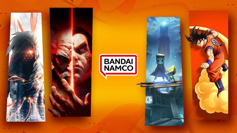
The Bandai Namco logo is one of the most recognized marks in the gaming world. It represents a company born from the 2005 merger of two Japanese giants, Bandai Co., Ltd. and Namco Limited, with the combined entity officially launching in 2006.
Within the broader history of gaming company logos, Bandai Namco’s branding stands out for how few times it has actually changed. Most publishers cycle through designs every few years. Bandai Namco kept its original look from 2006 all the way to 2022.
The current version, a red-outlined speech bubble containing the company name in black text, debuted on April 1, 2022. The company has gone through roughly three main logo iterations since its formation. Bandai Namco Holdings itself was established in September 2005, with roots tracing back to Namco’s founding in 1955 and Bandai’s founding in 1950.
What Is the Bandai Namco Logo?
The Bandai Namco logo is a combination mark featuring the words “BANDAI NAMCO” set inside a speech bubble (called “fukidashi” in Japanese) with a red border on a white background. Officially introduced on April 1, 2022, the design draws from Japanese manga culture and replaced the previous orange-red-yellow abstract emblem that had been used since 2006.
Here’s a breakdown of the key attributes:
- Design Type: Combination mark (wordmark inside a graphic element)
- Primary Elements: Speech bubble shape with rounded rectangular border, “BANDAI NAMCO” wordmark in black sans-serif font
- Official Introduction Date: April 1, 2022
- Designer/Agency: Developed internally by Bandai Namco Holdings based on research among focus groups and global staff input. The specific design agency has not been publicly named.
- Trademark Status: Registered trademark under Kabushiki Kaisha Bandai Namco Holdings, filed in August 2021 with first use in commerce dating to April 2006 for the “BANDAI NAMCO” mark
- Color Palette: Red (#E60000), Black (#000000), White (#FFFFFF)
- Usage Context: Applied across all Bandai Namco group companies, game titles, digital platforms, merchandise, marketing materials, and corporate communications. The logo first appeared in a game with Digimon Survive.
How Has the Bandai Namco Logo Evolved Over Time?
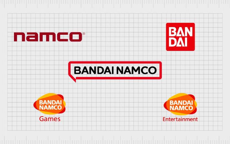
The Bandai Namco logo has gone through three distinct phases since 2006. It started with a colorful abstract blob design, shifted to the same mark with a minor text change in 2015, and then made a big jump to a simplified speech bubble in 2022.
Each version reflected where the company was headed at the time. The shifts were gradual, then sudden.
Original Bandai Namco Games Logo (2006-2014)
Years Active: 2006-2014
The first logo appeared when Namco Bandai Games Inc. officially launched on March 31, 2006. It featured an abstract shape made up of overlapping blobs in orange, red, and yellow, kind of like a sunset, with the words “BANDAI NAMCO” in white bold uppercase letters across the center.
Below the main graphic, the word “Games” sat in red, using a slightly thinner weight of the same typeface.
The warm color palette was meant to show the merger of two companies blending together. Orange and yellow brought energy and optimism. Red added passion.
The custom font used was simply called “Namco,” featuring geometric letterforms. The “A” characters had a distinctive triangular cut where the crossbar dropped to the bottom of the letter instead of sitting in the middle.
This was the era of Pac-Man Championship Edition, Tekken 6, and the first Dark Souls. Every time you booted up one of those games, that warm blob of color greeted you.
Bandai Namco Entertainment Logo (2015-2021)
Years Active: 2015-2021
In 2015, the company rebranded globally from “Bandai Namco Games” to “Bandai Namco Entertainment.” The logo stayed almost identical. The only difference? “Games” got swapped out for “Entertainment” in the same red text below the main emblem.
Same abstract blob. Same warm colors. Same Namco font. Took me a second to even notice the change when it happened, honestly.
The text swap signaled something bigger though. Bandai Namco wasn’t just a game publisher anymore. They had expanded into anime production (launching Bandai Namco Pictures as a spinoff of Sunrise Inc.), music, amusement parks, and toys. The word “Entertainment” covered all of that.
The orange color scheme remained a strong identifier during this period. You could spot a Bandai Namco product from across a store shelf just by that warm glow. It worked well at a time when many tech company logos were going flat and blue.
Current Bandai Namco Speech Bubble Logo (2022-Present)
Years Active: 2022-present
Everything changed on April 1, 2022. Bandai Namco ditched the colorful abstract design for something completely different: a white rectangle with rounded corners, bordered in red, containing “BANDAI NAMCO” in black text on a single line.
The shape is a speech bubble. Or as they call it in Japanese, “fukidashi.”
Here’s the weird part. The logo was originally announced in October 2021 with a magenta (purple-pink) border. Bandai Namco said the magenta “represents diversity” and “creates a bright and fun impression.” But somewhere between the announcement and the actual launch, the color switched to red.
The red version was quietly revealed in February 2022 during a mid-term shareholder plan. No big fanfare for the color change. It just… happened.
Fan reception was mixed. A lot of people thought the new mark looked too generic, too similar to Nintendo’s branding with its red and white simplicity. Others felt it lost the warmth and personality of the original. But it has certainly aged in well over time.
The new typography draws from manga culture, fitting for a Japanese entertainment company. The tagline “Fun for All into the Future” appears in corporate versions of the mark.
What Do the Design Elements of the Bandai Namco Logo Mean?
The current Bandai Namco logo centers on a speech bubble shape that connects to Japanese manga culture. It’s meant to represent communication, connection, and the sharing of ideas between the company and fans worldwide.
Every part of the design, from the hue of the border to the letterforms inside, was chosen with a specific purpose tied to the company’s identity and mission.
Why Did Bandai Namco Choose These Specific Colors?
The current logo uses three colors. Red (#E60000) serves as the primary border color. It signals passion, energy, and excitement, which fits an entertainment brand. Red also ties back to both predecessor companies, since Bandai’s original logo was red and white, and Namco used red accents in its branding.
Black (#000000) is used for the wordmark text. It adds a professional, grounded quality and keeps the text readable at any size. Color psychology tells us black communicates authority and strength.
White (#FFFFFF) fills the background of the speech bubble, giving the design breathing room and contrast. The move away from the previous sunset palette (oranges, yellows, reds) was deliberate. Bandai Namco wanted something cleaner and more modern.
What Typography Style Is Used in the Bandai Namco Logo?
Bandai Namco has consistently used a custom sans-serif font since 2006. The official name of the typeface is simply “Namco.” It features bold, geometric letterforms with clean lines and no decorative serifs.
The current version uses a manga-inspired update of this typeface. The characters are slightly rounded, uppercase, and evenly spaced. Tracking is generous enough that the text stays legible even when the logo is scaled down to small sizes on mobile screens or game icons.
What Are the Hidden Meanings in the Bandai Namco Logo?
The speech bubble is the obvious centerpiece, but there are layers to it. In Japanese, “fukidashi” doesn’t just mean “speech bubble.” It carries connotations of ideas bubbling up, of thoughts being shared. It’s the thing that brings characters to life in manga panels.
For Bandai Namco, the shape represents a two-way conversation with fans rather than a one-directional broadcast. The rounded rectangle form also creates a soft, approachable feeling, using shape psychology to signal friendliness. The small tail on the speech bubble points downward, grounding the design and suggesting the company “speaks” directly to its audience.
How Does the Bandai Namco Logo Compare to Competitor Logos?
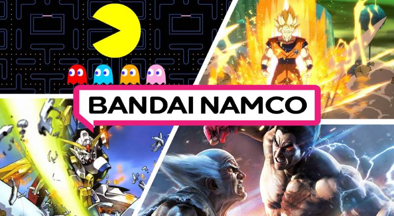
Among major Japanese game publishers, Bandai Namco’s current logo sits in an interesting spot. It went from being one of the most colorful marks in the industry to one of the most restrained.
Nintendo uses a simple red oval with white text. Sony Interactive Entertainment goes with a black wordmark. Square Enix uses a geometric emblem. Capcom has its blocky blue wordmark. Sega keeps the blue arch.
The old Bandai Namco logo was the warm outlier in that group. Nobody else was doing the abstract blob thing with sunset colors. It stood out immediately on a game shelf or boot screen.
The new speech bubble logo is cleaner, sure, but it blends in more. When people first saw it, the most common comparison was to Nintendo. Red, white, simple shape, corporate text. The similarities are hard to ignore.
Compare that to peers in the broader publisher space. The Electronic Arts logo uses a circular monogram. Unity Software’s logo relies on abstract geometry. The Paradox Interactive logo keeps things textual but adds a distinct mark. Each competitor has a different approach to standing out in an increasingly crowded video game logo landscape.
Where Bandai Namco does differ is the manga-inspired speech bubble concept. No other major publisher has tried to tie their logo to a specific cultural tradition in quite the same way.
What Are the Technical Specifications of the Bandai Namco Logo?
Official Color Codes
- Primary Color: Red
- Hex: #E60000
- RGB: (230, 0, 0)
- CMYK: (0, 100, 100, 10)
- Secondary Color: Black
- Hex: #000000
- RGB: (0, 0, 0)
- CMYK: (0, 0, 0, 100)
- Background: White
- Hex: #FFFFFF
- RGB: (255, 255, 255)
- CMYK: (0, 0, 0, 0)
- Legacy Accent: Orange (previous logo)
- Hex: #ED6D00
- RGB: (237, 109, 0)
Dimensions and Proportions
The current speech bubble logo uses a roughly rectangular aspect ratio with rounded corners. The “BANDAI NAMCO” text sits on a single horizontal line within the bubble, centered both vertically and horizontally.
The speech bubble tail extends from the bottom edge, typically off-center to the left. Clear space requirements follow standard brand guidelines practice: the logo needs a minimum buffer zone around all sides equal to approximately the height of the letter “B” in the wordmark.
For digital use, the logo needs to remain legible at small sizes, which is one reason the minimalist design approach was chosen. The bold lines and high contrast between red, black, and white keep things readable even at thumbnail scale. The logo is distributed in vector graphics formats (SVG, AI) for scalability, along with pixel-based PNG files for web and digital applications.
What Cultural Impact Has the Bandai Namco Logo Had?
The Bandai Namco logo carries weight because of what’s behind it. This is the company that publishes Pac-Man, Tekken, Dark Souls, Elden Ring, Dragon Ball Z games, and Gundam. When gamers see that mark, there’s an immediate association with specific franchises that have shaped entire genres.
The original orange blob became almost nostalgic the moment it was retired. People grew up seeing it on game boxes, boot screens, and arcade cabinets. The 2022 redesign sparked real debate in gaming communities because of that emotional attachment.
On a broader level, the speech bubble logo has become one of the more discussed examples of corporate logo simplification in the entertainment industry. It sits alongside other high-profile redesigns that moved away from detailed, colorful marks toward flat, stripped-down versions. Whether that’s progress or loss of character depends on who you ask.
How Does the Bandai Namco Logo Fit Into the Overall Brand Identity?
The logo sits at the top of a big corporate family. Bandai Namco Holdings oversees subsidiaries like Bandai Namco Entertainment (games), Bandai Namco Filmworks (anime, formerly Sunrise), Bandai Namco Amusement (arcades), and Bandai (toys). The speech bubble logo is used across all companies with “Bandai Namco” in their name.
This unified approach replaced a patchwork of different marks across divisions. Before 2022, Bandai Namco Entertainment had the orange blob, while other subsidiaries used their own designs. Now, the red speech bubble ties everything together under one brand style guide.
The tagline “Fun for All into the Future” works with the logo in corporate settings, though it’s dropped from most consumer-facing applications. The company’s mascot, Pac-Man, sometimes appears alongside the logo in promotional materials but isn’t part of the mark itself. It’s a visual hierarchy decision: the logo stands alone as the master brand, with franchise branding sitting below it.
How Should the Bandai Namco Logo Be Used?
Bandai Namco maintains strict control over its brand assets. All logo materials, including character designs, photographs, and graphics, are protected by copyright under Bandai Namco Holdings.
Here are the basics:
- Personal use only: The logo can be downloaded for non-commercial, personal purposes. One copy, one computer. That’s it.
- No modifications: You can’t reproduce, edit, or alter the logo. You can’t remove any trademark or copyright notices attached to it.
- No redistribution: Sharing modified or unmodified versions of the logo publicly, selling it, or reverse-engineering it is not permitted.
- Licensing: Commercial use of any Bandai Namco branding requires a formal licensing agreement through Bandai Namco Entertainment America Inc. (for US operations) or the appropriate regional office. Unsolicited submissions or requests outside of merchandise licensing channels are treated as per their Terms of Service.
- Trademark protections: The “BANDAI NAMCO” name and logo are registered trademarks. The company actively maintains trademark filings across multiple classes, covering computer game software, entertainment services, toys, and more.
If you need official logo files for press or editorial use, Bandai Namco typically provides them through press kits distributed to media outlets and partners. Check their official corporate site or contact their licensing portal for formal access.
FAQ on The Bandai Namco Logo
What does the Bandai Namco logo look like?
The current Bandai Namco logo features the company name in black text inside a red-bordered speech bubble on a white background. It replaced the older orange, red, and yellow abstract emblem that had been used since 2006.
When did Bandai Namco change its logo?
Bandai Namco officially switched to its current speech bubble logo on April 1, 2022. The redesign was announced in late 2021 by Bandai Namco Holdings as part of a new corporate mid-term plan and brand identity refresh.
What does the speech bubble in the Bandai Namco logo mean?
The speech bubble, called “fukidashi” in Japanese, represents connection with fans worldwide. It also ties into Japan’s manga culture.
Bandai Namco Entertainment said the shape shows their commitment to communication and creating experiences that are unique to the brand.
Who designed the Bandai Namco logo?
The specific designer or agency hasn’t been publicly named. Bandai Namco developed the logo internally based on research among focus groups and employee input from offices around the world. The logo design principles behind it focused on simplicity and global recognition.
What font does the Bandai Namco logo use?
The company uses a custom sans-serif typeface officially called “Namco.” The current version features manga-inspired letterforms. Bold, geometric, all uppercase. It has stayed consistent since 2006, with only minor refinements to the typography elements.
What are the official Bandai Namco logo colors?
The current logo uses red (#E60000), black (#000000), and white (#FFFFFF). The previous version used a warm sunset palette with oranges, yellows, and reds.
Red was chosen because it connects back to both Bandai and Namco’s original branding.
Why did Bandai Namco change its logo from orange to red?
The orange logo represented the 2005 merger of Bandai Co., Ltd. and Namco Limited. The shift to red came with a new corporate purpose focused on global fan connection. Bandai Namco wanted something cleaner that worked better across digital platforms and packaging.
Is the Bandai Namco logo trademarked?
Yes. The “BANDAI NAMCO” name and logo are registered trademarks under Kabushiki Kaisha Bandai Namco Holdings. Filings cover multiple classes including computer game software, entertainment services, and toys. First use in commerce dates to April 2006.
What games feature the Bandai Namco logo?
The logo appears on titles like Tekken, Dark Souls, Elden Ring, Pac-Man, Dragon Ball Z games, Ace Combat, SoulCalibur, and Gundam. Digimon Survive was the first game to use the current speech bubble version.
Can I use the Bandai Namco logo for my project?
Only for non-commercial, personal use. One copy on one device. Commercial use requires a formal licensing agreement through Bandai Namco Entertainment. You cannot modify, redistribute, or remove any trademark notices from the logo files.
Conclusion
The Bandai Namco logo has gone from a colorful merger symbol to a clean, manga-inspired speech bubble that works across games, toys, anime, and digital platforms. It’s a mark that carries decades of franchise recognition behind it.
Whether you’re booting up Elden Ring or picking up a Gundam model kit, that red fukidashi shape is now the consistent thread tying the whole Bandai Namco group together.
The redesign stripped away the warmth of the old gradient palette. But it gained something else: clarity at every scale and proportion.
For a Japanese entertainment company managing hundreds of IPs across global markets, that kind of brand simplicity matters more than nostalgia.

Renowned for his expertise in logo design and visual branding, Bogdan has developed a multitude of logos for various clients.
His skills extend to creating posters, vector illustrations, business cards, and brochures. Additionally, Bogdan's UI kits were featured on marketplaces like Visual Hierarchy and UI8.
He also wrote in the past years on sites like Design Your Way, WebDesignerDepot, WPDean, Designmodo, Speckyboy, Slider Revolution, and more.
- Jujutsu Kaisen Font Generator - 12 October 2026
- The Windsurf Logo History, Colors, Font, And Meaning - 10 October 2026
- How to Remove Background From Product Photos (No Photoshop) - 10 October 2026

Bogdan Sandu is a seasoned designer who has been designing websites since 2008. Renowned for his expertise in logo design and visual branding, Bogdan has developed a multitude of logos for various clients. His skills extend to creating posters, vector illustrations, business cards, and brochures. Additionally, Bogdan's UI kits were featured on marketplaces like Visual Hierarchy and UI8. He also wrote in the past years on sites like Design Your Way, WebDesignerDepot, WPDean, Designmodo, Speckyboy, Slider Revolution, and more.
You Might Also Like


