The Aristocrat logo is one of the most recognized brand marks in global gaming. It belongs to Aristocrat Leisure Limited, an Australian company that has been building slot machines and electronic gaming systems since 1953. Founded by Leonard Ainsworth in Sydney, the company grew from a small poker machine workshop into the second-largest slot manufacturer on the planet.
What makes this particular mark interesting is how it has stayed consistent through decades of change. The crown element, the bold lettering, the deep blue tones. All of it ties back to a brand that wants you to think “premium” the second you see it on a casino floor. The current version is a cleaned-up combination mark that balances a stylized crown icon with strong custom typography. It has gone through several redesigns since its debut, but the core idea has held.
Aristocrat operates in over 200 gaming jurisdictions worldwide, and their logo shows up on everything from physical slot cabinets to mobile apps. That kind of range demands a logo that works at basically any size, on any screen, under any lighting condition you can think of.
What Is the Aristocrat Logo?

The Aristocrat logo is a combination mark featuring a stylized crown symbol above bold, custom sans-serif lettering. Introduced alongside the company’s earliest poker machines in 1953 and refined multiple times since, the design uses deep blue and gold to communicate authority, trust, and premium positioning within the gaming technology sector.
Here is a breakdown of its core attributes:
- Design Type: Combination mark (crown icon paired with wordmark)
- Primary Elements: A stylized crown sitting above the “ARISTOCRAT” wordmark in bold, uppercase custom lettering. Some variations include the “Gaming” descriptor beneath the main name.
- Official Introduction Date: 1953, alongside Aristocrat’s first poker machine, “The Clubman.” The most recent significant refresh happened around 2020.
- Designer/Agency: The original mark was developed internally. The 2020 brand refresh was handled externally as part of a broader corporate identity overhaul.
- Trademark Status: Registered trademark of Aristocrat Leisure Limited. The company actively protects its intellectual property and has pursued legal action against unauthorized use.
- Color Palette: Deep blue (approximately #003DA5) as the primary brand color, with gold or metallic gold accents (#C8A951) used on premium materials. White is the standard background.
- Usage Context: Slot machine cabinets, electronic gaming terminals, casino management systems, mobile gaming apps (Heart of Vegas, Cashman Casino), corporate materials, trade show displays at events like G2E, and digital platforms across Aristocrat’s product lines including Lightning Link and Buffalo series games.
How Has the Aristocrat Logo Evolved Over Time?

The Aristocrat logo has changed several times since 1953, moving from a simple text-based poker machine label to a polished combination mark with crown symbolism. Each update reflected the company’s growth from a Sydney workshop into a global gaming technology leader, but the core identity stayed rooted in ideas of quality and authority.
Original Aristocrat Logo (1953 – 1970s)
Years Active: 1953 to late 1970s
When Len Ainsworth started manufacturing poker machines out of his father’s dental equipment factory in Rosebery, Sydney, the branding was basic. The first logo was a straightforward text treatment. Simple, functional lettering on the machine cabinet.
There was no crown icon yet. No elaborate color palette. Just the name, printed clearly enough for club patrons and RSL venue operators to read.
Color Scheme: Primarily black or dark tones on metallic machine surfaces.
Context: Poker machines had just been legalized in New South Wales. Aristocrat needed a mark for physical hardware, nothing more. The company was still small, competing locally, and selling machines to returned servicemen’s clubs.
The mark did what it needed to do. It identified the product. But it had no ambition beyond that.
Aristocrat Logo During Expansion (1980s – Mid 1990s)
Years Active: Early 1980s to mid-1990s
Aristocrat pushed into international markets during this period. Europe, New Zealand, South Africa. The machines got more complex (the company introduced the world’s first electronics-based slot back in the 1960s), and so did the branding.
The crown element started appearing around this time. It made sense. “Aristocrat” literally suggests nobility and class, so a crown became the obvious visual anchor.
Color Scheme: Dark blue tones began appearing alongside gold accents. The psychology behind these color choices was straightforward: blue for trust, gold for premium quality.
Key Changes: Introduction of the crown symbol. Updated lettering with bolder weight. The mark started looking like something you would see on corporate materials, not just stamped on a machine panel.
Cultural Significance: This era marked Aristocrat’s shift from “Australian poker machine maker” to “international gaming company.” The logo needed to carry that weight, and the crown gave it exactly that.
Post-IPO Aristocrat Logo (1996 – 2019)
Years Active: 1996 to approximately 2019
Aristocrat Leisure Limited listed on the Australian Stock Exchange in 1996. That changed everything about how the brand presented itself. The company was no longer a family-run operation. It was a publicly traded corporation.
The logo got tighter. Cleaner. The crown became more refined, less literal. The sans-serif lettering was standardized for use across multiple formats, from physical gaming cabinets to corporate reports.
Color Scheme: Deep blue solidified as the primary brand color. Gold continued as the secondary accent. White backgrounds became standard for corporate use.
Key Changes from Previous: More corporate feel overall. The mark was optimized for digital reproduction and scaled better across marketing materials. This version needed to work on everything from trade show booths at the Global Gaming Expo to the splash screens of games like Queen of the Nile and More Chilli.
Cultural Significance: Aristocrat became the second-largest slot manufacturer globally during this period, trailing only IGT. The brand had to look the part.
Current Aristocrat Logo (2020 – Present)
Years Active: 2020 to present
The most recent refresh happened around 2020. Brand New (Under Consideration) spotted the updated mark in December of that year. The redesign was part of a larger identity overhaul for Aristocrat Gaming specifically.
The new version is bolder. The crown is simplified and more geometric. The wordmark is stronger, with heavier strokes designed for maximum visibility on gaming floors. And honestly, it looks better on screens, which matters a lot now that Aristocrat runs mobile games through subsidiaries like Product Madness (Heart of Vegas, Cashman Casino).
Color Scheme: Deep blue (#003DA5 approximately) remains dominant. Gold accents appear in premium contexts. The mark also works in single-color white or reversed formats for flexibility.
Designer: The refresh involved external creative direction as part of a global brand repositioning effort.
Key Changes from Previous: Simplified crown geometry. Heavier, more confident letterforms. Better adaptability for digital platforms. The “Gaming” sub-brand got its own distinct treatment separate from the parent “Aristocrat Leisure Limited” mark.
What Do the Design Elements of the Aristocrat Logo Mean?
Every piece of the Aristocrat logo serves a purpose. The crown is not decoration. It is a direct reference to the brand name itself, connecting “Aristocrat” to ideas of leadership and top-tier quality in electronic gaming. The bold letterforms are built for visibility under the harsh, flickering lighting of casino environments.
Together, these elements create a mark that signals authority before you even read the name. That is the whole point.
Why Did Aristocrat Choose These Specific Colors?
Deep blue is the backbone of the Aristocrat color palette.
The approximate hex value is #003DA5. In RGB terms, that is roughly (0, 61, 165). The CMYK equivalent sits around (100, 63, 0, 35).
Blue signals trust and reliability. For a company that makes gambling equipment, those associations matter. Casino operators need to trust the hardware provider. Players need to feel comfortable engaging with the machine. Blue does that heavy lifting quietly.
Gold, used as a secondary accent (approximately #C8A951), connects to wealth and prestige. It reinforces the “aristocratic” identity without being over the top. You will see it most on premium cabinet lines and select marketing materials.
White (#FFFFFF) serves as the standard background, creating clean contrast that keeps the mark readable whether it appears on a 60-inch gaming display or a business card.
What Typography Style Is Used in the Aristocrat Logo?
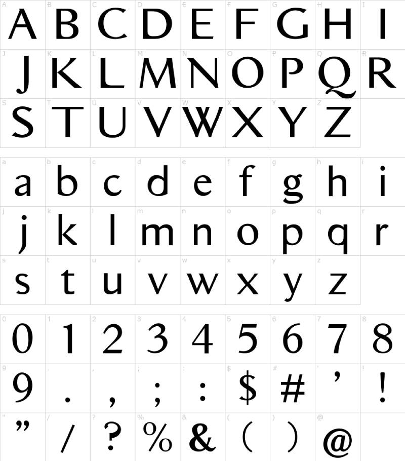
The font in the Aristocrat logo is a custom design. It is a bold, uppercase sans-serif with clean lines and a slightly geometric character. Took me a while to figure out it was not a standard commercial typeface, but a bespoke creation built for the brand.
The heavy stroke weight ensures readability across casino floor conditions, where lights flash constantly and viewing angles change. Letter spacing is tight but controlled. Nothing about the type feels loose or casual.
Over the years, the letterforms have gotten bolder. Earlier versions had slightly thinner strokes. The current iteration really leans into thickness for maximum impact, especially on gaming cabinet displays where you are competing with dozens of other machines for attention.
What Are the Hidden Meanings in the Aristocrat Logo?
The crown is the most obvious symbol, and it is doing double duty. On the surface, it ties to the “Aristocrat” name. But the angular construction of the crown also suggests upward momentum and ambition.
Look, there is no secret message buried in the negative space here. This is not the FedEx arrow. The design is direct and intentional. The crown says “we are the best.” The bold type says “pay attention.” The blue says “trust us.”
Some people have noted that the crown’s pointed elements mirror the peaks and valleys you might see on a slot machine pay line display. Whether that was intentional or just a happy accident, I honestly cannot say. But it is a neat connection if you squint at it the right way.
How Does the Aristocrat Logo Compare to Competitor Logos?
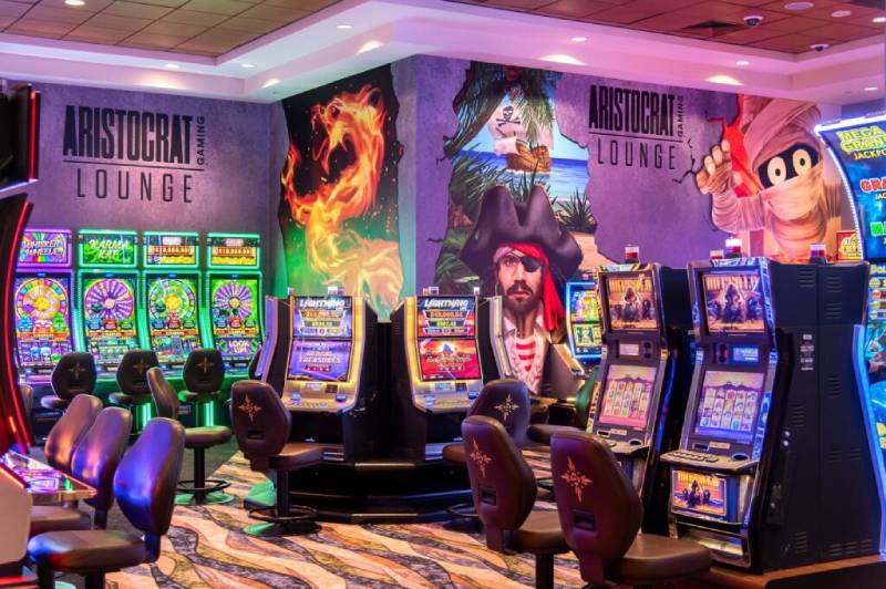
When you line up the major gaming company logos side by side, patterns show up fast. IGT (International Game Technology), Scientific Games, Konami Gaming, and Aristocrat all lean toward blue-heavy palettes. That is the gaming industry default, practically.
But Aristocrat is the only one in the top tier that uses a crown. IGT goes with a more abstract, corporate-looking wordmark. Scientific Games (now Light & Wonder after a rebrand) uses a modern, tech-forward mark. Konami leans on its red-and-white heritage from its Japanese video game roots.
The crown gives Aristocrat something the others do not have: an instantly recognizable symbol that works even without the wordmark. Compare that to the Electronic Arts logo, which also needed decades to distill down to a simple, icon-first approach.
Among the newer digital gaming competitors, companies like Playtika and Nexon tend toward brighter, more playful marks. That makes sense because they are mobile-first. Aristocrat straddles both worlds (land-based and digital), and the logo needs to feel at home on a $30,000 slot cabinet and on a free-to-play mobile game screen. It is a tough balance, and I think they pull it off better than most.
What Are the Technical Specifications of the Aristocrat Logo?
Official Color Codes
- Primary Color: Deep Blue
- Hex: #003DA5 (approximate)
- RGB: (0, 61, 165)
- CMYK: (100, 63, 0, 35)
- Pantone: 286 C (closest match)
- Secondary Color: Gold
- Hex: #C8A951 (approximate)
- RGB: (200, 169, 81)
- CMYK: (0, 16, 60, 22)
- Pantone: 7406 C (closest match)
- Background/Accent: White
- Hex: #FFFFFF
- RGB: (255, 255, 255)
- CMYK: (0, 0, 0, 0)
Dimensions and Proportions
The Aristocrat logo SVG file, as referenced by Wikipedia’s hosting, is nominally 469 x 148 pixels. That gives a roughly 3.17:1 aspect ratio for the horizontal wordmark version.
For proper reproduction, the logo requires clear space around it equal to the height of the crown element on all sides. This is standard practice for most brand guideline documents in the gaming industry.
Minimum size recommendations depend on the application. For print, the mark should not go below roughly 25mm in width to keep the crown detail legible. On screens, the minimum is typically around 120 pixels wide. The vector format ensures it scales infinitely without losing sharpness, which is critical for applications ranging from massive casino signage to small mobile app icons.
What Cultural Impact Has the Aristocrat Logo Had?
Walk into any major casino in Las Vegas, Macau, or Sydney, and you will see the Aristocrat crown. It has become shorthand for “this is a quality slot machine” among regular casino visitors. The Buffalo series alone has created a near-cult following, and that crown at the top of the cabinet anchors the whole experience.
In Australia specifically, the Aristocrat brand is practically synonymous with poker machines. The company dominated the domestic market for decades, at one point controlling around 75% of the country’s pokies market. That level of market penetration means the logo is seared into the public consciousness Down Under.
The 2022 NFL licensing agreement, where Aristocrat created football-themed slot games, pushed the brand into American sports culture in a new way. Suddenly the crown was showing up next to NFL team branding at events and inside stadiums. That is a different kind of cultural footprint.
How Does the Aristocrat Logo Fit Into the Overall Brand Identity?
The logo sits at the center of a layered brand system. Aristocrat Leisure Limited operates through multiple divisions. Aristocrat Gaming handles the land-based slot business. Pixel United covers mobile gaming (Big Fish Games, Product Madness, Plarium until its 2025 divestiture). Interactive manages online real-money gaming following the NeoGames acquisition in 2024.
Each division has its own sub-brand, but they all connect back to the parent identity. The crown works as a unifying element. You see echoes of the main brand’s style guide in everything from the Lightning Link game interfaces to corporate annual reports filed on the ASX.
This is where visual hierarchy really matters. The parent Aristocrat Leisure mark sits at the top. Then you get the division-specific marks. Then individual game brands like Buffalo, Dragon Link, and Walking Dead sit underneath those. It is a clear, structured system where the crown always signals the top of the chain.
The design elements stay consistent throughout. Deep blue. Bold type. Clean lines. Even when Aristocrat sponsors NFL teams like the New England Patriots or Dallas Cowboys, the visual identity holds together because the guidelines are tight.
How Should the Aristocrat Logo Be Used?
The Aristocrat logo is a registered trademark, and its use is controlled strictly. Here is what you need to know:
Official Usage Do’s:
- Always use the logo files provided directly by Aristocrat Gaming or Aristocrat Leisure Limited
- Maintain the required clear space around the mark
- Use approved color versions only (full color, single-color white, or reversed)
- Apply the logo on backgrounds that provide enough contrast for clear visibility
Official Usage Don’ts:
- Do not stretch, distort, rotate, or alter the proportions of the logo
- Do not change the logo colors to unapproved values
- Do not place the mark on busy or patterned backgrounds that reduce readability
- Do not add effects like drop shadows, gradients, or outlines to the official mark
- Do not recreate the logo using substitute fonts or hand-drawn elements
Where to Access Official Logos: Licensed partners and authorized distributors get logo files directly through Aristocrat’s brand management channels. The company does not make official high-resolution assets publicly available for general download. Media kit materials may be available through Aristocrat’s corporate communications team for press use.
Trademark Protection: Aristocrat actively defends its trademarks. The company has filed suit against competitors, including the high-profile 2019 case against Ainsworth Game Technology over Lightning Link cloning, and the ongoing litigation (settled in January 2026) with Light & Wonder over alleged IP theft. If you are not a licensed partner, do not use the mark. It is as simple as that.
Licensing Information: Use of the Aristocrat name, crown symbol, or any associated brand assets requires a formal licensing agreement with Aristocrat Leisure Limited. Unauthorized reproduction on merchandise, websites, or marketing materials violates trademark law in most jurisdictions where the company operates.
FAQ on The Aristocrat Logo
What does the Aristocrat logo look like?
The Aristocrat logo is a combination mark with a stylized crown icon above bold, uppercase lettering. The crown sits centered over the “ARISTOCRAT” wordmark. Deep blue and gold are the primary colors, set against a white background for clean readability on gaming cabinets.
When was the Aristocrat logo first created?
Aristocrat Leisure Limited introduced its first brand mark in 1953. That was the same year founder Leonard Ainsworth began manufacturing poker machines in Sydney, Australia.
The original version was a simple text treatment with no crown symbol.
What does the crown in the Aristocrat logo mean?
The crown represents leadership and premium quality in the gaming technology industry. It connects directly to the brand name. “Aristocrat” implies nobility, so the crown reinforces that positioning visually.
It separates the brand from competitors like IGT and Scientific Games on casino floors.
What colors are used in the Aristocrat Gaming logo?
Deep blue (approximately #003DA5) is the primary color. Gold (#C8A951) serves as a secondary accent for premium applications.
Blue builds trust associations critical for a slot machine manufacturer. Gold suggests wealth and prestige, which fits the brand identity well.
What font does the Aristocrat logo use?
The logo uses a custom sans-serif typeface designed specifically for the brand. It features bold uppercase characters with clean lines and tight spacing.
The heavy stroke weight keeps the wordmark readable under casino floor lighting conditions.
Has the Aristocrat logo changed over the years?
Yes. The logo has gone through several redesigns since 1953. Early versions were plain text on poker machine hardware. The crown appeared during the 1980s international expansion.
The most recent refresh happened around 2020, featuring simplified crown geometry and heavier letterforms for digital gaming platforms.
Who designed the current Aristocrat logo?
The 2020 brand refresh involved external creative direction as part of a global repositioning. The original 1953 mark was developed internally at Aristocrat Leisure Limited in Sydney.
Specific designer credits for the current version have not been publicly disclosed by the company.
Where does the Aristocrat logo appear?
You will find it on electronic gaming machines, casino management systems, and mobile apps like Heart of Vegas and Cashman Casino. It also shows up on corporate materials, trade show displays at events like G2E, and across game series including Lightning Link and Buffalo.
Can I download or use the Aristocrat logo?
No, not without permission. The Aristocrat trademark is protected intellectual property. Unauthorized use violates trademark law.
Licensed partners receive official files through brand management channels. The company does not offer public high-resolution downloads.
How does the Aristocrat logo compare to other gaming company logos?
Most major gaming brands lean toward blue palettes. But Aristocrat is the only top-tier casino game developer using a crown symbol. IGT relies on an abstract corporate wordmark. Konami uses its red-and-white Japanese heritage. The crown gives Aristocrat an edge in instant recognition.
Conclusion
The Aristocrat logo has earned its place as one of the most recognized marks in casino gaming. From a basic label on 1953 poker machines to a refined corporate identity seen across 200+ jurisdictions, the crown and wordmark carry real weight.
That consistency matters. Aristocrat Leisure Limited built a visual system that works on slot cabinets, mobile screens, and everything in between.
The deep blue palette, custom lettering, and crown symbol all reinforce the same message. Premium gaming technology, built by a company that has been at this for over 70 years.
Few brands in the electronic gaming machine space have managed that kind of staying power. The mark just works.

Renowned for his expertise in logo design and visual branding, Bogdan has developed a multitude of logos for various clients.
His skills extend to creating posters, vector illustrations, business cards, and brochures. Additionally, Bogdan's UI kits were featured on marketplaces like Visual Hierarchy and UI8.
He also wrote in the past years on sites like Design Your Way, WebDesignerDepot, WPDean, Designmodo, Speckyboy, Slider Revolution, and more.
- Canva vs PowerPoint: Which Is Better for Presentations? - 22 September 2026
- How to Install Fonts on Mac (Step-by-Step Guide) - 20 September 2026
- From Mockup to Code: How AI-Augmented Development Speeds Up the Design Handoff - 19 September 2026

Bogdan Sandu is a seasoned designer who has been designing websites since 2008. Renowned for his expertise in logo design and visual branding, Bogdan has developed a multitude of logos for various clients. His skills extend to creating posters, vector illustrations, business cards, and brochures. Additionally, Bogdan's UI kits were featured on marketplaces like Visual Hierarchy and UI8. He also wrote in the past years on sites like Design Your Way, WebDesignerDepot, WPDean, Designmodo, Speckyboy, Slider Revolution, and more.
You Might Also Like