The Spin Master logo is one of the most recognized brand marks in the global toy industry. It belongs to Spin Master Ltd., a Canadian toy and entertainment company founded in 1994 by Ronnen Harary, Anton Rabie, and Ben Varadi in Toronto, Ontario. The logo has gone through three main versions since the company’s early days, each reflecting a different stage of growth.
What makes it stick is how the mark balances trust and energy. Deep blue tones signal reliability to parents, while the bold lettering grabs the attention of kids walking through toy aisles. Took me a while to appreciate how much thought goes into branding for this audience, because you’re basically designing for two completely different groups at once.
The current version, introduced around 2012 and refined through the company’s TSX and NASDAQ listings, sits on products sold in over 100 countries. From PAW Patrol packaging to Hatchimals boxes, the mark does a lot of heavy lifting.
What Is the Spin Master Logo?
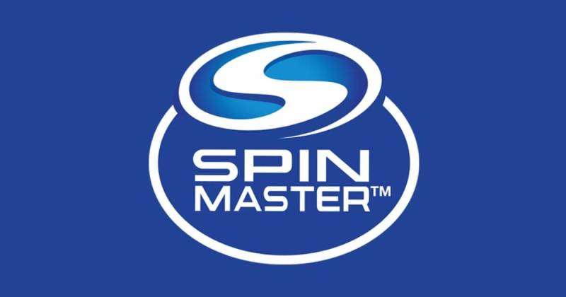
The Spin Master logo is a combination mark featuring bold white sans-serif lettering arranged in two lines (“SPIN” over “MASTER”) inside a deep blue ellipse. A stylized “S” icon sits above the text. The current design was introduced in 2012 and refined for the company’s public market listings.
Here’s what defines the current mark:
- Design Type: Combination mark. It pairs a wordmark with an icon (the stylized “S” emblem above the text). This setup gives the brand flexibility. The “S” can work alone on smaller applications, while the full lockup handles packaging and corporate materials.
- Primary Elements: The deep blue ellipse acts as a container. White uppercase text reads “SPIN MASTER” on two stacked lines. Above it, a stylized “S” with a three-dimensional look and thick blue outline serves as the focal point. The ellipse border is white, creating separation against any background.
- Official Introduction Date: The current logo debuted in 2012. It was then further refined during the 2015 Toronto Stock Exchange listing and the 2019 NASDAQ listing, which finalized the specifications used today.
- Designer/Agency: The specific design agency behind the 2012 update has not been publicly credited. The original 1994 branding was created in-house during the startup phase.
- Trademark Status: The Spin Master logo is a registered trademark of Spin Master Ltd. The animated entertainment version carries the tagline “A trademark of Spin Master Ltd.” in its TV appearances.
- Color Palette: Deep Blue (#224297), Light Blue (#138DCE), and White (#FFFFFF). These three colors form the official brand palette.
- Usage Context: The logo appears across product packaging, retail displays, animated TV show openings and closings, digital platforms, licensing materials, investor relations documents, and corporate communications.
How Has the Spin Master Logo Evolved Over Time?

The Spin Master logo has been through three distinct versions since 1994. Each update reflected the company’s shift from scrappy Toronto startup to publicly traded global brand. The original was playful and colorful. The second went corporate. The third found the sweet spot between the two.
Original Spin Master Toys Logo (1994-2001)
Years Active: 1994 to approximately 2001.
The first logo used a series of concentric ellipses in yellow and red. The brand name “Spin Master Toys” appeared in purple, set in a custom playful typeface against the ellipse backdrop.
It looked like exactly what it was: three university friends with $10,000 and a product called Earth Buddy. And honestly, that worked. The bright color palette of yellows and reds screamed “fun” at a time when the company needed shelf presence more than corporate credibility.
The concentric ellipse shapes suggested motion and spinning, which tied directly to the company name. There was nothing subtle about it. But for a startup competing against Hasbro and Mattel in the late 90s, subtlety would have been a mistake.
This version carried the brand through its first breakout hits, including the Air Hogs line in 1998 and the early days of Tech Deck fingerboards.
Second Spin Master Logo (2001-2012)
Years Active: 2001 to 2012.
The 2001 redesign was a big shift. Gone were the warm yellows and reds. In their place: a blue square background with “S P I N MASTER” written in white across two lines. The letters were spaced out in the top line.
A customized “S” sat inside a light blue-outlined oval above the text. The “S” had purple and blue outlines, giving it a slightly more polished feel than the original.
This version matched the company’s expansion into international markets. Spin Master had opened offices in Hong Kong and the UK by 2000, and the branding needed to feel more global. The blue palette communicated stability, which probably helped during licensing negotiations and retail buyer meetings.
The oval above the wordmark kept the sense of movement from the original. It was cleaner, more controlled. You could put it on a business card and a toy box without either looking out of place.
This logo appeared on Bakugan Battle Brawlers packaging, which generated close to $1 billion in sales within a year of launch. So whatever the design lacked in personality, it more than made up for in commercial results.
Current Spin Master Logo (2012-Present)
Years Active: 2012 to present.
The 2012 update kept the core structure but refined everything. The brand name in white still sits on two stacked lines, now enclosed in a deep blue ellipse with a white border. The stylized “S” got a three-dimensional treatment with a thicker blue outline.
The square container from the 2001 version was replaced with an ellipse. This was a smart move. Ellipses feel more dynamic than squares. They suggest movement without being chaotic about it.
When Spin Master listed on the Toronto Stock Exchange in 2015, the brand guidelines got a serious upgrade. Visual hierarchy rules were standardized across product categories. Then the 2019 NASDAQ listing finalized the current technical specifications.
The modern brand style guide now covers hundreds of applications, from licensing agreements to international packaging standards. That’s a long way from three guys with a grass-seed novelty toy.
What Do the Design Elements of the Spin Master Logo Mean?

Every piece of the Spin Master logo serves a purpose. The ellipse container suggests motion and play. The bold letterforms signal strength and market presence. The “S” icon acts as a quick visual shorthand for the full brand.
Together, these elements target two audiences at once: parents looking for trustworthy products and kids who just want something that looks cool on the shelf.
Why Did Spin Master Choose These Specific Colors?
The color choices are deliberate and worth looking at individually.
Deep Blue (#224297) is the foundation. In color psychology, blue builds trust. Parents see it and feel reassurance. It also suggests creativity and calm, which works for a company selling children’s products. The RGB values are (34, 66, 151), with CMYK at approximately (78, 56, 0, 41).
Light Blue (#138DCE) adds energy. It shows up in the “S” icon and accent areas. This shade keeps the brand from feeling too corporate. The RGB is (19, 141, 206). It’s the color that makes kids look twice.
White (#FFFFFF) handles the text and border elements. It creates contrast against the blue background, keeping everything readable at small sizes. On busy toy store shelves, readability is not optional.
The palette moved away from the original yellows and reds of the 1994 logo. That shift from warm to cool tones mirrored the company’s growth from novelty toy seller to global entertainment brand.
What Typography Style Is Used in the Spin Master Logo?
The current logo uses a thick, bold sans-serif font designed to feel contemporary and clean. The letterforms lean slightly forward, which gives the whole mark a sense of speed and energy.
The tracking between characters is tight but controlled. “SPIN” sits on top and “MASTER” below, with the two words set at slightly different sizes to create a natural reading flow.
What I notice most is how the rounded edges on certain letters soften the overall feel. You get boldness without aggression. That matters when your audience includes both six-year-olds and their parents.
The entertainment division uses the Oswald typeface for the “ENTERTAINMENT” text below the main logo in TV show appearances.
What Are the Hidden Meanings in the Spin Master Logo?
The stylized “S” does double duty. Obviously it stands for “Spin,” but its curved form also suggests a spinning motion, a top in rotation, or the continuous cycle of play and creativity. It’s not accidental.
The ellipse container echoes the concentric ellipses from the original 1994 logo. There’s a thread of continuity there that most people wouldn’t notice consciously, but it keeps the brand connected to its roots.
The three-dimensional treatment on the “S” adds depth, which at a subconscious level implies substance and solidity. Your mileage may vary on how much of that is intentional versus a happy accident of the rendering style.
How Does the Spin Master Logo Compare to Competitor Logos?

In the toy industry, blue is practically the default. Hasbro uses red and blue. Mattel goes with red. LEGO uses bold red and yellow. Spin Master’s deep blue positions it as the “serious innovator” in the group, which is an interesting play.
Compared to other entertainment-adjacent gaming company logos like the Bandai Namco logo or the Electronic Arts logo, Spin Master’s mark feels more traditional. EA went minimal. Bandai Namco uses bright orange and red. Spin Master sticks with a contained, badge-style approach that works well on physical products.
The combination mark format gives Spin Master an edge over pure wordmarks. When you’re printing on everything from tiny Kinetic Sand containers to large retail displays, having both an icon and a wordmark provides flexibility that a standalone wordmark can’t match.
Brands like Rovio Entertainment and Playtika lean heavier into playful design language. Spin Master threads the needle between playful and corporate, which makes sense given its dual identity as both a toy maker and a publicly traded company.
What Are the Technical Specifications of the Spin Master Logo?
Official Color Codes
Primary Color: Deep Blue
- Hex: #224297
- RGB: (34, 66, 151)
- CMYK: (78, 56, 0, 41)
- Pantone: 10249 C (approximate)
Secondary Color: Light Blue
- Hex: #138DCE
- RGB: (19, 141, 206)
- CMYK: (91, 32, 0, 19)
- Pantone: Process Blue C (approximate)
Tertiary Color: White
- Hex: #FFFFFF
- RGB: (255, 255, 255)
- CMYK: (0, 0, 0, 0)
Dimensions and Proportions
The logo’s elliptical container defines its aspect ratio. The proportional relationship between the “S” icon and the wordmark below it follows strict spacing rules outlined in the corporate brand guidelines.
Clear space requirements ensure the logo isn’t crowded by other elements. The minimum size specifications account for readability on small-format packaging, which is tricky when you’re talking about products as small as a Mighty Beanz capsule.
The logo is maintained as vector graphics, which allows it to scale from tiny product labels to massive retail banners without losing quality. DPI specifications for print ensure consistent reproduction across global manufacturing partners.
What Cultural Impact Has the Spin Master Logo Had?
The Spin Master logo has become shorthand for quality children’s entertainment. Through its association with PAW Patrol alone, one of the biggest preschool franchises in history, the mark reaches millions of households daily.
The animated entertainment logo, where a 3D version of the mark spins and assembles on screen accompanied by dramatic orchestral music, has become a familiar sight for kids watching Nickelodeon and other networks. There’s even a PAW Patrol-specific variant where the character Marshall crashes into the logo and makes it spin. That kind of playful self-awareness builds affection for the brand among young viewers.
The company’s 18 Toy of the Year awards from the Toy Industry Association have further cemented the logo’s status as a mark of quality in the industry. When parents see it on a product, there’s a built-in level of trust that took decades to build.
How Does the Spin Master Logo Fit Into the Overall Brand Identity?

The logo sits at the center of a brand system that extends across toys, entertainment, and digital games. Each division, including Spin Master Entertainment, Spin Master Games, Spin Master Studios, and Spin Master Digital Games, uses a variation of the core mark with its division name below.
This structure creates unity across a massive product portfolio. Whether you’re looking at a Rubik’s Cube box, a Gund plush toy, or a Kinetic Sand package, the parent brand is always visible. It’s an endorsed brand architecture, not a house of brands.
The consistency of the deep blue palette across all touchpoints reinforces recognition. On product shelves, in TV commercials, across social media, and on the corporate website, the same color system shows up. That level of repetition is what turns a logo into something people recognize without thinking about it.
Sub-brands like PAW Patrol and Hatchimals carry their own visual identities, but the Spin Master logo appears on all packaging as the corporate endorsement. It’s a smart setup. The individual brands do the heavy lifting for kid appeal, and the corporate logo reassures parents.
How Should the Spin Master Logo Be Used?
Spin Master maintains strict usage guidelines through its corporate brand standards. If you’re working with the logo in any official capacity, here are the basics:
- Do maintain the specified clear space around the logo at all times. No other graphic elements should crowd the mark.
- Do use only the official color versions: full color on white, full color on dark backgrounds, or single-color versions in white or deep blue.
- Don’t stretch, rotate, recolor, or modify the logo in any way. The proportions and colors are fixed.
- Don’t place the logo on busy backgrounds that reduce readability.
- Don’t recreate the logo using substitute fonts or approximate colors.
Official logo files are managed through Spin Master’s corporate communications and licensing teams. Licensing partners receive approved files as part of their agreements.
The logo is a registered trademark of Spin Master Ltd. Unauthorized use is subject to trademark protection under Canadian and international law. If you’re a licensee or retail partner, the brand guidelines document specifies every possible application scenario, from hang tags to digital ads.
For anyone analyzing what makes a logo work, Spin Master is a solid case study. It’s not the flashiest mark in the toy industry, but that’s kind of the point. It does its job quietly and consistently across thousands of products in over 100 countries. Sometimes the best design is the one you barely notice because it just works.
FAQ on The Spin Master Logo
What does the Spin Master logo look like?
The current Spin Master logo features a deep blue ellipse containing the words “SPIN MASTER” in white bold typography. A stylized 3D “S” icon sits above the text. The design uses a clean combination mark format suited for global toy packaging.
When was the Spin Master logo first created?
Spin Master’s first logo appeared in 1994 when founders Ronnen Harary, Anton Rabie, and Ben Varadi launched the company in Toronto. That original version used concentric ellipses in yellow and red with a playful purple wordmark reading “Spin Master Toys.”
How many times has the Spin Master logo changed?
Three versions exist. The 1994 original used warm colors and playful lettering. A 2001 redesign introduced blue tones and a square container. The current 2012 version switched to an ellipse shape and added the three-dimensional “S” symbol.
What colors are in the Spin Master logo?
Deep blue (#224297), light blue (#138DCE), and white (#FFFFFF). The deep blue communicates trust to parents. Light blue adds energy that appeals to children. White text provides readability across product lines and print materials.
What font does the Spin Master logo use?
Spin Master uses a custom thick sans-serif typeface with forward-leaning letterforms. The entertainment division adds “ENTERTAINMENT” in the Oswald font below the main mark. Both choices prioritize clean readability on toy store shelves.
What does the “S” symbol in the Spin Master logo mean?
The stylized “S” represents both the brand initial and a spinning motion. Its curved form suggests continuous play and creativity. The 3D treatment adds depth, making the emblem stand out as the primary visual element of the corporate identity.
Can I download the Spin Master logo for free?
The Spin Master logo is a registered trademark of Spin Master Ltd. Official logo files are provided only to licensed partners through formal agreements. Unauthorized use violates trademark protection under Canadian and international law.
Why did Spin Master choose blue for its logo?
Blue builds parental trust while signaling creativity. It also separates Spin Master from competitors like Mattel and LEGO, which lean on red and yellow. The complementary pairing of deep and light blue creates visual energy without clashing.
Where does the Spin Master logo appear?
Everywhere the company operates. Product packaging for brands like PAW Patrol and Hatchimals. Animated TV show credits on Nickelodeon. Digital game platforms. Retail displays. Investor documents. Corporate web properties. It covers over 100 countries.
How does the Spin Master logo compare to other toy brand logos?
Most toy companies use bright, warm colors. Spin Master’s deep blue palette positions it as more corporate and innovation-focused. The combination mark format gives it more flexibility than pure wordmarks used by competitors like Hasbro or Nexon.
Conclusion
The Spin Master logo tells the story of a company that grew from a $10,000 startup into a global entertainment brand. Three versions across three decades, each one sharper than the last.
That deep blue ellipse with the stylized “S” now appears on products in over 100 countries. It works on a tiny Kinetic Sand label and a massive retail banner without breaking.
The real lesson here is consistency. Spin Master kept its core identity intact through every redesign, every stock exchange listing, every brand acquisition from Etch A Sketch to Rubik’s Cube.
Good logo design doesn’t shout. It just shows up and does the work, year after year.

Renowned for his expertise in logo design and visual branding, Bogdan has developed a multitude of logos for various clients.
His skills extend to creating posters, vector illustrations, business cards, and brochures. Additionally, Bogdan's UI kits were featured on marketplaces like Visual Hierarchy and UI8.
He also wrote in the past years on sites like Design Your Way, WebDesignerDepot, WPDean, Designmodo, Speckyboy, Slider Revolution, and more.
- Jujutsu Kaisen Font Generator - 12 October 2026
- The Windsurf Logo History, Colors, Font, And Meaning - 10 October 2026
- How to Remove Background From Product Photos (No Photoshop) - 10 October 2026

Bogdan Sandu is a seasoned designer who has been designing websites since 2008. Renowned for his expertise in logo design and visual branding, Bogdan has developed a multitude of logos for various clients. His skills extend to creating posters, vector illustrations, business cards, and brochures. Additionally, Bogdan's UI kits were featured on marketplaces like Visual Hierarchy and UI8. He also wrote in the past years on sites like Design Your Way, WebDesignerDepot, WPDean, Designmodo, Speckyboy, Slider Revolution, and more.
You Might Also Like