The Sciplay logo is the corporate identity mark for one of the biggest free-to-play mobile gaming companies in the social casino space. SciPlay Corporation launched in 2019 as a spinoff from Scientific Games (now Light & Wonder), and the company needed branding that could stand on its own from day one.
The mark sits within a broader tradition of gaming company logos that lean toward clean, digital-forward aesthetics rather than flashy casino imagery. That was a deliberate choice. SciPlay wanted to position itself as a tech company that happens to make casino games, not the other way around.
The current version of the logo was introduced in 2019 alongside the company’s NASDAQ IPO under ticker symbol SCPL. It uses a modern sans-serif font with blue as the dominant color. The company has gone through at least two visual updates since its origins as SG Social Games Corporation. Previously known under the Scientific Games umbrella since 1997, SciPlay’s independent branding represents a single, focused identity built for mobile screens.
What Is the SciPlay Logo?
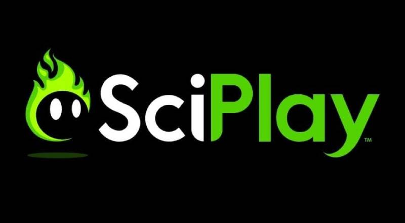
The SciPlay logo is a wordmark-style design featuring the company name in clean, modern letterforms with a blue and green color scheme. It was introduced in 2019 when SciPlay Corporation became a publicly traded entity separate from Scientific Games. The design communicates technological precision and entertainment appeal for social casino audiences.
Design Type: Wordmark (combination mark with subtle graphical treatment). The logo relies on typography as its primary visual element rather than a separate icon or mascot.
Primary Elements: The wordmark splits into two parts. “Sci” carries a slightly different visual weight than “Play,” which creates a natural break that highlights both the scientific/tech side and the entertainment side. It’s a small thing, but it matters.
Official Introduction Date: May 2019, coinciding with the company’s IPO on May 3, 2019.
Designer/Agency: Not publicly confirmed. The logo was likely developed through an internal branding effort or an undisclosed agency during the spinoff process from Scientific Games.
Trademark Status: SciPlay Corporation holds trademark protection for its logo and brand assets across mobile gaming platforms and digital entertainment applications.
Color Palette: The brand uses three main colors. Bright Green (#54D400), Dodger Blue (#41C3FF), and Jelly Bean (#26789D). The green and blue pairing is unusual for casino-adjacent companies, which tend to go heavy on reds and golds.
Usage Context: The logo appears across SciPlay’s game portfolio (Jackpot Party Casino, Gold Fish Casino, Quick Hit Slots, 88 Fortunes Slots, MONOPOLY Slots, Hot Shot Casino), corporate communications, investor materials, app store listings, and web design assets on sciplay.com.
How Has the SciPlay Logo Evolved Over Time?
The SciPlay brand identity has gone through a few phases tied directly to corporate ownership changes. It started under the Scientific Games umbrella, got its own identity at the 2019 IPO, and has continued operating under Light & Wonder’s full ownership since October 2023.
Each transition brought visual adjustments to match the company’s evolving position in mobile gaming.
SG Social Games Era (1997-2019)
Years Active: 1997 to March 2019
Before SciPlay existed as a brand, the company operated as SG Social Games Corporation. The visual identity during this period was tied to Scientific Games’ broader corporate branding.
There wasn’t a standalone logo for the social gaming division in the way we think of it now. The branding borrowed heavily from Scientific Games’ own color palette and corporate identity system.
Individual game titles like Jackpot Party Casino carried their own branding that was far more visible to players than any parent company mark. Most users had no idea who made the games they were playing.
Context: Scientific Games acquired Dragonplay in 2014, which brought cross-platform social gaming capabilities into the fold. The social gaming division was growing fast, generating $415.9 million in revenue by 2018, but it didn’t yet have a distinct public identity.
SciPlay Launch Logo (2019-Present)
Years Active: 2019 to present
The company rebranded to SciPlay Corporation in March 2019. Two months later, it went public on NASDAQ at $16 per share.
The new logo was a clean break from the Scientific Games look. It dropped any visual connection to traditional casino imagery. The wordmark used a modern sans-serif typeface with a blue-and-green palette that felt more like a tech startup than a casino game maker.
Key Changes from Previous: Everything, basically. New name, new colors, new typography, new attitude. The “Sci” prefix was kept as a nod to Scientific Games, but “Play” was appended to signal the entertainment focus.
Cultural Significance: This was the first time the social gaming division had a public-facing brand separate from its parent. The logo had to work in app stores, investor decks, press materials, and across seven different game titles. That’s a lot of ground to cover with one mark.
Post-Acquisition Period (2023-Present)
Years Active: October 2023 to present
Light & Wonder completed its acquisition of SciPlay’s remaining public shares in October 2023 for $22.95 per share. SciPlay became a wholly-owned subsidiary and was delisted from NASDAQ.
The logo itself didn’t change significantly with this transition. SciPlay continues operating under its own brand identity as a subsidiary. But the context shifted. The logo no longer needs to function as a public company mark for investor relations in the same way.
Its primary job now is player-facing brand recognition across the game portfolio and internal corporate identity within Light & Wonder’s structure.
What Do the Design Elements of the SciPlay Logo Mean?

The SciPlay logo communicates a specific message: this is a technology-driven gaming company that prioritizes trust and fun equally. The wordmark’s clean lines and open spacing reflect a digital-first approach to entertainment.
The design avoids traditional casino cues like playing card suits, dice, or gold tones. That’s intentional. SciPlay targets a broader mobile gaming audience, not just dedicated casino players.
Why Did SciPlay Choose These Specific Colors?
Bright Green (#54D400)
RGB: 84, 212, 0. CMYK: 60, 0, 100, 17.
Green signals growth and energy. In the gaming context, it also suggests reward and winning. There’s a reason slot machines light up green when you hit something good.
The specific shade SciPlay uses is vivid and saturated. Sitting at full saturation, it pops on mobile screens, which is exactly where most players encounter it first.
Dodger Blue (#41C3FF)
RGB: 65, 195, 255. CMYK: 75, 24, 0, 0.
Blue builds trust. That matters a lot when your business model involves in-app purchases in free-to-play games. Players need to feel comfortable spending money, and blue psychologically reinforces security and reliability.
This particular blue hue sits on the lighter, more approachable end of the spectrum. It doesn’t feel corporate or cold. It feels friendly.
Jelly Bean (#26789D)
RGB: 38, 120, 157. CMYK: 76, 24, 0, 38.
This darker teal acts as an anchor. It adds depth to the palette and provides contrast when the brighter colors need grounding. You’ll see it in backgrounds, secondary UI elements, and supporting graphics.
What Typography Style Is Used in the SciPlay Logo?
The SciPlay wordmark uses a clean sans-serif style. The exact font hasn’t been officially confirmed, though some sources reference Lato as a close match or related brand font.
The letterforms prioritize readability at small sizes. That’s not optional when your logo needs to work as a tiny app icon on someone’s phone. Decorative typefaces fall apart at 32 pixels, but SciPlay’s choice holds up fine.
The tracking between characters is generous enough to prevent crowding without making the word look disconnected. It’s the kind of detail most people never notice, but it matters for legibility across screens of all sizes.
Stroke weight stays consistent throughout the letterforms. No thin-to-thick variation, which keeps things looking stable and uniform across the wordmark.
What Are the Hidden Meanings in the SciPlay Logo?
The “Sci” prefix is the most obvious embedded meaning. It links back to Scientific Games, the parent company that launched SciPlay. But it also positions the brand as science-driven, data-informed, analytical. Not just entertainment.
The combination of “Sci” and “Play” creates a tension that’s actually the whole point. Science is serious. Play is fun. Put them together and you get a company that takes fun seriously. Or makes serious fun. Either reading works.
The green-and-blue palette avoids the red and gold palette that dominates traditional casino branding. That’s a quiet rejection of the old-school gambling aesthetic. SciPlay is saying: we’re different.
The lack of any graphical symbol or icon alongside the wordmark is itself a design statement. It signals confidence. The name alone is meant to carry the brand, without needing a crutch.
How Does the SciPlay Logo Compare to Competitor Logos?

Social casino gaming is a crowded field. SciPlay competes with companies like Playtika, Zynga, and DoubleU Games, each with distinctly different visual approaches. SciPlay’s branding sits at the tech-forward end of that spectrum.
Playtika uses bolder, more entertainment-driven branding that leans into playfulness. Zynga’s logo is warm and game-like with rounded letterforms. DoubleU tends toward more traditional casino aesthetics.
SciPlay’s approach is more restrained. The blue-and-green palette reads as modern technology, not casino floor. Compare that to Aristocrat‘s logo, which carries much heavier traditional gaming industry weight, or Electronic Arts‘ mark, which goes full corporate.
Among other publicly traded (or formerly publicly traded) game companies, Nexon shares some of SciPlay’s minimalist sensibility, though Nexon leans harder into the playful side. Rovio Entertainment goes full character-driven, which makes sense for their audience but would be wrong for social casino.
The real differentiator is restraint. Most gaming companies overdesign their logos. SciPlay went the other direction.
What Are the Technical Specifications of the SciPlay Logo?
Official Color Codes
Primary Color: Bright Green
Secondary Color: Dodger Blue
- Hex: #41C3FF
- RGB: (65, 195, 255)
- CMYK: (75, 24, 0, 0)
Tertiary Color: Jelly Bean
- Hex: #26789D
- RGB: (38, 120, 157)
- CMYK: (76, 24, 0, 38)
Dimensions and Proportions
The SciPlay logo is a horizontal wordmark with a wider-than-tall aspect ratio. Like most wordmarks, it doesn’t work great in square formats without modification, which is why the company uses a simplified icon version for app store listings and social media avatars.
Clear space requirements follow standard brand guidelines practice. There needs to be enough breathing room around the mark that it doesn’t get crowded by other elements. A good rule of thumb with wordmarks like this: the height of the capital “S” defines the minimum padding on all sides.
The logo is distributed as vector graphics (SVG and AI formats) for scalable use, plus rasterized PNG versions for web and mobile applications. The vector formats guarantee the mark stays sharp whether it’s on a business card or a billboard (if SciPlay ever does billboards, which I’d guess they don’t do much of).
What Cultural Impact Has the SciPlay Logo Had?
SciPlay’s logo isn’t a household name in the way Nike’s swoosh or Apple’s apple is. But within mobile gaming, it represents a shift in how social casino companies present themselves.
The tech-first, casino-second approach to branding influenced how other social gaming studios thought about their own identities. Before SciPlay, most social casino brands were covered in coins, gems, and Vegas-style flash. SciPlay showed you could strip that away and still connect with the audience.
For investors, the logo became associated with one of the more successful gaming IPOs of 2019. The company raised over $352 million and built a player base of over 7 million daily active users. The clean branding helped position the company as a serious tech investment, not a gambling curiosity.
How Does the SciPlay Logo Fit Into the Overall Brand Identity?

The SciPlay logo sits at the center of a layered brand system. It’s the corporate umbrella, but each game in the portfolio, from Jackpot Party Casino to Gold Fish Casino to Bingo Showdown, has its own visual identity with its own colors, characters, and design language.
The corporate logo provides unity. The individual game logos provide personality.
Since the 2023 acquisition, SciPlay’s brand also exists within Light & Wonder’s broader corporate identity. Light & Wonder is the parent. SciPlay is the social gaming arm. The individual titles are the player-facing products. It’s a three-tier structure, and each level has its own brand style guide and usage rules.
The SciPlay logo does not appear prominently within the games themselves. Players of Jackpot Party Casino see Jackpot Party Casino branding, not SciPlay branding. The corporate mark lives in app store descriptions, loading screens (briefly), corporate pages, and press materials. That separation is smart. Players don’t care who makes their game. They care about the game.
How Should the SciPlay Logo Be Used?
Do:
- Use the official color versions on appropriate backgrounds (light or dark, depending on the variant)
- Maintain minimum clear space around the wordmark
- Use vector formats for print and high-resolution needs
- Reference official brand assets when creating materials that include the SciPlay mark
Don’t:
- Stretch, rotate, or warp the logo
- Change the colors to non-approved variations
- Place the logo over busy backgrounds where readability suffers
- Combine the SciPlay logo with individual game logos in ways that create visual confusion
Where to Access Official Logos: SciPlay’s official brand assets are available through press resources on sciplay.com. Third-party platforms like Brandfetch also host versions of the logo in SVG and PNG formats, though the official source is always the safest bet for accuracy.
Licensing Information: The SciPlay logo is a registered trademark. Use of the logo in any commercial context requires permission from SciPlay (or its parent company, Light & Wonder). Fan sites, press coverage, and editorial use typically fall under fair use, but slapping the logo on merchandise or your own app? Don’t do that.
Trademark Protection: SciPlay Corporation maintains trademark protections for its name and visual identity across mobile gaming platforms and digital entertainment. Since the October 2023 acquisition, these protections fall under Light & Wonder’s broader intellectual property portfolio.
FAQ on The Sciplay Logo
What does the Sciplay logo look like?
The Sciplay logo is a wordmark featuring clean, modern letterforms in blue and green. It uses a sans-serif font with open spacing built for mobile screens. No icons, no mascots. Just the company name styled for digital platforms.
When was the Sciplay logo introduced?
SciPlay Corporation introduced its logo in May 2019. That’s when the company spun off from Scientific Games and went public on NASDAQ under ticker SCPL.
The timing wasn’t random. You need a brand identity before an IPO. The logo launched alongside 22 million shares at $16 each.
What colors are used in the Sciplay logo?
Three colors define the brand. Bright Green (#54D400), Dodger Blue (#41C3FF), and Jelly Bean (#26789D).
The green-and-blue combination is unusual for a social casino game developer. Most competitors lean into reds and golds. SciPlay went a different direction, using color theory principles that signal technology over gambling.
What font does the Sciplay logo use?
The exact font hasn’t been officially disclosed. It appears to be a custom or proprietary sans-serif typeface designed for optimal readability on mobile gaming apps. Some sources reference Lato as a close match to the brand’s supporting typography elements.
Who designed the Sciplay logo?
The designer or agency behind the Sciplay logo hasn’t been publicly confirmed. It was developed during the 2019 spinoff from Scientific Games.
Likely an internal branding effort or an undisclosed firm. Many tech company logos go through this kind of quiet development process during corporate restructuring.
Has the Sciplay logo changed since its launch?
The core design has stayed mostly consistent since 2019. Before that, the company operated as SG Social Games Corporation under Scientific Games’ visual identity.
The 2023 acquisition by Light & Wonder didn’t trigger a major redesign. SciPlay kept its own brand mark as a subsidiary.
Where can I download the Sciplay logo?
Official brand assets are available through SciPlay’s press resources at sciplay.com. Third-party platforms like Brandfetch host SVG and PNG versions too.
For print design projects, always grab the vector file. The rasterized versions lose quality at larger sizes.
What does the Sciplay logo represent?
It represents the blend of science and entertainment. The “Sci” prefix ties back to Scientific Games heritage. “Play” signals the free-to-play mobile gaming focus.
Together, they position SciPlay as a data-driven company that makes games like Jackpot Party Casino and Gold Fish Casino Slots for millions of daily active users.
Is the Sciplay logo trademarked?
Yes. SciPlay Corporation holds trademark protection for its logo and brand assets. Since October 2023, those protections fall under Light & Wonder’s intellectual property portfolio.
Using the logo commercially without permission isn’t allowed. Editorial and press use is typically fine.
How does the Sciplay logo compare to other gaming logos?
It’s more restrained than most. Companies like Bandai Namco and Spin Master use bolder, more playful marks. SciPlay’s minimalist design approach prioritizes clean readability over visual flair, which makes it stand out in the crowded video game logo landscape.
Conclusion
The Sciplay logo does a lot of heavy lifting with very little. A clean wordmark, a blue-and-green palette, and smart logo choices that separate it from the crowded social casino market.
Since the 2019 IPO through the Light & Wonder acquisition, the brand identity has held up without needing a major overhaul. That says something about the original design decisions.
The mark works across app stores, investor decks, and loading screens for titles like Quick Hit Slots and 88 Fortunes. It scales cleanly because the logo design fundamentals are solid.
For a Las Vegas-based mobile gaming company pulling in hundreds of millions annually, the branding stays refreshingly understated. Sometimes less really does work better.

Renowned for his expertise in logo design and visual branding, Bogdan has developed a multitude of logos for various clients.
His skills extend to creating posters, vector illustrations, business cards, and brochures. Additionally, Bogdan's UI kits were featured on marketplaces like Visual Hierarchy and UI8.
He also wrote in the past years on sites like Design Your Way, WebDesignerDepot, WPDean, Designmodo, Speckyboy, Slider Revolution, and more.
- Jujutsu Kaisen Font Generator - 12 October 2026
- The Windsurf Logo History, Colors, Font, And Meaning - 10 October 2026
- How to Remove Background From Product Photos (No Photoshop) - 10 October 2026

Bogdan Sandu is a seasoned designer who has been designing websites since 2008. Renowned for his expertise in logo design and visual branding, Bogdan has developed a multitude of logos for various clients. His skills extend to creating posters, vector illustrations, business cards, and brochures. Additionally, Bogdan's UI kits were featured on marketplaces like Visual Hierarchy and UI8. He also wrote in the past years on sites like Design Your Way, WebDesignerDepot, WPDean, Designmodo, Speckyboy, Slider Revolution, and more.
You Might Also Like