


The Watford logo is one of those football badges that gets people talking. Not because it is flashy or over-designed, but because it raises a question most fans have asked at least once: why does a team called “The Hornets” have what looks like a moose on their crest?
The answer sits in local history. The animal is actually a hart, a male red deer, taken from the Hertfordshire coat of arms. Watford Football Club, founded in 1881 as Watford Rovers, has cycled through roughly 11 badge designs since 1927. The current version has been in use since 2001 and features the hart centered on a yellow-and-black shield with the club name across the top in capitalized lettering.
That mix of county pride and club identity packed into a single logo is what makes this badge worth breaking down.
What Is the Watford FC Logo?

The Watford FC logo is a shield-shaped emblem featuring a red hart (male deer) on a yellow and black divided background. Introduced in its current form in 2001, the badge uses a capitalized “WATFORD” wordmark across the top. The hart represents the club’s location in Hertfordshire, England, while the yellow-and-black color scheme reflects the team’s “Hornets” nickname adopted in 1959.
- Design Type: Combination mark (shield emblem with wordmark)
- Primary Elements: Red hart (deer head), divided shield, “WATFORD” text in uppercase
- Official Introduction Date: 2001 (refined version of the 1982 redesign)
- Designer/Agency: Not publicly credited. The club has confirmed the hart was introduced in 1978 but the specific designer remains unattributed in official records
- Trademark Status: Registered trademark of Watford Football Club. Protected under UK intellectual property law
- Color Palette: Yellow (#FBEE23), Red (#ED2127), Black (#11210C)
- Usage Context: Matchday kits, official merchandise, Vicarage Road stadium branding, digital platforms, marketing materials, and club communications
How Has the Watford Logo Evolved Over Time?

The Watford badge has gone through roughly 11 versions since the late 1920s. Early designs were simple monogram shields. The 1960s brought hornet imagery that matched the club’s nickname.
Then, in 1978, everything changed. The hart replaced the hornet entirely. Each version since has refined that same concept with cleaner lines and bolder execution.
Original Watford Logo (1927-1950)
- Years Active: 1927-1950
- Design Description: A plain shield shape with the letters “WFC” in bold, rounded sans-serif type on a white background with a black outline
- Color Scheme: Black and white
- Designer: Unknown
- Context: Created when the club was competing in the lower tiers of English football. The badge reflected the stripped-back, no-frills attitude of the era
- Key Changes from Previous: First known official badge for the club
- Cultural Significance: Set the template for decades of shield-based designs. The monochrome color palette was common across English football at the time
The Decorated Shield (1950-1958)
- Years Active: 1950-1958
- Design Description: Retained the shield format but added a deer illustration above the “W.F.C.” monogram, with a football icon placed below. The letters were now separated by square dots in a custom typeface
- Color Scheme: Black and white
- Designer: Unknown
- Context: Post-war period. The club added more visual elements to differentiate itself. The deer image was an early nod to the Hertfordshire connection
- Key Changes from Previous: First appearance of a deer in the badge, first inclusion of a football symbol
- Cultural Significance: Marked the beginning of the heraldic direction that would eventually define the club’s identity
The Blue and White Badge (1958-1959)
- Years Active: 1958-1959
- Design Description: A white crest set on a blue background. Featured a white deer head, a stylized “W.F.C.” monogram with an elongated central “F,” and a ribbon bearing “WATFORD” in uppercase
- Color Scheme: Blue and white
- Designer: Unknown
- Context: This badge reflected the club’s blue-and-white kit era. It lasted less than a year before the club switched directions
- Key Changes from Previous: Complete color overhaul. The football icon was dropped. First time the full “Watford” name appeared on the badge
- Cultural Significance: The shortest-lived Watford badge. A transitional moment before the yellow-and-black identity took hold
Return to the Shield (1959-1968)
- Years Active: 1959-1968
- Design Description: A return to the basic shield. Three bold sans-serif letters “WFC” on a black background, with a gray and yellow double outline. “WF” sat above “C”
- Color Scheme: Yellow, black, and gray
- Designer: Unknown
- Context: Coincided with the club adopting gold shirts and black shorts for the 1959-60 season. A popular vote among supporters changed the nickname to “The Hornets”
- Key Changes from Previous: Introduction of the yellow and black palette that would become permanent
- Cultural Significance: The birth of the Hornets identity. The colors chosen to match the club’s new nickname stuck around for good
The Hornet Era (1968-1978)
- Years Active: 1968-1978 (with sub-variations in 1968, 1972, and 1974)
- Design Description: A circular badge (1968) featuring a hornet above “WFC” letters. Redesigned into a rectangular format in 1972 with an orange-tinted yellow background. The 1974 version introduced a cartoon-like anthropomorphized hornet known as “Harry the Hornet”
- Color Scheme: Yellow, black, and orange accents
- Designer: Unknown
- Context: The club fully committed to the Hornets nickname in their badge design. Manager Mike Keen recommended adding red to the kit colors in 1973
- Key Changes from Previous: First time the badge moved away from a shield format. First mascot-based design. The “W.F.C.” lettering shifted to a custom extra-bold serif font
- Cultural Significance: The cartoon hornet, especially the 1974 version, became a cult classic among fans despite being officially unpopular at the time. It proved the club was willing to take creative risks
The Hart Arrives (1978-1979)
- Years Active: 1978-1979
- Design Description: A shield divided into red and black fields, with the head of a red deer (hart) centered. “Watford” appeared above the shield. The initials “FC” flanked the hart
- Color Scheme: Red, black, and yellow
- Designer: Not officially credited
- Context: Graham Taylor had just taken charge of the club in 1977. The badge change coincided with a new chapter in the club’s history. The hart was drawn from the Hertfordshire coat of arms
- Key Changes from Previous: Complete departure from the hornet imagery. Introduction of the hart as the central design element
- Cultural Significance: This version set the foundation for every Watford badge that followed. The switch from hornet to hart has remained one of the most debated decisions in English football badge history
Refined Hart Badge (1979-1982)
- Years Active: 1979-1982
- Design Description: Cleaner version of the 1978 badge. The “FC” initials were removed. “Watford” appeared in an elegant serif typeface in title case rather than all caps. The hart was enlarged and drawn with more authority
- Color Scheme: Red, black, and yellow
- Designer: Not officially credited
- Context: The club was climbing through the divisions under Graham Taylor. The cleaner design reflected a growing sense of professionalism
- Key Changes from Previous: Removal of “FC” initials. Serif typeface for club name. More powerful hart illustration
- Cultural Significance: Coincided with the most successful period in the club’s history up to that point
The Classic Badge (1982-2001)
- Years Active: 1982-2001
- Design Description: A professionally redrawn version with cleaner, stronger contours. The hart image was smoother and more polished. The serif typeface and color scheme remained the same
- Color Scheme: Red, black, and yellow
- Designer: Not officially credited
- Context: Watford reached the First Division, finished second in 1982-83, played in the UEFA Cup in 1983-84, and reached the 1984 FA Cup final during this badge’s tenure
- Key Changes from Previous: Refined illustration quality. All elements redrawn with professional precision
- Cultural Significance: This is the badge most older fans associate with the Graham Taylor glory days. A special centenary version appeared for the 1991-92 season with green wreath detailing and “Official Centenary” text
Current Watford Logo (2001-Present)
- Years Active: 2001-present
- Design Description: Nearly identical to the 1982 version but with the club name in a simpler, capitalized typeface. The hart, shield, and color divisions remain unchanged. A special 125th anniversary version appeared in 2006 with added ribbons showing “1881” and “2006”
- Color Scheme: Yellow (#FBEE23), Red (#ED2127), Black (#11210C)
- Designer: Not publicly attributed
- Context: Introduced as Graham Taylor retired and Gianluca Vialli took over. The subtle update modernized the lettering without disrupting the badge’s established identity
- Key Changes from Previous: Capitalized wordmark. Simpler font. Everything else stayed the same
- Cultural Significance: The badge that carried Watford through multiple Premier League campaigns (2006-07, 2015-2020), the 2019 FA Cup final, and the ongoing EFL Championship era. In 2019, the club held a fan vote on a potential redesign featuring a hornet by designers Marcus Dilley and Brian Gundell, but supporters voted 60% to keep the current crest
What Do the Design Elements of the Watford Logo Mean?
Every piece of the Watford badge connects to something specific. The hart ties to geography. The colors tie to the club’s nickname.
The shield itself references traditional English heraldry. None of it is accidental, even if the hart does look a bit like a moose to most people.
Why Does the Badge Feature a Hart Instead of a Hornet?
The hart represents Hertfordshire, the county where Watford is located. Harts appear on the Hertfordshire coat of arms, and the connection dates back centuries to the De Clare family who held the Earldom of Hertford in the 12th century.
The club swapped the hornet for the hart in 1978. While many fans still debate this choice (the team is literally called “The Hornets”), the hart stuck.
It is a nod to place rather than nickname, which is actually more common in English football than you might think.
Why Did Watford Choose These Specific Colors?
- Yellow (#FBEE23)
- Symbolic meaning: Energy, optimism, and visibility. It connects directly to the hornet-inspired identity adopted in 1959
- Psychological impact: Yellow grabs attention. On the pitch and in merchandise, it makes Watford instantly recognizable. The psychology behind color choices plays a big role here
- Brand connection: Yellow has been the club’s primary identity color since the 1959-60 season when the gold shirts were introduced
- Red (#ED2127)
- Symbolic meaning: Passion, aggression, and fight. It is used for the hart illustration, giving the animal a fierce appearance
- Psychological impact: Red adds intensity and contrast against the yellow and black
- Brand connection: Introduced to the kit in 1973 on the recommendation of manager Mike Keen. It has been part of the badge since the hart’s arrival in 1978
- Black (#11210C)
- Symbolic meaning: Strength, authority, and tradition
- Psychological impact: Grounds the brighter yellow and red, providing stability to the overall design
- Brand connection: Part of the club’s identity since 1959. Black completes the hornet color association alongside yellow
What Typography Style Is Used in the Watford Logo?
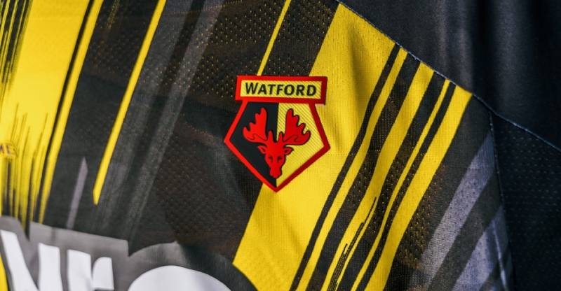
The current badge uses a clean, capitalized sans-serif typeface for the “WATFORD” wordmark. Some sources identify it as close to FF Plus Sans Bold, designed by Jurgen Huber.
Earlier versions used serif lettering, especially during the 1979-2001 period when the club name appeared in title case.
The switch to all caps in 2001 gave the text more presence and made it easier to read at smaller sizes, which matters more than you would think for font choices on kits and merchandise.
What Are the Hidden Meanings in the Watford Logo?
The shield shape itself is unique among English football clubs. You will not find another Premier League or Championship team using this exact form, which gives Watford a visual advantage.
The hart’s red coloring does not match real-life deer. It was a deliberate choice to add vibrancy and a sense of danger to the image.
The divided yellow-and-black background mirrors the hornet association without showing an actual hornet. It is a clever way to honor the nickname through color rather than imagery.
How Does the Watford Logo Compare to Competitor Logos?
Most English football clubs at Watford’s level lean toward circular or rounded badge shapes. Watford’s pointed shield stands apart. It feels older and more rooted in heraldry than, say, the Norwich City logo with its clean circular canary design.
Compared to clubs like Hull City, which also uses a distinctive animal (a tiger), Watford’s badge has a stranger disconnect. Hull’s tiger matches their nickname. Watford’s hart does not match “The Hornets” at all.
Clubs like Burnley and Leeds United keep things more traditional with text-heavy designs. Watford lands somewhere in the middle. It is heraldic without being overly formal, and the bright colors keep it from feeling stuffy.
The Crystal Palace logo and Leicester City logo both feature animals that match their nicknames (eagle and fox respectively). That consistency gives them a branding edge that Watford trades for regional identity.
What Are the Technical Specifications of the Watford Logo?
Official Color Codes
- Primary Color: Yellow
- Hex: #FBEE23
- RGB: (251, 238, 35)
- CMYK: (3, 2, 98, 0)
- Secondary Color: Red
- Hex: #ED2127
- RGB: (237, 33, 39)
- CMYK: (4, 100, 100, 0)
- Tertiary Color: Black
- Hex: #11210C
- RGB: (18, 17, 12)
- CMYK: (71, 66, 69, 83)
Dimensions and Proportions
- Aspect ratio: The badge is taller than it is wide, following the classic shield proportion. The exact ratio is approximately 1:1.2 (width to height)
- Minimum size requirements: The club guidelines require the badge to maintain legibility of the “WATFORD” text, which typically sets a minimum width of around 25mm for print
- Clear space: Official usage requires a buffer zone around the badge equal to roughly the height of the “WATFORD” lettering on all sides
- Official usage guidelines: The badge must appear on a background that does not clash with its yellow and black scheme. For digital use, vector graphic formats are preferred to maintain sharpness at any size
What Cultural Impact Has the Watford Logo Had?
The Watford badge is probably best known for confusing people. “Why the moose?” is basically a meme among English football fans at this point.
But that confusion has actually worked in the club’s favor. It starts conversations. It makes the badge memorable for reasons that go beyond aesthetics.
The 2019 fan vote to keep the current crest over a hornet redesign showed something interesting. Even when given the option to “fix” the badge and align it with the Hornets nickname, 60% of supporters chose to stick with the hart. That tells you the badge has earned real emotional weight over the decades.
Across Vicarage Road and in Watford’s merchandise, the hart has become a proud local symbol regardless of what outsiders think about it.
How Does the Watford Logo Fit Into the Overall Brand Identity?
The Watford badge sits at the center of a broader identity system. The yellow-and-black color scheme runs through everything from the stadium seats at Vicarage Road to the club’s website and social media presence.
“Forza Watford” serves as a rallying cry, and “1881” anchors the brand to its founding year. The hart connects the club to Hertfordshire, while the Hornets nickname drives the matchday atmosphere, mascot (Harry the Hornet), and fan culture.
Those brand guidelines tie it all together. The badge, the colors, and the messaging form a system where each piece supports the others. It is a case where the visual identity does not match the verbal one perfectly (hart vs. hornet), but the club has made it work through decades of consistency.
How Should the Watford Logo Be Used?
Official Usage Guidelines
- Do: Use the badge in its original proportions without stretching or warping. Place it on backgrounds that provide enough contrast for the yellow and black to read clearly. Use the official color codes listed above for any reproduction
- Don’t: Alter the colors, remove the “WATFORD” text, separate the hart from the shield, or place the badge on backgrounds that cause the yellow elements to disappear. Do not recreate the badge from memory or use unofficial versions
Where to Access Official Logos
- The official Watford FC website (watfordfc.com) provides brand assets for media and licensed partners
- Press kits and media resources are available through the club’s communications department
- Licensed merchandise carries the official badge and can be purchased through the club’s online store and partner retailers
Licensing and Trademark
- The Watford FC badge is a registered trademark. Any commercial use requires written permission from the club
- Fan art and non-commercial uses are generally tolerated but cannot be sold without a license
- Unauthorized reproduction on merchandise is a violation of UK trademark law and will be pursued by the club’s legal team
FAQ on The Watford Logo
Why Does Watford Have a Moose on Their Badge?
It is not a moose. The animal on the Watford FC badge is a hart, a male red deer. It comes from the Hertfordshire coat of arms, representing the county where Watford is based. The hart replaced the hornet crest back in 1978.
When Was the Current Watford Logo Introduced?
The current version launched in 2001. It kept the same hart and shield from the 1982 redesign but switched the club name to a simpler, capitalized typeface.
Not much changed visually. The biggest difference is the lettering.
What Do the Colors on the Watford Crest Mean?
Yellow and black represent the Hornets nickname, adopted in 1959 when the club switched from blue-and-white kits. Red was added in 1973 and is used for the hart illustration.
Together, these three colors form the core of Watford’s visual identity.
Did Watford Ever Try to Change Their Logo?
Yes. In 2019, the club ran a fan contest for a new badge design. Marcus Dilley and Brian Gundell won with a hornet-based crest. But supporters voted 60% to keep the existing badge.
The Watford club crest stayed exactly as it was.
What Font Is Used in the Watford FC Logo?
Sources identify the typography as close to FF Plus Sans Bold, a humanist sans-serif designed by Jurgen Huber. Earlier badge versions used serif lettering, especially during the 1979-2001 period when the text appeared in title case.
Why Did Watford Replace the Hornet With a Hart?
The switch happened in 1978, right when Graham Taylor took charge. The hart ties the club to its home in Hertfordshire rather than its nickname.
Plenty of fans still argue about this. But the hart has stuck for over 45 years now, so it clearly works.
What Is the History Behind the Watford Badge?
The first known Watford FC emblem appeared around 1927. A simple black-and-white shield with “WFC” initials. Since then, the club has used roughly 11 badge variations.
Hornet designs dominated the 1960s and 1970s. The Watford badge evolution shifted to the hart in 1978 and has not looked back.
Can I Download the Watford Logo for Personal Use?
The badge is a registered trademark of Watford Football Club. Fan art and non-commercial projects are generally tolerated. But selling anything with the official color palette and crest without a license is not allowed under UK trademark law.
What Makes the Watford Shield Shape Unique?
Most English football clubs use circular or rounded badges. Watford’s pointed shield stands out in the EFL Championship and did in the Premier League too.
The psychology behind shapes matters here. The angular form suggests tradition and authority, which fits the club’s heraldic approach.
Where Can I Buy Official Watford Logo Merchandise?
Official gear is available through the Watford FC online store at watfordfc.com and at the Vicarage Road club shop. Select sports retailers also carry licensed products. Always check for the official badge to confirm authenticity.
Conclusion
The Watford logo tells a story that most football badges do not. A hart instead of a hornet. County pride over nickname logic. And a fanbase that voted to keep it that way.
From the simple “WFC” shield of 1927 to the current Watford FC emblem introduced in 2001, every redesign reflected where the club stood at that moment in its history.
The yellow-and-black shield, the red hart, the clean wordmark. These elements carry the weight of Vicarage Road, Graham Taylor’s legacy, and Hertfordshire’s heraldic roots all at once.
Few badges in the EFL Championship pack that much meaning into such a compact design.

Renowned for his expertise in logo design and visual branding, Bogdan has developed a multitude of logos for various clients.
His skills extend to creating posters, vector illustrations, business cards, and brochures. Additionally, Bogdan's UI kits were featured on marketplaces like Visual Hierarchy and UI8.
He also wrote in the past years on sites like Design Your Way, WebDesignerDepot, WPDean, Designmodo, Speckyboy, Slider Revolution, and more.
- The Cursor Logo History, Colors, Font, And Meaning - 24 September 2026
- Top 7 Web Design Subscription Services That Replace Full-Time Hires - 24 September 2026
- Canva vs PowerPoint: Which Is Better for Presentations? - 22 September 2026

Bogdan Sandu is a seasoned designer who has been designing websites since 2008. Renowned for his expertise in logo design and visual branding, Bogdan has developed a multitude of logos for various clients. His skills extend to creating posters, vector illustrations, business cards, and brochures. Additionally, Bogdan's UI kits were featured on marketplaces like Visual Hierarchy and UI8. He also wrote in the past years on sites like Design Your Way, WebDesignerDepot, WPDean, Designmodo, Speckyboy, Slider Revolution, and more.
You Might Also Like


