Papyrus divides the design world like few other typefaces. Love it or hate it, you’ve probably overused it at some point.
The good news? Plenty of fonts similar to Papyrus exist without the controversial baggage. These alternatives capture that organic, ancient, handcrafted aesthetic while offering better versatility and professional credibility.
This guide examines 25 carefully selected alternatives across different styles. You’ll discover options for typography projects ranging from ancient civilizations to modern tribal designs, from script fonts to decorative display faces.
Each font includes visual characteristics, design origins, usage recommendations, and technical specifications. Whether you need something for branding, editorial design, or cultural projects, you’ll find better options than reaching for that overused default.
Fonts Similar To Papyrus
| Font Name | Primary Context | Best Use Cases | Style Attributes |
|---|---|---|---|
| Parchment MF | Historical Documents | Manuscripts, certificates, vintage designs | Aged texture, script-like |
| ITC Tempus | Classic Typography | Books, formal publications, editorial | Roman capitals, refined serif |
| Rosemary | Botanical & Natural | Herbal products, organic branding, nature themes | Organic flow, hand-drawn feel |
| Burowai | Ethnic & Cultural | Cultural events, world music, ethnic restaurants | Tribal influence, decorative |
| Old North | Norse & Medieval | Viking themes, fantasy games, historical fiction | Runic styling, ancient Norse |
| Azteker | Pre-Columbian | Mexican restaurants, archaeological content, cultural heritage | Aztec-inspired, geometric patterns |
| Ancient Totem | Indigenous & Spiritual | Native art, spiritual content, tribal designs | Totem-like, symbolic forms |
| Nomad Tribes | Adventure & Travel | Travel blogs, adventure brands, nomadic lifestyle | Wanderlust aesthetic, rough texture |
| Jotunheim | Nordic Mythology | Fantasy games, Norse mythology, metal bands | Mythological, giant-realm inspired |
| Nowra | Australian Indigenous | Aboriginal art, Australian tourism, cultural projects | Aboriginal art influence |
| Rimba Andalas | Southeast Asian | Indonesian culture, tropical themes, Asian cuisine | Rainforest aesthetics, tropical |
| Paraoh | Ancient Egyptian | Egyptian history, museums, archaeological sites | Hieroglyphic influence, pharaonic |
| Tropicane | Tropical & Resort | Beach resorts, tropical drinks, vacation branding | Island vibes, relaxed feel |
| Papira | Paper & Craft | Stationery, handmade products, craft businesses | Paper-like texture, artisanal |
| Magalon | Magic & Fantasy | Fantasy literature, RPG games, mystical branding | Magical aesthetic, spell-like |
| Duffy Script | Casual Handwriting | Personal blogs, greeting cards, informal messaging | Brush lettering, casual script |
| Film Cryptic | Cinema & Mystery | Movie posters, thriller content, mysterious themes | Cinematic, enigmatic |
| Plato | Philosophy & Academia | Educational content, philosophy sites, academic papers | Classical Greek, scholarly |
| Humana Sans ITC | Modern Humanist | Healthcare, human services, accessible design | Friendly sans-serif, humanistic |
| Inkster | Tattoo & Art | Tattoo shops, street art, alternative culture | Ink-drawn, artistic grunge |
| Rotis Semi Serif | Transitional Hybrid | Corporate identity, signage, versatile applications | Semi-serif blend, balanced |
| Mateo | Spanish Heritage | Spanish restaurants, Latin culture, Mediterranean themes | Iberian influence, cultural |
| ITC Highlander | Scottish & Celtic | Scottish brands, Celtic themes, whisky labels | Highland aesthetic, Celtic knots |
| Alcuin | Carolingian Script | Religious texts, medieval manuscripts, classical studies | Medieval calligraphy, monastic |
| Vaska | Eastern European | Slavic culture, Eastern European restaurants, folklore | Cyrillic influence, traditional |
Parchment MF

Parchment MF delivers a calligraphic style inspired by historical manuscripts and ancient writing traditions. Rick Mueller created this font to replicate the appearance of ink on aged parchment material.
Visual Characteristics
The letterforms feature irregular strokes that mimic hand-drawn penmanship.
Uppercase characters are bold and prominent while lowercase letters maintain gentle curves with subtle flourishes. Each character displays slightly uneven edges that suggest texture without being heavy-handed. The overall effect reads as historical but remains clean enough for modern applications.
Design Origin & Context
Mueller designed Parchment MF in 1995 using Altsys Fontographer 4.1. The font emerged during a period when designers sought alternatives to standard computer typefaces. Mueller’s approach focused on capturing the organic imperfections found in actual manuscript writing.
Usage & Applications
This font works well for invitations, certificates, and historical-themed design projects. Museums and cultural organizations use it for exhibition materials.
But it struggles in body text applications at small sizes. The decorative elements become difficult to read below 14 points.
Similar Typeface Alternatives
Carolus Magnus offers more structured letterforms with similar medieval character. Mason offers cleaner readability while maintaining historical aesthetic. Cloister Black provides a more formal blackletter approach for period-specific projects.
Technical Specifications
Available in single Regular weight through TrueType format. Includes 193 characters with basic Latin and Latin-1 Supplement coverage. Free for personal use with commercial licensing available through the designer.
ITC Tempus
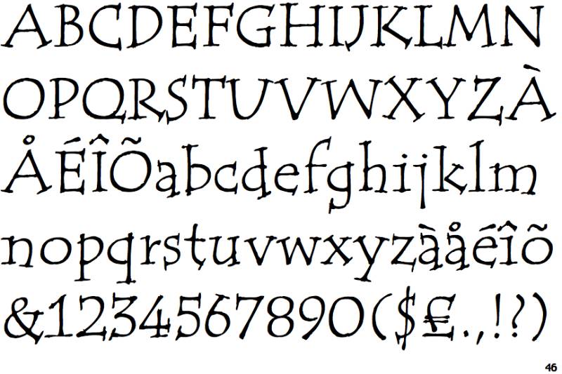
British designer Phill Grimshaw created ITC Tempus to blend calligraphic aspiration with practical reality. The font family includes both serif and sans versions that share distinctive rugged edges.
Visual Characteristics
Grimshaw used a fountain pen on porous paper, deliberately allowing ink to bleed. This technique created rough edges that deviate from perfect roman type proportions.
The characters maintain classical structure while incorporating organic imperfections. Both the serif and sans versions share these textured qualities, though the sans variant removes serifs while preserving character proportions.
Design Origin & Context
Published by ITC (International Typeface Corporation), the font reflects Grimshaw’s philosophy that perfection in calligraphy remains difficult to achieve with traditional tools. He embraced these limitations rather than fighting them.
Usage & Applications
The font performs best at larger point sizes where texture becomes an asset. Editorial design, book covers, and branding projects benefit from its character.
Small text applications reduce the impact of the textured edges. Print design contexts showcase the font better than web design due to rendering limitations at screen resolutions.
Similar Typeface Alternatives
Stone Informal provides cleaner calligraphic forms without texture. Hiroshige offers similar hand-drawn aesthetic with Asian influence. Briem Script maintains calligraphic roots with better small-size legibility.
Technical Specifications
Available in Regular and Bold weights for both Serif and Sans variants. OTF and TTF formats support standard Latin character sets. Commercial licensing through Monotype with Desktop, Web, and App EULA options.
Rosemary
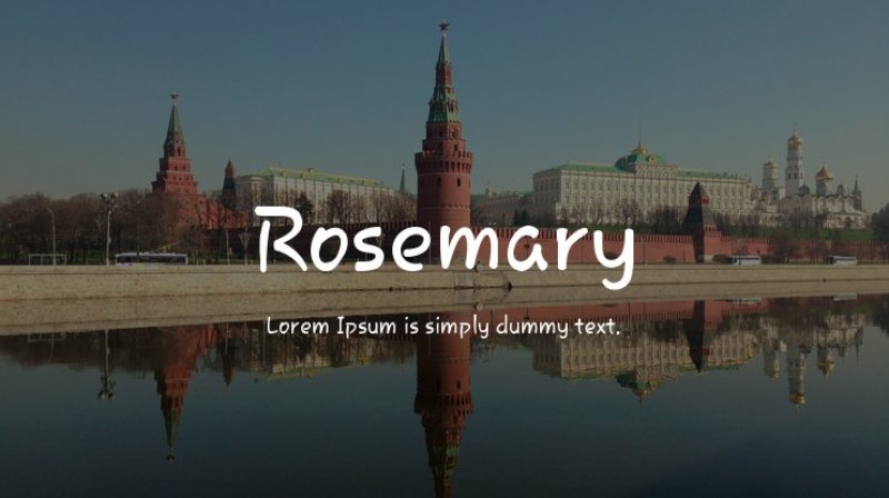
Multiple versions of Rosemary exist from different foundries, though the Samsung/YoonDesign version appears most commonly. Each interpretation brings a playful, hand-drawn quality to display applications.
Visual Characteristics
The letterforms combine casual script elements with display functionality. Characters feature varying stroke widths and organic shapes that suggest handwriting without strict cursive connections.
Some versions lean toward serif details while others embrace pure display aesthetics. The unified element across versions remains the approachable, friendly character that works for contemporary projects.
Design Origin & Context
YoonDesign Inc. released their Rosemary version in 2011 for Samsung devices. Chank Diesel created a separate Rosemary font for Chank foundry with distinct characteristics.
Both versions emerged during a period of increased interest in humanist, hand-drawn typefaces for digital applications.
Usage & Applications
Perfect for logos, branding materials, and social media graphics where personality matters more than formal presentation. Children’s books, invitation design, and creative packaging benefit from its warmth.
Not suitable for body text or professional documents where readability and formality are required.
Similar Typeface Alternatives
Felt Tip provides similar casual energy with cleaner structure. Boulevard offers handwritten style with better versatility across weights. Marker Felt delivers comparable approachability with tighter letterspacing.
Technical Specifications
The YoonDesign version supports extensive language coverage including Latin, Hebrew, Thai, Hangul, and Hiragana character sets. Available in TrueType format with free personal use licensing. Commercial versions offer additional weights and refined spacing.
Burowai
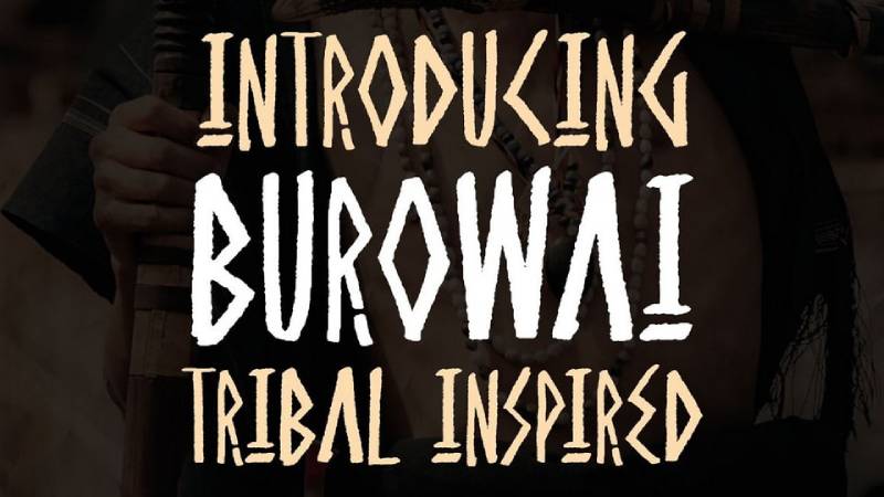
An ethnic display typeface drawing from ancient Greek letters, tree branch shapes, and cave symbols. Burowai captures tribal aesthetics through deliberate roughness and primitive forms.
Visual Characteristics
Letterforms feature irregular strokes that mimic natural elements and ancient inscriptions. Characters combine rough textures with organic shapes suggesting weathered stone or carved wood.
The uppercase-only design emphasizes bold, declarative statements. Multiple alternate characters enable custom combinations for unique tribal handwritten effects.
Design Origin & Context
Created as a modern interpretation of ancient visual language systems. The design process combined research into archaeological typography with contemporary display font requirements. Natural themes, folk traditions, and tribal motifs informed the aesthetic direction.
Usage & Applications
Best deployed in poster design, album covers, event branding, and adventure-themed projects. Environmental and cultural organizations use it for campaigns emphasizing heritage connections.
Limited to headline and display use due to lack of lowercase characters. Reading extended text becomes difficult with the decorative styling.
Similar Typeface Alternatives
Mesquite provides cleaner ancient aesthetic with better readability. Herculanum offers Roman-inspired forms with similar gravitas. Trajan brings classical proportions without excessive texture.
Technical Specifications
Available in OTF, TTF, and WOFF formats. Includes extensive alternate characters and accent marks. Free for personal use with commercial licensing required for business applications. Uppercase letters, numbers, and symbols only.
Old North
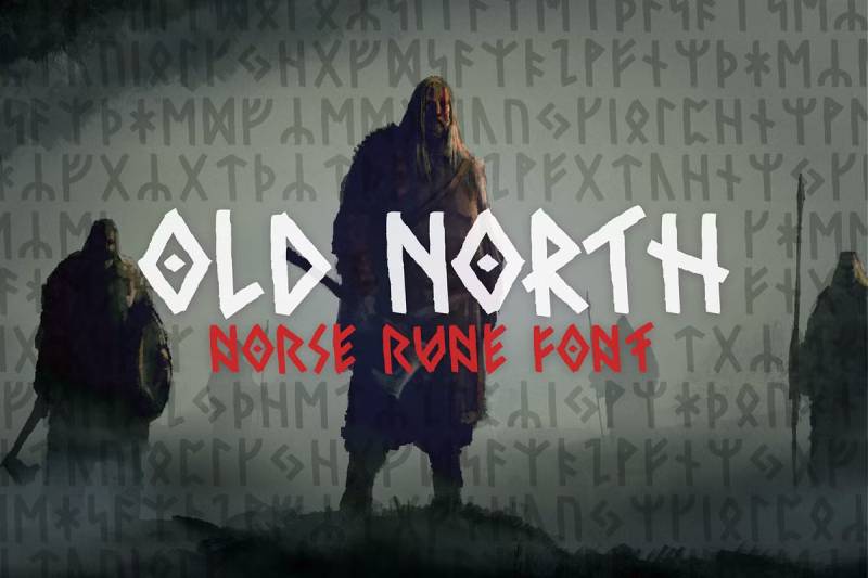
Norse rune-inspired font offering authentic Viking aesthetic through two distinct runic alphabets. Old North bridges historical accuracy with modern Latin character functionality.
Visual Characteristics
Features two complete styles of runes applied to uppercase and lowercase letters. Additional stylistic alternates based on authentic Norse runes expand creative possibilities dramatically.
The angular, geometric forms capture the carved quality of historical runic inscriptions. Wide Latin character support enables modern language use while maintaining period aesthetic.
Design Origin & Context
Designed to bring genuine Norse and Viking visual language into contemporary digital typography. The development process involved studying actual runic artifacts to ensure authenticity. Both simplified and complex runic forms received equal attention.
Usage & Applications
Fantasy novels, game design, historical reenactment materials, and Nordic cultural projects benefit from the authentic character. Museum exhibitions and educational materials about Viking history employ it for period-appropriate presentation.
The specialized aesthetic limits mainstream commercial applications. Best reserved for projects specifically requiring Norse visual identity.
Similar Typeface Alternatives
Jotunheim offers similar runic inspiration with three complexity levels. Norseman provides cleaner Viking aesthetic with better versatility. Runic ALS delivers authentic rune forms in more compact structure.
Technical Specifications
Includes multiple stylistic sets with authentic rune variations for A-Z. Available in TrueType and OpenType formats with full Latin character support. Uppercase and lowercase feature different runic interpretations. Some characters include mirrored versions accessible through Caps Lock.
Azteker
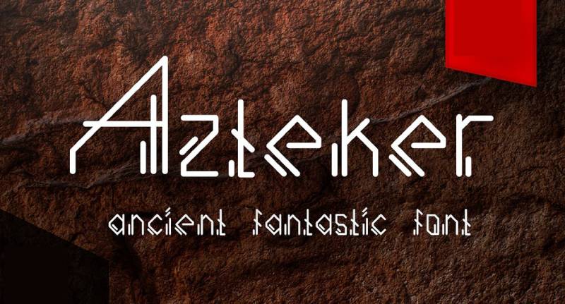
Ancient-inspired display font merging historical elements with contemporary sans-serif structure. Azteker brings sophisticated Mesoamerican aesthetic to fashion and editorial design.
Visual Characteristics
Clean sans-serif letterforms receive decorative linear elements suggesting ancient inscriptions. The additions remain subtle enough to maintain modern readability.
Characters balance geometric precision with organic decorative touches. Uppercase and lowercase work together seamlessly while offering distinct personalities.
Design Origin & Context
Created to bridge ancient cultural aesthetics with modern design sensibilities. The development focused on making historical inspiration accessible for contemporary branding. Fashion industry and book publishing drove initial use cases.
Usage & Applications
Apparel design, book cover design, fashion branding, and title applications showcase the font’s strengths. Logo design projects benefit from its unique character.
Works for body text in limited applications where decorative style supports content. Vector decoratives and frame elements extend design possibilities.
Similar Typeface Alternatives
Neutraface provides cleaner geometric sans with display presence. Gotham offers similar structure without decorative elements. Avenir brings sophisticated sans-serif styling with better versatility.
Technical Specifications
Available in OTF format with uppercase, lowercase, numerals, and punctuation. Bonus vector decoratives and frames included in some packages. PSD format templates accompany certain commercial licenses. Standard Latin character coverage.
Ancient Totem
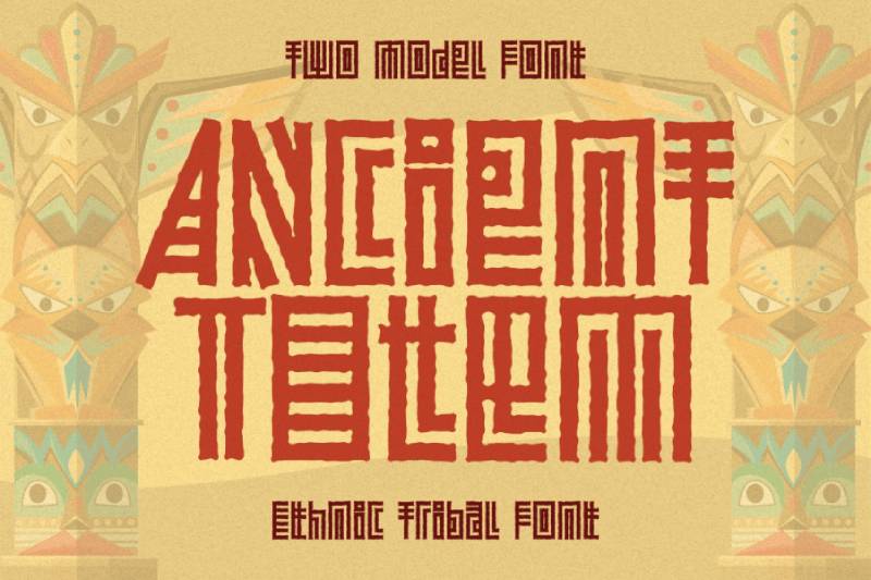
Ethnic tribal font featuring two distinct model variations inspired by traditional indigenous styles. Ancient Totem captures ceremonial and cultural heritage through bold decorative forms.
Visual Characteristics
Bold letterforms incorporate geometric patterns and symbolic elements from various tribal traditions. Regular and textured versions offer different intensity levels.
The playful character maintains cultural authenticity while remaining accessible for contemporary applications. Massive characters command attention though spacing requires careful attention.
Design Origin & Context
PutraCetol Studio developed Ancient Totem to celebrate traditional tribal and ethical design traditions. The font emerged from research into indigenous visual languages across multiple cultures. Both modern technology compatibility and cultural respect guided development decisions.
Usage & Applications
Packaging design, branding materials, greeting cards, advertisements, and billboard applications benefit from its commanding presence. T-shirt designs, stickers, and apparel graphics work well with both versions.
Body paragraph use creates overcrowding issues due to character size. Best limited to headlines and display contexts where spacing can be carefully controlled.
Similar Typeface Alternatives
Tribal Broots offers similar cultural aesthetic with tighter spacing. Naluka provides ethnic styling with additional decorative elements. Folk delivers tribal influences through more restrained letterforms.
Technical Specifications
Two font models available (Regular and Textured) in TTF and OTF formats. Full multilingual support across Latin character sets. Compatible with Windows, macOS, Cricut, Procreate, and various design software. Free personal use with commercial licensing through developer website.
Nomad Tribes
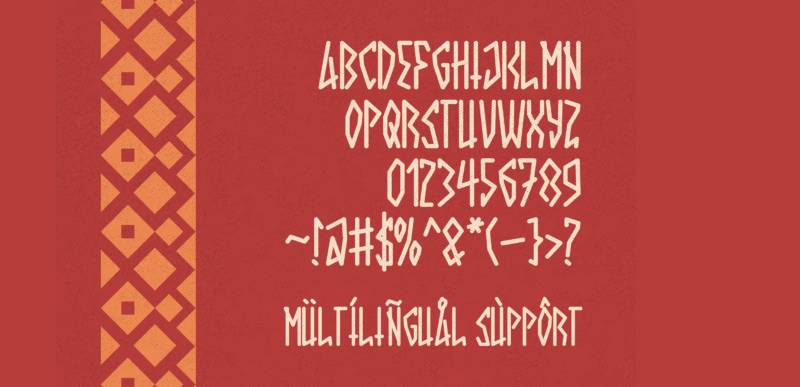
Ancient display font capturing the spirit of nomadic civilizations through bold decorative styling. Each letter carries visual weight suggesting tales from forgotten cultures.
Visual Characteristics
Intricate decorative details suggest ancient calligraphy and tribal artistry. Angular geometric patterns combine with organic curves throughout characters.
The bold presence creates striking visual impact in large-scale applications. Sharp edges and complex internal patterns demand attention without becoming illegible.
Design Origin & Context
Developed by Asf Graphics in 2023 as a typographic journey through ancient civilizations. The design process explored how nomadic peoples left visual marks across landscapes. Historical research informed decorative pattern selection.
Usage & Applications
Album covers, world music branding, cultural event materials, and travel-themed projects showcase the font effectively. Branding for cultural organizations and heritage sites benefits from authentic character.
Complex decorative elements make small-size applications impractical. Reserved exclusively for headline and display contexts where details remain visible.
Similar Typeface Alternatives
LOST TRIBES provides similar tribal aesthetic with brush texture. Miketoba offers ancient distressed styling with Celtic influences. Konvix merges tribal elements with sci-fi modernism.
Technical Specifications
Available as decorative display font with geometric tribal aesthetic. Full uppercase, lowercase, numbers, and special characters maintain consistent bold angular design. Standard Latin character support across modern operating systems.
Jotunheim
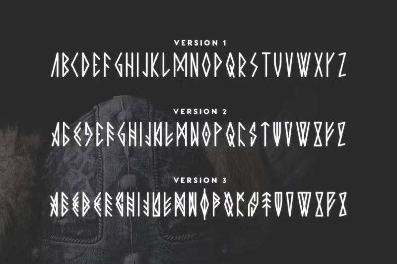
Rune-inspired decorative font offering three distinct complexity levels for flexible ancient Nordic design. Created by Tugcu Design Co. for authentic historical projects.
Visual Characteristics
Version 1 emphasizes simplicity and legibility with clean runic forms. Version 2 increases authenticity through more complex rune interpretation. Version 3 delivers maximum intricacy for fully immersive historical aesthetic.
Uppercase multilingual letters receive primary attention while simple punctuation and numbers support basic text requirements. Mirrored character versions accessible via Caps Lock add creative flexibility.
Design Origin & Context
Inspired by authentic ancient runes discovered in archaeological research. Tugcu Design Co. developed the three-tiered complexity system to serve different project needs. The most intricate version sacrifices some legibility for period accuracy.
Usage & Applications
Fantasy game design, Viking-themed entertainment properties, historical fiction covers, and Nordic cultural materials employ the font successfully. Museum exhibits and educational content about Scandinavian history benefit from authenticity.
Mix different versions within single projects to balance impact with readability. Version 1 handles more text-heavy applications while Version 3 creates dramatic headlines.
Similar Typeface Alternatives
Old North provides similar Norse aesthetic with full Latin compatibility. Norseman offers Viking character through less complex forms. Mjolnir captures Nordic mythology through tribal styling.
Technical Specifications
Three font files with increasing complexity levels. Uppercase letters, numbers, and basic punctuation across all versions. Some characters feature mirrored variants. Available in standard font formats with straightforward installation across platforms.
Nowra

Ethnic display font inspired by Papua’s rich artistic traditions and Indonesian cultural heritage. Nowra weaves intricate tribal motifs into elegant, high-contrast serif characters.
Visual Characteristics
Condensed serif structure combines with tribal pattern integration throughout letterforms. High contrast between thick and thin strokes creates sophisticated fashion-forward aesthetic.
The ethnic display characteristics capture Papua’s artistic energy while maintaining refined elegance. Each character incorporates cultural motifs without overwhelming core letterform structure.
Design Origin & Context
Created to honor and share Papua’s cultural visual traditions through contemporary typography. The condensed structure emerged from desire to balance cultural authenticity with modern design trends. High contrast serif foundation provides confidence and sophistication.
Usage & Applications
Fashion branding, cultural event materials, art exhibition graphics, and editorial design benefit from unique character. Projects celebrating ethnic diversity and Polynesian themes find authentic voice through Nowra.
The specialized cultural aesthetic limits universal application. Best reserved for projects where Indonesian or Pacific cultural connection enhances message.
Similar Typeface Alternatives
Naluka offers ethnic styling with tiki culture influences. Tribal Broots provides similar cultural heritage emphasis. Miketoba brings ethnic patterns through different regional inspiration.
Technical Specifications
High contrast serif font with condensed proportions. Includes intricate tribal pattern integration throughout character designs. Standard font formats support contemporary design software across operating systems.
Rimba Andalas
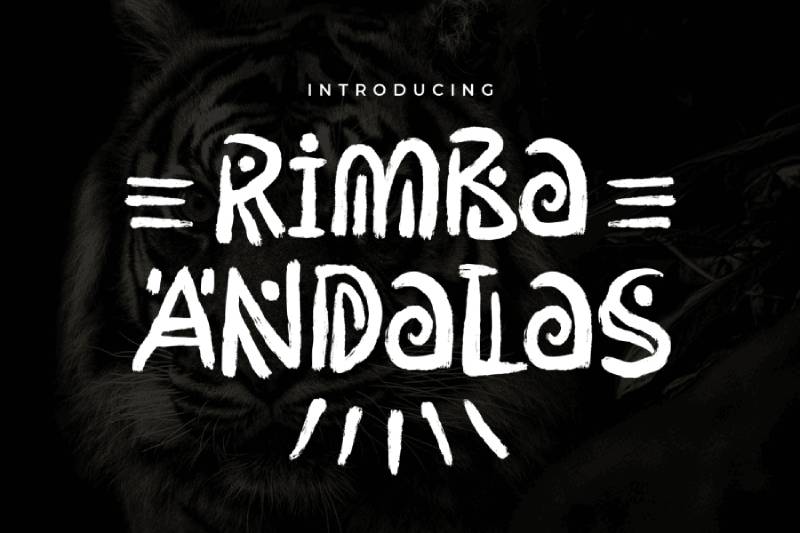
Inventive ethnic display font drawing from nature’s elements and ancient symbols. Arterfak Project created Rimba Andalas to communicate natural and tribal themes through contemporary handwritten aesthetics.
Visual Characteristics
Letterforms combine tree branch shapes, cave symbols, and natural elements into cohesive design. Tribal and irregular strokes highlight electromagnetic energy of unique display characteristics.
Smooth curves alternate with repeating decorative lines throughout characters. The playful feel maintains functionality across various display applications despite complex approach.
Design Origin & Context
Ahmad Ramzi Fahruddin designed Rimba Andalas in 2020 for Arterfak Project. Natural theme projects and tribal cultural work drove design decisions. Cave art and ancient symbols found in nature provided primary inspiration sources.
Usage & Applications
Zoo graphics, nature-related advertising, outdoor recreation branding, and environmental campaign materials work well with natural aesthetic. Signage, websites, logos, headers, and print designs for adventure themes benefit from unique character.
Complex decorative approach overpowers formal or minimalist design contexts. Reserved for projects where natural or tribal visual language supports core message.
Similar Typeface Alternatives
Burowai offers similar tribal inspiration with Greek influences. Ancient Totem provides ethnic styling through different decorative approach. Tribal Broots delivers cultural heritage aesthetic with distinct pattern choices.
Technical Specifications
Two font files available supporting 12 languages. Includes dual-case letters, numbers, symbols, numerous ligatures, and accent marks. TTF format with free personal use, commercial licensing through Arterfak Project website. Copyright 2020 Arterfak Project with all rights reserved.
Paraoh

Stylish handwritten script font delivering clean, extraordinary typography results. Paraoh captures organic flow similar to Papyrus while maintaining better contemporary usability.
Visual Characteristics
Flowing script letterforms suggest confident handwriting without excessive decoration. The clean execution keeps individual character shapes readable even at smaller sizes.
Balance between casual script energy and professional polish creates versatile aesthetic. Connections between letters flow naturally without forced continuity.
Design Origin & Context
Developed as modern alternative to heavily textured ancient-style fonts. The design prioritized maintaining handwritten character while improving practical usability. Clean lines and extraordinary results became guiding principles throughout development.
Usage & Applications
Logo design, headers, title treatments, and print applications showcase the script styling effectively. Creative projects requiring personal touch without rustic heaviness find good balance.
Extended body text reduces readability due to script characteristics. Best deployed selectively for emphasis and creative expression.
Similar Typeface Alternatives
Duffy Script offers similar script energy through different stylistic interpretation. Mistral provides flowing script with established commercial track record. Brush Script delivers comparable handwritten aesthetic with wider recognition.
Technical Specifications
Available in TTF and OTF formats for broad compatibility. Standard script font features with connected letterforms. Simple installation and use across common design applications and word processors.
Tropicane
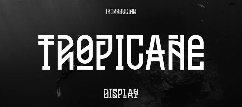
Abstract sans-serif font blending electro influences with traditional aesthetics into stylish versatile design. Tropicane brings distinctive character to contemporary headline and branding applications.
Visual Characteristics
Sans-serif structure receives abstract decorative treatments suggesting tropical or electronic influences. The fusion creates unique aesthetic that stands apart from standard geometric sans faces.
Minimalist undertones allow versatile deployment across different design contexts. Characters maintain clarity while offering memorable distinctiveness.
Design Origin & Context
Created to bridge multiple aesthetic traditions into cohesive modern typeface. Electronic music culture, tropical design trends, and traditional typography informed development. Versatility across applications guided technical decisions.
Usage & Applications
Headlines, labels, minimalist print design, flyers, posters, and t-shirt graphics benefit from unique character. Logo applications and branding projects find distinctive voice through abstract styling.
The specialized aesthetic works best with limited text applications. Body copy and extended reading reduce impact of decorative qualities.
Similar Typeface Alternatives
Neue provides cleaner sans-serif approach with better versatility. Bilo offers geometric sans styling with display character. Hurme Geometric Sans combines similar modern sensibility with traditional structure.
Technical Specifications
Sans-serif display font with abstract decorative elements. Standard font format compatibility across design software and operating systems. Includes uppercase, lowercase, numerals, and basic punctuation.
Papira
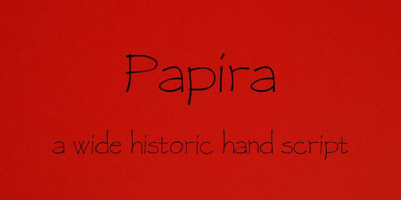
Display font capturing ancient papyrus aesthetic through contemporary typeface structure. Papira offers direct alternative to original Papyrus while addressing some common criticisms.
Visual Characteristics
Letterforms suggest hand-crafted organic quality associated with ancient writing surfaces. Texture and irregularity remain present but controlled for better modern usability.
The design balances historical inspiration with practical functionality. Characters maintain distinctiveness without excessive decoration overwhelming readability.
Design Origin & Context
Developed specifically as response to demand for better Papyrus alternatives. The creation process studied what made original appealing while identifying opportunities for refinement. Modern font technology enabled improvements impossible during Papyrus’s original development.
Usage & Applications
Projects requiring ancient or organic aesthetic without Papyrus’s controversial reputation benefit from alternative approach. Historical themes, natural product branding, and cultural materials find suitable voice.
Still carries some association with original despite improvements. Designers should consider project context and client base when selecting.
Similar Typeface Alternatives
Parchment offers similar ancient manuscript aesthetic. Mesquite provides Greek-inspired organic character. Cochin brings refined historical styling through different structural approach.
Technical Specifications
Standard display font format with organic decorative characteristics. Compatible across modern design software and operating systems. Includes typical character sets for Latin-based languages.
Magalon
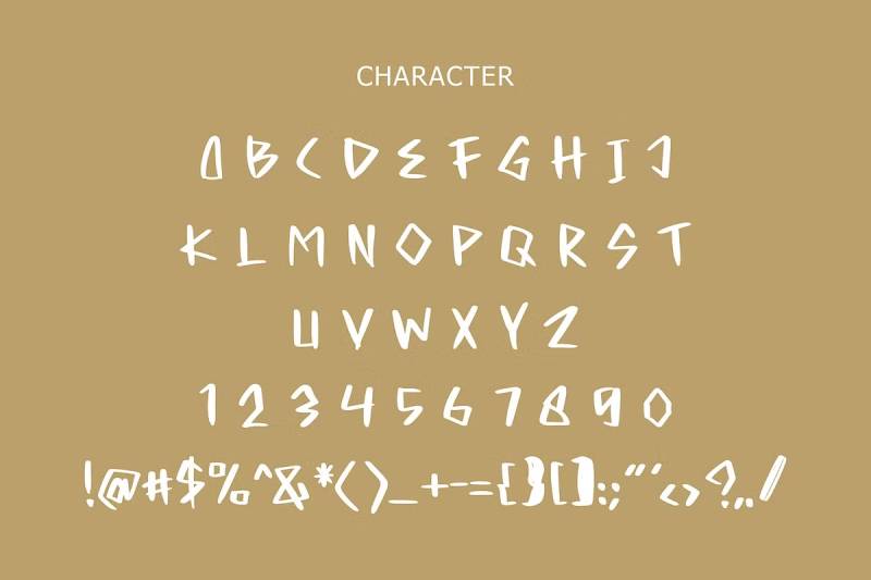
Display font combining vintage charm with contemporary functionality for distinctive headline applications. Magalon brings character-rich styling to branding and editorial projects.
Visual Characteristics
Letterforms feature decorative elements suggesting historical influences without strict period accuracy. The vintage aesthetic reads as charming rather than formal or academic.
Characters balance personality with practical readability in display contexts. Distinctive styling creates memorable visual identity without excessive ornamentation.
Design Origin & Context
Created during renewed interest in vintage and retro design aesthetics. The development balanced historical inspiration with modern usability requirements. Display headline use guided structural decisions throughout creation.
Usage & Applications
Editorial headlines, branding materials, and vintage-themed projects benefit from distinctive character. Restaurant menus, product packaging, and artisan brand identities find appropriate voice.
Limited to display and headline applications due to decorative nature. Body text and extended reading require different typeface solutions.
Similar Typeface Alternatives
Bookmania provides similar vintage character through different stylistic approach. Freight Display offers refined historical styling with better versatility. Chronicle Display brings editorial sophistication with comparable charm.
Technical Specifications
Display font with vintage decorative characteristics. Standard font formats support common design applications. Includes uppercase, lowercase, numerals, and punctuation across Latin character sets.
Duffy Script
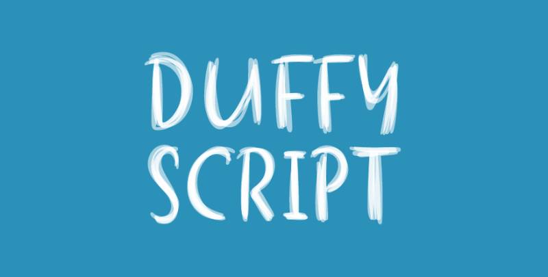
Flowing script font with multiple variations offering illustrator’s grace across diverse design applications. Duffy Script delivers handwritten aesthetic with controlled elegance.
Visual Characteristics
Script letterforms suggest confident calligraphic brushwork without excessive decoration. Variations provide different weights and styling options for flexible application.
The illustrator’s approach creates refined handwritten quality. Characters flow together naturally while maintaining individual clarity.
Design Origin & Context
Developed to provide versatile script solution for professional design work. The creation process emphasized both artistic expression and practical functionality. Multiple variations emerged from desire to serve different project requirements.
Usage & Applications
Invitations, branding materials, editorial headlines, and personal stationery showcase elegant script characteristics. Projects requiring sophisticated handwritten quality without casual roughness benefit from refinement.
Extended text applications reduce readability as with most script fonts. Best deployed selectively for creative emphasis and personalization.
Similar Typeface Alternatives
Bickham Script provides similar calligraphic elegance with wider recognition. Edwardian Script offers comparable flowing aesthetic. Kunstler Script delivers refined handwriting through different stylistic interpretation.
Technical Specifications
Multiple font variations with different weights and styling options. Standard script font formats compatible across design software. Includes connected letterforms with natural flow characteristics.
Film Cryptic
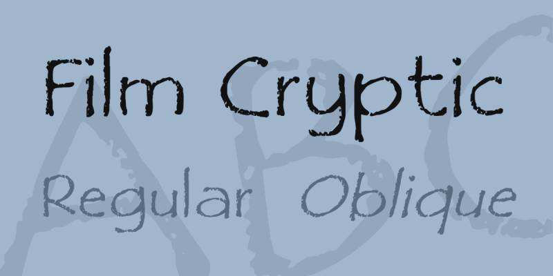
Versatile sans-serif font stepping beyond standard geometric forms toward distinctive character. Film Cryptic offers unique alternative for creative projects requiring memorable typography.
Visual Characteristics
Sans-serif structure receives unconventional treatments creating cryptic, mysterious aesthetic. The design suggests film noir or thriller genre influences through character shapes.
Letterforms maintain functionality while offering distinctive visual presence. The balance between readability and character creates versatile display option.
Design Origin & Context
Created to serve film and entertainment design projects requiring atmospheric typography. The development process explored how letterform modifications could suggest narrative genre and mood. Cryptic name reflects mysterious visual qualities throughout design.
Usage & Applications
Film titles, entertainment branding, poster design, and atmospheric graphic projects benefit from unique character. Mystery, thriller, and noir aesthetic projects find appropriate typographic voice.
The specialized aesthetic limits universal deployment. Works best when mysterious or atmospheric qualities enhance project message.
Similar Typeface Alternatives
Trade Gothic provides cleaner sans-serif with display presence. Franklin Gothic offers similar structure without cryptic modifications. Antique Olive brings unconventional sans-serif character through different approach.
Technical Specifications
Sans-serif display font with 214 characters. Available in standard font formats for desktop and web use. Includes uppercase, lowercase, numerals, and punctuation supporting basic Latin languages.
Plato
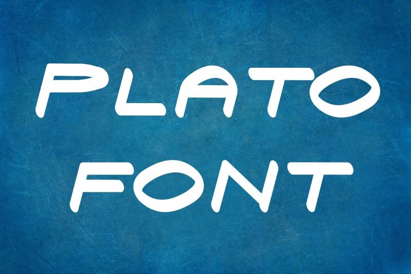
Robust typeface standing among fonts delivering strong ancient Greek aesthetic. Plato brings classical proportions and historical gravitas to contemporary digital typography.
Visual Characteristics
Letterforms suggest carved stone inscriptions and classical Greek architectural lettering. Strong geometric structure provides stability and timeless aesthetic.
Characters balance historical accuracy with practical modern functionality. The robust construction creates authoritative presence appropriate for serious applications.
Design Origin & Context
Named for famous Greek philosopher, the font channels classical Hellenic design traditions. Development studied historical Greek letterforms while adapting proportions for contemporary use. Personal and commercial licensing availability reflects broad intended use.
Usage & Applications
Academic publications, museum materials, philosophy and classics-related projects benefit from authentic classical aesthetic. Historical fiction, educational materials, and cultural organization branding find appropriate voice.
The serious classical aesthetic limits playful or contemporary applications. Best reserved for projects where historical Greek connection strengthens message.
Similar Typeface Alternatives
Herculanum offers similar ancient aesthetic with different structural approach. Lithos provides Greek-inspired character through modern sans-serif execution. Trajan brings classical proportions without specifically Greek cultural associations.
Technical Specifications
Robust display font with classical Greek-inspired structure. Standard font formats support common design applications. Includes full Latin character sets for contemporary language support.
Humana Sans ITC
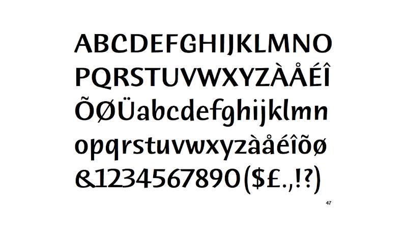
Calligraphic sans-serif created by British designer Timothy Donaldson using broad-tipped pen. Humana Sans ITC brings organic handwritten quality to wide range of print and web design applications.
Visual Characteristics
Sans-serif letterforms receive calligraphic treatment through broad-tipped pen construction. The result combines geometric sans structure with humanist warmth.
Stroke weight variations suggest handwriting without departing from sans-serif classification. Multiple weights provide versatility across different design contexts.
Design Origin & Context
Published by ITC, the font represents Donaldson’s exploration of calligraphic sans-serif possibilities. The broad-tipped pen approach created distinctive stroke characteristics. Design aimed for broad applicability across both print and digital media.
Usage & Applications
Editorial design, corporate communications, branding materials, and web typography benefit from approachable calligraphic quality. The versatility across multiple weights enables flexible type hierarchy systems.
The calligraphic qualities work better at medium to large sizes. Small text applications may lose distinctive characteristics depending on rendering environment.
Similar Typeface Alternatives
Myriad provides similar humanist sans without calligraphic elements. Frutiger offers comparable warmth through different structural approach. Gill Sans brings British design tradition with hand-drawn qualities.
Technical Specifications
Multiple weight variants from Light through Bold. Available in OTF and TTF formats with standard Latin character coverage. Commercial licensing through Monotype with various EULA options for different usage scenarios.
Inkster
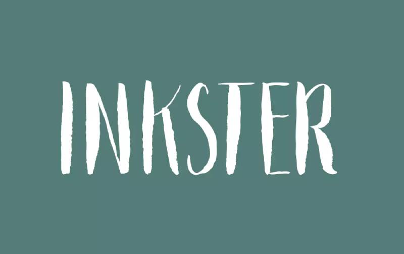
Quirky display font teasing the line between whimsical character and professional functionality. Inkster brings unique texture and personality to character-filled design projects.
Visual Characteristics
Letterforms feature unconventional construction suggesting ink-based experimentation. The texture creates memorable visual presence without overwhelming legibility.
Characters balance playfulness with controlled execution. The design walks carefully between eccentric novelty and useful professional tool.
Design Origin & Context
Created to serve projects requiring distinctive personality beyond standard typeface offerings. The development explored how far character expression could push while maintaining usability. Ink texture suggestions informed naming and aesthetic decisions.
Usage & Applications
Creative branding, independent publishing, artistic poster design, and personality-driven projects showcase quirky characteristics effectively. Design studios and creative professionals seeking distinctive voice find useful alternative.
Limited to display and headline contexts due to unconventional styling. Professional corporate applications may find aesthetic too informal depending on brand guidelines.
Similar Typeface Alternatives
House Industries fonts provide similar design experimentation. Emigre typefaces offer comparable pushing of typographic boundaries. Letterror designs bring unconventional approaches through different execution.
Technical Specifications
Display font with quirky texture and unconventional letterforms. Standard font formats support desktop and web applications. Includes basic character sets for English and common European languages.
Rotis Semi Serif
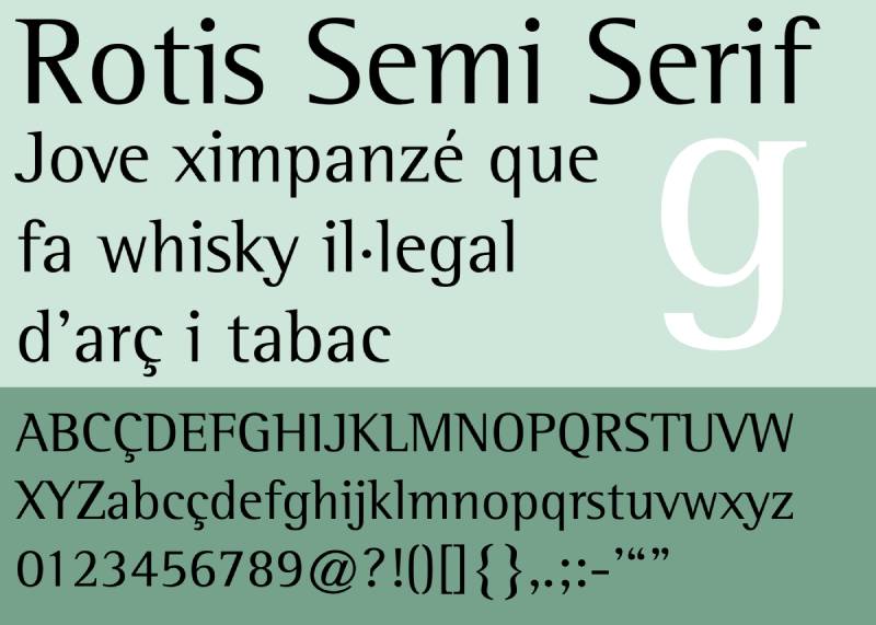
Hybrid typeface designed by Otl Aicher exploring maximum legibility through unified yet varied font family. Rotis Semi Serif bridges serif and sans characteristics into balanced structure.
Visual Characteristics
Letterforms combine subtle serif details with primarily sans structure creating hybrid classification. Small serifs appear strategically rather than consistently across all characters.
The semi-serif approach creates distinctive middle ground between traditional categories. High legibility remains paramount throughout design decisions.
Design Origin & Context
German graphic designer and typographer Otl Aicher created Rotis in 1988 as exploration of typeface family unity. The complete Rotis family ranges from full serif through glyphic to pure sans. Semi Serif variant became most widely adopted version.
Usage & Applications
Corporate identity, signage systems, editorial design, and wayfinding benefit from legible hybrid structure. Organizations like Accenture, Nokia, and PNC Financial Services employed it in branding. Street signage and transit systems use it for clarity.
The hybrid classification creates debate among typography purists. Erik Spiekermann notably criticized the design despite widespread commercial adoption.
Similar Typeface Alternatives
TheSerif provides similar hybrid approach with different proportions. FF Meta Serif bridges categories through different structural decisions. Stone Serif family offers related serif-sans exploration.
Technical Specifications
Part of larger Rotis family system with Serif, Semi Serif, Semi Sans, and Sans variants. Available in multiple weights providing flexible type systems. Standard font formats support professional design workflows across platforms.
Mateo
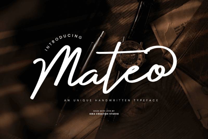
Contemporary display font bringing refined character to branding and headline applications. Mateo combines sophistication with approachability through balanced letterform design.
Visual Characteristics
Letterforms feature refined proportions suggesting careful geometric construction. The sophisticated aesthetic reads as polished without becoming cold or impersonal.
Characters maintain distinctiveness while working together harmoniously. The balance creates memorable identity without decorative excess.
Design Origin & Context
Developed to serve contemporary branding projects requiring sophisticated yet approachable aesthetic. The creation process emphasized versatility across different design contexts. Display headline use guided structural and spacing decisions.
Usage & Applications
Fashion branding, lifestyle magazines, premium product packaging, and sophisticated corporate materials benefit from refined character. Projects requiring contemporary polish without sterile perfection find appropriate voice.
Limited to display and headline contexts due to display optimization. Body text applications require different typeface solutions for extended reading.
Similar Typeface Alternatives
Freight Display offers similar sophistication through different stylistic approach. Chronicle Display provides comparable refinement with more versatile family. Quarto brings elegant headline solutions with related aesthetic sensibility.
Technical Specifications
Display font optimized for headline and branding applications. Standard font formats compatible across design software platforms. Includes uppercase, lowercase, numerals, and punctuation for Latin-based languages.
ITC Highlander
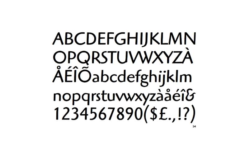
Soft terminal monoline font by Dave Farey based on Oswald Cooper’s work. ITC Highlander brings early 20th-century American design sensibility to contemporary sans-serif applications.
Visual Characteristics
Characters feature soft terminals rather than purely geometric sans construction. The monoline approach maintains even stroke weight with subtle variations.
Slightly uneven character stroke weights suggest hand-drawn origins without obvious irregularity. Soft terminals aid readability compared to strictly geometric sans designs.
Design Origin & Context
Farey discovered Oswald Cooper’s display lettering exercises featuring serifless forms. Though Cooper never created complete sans-serif typeface, these exercises provided foundation. Farey developed ITC Highlander maintaining hand-drawn qualities from original inspiration.
Usage & Applications
Editorial design, branding materials, book design, and sophisticated headline applications benefit from refined sans character. Projects requiring warmth beyond purely geometric sans solutions find good balance.
The subtle hand-drawn qualities work better at display sizes. Small text applications may lose distinctive characteristics.
Similar Typeface Alternatives
ITC Novarese shares designer’s aesthetic sensibility through serif structure. P22 Underground brings soft terminal approach through different inspiration. Cooper Black connects to original Oswald Cooper’s better-known work.
Technical Specifications
Available in Book, Medium, Bold weights with corresponding italic variants. OTF format provides desktop use across platforms. Published by ITC with commercial licensing through Monotype. 252 characters support standard Latin typography.
Alcuin
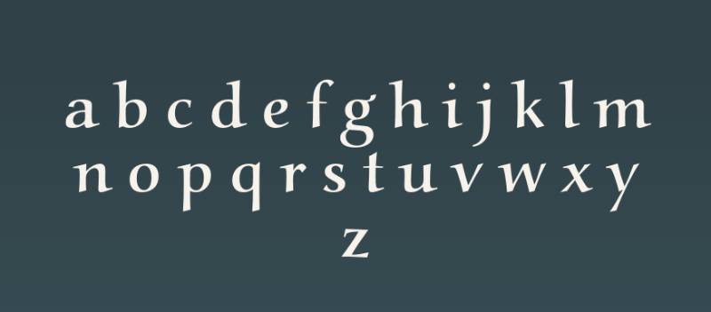
Historical calligraphic font inspired by medieval manuscript traditions and Carolingian minuscule. Alcuin brings authentic period aesthetic to projects requiring scholarly or religious historical character.
Visual Characteristics
Letterforms replicate pen-drawn calligraphy from medieval manuscripts. The proportions follow historical models rather than modern optical optimization.
Characters display distinctive medieval letter shapes including long s and period-specific ligatures. The authentic approach creates strong historical atmosphere.
Design Origin & Context
Named for Alcuin of York, the scholar who standardized Carolingian minuscule script. Font development studied historical manuscripts to ensure authentic representation. Period accuracy guided decisions over modern usability preferences.
Usage & Applications
Historical reenactment materials, medieval studies publications, museum exhibits, and religious historical documents employ authentic character. Projects requiring specific medieval period aesthetic find accurate voice.
The specialized historical aesthetic limits contemporary applications. Modern readers may struggle with unfamiliar letterforms in extended text.
Similar Typeface Alternatives
Cloister provides related medieval aesthetic through different stylistic approach. Carolus brings Carolingian influences with better modern adaptation. Libra offers historical calligraphic character with improved contemporary usability.
Technical Specifications
Calligraphic font based on Carolingian minuscule historical models. Includes period-appropriate ligatures and alternative letter forms. Available in standard font formats for digital typography applications.
Vaska
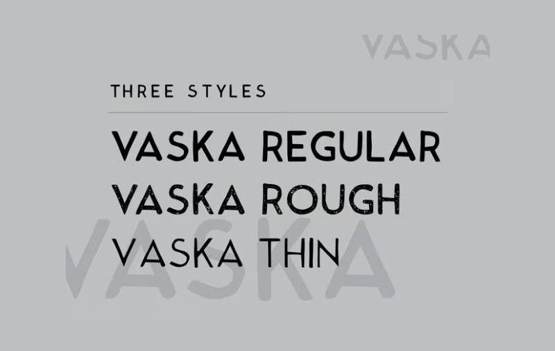
Contemporary display font combining geometric structure with organic warmth for versatile branding applications. Vaska brings balanced aesthetic serving diverse creative projects.
Visual Characteristics
Letterforms merge geometric construction principles with softened humanist qualities. The combination creates approachable aesthetic without sacrificing sophistication.
Characters maintain strong structure while incorporating subtle warmth through refined details. The balance enables flexible deployment across different design contexts.
Design Origin & Context
Developed to bridge purely geometric and overtly humanist approaches in contemporary display typography. The creation process sought sweet spot between technical precision and organic character. Multiple use case scenarios guided design decisions.
Usage & Applications
Branding materials, editorial headlines, packaging design, and sophisticated digital applications benefit from balanced aesthetic. Projects requiring contemporary polish with human warmth find appropriate character.
Display optimization limits body text applications. Best deployed for headlines and short text where character details remain visible.
Similar Typeface Alternatives
Brandon Grotesque provides similar geometric-humanist balance through different execution. Proxima Nova offers comparable versatility with established commercial track record. Avenir brings geometric warmth through classic modernist approach.
Technical Specifications
Display font with geometric structure and humanist refinements. Standard font formats support common design applications. Includes full character sets for Latin-based languages with numerals and punctuation.
FAQ on Fonts Similar To Papyrus
Why do designers avoid Papyrus?
Papyrus became overused after Microsoft bundled it with Office in 1997. Its appearance in countless amateur projects damaged its reputation among professional designers. The textured, ancient aesthetic feels dated and lacks versatility for modern branding. Better alternatives exist that capture similar organic qualities without the controversial associations.
What makes a good Papyrus alternative?
Strong alternatives balance organic character with practical usability. Look for fonts offering textured or handcrafted aesthetics without excessive decoration. Typography should maintain readability at intended sizes while providing distinctive personality. Consider weight options, licensing terms, and technical format support for your specific project requirements.
Are there free fonts similar to Papyrus?
Ancient Totem, Parchment MF, and Rimba Andalas offer free personal use with commercial licenses available separately. Always verify licensing terms before deployment. Free options often include limited character sets or single weights. Premium alternatives provide better technical support and expanded font families for professional applications.
Which Papyrus alternative works best for logos?
ITC Tempus, Burowai, and Azteker deliver strong brand identity without Papyrus associations. Consider your industry and target audience when selecting. Cultural organizations benefit from authentic tribal fonts while fashion brands prefer refined decorative options. Test logo design concepts at multiple sizes before finalizing.
Can I use these fonts for web design?
Most alternatives include webfont formats (WOFF, WOFF2) for browser compatibility. Check licensing terms since desktop and web use require different agreements. Rotis Semi Serif, Humana Sans ITC, and ITC Tempus work well for web typography. Optimize file sizes and test rendering across devices before launch.
What font captures ancient Egyptian aesthetics?
Parchment MF and Plato reference historical writing systems without literal hieroglyphic reproduction. Mesquite brings ancient Greek character while Papira offers direct Papyrus alternative. Archaeological museums and cultural exhibitions frequently employ these for authentic period representation. Pair with neutral body text for balanced visual hierarchy.
How do I pair fonts with Papyrus alternatives?
Combine decorative display fonts with clean sans-serif or serif fonts for body text. Ancient Totem pairs well with simple sans-serif fonts like Open Sans. ITC Tempus works with traditional book serifs. Maintain strong contrast between headline and body typefaces. Limit font combinations to two or three maximum.
Which alternative works for natural or organic brands?
Rimba Andalas, Burowai, and Rosemary deliver natural, handcrafted character perfect for organic products. Environmental organizations and sustainable brands benefit from tribal-inspired aesthetics. These fonts communicate authenticity and earth-friendly values. Test with actual packaging design mockups to ensure legibility at production sizes.
Are tribal fonts culturally appropriate?
Context matters significantly. Authentic cultural projects benefit from period-accurate fonts like Old North or Jotunheim. Generic tribal aesthetics risk cultural appropriation if misapplied. Research the culture you’re representing and consult community members when possible. Respect prevents graphic design mistakes that offend or misrepresent.
What’s the most versatile Papyrus alternative?
Rotis Semi Serif offers the broadest application range from corporate identity to signage systems. ITC Tempus provides strong character across multiple weights. Humana Sans ITC bridges calligraphic warmth with professional functionality. Versatility depends on your specific needs, but these three serve diverse projects effectively without specialized limitations.
Conclusion
Finding fonts similar to Papyrus doesn’t mean settling for inferior alternatives. The options presented here often surpass the original in versatility, readability, and professional credibility.
Your choice depends on project context. Historical accuracy guides museum exhibits toward Old North or Jotunheim. Commercial branding benefits from Rotis Semi Serif or ITC Tempus refinement.
Test fonts at intended sizes before committing. What works for poster design fails in body text applications. Consider kerning, leading, and tracking adjustments for optimal results.
Verify licensing terms for your usage scenario. Desktop, web, and app deployments require different permissions. Respect font psychology principles when matching typefaces to brand personality.
The right alternative elevates your design elements while avoiding Papyrus’s controversial reputation.
If you enjoyed reading this article about fonts similar to Papyrus, you should check out these articles with fonts similar to Proxima Nova, Avenir, Lato, Comic Sans, Old English, Century Gothic, Minion Pro, Gill Sans, and Eurostile.

Renowned for his expertise in logo design and visual branding, Bogdan has developed a multitude of logos for various clients.
His skills extend to creating posters, vector illustrations, business cards, and brochures. Additionally, Bogdan's UI kits were featured on marketplaces like Visual Hierarchy and UI8.
He also wrote in the past years on sites like Design Your Way, WebDesignerDepot, WPDean, Designmodo, Speckyboy, Slider Revolution, and more.
- How to Install Fonts on Mac (Step-by-Step Guide) - 20 September 2026
- From Mockup to Code: How AI-Augmented Development Speeds Up the Design Handoff - 19 September 2026
- The Beehiiv Logo History, Colors, Font, And Meaning - 18 September 2026

Bogdan Sandu is a seasoned designer who has been designing websites since 2008. Renowned for his expertise in logo design and visual branding, Bogdan has developed a multitude of logos for various clients. His skills extend to creating posters, vector illustrations, business cards, and brochures. Additionally, Bogdan's UI kits were featured on marketplaces like Visual Hierarchy and UI8. He also wrote in the past years on sites like Design Your Way, WebDesignerDepot, WPDean, Designmodo, Speckyboy, Slider Revolution, and more.
You Might Also Like