


The Comcast logo is one of the most recognized corporate marks in American telecommunications. It represents Comcast Corporation, the largest home internet provider and one of the biggest cable television companies in the United States.
Founded as American Cable Systems in 1963, the company rebranded to Comcast in 1969. The name itself is a mashup of “Communication” and “Broadcast.” Over the decades, the logo has gone through four major versions, each reflecting a different chapter in the company’s growth from a small cable operator in Mississippi to a global media giant headquartered in Philadelphia.
The current version pairs the famous NBC peacock emblem with a custom wordmark. It signals Comcast’s ownership of NBCUniversal and its reach across cable, internet, streaming, and entertainment. The logo has become shorthand for a company that touches millions of households daily.
What Is the Comcast Logo?

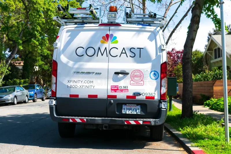
The Comcast logo is a combination mark featuring the six-feathered NBC peacock positioned above a custom uppercase wordmark reading “COMCAST.” It was first introduced in December 2012 after Comcast acquired a majority stake in NBCUniversal, and it was designed by Comcast’s in-house team. The peacock symbolizes the diversity of content and services the company offers across media and technology.
Here’s a breakdown of its key attributes:
- Design Type: Combination mark (symbol plus wordmark)
- Primary Elements: The NBC peacock emblem with six colorful feathers and a white peacock silhouette, paired with the “COMCAST” wordmark in uppercase custom typography
- Official Introduction Date: December 10, 2012 (with a gradient refresh on January 11, 2024)
- Designer/Agency: Comcast in-house design team. The peacock itself traces back to the original NBC logo created by Chermayeff & Geismar in 1986
- Trademark Status: “COMCAST” was registered as a trademark on July 9, 1984. The company holds over 400 trademark applications through the USPTO, covering the Comcast name, logo, and related brand assets like Xfinity and NBCUniversal
- Color Palette: Six peacock feather colors (Yellow #FCB712, Orange #F37020, Red/Magenta #CD004D, Purple #6460AC, Blue #008AD2, Green #0CB14B) plus black (#000000) for the wordmark
- Usage Context: Corporate communications, billing statements, Comcast Business materials, investor presentations, Comcast Center signage in Philadelphia, digital platforms, and merchandise
How Has the Comcast Logo Evolved Over Time?

The Comcast logo has been redesigned four times since 1969. It started as a bold, black-and-white monogram, shifted to a red accent mark in 2000, and then adopted the NBC peacock in 2012 after acquiring NBCUniversal.
The 2024 update refined the peacock with gradient colors and a new wordmark style.
Original Comcast Logo (1969-2000)
Years Active: 1969 to 2000
The first logo appeared right after the company changed its name from American Cable Systems to Comcast. It featured “COMCAST” in bold, uppercase black letters set in a sans-serif typeface similar to Microgramma Std Bold Extended.
To the left sat a black square emblem containing two interlocking letter “C”s, one nested inside the other.
The whole thing was black and white. No color at all. It looked strict, industrial, and professional, which honestly fit the cable industry of that era perfectly.
This logo stuck around for over 30 years. That’s a long run for any mark, and it says something about how well it represented stability and reliability during Comcast’s expansion years.
The double-C monogram inside the square worked as a compact brand mark that could stand on its own, separate from the full wordmark. It was simple and direct, though by the late 1990s, it started to feel dated as the company moved into digital services.
Comcast Logo Redesign (2000-2007)
Years Active: 2000 to 2007
Unveiled on December 12, 1999 and rolled out in 2000, this redesign marked a big shift. The uppercase letters switched to lowercase, and the typeface changed to a modified Futura, which gave the whole thing a friendlier, more modern vibe.
The black square monogram was dropped entirely. In its place, a red arched line (sort of a crescent shape) wrapped around the first letter “c” from the left side.
This introduced color to the Comcast identity for the first time. Red and black became the primary color palette, signaling energy and ambition.
The redesign reflected Comcast’s shift into digital cable and internet services. It wanted to appear more approachable and less like a utility company. The lowercase letters were a conscious choice to soften the brand’s image during a period of rapid subscriber growth.
Comcast Logo Refinement (2007-2012)
Years Active: 2007 to 2012
This wasn’t a full redesign. More like a tune-up. The wordmark got slightly bolder and more geometric, switching to something close to URW Geometric Arabe SemiBold.
The red crescent “C” stayed. The color scheme stayed. Most people probably didn’t even notice.
Small details changed, like the shape of the uppercase “T” and the overall letter spacing. But the visual feel remained consistent with the 2000 version.
This is the kind of update companies make when the existing identity is working well enough but needs minor technical adjustments for digital use. Screen readability and scalability across devices were likely factors.
Comcast Peacock Logo (2012-2024)
Years Active: December 2012 to January 2024
This was the big one. After buying a 51% stake in NBCUniversal in 2011, Comcast dropped the red crescent completely and placed the iconic NBC peacock above the wordmark.
The “COMCAST” text shifted back to all uppercase, rendered in a thin, elegant sans-serif font believed to be from the Intervogue family. The custom Comcast typography included a deliberate mix of rounded and squared-off letter endings.
The rounded feet represented Comcast’s entertainment properties (NBCUniversal). The squared-off feet represented its technology and cable internet side (Xfinity). That’s a surprisingly thoughtful detail for a corporate wordmark.
The peacock’s six feathers, each in a different hue (yellow, orange, red, purple, blue, green), added a burst of color that completely transformed the brand’s visual presence.
Current Comcast Logo (2024-Present)
Years Active: January 11, 2024 to present
The latest version keeps the peacock-and-wordmark structure but refines both elements. The peacock feathers now feature gradient shading and a subtle reflection effect, based on the revised NBC peacock design introduced in 2022.
The wordmark was also updated, though the overall composition remains similar to the 2012 version.
These changes brought the Comcast identity closer to the look NBC had already been using, creating a tighter visual connection across the parent company and its media properties.
What Do the Design Elements of the Comcast Logo Mean?

Every piece of the Comcast logo carries specific meaning. The peacock represents diversity in programming and content, while the six feathers stand for NBC’s original six divisions.
The custom wordmark blends two different letter styles to represent the company’s dual focus on entertainment and technology.
What Does the Peacock Symbol Represent?
The peacock was first adopted by NBC in 1956 to promote color television. It became the network’s permanent symbol in 1986, designed by the firm Chermayeff & Geismar.
When Comcast adopted it in 2012, the peacock took on additional meaning. It now represents the breadth of Comcast’s media empire, from broadcast television and cable networks to theme parks and streaming.
The bird faces right, which in design language suggests forward motion and progress. Each of its six feathers originally corresponded to one of NBC’s six divisions, though that specific meaning has faded over time. Now they mostly represent variety and the full spectrum of content Comcast delivers.
It functions as the focal point of the entire mark, drawing attention before the eye moves down to the wordmark.
Why Did Comcast Choose These Specific Colors?
The peacock colors aren’t random. They follow a color theory approach that spans the visible spectrum, creating a rainbow-like effect.
Here’s each color and what it brings to the table:
- Yellow (#FCB712): Optimism, energy, warmth. It represents vibrancy and catches attention fast. In terms of saturation, it’s pushed toward a rich gold tone
- Orange (#F37020): Enthusiasm, creativity, friendliness. It bridges the warmth of yellow with the intensity of red
- Red/Magenta (#CD004D): Passion, confidence, trustworthiness. It anchors the warmer side of the palette with a strong emotional pull
- Purple (#6460AC): Luxury, imagination, quality. It shifts the palette into cooler tones and adds a premium feel
- Blue (#008AD2): Trust, reliability, technology. This is the color most associated with telecom and tech companies
- Green (#0CB14B): Growth, freshness, quality. It rounds out the spectrum and suggests forward momentum
The black wordmark (#000000) provides grounding. It creates contrast against the colorful peacock and communicates authority and permanence.
What Typography Style Is Used in the Comcast Logo?

The current Comcast wordmark uses a custom typeface that’s hard to pin down to a single existing font family. It sits close to fonts like Comfortaa or Intervogue, but it’s been modified specifically for the brand.
The most interesting thing about it is the mix of rounded and squared-off letter terminals. Round endings nod to entertainment and creativity. Sharp endings suggest precision and tech.
The letter spacing is generous, giving the wordmark room to breathe beneath the peacock. All letters are uppercase, which adds formality and makes the corporate name feel authoritative at any size.
What Are the Hidden Meanings in the Comcast Logo?
The dual-style letter terminals are the most subtle detail. Unless someone points it out, you’d probably miss that the rounded and angular feet on the letters actually represent different sides of the business.
The peacock facing right is a classic design convention for suggesting progress. The white space between the peacock feathers also creates the shape of the bird’s body, which is a nice use of negative space, a principle closely tied to Gestalt design thinking.
The 2024 gradient update adds depth to the feathers. It creates the impression that the peacock is almost three-dimensional, which could be read as the brand stepping into a new era of immersive content and streaming.
How Does the Comcast Logo Compare to Competitor Logos?
Comcast’s logo stands out among telecommunications competitors primarily because of the peacock. Most telecom logos lean heavily on minimalist abstract marks or simple wordmarks.
Take a look at what the competition does differently.
The AT&T logo uses a striped globe symbol in blue and white, representing global connectivity. It’s clean and abstract, with no mascot or figurative element.
The Verizon logo dropped its red checkmark in 2015 and now relies on a simple black wordmark with a red “V” accent. Very stripped back.
T-Mobile’s logo is one of the most recognizable in wireless, using hot magenta pink and a simple “T” lettermark. It relies on color more than anything else.
The Vodafone logo features a speech mark (quotation mark) inside a red circle. It’s abstract, focused on communication, and uses a single bold red tone.
Meanwhile, Deutsche Telekom’s logo keeps it simple with a magenta “T” and the company name.
Comcast is the only one in this group that uses a figurative symbol (the peacock) and a multi-color palette. That gives it more visual complexity, which can be both a strength and a challenge. It’s memorable, sure. But it also requires more careful management across different media to maintain consistency.
What Are the Technical Specifications of the Comcast Logo?
Official Color Codes
- Peacock Yellow: Hex #FCB712 | RGB (252, 183, 18) | CMYK (0, 27, 93, 1)
- Peacock Orange: Hex #F37020 | RGB (243, 112, 32) | CMYK (0, 54, 87, 5)
- Peacock Red/Magenta: Hex #CD004D | RGB (205, 0, 77) | CMYK (0, 100, 62, 20)
- Peacock Purple: Hex #6460AC | RGB (100, 96, 172) | CMYK (42, 44, 0, 33)
- Peacock Blue: Hex #008AD2 | RGB (0, 138, 210) | CMYK (100, 34, 0, 18)
- Peacock Green: Hex #0CB14B | RGB (12, 177, 75) | CMYK (93, 0, 58, 31)
- Wordmark Black: Hex #000000 | RGB (0, 0, 0) | CMYK (0, 0, 0, 100)
Dimensions and Proportions
The peacock sits centered above the wordmark, creating a vertically stacked composition. The overall aspect ratio of the full logo (peacock plus wordmark) is roughly 1:1.2 in its standard vertical configuration.
Comcast’s brand guidelines require minimum clear space around the logo, typically equal to the height of the “C” in the wordmark. This buffer zone keeps the logo from being crowded by other visual elements.
Minimum reproduction size is generally set so the wordmark remains legible. For print applications, the logo should not be reproduced smaller than roughly 1 inch wide. For digital use, minimum pixel dimensions depend on the platform, but the peacock detail requires adequate resolution (typically at least 72 DPI for screens and 300 DPI for print).
The logo is maintained as vector files (SVG, EPS, AI) for scalability, along with raster versions in PNG and JPEG for everyday digital use.
What Cultural Impact Has the Comcast Logo Had?
The Comcast logo sits at a strange intersection. Most people have strong feelings about Comcast as a company (and not always positive ones), but the peacock itself carries a different kind of recognition entirely.
It borrows decades of cultural goodwill from NBC. The peacock has been part of American television since the 1950s. When Comcast adopted it, the company inherited visual equity that would have taken years to build from scratch.
You see the Comcast peacock logo on the side of the Comcast Center and Comcast Technology Center in Philadelphia, two of the tallest buildings in the city. That’s physical brand presence at a scale most companies can’t match.
The logo also appears across sporting events (Comcast Spectacor owns the Philadelphia Flyers and manages the Wells Fargo Center), theme parks (Universal Studios), and streaming (Peacock). Its reach touches entertainment, sports, news, and daily internet use for millions.
Took me a while to realize how much the adoption of the NBC peacock changed public perception. Before 2012, Comcast’s brand image was strongly tied to cable service (and the frustrations that came with it). The peacock gave the brand a visual connection to entertainment and creativity that the old red crescent just couldn’t deliver.
How Does the Comcast Logo Fit Into the Overall Brand Identity?

The Comcast logo doesn’t exist in isolation. It’s the top of a layered identity system that connects several major brands under one corporate umbrella.
Xfinity handles consumer-facing cable, internet, and mobile services. NBCUniversal covers entertainment, news, and theme parks. Peacock is the streaming platform. Sky Group manages European operations. Each has its own visual identity, but they all connect back to the parent through the peacock.
The Comcast brand style guide defines how the corporate logo relates to these sub-brands. In most cases, the Comcast peacock logo appears in corporate and investor contexts, while Xfinity branding faces consumers.
This setup lets Comcast keep the corporate identity somewhat separate from the day-to-day customer experience. Smart move, honestly. It means brand perception issues with cable service don’t automatically stain the NBCUniversal or Peacock brands.
The visual hierarchy is clear: peacock on top, wordmark below, sub-brands operate underneath with their own marks. It follows a structured approach to brand architecture that keeps things organized without being confusing.
How Should the Comcast Logo Be Used?
Comcast maintains strict rules about how its logo can and can’t be used. If you’re working with the mark in any official capacity, here’s what matters.
Do’s:
- Use official logo files provided through Comcast’s brand portal or media contacts
- Maintain the required clear space around the logo at all times
- Reproduce the logo only at or above the specified minimum size
- Use the logo on backgrounds that provide sufficient visual clarity
- Follow color specifications exactly when reproducing in print or digital formats
Don’ts:
- Don’t alter the colors, proportions, or arrangement of the logo elements
- Don’t place the logo on busy or low-contrast backgrounds that reduce readability
- Don’t rotate, stretch, distort, or add effects like drop shadows to the logo
- Don’t separate the peacock from the wordmark unless specifically approved
- Don’t use outdated versions of the logo for current communications
The COMCAST name, logo design, and NBC peacock are all registered trademarks of Comcast Corporation and NBCUniversal. Unauthorized use of these marks can result in legal action. Any reproduction for editorial, journalistic, or informational purposes should follow standard trademark fair use principles.
For official logo files, reach out to Comcast’s corporate communications team or check the media resources section of corporate.comcast.com. Press kits and brand assets are typically available for approved media and business partners.
FAQ on The Comcast Logo
What does the Comcast logo look like?
The current Comcast logo features the NBC peacock with six colorful feathers positioned above the “COMCAST” wordmark in uppercase letters. The peacock uses rainbow colors while the text appears in black. It’s a combination mark that blends symbol and text.
When was the Comcast logo first created?
The first Comcast logo appeared in 1969, right after the company renamed from American Cable Systems. It featured a bold black wordmark with two interlocking “C” letters inside a square emblem. Ralph J. Roberts founded the company back in 1963 in Tupelo, Mississippi.
Why did Comcast adopt the NBC peacock?
Comcast added the NBC peacock in December 2012 after purchasing a 51% stake in NBCUniversal. The move signaled its expansion from cable provider to media conglomerate. Dropping the old red crescent tied the corporate identity directly to its entertainment and broadcasting properties.
What colors are in the Comcast logo?
Six peacock feather colors make up the palette: yellow (#FCB712), orange (#F37020), magenta (#CD004D), purple (#6460AC), blue (#008AD2), and green (#0CB14B). The wordmark is black.
Together they span the full visible spectrum. The warm-to-cool color range represents diversity in content and services.
What font does the Comcast logo use?
Comcast uses a custom typeface that blends rounded and squared-off letter terminals. It sits close to fonts like Intervogue or Comfortaa but was specifically modified. The rounded endings represent entertainment assets while angular endings reflect the technology side of the business.
How many times has the Comcast logo changed?
Four major versions exist. The 1969 original, the 2000 lowercase redesign with the red crescent, the 2012 peacock adoption, and the 2024 gradient refresh. A minor tweak also happened in 2007.
Each update tracked a specific phase of corporate growth.
What is the difference between the Comcast and Xfinity logos?
The Comcast peacock logo serves corporate and investor communications. The Xfinity logo, a purple lowercase wordmark, faces consumers for cable, internet, and mobile services. They belong to the same company but target different audiences. Comcast introduced the Xfinity brand in 2010.
Can I download or use the Comcast logo?
The Comcast name and peacock are registered trademarks. You can’t use them commercially without permission. Official assets are available through Comcast’s corporate communications team for approved media and business partners. Unauthorized use risks trademark infringement action.
What does the Comcast name mean?
Comcast is a portmanteau of “Communication” and “Broadcast.” The name was adopted in 1969 when American Cable Systems rebranded. It reflected the company’s core business in cable television and later broadband internet delivery across the United States from its Philadelphia headquarters.
How does the Comcast logo compare to other telecom logos?
Most telecom brands like Telstra or CenturyLink rely on abstract marks or simple wordmarks. Comcast stands apart with its figurative peacock symbol and multi-color approach.
That added visual complexity makes it more memorable but trickier to manage across different digital platforms.
Conclusion
The Comcast logo has tracked every major shift in the company’s history. From a black-and-white cable operator mark in 1969 to the colorful NBC peacock identity it carries today, each version reflected real business changes rather than cosmetic updates.
The Comcast Corporation brand system now connects everything from Xfinity broadband services to Universal Pictures and the Peacock streaming platform under one visual umbrella.
That peacock does a lot of heavy lifting. It carries decades of broadcast television recognition into a company that now operates across cable, internet, motion graphics, and digital media.
Whether you’re looking at the logo on a Philadelphia skyscraper or a set-top box, the design elements work together to communicate scale, variety, and corporate reach.

Renowned for his expertise in logo design and visual branding, Bogdan has developed a multitude of logos for various clients.
His skills extend to creating posters, vector illustrations, business cards, and brochures. Additionally, Bogdan's UI kits were featured on marketplaces like Visual Hierarchy and UI8.
He also wrote in the past years on sites like Design Your Way, WebDesignerDepot, WPDean, Designmodo, Speckyboy, Slider Revolution, and more.
- Jujutsu Kaisen Font Generator - 12 October 2026
- The Windsurf Logo History, Colors, Font, And Meaning - 10 October 2026
- How to Remove Background From Product Photos (No Photoshop) - 10 October 2026

Bogdan Sandu is a seasoned designer who has been designing websites since 2008. Renowned for his expertise in logo design and visual branding, Bogdan has developed a multitude of logos for various clients. His skills extend to creating posters, vector illustrations, business cards, and brochures. Additionally, Bogdan's UI kits were featured on marketplaces like Visual Hierarchy and UI8. He also wrote in the past years on sites like Design Your Way, WebDesignerDepot, WPDean, Designmodo, Speckyboy, Slider Revolution, and more.
You Might Also Like


