


The Verizon logo is one of the most recognized marks in American telecommunications. It has gone through multiple redesigns since the company’s founding as Bell Atlantic in 1983, each version reflecting shifts in both corporate strategy and design trends.
Verizon Communications ranks among the largest wireless providers in the United States. The brand name itself is a combination of the Latin word “veritas” (meaning truth) and “horizon.” That dual meaning has shaped the logo’s visual direction for over two decades.
The current logo, refreshed in 2024 by Turner Duckworth, centers on a glowing “V” symbol with a warm yellow gradient accent. It replaced the 2015 Pentagram-designed checkmark wordmark. Across its history, the brand has cycled through roughly five distinct logo versions, counting the Bell Atlantic era.
What Is the Verizon Logo?
The Verizon logo is a combination mark featuring the company name in Neue Haas Grotesk typeface alongside a stylized “V” symbol with a golden glow at its center. Introduced in its current form in 2024 by Turner Duckworth, it replaced the 2015 Pentagram design. The “V” represents connection and energy, drawing from the brand name’s roots in “veritas” and “horizon.”
Here are the key attributes of the Verizon logo:
- Design Type: Combination mark (wordmark plus symbol). The “V” functions independently as an app icon and shorthand brand identifier.
- Primary Elements: A ribbon-shaped folded letter “V” with a warm gradient glow at the junction point, paired with the full “verizon” wordmark in lowercase letters. The glow is meant to suggest the horizon at sunrise.
- Official Introduction Date: The latest version launched in June 2024. The original Verizon-branded logo debuted in 2000.
- Designer/Agency: Turner Duckworth handled the 2024 refresh. Pentagram (Michael Bierut) designed the 2015 version. Landor Associates created the original 2000 mark.
- Trademark Status: Registered with the USPTO. The VERIZON wordmark holds Registration No. 2,886,813, filed September 10, 1999, and issued September 21, 2004. Multiple additional registrations cover the logo and checkmark variations.
- Color Palette: Vibrant red (primary), black, white, and a warm yellow-to-orange gradient on the “V” symbol. The red has shifted brighter compared to previous iterations.
- Usage Context: The logo appears across wireless devices, retail stores, marketing campaigns, digital platforms, app icons, fleet vehicles, and all corporate communications. Verizon prioritizes the full wordmark for primary use while rolling out the standalone “V” for digital and compact applications.
How Has the Verizon Logo Evolved Over Time?
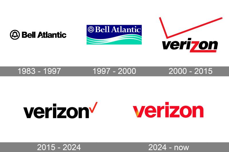
The Verizon logo has gone through five major phases since 1983. It started as the Bell Atlantic mark, transitioned through the merger-era rebrand in 2000, received a major simplification in 2015, and landed on a more expressive, color-forward identity in 2024.
Each version tracked a specific corporate moment. Mergers, acquisitions, and market repositioning drove most of these changes.
Original Bell Atlantic Logo (1983-1997)
Years Active: 1983 to 1997
The Bell Atlantic Corporation was formed in 1983 as a successor to the Bell System after the breakup of AT&T. Its logo carried a stylized bell inside a thick black ring, placed to the left of the “Bell Atlantic” wordmark.
The letters used a sans-serif font style. But the real character came from the letter “A” in “Atlantic,” which had a wave-shaped cutout at its base. That detail tied the brand to its Mid-Atlantic regional roots.
The color scheme was simple. Black on white for most applications, sometimes rendered in blue. It felt corporate and reliable, which was the point. Telecommunications companies in the 1980s were not trying to be flashy.
The bell symbol itself came from Bass & Yager, dating back to the 1960s Bell System identity. So even in its first logo, Bell Atlantic was building on inherited design DNA.
Redesigned Bell Atlantic Logo (1997-2000)
Years Active: 1997 to 2000
After Bell Atlantic absorbed NYNEX in 1997, the logo got an update. The bell emblem stayed, now rendered in white against a colored background. Three wave-shaped strokes appeared beneath the wordmark.
The biggest shift was the introduction of color. Dark blue and aqua tones replaced the stark black-and-white palette, bringing a more marine, coastal feel to the brand. Think sea foam.
The typography moved from bold sans-serif to a cleaner serif style. The overall layout became more horizontal and structured.
This version was short-lived. Within three years, the Bell Atlantic name would disappear entirely.
First Verizon Logo (2000-2015)
Years Active: 2000 to 2015
Bell Atlantic acquired GTE Corporation in 2000. The merged entity needed a completely new identity. Lippincott & Margulies coined the name “Verizon,” and Landor Associates in San Francisco designed the logo.
It was… polarizing. The wordmark used an italicized lowercase treatment with a stylized “z” that had a red gradient, almost like an electric spark. Above the text sat an oversized red checkmark, also with a gradient.
The red and black color palette became the brand’s signature. Red for the checkmark and “z,” black for the remaining letters, white backgrounds.
Critics were not kind. The logo was frequently listed among the worst corporate identities in design circles. The gradients made it tricky to reproduce consistently across media. The oversized checkmark competed with the wordmark for attention, which created visual hierarchy problems.
But here is the thing. It worked from a recognition standpoint. Verizon became the largest wireless carrier in the U.S. during this period, and that red checkmark became deeply familiar to millions of customers.
The DeSola Group drafted the brand’s identity standards manual and placed special emphasis on the “z” as a distinguishing feature.
Pentagram Redesign (2015-2024)
Years Active: 2015 to 2024
After 15 years, the overhaul was overdue. Pentagram partner Michael Bierut, one of the most well-known figures in graphic design, led the effort. The result was a dramatic simplification.
Gone were the italics. Gone was the gradient. The new wordmark used Neue Haas Grotesk, fine-tuned by Christian Schwartz of Commercial Type. Lowercase, bold, no frills.
The checkmark survived, but barely. It shrank to a small, solid red mark placed at the end of the wordmark, like a period. Or a sign-off. Pentagram described it as “the universally understood symbol for getting things done.”
The overall feel was corporate and reliable, leaning heavily into that Swiss design tradition of clean type on minimal backgrounds. Black text, red accent, white space. That was it.
Some people loved the restraint. Others found it almost too plain. The brand occasionally looked like nothing more than bold white type on a black backdrop. Identifiable, sure. But as Turner Duckworth later noted, it came “at a little cost of the joy.”
Turner Duckworth Refresh (2024-Present)
Years Active: 2024 to present
Nine years into the Pentagram identity, Verizon made another move. Internal research found that the red checkmark had failed to build a strong emotional connection with customers. The brand needed something that felt less like a corporate utility and more like a lifestyle company.
Turner Duckworth, a Publicis Groupe design shop, took on the project. The checkmark was removed entirely. In its place, the letter “V” from the wordmark was reshaped into a ribbon-like folded form with a warm yellow-to-orange glow at its center.
That glow is intentional. It references the “horizon” in Verizon’s name, evoking the golden light of sunrise. The “V” now functions as both part of the wordmark and a standalone symbol for app icons and compact applications.
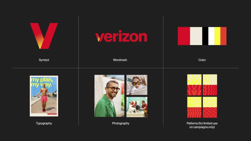
The full wordmark shifted to vibrant red. Neue Haas Grotesk stayed as the typeface, but the overall presentation moved away from the restrained black-and-white approach. Beige and yellow entered the supporting palette in the broader identity system.
Some observers quickly pointed out that the standalone “V” on a dark background looks a lot like the Netflix app icon. That might even be deliberate. Verizon is actively repositioning itself beyond wireless infrastructure into streaming, gaming, and entertainment partnerships.
The rebrand launched alongside a revived version of the iconic “Can You Hear Me Now?” campaign, now featuring a real Verizon network engineer instead of the original actor.
What Do the Design Elements of the Verizon Logo Mean?

Every piece of the Verizon logo connects back to the company’s name and mission. The folded “V” represents connection. The golden glow stands for the horizon and forward momentum.
The red wordmark signals energy and confidence. Together, these elements position Verizon as both a reliable network and an entertainment-forward brand.
Why Did Verizon Choose These Specific Colors?
Verizon Red has been a constant since 2000. The current primary red uses hex codes that have varied slightly between iterations. Commonly referenced values include #CD040B and #D52B1E, with the Pantone equivalent listed as PMS 179 C.
Red communicates energy, urgency, and passion. For a wireless carrier, it also suggests speed and power. There is a reason so many companies opt for red in their logos. It grabs attention fast.
Black (#000000, Pantone PMS Black 6 C) served as the primary text color from 2015 through the Pentagram era. It grounded the brand in seriousness and professionalism.
The 2024 refresh introduced a warm yellow-to-orange gradient on the “V” symbol. This golden glow is directly inspired by the “horizon” half of the Verizon name. According to color psychology, warm yellows and oranges suggest optimism, warmth, and approachability.
The shift from a dominant black-and-red scheme to a red-forward palette with warm accents tracks with Verizon’s repositioning. Less corporate. More consumer-friendly.
What Typography Style Is Used in the Verizon Logo?

The current wordmark uses Neue Haas Grotesk Display 75 Bold. It is a modern interpretation of the classic Helvetica font family, developed by Linotype.
Christian Schwartz of Commercial Type customized this version for Verizon’s 2015 rebrand, and the 2024 refresh kept it intact. The letter spacing is tight but readable. All lowercase.
Before 2015, the logo used an italicized custom treatment with those distinctive gradient effects on certain characters. That older approach had readability issues at small sizes and was difficult to reproduce consistently.
The move to Neue Haas Grotesk was about reliability across contexts, from billboards to phone screens. It reads clean at any pixel density.
What Are the Hidden Meanings in the Verizon Logo?
The golden glow on the “V” lands exactly where the two arms meet. Turner Duckworth describes this as symbolizing the energy that comes from connection, to people, to technology, to the world.
The fold in the “V” creates a three-dimensional ribbon effect. It is subtle, but it makes the letter feel like it exists in physical space rather than as a flat graphic.
Some design commentators have noted that the standalone “V” resembles a folded piece of paper or fabric, suggesting both simplicity and craftsmanship. Whether that was the explicit intent or a happy accident is up for debate.
How Does the Verizon Logo Compare to Competitor Logos?
Telecommunications logos tend to cluster around a few approaches. Bright, bold colors. Simple wordmarks. Occasionally, an abstract symbol. Verizon’s latest identity sits somewhere between a pure wordmark and a symbol-driven brand.
Compare it to the competition. The T-Mobile logo leans heavily on magenta pink, an unusual color in the telecom space that immediately sets it apart. Their “T” symbol is angular and energetic.
The AT&T logo uses a globe symbol with horizontal stripes. It reads as global, networked, institutional. More conservative than Verizon’s current direction.
The Comcast logo and the Vodafone logo both use abstract shapes (a peacock derivative and a speech mark, respectively) that aim for approachability.
Verizon’s 2024 identity is unique in the telecom space because it uses a gradient glow, which most competitors avoid. That warm light effect feels more like something you would see from a streaming service or a tech company than a wireless carrier. Which is exactly the point.
The old Sprint logo, before its merger with T-Mobile, used a simple pin-drop symbol. Deutsche Telekom relies on a blocky “T” in magenta. Telstra in Australia uses a multi-colored arc.
Across this competitive set, Verizon’s gradient “V” is arguably the most visually complex element. Whether that translates into stronger brand recall will take time to measure.
What Are the Technical Specifications of the Verizon Logo?
Official Color Codes
Primary Color: Verizon Red
- Hex: #CD040B (also referenced as #D52B1E in some brand guides)
- RGB: (205, 4, 11) / (213, 43, 30)
- CMYK: (11, 96, 100, 2)
- Pantone: PMS 179 C
Secondary Color: Black
- Hex: #000000
- RGB: (0, 0, 0)
- CMYK: (60, 40, 40, 100)
- Pantone: PMS Black 6 C
Accent: Warm Gradient (2024 “V” Glow)
- Transitions from deep red through orange to golden yellow at the center junction of the “V.” Exact gradient hex values have not been publicly specified in official brand documentation as of writing.
Dimensions and Proportions
Verizon maintains strict brand guidelines for logo usage. The wordmark has defined clear space requirements, meaning a minimum buffer zone must surround it in all applications.
Minimum size specifications ensure legibility across print and digital formats. The standalone “V” symbol has its own sizing rules, particularly for app icon usage where it needs to read clearly at very small dimensions.
The logo is distributed as vector graphics (SVG, EPS, AI formats) for scalable reproduction, and in raster formats like PNG for digital use. The aspect ratio of the full wordmark is roughly 5:1 (wide to tall), though this shifts when the “V” symbol is used independently.
What Cultural Impact Has the Verizon Logo Had?
The Verizon logo has been a constant presence in American culture since 2000. It appears on storefronts in almost every U.S. city, on the startup screens of millions of smartphones, and across major sports sponsorships.
The 2000 logo with its oversized gradient checkmark became a frequent target for design critics, making it one of the most talked-about corporate marks of the early 2000s. Love it or not, people had opinions about it.
The 2015 simplification reflected a broader cultural trend in corporate branding. Companies across every industry were stripping their logos down to flat, clean wordmarks. Verizon’s pivot fit neatly into that minimalist design movement.
And the 2024 refresh signals something else entirely. The return of color, warmth, and personality in branding after years of flat, monochromatic corporate marks. Verizon is betting that consumers want brands that feel alive, not just reliable.
How Does the Verizon Logo Fit Into the Overall Brand Identity?

The logo does not live in isolation. It sits at the center of a full identity system that includes photography style, motion language, retail store design, advertising tone, and digital product interfaces.
The 2024 refresh introduced warmer photography, more dynamic layouts, and the reintroduction of the iconic “Can You Hear Me Now?” tagline. The glowing “V” works as an anchor point across all of these touchpoints.
Verizon’s brand style guide governs how these elements work together. It defines approved color combinations, typographic hierarchy rules, and guidelines for how the logo interacts with sub-brands like Verizon Business and Verizon Fios.
The overall identity system is designed to be flexible. Red dominates consumer-facing materials, while the black-and-white treatment still appears in enterprise and B2B contexts. This kind of segmentation lets one logo serve very different audiences.
How Should the Verizon Logo Be Used?
Official usage guidelines include:
- Do maintain the required clear space around the logo at all times. No other graphic elements should encroach on this buffer zone.
- Do use the approved color versions. The primary version is the red wordmark with the gradient “V” on white. Reversed (white on dark) versions exist for specific contexts.
- Don’t stretch, rotate, or recolor the logo. Altering proportions or swapping in non-approved colors violates usage standards.
- Don’t place the logo on busy backgrounds where legibility suffers. Sufficient contrast is required.
- Don’t recreate the logo using alternative fonts or redraw the “V” symbol. Always use official files.
Official logo files are available through Verizon’s brand portal. Third-party use of the Verizon name and logo requires written permission from Verizon Trademark Services LLC.
The Verizon name, logos, and all related design marks are registered trademarks. Unauthorized reproduction or modification can result in legal action. The trademark covers telecommunications products and services across multiple classifications with the USPTO.
FAQ on The Verizon Logo
What Does the Verizon Logo Look Like?
The current Verizon logo features the brand name in lowercase red letters using Neue Haas Grotesk. A folded “V” symbol with a warm yellow-to-orange glow sits at the start of the wordmark.
Turner Duckworth designed this version in 2024. The glow represents connection and energy, pulling from the “horizon” in the company name.
Who Designed the Current Verizon Logo?
Turner Duckworth, a Publicis Groupe design agency, created the 2024 refresh. Before that, Michael Bierut at Pentagram handled the 2015 redesign.
Landor Associates built the original 2000 mark. Three different agencies across three eras.
When Did Verizon Change Its Logo?
Verizon has updated its logo three times. The first version launched in 2000 after the Bell Atlantic and GTE merger. Pentagram simplified it in 2015.
The latest brand refresh dropped in June 2024. It removed the red checkmark entirely and introduced the glowing “V” symbol.
What Do the Colors in the Verizon Logo Mean?
The vibrant red signals energy and confidence. It has been part of the Verizon color theory since day one, using hex #CD040B.
The golden glow on the “V” references sunrise on the horizon. Warm tones suggest optimism and approachability, a deliberate shift from the old black-heavy corporate look.
What Font Does Verizon Use in Its Logo?
Verizon uses Neue Haas Grotesk Display 75 Bold, a modern take on classic Helvetica. Christian Schwartz of Commercial Type customized it for the brand in 2015.
The 2024 refresh kept this sans-serif typeface intact. All lowercase, tight spacing, clean at any size.
Why Did Verizon Remove the Checkmark From Its Logo?
Research showed the checkmark failed to build emotional connection with customers. It worked as a functional symbol but never became something people felt attached to.
Turner Duckworth shifted focus to the letter “V” instead. The new symbol doubles as an app icon and a standalone brand mark for digital platforms.
What Was the Original Verizon Logo?
The 2000 logo by Landor Associates used an italicized lowercase wordmark with a large red checkmark on top. The letter “z” had a red gradient that looked like an electric spark.
Critics disliked it. The gradients caused print reproduction problems and the oversized checkmark competed for attention against the text.
Is the Verizon Logo Trademarked?
Yes. The VERIZON wordmark holds USPTO Registration No. 2,886,813, filed in 1999 and issued in 2004. Additional registrations cover the checkmark variations and app icon designs.
Verizon Trademark Services LLC owns all marks. Unauthorized use can lead to legal action.
What Is the Meaning Behind the Verizon Name and Logo?
The name combines Latin “veritas” (truth) with “horizon.” Lippincott & Margulies coined it during the 2000 Bell Atlantic and GTE Corporation merger.
The logo’s glowing “V” pulls directly from that meaning. The golden light at the center represents a sunrise on the horizon, connecting reliability with forward momentum.
Where Can I Download the Official Verizon Logo?
Official logo files are available through Verizon’s brand portal. They provide vector formats (SVG, EPS) for scalable use and raster formats like PNG and JPEG for digital applications.
Third-party use requires written consent from Verizon. Their guidelines specify approved colors, sizing, and clear space rules.
Conclusion
The Verizon logo has tracked every major turning point in the company’s history. From the Bell Atlantic bell to Landor’s polarizing checkmark to Pentagram’s stripped-back wordmark, each version told a different story about where the brand was headed.
The 2024 Turner Duckworth refresh is the boldest shift yet. Dropping the checkmark for a glowing “V” signals that Verizon sees itself as more than a wireless carrier now.
Good logo design principles show up across every iteration. Simplicity, balance, and clear brand recognition stayed constant even as the visual details changed completely.
That consistency matters. It is what separates a forgettable corporate mark from one that millions of people recognize instantly.

Renowned for his expertise in logo design and visual branding, Bogdan has developed a multitude of logos for various clients.
His skills extend to creating posters, vector illustrations, business cards, and brochures. Additionally, Bogdan's UI kits were featured on marketplaces like Visual Hierarchy and UI8.
He also wrote in the past years on sites like Design Your Way, WebDesignerDepot, WPDean, Designmodo, Speckyboy, Slider Revolution, and more.
- Jujutsu Kaisen Font Generator - 12 October 2026
- The Windsurf Logo History, Colors, Font, And Meaning - 10 October 2026
- How to Remove Background From Product Photos (No Photoshop) - 10 October 2026

Bogdan Sandu is a seasoned designer who has been designing websites since 2008. Renowned for his expertise in logo design and visual branding, Bogdan has developed a multitude of logos for various clients. His skills extend to creating posters, vector illustrations, business cards, and brochures. Additionally, Bogdan's UI kits were featured on marketplaces like Visual Hierarchy and UI8. He also wrote in the past years on sites like Design Your Way, WebDesignerDepot, WPDean, Designmodo, Speckyboy, Slider Revolution, and more.
You Might Also Like


