


The CenturyLink logo is one of those corporate marks that tells a bigger story than most people realize. It’s tied to a company that started as a tiny telephone operation in rural Louisiana back in 1930 and grew into one of the largest telecom providers in the United States. The brand went through five distinct name changes before landing on “CenturyLink” in 2009, and each one came with a fresh visual identity.
What makes this logo interesting isn’t just the final green-and-black mark most people recognize. It’s the full arc of changes that reflect how the telecom industry itself shifted over nearly a century. From hand-drawn diamond shapes to bold italic caps to the clean circular emblem we know today, the CenturyLink logo tracks the company’s growth from a family-run switchboard to a Fortune 500 giant. And then, in 2020, the whole thing got retired when the parent company rebranded to Lumen Technologies.
That’s a lot of identity packed into a single mark. Let’s break it down.
What Is the CenturyLink Logo?

The CenturyLink logo is a combination mark featuring a circular green emblem alongside a black wordmark. It was officially introduced in 2009 after Denver-based Monigle Associates developed the brand strategy following the CenturyTel and Embarq merger. The symbol represents connectivity and the company’s “pathways” concept.
Design Attributes
- Design Type: Combination mark (symbol plus wordmark)
- Primary Elements: A circular emblem made of twelve green triangles arranged in a ring, paired with the “CenturyLink” wordmark in black
- Official Introduction Date: 2009, with the corporate name becoming official in May 2010
- Designer/Agency: Monigle Associates, Denver, Colorado
- Trademark Status: Registered trademark under CenturyLink, Inc. (now Lumen Technologies). The CenturyLink brand is still used for residential and small business copper network services
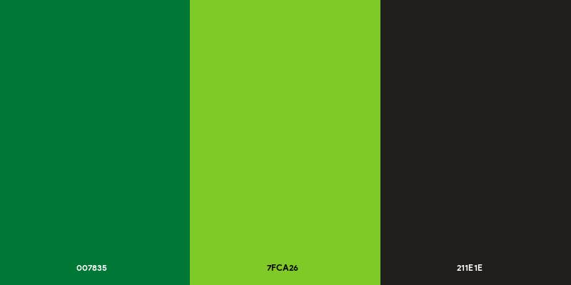
- Color Palette: La Salle Green (#007835), Dark Lemon Lime (#7FCA26), and Eerie Black (#211E1E)
- Usage Context: Residential broadband marketing, small business services, legacy signage, stadium naming (CenturyLink Field in Seattle), and copper network telecommunications
How Has the CenturyLink Logo Changed Over Time?

The logo went through five major versions across nearly five decades. Each redesign reflected a corporate name change driven by mergers, acquisitions, or strategic repositioning. The progression moved from complex graphic elements toward minimalist design, which tracks pretty closely with broader trends in tech company logos during the same period.
Century Telephone Enterprises Logo (1971-1998)
- Years Active: 1971-1998
- Design Description: A diamond-shaped graphic element made of clustered smaller shapes sat to the left of the company name. “Century” and “Telephone” were stacked vertically in two different weights. The “Century” line used bolder, tighter letterforms where some characters merged together. The overall feel was technical and corporate
- Color Scheme: Black
- Designer: Not publicly documented
- Context: This logo launched when Central Telephone and Electronics was renamed Century Telephone Enterprises in 1971. The company was aggressively acquiring smaller phone companies across the rural United States at the time
- Key Changes from Previous: First formal corporate logo after the holding company went public
- Cultural Significance: The diamond emblem with its cluster pattern suggested signal transmission. That was a deliberate nod to the telephone network infrastructure that defined the company’s business
CenturyTel Logo (1999-2009)
- Years Active: 1999-2009
- Design Description: A complete departure from the previous mark. “CENTURYTEL” was set in bold italic all-caps lettering with a dynamic red elliptical arc behind it. The first “C” and the “T” in “Tel” were taller than the other characters. The overall look was aggressive and forward-leaning
- Color Scheme: Dark blue lettering with red orbital arcs
- Designer: Not publicly attributed
- Context: This was a unification rebrand. The company had been operating under multiple names (Century Telephone, Century Long Distance, PTI Communications, Century Cellunet) and needed a single identity across 21 states
- Key Changes from Previous: Dropped the diamond emblem entirely. Moved from stacked text to a single-line wordmark. Introduced color (red and blue) for the first time. Switched to italic styling
- Cultural Significance: The red ellipse was meant to suggest orbit and motion, reflecting the late-1990s tech optimism. It looked like half the telecom logos from that era, honestly. Very much a product of its time
CenturyLink Logo (2010-2020)
- Years Active: 2010-2020
- Design Description: The final and best-known version. A circular emblem composed of twelve triangles in two shades of green, arranged in a ring pointing inward, sat to the left of the “CenturyLink” wordmark. The wordmark split the name visually: “Century” in thin weight, “Link” in bold
- Color Scheme: Two-tone green (#007835 and #7FCA26) for the emblem, black (#211E1E) for the text
- Designer: Monigle Associates
- Context: Created after CenturyTel acquired Embarq Corporation in 2009. The name “CenturyLink” was chosen because research showed the “link” concept resonated with consumers. The “tel” suffix felt dated
- Key Changes from Previous: Completely new color palette (green replaced red and blue). New circular symbol replaced the italic wordmark-only approach. Mixed-weight typography replaced the all-caps italic
- Cultural Significance: Monigle called the twelve-triangle symbol the “pathways” visual. It was meant to represent the hub-and-spoke nature of connectivity, the idea that CenturyLink linked people to what they need. The company even named its internal employee portal “Pathways” after it
Transition to Lumen Technologies (2020-Present)
- Years Active: 2020 onward
- Design Description: The parent company rebranded entirely. The new logo reads “LUMEN” in a square, blocky sans-serif typeface with rounded corners. The “E” is split into two parts: a blue top bar and a black bottom section
- Color Scheme: Black and blue
- Context: CenturyLink became Lumen Technologies in September 2020 to reflect its shift toward enterprise-level fiber optic and cloud services. But the CenturyLink brand and logo were kept alive for residential and small business customers still using copper network services
- Key Changes from Previous: The green palette was dropped for black and blue. The circular emblem disappeared. The design leaned toward a more tech-forward, enterprise look
What Do the Design Elements of the CenturyLink Logo Mean?
The twelve green triangles arranged in a circle are the heart of the CenturyLink mark. They point inward, creating a sense of convergence and connection.
Monigle Associates designed this as a “hub-and-spoke” pattern. The idea is that the triangles represent pathways leading to a central point, which maps to CenturyLink’s role as a network provider connecting millions of subscribers.
The split-weight wordmark also carries meaning. “Century” in light weight nods to the company’s long history (going back to 1930). “Link” in bold puts the focus on what the company does: connect people.
Why Did CenturyLink Choose These Specific Colors?
The green palette was a deliberate break from the red-and-blue scheme of the CenturyTel era.
La Salle Green (#007835): This is the darker shade used in the emblem. In color psychology, darker greens signal stability, reliability, and maturity. For a telecom company asking you to trust them with your internet connection, that tracks.
Dark Lemon Lime (#7FCA26): The lighter green adds energy. It suggests growth and progress. Think of it as the “forward-looking” half of the brand’s personality. Together, these two greens create a analogous color relationship that feels unified but not flat.
Eerie Black (#211E1E): Used for the wordmark. Black is about as safe as you can get for corporate text. It keeps the logo readable at any size and adds weight to the mark without competing with the green emblem.
If you look at other green logos across industries, you’ll see the same pattern: green signals trustworthiness and growth. CenturyLink leaned into that pretty hard.
What Typography Style Is Used in the CenturyLink Logo?
The CenturyLink wordmark uses a clean sans-serif typeface. The closest matches are Urbano Regular for the “Century” portion and Urbano Bold for the “Link” portion.
Some sources also compare it to Iwata Gothic Old Pro or Univers Cyrillic 55 Roman. The letterforms are straightforward with no decorative elements. That makes sense for a telecom brand where clarity matters more than personality.
The dual-weight approach (light “Century” and bold “Link”) creates a subtle typographic hierarchy within a single word. Your eye naturally lands on “Link” first, which is exactly the point. The company wanted “linking” to be the core takeaway from every brand interaction.
What Are the Hidden Meanings in the CenturyLink Logo?
The twelve triangles aren’t random. They create the appearance of a starburst or signal radiating outward (or inward, depending on how you look at it). Some people read it as a clock face, which nods to the “Century” part of the name.
Monigle Associates stated the design was meant to represent “pathways” of connection. But there’s also an unintentional read here. The inward-pointing triangles create negative space in the center that looks like a small circle. That central void can be interpreted as a hub, the node where all connections meet. Whether that was intentional or a happy accident is hard to say.
How Does the CenturyLink Logo Compare to Competitor Logos?

Telecom logos tend to cluster around a few visual ideas: globes, swooshes, and blue. CenturyLink broke from that pattern. While the AT&T logo uses a blue globe with horizontal lines and the Verizon logo relies on a red checkmark accent, CenturyLink went with green and a geometric emblem.
The Comcast logo kept things corporate with a simple wordmark approach. T-Mobile went bold with magenta. Sprint (before its merger) used a yellow pin drop. Vodafone went with a red speech mark inside a circle.
CenturyLink’s choice to go green was a smart differentiator. In a sea of blue and red telecom marks, the bright green emblem stood out on signage, truck wraps, and digital interfaces. It didn’t hurt that green also avoids the aggressive feel that red can carry.
The Telus logo is probably the closest visual cousin. Telus also uses green as its primary brand color and leans into nature-inspired imagery. But where Telus goes soft and organic, CenturyLink stayed geometric and precise.
What Are the Technical Specifications of the CenturyLink Logo?

Official Color Codes
- Primary Color: La Salle Green
- Hex: #007835
- RGB: (0, 120, 53)
- CMYK: (100, 0, 56, 53)
- Pantone: Closest match 349 C
- Secondary Color: Dark Lemon Lime
- Hex: #7FCA26
- RGB: (127, 202, 38)
- CMYK: (37, 0, 81, 21)
- Pantone: Closest match 376 C
- Text Color: Eerie Black
- Hex: #211E1E
- RGB: (33, 30, 30)
- CMYK: (0, 9, 9, 87)
- Pantone: Closest match Black 6 C
Dimensions and Proportions
- Aspect Ratio: The full logo (emblem plus wordmark) maintains approximately a 4:1 width-to-height ratio
- Minimum Size: The logo should not be reproduced smaller than 1 inch (25mm) in width for print applications to maintain legibility
- Clear Space: CenturyLink’s brand guidelines specify a minimum clear space around the logo equal to the height of the “L” in “Link”
- Background Usage: The standard two-color version goes on white backgrounds. A one-color white reverse version exists for dark green or black backgrounds. A one-color black version is restricted to single-color applications like fax, newsprint, and imprintables
What Cultural Impact Has the CenturyLink Logo Had?
The CenturyLink logo became deeply embedded in American sports culture, primarily through stadium naming deals. CenturyLink Field in Seattle (home of the Seahawks and Sounders) put that green emblem in front of millions of TV viewers every game day.
Beyond sports, the logo appeared on infrastructure across 37 states. Trucks, utility boxes, storefronts, and data centers all carried the mark. For millions of Americans in suburban and rural areas, the CenturyLink logo was the most visible telecom brand in their daily lives.
The 2020 transition to Lumen Technologies created an unusual split. The CenturyLink brand still exists for copper network customers, while Lumen handles the enterprise and fiber side. So you can still find that green logo in active use today, even though the parent company moved on.
How Does the CenturyLink Logo Fit Into the Overall Brand Identity?
The logo is just one piece of a larger system that Monigle Associates built. The “pathways” visual from the emblem carried across all brand touchpoints, including internal communications, advertising campaigns, environmental branding at hundreds of locations, and a brand style guide that governed everything from signage specs to digital templates.
The tagline “Linking you to what’s next” connected directly to the “Link” emphasis in the logo. The “Stronger Connected” ad campaign ran across TV, radio, and print, reinforcing the same idea.
Even the employee engagement portal was called “Pathways,” pulling from the emblem’s design concept. That kind of internal-external consistency is something most brands aim for but few actually pull off. It shows that the logo wasn’t designed in isolation. It was part of a thought-out identity system that touched every part of the company.
How Should the CenturyLink Logo Be Used?
Official Usage Guidelines
- Do: Use the two-color positive logo on white backgrounds as the default. Maintain required clear space. Use official vector graphics files for any reproduction
- Don’t: Stretch, rotate, or recolor the logo. Don’t place it on busy backgrounds where the emblem loses definition. Don’t separate the emblem from the wordmark unless specifically approved for icon-only applications
- Monochrome Use: One-color black is available but restricted to situations where color printing isn’t possible (fax, newsprint, certain promotional items)
- Reverse Version: The white reverse logo should only go on solid CenturyLink Dark Green or solid black backgrounds
Where to Access Official Logos
CenturyLink’s official brand assets were historically available through their corporate cloud assets portal. Since the Lumen Technologies rebrand, access to current logo files requires going through Lumen’s corporate communications team for authorized use.
Licensing and Trademark
The CenturyLink name and logo are registered trademarks of Lumen Technologies (formerly CenturyLink, Inc.). Any commercial use requires written authorization. The trademark covers telecommunications services including broadband, voice, and managed network solutions.
Using the CenturyLink logo without permission in marketing materials, websites, or products could result in trademark infringement claims. If you need the logo for editorial, journalistic, or educational purposes, standard fair use guidelines apply, but it’s worth double-checking with Lumen’s legal team if your use case is borderline.
FAQ on The CenturyLink Logo
What does the CenturyLink logo look like?
The CenturyLink logo is a combination mark. Twelve green triangles form a circular emblem to the left of a black wordmark.
“Century” appears in light weight. “Link” is bold. The two-tone green symbol is called the “pathways” visual, designed by Monigle Associates in 2009.
What do the colors in the CenturyLink logo mean?
The logo uses two shades of green plus black. La Salle Green (#007835) represents stability. Dark Lemon Lime (#7FCA26) signals growth and energy.
Black (#211E1E) grounds the wordmark. The green palette was chosen to stand apart from the blue and red marks that dominate telecom branding.
Who designed the CenturyLink logo?
Denver-based Monigle Associates created the CenturyLink brand identity. They were hired in 2009 after CenturyTel acquired Embarq Corporation.
Monigle developed the name, the pathways emblem, the tagline “Linking you to what’s next,” and the environmental branding for hundreds of locations nationwide.
What font is used in the CenturyLink logo?
The wordmark uses a clean sans-serif typeface. The “Century” portion closely matches Urbano Regular. “Link” matches Urbano Bold.
Some sources also cite similarities to Iwata Gothic Old Pro. The dual-weight approach creates a subtle visual hierarchy that draws attention to “Link” first.
Is the CenturyLink logo still in use?
Yes, partially. The parent company rebranded to Lumen Technologies in September 2020. But the CenturyLink name and logo are still active for residential and small business copper network services.
Fiber customers see the Quantum Fiber brand instead.
What is the history of the CenturyLink logo?
The company’s visual identity went through five major versions. It started as Century Telephone Enterprises in 1971 with a diamond-shaped emblem.
CenturyTel arrived in 1999 with bold italic caps and red arcs. The green CenturyLink mark launched in 2010. Then Lumen replaced it at the corporate level in 2020.
Where can I download the official CenturyLink logo?
Official logo files were available through CenturyLink’s corporate cloud assets portal. Since the Lumen rebrand, you’ll need to contact Lumen’s corporate communications team for authorized files.
The logo is a registered trademark. Commercial use without permission isn’t allowed.
What do the triangles in the CenturyLink emblem represent?
The twelve triangles arranged in a ring represent connectivity pathways. They point inward toward a central hub, reflecting CenturyLink’s role as a network provider linking subscribers together.
Monigle Associates called this the “pathways” visual. It became a core design element across all brand materials.
How does the CenturyLink logo differ from the Lumen Technologies logo?
They’re completely different marks. CenturyLink used a green circular emblem with a mixed-weight black wordmark. Lumen uses a blocky, square font in black with a blue accent on the split “E.”
Green was dropped entirely. The Lumen mark targets enterprise clients, not residential users.
What are the hex color codes for the CenturyLink logo?
Three colors make up the CenturyLink logo. La Salle Green is #007835. Dark Lemon Lime is #7FCA26. Eerie Black is #211E1E.
These codes ensure consistent reproduction across digital and print applications. The green values are critical for matching the emblem accurately on any screen or printed material.
Conclusion
The CenturyLink logo captures nearly a century of telecom history in a single mark. From a small Louisiana telephone company to a Fortune 500 corporation, every redesign tracked a real business shift, not just a cosmetic update.
Monigle Associates built something that worked across stadiums, truck fleets, and digital platforms. The green pathways emblem and split-weight wordmark gave the brand instant contrast against competitors leaning on blue and red.
Even after the Lumen Technologies rebrand, the CenturyLink identity lives on for millions of residential subscribers. That kind of staying power says a lot about what good logo design can do when it’s rooted in a clear brand strategy.

Renowned for his expertise in logo design and visual branding, Bogdan has developed a multitude of logos for various clients.
His skills extend to creating posters, vector illustrations, business cards, and brochures. Additionally, Bogdan's UI kits were featured on marketplaces like Visual Hierarchy and UI8.
He also wrote in the past years on sites like Design Your Way, WebDesignerDepot, WPDean, Designmodo, Speckyboy, Slider Revolution, and more.
- Jujutsu Kaisen Font Generator - 12 October 2026
- The Windsurf Logo History, Colors, Font, And Meaning - 10 October 2026
- How to Remove Background From Product Photos (No Photoshop) - 10 October 2026

Bogdan Sandu is a seasoned designer who has been designing websites since 2008. Renowned for his expertise in logo design and visual branding, Bogdan has developed a multitude of logos for various clients. His skills extend to creating posters, vector illustrations, business cards, and brochures. Additionally, Bogdan's UI kits were featured on marketplaces like Visual Hierarchy and UI8. He also wrote in the past years on sites like Design Your Way, WebDesignerDepot, WPDean, Designmodo, Speckyboy, Slider Revolution, and more.
You Might Also Like


