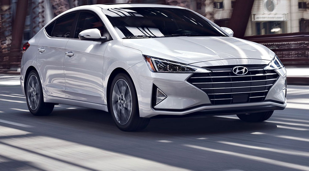
The Hyundai Logo stands as one of the most recognized automotive emblems worldwide. At first glance, it looks like a simple italic “H” inside an oval. But there’s more going on here.
Hyundai Motor Company was founded on 29 December 1967 in South Korea. Its early cars wore an “HD” badge, and the slanted H in an oval replaced it in the early 1990s. The shape has barely changed since; the finish and color treatment have.
The emblem arrived as Hyundai was pushing into export markets, and it helped give the brand a consistent face during that global expansion.
What is the Hyundai Logo?
The Hyundai logo is a slanted, stylized “H” inside a horizontal oval, introduced in the early 1990s (sources give 1990 or 1992) to replace the older “HD” badge. No designer or agency has been publicly credited. Hyundai describes the H as two people shaking hands: the company and a satisfied customer.
| Symbol | Slanted “H” inside an oval, read as two figures shaking hands |
| Designer/agency | Not publicly credited |
| Current version since | Early 1990s (1990 or 1992, depending on the source); chrome and flat monochrome treatments came later |
| Colors (hex) | Hyundai Blue #002C5F; accents #00AAD2 and #E4DCD3 on hyundai.com |
| Typeface | Custom squared wordmark; corporate typeface Hyundai Sans (Sandoll, 2016) |
| Previous major version | “HD” monogram badge used from the 1970s, including on the 1975 Pony |
How Has the Hyundai Logo Evolved Over Time?
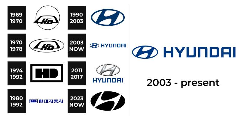
Hyundai’s logo history has two big chapters: the “HD” years and the oval H years. Within each, the details shifted more than once.
Logo galleries list many versions with exact years, but they disagree with each other. The dates below are the ones that reliable reporting supports.
The Original Hyundai Logo: the HD Badge (1970s to early 1990s)
The Hyundai original logo on cars was a stylized “HD” monogram, short for Hyundai. Early versions set italic “HD” letters inside an oval or rounded frame. A blockier “HD” in a rectangle was used later, often next to the Korean name 현대자동차.
The HD badge was on the Hyundai Pony of 1975, the first mass-produced Korean car, styled by Giorgio Giugiaro of Italdesign. It was still the badge when the Excel went on sale in the U.S. on 20 February 1986.
If you are searching for the Hyundai old logo, this is it: the letters H and D, not the oval H.
The Oval H (early 1990s to today)
Hyundai replaced the HD with the slanted H inside an oval in the early 1990s. Jalopnik dates its first appearance to 1992; many logo histories say 1990.
The letter tilts to the right, which suggests forward motion. The HYUNDAI wordmark in squared capitals often sits beside it.
Chrome and Flat Versions (2000s to 2020s)
On cars, the blue badge gave way to a shiny chrome H, which most people picture today.
In the 2020s Hyundai moved to a simpler, flat monochrome version of the same emblem for digital and print use. So, did Hyundai change their logo? The shape stayed the same; only the finish and color treatment changed.
What Do the Design Elements of the Hyundai Logo Mean?
The tilted “H” does double duty. It’s the first letter of “Hyundai”, a Korean word that means “modern” or “modernity”.
Hyundai also says the H shows two figures shaking hands. One represents the company. The other represents the customer.
The oval around them is described as standing for Hyundai’s global presence.
What Are the Hyundai Brand Colors?
The main Hyundai brand color is a deep navy known as Hyundai Blue, #002C5F. It is the most-used color in the style sheets of Hyundai’s global website.
The rest of the site’s color palette adds a bright sky blue, #00AAD2, as an accent and a warm sand tone, #E4DCD3, for backgrounds. Hyundai hasn’t published official RGB, CMYK or Pantone equivalents, so treat any you find online as estimates.
Understanding color psychology helps explain the choice. Dark blue reads as calm and dependable, which suits a brand built on value and reliability.
Silver/Chrome
On cars the badge is chrome, not blue. The metallic finish catches light and looks more premium on a grille.
What Font Is Used in the Hyundai Logo?
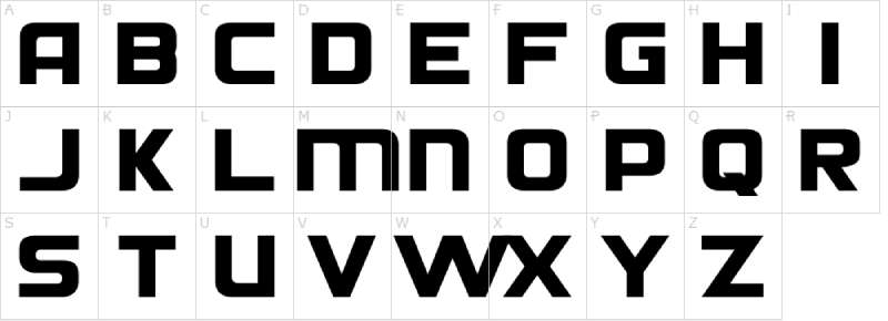
The “H” emblem is a custom letterform, not a standard font. The HYUNDAI wordmark is custom lettering too, with squared, wide capitals and an open “U” and “D”.
For everything else, Hyundai uses its own corporate typeface, Hyundai Sans, in Head and Text versions. Type designer reference Luc Devroye lists it as a 2016 custom typeface by the Korean foundry Sandoll. It is a corporate font, not a standard retail release.
The stroke weight in the wordmark stays even, with no thin-to-thick contrast like you’d see in a serif font. That’s common in automotive typography.
What Are the Hidden Meanings in the Hyundai Logo?
The handshake is the big one. Most people miss it until someone points it out, which is exactly what happened when Jalopnik wrote about it in 2018.
The oval is linked to Hyundai’s worldwide presence.
Some people also see a road stretching ahead or two people bowing. Hyundai hasn’t confirmed those readings, so treat them as fan interpretations.
How Does the Hyundai Logo Compare to Competitor Logos?
Korean rival Kia’s emblem takes a different approach. Its 2021 redesign dropped the oval for a bold, angular wordmark.
Toyota also uses ovals, while Honda puts its H in a rounded square.
European brands tend toward other shapes. Look at BMW’s roundel or the Audi rings.
American manufacturers like Ford and Chevrolet rely on a script wordmark and a simple bowtie shape.
Hyundai sits in the middle. It’s practical, which fits the brand’s value proposition.
What Cultural Impact Has the Hyundai Logo Had?
The logo helped shift Western views of Korean manufacturing. In the 1980s, “Made in Korea” didn’t carry much prestige.
Hyundai’s consistent visual identity built recognition over decades. People started linking the emblem with affordable reliability.
Today the logo appears at major sporting events and in city centers worldwide. That kind of visibility took years to build.
How Does the Hyundai Logo Fit Into the Overall Brand Identity?

The logo anchors everything else. Dealerships carry the chrome emblem and letters, and marketing leans on Hyundai Blue.
Following solid logo design principles, the mark works across cars, buildings and screens. Hyundai keeps internal brand guidelines, but they are not public.
The premium Genesis brand, spun off in 2015, uses a completely different winged emblem. That Genesis logo needed to stand apart from Hyundai’s value-focused image.
This separation shows smart brand architecture. Different customers, different visual identities.
How Should the Hyundai Logo Be Used?
This is general advice, not Hyundai’s own rules.
The emblem and name are registered trademarks of Hyundai Motor Company. Commercial use needs permission. Editorial use, such as news or reviews, is usually treated differently.
Scale the logo proportionally, keep its colors and use a clean source file, ideally vector graphics, so it stays sharp at any size.
FAQ on the Hyundai Logo
What does the Hyundai logo represent?
The Hyundai emblem is a slanted H that also shows two people shaking hands, the company and a satisfied customer. The oval around it stands for Hyundai’s global presence.
Did Hyundai change their logo?
Not the shape. The oval H has been used since the early 1990s. What changed was the finish: blue at first, then chrome on cars, and a flat monochrome version in the 2020s.
What was the original Hyundai logo?
Hyundai’s first car badge was an “HD” monogram, short for Hyundai. It appeared on cars such as the 1975 Pony and was replaced by the oval H in the early 1990s.
When was the current Hyundai logo introduced?
Sources give 1990 or 1992. Jalopnik dates the first oval H to 1992, while many logo histories say 1990. Hyundai Motor Company itself was founded in 1967.
Who designed the Hyundai logo?
No designer or agency has been publicly credited for the oval H. Unlike work by famous graphic designers, many corporate emblems come from teams whose names are never released.
What are the Hyundai brand colors?
The main color is Hyundai Blue, #002C5F, one of many blue logos in the car world. Hyundai’s website also uses #00AAD2 and a sand tone, #E4DCD3. Car badges are chrome, and white backgrounds are common in print.
Why is the Hyundai logo slanted?
The tilt adds a sense of movement and forward momentum. It also forms the handshake image and makes the H look less like a plain letter.
What font does Hyundai use?
The logo uses custom lettering, not a font you can download. Hyundai’s corporate typeface is Hyundai Sans, a custom font in Head and Text versions made by Sandoll in 2016.
What is the hidden meaning in the Hyundai logo?
Two people shaking hands. The psychology of shapes helps too: the oval suggests unity and completeness. Other readings, like a road or a bow, are fan interpretations.
How is the Hyundai logo different from other car logos?
Many car logos use detailed crests, such as the Porsche emblem or Alfa Romeo badge. Hyundai’s single letter in an oval leans toward minimalist design.
Where can I get a Hyundai logo file?
Hyundai’s press sites supply images to media. For web design mockups or editorial use, pick a clean vector or a high-resolution PNG or JPEG, with enough DPI for print. Commercial use needs permission.
Conclusion
The Hyundai Logo proves that simple designs can carry real meaning. A slanted H inside an oval. That’s it. Yet it says trust, global reach and customer partnership all at once.
The handshake gives the emblem its character. Most people never notice it until someone points it out.
Since the early 1990s, the Korean automaker has kept the shape remarkably consistent. Smart move. Brand recognition compounds over time.
Whether on a steering wheel, a dealership or a phone screen, the emblem keeps strong visual hierarchy and instant recognition.
Good logo design ages well. This one certainly has.
Sources
- Jalopnik, Hyundai’s Logo Secretly Shows Two People Shaking Hands – https://www.jalopnik.com/1962013/hyundai-logo-two-people-shaking-hands/
- Motor1, Can’t Unsee: Hyundai Logo Is Actually Two People Shaking Hands – https://www.motor1.com/news/244338/hyundai-logo-people-shaking-hands/
- Wikipedia, Hyundai Motor Company – https://en.wikipedia.org/wiki/Hyundai_Motor_Company
- Hyundai Worldwide, site style sheet (renewalmain.min.css) – https://www.hyundai.com/etc/designs/hyundai/ww/en/clientlibs/renewalmain.min.css
- Luc Devroye, Type Design Information Page (Sandoll) – https://luc.devroye.org/fonts-37872.html

Renowned for his expertise in logo design and visual branding, Bogdan has developed a multitude of logos for various clients.
His skills extend to creating posters, vector illustrations, business cards, and brochures. Additionally, Bogdan's UI kits were featured on marketplaces like Visual Hierarchy and UI8.
He also wrote in the past years on sites like Design Your Way, WebDesignerDepot, WPDean, Designmodo, Speckyboy, Slider Revolution, and more.
- Black Metal Font Generator - 2 November 2026
- Best Cursor AI skills for web designers building responsive websites - 2 November 2026
- Designing One Flutter App for Phones, Tablets, Mac and Vision Pro - 30 October 2026

Bogdan Sandu is a seasoned designer who has been designing websites since 2008. Renowned for his expertise in logo design and visual branding, Bogdan has developed a multitude of logos for various clients. His skills extend to creating posters, vector illustrations, business cards, and brochures. Additionally, Bogdan's UI kits were featured on marketplaces like Visual Hierarchy and UI8. He also wrote in the past years on sites like Design Your Way, WebDesignerDepot, WPDean, Designmodo, Speckyboy, Slider Revolution, and more.
You Might Also Like