The Chrysler logo stands as one of the most recognizable symbols in American automotive history. It represents a brand that has shaped the car industry since 1925.
Within the broader landscape of automotive branding, the Chrysler emblem holds a unique position. The winged design connects directly to the Art Deco movement that influenced early 20th century design.
The current version features silver wings with the Chrysler name at the center. This iteration was introduced in 1998, though it has seen refinements since then. Chrysler has gone through approximately 12 logo variations since the company’s founding, each reflecting different eras of automotive design and corporate ownership.
What is the Chrysler Logo?
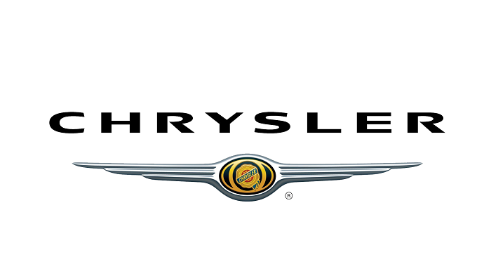
The Chrysler logo is a winged emblem featuring the brand name in the center, officially reintroduced in 1998. It draws from 1920s aviation aesthetics and symbolizes speed, elegance, and American craftsmanship in automobile manufacturing.
Design Type: Combination mark (emblem with wordmark)
Primary Elements:
- Symmetrical silver wings extending horizontally
- Central badge containing the Chrysler wordmark
- Sleek, aerodynamic silhouette
Official Introduction Date: 1998 (current winged version)
Designer/Agency: Chrysler’s in-house design team, with influences from the original 1920s designs
Trademark Status: Registered trademark, currently owned by Stellantis N.V.
Color Palette:
- Silver/Chrome (primary)
- Dark Blue (#1C3A6E) (secondary)
- Black (accent and backgrounds)
Usage Context: Vehicle grilles, steering wheels, dealership signage, marketing materials, digital platforms, and merchandise
How Has the Chrysler Logo Evolved Over Time?
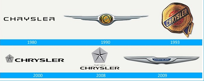
The Chrysler logo has transformed dramatically across nearly a century. It shifted from simple text-based marks to elaborate winged emblems.
The brand experimented with the Pentastar symbol for decades before returning to wings. Each change reflected corporate mergers, market positioning, and design trends of the time.
Original Chrysler Logo (1925-1955)
Years Active: 1925-1955
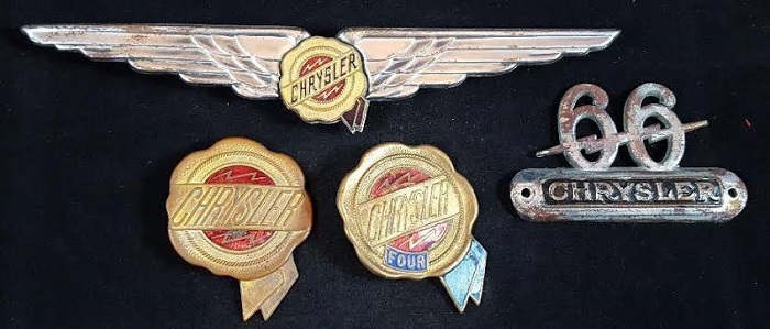
Design Description: The earliest Chrysler logos were primarily wordmarks. They featured the Chrysler name in various serif typefaces, sometimes enclosed in circular or ribbon-shaped badges. Some versions included a wax seal motif.
Color Scheme: Gold, black, and red combinations
Designer: Various internal designers
Context: Walter P. Chrysler founded the company in 1925 after restructuring the Maxwell Motor Company. The early logos needed to establish credibility in a competitive market dominated by Ford and General Motors.
Key Changes: Multiple iterations during this period, moving from simple typography to more elaborate badge designs
Cultural Significance: These logos represented the birth of what would become one of America’s Big Three automakers
Ribbon Era Logo (1930s-1950s)
Years Active: Early 1930s through mid-1950s
Design Description: A flowing ribbon design with the Chrysler name prominently displayed. This version had an elegant, almost regal quality to it.
Color Scheme: Gold and blue, sometimes with red accents
Context: The Great Depression and post-war era demanded logos that conveyed stability and sophistication. Chrysler wanted to position itself as a premium American brand.
Cultural Significance: This era established Chrysler’s reputation for engineering excellence and luxury
Pentastar Era (1962-1998)
Years Active: 1962-1998
Design Description: A five-pointed star contained within a pentagon shape. Clean, geometric, and modern for its time. The design was stark and corporate.
Color Scheme: Blue and white (primary), sometimes rendered in silver
Designer: Created by the Lippincott & Margulies design firm
Context: The early 1960s saw corporations embracing modernist design. The Pentastar unified Chrysler’s various divisions under one recognizable symbol.
Key Changes from Previous: Complete departure from traditional automotive emblems. No script, no wings, no ornamental elements.
Cultural Significance: Became synonymous with American muscle cars, the Mopar brand, and Chrysler’s engineering innovations
Return to Wings (1998-Present)
Years Active: 1998-present
Design Description: Silver wings extending from a central oval badge containing the Chrysler wordmark. Sleek, aerodynamic, and premium in appearance.
Color Scheme: Silver, chrome, dark blue
Context: The DaimlerChrysler merger era brought a return to heritage-inspired design. The wings connected to 1920s aesthetics while feeling contemporary.
Key Changes from Previous: Complete abandonment of the Pentastar for passenger vehicles. Return to winged symbolism from the brand’s earliest days.
Cultural Significance: Signaled Chrysler’s attempt to reclaim its luxury positioning against European competitors
What Do the Design Elements of the Chrysler Logo Mean?
The wings represent speed, freedom, and aspiration. They connect to early aviation imagery that fascinated Americans in the 1920s and 1930s.
This symbolism suggests vehicles that transcend ordinary transportation. The horizontal spread creates a sense of motion even when static.
What is the Symbolic Meaning Behind the Chrysler Wings?
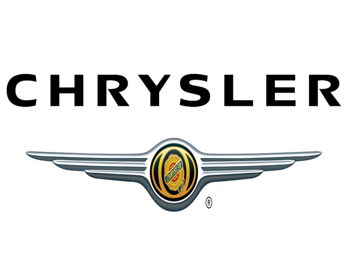
Wings in automotive design draw from ancient mythology and early flight. They suggest transcendence and human achievement.
For Chrysler, the wings reference the brand’s founding era when aviation was the ultimate symbol of progress. The symmetrical design creates visual balance and stability.
The shape also connects to the Chrysler Building in New York City. That Art Deco landmark features similar wing motifs in its architecture.
Why Did Chrysler Choose These Specific Colors?
Silver/Chrome
- Hex: #C0C0C0
- Symbolic meaning: Premium quality, technological sophistication, modernity
- Psychological impact: Conveys sleekness and futuristic thinking
- Brand connection: Reflects the metallic nature of automobiles themselves
Dark Blue
- Hex: #1C3A6E
- Symbolic meaning: Trust, reliability, American heritage
- Psychological impact: Creates feelings of dependability and professionalism
- Brand connection: Common in American automotive branding, connects to patriotic themes
The psychology behind these color choices directly supports Chrysler’s positioning as a trustworthy American manufacturer.
What Typography Style Is Used in the Chrysler Logo?
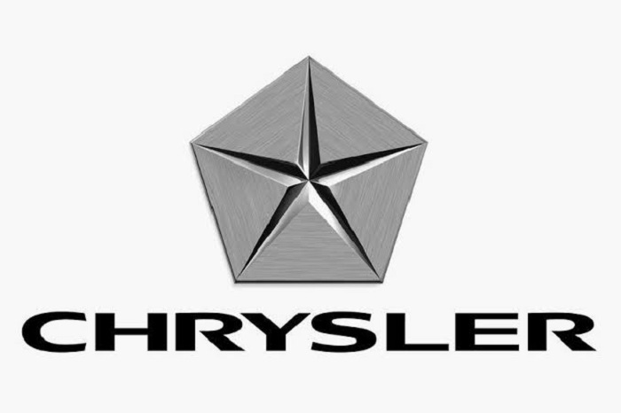
The wordmark uses a custom sans-serif typeface with clean lines. The letterforms are slightly condensed and modern.
Uppercase letters create formality and presence. The spacing between characters has been carefully adjusted for legibility at various sizes.
Earlier versions used more decorative scripts. The current typographic approach prioritizes clarity over ornamentation.
What Are the Hidden Meanings in the Chrysler Logo?
The wings subtly mirror the hood ornaments of classic luxury vehicles. This creates an instant association with automotive heritage.
The horizontal orientation suggests forward motion and progress. Some observers note the shape resembles an eagle in flight, connecting to American symbolism.
The central badge acts as a shield, implying protection and security. Designer intentions focused on evoking the brand’s 1920s golden age while feeling fresh.
How Does the Chrysler Logo Compare to Competitor Logos?
Chrysler’s winged emblem stands apart from most American competitors. Ford uses simple script. Chevrolet relies on its bowtie. Chrysler chose something more elaborate.
The design competes more directly with European luxury brands. Bentley and Aston Martin both use winged emblems, placing Chrysler in aspirational company.
Comparative Analysis:
Chrysler vs. Ford: Chrysler’s wings are ornamental and heritage-focused. Ford’s blue oval is straightforward and democratic. Different target audiences, different approaches.
Chrysler vs. Chevrolet: Both are American icons. Chevrolet’s bowtie is more abstract and universal. Chrysler’s wings target buyers seeking something more exclusive.
Chrysler vs. Bentley: Both use wings. Bentley’s are more stylized and compact. Chrysler’s spread wider, creating a different proportion and feel.
Chrysler vs. Tesla: Tesla’s minimalist “T” represents the future. Chrysler’s wings look backward to move forward. Generational design philosophy differences.
What Are the Technical Specifications of the Chrysler Logo?
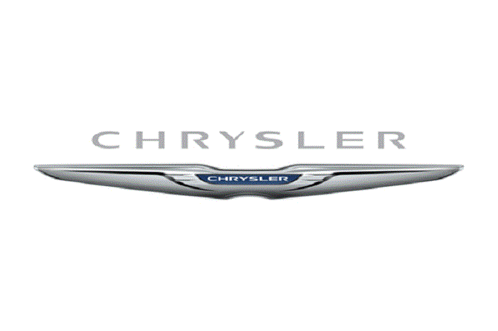
Official Color Codes:
Primary Color (Silver):
Secondary Color (Dark Blue):
- Hex: #1C3A6E
- RGB: (28, 58, 110)
- CMYK: (100, 75, 20, 15)
- Pantone: 295 C
Accent Color (Black):
- Hex: #000000
- RGB: (0, 0, 0)
- CMYK: (0, 0, 0, 100)
Dimensions and Proportions:
- Aspect ratio: Approximately 4:1 (width to height)
- Minimum size: 1 inch width for print applications
- Clear space: Equal to the height of the central badge on all sides
- The logo should always maintain proportional scaling
What Cultural Impact Has the Chrysler Logo Had?
The Chrysler emblem represents more than a car company. It symbolizes an era of American industrial ambition and design excellence.
The connection to the Chrysler Building gives it architectural significance. That skyscraper remains one of Art Deco’s greatest achievements.
In popular culture, the winged badge appears in countless films and television shows. It often represents American luxury and aspiration.
How Does the Chrysler Logo Fit Into the Overall Brand Identity?
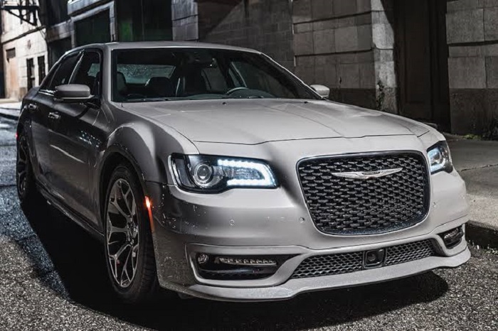
The logo anchors Chrysler’s entire visual system. It appears on vehicles, dealerships, marketing materials, and digital platforms.
Stellantis (Chrysler’s parent company) maintains the emblem as distinct from sibling brands like Dodge, Jeep, and Ram. Each brand keeps its own identity.
The wings inform broader design language. Chrysler vehicles often feature horizontal design elements that echo the logo’s spread. Interior details and headlight shapes sometimes reference the winged theme.
How Should the Chrysler Logo Be Used?
Official Usage Guidelines:
Do:
- Maintain the official aspect ratio when scaling
- Use approved color variations (full color, single color, reversed)
- Provide adequate clear space around the logo
- Use vector formats for print and large-scale applications
Don’t:
- Stretch, compress, or distort the logo
- Change the official colors to unapproved alternatives
- Place the logo on busy backgrounds that reduce legibility
- Add effects like shadows, gradients, or outlines not in the original design
- Recreate or modify the logo elements
Where to Access Official Logos: Authorized Chrysler dealers and Stellantis media portals provide approved logo files for legitimate business use.
Licensing Information: The Chrysler name and logo are registered trademarks. Commercial use requires written authorization from Stellantis. Unauthorized use may result in legal action.
Trademark Protection: The winged emblem is protected under U.S. and international trademark law. Stellantis actively monitors and enforces its intellectual property rights.
The Chrysler logo stands as one of the most recognizable symbols in American automotive history. It represents a brand that has shaped the car industry since 1925.
Within the broader landscape of automotive branding, the Chrysler emblem holds a unique position. The winged design connects directly to the Art Deco movement that influenced early 20th century design.
The current version features silver wings with the Chrysler name at the center. This iteration was introduced in 1998, though it has seen refinements since then. Chrysler has gone through approximately 12 logo variations since the company’s founding, each reflecting different eras of automotive design and corporate ownership.
What is the Chrysler Logo?
The Chrysler logo is a winged emblem featuring the brand name in the center, officially reintroduced in 1998. It draws from 1920s aviation aesthetics and symbolizes speed, elegance, and American craftsmanship in automobile manufacturing.
Design Type: Combination mark (emblem with wordmark)
Primary Elements:
- Symmetrical silver wings extending horizontally
- Central badge containing the Chrysler wordmark
- Sleek, aerodynamic silhouette
Official Introduction Date: 1998 (current winged version)
Designer/Agency: Chrysler’s in-house design team, with influences from the original 1920s designs
Trademark Status: Registered trademark, currently owned by Stellantis N.V.
Color Palette:
- Silver/Chrome (primary)
- Dark Blue (#1C3A6E) (secondary)
- Black (accent and backgrounds)
Usage Context: Vehicle grilles, steering wheels, dealership signage, marketing materials, digital platforms, and merchandise
How Has the Chrysler Logo Evolved Over Time?
The Chrysler logo has transformed dramatically across nearly a century. It shifted from simple text-based marks to elaborate winged emblems.
The brand experimented with the Pentastar symbol for decades before returning to wings. Each change reflected corporate mergers, market positioning, and design trends of the time.
Original Chrysler Logo (1925-1955)
Years Active: 1925-1955
Design Description: The earliest Chrysler logos were primarily wordmarks. They featured the Chrysler name in various serif typefaces, sometimes enclosed in circular or ribbon-shaped badges. Some versions included a wax seal motif.
Color Scheme: Gold, black, and red combinations
Designer: Various internal designers
Context: Walter P. Chrysler founded the company in 1925 after restructuring the Maxwell Motor Company. The early logos needed to establish credibility in a competitive market dominated by Ford and General Motors.
Key Changes: Multiple iterations during this period, moving from simple typography to more elaborate badge designs
Cultural Significance: These logos represented the birth of what would become one of America’s Big Three automakers
Ribbon Era Logo (1930s-1950s)
Years Active: Early 1930s through mid-1950s
Design Description: A flowing ribbon design with the Chrysler name prominently displayed. This version had an elegant, almost regal quality to it.
Color Scheme: Gold and blue, sometimes with red accents
Context: The Great Depression and post-war era demanded logos that conveyed stability and sophistication. Chrysler wanted to position itself as a premium American brand.
Cultural Significance: This era established Chrysler’s reputation for engineering excellence and luxury
Pentastar Era (1962-1998)
Years Active: 1962-1998
Design Description: A five-pointed star contained within a pentagon shape. Clean, geometric, and modern for its time. The design was stark and corporate.
Color Scheme: Blue and white (primary), sometimes rendered in silver
Designer: Created by the Lippincott & Margulies design firm
Context: The early 1960s saw corporations embracing modernist design. The Pentastar unified Chrysler’s various divisions under one recognizable symbol.
Key Changes from Previous: Complete departure from traditional automotive emblems. No script, no wings, no ornamental elements.
Cultural Significance: Became synonymous with American muscle cars, the Mopar brand, and Chrysler’s engineering innovations
Return to Wings (1998-Present)
Years Active: 1998-present
Design Description: Silver wings extending from a central oval badge containing the Chrysler wordmark. Sleek, aerodynamic, and premium in appearance.
Color Scheme: Silver, chrome, dark blue
Context: The DaimlerChrysler merger era brought a return to heritage-inspired design. The wings connected to 1920s aesthetics while feeling contemporary.
Key Changes from Previous: Complete abandonment of the Pentastar for passenger vehicles. Return to winged symbolism from the brand’s earliest days.
Cultural Significance: Signaled Chrysler’s attempt to reclaim its luxury positioning against European competitors
What Do the Design Elements of the Chrysler Logo Mean?
The wings represent speed, freedom, and aspiration. They connect to early aviation imagery that fascinated Americans in the 1920s and 1930s.
This symbolism suggests vehicles that transcend ordinary transportation. The horizontal spread creates a sense of motion even when static.
What is the Symbolic Meaning Behind the Chrysler Wings?
Wings in automotive design draw from ancient mythology and early flight. They suggest transcendence and human achievement.
For Chrysler, the wings reference the brand’s founding era when aviation was the ultimate symbol of progress. The symmetrical design creates visual balance and stability.
The shape also connects to the Chrysler Building in New York City. That Art Deco landmark features similar wing motifs in its architecture.
Why Did Chrysler Choose These Specific Colors?
Silver/Chrome
- Hex: #C0C0C0
- Symbolic meaning: Premium quality, technological sophistication, modernity
- Psychological impact: Conveys sleekness and futuristic thinking
- Brand connection: Reflects the metallic nature of automobiles themselves
Dark Blue
- Hex: #1C3A6E
- Symbolic meaning: Trust, reliability, American heritage
- Psychological impact: Creates feelings of dependability and professionalism
- Brand connection: Common in American automotive branding, connects to patriotic themes
The psychology behind these color choices directly supports Chrysler’s positioning as a trustworthy American manufacturer.
What Typography Style Is Used in the Chrysler Logo?
The wordmark uses a custom sans-serif typeface with clean lines. The letterforms are slightly condensed and modern.
Uppercase letters create formality and presence. The spacing between characters has been carefully adjusted for legibility at various sizes.
Earlier versions used more decorative scripts. The current typographic approach prioritizes clarity over ornamentation.
What Are the Hidden Meanings in the Chrysler Logo?
The wings subtly mirror the hood ornaments of classic luxury vehicles. This creates an instant association with automotive heritage.
The horizontal orientation suggests forward motion and progress. Some observers note the shape resembles an eagle in flight, connecting to American symbolism.
The central badge acts as a shield, implying protection and security. Designer intentions focused on evoking the brand’s 1920s golden age while feeling fresh.
How Does the Chrysler Logo Compare to Competitor Logos?
Chrysler’s winged emblem stands apart from most American competitors. Ford uses simple script. Chevrolet relies on its bowtie. Chrysler chose something more elaborate.
The design competes more directly with European luxury brands. Bentley and Aston Martin both use winged emblems, placing Chrysler in aspirational company.
Comparative Analysis:
Chrysler vs. Ford: Chrysler’s wings are ornamental and heritage-focused. Ford’s blue oval is straightforward and democratic. Different target audiences, different approaches.
Chrysler vs. Chevrolet: Both are American icons. Chevrolet’s bowtie is more abstract and universal. Chrysler’s wings target buyers seeking something more exclusive.
Chrysler vs. Bentley: Both use wings. Bentley’s are more stylized and compact. Chrysler’s spread wider, creating a different proportion and feel.
Chrysler vs. Tesla: Tesla’s minimalist “T” represents the future. Chrysler’s wings look backward to move forward. Generational design philosophy differences.
What Are the Technical Specifications of the Chrysler Logo?
Official Color Codes:
Primary Color (Silver):
Secondary Color (Dark Blue):
- Hex: #1C3A6E
- RGB: (28, 58, 110)
- CMYK: (100, 75, 20, 15)
- Pantone: 295 C
Accent Color (Black):
- Hex: #000000
- RGB: (0, 0, 0)
- CMYK: (0, 0, 0, 100)
Dimensions and Proportions:
- Aspect ratio: Approximately 4:1 (width to height)
- Minimum size: 1 inch width for print applications
- Clear space: Equal to the height of the central badge on all sides
- The logo should always maintain proportional scaling
What Cultural Impact Has the Chrysler Logo Had?
The Chrysler emblem represents more than a car company. It symbolizes an era of American industrial ambition and design excellence.
The connection to the Chrysler Building gives it architectural significance. That skyscraper remains one of Art Deco’s greatest achievements.
In popular culture, the winged badge appears in countless films and television shows. It often represents American luxury and aspiration.
How Does the Chrysler Logo Fit Into the Overall Brand Identity?
The logo anchors Chrysler’s entire visual system. It appears on vehicles, dealerships, marketing materials, and digital platforms.
Stellantis (Chrysler’s parent company) maintains the emblem as distinct from sibling brands like Dodge, Jeep, and Ram. Each brand keeps its own identity.
The wings inform broader design language. Chrysler vehicles often feature horizontal design elements that echo the logo’s spread. Interior details and headlight shapes sometimes reference the winged theme.
How Should the Chrysler Logo Be Used?
Official Usage Guidelines:
Do:
- Maintain the official aspect ratio when scaling
- Use approved color variations (full color, single color, reversed)
- Provide adequate clear space around the logo
- Use vector formats for print and large-scale applications
Don’t:
- Stretch, compress, or distort the logo
- Change the official colors to unapproved alternatives
- Place the logo on busy backgrounds that reduce legibility
- Add effects like shadows, gradients, or outlines not in the original design
- Recreate or modify the logo elements
Where to Access Official Logos: Authorized Chrysler dealers and Stellantis media portals provide approved logo files for legitimate business use.
Licensing Information: The Chrysler name and logo are registered trademarks. Commercial use requires written authorization from Stellantis. Unauthorized use may result in legal action.
Trademark Protection: The winged emblem is protected under U.S. and international trademark law. Stellantis actively monitors and enforces its intellectual property rights.
Conclusion
The Chrysler logo tells a story nearly a century in the making. From the early wordmarks of the Walter P. Chrysler era to the Pentastar years and back to winged elegance, this emblem has mirrored American automotive history.
The current design connects Detroit craftsmanship with luxury positioning. It works.
Whether on a Chrysler 300 grille or Chrysler Pacifica liftgate, those silver wings carry real weight. They represent brand heritage that few competitors can match.
Stellantis now guards this trademark. But the symbol belongs to anyone who remembers what American car brands once meant.

Renowned for his expertise in logo design and visual branding, Bogdan has developed a multitude of logos for various clients.
His skills extend to creating posters, vector illustrations, business cards, and brochures. Additionally, Bogdan's UI kits were featured on marketplaces like Visual Hierarchy and UI8.
He also wrote in the past years on sites like Design Your Way, WebDesignerDepot, WPDean, Designmodo, Speckyboy, Slider Revolution, and more.
- The Cursor Logo History, Colors, Font, And Meaning - 24 September 2026
- Top 7 Web Design Subscription Services That Replace Full-Time Hires - 24 September 2026
- Canva vs PowerPoint: Which Is Better for Presentations? - 22 September 2026

Bogdan Sandu is a seasoned designer who has been designing websites since 2008. Renowned for his expertise in logo design and visual branding, Bogdan has developed a multitude of logos for various clients. His skills extend to creating posters, vector illustrations, business cards, and brochures. Additionally, Bogdan's UI kits were featured on marketplaces like Visual Hierarchy and UI8. He also wrote in the past years on sites like Design Your Way, WebDesignerDepot, WPDean, Designmodo, Speckyboy, Slider Revolution, and more.
You Might Also Like