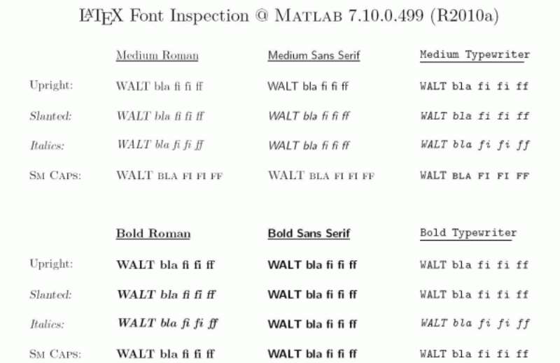
Slack uses Lato as its primary UI font across the desktop and mobile app, a humanist sans-serif font designed by Warsaw-based type designer Łukasz Dziedzic in 2010.
For its website wordmark and marketing headlines, Slack licensed Larsseit, a contemporary grotesque sans-serif published by Type Dynamic and designed by Nico Inosanto. The Slack logo wordmark sits in an all-lowercase, clean sans-serif style consistent with that typeface.
Slack’s Japanese brand communications use Tazugane as the localized brand font, with Noto Sans serving as a fallback for multilingual UI rendering.
—
What Type of Font Is Lato?
Lato is a humanist sans-serif. That classification matters because humanist sans-serifs draw from classical calligraphic forms, giving letterforms slightly organic, warm proportions compared to geometric or grotesque alternatives.
Dziedzic designed it in the summer of 2010 (the name “Lato” means “summer” in Polish). The brief was to balance two competing goals: transparency at body text sizes and personality at display sizes.
Key typographic traits of Lato:
- x-height: tall, which improves legibility at small sizes
- Apertures: open, reducing confusion between similar letterforms (c/e, d/b)
- Stroke contrast: very low, keeping it neutral across different screen resolutions
- Letter spacing: slightly generous, reducing eye strain in dense message threads
These properties make it a practical fit for a chat interface where users read hundreds of messages per day at 13–15px.
Slack primarily uses the Regular (400) and Bold (700) weights. That two-weight system creates a clear typographic hierarchy between message body text, timestamps, and channel names without needing multiple intermediate weights.
—
Who Designed Lato?
Łukasz Dziedzic designed Lato through his Warsaw-based studio tyPoland. It was originally commissioned as a proprietary corporate typeface for a large company, but that project was shelved.
Dziedzic released Lato publicly under the SIL Open Font License in 2010, and it was later added to Google Fonts. That open release is what made it accessible enough for Slack to build its interface around.
The font now exists in 18 styles, from Thin (100) to Black (900), each with italic variants. Slack uses a narrow slice of that range.
—
Who Designed Larsseit (The Slack Wordmark Font)?
Nico Inosanto designed Larsseit, published through the foundry Type Dynamic. The typeface blends very low contrast with classical proportions, built specifically for readability and neutrality.
Larsseit comes in 6 weights from UltraThin to Black, each with corresponding italics and small caps. It includes OpenType features like proportional figures, ligatures, and fractions.
The font accompanying the Slack icon in the 2019 rebrand is set in a clean, all-lowercase grotesque style consistent with Larsseit’s character. The wordmark uses a bold weight to ground the colorful pinwheel symbol visually.
—
Is Lato Free to Use?
Yes. Lato is released under the SIL Open Font License (OFL), which means it is free for both personal and commercial use, including embedding in apps, websites, and print materials.
| Source | Format | License | Cost |
| Google Fonts | Web / Download | OFL (open source) | Free |
| Adobe Fonts | Desktop / Web | Adobe subscription | Included with CC |
| Font Squirrel | Download | OFL | Free |
You can load Lato in a web project with a single Google Fonts embed. No attribution required for commercial use.
Larsseit, the wordmark font, is a different story. It requires a paid commercial license from Type Dynamic, available through MyFonts and Fontspring. A demo version exists for personal, non-commercial testing only.
—
What Font Did Slack Use Before?
Before the 2019 rebrand, Slack used a wordmark with a more casual, less structured typeface alongside the original 11-color hashtag symbol. The typography lacked formal consistency across brand materials.
In January 2019, Slack worked with Pentagram’s New York office, led by partner Michael Bierut, alongside Slack’s in-house design team and co-founder Stewart Butterfield.
The rebrand introduced Larsseit for the wordmark. Bierut’s team restructured the entire brand identity from the logo to the color system, cutting 11 colors down to 4 primary hues plus the signature Aubergine purple.
The old logo was Slack’s own admission. Their internal team stated it was “extremely easy to get wrong” because it required a specific 18-degree rotation and broke on any background color other than white. The new system was built to be consistent across every platform and application size.
—
What Are the Best Free Alternatives to Lato?
If you want a similar feel to Slack’s UI without pulling in Lato directly, these are the closest free matches:
| Font | Why It’s Similar | License | Source |
| Inter | Humanist sans-serif, optimized for screen readability at small sizes | OFL | Google Fonts |
| Source Sans Pro | Open proportions, clean stroke weight, Adobe-designed for UI | OFL | Google Fonts |
| Nunito | Slightly rounded terminals, warm feel, similar weight range | OFL | Google Fonts |
| Work Sans | Low contrast grotesque, highly legible in dense text layouts | OFL | Google Fonts |
Inter is the strongest alternative for interface work. It was literally designed for screen UIs, and at 13–16px it outperforms Lato in some rendering environments. Well worth testing if you’re building a productivity tool.
If you want something that more closely matches fonts similar to Lato in character and proportion, those options are also worth exploring before committing to a stack.
—
How to Use Lato in Your Project
Web Embed (Google Fonts)
Add this to your <head>:
“ <link href="https://fonts.googleapis.com/css2?family=Lato:wght@400;700&display=swap" rel="stylesheet"> `
Then apply it in CSS:
` body { font-family: 'Lato', sans-serif; font-weight: 400; } `
Slack-style hierarchy uses font-weight: 700 for channel names, user handles, and sidebar labels. Regular weight handles message body text.
In Figma
Lato is pre-installed in Figma’s font library via the Google Fonts integration. Search “Lato” in the font picker, no installation needed. If you want to match Slack’s exact spacing, set tracking to 0 and leading to around 1.4–1.5 of the font size.
In Photoshop or Illustrator
Download the OTF files from Google Fonts, install them system-wide, and they appear automatically in both apps. See the full steps for how to add fonts to Photoshop or how to add fonts to Adobe Illustrator if you’re new to that process.
Changing the Font Inside Slack
Slack lets you change the chat message font using the /slackfont command. Type /slackfont Helvetica to switch, or /slackfont with no argument to reset to the Lato default.
The setting applies to message text only. Code blocks use a separate monospaced font that is not easily customizable through the UI.
—
Why Did Slack Choose Lato?
The short answer: it works well at the sizes that matter.
Most text in Slack renders between 13px and 15px on desktop. At those sizes, geometric sans-serifs like Futura or Circular tend to feel cold and can show spacing quirks. Humanist fonts like Lato hold up better because their letterforms have more variation in stroke, which helps the eye distinguish characters faster.
There is also a brand positioning angle. Lato’s semi-rounded details give it warmth. That is intentional. Slack’s product philosophy has always leaned toward approachability, the idea that work software does not have to feel corporate and rigid. The font psychology behind humanist sans-serifs aligns with that positioning well. Compare it to Microsoft Teams, which uses Segoe UI, a much more neutral, functional typeface with no real warmth. Different brand goals, different type choices.
Lato’s open license also made it a practical call. Slack could use it across the web app, desktop app, mobile apps, and marketing materials without negotiating separate licensing deals for each surface. For a company scaling across platforms at speed, that matters.
Overall, it is a smart, low-ego choice. Not flashy. Just readable, consistent, and appropriate.
—
How Slack’s Font Compares to Other App Fonts
It is worth putting Slack’s typography in context with other major communication tools. The differences are not random.
| Platform | Primary Font | Font Type | Character |
| Slack | Lato | Humanist sans-serif | Warm, approachable |
| Microsoft Teams | Segoe UI | Humanist sans-serif | Neutral, corporate |
| Discord | Whitney / gg sans | Humanist sans-serif | Casual, friendly |
| Zoom | Lato | Humanist sans-serif | Clean, professional |
| Notion | ui-sans-serif / system | System font stack | Minimal, native-feeling |
Interestingly, Zoom also uses Lato as its default UI font. Both platforms target workplace productivity, and both landed on the same humanist typeface. That is not a coincidence. It reflects the typography consensus in productivity app design around clean, high-legibility humanist sans-serifs.
If you are curious about other apps and what they use, the Notion font, WhatsApp font, and Asana font each tell different typographic stories worth comparing.
FAQ on The What Font Does Slack Use
What is the default font in the Slack app?
Slack’s default UI font is Lato, a humanist sans-serif designed by Łukasz Dziedzic.
It renders across desktop, mobile, and the browser version. When you reset via /slackfont with no argument, Lato is what you get back.
What font does Slack use for its logo and wordmark?
The wordmark uses Larsseit, a grotesque sans-serif by Nico Inosanto, published through Type Dynamic.
It sits in all-lowercase beside the pinwheel icon introduced during the 2019 Pentagram rebrand.
Is the Slack font free to download?
Lato is free under the SIL Open Font License. Download it directly from Google Fonts for personal or commercial use, no strings attached.
Larsseit is not free. Commercial use requires a paid license from Type Dynamic via MyFonts or Fontspring.
Did Slack change its font?
Yes. The 2019 rebrand updated the wordmark typography to Larsseit, replacing the older, less consistent type treatment.
The app UI font, Lato, has remained the primary interface font throughout Slack’s history.
What font does Slack use on its website headlines?
Slack’s marketing site uses Larsseit and Circular for headlines, with Helvetica Neue as a secondary text fallback.
That combination keeps the site feeling clean and neutral, letting the brand color system do the heavy lifting visually.
Can you change the font inside Slack?
Yes. Type /slackfont [font name] in any message box to switch the chat font. The font must be installed locally on your machine.
The change applies to message text only. Monospaced fonts used in code blocks are separate and not easily changed.
What type of font is Lato?
Lato is a humanist sans-serif. It has open apertures, a tall x-height, and semi-rounded terminals that give it warmth without sacrificing readability.
Those traits make it well suited for dense message-heavy interfaces like Slack’s.
Who designed the Slack font?
Lato was designed by Łukasz Dziedzic at his Warsaw studio tyPoland in 2010. Larsseit was designed by Nico Inosanto for Type Dynamic.
The 2019 brand identity, including the wordmark treatment, was developed by Pentagram’s Michael Bierut alongside Slack’s internal team.
What fonts are similar to Slack’s Lato?
The closest free alternatives are Inter, Source Sans Pro, and Work Sans. All three are available on Google Fonts under open licenses.
Inter is particularly close in feel, built specifically for screen UI readability at small sizes.
Does Slack use a system font or a custom font?
Slack uses a custom-loaded font rather than a system font stack. Lato is bundled under the internal name “Slack-Lato” in the app’s CSS.
On some Linux installations via Snap, system font access is restricted and Slack falls back to Lato as the default regardless.
Conclusion
If you’ve been wondering what font does Slack use, the answer splits across two surfaces: Lato for the app UI and Larsseit for the brand wordmark.
Both are humanist sans-serifs chosen for legibility, not style points. Lato’s open apertures and tall x-height hold up well across Slack’s desktop and mobile interfaces, while Larsseit gives the logotype a clean, neutral weight.
The good news for designers is that Lato’s SIL Open Font License makes it freely available on Google Fonts for any commercial project. It pairs well with Inter, Source Sans Pro, or Work Sans if you need a secondary typeface in your stack.

Renowned for his expertise in logo design and visual branding, Bogdan has developed a multitude of logos for various clients.
His skills extend to creating posters, vector illustrations, business cards, and brochures. Additionally, Bogdan's UI kits were featured on marketplaces like Visual Hierarchy and UI8.
He also wrote in the past years on sites like Design Your Way, WebDesignerDepot, WPDean, Designmodo, Speckyboy, Slider Revolution, and more.
- Friendly Karla Font Pairing Ideas for Modern Brands - 26 September 2026
- The Cursor Logo History, Colors, Font, And Meaning - 24 September 2026
- Top 7 Web Design Subscription Services That Replace Full-Time Hires - 24 September 2026

Bogdan Sandu is a seasoned designer who has been designing websites since 2008. Renowned for his expertise in logo design and visual branding, Bogdan has developed a multitude of logos for various clients. His skills extend to creating posters, vector illustrations, business cards, and brochures. Additionally, Bogdan's UI kits were featured on marketplaces like Visual Hierarchy and UI8. He also wrote in the past years on sites like Design Your Way, WebDesignerDepot, WPDean, Designmodo, Speckyboy, Slider Revolution, and more.
You Might Also Like